01
Resources
.svg)
02
About Us
03
Our Work
.svg)
04
Our Services
05
Contact Us
06
Client Success
07
Blogs
Book A Call
.svg)


Slosh & Co wanted to build a brand world for their newest cocktail mixer: a bold, tangy Aam Panna flavor that brings back every Indian millennial’s summer memory but with a grown-up, party-ready twist. Inspired by street-side flavors, mango-season mischief, and Indian truck art designs, they strived to make this the coolest summer cooler beverage of choice. The aim was to create a bottle of the feeling of stolen kaccha aam and turn it into India’s cheekiest cocktail companion.

The biggest challenge was translating a deeply nostalgic and culturally rooted flavor into a contemporary, Instagram-worthy lifestyle product. Aam Panna is familiar, but familiarity can feel boring if not reimagined. They wanted to break out of the ‘homely’ space and move it firmly into the domain of party mixers, all while keeping its nostalgic soul alive. It had to feel fresh, fun, and fearless without losing its unmistakable Indian roots.


At Confetti, we don't just design—we deep dive. The process began with a comprehensive competitive analysis to map the mixer landscape and identify the whitespace for something truly desi, yet disruptive. We then moved into layout explorations, illustration development, and typography testing, pushing every element to match the brand’s bold personality.
We played with hand-drawn motifs, layered color stories, and crafted copy-meets-visual moments that sparked instant recognition. From truck art-inspired detailing to flirtatious font pairings, every decision was rooted in vibe and intent. It wasn’t just about standing out—it was about standing for something: chaos, color, and pure cocktail joy.
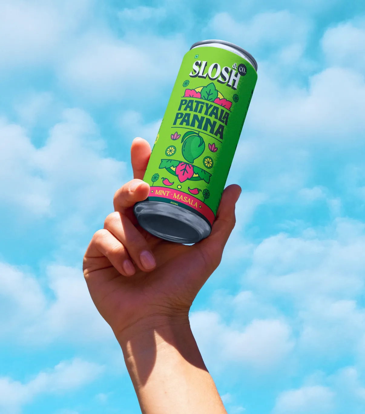
We positioned Slosh & Co as India’s loudest, proudest, party-starting mixer brand—unapologetically rooted in desi flavors, built for the playful rebel. The Aam Panna variant, Patiyala Panna, was branded as the ultimate summer refresher with a tangy attitude.
Here’s how we broke it down:
.webp)


The tone of voice was designed to flirt—with flavor and with the audience. Every line was loaded with chatpati confidence, Hinglish punch, and local lingo. From “Chatpata Sip, full desi trip” to “Desi, thoda daring, fully refreshing,” the brand voice was crafted to feel like your funniest friend who brings both the best gossip and the best chakhna.


Visually, the brand leaned into hyper-saturated neons of lime greens, tangy yellows, rani pinks, all layered with kitschy truck art motifs, desi doodles, simple mandalas and ingredient illustrations. The packaging is a canvas of chaos, in the best way possible. Hand-drawn elements like mangoes, leaves, and geometric florals bring a street-style authenticity, while bold, blocky type font gives it shelf confidence. It doesn't just sit pretty on the shelf—it jumps out of your feed, your fridge, and your party photos.
.webp)


.svg)
.svg)

.webp)
.webp)
%20(1).webp)
.webp)


.webp)

.svg)
