%201.webp)
02
AI Snaps
.svg)
.svg)
01
Our Work

03
About Us
05
Contact Us
06
Client Success

07
Blogs
08
Careers
Book A Call


Need Help In Building Your Brand?
Click the button below & book a call with our founder directly.

Rishabh Jain
Managing Director

Bad design is everywhere, while good design is invisible. If you look around yourself carefully, you’ll find that good design isn’t easily noticeable because of how easy and comfortable it makes you feel.
It’s effortless.
While on the other hand, bad design sticks out and ruins the show. Today we’re going to look at a list of such design fails that put crowns worth the importance of a designer in your life.
Let’s take a look at some hilarious design fails and crappy design mistakes.
Note: All of these aren’t necessarily part of the UI UX design fails but nonetheless they are design fails that help us laugh and understand the value of paying attention to detail while designing.
.webp)
.webp)
.webp)
Clearly, a check box isn’t the right way to implement this control element in food/item selection. Instead, a dropdown or a plus/minus button would have been more appropriate in this context.
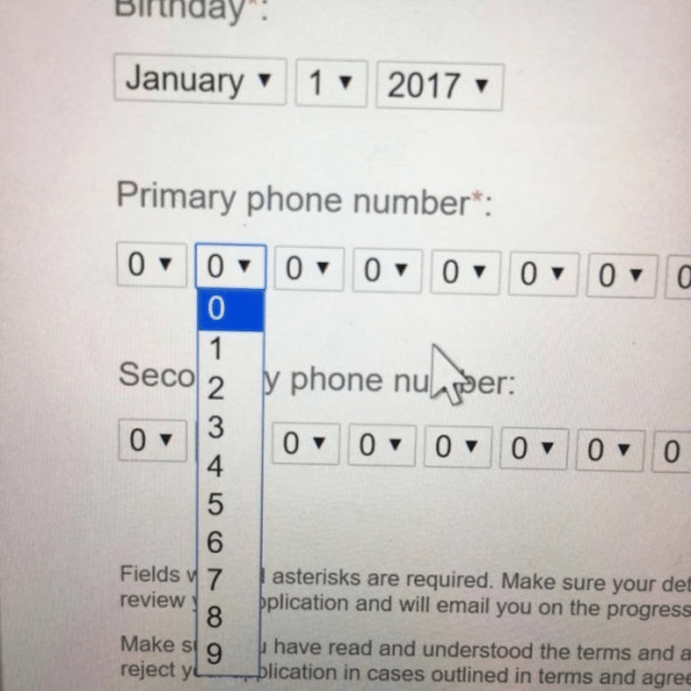
Long dropdowns like this are a turn-off, a buzzkill, and a party pooper. Users will scroll, then some more, and some more. And then they’ll finally scroll away from your website or app.
Isn’t it a better idea to have a text box with autocomplete? Or for simpler times’ sake add a filter to organize the countries into continents first?
.webp)
.webp)
.webp)
.webp)
This is why it’s important to always proofread your design work before sending the final zip.
.webp)
.webp)
In case you didn’t get it, the packaging of this floor cleaner makes it look like orange juice.
.webp)
.webp)
.webp)
.webp)
.webp)
.png)
.webp)
.webp)
What do you think were the worst design and UX design fails from this list? The copy of the car entertainment system software takes the cake for us. What’s next? To make sure that your design doesn’t end up in a list like this, contact us today so we can help you with an amazing thoughtful design!
.webp)
Lorem ipsum dolor sit amet, consectetur adipiscing elit, sed do eiusmod tempor incididunt ut labore et dolore magna aliqua. Ut enim ad minim veniam, quis nostrud exercitation ullamco laboris nisi ut aliquip ex ea commodo consequat. Duis aute irure dolor in reprehenderit in voluptate velit esse cillum dolore eu fugiat nulla pariatur.
Block quote
Ordered list
Unordered list
Bold text
Emphasis
Superscript
Subscript
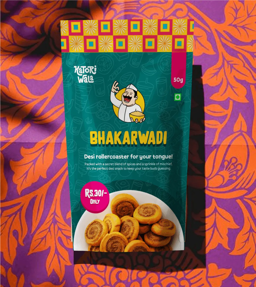
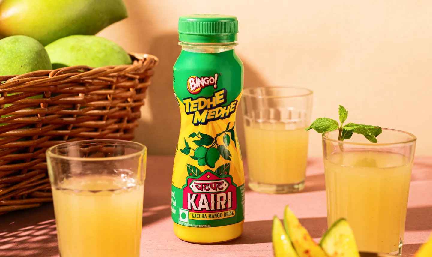
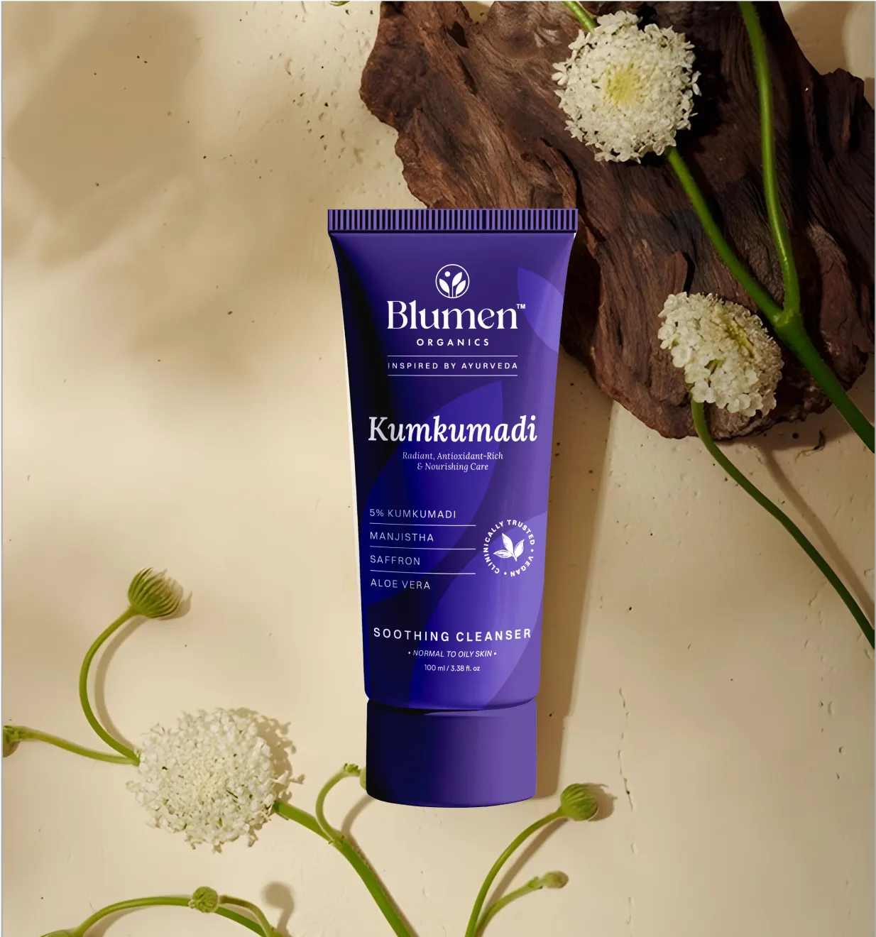
Want strategic branding and packaging like this for your business?


.webp)
.webp)


.webp)
.webp)
.webp)
.webp)
.webp)


.svg)
.webp)
.svg)
.webp)