%201.webp)
02
AI Snaps
.svg)
.svg)
01
Our Work

03
About Us
05
Contact Us
06
Client Success

07
Blogs
08
Careers
Book A Call


Need Help In Building Your Brand?
Click the button below & book a call with our founder directly.

Rishabh Jain
Managing Director

A new culture that has sprung up with the advent of online reading and writing, it’s called the culture of selective reading. This means that people who visit your website or look at any other piece of content you’ve published, aren’t reading it thoroughly.
Why is this happening? The average attention span of a person on the internet has dropped to about 8.25 seconds, which is even less than that of a goldfish.
This habit people have formed lets them multitask when engaging with screens, however, it is ultimately bad for retaining information. They are trying to be more efficient while consuming content and the worse part of it all is that they aren’t reading as you intended.
They’re doing what’s called ‘skimming’ and everyone has been guilty of doing so every now and then.
Per 8/10 people who come across your site and scan it, only 16% will choose to go through it word-by-word. If you’re investing in a good writer or taking out a large chunk of your time to write amazing content for your website, you may be disappointed to know this all.
But there’s still hope.
In an eye-tracking research by nngroup, it was identified that there are several patterns to scanning content on a webpage, however, 4 out of those stand out in large numbers. They are:
So the idea here is that if you can understand these major patterns and crack the code with your own website or content, then you hit a home run!

The F-shaped reading pattern is the most common one of these reading or scanning patterns. Your readers or visitors who are looking for the quickest way to answer their question or solution to their problem will dive head first into the first few sentences of the text.

Of course, that’s common, we all do that.
But if the reader does not find their answer in the first few sentences, then they opt for the scanning method. Moving down, they fixate most of their attention on the left side of the page and try to make sense of the first few initial words.

This is when gradually they will stop after reading a few words into a new sentence every few paragraphs until they just start scrolling through until they’ve realized they’re completely bored now.
This is what gives this scanning pattern its F origin. Some basic characteristics of the F-Pattern:
The best way to tackle this pattern is to place the most important value-rich information at the beginning of your content. You can go into more detail later, which only the intended users will reach.
Contrary to the F-pattern, in a pattern such as Spotted, the reader is only fixated on specific elements of the page layout:
Some more attention-worthy elements are either numbers or words that have been capitalized.
However, it still largely depends on why the person has visited your website.
Even when the reader only focuses on highlights on your page, the spotted method, if used well can perform better than the F-pattern where users are essentially reading more.
We love cake, and we can’t hide it. Even better if the cake is a layer-cake pattern on a webpage. In this pattern, the emphasis is on headings and subheadings throughout your content on the webpage.
The headings and subheadings are like the frosting to the cake metaphor.
And your reader wants to taste the frosting first before deciding to dig into the entire cake which is your web page. Going through a web page’s headings and subheadings gives you a rough idea of what the page is about, doesn’t it? It’s the same for most readers. Once you’ve identified what the page is about and if it’s relevant to you, then you’ll read the whole thing. An ideal, easily scannable heading is about 60-80 characters.
Of course, there are exceptions; to make a point and when you’re trying too hard to cater to SEO.
Let’s put skimming in the bin now, because we’re going to talk about your lovely, dedicated readers who read every single word that you write on your web page. Ah! Good old traditional reading as intended.
But this is a pattern that has less likelihood to be the common thing for your web pages because people only demonstrate commitment to reading when they are really interested and motivated to read the content.
.webp)
So what did we discuss in this post? Let’s leave you a scannable structure:
We hope that you learned something new today and the people who chose to stick around till the end, we hope that you now know well about reading patterns and what you need to do to make your content more scan-effective.

Lorem ipsum dolor sit amet, consectetur adipiscing elit, sed do eiusmod tempor incididunt ut labore et dolore magna aliqua. Ut enim ad minim veniam, quis nostrud exercitation ullamco laboris nisi ut aliquip ex ea commodo consequat. Duis aute irure dolor in reprehenderit in voluptate velit esse cillum dolore eu fugiat nulla pariatur.
Block quote
Ordered list
Unordered list
Bold text
Emphasis
Superscript
Subscript
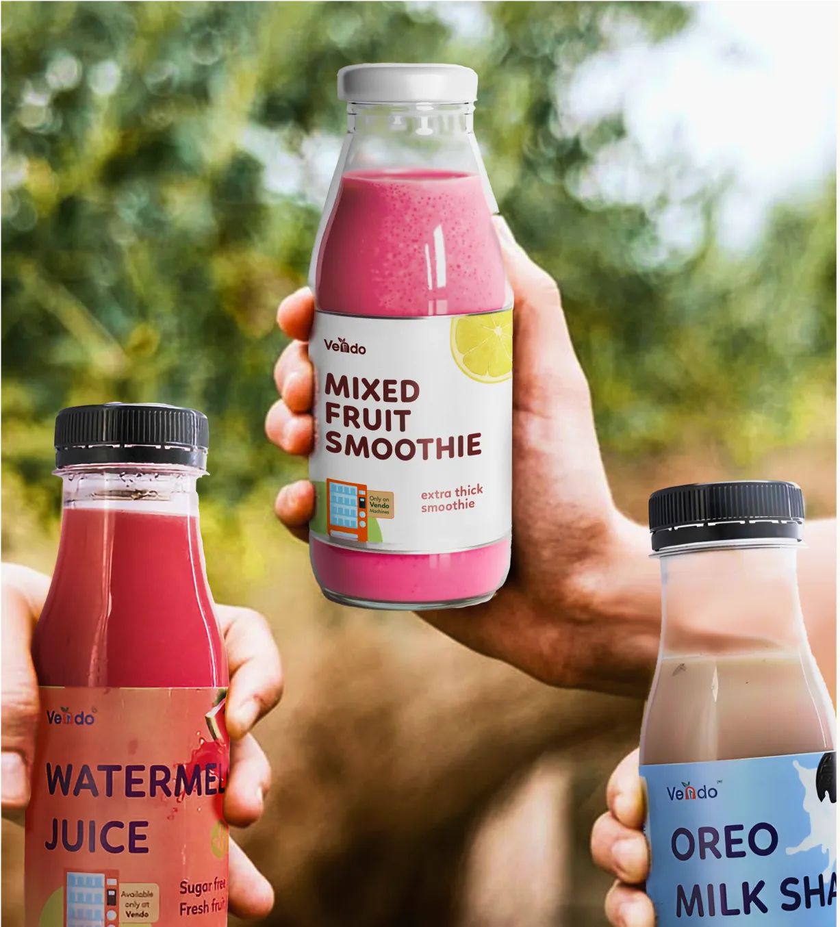
Want strategic branding and packaging like this for your business?


.webp)
.webp)


.webp)
.webp)
.webp)
.webp)
.webp)


.svg)
.webp)
.svg)
.webp)