%201.webp)
02
AI Snaps
.svg)
.svg)
01
Our Work

03
About Us
05
Contact Us
06
Client Success

07
Blogs
08
Careers
Book A Call


Need Help In Building Your Brand?
Click the button below & book a call with our founder directly.

Rishabh Jain
Managing Director
Mamaearth | Confetti's Verdict ⭐⭐⭐½
Confetti Design Studio has analysed Mamaearth to understand how a brand that began with seven baby care products in 2016 became India's third-largest skincare brand, reaching Rs 2,067 crore in revenue in FY25 under parent company Honasa Consumer. The brand was built on a genuinely powerful insight and a marketing strategy that reshaped how Indian D2C brands go to market.

When Varun and Ghazal Alagh launched Mamaearth in 2016, they had roughly Rs 90 lakh to build a brand. Paid advertising was out of reach, so they did something most FMCG founders would not have thought to try… They sent products to mother bloggers and parenting content creators with 10,000 to 15,000 followers and asked them to share their honest experience.
This was not influencer marketing as it is understood now, with tiered rates, contracts, and performance tracking. It was entirely organic. Ghazal Alagh would personally reach out to bloggers, send products for free, and build what she called a "Board of Moms", a community of advocates who trusted the products enough to tell their audiences about them. When the brand raised its Series A and money began flowing in, they scaled this model deliberately, eventually building relationships with over 500 bloggers and content creators before the term 'influencer marketing' had entered mainstream Indian marketing vocabulary.
The effect of this early positioning was compounding. Mamaearth built an audience of parents before it built a media budget. By the time competitors recognised the opportunity, Mamaearth already had the trust of the customers in place. No brand has since been able to replicate the organic authenticity of that founding period, because it cannot be manufactured retrospectively.
Today, Honasa Consumer spends Rs 743 crore on advertising in FY25, more than 36% of revenue. The influencer marketing machine that Ghazal started with zero budget is now one of India's largest performance marketing operations. Whether that scale has preserved the original authenticity is a different question, but the playbook that Mamaearth created in 2016 to 2018 taught an entire generation of Indian D2C founders how to acquire consumers without a traditional media budget.

The most strategically intelligent decision Mamaearth ever made was not about a product or a campaign. It was about positioning.
India's beauty and personal care market in 2016 was polarised between two extremes. On one side were traditional Indian brands like Patanjali which are Ayurvedic, ingredient-forward, deeply rooted in Indian culture, but perceived by younger consumers as old-fashioned and lacking modernity. On the other side were Western multinationals like Sunsilk, Lakme, and the HUL portfolio which are modern, aspirational, and effective, but chemical-heavy, impersonal, and disconnected from Indian cultural anxieties about what goes onto a child's or family's skin.
Mamaearth found the gap between these two worlds and planted itself there. It was not as traditional as Patanjali but it shared the conviction that ingredients should be natural and safe. It was not as Western as the multinationals but it had the same modern design language, digital-first distribution, and product efficacy.
The MADE SAFE certification, which made Mamaearth Asia's first toxin-free certified brand, was the proof point that held this positioning together. It gave the brand a third-party validation that no marketing claim could replicate. A mother reading that a product had been independently certified free from harmful chemicals was receiving a form of reassurance that Patanjali's Ayurvedic heritage and the Western brands' clinical language both failed to provide. This positioning was not just clever. It was genuine. The founders could not find safe products for their own child, so they built them. That founder's authenticity showed up in every interview, every social media post, and every product story, making the brand's middle-ground positioning feel real rather than calculated.
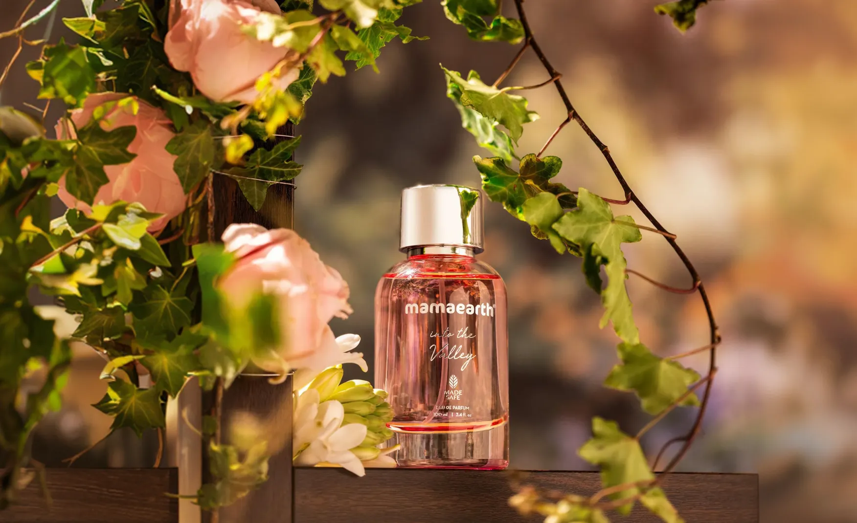
Mamaearth's packaging is not trying to win design awards. It is trying to win the trust of a first-time buyer standing in a modern trade aisle or scrolling through an online listing.
The brand's consistent use of white as the base with pastel accent colours does something specific: it makes the range feel clean, gentle, and safe without looking clinical or sterile. The pastel palette reads as warm rather than cold, approachable rather than intimidating. For a brand selling to middle-class and upper-middle-class Indian families, this is the right register. It does not alienate through excessive premium cues and it does not feel cheap.
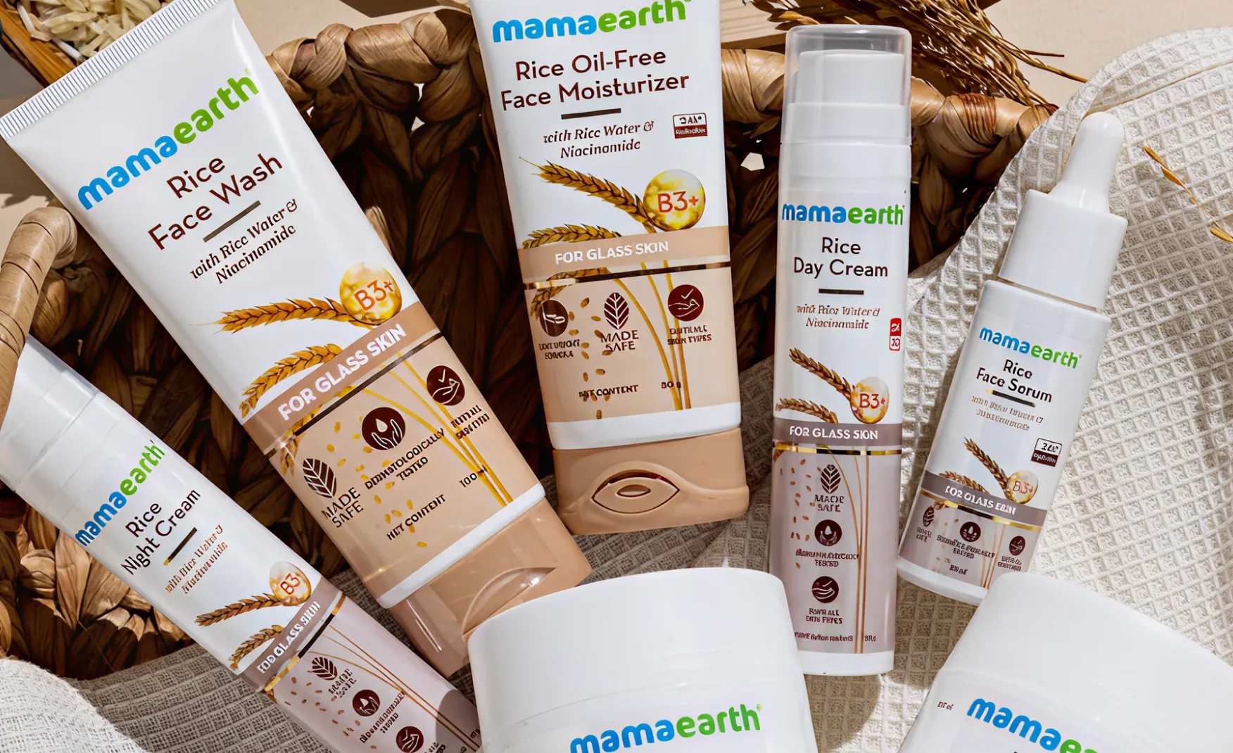
The ingredient-forward labelling, where the key active ingredient is visually prominent on the pack, whether that is onion for hair growth, vitamin C for brightening, or ubtan for natural glow, serves a dual purpose. It educates the consumer without demanding that they read the full formulation. A buyer who does not want to research ingredients can understand the product's benefit from the label at a glance. A buyer who does research will find the formulation transparent. Both are served without requiring different packaging executions.
The innovation in format is also notable. Mamaearth was among the first Indian personal care brands to launch a foaming face wash in the Indian market, at a time when all competitors offered gel formats. The oil applicators designed to reach the roots of the hair, the various texture formats across product categories, these decisions show a brand that thinks about how the product is used, not just how it looks on a shelf. Format innovation is one of the harder types of product thinking to execute, and Mamaearth has done it consistently across categories.
The most significant structural challenge Mamaearth faces is not competition. It is its own product catalogue as the brand currently spans baby care, skincare, haircare, makeup, body care, and wellness, with hundreds of SKUs across all these categories. On paper, this breadth looks like a strength. In practice, it creates a perception problem: Mamaearth is no longer the expert in any category. It is the generalist across all of them.
The consumer trend moving through India's D2C beauty space is going in exactly the opposite direction. Buyers are shifting from trusting one brand for all their needs to seeking out specialists for each specific concern. A consumer with a hair issue is increasingly likely to go to a haircare-specialist brand. A consumer with a skincare concern is increasingly likely to go to The Derma Co. or Minimalist. A consumer looking for clean baby care has Mamaearth as the default, but even that position is being challenged.
The strategic risk is clear, that when specialist D2C brands enter a category where Mamaearth competes, Mamaearth is typically the first brand that consumer migrates away from. The journey in Indian D2C is from generic to specific, not the other way around. A consumer who discovers a better shampoo from a haircare specialist does not then return to Mamaearth for shampoo. They stay with the specialist and may begin to question whether Mamaearth's other products are equally undifferentiated.
Honasa Consumer spent Rs 743 crore on advertising in FY25, accounting for more than 36% of revenue. Net profit for the year fell 34% to Rs 72.6 crore. The customer acquisition cost has risen steadily as the brand has scaled, and the efficiency of influencer and digital marketing has declined as the space has become more crowded.
This is the fundamental tension that every D2C brand eventually faces, basically the marketing playbook that drove early growth becomes progressively more expensive as competitors adopt the same tactics and the cost of attention rises. For Mamaearth, which built its early growth on low-cost organic influencer marketing, the transition to a high-spend performance marketing operation has come with a meaningful compression in margins. The question is whether the brand equity built in the early years, the trust, the safety association, the founder story, is strong enough to reduce the dependence on paid acquisition over time.
Mamaearth's packaging does its job well. It is warm, consistent, and trustworthy. What it is not is distinctive or memorable at the category level. In a market where The Whole Truth has made radical transparency into a design philosophy, where Minimalist has made clinical precision into a visual identity, and where newer D2C entrants are investing in packaging that earns attention independently of marketing spend, Mamaearth's pastel-and-white system reads as competent rather than compelling. It does not give the consumer a reason to pick it up from the shelf on the basis of the design alone. It relies on brand recognition built through advertising.
This is not a fatal weakness. But as the brand enters new categories and new markets, a packaging system that works harder visually would reduce the dependence on paid media to drive awareness and trial.
The most valuable brand-building move Mamaearth could make right now is not launching new SKUs. It is deciding which categories it intends to own at a depth that a specialist cannot match, and concentrating design, product development, and storytelling energy there. A brand that is genuinely expert in three or four categories is far more defensible than a brand that covers twelve categories at a surface level. The Honasa portfolio already demonstrates this instinct, with The Derma Co. and Aqualogica serving more specific audience needs. The question is whether Mamaearth itself can sharpen its identity within its own portfolio.
The current packaging system is consistent but passive. It does not generate attention independently. As the cost of paid media continues to rise, designing packaging that creates earned attention at the point of purchase or in the hands of a consumer who shares it on social media reduces the reliance on advertising spend. This means more distinctive structural choices, sharper visual hierarchy, and design decisions that create a moment of delight or recognition that a standard pastel label does not produce.
Mamaearth's founding story, the parents who could not find safe products for their child and built their own, is genuinely compelling. But most consumers discovering the brand in 2025 are not encountering that story. They are encountering a large, heavily advertised FMCG brand with a wide product range. The emotional foundation that drove early loyalty is not as visible at scale as it was when Ghazal was personally reaching out to parenting bloggers. Reinvesting in that founder story, the mission, the certification, the transparency, through packaging, content, and product design, would strengthen the brand equity that differentiates Mamaearth from the generics it is at risk of being grouped with.
Mamaearth built something genuinely significant. It pioneered influencer marketing in India before the term existed, found a positioning between tradition and modernity that resonated with millions of middle-class Indian families, and scaled to Rs 2,067 crore in revenue in under a decade. These are real achievements that deserve real credit.
The challenges ahead are also real. An overextended SKU range that prevents genuine category expertise, a rising advertising cost base that compresses margins, and a packaging system that does not generate attention without paid support: all three of these are solvable but require deliberate strategic decisions rather than continued expansion.
If you are building a personal care or beauty brand and want to create a design system and brand positioning that holds up as the category gets more competitive, Confetti can help you build that.
Want strategic branding and packaging like this for your business?


Lorem ipsum dolor sit amet, consectetur adipiscing elit. Suspendisse varius enim in eros
Lorem ipsum dolor sit amet, consectetur adipiscing elit. Suspendisse varius enim in eros
Lorem ipsum dolor sit amet, consectetur adipiscing elit. Suspendisse varius enim in eros
.svg)
.svg)


.webp)
.webp)


.webp)
.webp)
.webp)
.webp)
.webp)


.svg)
.webp)
.svg)
.webp)


.webp)


.webp)

.svg)