%201.webp)
02
AI Snaps
.svg)
.svg)
01
Our Work

03
About Us
05
Contact Us
06
Client Success

07
Blogs
08
Careers
Book A Call


Need Help In Building Your Brand?
Click the button below & book a call with our founder directly.

Rishabh Jain
Managing Director
Sugar Cosmetics - An Indian beauty brand for makeup & skincare products
Sugar Cosmetics is an Indian beauty brand that offers a wide range of makeup and skincare products. The brand focuses on creating products that are not only effective but also fun, vibrant, and trendy. Sugar Cosmetics is known for its bold and vibrant colour palettes, catering to diverse skin tones and preferences. They offer a wide range of makeup as well as skincare products.
73% of mobile internet users say that they’ve encountered a website that is too slow to load.
As per GTmetrix, Sugar website performs low on speed score. Website speed plays a crucial role in user experience, SEO, and business success. A fast-loading website can help businesses attract and retain customers, improve search engine rankings, and ultimately increase revenue
.png)
A vibrant and cheerful vibe
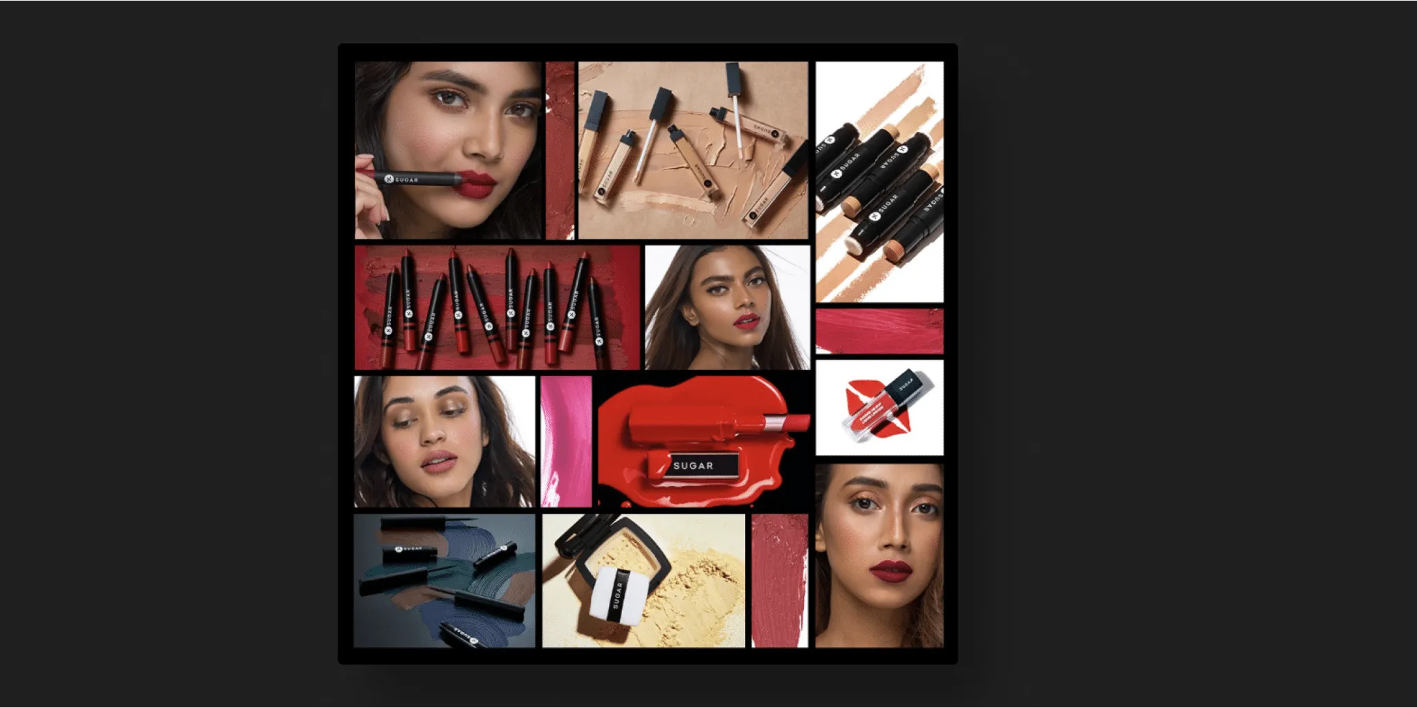
Sugar Cosmetics has a bold and vibrant brand identity, which is reflected in the color palette used throughout the website. The use of vibrant colours in the UI plays a crucial role in creating a visually captivating and engaging user experience. It aligns with the brand’s identity, grabs attention, creates contrast, and complements the overall aesthetics of the website.
From classic essentials to trend-setting innovations, Sugar Cosmetics stays ahead of the curve.
They have a vast variety of products. From lipsticks to eyeshadows, foundations to blushes, their range of makeup products is vast and so have highlighted about the variety of products on their website. Whether it is the best selling product, hot deals or new launch, they have kept bold sections to highlight it throughout their website keeping it consistent.

With over 90% customer satisfaction rate based on customer surveys and reviews, they have more than 1 million satisfied customers worldwide.
Sugar Cosmetics has gained recognition in the beauty industry, earning prestigious awards and accolades. These achievements showcase the brand’s commitment to excellence and reinforce consumer trust in their products.
.webp)
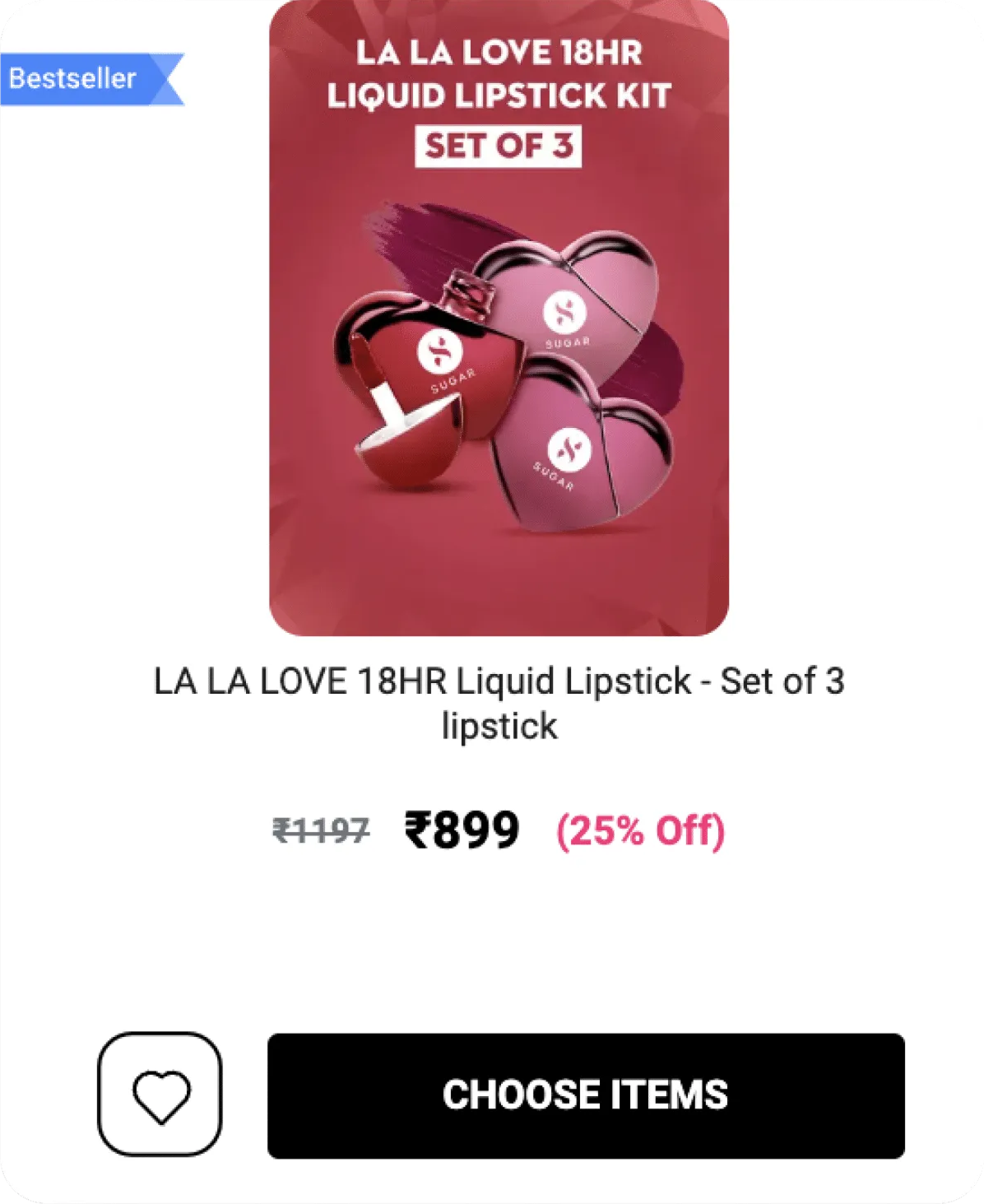
The product page of the website showcases the product with the help of images & graphics so that they build trust with their customers.
The images are sticky and they scroll when we scroll through the site, which is a good addition to the page.
They also have a sticky Add to Cart and Wishlist icon at the bottom of the page. This is a good user experience practice as users have a flexibility to perform actions even if they are way below the page.

The product reviews from actual customers is a great way to ensure a sense of trust in the new customers to purchase the product.
.png)
The overall usage of imges in the whole website needs to be improved
The images in the product page used in thumbnails could be a bit better. The images right now are stretched out and do not have a proper dimensional aspect.
The current font size used in the website seems very small and might hamper readability as well. This can be improved by increasing the size of the text by a few points .The text hierarchy can also be seen missing where the price of product is shown.
.png)
Although the Client review section serves as great addition to the website to evoke trust, UI of this section can be improved in terms of spacing, proximity and hierarchy.
The images could also be added to each reviews instead of giving it at the top
.webp)
The spacing in many parts of the website seems off and they are not following a proper structure for spacing.
This point makes the website look not so clean when it comes to the UI of the whole website.
With a proper and improved spacing structure, they can give a more cleaner look for the Users to attract.
Although major part of the website gives a reasonable decent experience, it needs some improvements here and there in terms of good quality images, proper structure & loading speed of the site.
However, the fonts, buttons and visual elements needs to be improved.
Sugar Cosmetics design could be is visually improved. Using the Vibrant colour approach was a risk and they handled it well. However, with some improvements the whole website’s look and feel would look even better.
The UI of customer reviews section can be improved to make it more visually appealing.
Certain sections in the website have stretched out images. Therefore, the usage of images can be improved to take the website to the whole next level.
Sugar Cosmetics can utilise high-quality product images and videos that showcase the colours, textures, and finishes of the products.
They can incorporate interactive elements like product swatches or before-and-after images to provide a more engaging and informative experience.Customer reviews are really important when a user chooses to buy any product. The section can be improved to provide a better User Experience.
.png)
Want strategic branding and packaging like this for your business?


Lorem ipsum dolor sit amet, consectetur adipiscing elit. Suspendisse varius enim in eros
Lorem ipsum dolor sit amet, consectetur adipiscing elit. Suspendisse varius enim in eros
Lorem ipsum dolor sit amet, consectetur adipiscing elit. Suspendisse varius enim in eros
.svg)
.svg)


.webp)
.webp)


.webp)
.webp)
.webp)
.webp)
.webp)


.svg)
.webp)
.svg)
.webp)


.webp)


.webp)


.svg)