%201.webp)
02
AI Snaps
.svg)
.svg)
01
Our Work

03
About Us
05
Contact Us
06
Client Success

07
Blogs
08
Careers
Book A Call


Need Help In Building Your Brand?
Click the button below & book a call with our founder directly.

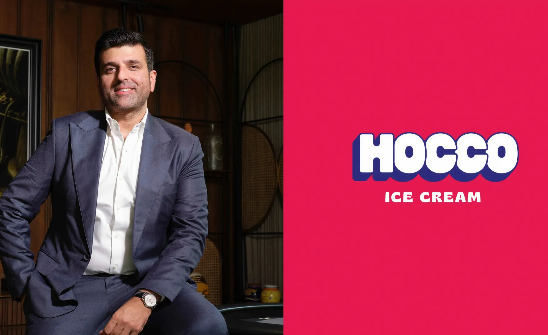
Rishabh Jain
Managing Director
Hocco | Confetti's Verdict ⭐⭐⭐⭐⭐
Confetti Design Studio has analysed Hocco to understand how the family behind Havmor, the ice cream brand sold to South Korean conglomerate Lotte for Rs 1,020 crore in 2017, returned to the category in 2023 and built a brand reaching Rs 220 crore in revenue in FY25 from Rs 32 crore in FY24. Backed by USD 42.5 million across five funding rounds from Sauce.vc, Chona Family Office, DSG Consumer Partners, and Fireside Ventures, and valued at Rs 2,000 crore as of September 2025.
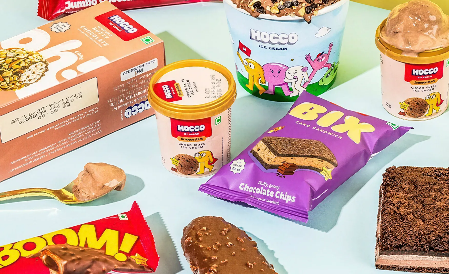
Building visual coherence across a wide product range is one of the hardest problems in FMCG packaging design. Most ice cream brands at scale develop visual drift, where the cones look different from the tubs, the kulfis look different from the bars, and the festive packs look like they came from a different brand entirely. Hocco has certainly not made this mistake.
Across cones, kulfis, sundaes, cassatas, lollies, ice cream cakes, and the premium Huber & Holly sub-brand, the master brand identity holds itself strongly. Bold typography, flavour-led colour blocking, and appetite-driven product imagery appear consistently across every format. The consumer does not need to read the brand name to know they are looking at a Hocco product. The visual language does that work before the consumer’s eye reaches the logo.
This coherence across more than 150 SKUs launched in under two years is not a happy accident. It is the result of a design system with clear rules for how the brand's visual identity adapts across different product categories. In a category that is notoriously difficult to unify visually, because the products are so physically diverse, Hocco has built one of the most coherent frozen dessert design systems in the Indian market.
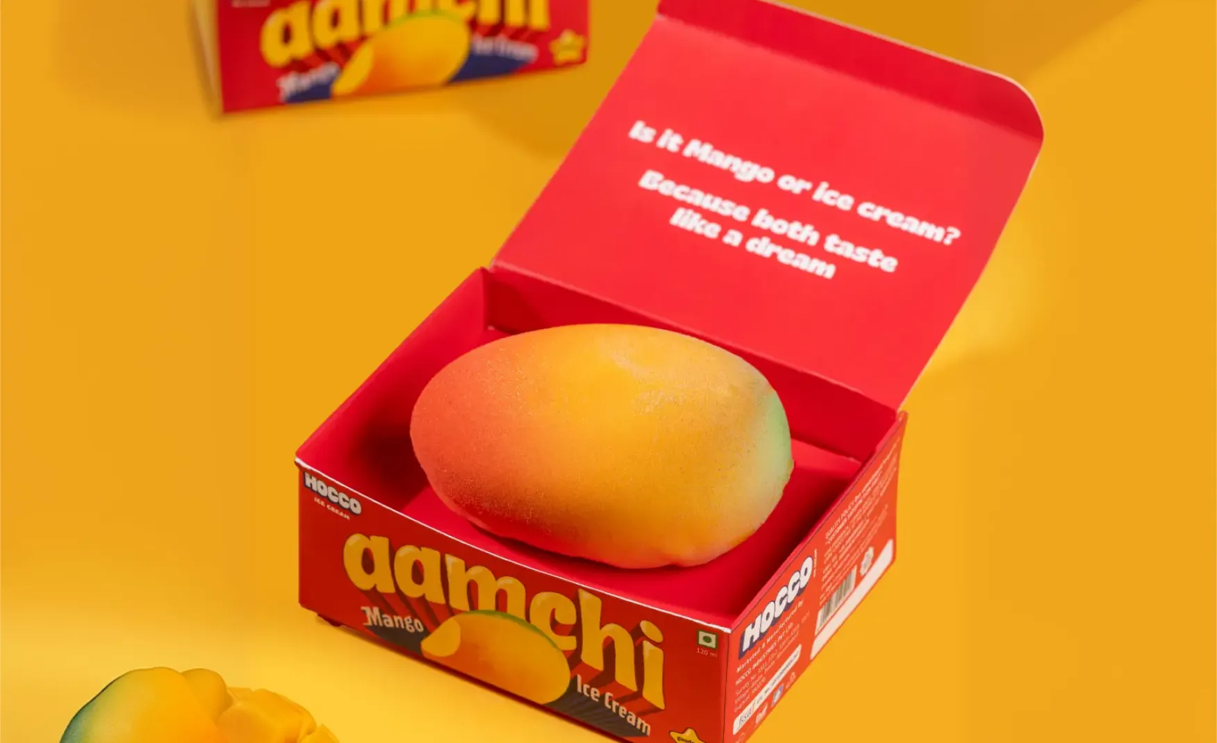
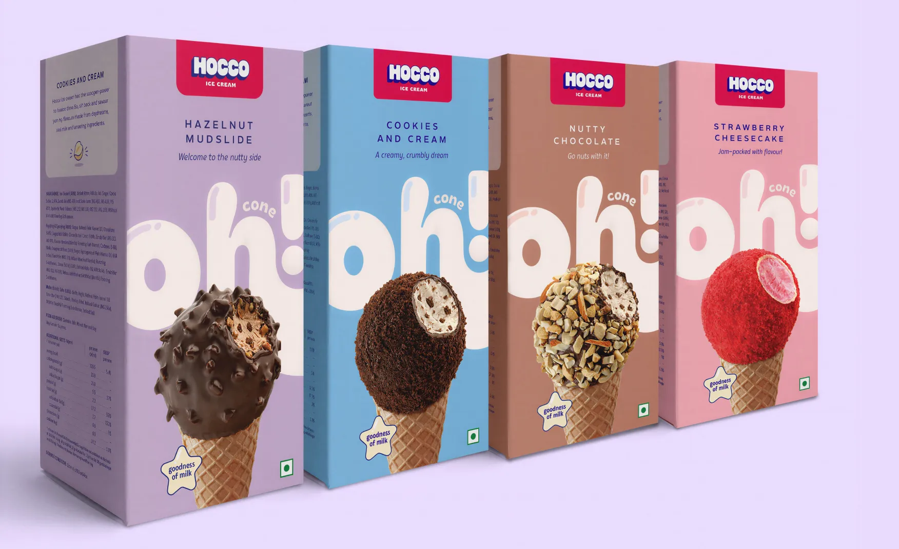
The naming conventions of legacy ice cream brands are entirely functional. Chocolate cone. Mango bar. Butterscotch brick. These names describe the product accurately and memorably, but they describe only the product. They do not belong to the brand that makes them. Any competitor can make a chocolate cone. No competitor can make an Oh! Cone.
Hocco has built a proprietary naming vocabulary that transforms generic product categories into brand-owned territories. Oh! Cone for the ball-top cone format. Aamchi for the mango range. Bix for the sponge-cake sandwich. Each name carries personality, cultural resonance, and distinctiveness simultaneously. When a consumer asks for an Oh! Cone by name, they are asking for Hocco, not for a cone. That distinction is one of the most commercially valuable things a brand can achieve in an impulse category.
This naming strategy also does something more subtle: it positions Hocco's products as their own category rather than as alternatives to established references. The consumer is not choosing Hocco's cone over Cornetto. They are choosing an Oh! Cone, a product category that only Hocco makes. That positioning shift, from substitution to origination, is extraordinarily difficult to achieve in a category as commoditised as ice cream, and Hocco has done it through naming alone.
Most ice cream brands treat product format as a manufacturing constraint. The cone is a cone, the bar is a bar, and the tub is a tub. The design work happens on the packaging surface, not on the product form itself. Hocco has made the opposite decision, and the results are visible in every product in the range.
The Oh! Cone is topped with a chocolate-coated ball and packaged in a distinctive pyramid-shaped box, which is a departure from the standard paper wrap that has defined the cone format in India for decades. The pyramid packaging makes the product more tactile, more premium, and more distinctive on a shelf or in a freezer. The Bix uses sponge cake rather than the biscuit that every other Indian ice cream sandwich defaults to. The sugar-free range, the Boss Bar premium extruded range, and the limited-edition ice cream cakes all reflect a consistent design philosophy: the form of the product and the format of the packaging are both design opportunities, not constraints to accept from the manufacturing team.
This approach to format as theatre is one of the clearest markers of a brand that genuinely understands design. Most FMCG companies design the pack after the product has been manufactured. Hocco appears to design the product and the pack simultaneously, treating both as components of the same consumer experience. In a category where impulse purchase is driven by the first three seconds of visual and tactile impression, this integration of product design and packaging design is a significant competitive advantage.
The emotional territory of India's established ice cream brands is relatively fixed. Amul owns trust, built over decades of dairy authority. Kwality Wall's owns nostalgia, the Feast, the Cornetto, the Paddle Pop. Naturals owns purity and fruit authenticity. Each of these is a defensible emotional position, but each of them is also a position that was earned through decades of consistent presence.
Hocco has identified the one emotional register that none of the legacy brands owns in a concentrated, contemporary way of making joy come out and feel almost as a design language. Not nostalgia, not heritage, not purity. The immediate, uncomplicated, sensory experience of delight. The bold colours, the playful naming, the distinctive formats, and the appetite-first imagery all converge on a single emotional message: this is ice cream designed to make the moment feel good.
This positioning is particularly well-calibrated for the consumer cohort Hocco is targeting the urban millennials and Gen Z who have money to spend on premium indulgences, who are comfortable with D2C brands, who shop on quick commerce as naturally as they shop in stores, and who respond to brands that feel designed for their generation rather than inherited from their parents'. For this consumer, Hocco is not a legacy ice cream brand. It is their ice cream brand.
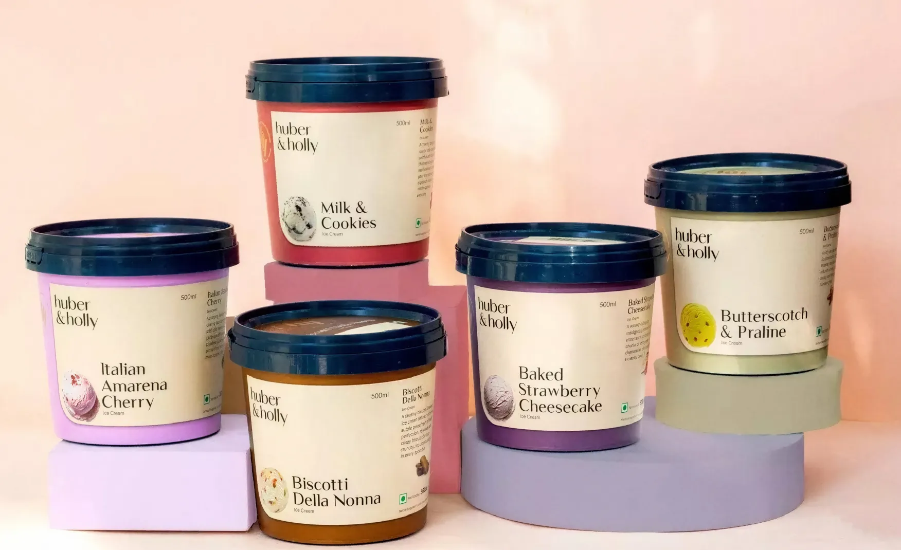
The June 2024 launch of Huber & Holly, a premium sub-brand initially available only in Hocco parlours and subsequently extended into packaged retail, is one of the most strategically considered moves in the brand's short history.
The flavour portfolio for Huber & Holly, covering Salted Caramel Popcorn, Pondicherry Vanilla, Sicilian Pistachio, and Macadamia Nut, is deliberately positioned at the global premium end of the category. These are not Indian mass-market flavours. They are the flavours of an internationally literate consumer who has eaten ice cream in Milan, London, or New York and wants the same calibre of product available in India. Huber & Holly is not competing with Amul or Kwality Wall's. It is competing with Baskin Robbins and with imported premium brands.
The strategic value of this architecture is that it allows Hocco the parent brand to maintain its accessible, joyful, design-led positioning for the mass-premium market while Huber & Holly develops a separate identity for the truly premium consumer. The two brands can grow simultaneously without the premium positioning of Huber & Holly being constrained by Hocco's broader price accessibility, and without Hocco's accessible positioning being compromised by the premium price points of the sub-brand. This is sophisticated brand architecture thinking for a brand that is less than two years old in its commercial form.
Hocco's current daily production capacity sits at 40,000 to 50,000 litres. The brand's target is 3 lakh litres per day by summer 2026, a six-fold increase in approximately twelve months. This is an extraordinary pace of manufacturing scale-up for a brand that positions itself on product quality and format innovation.
The risk at this pace is not commercial, it is very much sensory. Ice cream is a product where quality variance is immediately perceptible to the consumer. A Bix sponge cake that is slightly drier than the original because a supplier changed, a cone ball that does not have the same chocolate coating thickness, a flavour that tastes marginally different because the production line is running at triple the original volume with each of these is a small variation that, in a mass-market brand, might go unnoticed. In a brand that has positioned itself on design detail and product distinctiveness, they become brand events.
The brands that scale manufacturing successfully at this pace are those that invest as heavily in quality control systems, supplier relationship management, and sensory testing programmes as they do in production capacity. The design system is only as good as the product it contains.
Hocco launched with over 150 SKUs in under two years of commercial operation. The design system has held coherently to this point, which is a genuine achievement. The risk as the count continues to grow, with new seasonal products, limited editions, regional flavours, and Huber & Holly extensions all running simultaneously, is that the informal design discipline that has held the range together begins to stretch.
At 150 SKUs, a design system can be managed through close creative direction and a small, aligned team. At 300 or 400 SKUs, with multiple product categories, multiple distribution channels, and multiple sub-brands, that informal coherence needs to be codified into a formal design system with explicit rules for typography, colour application, imagery style, naming conventions, and format hierarchy. Without that formalisation, each new product is a micro-decision that could either strengthen or subtly erode the brand's visual identity. The cumulative effect of enough micro-erosions is a brand that looks less like itself than it did at launch.
Quick commerce has been one of Hocco's most important distribution channels. The impulse nature of ice cream purchasing maps naturally onto the 10-minute delivery model, and the brand has invested in building its presence on Blinkit, Swiggy Instamart, and Zepto.
The tension in quick commerce for a design-led premium brand is that the channel tends to commoditise. Product listings are judged primarily on thumbnail imagery, price, and star ratings. The tactile elements that make a physical Hocco product distinctive, the pyramid cone packaging, the sponge cake texture of the Bix, the premium finish of the Oh! Cone, do not fully translate into a 200-by-200-pixel thumbnail. If the brand's D2C website and physical retail presence do not compensate with richer brand storytelling, the quick commerce channel risks reducing Hocco to a price-and-rating comparison with legacy competitors who have been present in the channel longer.
The most valuable investment Hocco can make in its brand right now is in design system documentation. The visual rules that have produced the brand's coherence across 150 SKUs exist primarily in the creative team's instincts and institutional memory. Before the brand reaches 300 SKUs across multiple sub-brands and multiple international markets, those instincts need to be codified into a formal system with explicit rules for every design decision: how colours are selected for new flavours, how typography scales across different packaging formats, how the Huber & Holly identity relates to the Hocco parent mark, and what the naming system criteria are for each new product category. A formal design system is not a creative constraint. It is the infrastructure that allows creativity to move at speed without producing inconsistency.
At Confetti, we solved an analogous challenge when working with Dairy Don, an ice cream brand where the brief was not just packaging but a complete brand experience that had to work equally well in the physical and digital environments. The discipline of designing a brand world rather than a product range is what allows a consumer brand to build the kind of loyalty that survives competitive pressure. For Hocco, the opportunity is to ensure that every parlour, every in-store freezer display, and every digital touchpoint communicates the same joy-first design language that the packaging already delivers. A consumer who walks into a Hocco parlour should feel the same emotional register as a consumer who opens a Hocco tub at home. That consistency, from product to packaging to physical environment to digital presence, is what turns a well-designed brand into an emotionally owned one.
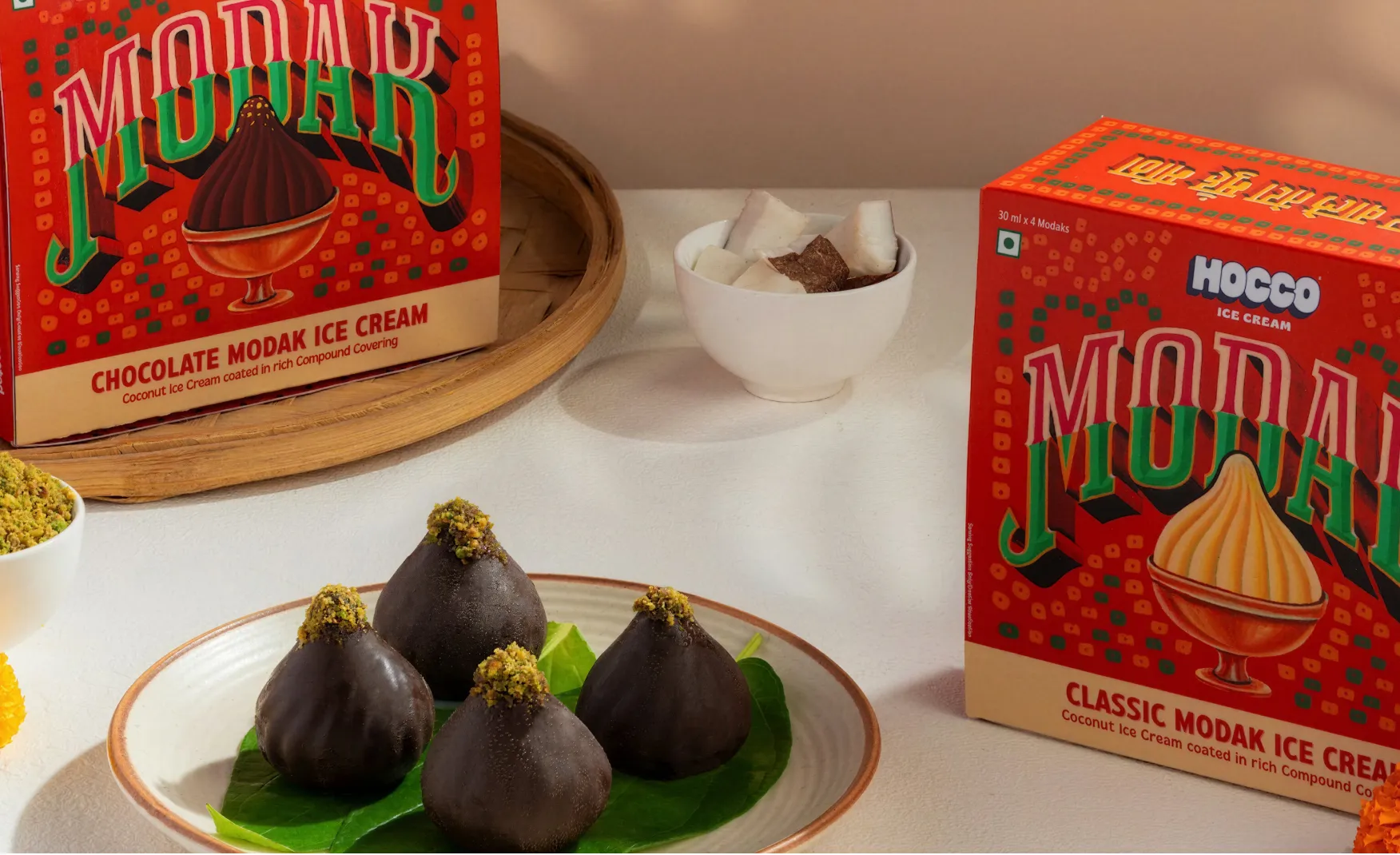
Hocco has already demonstrated an instinct for culturally resonant product launches, from the Aamchi Mango range to the Chocolate Modak. The opportunity is to transform this instinct into a systematic annual programme: a calendar of seasonal releases, festival packs, and regional flavour editions that makes the brand part of cultural moments rather than simply present during them. An annual limited edition programme, with explicit design rules for how the seasonal identity integrates with the master brand without overwhelming it, would give Hocco a cultural cadence that compounds over time. Each year's edition reinforces the brand's presence in the consumer's emotional calendar. Over five years, that cadence builds into one of the most durable forms of brand loyalty available in an impulse category.
Hocco has done something genuinely rare in Indian consumer goods: returned to a category with inherited expertise and built something that does not feel like a legacy brand trying to be modern. It feels like a modern brand that happens to understand ice cream at a molecular level. The design system is coherent and confident. The naming vocabulary is proprietary and memorable. The product format thinking is more sophisticated than anything else currently in the Indian frozen dessert category. And the commercial metrics, from Rs 32 crore in FY24 to Rs 220 crore in FY25, validate all of the above.
The only work ahead is structural: codifying the design system before the SKU count makes informal management impossible, building the brand story consistently into physical retail environments, and systematising the cultural moment strategy that has so far operated on instinct. These are the challenges of a brand that has succeeded quickly, not the challenges of a brand that is struggling. The path from Rs 2,000 crore valuation to the Rs 400 crore revenue target the brand has set for itself runs directly through those design and architecture decisions.
If you are building an ice cream, frozen dessert, or indulgence brand and want to create the kind of design-led brand system that earns both shelf presence and consumer loyalty, Confetti can help you build that.
Want strategic branding and packaging like this for your business?


Lorem ipsum dolor sit amet, consectetur adipiscing elit. Suspendisse varius enim in eros
Lorem ipsum dolor sit amet, consectetur adipiscing elit. Suspendisse varius enim in eros
Lorem ipsum dolor sit amet, consectetur adipiscing elit. Suspendisse varius enim in eros
.svg)
.svg)


.webp)
.webp)


.webp)
.webp)
.webp)
.webp)
.webp)


.svg)
.webp)
.svg)
.webp)


.webp)


.webp)


.svg)