%201.webp)
02
AI Snaps
.svg)
.svg)
01
Our Work

03
About Us
05
Contact Us
06
Client Success

07
Blogs
08
Careers
Book A Call


Need Help In Building Your Brand?
Click the button below & book a call with our founder directly.

Rishabh Jain
Managing Director
MyMuse| Confetti's Verdict ⭐⭐⭐⭐
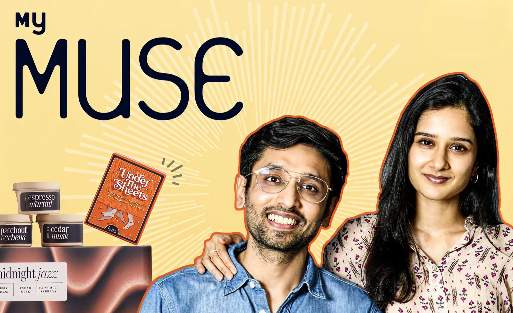
Confetti Design Studio has analysed MyMuse to understand how India's first bedroom essentials brand grew revenue 90% year on year to Rs 36 crore in FY24, turned EBITDA positive, crossed an MRR of Rs 5 crore, and served over 3.7 lakh customers across 800 cities. In a category where most brands have struggled to exist openly, MyMuse built the category itself.
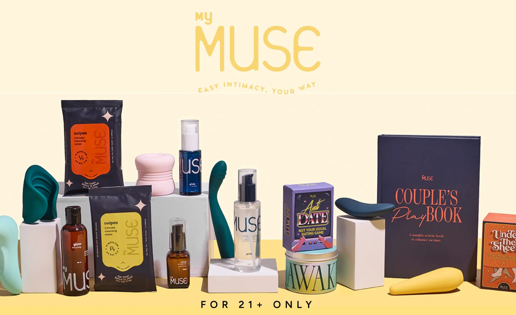
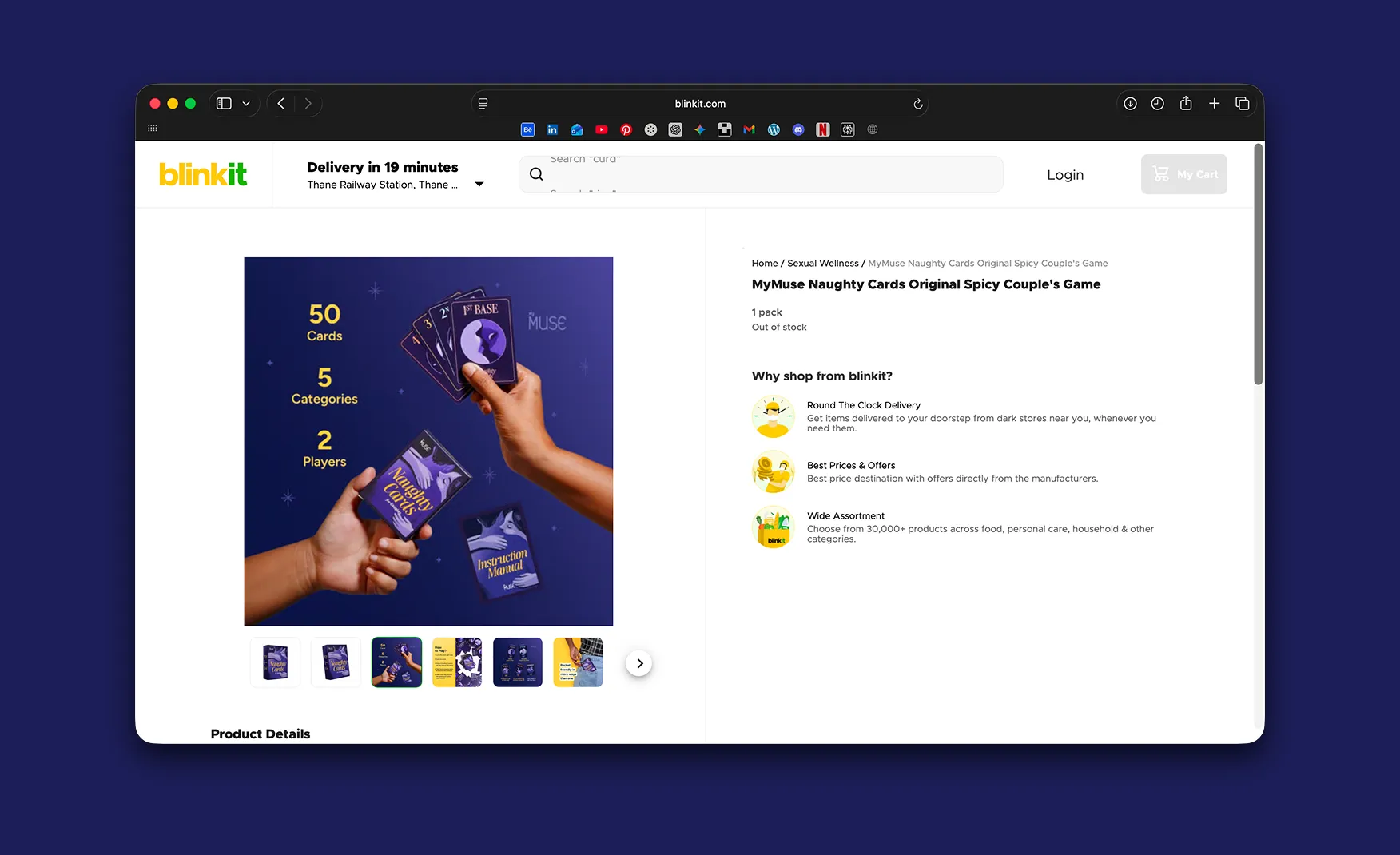
The most important design decision a sexual wellness brand can make in India is understanding what its packaging must not do. It must not shout. It must not make the buyer feel exposed. It must not carry any visual language that triggers embarrassment at the door or on the shelf.
MyMuse understood this from the start. The brand's packaging leans into a soft, minimal design language with muted tones, clean typography, and no sensational imagery. For a first-time buyer, which describes the majority of India's sexual wellness consumers, this restraint is not a design limitation. It is a purchase enabler. A discreet, considered pack removes the hesitation that would otherwise cause a customer to abandon the order entirely.
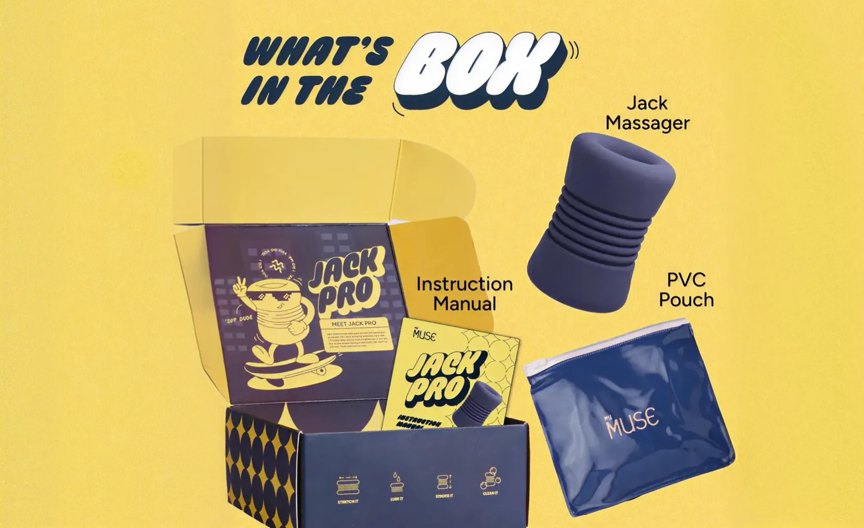
Where MyMuse's packaging truly distinguishes itself is inside the box. Small inserts, stickers, a travel pouch, and instructions written in a warm, non-clinical tone turn what could be an awkward unboxing moment into something that feels thoughtful and reassuring. These details demonstrate that the brand has thought through the full emotional arc of the purchase, from the moment of ordering to the moment of opening. That level of empathy is rare in any category, and in a niche and upcoming category of sexual wellness in India, it is remarkably exceptional to have.
MyMuse operates in a category that is largely banned from Google and Meta advertising. This constraint, which would cripple most D2C brands, has instead pushed MyMuse to develop one of the more interesting organic content strategies in Indian D2C.
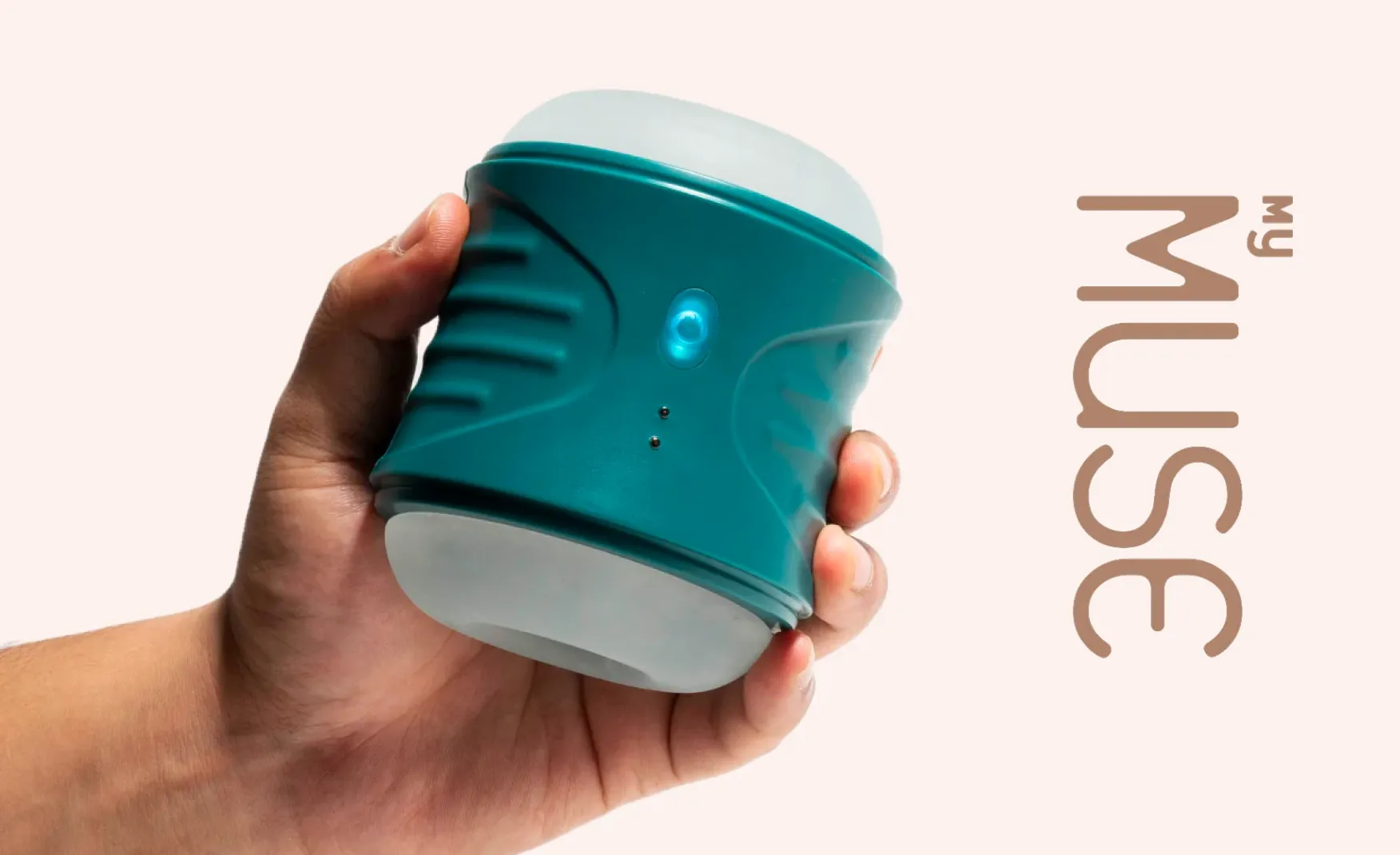
Rather than working with major A-list celebrities or Bollywood names, which would add cost without necessarily reaching the right audience, MyMuse focuses on smaller creators, UGC contributors, and its own in-house creator. The in-house creator, who appears regularly across the brand's Instagram feed, functions effectively as a brand ambassador without carrying the risks or costs of an external celebrity partnership. She gives the brand a human face that belongs entirely to MyMuse, not to an influencer who works with dozens of other brands simultaneously.
This approach reflects a sophisticated understanding of the category. Gen Z and millennial consumers, who make up the core audience for sexual wellness products, are highly sceptical of paid celebrity endorsements. They respond to real people, relatable conversations, and content that feels organic rather than produced. MyMuse's creator strategy delivers exactly that.
The brand also runs an educational content platform called unLearn, which addresses myths, stigma, and knowledge gaps around sexual wellness in India. In a category where advertising is restricted, education becomes the primary channel for building trust and awareness. This content investment is strategically essential, not optional.
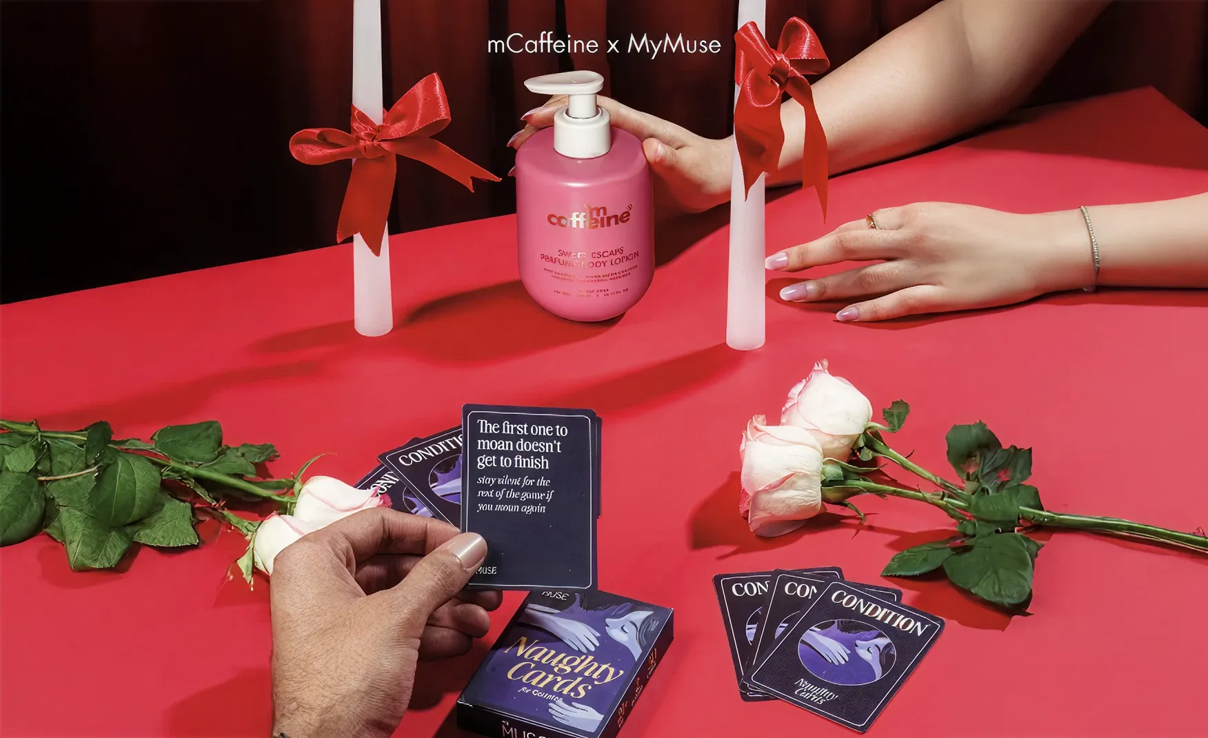
MyMuse's collaboration strategy is one of its most underappreciated brand-building decisions.
Rather than partnering with brands in adjacent but unrelated categories, MyMuse has focused on brands whose customers already overlap with theirs. Collaborations with mCaffeine and Bummer are strong examples of this thinking. Both are modern, D2C, lifestyle-forward brands that attract a similar young urban audience. A consumer who already trusts mCaffeine's skin-first positioning or Bummer's anti-boring underwear aesthetic is already a warm prospect for MyMuse.
The logic is simple but rarely executed this cleanly: if your audience already buys from these brands, showing up together tells that audience that MyMuse belongs in the same consideration set. It transfers brand trust horizontally rather than building it from scratch. For a brand in a stigmatised category that cannot advertise openly, this kind of audience-borrowing through brand partnerships is one of the most efficient growth levers available.
MyMuse's quick commerce expansion delivered a 670% revenue increase in 2024, making it one of the most consequential distribution decisions the brand has made.
The strategic fit between quick commerce and sexual wellness is unusually strong. Most intimate wellness products are not bought at a pharmacy counter or a supermarket shelf because the act of purchasing them in person carries social discomfort. Quick commerce removes that friction entirely. The consumer orders privately, from their phone, and receives delivery in 15 to 20 minutes without interacting with a single person.
This also converts what would otherwise be a considered purchase into something closer to an impulse buy. A consumer who might have delayed or abandoned an online purchase for a discretion-sensitive product can now act on the impulse immediately and privately. No other distribution channel does both of these things simultaneously for this category, which is why the quick commerce revenue spike was so dramatic. Many of MyMuse's competitors in the sexual wellness space have not built the quick commerce infrastructure to match this. That gap is a meaningful moat, but one with a limited shelf life as the category attracts more competition.
MyMuse entered India's sexual wellness market in 2021, when the category was fragmented, stigmatised, and largely inaccessible to mainstream consumers. There were no credible, design-forward Indian brands occupying the space. Legacy international brands like Durex operated at the functional, pharmacy-counter end of the market. Everything else was unbranded, low-quality, and discreet to the point of invisibility.
What first mover advantage gives MyMuse is not just awareness. It is category ownership. When Indian consumers think of sexual wellness products, MyMuse is the reference point in the same way that Maggi is the reference point for instant noodles. A 7 out of 10 execution by a first mover reads as 9 out of 10 in the consumer's mind, because there is no competing benchmark. The brand is not being compared to a superior alternative. It is defining the standard itself. This advantage is time-limited. As international brands deepen their India presence and new D2C entrants enter the space, that benchmark effect will erode. The window to convert first mover advantage into deep brand loyalty is the next 12 to 24 months.
MyMuse's outer packaging and in-box experience are thoughtful and considered. The FMCG product range, particularly the lubricants and repeat-purchase liquid SKUs, tells a different story.
The lubricant bottles and similar products rely on transparent or white plastic containers with simple label applications. At a price point of Rs 400 to 450, these products sit in the mass premium segment. But the packaging does not communicate mass premium. It communicates generically. There is no differentiated bottle silhouette, no material innovation, no structural design that signals the brand's values. A consumer who discovers MyMuse through its beautifully considered website or gift kit and then receives a lubricant that looks like a repackaged import will experience a perceptible drop in brand confidence.
This is the most urgent design gap in the MyMuse range and the one most likely to affect repeat purchase rates as competition increases. When brands like Durex or new international entrants offer a similarly functional product in packaging that looks more intentional, switching becomes easy.
The sexual wellness category in India is attracting increasing investor and brand attention. International brands are building India-specific strategies. Shark Tank-backed Indian brands are entering with lower price points and stronger retail distribution. The competitive landscape that MyMuse currently navigates largely alone will look very different in 24 months.
First mover advantage protects a brand when there is no alternative reference point. Once credible alternatives exist, it stops being a moat and becomes simply a head start. MyMuse needs to use the current window to build the kind of brand loyalty that survives competitive pressure: repeat purchase rates driven by product quality, community engagement built around the unLearn platform, and a packaging system that makes existing customers proud to own the products regardless of what else is available.
MyMuse's next significant growth opportunity lies in Tier 2 and Tier 3 cities, where demand is growing but access remains limited and cultural sensitivity around the category is considerably higher than in metros. Scaling into these markets will require careful calibration of communication, packaging, and channel strategy. The brand's current visual and verbal identity was designed for a metro, digitally-native audience. Whether that same identity resonates in Indore, Coimbatore, or Patna, or whether it needs adaptation, is a question the brand must answer before distribution outpaces brand readiness.
The most immediate priority for MyMuse is elevating the FMCG product packaging to match the standard set by the outer packaging and in-box experience. At Confetti, we faced a similar challenge when working with AIM (All in a Minute), a wellness brand that needed to balance discretion, education, and premium positioning across supplement and skincare formats. Rather than defaulting to stock containers, we developed a unique packaging structure that separated AIM from every competitor in its category. The same thinking applies here: a more considered bottle silhouette, a refined label system, and material choices that communicate quality at a glance would significantly raise the perceived value of MyMuse's repeat-purchase SKUs and reduce the risk of customer attrition when alternatives appear.
MyMuse currently has a visual identity that works well at the brand level but has not yet been systematised into a coherent packaging architecture across all product categories. As the range expands into new formats, materials, and use cases, a modular design system with clear rules for typography, colour coding by product category, and structural guidelines for different pack formats will be essential. Without this infrastructure, each new product launch becomes a one-off design decision rather than an additive contribution to a coherent brand world.
MyMuse's unLearn educational content platform is one of its most strategically valuable but under-scaled assets. In a category where advertising is restricted and consumer education is genuinely needed, a content platform that helps people understand, normalise, and navigate sexual wellness builds a depth of brand trust that no performance marketing can replicate.
Investing in unLearn as a standalone content brand, with its own identity, regular programming, and community features, would give MyMuse an audience relationship that competitors cannot easily replicate. The brand that educates the market owns the market. That is the long-term moat available to MyMuse if it chooses to build it.
MyMuse has done something genuinely difficult. It has made a stigmatised category feel approachable, designed, and normal for a mainstream Indian audience. The thoughtfulness of its outer packaging, the empathy of its in-box experience, the intelligence of its creator and collaboration strategy, and the commercial instinct behind its quick commerce pivot all reflect a brand that understands both its consumer and its cultural context deeply.
The gap between where MyMuse is and where it could be lies almost entirely in one place: the FMCG product packaging. Closing that gap before competitive pressure intensifies is the single most important brand-building decision the company faces in the next 12 months.
If you are building a brand in a sensitive or stigmatised category and want to create the kind of design system and brand architecture that builds trust at every touchpoint, Confetti knows how to get you there.
Want strategic branding and packaging like this for your business?


Lorem ipsum dolor sit amet, consectetur adipiscing elit. Suspendisse varius enim in eros
Lorem ipsum dolor sit amet, consectetur adipiscing elit. Suspendisse varius enim in eros
Lorem ipsum dolor sit amet, consectetur adipiscing elit. Suspendisse varius enim in eros
.svg)
.svg)


.webp)
.webp)


.webp)
.webp)
.webp)
.webp)
.webp)


.svg)
.webp)
.svg)
.webp)


.webp)


.webp)


.svg)