%201.webp)
02
AI Snaps
.svg)
.svg)
01
Our Work

03
About Us
05
Contact Us
06
Client Success

07
Blogs
08
Careers
Book A Call


Need Help In Building Your Brand?
Click the button below & book a call with our founder directly.

Rishabh Jain
Managing Director
Indri Whiskey | Confetti's Verdict ⭐⭐⭐⭐
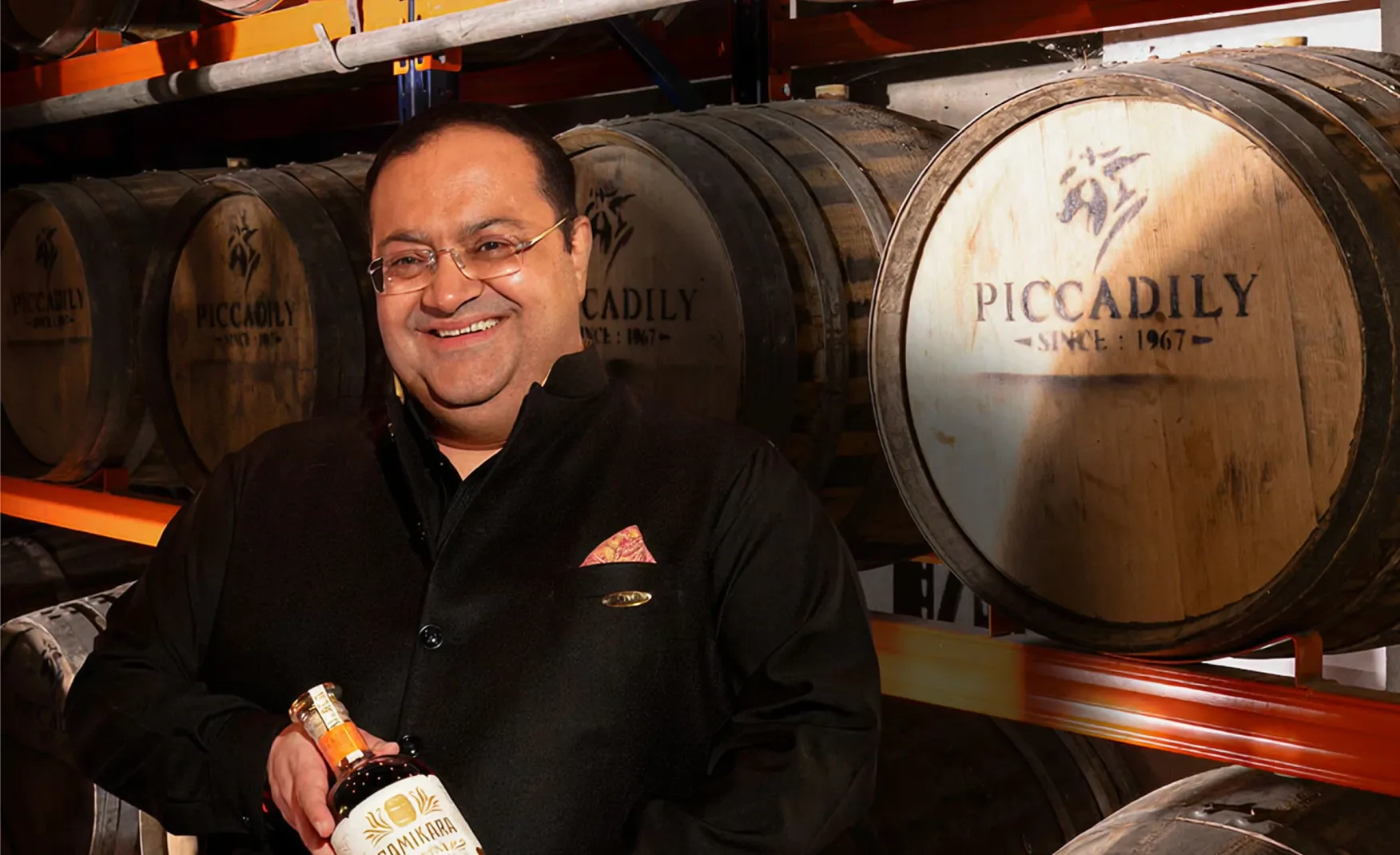
Confetti Design Studio has analysed Indri to understand how an Indian single malt launched in 2022 became the fastest-growing single malt brand in the world, selling over 2 million bottles in 2024 across 40 countries. In the same period it won Best Indian Single Malt at the World Whiskies Awards, Best Whisky in the World at the Whiskies of the World Awards, and Brand of the Year at The Spirits Business Awards. Parent company Piccadily Agro Industries posted revenue of Rs 893 crore in FY25, with the distillery business at the centre of that growth.
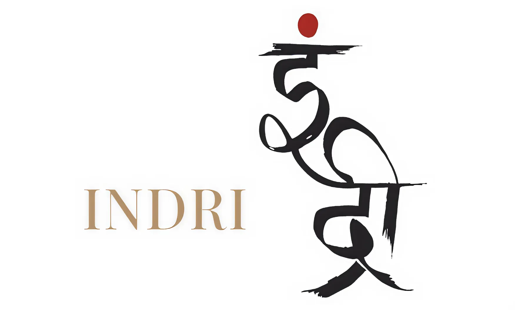
Most premium spirits are named after founders, locations, or invented heritage. Indri chose something far more interesting. The name is derived from the Sanskrit word for the five senses. It is a naming decision that is Indian, philosophical, and sensory all at once. It signals immediately that this is not a whisky trying to sound Scottish or Irish. It is a whisky that is confident in its Indian identity and frames that identity around something universal, which is the human experience of perception.
This carries through into everything the brand does. The packaging references touch, smell, taste, sight, and sound as dimensions of the whisky experience. The label copy uses sensory language with precision, flavour notes and aromatic cues that feel deliberate rather than formulaic. The name is not just a name. It is a brief for the entire brand. In a category dominated by borrowed Scottish prestige and invented heritage, a name that is genuinely rooted in Indian philosophy gives Indri a cultural authority that competitors cannot replicate by simply updating their label.
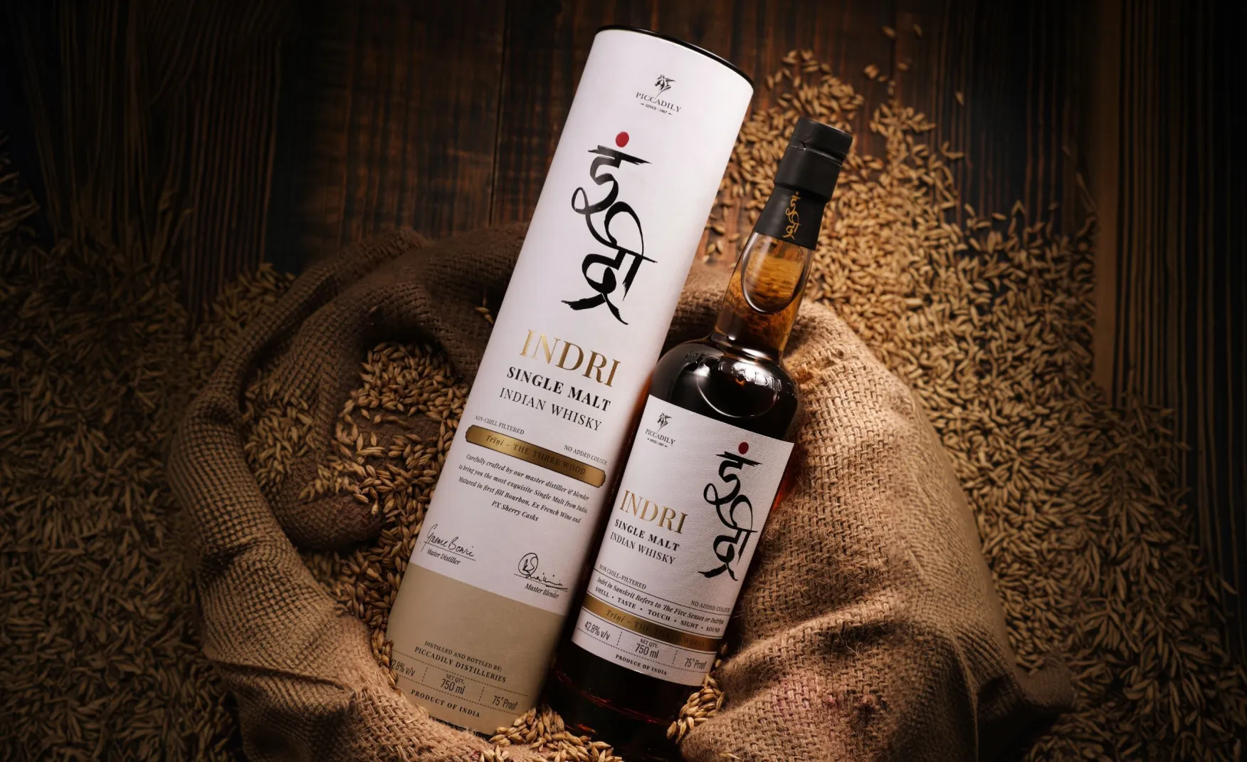
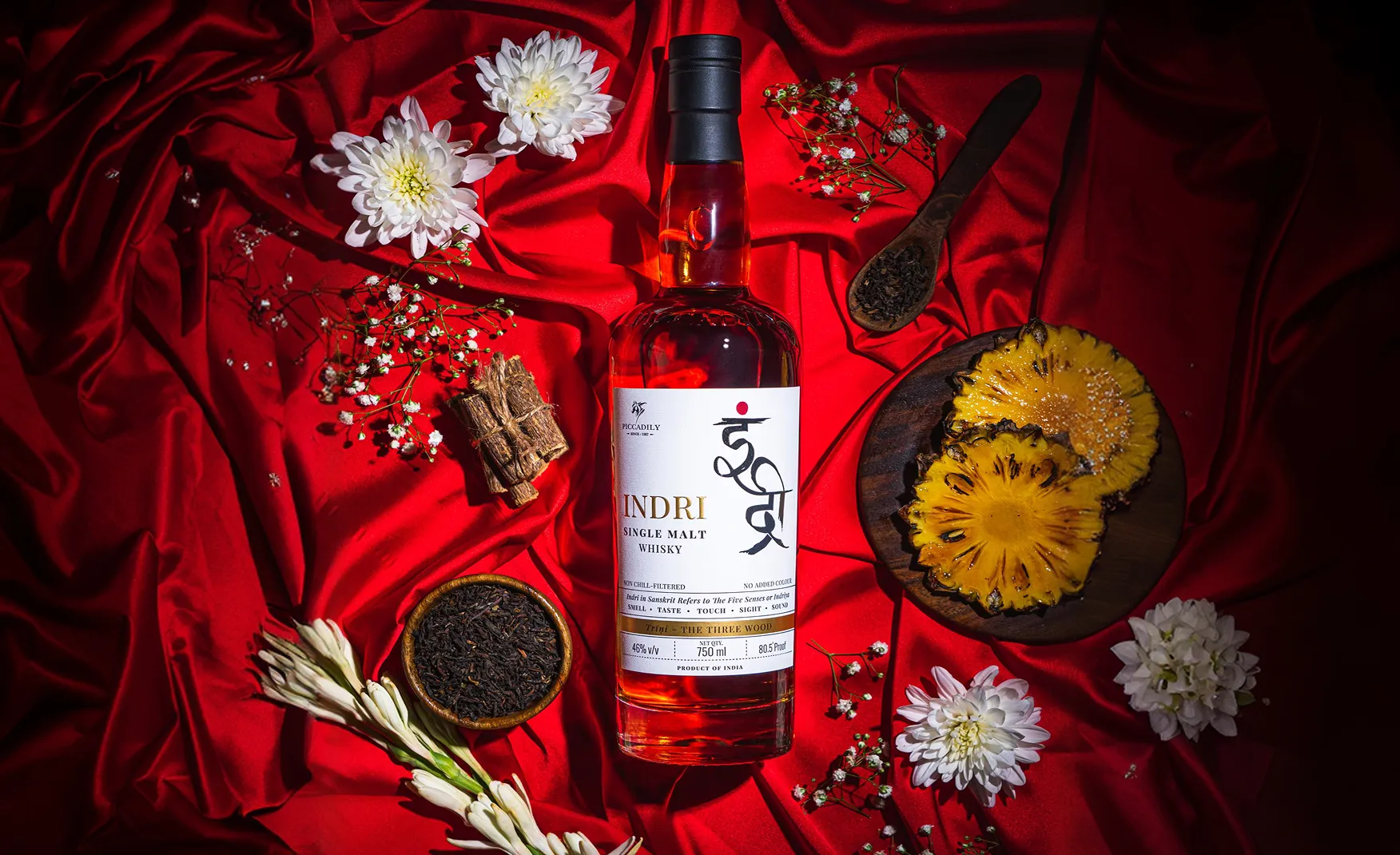
The easiest thing to do in premium spirits packaging is to reach for visual complexity: heavy embossing, gold foil, wax seals, elaborate illustration. Most Indian whisky brands have done exactly that. Indri went the other way. The standard Indri bottle wears a clean white label with considered typography, precise flavour notation, and a design system that communicates through what it leaves out rather than what it puts in. In premium design, this kind of restraint is always the harder execution. It requires complete confidence in the product and the brand identity. There is nothing to hide behind.
The dual-script identity, with the brand name presented in both Devanagari and Roman script, is one of the most strategically intelligent decisions on the pack. It does not choose between India and the world. It holds both simultaneously, telling the premium whisky buyer in Tokyo, London, or New York that this bottle comes from a civilisation with a four-thousand-year relationship with language, thought, and craft. The overall effect is a bottle that commands attention through stillness. It sits on a shelf of competing premium spirits and asks to be picked up rather than shouting to be noticed. For a high net worth buyer, that is exactly the right register.
Good design gets a brand its first customer. The product gets the repeat purchase. This sounds obvious but most brands forget it, pouring creative energy into packaging while letting product quality slide. Indri has not made that mistake.
The whisky is produced using six-row Indian barley from Rajasthan, distilled in copper pot stills, and matured using multiple cask types including ex-bourbon, ex-French wine, and ex-Pedro Ximenez sherry. India's climate, with its extreme heat accelerating maturation, gives the spirit a distinct character that cannot be replicated in cooler distilling countries.
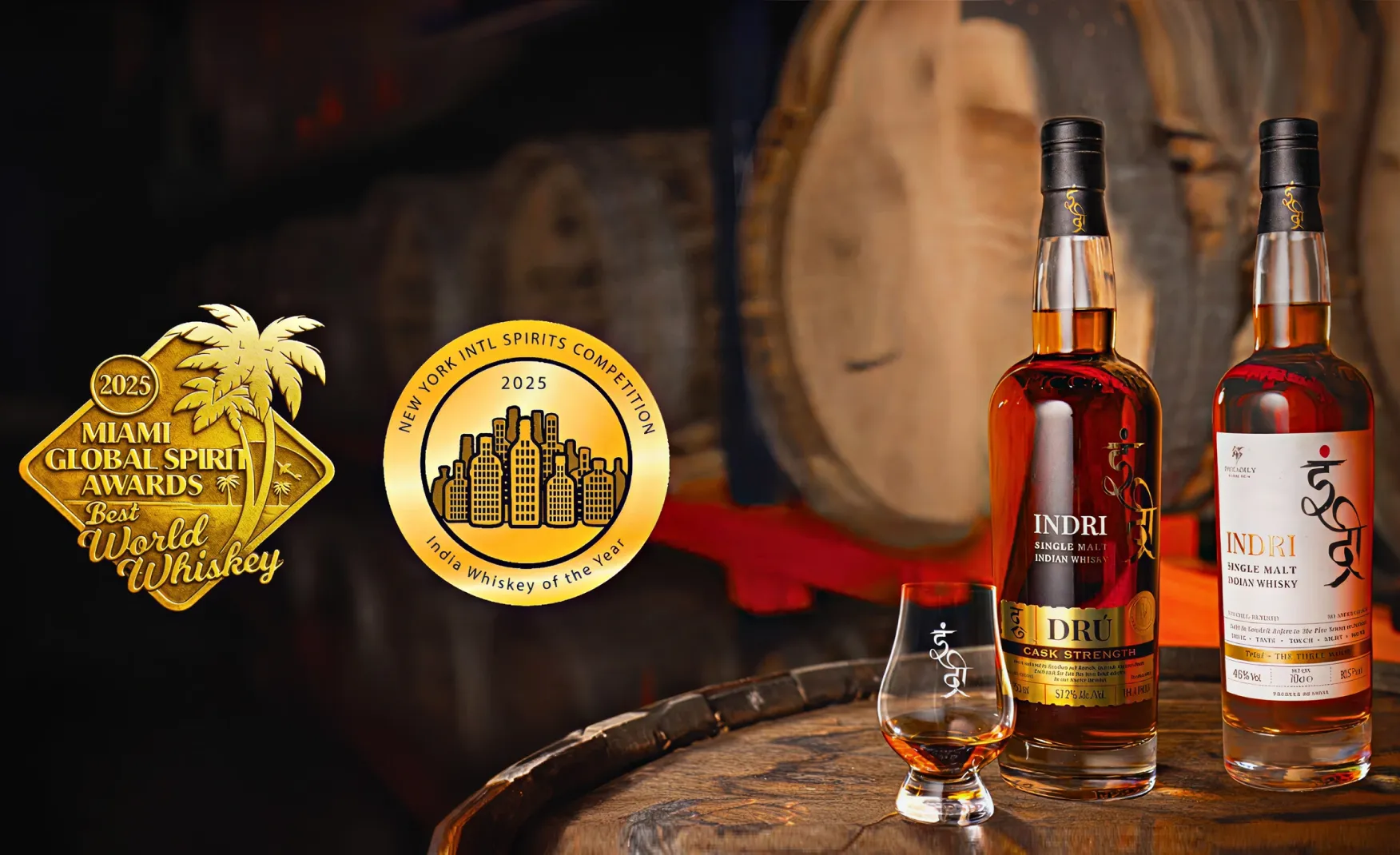
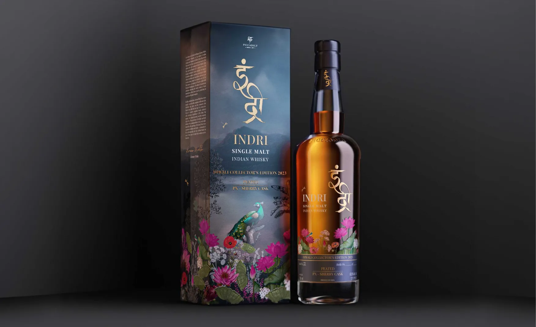
The award trajectory confirms it. Indri Dru won Best Indian Single Malt at the World Whiskies Awards 2024. The Diwali Collector's Edition won Best in Show Double Gold at the Whiskies of the World Awards 2023. In 2025, Indri received the World's Best Whisky title at the Miami Global Spirits Awards with a near-perfect score of 99.1 points. These are not regional or participation awards. They are the most credible international spirits competitions in the world. For the high net worth buyer who researches before they purchase, this award trail is the most powerful marketing the brand has. It converts a beautiful bottle into a verified world-class product.
Premium spirits brands live and die by how they manage their special editions. Too few and the brand feels static. Too many and each new release loses its significance.
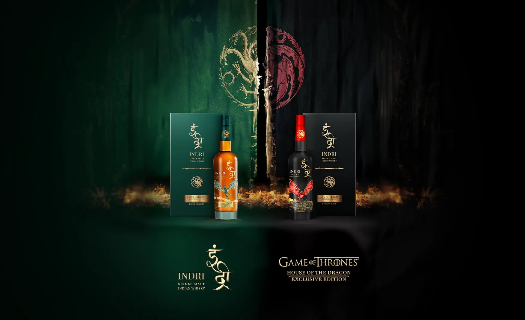
Indri has found a considered rhythm. The annual Diwali Collector's Edition has become one of the most anticipated seasonal whisky releases in India, earning its own international award recognition and collector following. The Game of Thrones House of the Dragon collaboration and the Founders Reserve 11 Year Old speak to different buyer motivations, the culture enthusiast and the connoisseur respectively, without compromising either.
What holds these together is that the Indri design DNA stays intact across every expression. The typography, the sensory philosophy, the Devanagari script element, and the restraint in execution remain constant. A collector who buys the Diwali edition knows immediately that it is Indri. The collaboration does not override the brand. The brand absorbs the collaboration without being changed by it. This is a level of design system discipline that many far older spirits brands have failed to maintain and especially for a brand that is less than three years old, it is exceptional.
Indri is not trying to sell whisky to everyone. It is trying to sell the best Indian single malt in the world to people who understand what that means. This clarity of audience shapes every marketing decision the brand makes. The target buyer is a high net worth individual willing to spend Rs 4,000 to Rs 20,000 on a bottle of whisky. This buyer reads press, follows awards, seeks out bartender recommendations, and values provenance. They are not impressed by celebrity endorsements or social media influencers. They are impressed by gold medals, critical recognition, and the confidence of professionals in the trade.
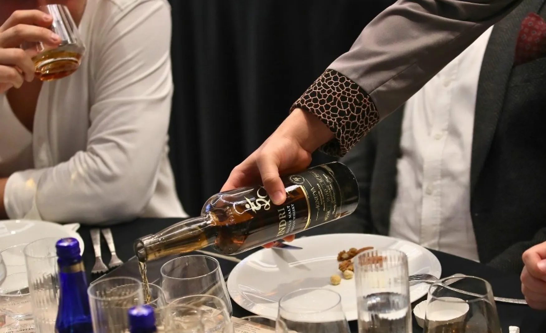
Indri's marketing reflects this precisely. The brand invests in tasting events and offline activations, which communicate product confidence in the most direct way possible. When a brand puts its whisky in front of expert palates publicly and repeatedly, it is saying: we have nothing to hide and everything to prove. For a high net worth buyer who has tried Scotch and Japanese single malts, that kind of evidence-based confidence is far more persuasive than any advertising campaign.
The press coverage and award placements are not incidental. They are a deliberate marketing strategy for an audience that specifically looks for third-party validation before committing to a premium purchase. Indri understands that for this buyer, the press article is the advertisement.
There is no weakness in Indri's current execution. There is one strategic risk worth naming clearly which is the danger of over-collaboration as the brand scales.
The global reference point is Starbucks, which at its peak of cultural relevance began collaborating with Frozen, Marvel, Taylor Swift, and Disney Princesses in rapid succession. Each individual collaboration made commercial sense. Collectively, they diluted the brand's identity from a cult premium experience into a general-purpose entertainment platform. The core audience felt the brand had moved away from them.
Indri is philosophical, restrained, and sensory at its core. Those three qualities are entirely incompatible with high-frequency trend-driven collaborations. As the brand grows and commercial opportunities multiply, the discipline to say no to culturally misaligned partnerships will be tested. The framework for making those decisions should be established now, while the brand identity is still clear and uncomplicated.
Indri now distributes across 40 countries. As it enters new markets, adapts to different retail environments, and potentially localises for different cultural contexts, the risk is that the visual identity begins to drift. A slightly different label treatment in one market, a different pack format for another, and over time the coherence of the brand's design language erodes. This is a structural risk rather than an immediate one. But the brands that manage international expansion well are those that document their design system rigorously before the need arises, not after the first inconsistency appears. For a brand whose competitive advantage is partly built on visual restraint and consistency, this is worth thinking about now.
Selling 2 million bottles in 2024 across 40 countries is an extraordinary volume milestone for a brand less than three years old. The commercial momentum is real. The question ahead is whether that volume growth is building brand depth or simply riding the wave of Indian single malt's international moment.
Brand depth comes from consumer relationships, stories, and experiences that go beyond the product. Indri has the awards, the design, and the product quality. The next layer is the community: the brand's own bartender network, a collector programme for the limited editions, and deeper storytelling around the distillery, the climate, the barley, and the people behind each expression. These investments compound over time and become the difference between a brand that endures and one that peaks with a trend.
Indri's design language is currently held together by the clarity of its founding creative vision. As the brand scales into more markets, more expressions, and more collaborative editions, that informal coherence needs to be codified into a formal design system with explicit rules for typography, label architecture, colour application, script usage, and collaboration guidelines. This is the work that protects a brand's identity during its fastest growth phase, when commercial pressure to move quickly is at its highest.
The Diwali Collector's Edition has demonstrated that there is a genuine collector market for Indri. This is one of the most commercially valuable communities a premium spirits brand can build, because collectors do not just buy, they advocate, they document, and they bring other high-value buyers into the ecosystem. A structured collector programme, with early access to limited editions, distillery experiences, and direct relationships with the master distiller, would deepen this community and give the brand an audience that is genuinely difficult for competitors to access.
The offline tasting events that Indri runs domestically are one of its strongest brand-building tools. Extending this approach internationally, working with premium bars, specialist whisky retailers, and spirits festivals in key export markets, would give Indri the kind of credible in-person advocacy that no digital marketing campaign can replicate. For a premium brand selling to high net worth buyers who respond to expert recommendation, putting the whisky directly in front of trade professionals in global markets is the most efficient path to sustained international growth.
Indri is the most complete brand story in Indian premium spirits. In less than three years it has built a design identity that is disciplined and culturally confident, a product that has been validated by the world's most credible whisky competitions, and a marketing approach precisely calibrated to the audience it is trying to reach.
The 2 million bottles sold in 2024, the 40-country distribution footprint, and the consistent international award recognition are not the result of a lucky moment. They are the outcome of a brand that understands its product, its audience, and its identity from the start and has not deviated from any of them.
If you are building a whiskey, alcohol or any beverage brand that wants to move beyond product and into culture, Confetti can help you build that.
Want strategic branding and packaging like this for your business?


Lorem ipsum dolor sit amet, consectetur adipiscing elit. Suspendisse varius enim in eros
Lorem ipsum dolor sit amet, consectetur adipiscing elit. Suspendisse varius enim in eros
Lorem ipsum dolor sit amet, consectetur adipiscing elit. Suspendisse varius enim in eros
.svg)
.svg)


.webp)
.webp)


.webp)
.webp)
.webp)
.webp)
.webp)


.svg)
.webp)
.svg)
.webp)


.webp)


.svg)