%201.webp)
02
AI Snaps
.svg)
.svg)
01
Our Work

03
About Us
05
Contact Us
06
Client Success

07
Blogs
08
Careers
Book A Call


Need Help In Building Your Brand?
Click the button below & book a call with our founder directly.

Rishabh Jain
Managing Director
Jimmy’s Cocktails | Confetti's Verdict ⭐⭐⭐⭐
Confetti Design Studio has analysed Jimmy's Cocktails to understand how a brand founded in 2019 became India's most recognised cocktail mixer, expanding to over 20,000 retail outlets across 50 cities, raising USD 6 million across five funding rounds, and building a valuation of Rs 212 crore.
Most beverage brands build a logo that is inseparable from their hero product. When they try to extend into a new category, the logo fights the new context and the brand feels inconsistent. Jimmy's Cocktails avoided this entirely.
The brand uses a clean wordmark logo where the name is rendered in a consistent typeface, without iconography, illustration, or product-specific imagery. This is not a default design choice. It is a deliberate strategic one. A wordmark is infinitely flexible. It can sit on a glass cocktail mixer bottle in black on white and look premium. It can sit on a bright, colourful beer can and look fun. It can appear on a sparkling water carton or an energy drink without visual conflict. The result is a brand identity that scales across product categories without needing to be redesigned for each one. As Jimmy's expands its range, the wordmark travels with it. This is the kind of logo decision that looks simple on the surface but requires real design thinking to arrive at.
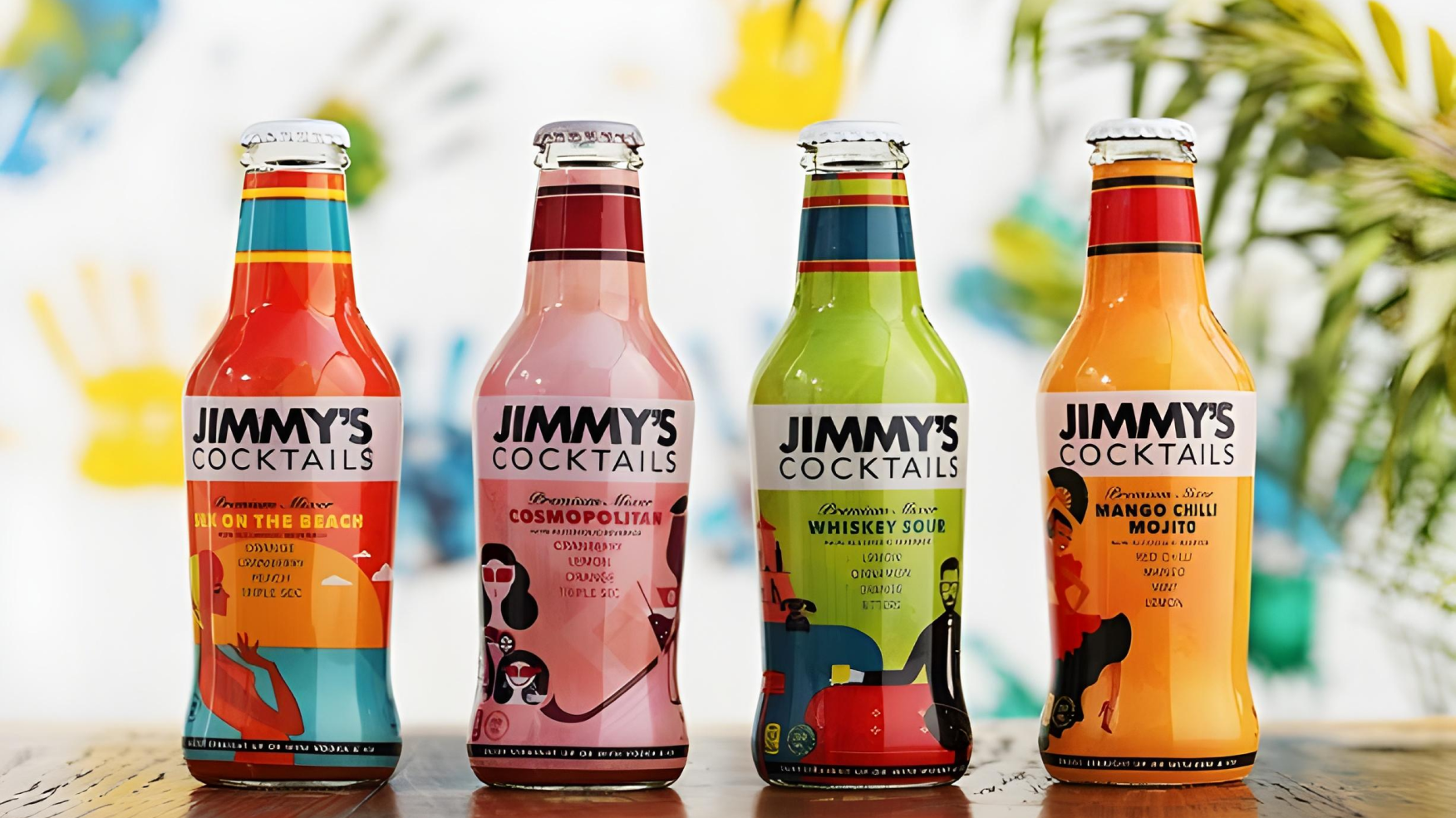
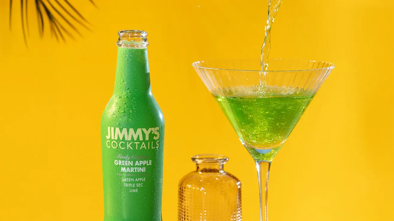
What Confetti finds most impressive about Jimmy's Cocktails is not any single packaging decision. It is the discipline of applying a different visual register to each product category while keeping the master brand legible across all of them. The cocktail mixer range is clean, minimal, and premium. Glass bottles with a single dominant colour and clear flavour communication. The design signals that this product sits beside a Rs 3,000 bottle of whisky, not beside a cola.
The A Lot Like Beer non-alcoholic beer range is an entirely different visual world. Louder, more playful, with a design language that reads as summer, fun, and accessible. It looks like beer is supposed to look, which is exactly right for a category where the product needs to feel familiar to the consumer it is trying to convert from regular beer.
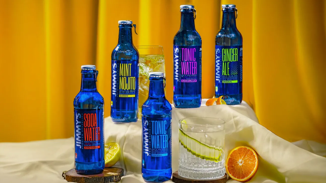
The sparkling mixer range sits between the two in terms of energy: more colourful than the cocktail mixers but more restrained than the beer cans, with clear flavour communication for ginger ale, lemonade, and mint mojito formats. Each of these ranges could exist as a standalone brand. The fact that they all live under Jimmy's without visual confusion is a testament to a design team that understands the difference between a brand system and a rigid template.
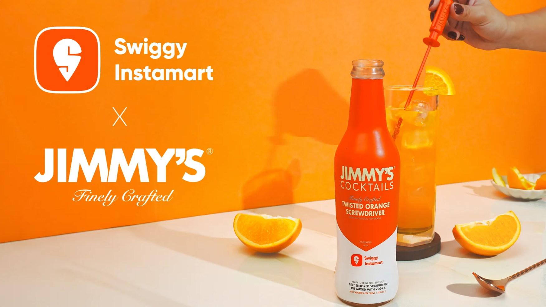
The timing of Jimmy's Cocktails' growth with the explosive rise of Indian quick commerce is not a coincidence. It is a structural fit that few beverage brands recognised early enough to capitalise on. The core occasion for cocktail mixers is the urban house party, very spontaneous, social, and typically decided on short notice. The host needs ingredients quickly, wants to impress, and is unlikely to plan a supermarket trip in advance. This is the definition of a quick commerce purchase. The consumer is in Tier 1 cities, the decision is impulse-driven, and the 15 to 20 minute delivery window converts what would have been a missed sale into a completed one.
This distribution insight is one of Jimmy's most commercially important advantages. Many competitors in the beverage category did not build the quick commerce infrastructure early enough. Jimmy's did, and the result is that the brand became the default cocktail mixer on Blinkit, Zepto, and Swiggy Instamart at exactly the moment when those platforms were becoming the primary impulse purchase channel for urban India.
Sponsoring the wrong events is one of the most expensive branding mistakes a consumer brand can make. Jimmy's Cocktails has been disciplined about this in a way that many larger brands are not. The brand has focused its event presence on paddle tennis and pickleball tournaments, which attract precisely the urban, premium, Gen Z and millennial audience that makes up its core buyer. These are not mass-market sporting events. They are the kind of events where the attendee is already predisposed to trying a premium, design-forward beverage brand. The brand shows up where its consumer is already in the right mindset, rather than broadcasting to the widest possible audience and hoping for relevance.
The collaboration with BRB's pop chips for the A Lot Like Beer range is equally well-considered. BRB positions its chips as the better-for-you alternative to regular potato chips. Jimmy's non-alcoholic beer positions itself as the better-for-you alternative to regular beer. The audience overlap is near-perfect, and the collaboration communicates a shared value system, healthier choices without compromise, to a consumer who is already responsive to that message.
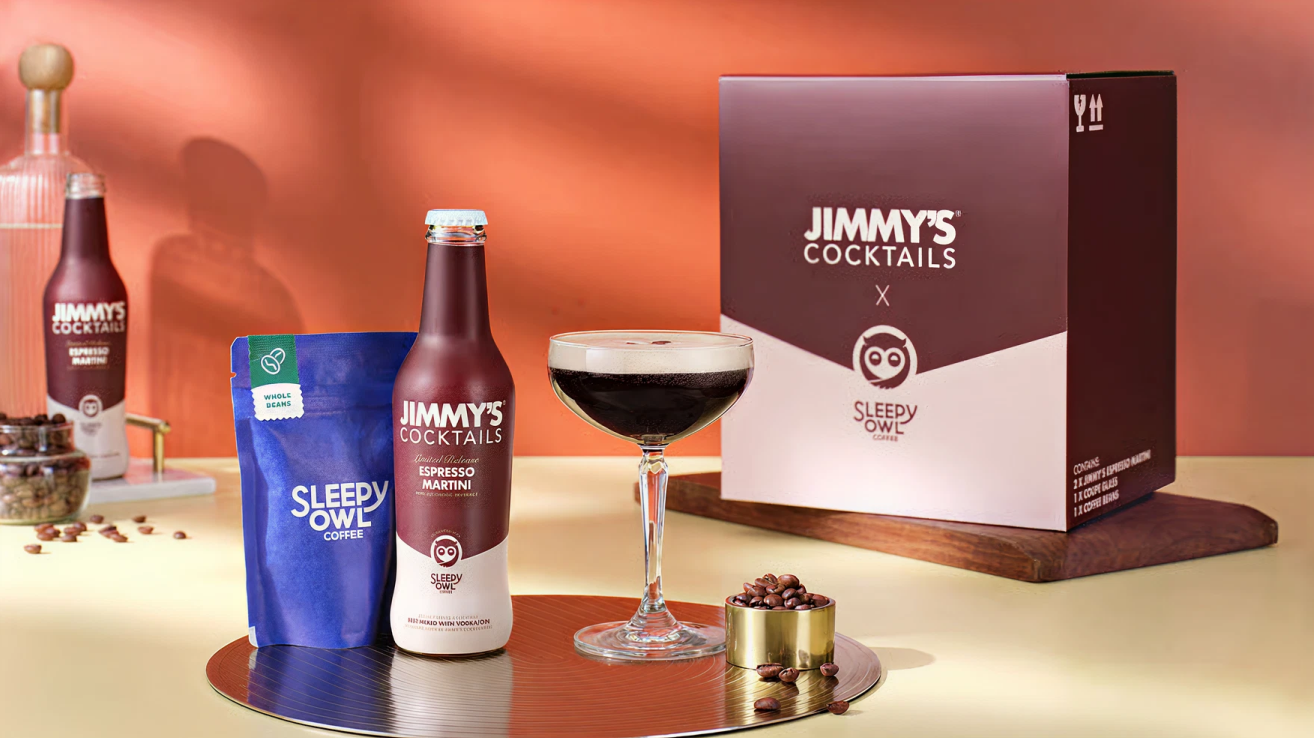
The Sleepy Owl espresso martini mixer collaboration is another example of this thinking. Sleepy Owl's cold brew coffee audience and Jimmy's cocktail mixer audience are essentially the same person who is urban, quality-conscious, and willing to pay more for a better experience. Putting those two brands together on a single product tells the consumer that both brands understand them.
Cocktail culture in India is still developing. A significant portion of Jimmy's buyers are people who want the experience of a bar-quality cocktail at home but do not know how to build one from scratch. This is the exact consumer the brand is designed for, and the packaging reflects that understanding.
Every bottle clearly states which spirit it pairs with and what cocktail it makes like whisky sour, cosmopolitan, mango chilli mojito, espresso martini, sex on the beach & more. This on-pack guidance does two things simultaneously. It removes the friction of purchase by telling a new buyer exactly what to do with the product, and it elevates the consumer's confidence by making them feel capable of making a drink they would normally order at a bar. That confidence is part of what makes Jimmy's a repeat purchase. The consumer does not just buy a mixer, they buy the feeling of being a good host.
Jimmy's Cocktails' biggest challenge right now is one that most brands would envy having: the brand has become so strongly associated with cocktail mixers that everything outside that category struggles to carry the same weight. The energy drink launch under the Hustle brand did not achieve the traction of the core mixer range. The sparkling water range has not broken through as a standalone proposition. This is not a product quality problem. It is a brand perception problem. When a consumer thinks of Jimmy's, they think of cocktail mixers. When they see a Jimmy's energy drink, the mental association does not transfer cleanly. The brand equity built in the cocktail category is genuinely strong, but it is also genuinely specific.
This is a classic category extension tension. The brand can go wider, but each step away from the cocktail mixer core requires more marketing investment to establish relevance. The more successfully it has owned the cocktail space, the harder it is to be taken seriously in categories where the consumer does not immediately understand why Jimmy's belongs there.
Jimmy's Cocktails saw its operating revenue decline 31% to Rs 23.7 crore in FY24 from Rs 34.3 crore in FY23, while net losses widened to Rs 10 crore. Revenue has since recovered to Rs 34.3 crore in FY25, returning to FY23 levels. But the dip raises a question worth examining: what caused it, and is the recovery structural or fragile?
The most likely explanation is the energy drink expansion drawing investment and attention away from the core cocktail mixer business, combined with general D2C headwinds of rising customer acquisition costs. The recovery in FY25 suggests the brand has refocused, but the path to the Rs 100 crore revenue target the founders have set requires either a significant acceleration of the core category or a successful category extension, and the two are in tension with each other.
Jimmy's Cocktails' current packaging is functional and well-designed. The bottles are clean, the colours are distinctive, and the communication is clear. What the packaging does not yet do is create a distinctive physical experience in the hand.
The standard glass bottle format is shared by dozens of beverage brands. There is no proprietary silhouette, no functional innovation in the cap or closure, and no tactile element that makes the Jimmy's bottle feel different to hold. Brands like Bartisans have introduced a bottle cap that doubles as a 30ml and 60ml measuring tool, turning the packaging itself into part of the cocktail-making ritual. This kind of functional structural innovation is exactly what a premium mixer brand can and should pursue.
The consumer who is buying Jimmy's mixers to go with a Rs 3,000 to Rs 5,000 bottle of whisky is not price-sensitive about the mixer. They are paying for an elevated experience. A packaging structure that delivers that elevation in the hand, through shape, texture, or a functional innovation, would strengthen the brand's premium positioning and give it a physical distinctiveness that no competitor currently has in this category.
At Confetti, we tackled a similar packaging differentiation challenge when working with AIM (All in a Minute), a wellness brand in a category crowded with identical tubs and jars. Rather than accepting the standard container formats, we explored a unique packaging structure that immediately separated AIM from every competitor on the shelf and elevated the perceived value of the product. The same opportunity exists for Jimmy's cocktail mixer range. A distinctive bottle silhouette, a measuring cap, or a textured label treatment would move the brand from well-designed to physically iconic in a category where the physical product experience matters enormously.
The brand needs a more explicit framework for how it enters new categories, what stays Jimmy's and what gets a sub-brand identity, and how each extension communicates its relationship to the core. The A Lot Like Beer range already demonstrates this instinct with its distinct visual language. Extending that thinking into a formal brand architecture document would make future category entries more deliberate and reduce the risk of diluting the cocktail mixer equity that the brand has worked hard to build.
Jimmy's Cocktails' strongest emotional territory is the urban house party: spontaneous, social, slightly elevated, and fun. This occasion has not been fully developed as a brand world. There is an opportunity to create content, experiences, and activations that make Jimmy's synonymous with that occasion at a deeper level than product placement. Owned occasions, recipe content, hosting guides, event partnerships: all of these would build the brand's association with the house party moment rather than simply being available when that moment arises.
Jimmy's Cocktails built a category, cracked the right distribution channel before competitors understood its significance, and created a brand identity flexible enough to travel across product formats without losing coherence. For a six-year-old brand operating in a category that barely existed in India when it launched, that is a genuinely impressive body of work. The challenges ahead are real but navigable: refocusing on the core cocktail mixer business, finding the right structural packaging innovation to elevate the premium positioning, and building a clearer framework for category extensions so that the brand's strongest equity is never accidentally diluted by a product that does not carry the same weight.
If you are building a beverage or D2C brand and want to create packaging and brand architecture that earns shelf attention and builds genuine consumer loyalty, Confetti can help you build that.
Want strategic branding and packaging like this for your business?


Lorem ipsum dolor sit amet, consectetur adipiscing elit. Suspendisse varius enim in eros
Lorem ipsum dolor sit amet, consectetur adipiscing elit. Suspendisse varius enim in eros
Lorem ipsum dolor sit amet, consectetur adipiscing elit. Suspendisse varius enim in eros
.svg)
.svg)


.webp)
.webp)


.webp)
.webp)
.webp)
.webp)
.webp)


.svg)
.webp)
.svg)
.webp)


.webp)


.webp)


.svg)