%201.webp)
02
AI Snaps
.svg)
.svg)
01
Our Work

03
About Us
05
Contact Us
06
Client Success

07
Blogs
08
Careers
Book A Call


Need Help In Building Your Brand?
Click the button below & book a call with our founder directly.

Rishabh Jain
Managing Director
Paper Boat | Confetti's Verdict ⭐⭐⭐⭐
Confetti Design Studio has analysed Paper Boat to understand how a brand built on collective memory scaled to Rs 682 crore in revenue in FY25, recording its first net profit of Rs 46 crore after over a decade of losses. Parent company Hector Beverages has raised Rs 1,030 crore in total funding from investors including GIC, Peak XV, Sofina Ventures, and A91 Partners.
Most beverage brands use nostalgia as a campaign device. A film set in the past, a childhood reference in the caption, a vintage-style label. Paper Boat did something fundamentally different, it made nostalgia the actual product.
When former Coca-Cola executive Neeraj Kakkar and his co-founders launched Paper Boat in August 2013 with Aam Panna and Jaljeera, they were not entering the fruit juice category. They were creating a new category of drinks that taste like a specific Indian memory. The flavours they chose, raw mango, spiced lemonade, kokum, jamun, tamarind, were not new. They had existed in homes, street vendors, and nani ke ghar kitchens across India for generations. What did not exist was a bottled, consistently reproducible, nationally available version of them.
This distinction matters enormously. Paper Boat is not a nostalgia-themed brand. It is a brand that has identified the flavour of nostalgia and made it physically available. That is a fundamentally stronger positioning than anything visual or tonal nostalgia can deliver, because taste is the most direct memory trigger available to any product. The brand made a scientific observation, that flavour and memory are directly linked in the brain, and built an entire commercial strategy around it. The result is a brand that a consumer does not just choose. They feel something when they reach for it. That emotional quality is the most durable form of brand equity in any consumer goods category.
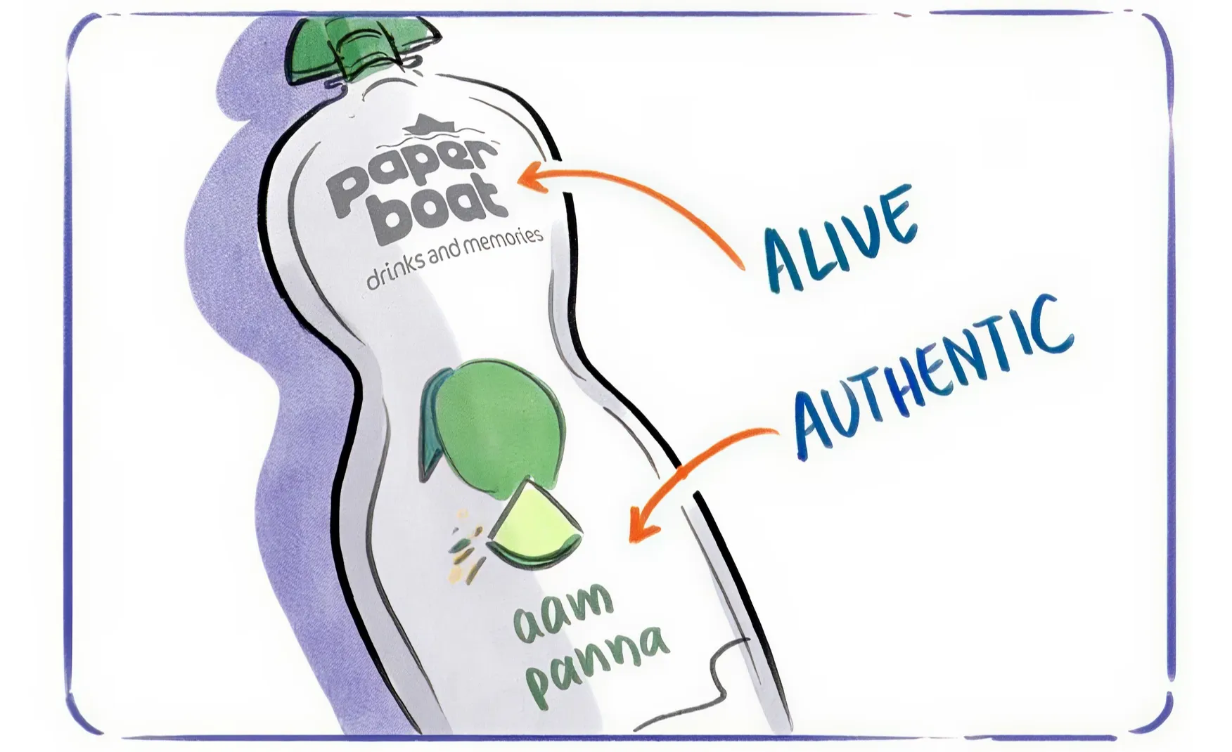
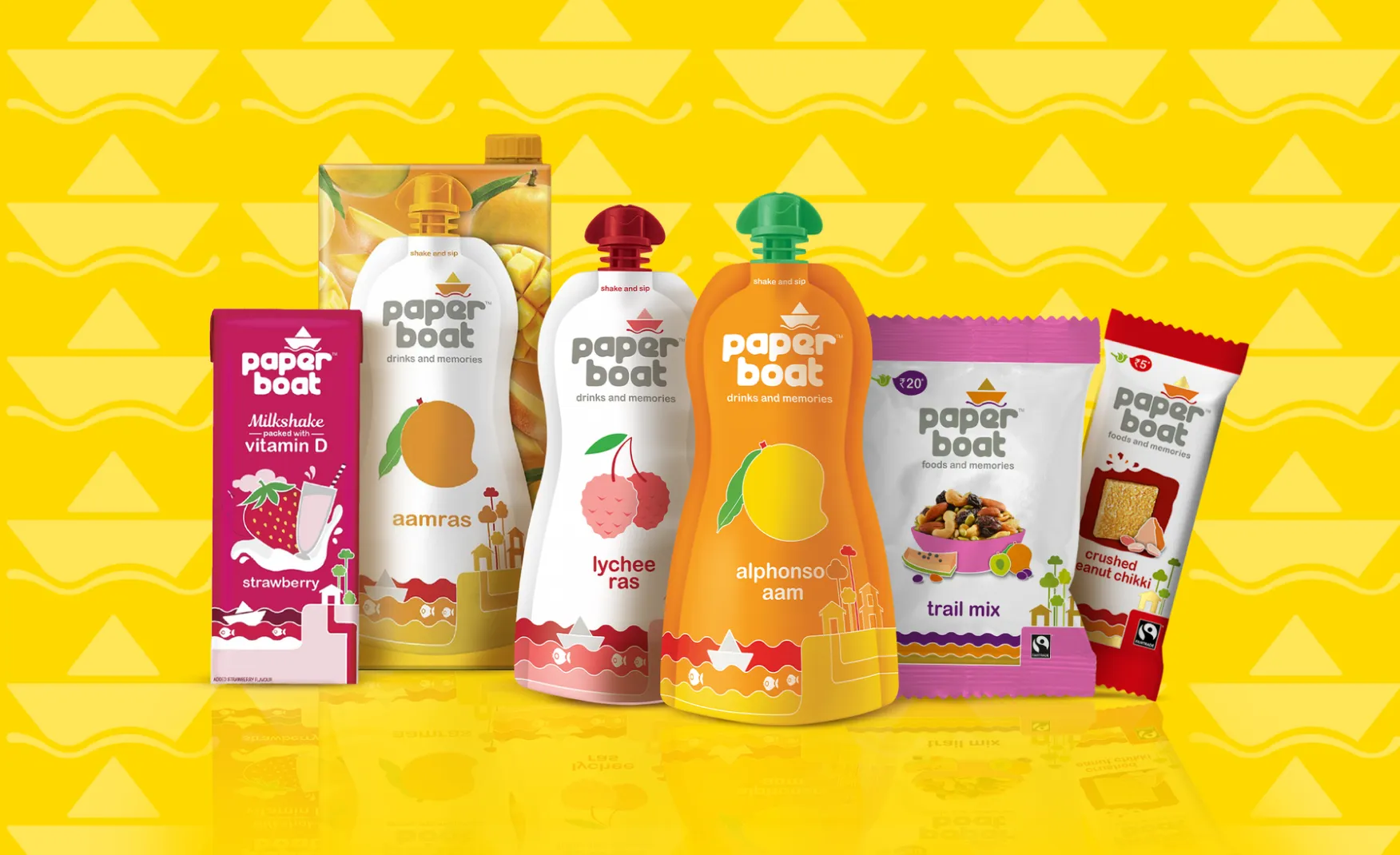
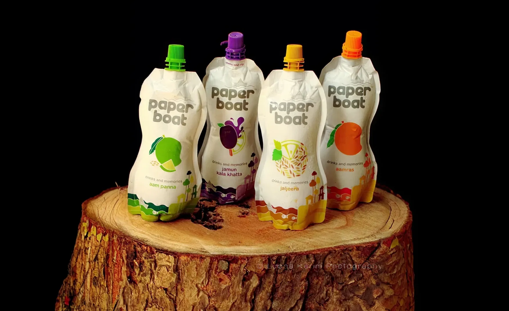
In a beverage category dominated by cans, PET bottles, tetra packs, and glass bottles, Paper Boat chose none of the above. The soft stand-up pouch with a twist cap was a format that had no precedent in the Indian organised beverage market, and that unfamiliarity was the point.
The pouch shape, soft, slightly rounded, and small enough to fit in a tiffin box or a school bag, carries a physical resonance with childhood that no bottle could match. It feels like something a parent might pack, something that belongs in a lunchbox alongside a paratha rather than on a café counter beside a cold brew. The format itself is part of the nostalgic communication, and no amount of label design on a standard PET bottle could have created the same effect.
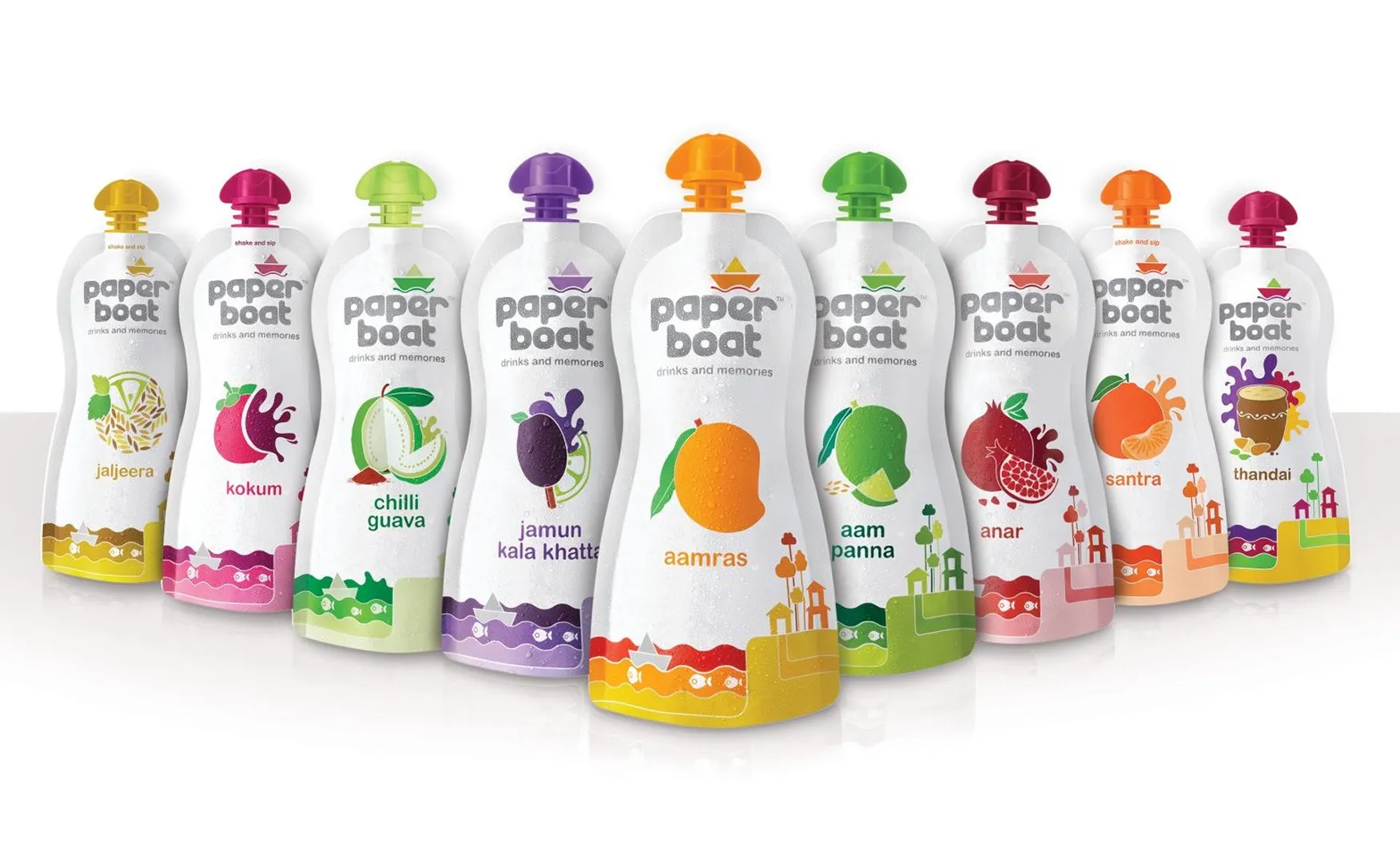
The visual language on the pack reinforces this at every turn. Hand-drawn illustrations, specific to each flavour, create a micro-narrative like aamras shows kite-flying, jaljeera shows rain boots, thandai shows the chaos and colour of Holi. Each flavour has its own memory scene. The consumer does not pick up a drink. They pick up a specific memory, contained in a specific drawing, tied to a specific taste. This is multi-sensory brand architecture executed at a fraction of the cost of any experience marketing campaign.
The back-of-pack copy, short anecdotes written in the voice of a gentle, slightly wistful narrator, extends the storytelling further. The packaging does not stop communicating when the consumer picks it up. It keeps talking until they have finished the drink. No other Indian FMCG brand has sustained this level of narrative density across packaging as consistently.
"Drinks and Memories" is one of the most quietly powerful taglines in Indian FMCG. It is worth unpacking why.
Most beverage taglines communicate product attributes: freshness, energy, taste, quality. They describe what the drink does to you physically. Drinks and Memories communicates what the drink does to you emotionally, and in doing so, positions the product in a territory that no competitor can claim by simply making a better drink. A competitor can make a fresher aam panna. They cannot make a more emotionally resonant one if Paper Boat owns the emotional territory first.
The brand voice that flows from this tagline is gentle, unhurried, and literary. The social media captions read like diary entries. The packaging copy reads like the opening of a short story. The campaign films feel less like advertisements and more like the kind of short films that get shared because they make people feel something they had forgotten they felt.
This tone is extraordinarily difficult to sustain at scale. Most brands that attempt emotional communication drift into sentimentality or, worse, irony when the tone becomes hard to maintain. Paper Boat has held its register more consistently than almost any other Indian consumer brand in this category. That consistency is itself a brand asset.
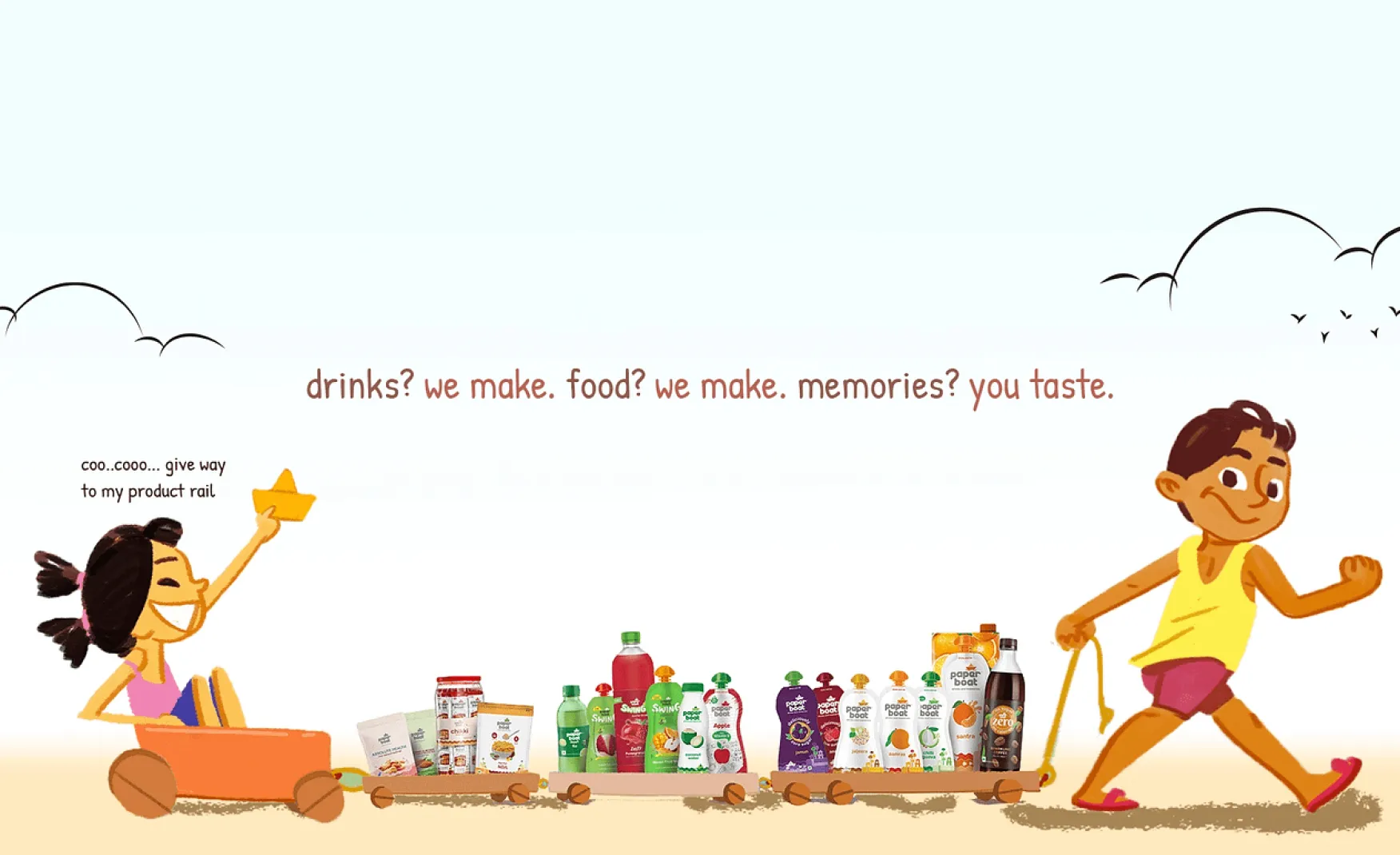
Paper Boat's product range is not a list of flavours. It is a curated archive of Indian beverage heritage, one that spans regional specificity, seasonal relevance, and generational memory with unusual precision.
Kokum is a West Coast, particularly Goan and Konkan, summer staple. Neer mor is South Indian. Thandai is Holi. Aam Panna is summer everywhere. Each product targets a different regional memory and a different seasonal moment, which means Paper Boat has multiple purchase occasions that most beverage brands do not. The brand is not competing only for the daily hydration purchase. It is competing for the festival occasion, the summer ritual, the regional identity purchase, and the gifting moment simultaneously.
The expansion into sparkling waters under the Zero range, and into snack foods including chikki and aam papad, follows the same underlying logic that every product should taste like something that already existed in Indian memory, not something invented by a product team. This discipline is harder to maintain than it sounds. The temptation for a growing FMCG brand is always to extend into categories where the margins are better or the competition is lower, regardless of whether the extension makes cultural sense. Paper Boat has largely resisted that temptation.
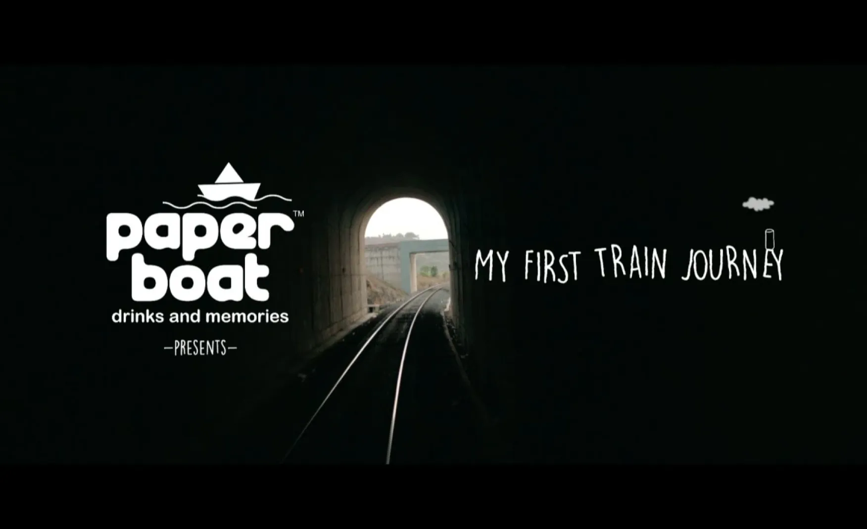
Paper Boat's most significant marketing investment has never been in advertising in the conventional sense. It has been in short films, illustrated narratives, and community content that accumulates into something that looks less like a campaign portfolio and more like a body of cultural work.
Short films about train journeys, childhood games, the last day at Nani's house: each of these functions as both marketing content and brand equity. A viewer who watches a Paper Boat film and is moved by it does not just remember the brand. They associate it with the feeling the film gave them, and that association travels into every future purchase encounter.
The collaboration with Tinkle Comics for a Holi campaign put Suppandi, one of India's most beloved children's comic characters, in a Paper Boat story. This is precisely the kind of brand partnership that works because the cultural overlap is complete: both Paper Boat and Tinkle Comics are in the business of preserving a specific version of Indian childhood. The collaboration felt like a homecoming rather than a commercial arrangement.
Paper Boat recorded its first net profit, Rs 46 crore in FY25, after over a decade of losses despite reaching Rs 682 crore in revenue. The path to profitability required cutting losses by 48% in FY24 and tightening operational costs significantly. While the FY25 turnaround is a genuine milestone, the length of the loss period raises a structural question worth examining: is the unit economics of nostalgic beverages structurally sound at scale, or has profitability come primarily from cost discipline rather than from improved commercial fundamentals?
The beverage category is inherently cost-intensive: raw materials, cold chain logistics, packaging, and distribution all compress margins before the product reaches the consumer. Paper Boat's premium pricing relative to mass-market alternatives is justified by the brand's emotional positioning, but that positioning requires sustained marketing investment to maintain. The brands that find the most durable path to profitability in this category are those that reduce customer acquisition costs by building such strong brand loyalty that repeat purchase becomes habitual rather than prompted.
The stand-up pouch is Paper Boat's most distinctive brand asset. It is also, structurally, a format with limitations as the brand moves up the value chain and into new consumption contexts.
The pouch works beautifully for the impulse purchase, the school bag, the picnic, the lunchbox occasion. It works less well for the dinner table, the corporate gifting occasion, or the modern trade premium shelf. As the sparkling water range demonstrates, the brand is already exploring PET bottle formats for certain product lines. But the visual language and illustration system that makes the pouch iconic does not transfer as naturally to a transparent PET bottle, and the brand discipline around how the identity adapts across formats is a design system challenge that will become more visible as the product range diversifies.
This is not an argument for abandoning the pouch. It is an argument for developing a second packaging architecture, as coherent and as emotionally resonant as the original, that allows the brand to compete credibly in contexts where the pouch is structurally insufficient.
Paper Boat's core emotional territory, the collective nostalgia of Indians who grew up in the 1980s and 1990s, is a generational asset that is also, by definition, a finite one.
The consumers who feel an instinctive connection to Aam Panna or Jaljeera because they grew up with them are now in their late 30s and 40s. The generation currently entering purchasing power, those in their early 20s, did not grow up with the same flavour memories in the same cultural context. They are encountering these drinks as interesting traditional flavours rather than as tastes of their own childhood. The flavour archive that Paper Boat draws on is still Indian, still authentic, still interesting to this generation, but the emotional charge of memory is weaker.
The brand will need to build a new emotional framework for this younger cohort without abandoning the nostalgia positioning that holds the existing loyal base. That is a genuinely difficult branding challenge and one that requires more than a cosmetic campaign refresh.
The pouch is irreplaceable for the core product range. But Paper Boat needs a second visual system, equally disciplined, equally narrative, and equally Indian, that works for glass or PET bottle formats, tin gift sets, and retail shelf contexts where the pouch format is not optimal. This means extending the illustration system, the handwritten typography, and the memory-led copywriting into a new structural vocabulary, one that a consumer unfamiliar with the original pouch would still immediately recognise as Paper Boat. At Confetti, this kind of design system extension is work we have done for brands with similarly wide product ranges, ensuring that new formats serve the brand rather than diluting it.
The brand does not need to abandon nostalgia. It needs to expand the definition of what Paper Boat is nostalgic about. For the current 20-something consumer, the emotional territory is not the same flavour memories as for a 40-year-old. But there are Indian food and drink experiences that are genuinely theirs: the chaiwala outside the college gate, the street-side pani puri, the summer mangoes from a specific local variety. Paper Boat could expand its flavour archive into these territories and build new illustration narratives and pack stories around them, broadening the nostalgia without diluting its authenticity. The brand's core promise, Drinks and Memories, is broad enough to contain this expansion. The design system needs to be built to express it.
Paper Boat's flexible laminated pouches are convenient and distinctive but present a recyclability challenge in most Indian markets. For a brand whose core audience increasingly values environmental consideration alongside cultural authenticity, this tension is worth addressing proactively. Developing a sustainable packaging roadmap, whether through compostable materials, a take-back programme, or a transition to recyclable formats, would align the brand's environmental footprint with the cultural values it espouses. The brand that preserves Indian flavour heritage and the brand that takes responsibility for its packaging waste are the same brand. Making that alignment visible through design would strengthen the brand's integrity in the eyes of an audience that is paying increasing attention to it.
Paper Boat has built something that very few Indian consumer brands have managed: a design system and an emotional positioning that are genuinely inseparable from each other. The pouch, the illustrations, the flavours, the copywriting voice, the tagline: all of it forms a single coherent system that could only have been designed by people who understood both the cultural archive they were drawing from and the design principles that could make it commercially legible.
The Rs 46 crore net profit in FY25 after over a decade of losses is the commercial validation of that positioning. The path to the next decade runs through two design challenges: a packaging system that can scale into new formats without losing its identity, and a brand narrative that can speak to a generation for whom the original memories belong to their parents rather than themselves.
If you are building a heritage, food, or beverage brand and want to create the kind of packaging system and emotional positioning that earns genuine loyalty rather than just trial, Confetti can help you build that.
Want strategic branding and packaging like this for your business?


Lorem ipsum dolor sit amet, consectetur adipiscing elit. Suspendisse varius enim in eros
Lorem ipsum dolor sit amet, consectetur adipiscing elit. Suspendisse varius enim in eros
Lorem ipsum dolor sit amet, consectetur adipiscing elit. Suspendisse varius enim in eros
.svg)
.svg)


.webp)
.webp)


.webp)
.webp)
.webp)
.webp)
.webp)


.svg)
.webp)
.svg)
.webp)


.webp)


.webp)


.svg)