%201.webp)
02
AI Snaps
.svg)
.svg)
01
Our Work

03
About Us
05
Contact Us
06
Client Success

07
Blogs
08
Careers
Book A Call


Need Help In Building Your Brand?
Click the button below & book a call with our founder directly.

Rishabh Jain
Managing Director
Third Wave Coffee Roasters | Confetti's Verdict ⭐⭐⭐½
Confetti Design Studio has analysed Third Wave Coffee Roasters to understand how a specialty coffee brand that opened its first outlet in Koramangala in 2016 scaled to Rs 285 crore in revenue in FY25, raised USD 69.9 million across ten funding rounds from investors including Creaegis and WestBridge Capital, and built a network of over 165 cafes across 12 Indian cities at a valuation of Rs 1,300 crore.
Most cafe brand names are either geographical (Blue Tokai), founder-derived (Tim Hortons), or invented (Starbucks, whose connection to Moby Dick is largely unknown to its average customer). Third Wave Coffee chose something categorically different with a name that is itself a piece of coffee education.
The third wave coffee movement is a real, globally recognised shift in how the industry approaches the crop.
By naming the brand after this movement, the founders signalled from the first day of trading that this was not going to be another outlet selling caramel something in a brown-and-green interior. The name alone communicates a higher standard, an educational intent, and a positioning above the mainstream cafe category
This creates a compounding brand advantage because every new customer who asks what third wave means is a customer being educated by the brand before they have tasted a drop of the coffee while every coffee enthusiast who already knows the term instinctively recognises the brand as credible before they step inside.
When Third Wave Coffee entered the Indian market in 2016, the dominant cafe aesthetic was the warm brown-and-green palette of global chains. Most Indian coffee brands were either borrowing this visual vocabulary or overcompensating with loud, trend-driven interiors. Third Wave chose neither.
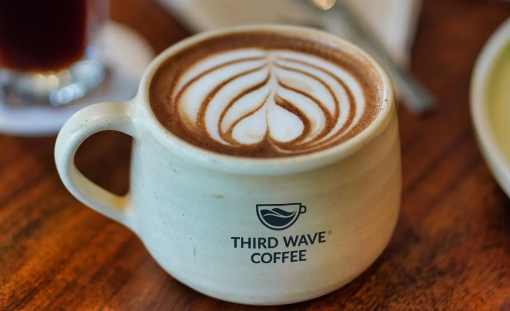
The logo, three waves inside a cup, is elegant in its directness. It does not attempt to illustrate coffee, origin, or craft through elaborate imagery; in fact it takes the brand's core concept, the wave, and places it precisely where it belongs, inside the vessel through which the consumer experiences it. The mark communicates philosophy translated into form, which is a level of conceptual thinking that most F&B brand logos do not achieve. The brand's overall visual language, modern, minimal, and considered, was a genuinely refreshing alternative in a category that tends toward visual excess. In specialty coffee aesthetics globally, restraint is authority.
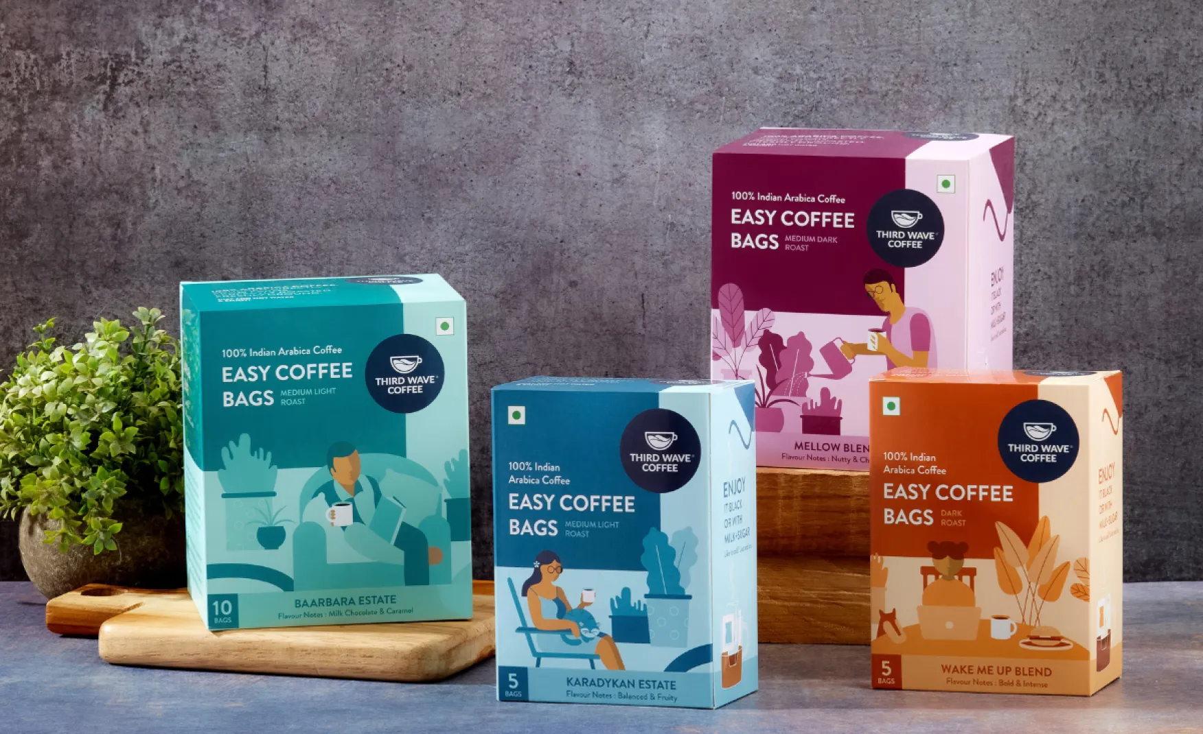
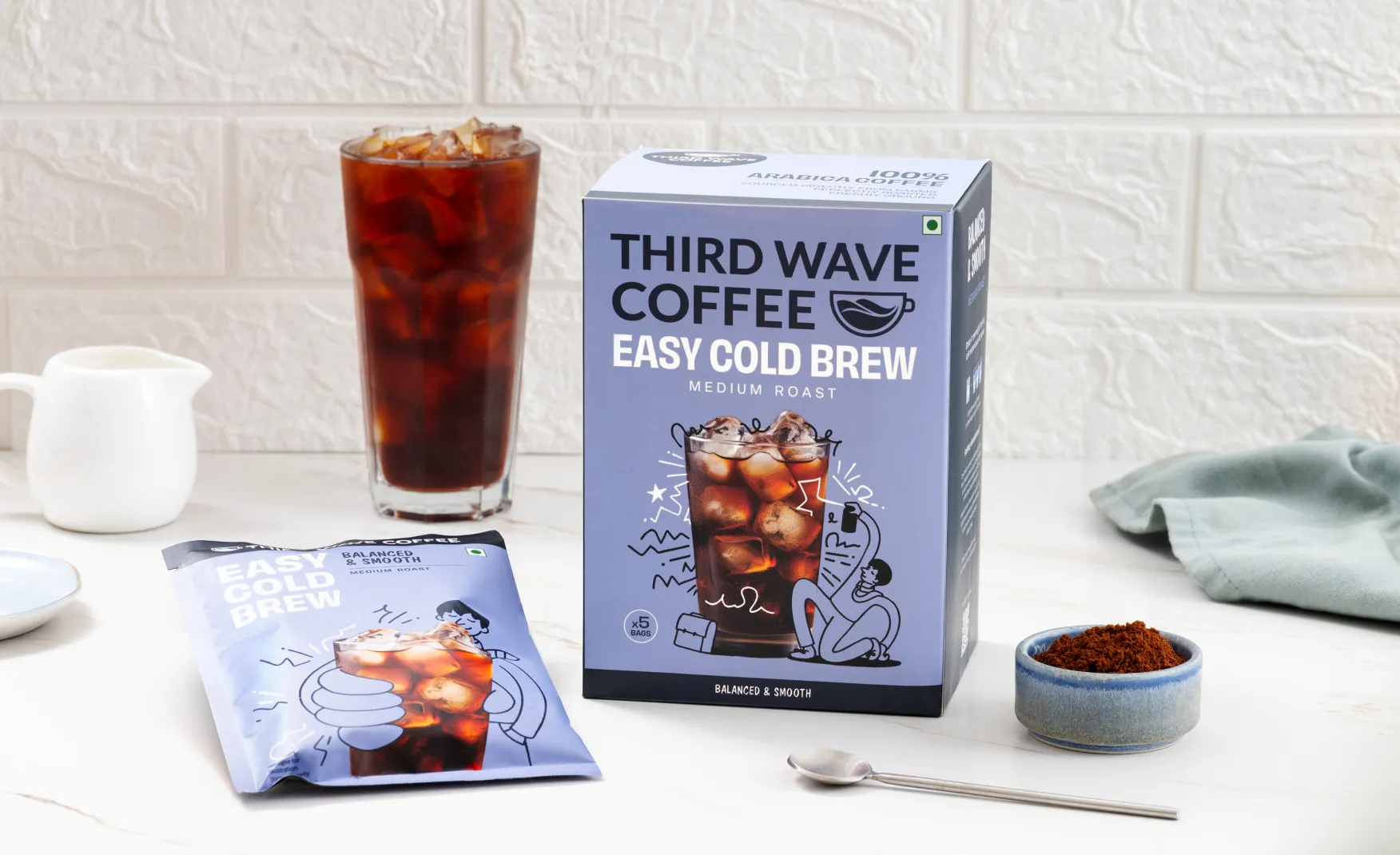
The strongest element of Third Wave Coffee's design system is not the cafe interiors or the brand identity, instead it is the coffee bean packaging, and specifically what is communicated on the bag.
Where most commercial coffee brands reach for flavour gimmicks, winter blends, caramel notes, seasonal specials, Third Wave's bean bags lead with provenance information such as the coffee origin, altitude, processing method, roast level, and tasting notes. This is the vocabulary of specialty coffee, presented without simplification or sugar-coating communicates to the consumer that the brand knows exactly what is inside the bag, where it came from, how it was processed, and what it should taste like when brewed correctly.
This earns the trust of the specialty coffee consumer, who is a more demanding, better-informed, and more loyal buyer than the average cafe customer. A consumer who reads a Third Wave bean bag and finds precisely the information they were looking for is a consumer who returns, because the brand has demonstrated it speaks their language. The packaging is a credibility proof point delivered in six inches of print.
The brand roasts between 10,000 and 15,000 kilograms of coffee beans per week across its network. That volume creates a meaningful challenge of maintaining the sourcing specificity and origin transparency at scale that is straightforward when you are a boutique roaster and significantly harder when weekly throughput reaches those numbers.
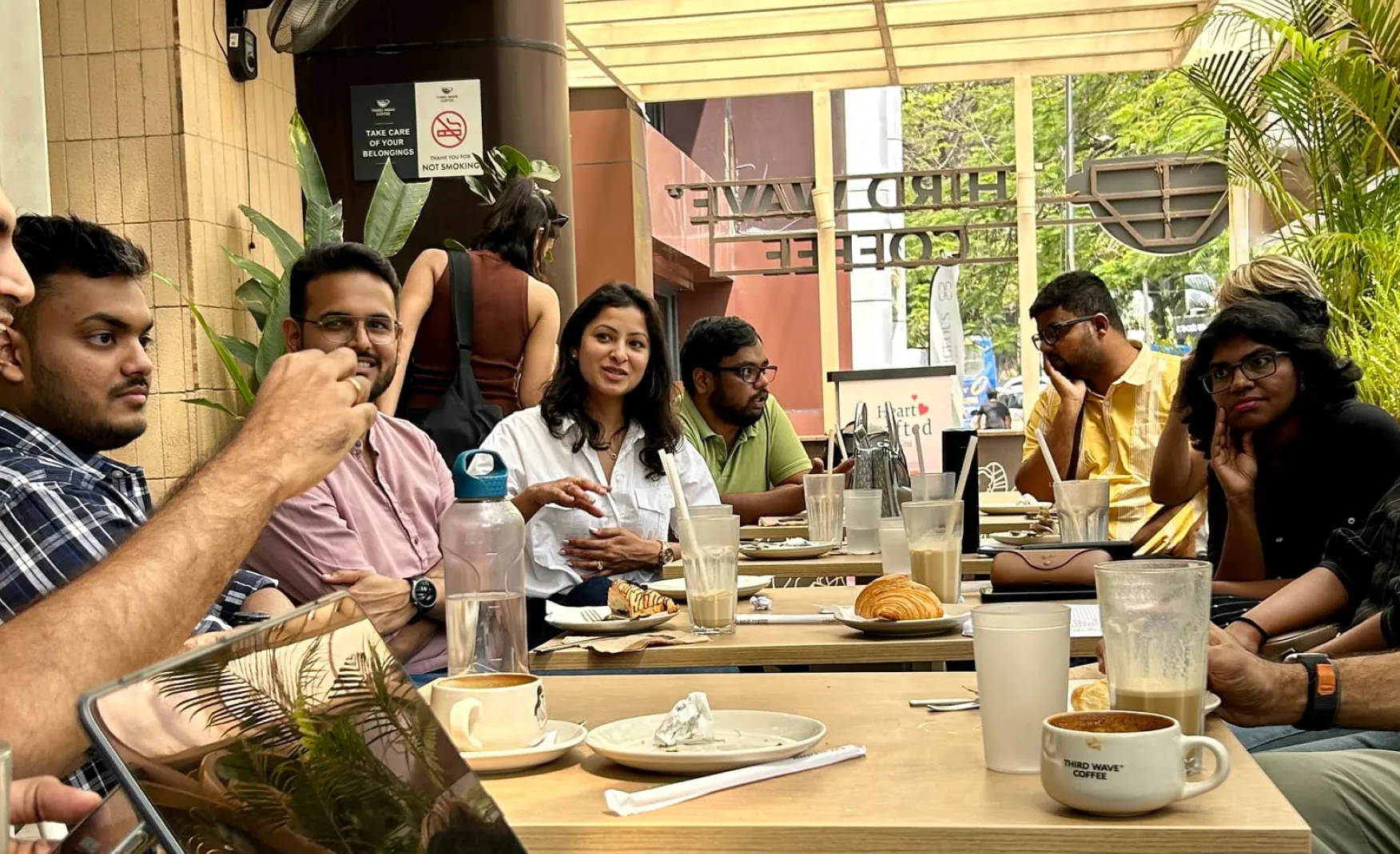
The founders' original research before opening the first Koramangala outlet identified something that most international coffee chains had not fully grasped about the Indian consumer: coffee shops in India are not primarily about coffee. They are about space, a place to work, to meet, to study, to have conversations that do not fit in an office or a home. The third space, between the professional and the personal.
Third Wave Coffee built its first cafe with this insight at the centre. The interiors were designed as community spaces and events, barista education sessions, brewing demonstrations, and gatherings of freelancers, designers, and startup founders became part of the brand's fabric. The result was a consumer base that did not just buy coffee but they felt ownership over the spaces
This community layer is one of the harder brand assets to replicate. A competitor can match the menu, match the price, and match the aesthetic. Replicating a decade of community relationships, local cultural presence, and the accumulated emotional equity of being the place where a specific creative community has gathered, is a different challenge in itself. Third Wave Coffee's community positioning is its most durable competitive asset and also the one at greatest risk as the brand scales into unfamiliar cities and formats.
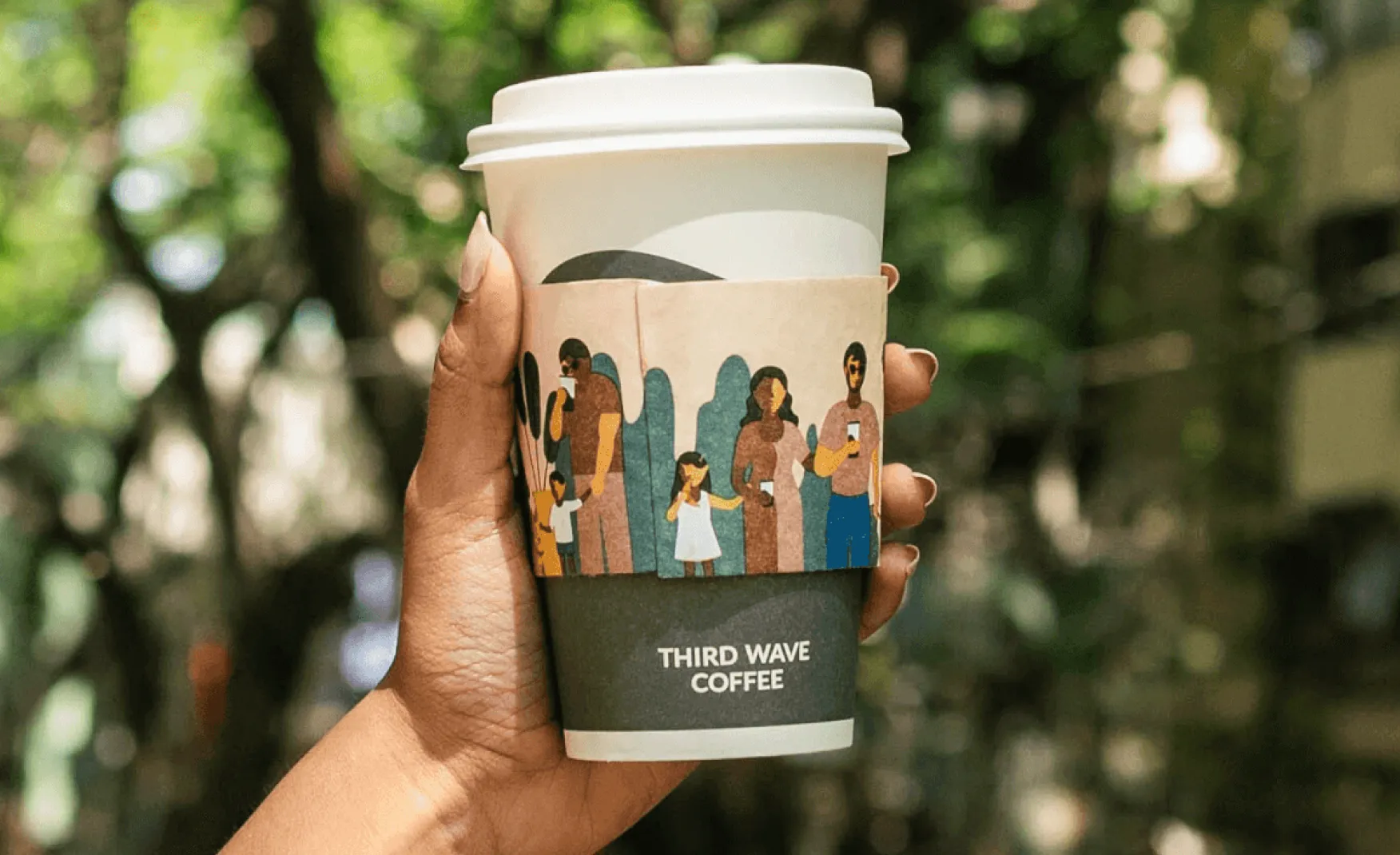
Third Wave Coffee's decision to build a D2C product range alongside its cafe network is commercially intelligent and brand-strategically sound. The consumer who has become loyal to the brand through cafe visits is a consumer who is already motivated to extend that relationship into their home routine.
The product range, covering coffee beans, easy brew bags, cold brew formats, and brewing equipment, creates multiple touchpoints for the same consumer across different contexts and occasions. By April 2025, 30% of the brand's total sales were coming through digital orders. This is a meaningful indicator that the brand has successfully converted cafe loyalty into a D2C habit, which is the hardest part of building a coffee brand with retail dimensions.
The easy brew bag format is particularly well-considered as it removes the barrier of equipment for the consumer who wants specialty coffee at home but does not own a French press, an AeroPress, or an espresso machine. It extends the brand's philosophy of democratising specialty coffee into a format that genuinely reduces friction. This product thinking is actually a sign of a team that understands its audience well.
The name Third Wave Coffee carries significant intellectual and philosophical weight. The interiors of the cafes, as of the brand's current scale, do not carry the same weight. The cafes are clean, functional, and modern, they are also, by and large, indistinguishable from a well-designed generic cafe. If you removed the branding and replaced it with any other cafe name, most Third Wave outlets would look entirely at home under a different identity because there is literally nothing in the physical environment that communicates specialty coffee, the origins of the beans, the roasting process, or the intellectual depth of the movement the brand is named after.
A brand built on education should feel educational the moment the consumer steps inside. The first Koramangala outlet had a visible roaster that allowed customers to see how the beans were prepared. That operational transparency was a physical expression of the brand's philosophy but as the chain has scaled to 165 cafes, that original commitment to visible craft and it has not been carried through into the interior design consistently. The gap between what the brand name promises and what the physical environment delivers is a brand coherence problem that compounds as the footprint grows.
As brands that built their identity around craft, origin, and education grow, they face commercial pressure to expand their audience. The most common response is to introduce flavour-led, trend-driven products, seasonal specials, dessert-adjacent beverages, and mainstream-friendly formats that reach consumers who were not attracted to the brand's original positioning. Third Wave Coffee has begun to feel this tension recently.
Their products like the Gulab Jamun Croissant, the Tiramisu Latte, and the Tiramisu Frappe to name a few are designed to drive footfall and trial from a broader consumer base. These are legitimate commercial decisions and here the ultimate risk is that each step toward mainstream flavour-led marketing is a step away from the educational, provenance-first identity that makes the brand's name meaningful. The third wave movement explicitly rejected this kind of flavour gimmickry. A brand named after that rejection now needs to manage how far it can stretch toward the mainstream before the name becomes ironic rather than authoritative.
The bean packaging remains strong. The cafe menu and seasonal specials are where the dilution risk is most visible. These two parts of the brand are currently pulling in different directions, and that tension will become harder to manage as the scale of the chain increases.
Third Wave Coffee's total expenses reached Rs 358 crore in FY24 against revenue of Rs 241 crore, producing a significant operating loss. The brand has grown revenue at an impressive pace, and the FY25 revenue of Rs 285 crore represents continued momentum. But the pace of cafe expansion, currently targeting 80 to 100 new outlets per year, requires sustained capital deployment, and the unit economics of specialty coffee at scale are structurally different from mass-market coffee chains.
The risk for a brand in this position is that commercial pressure to generate revenue at volume begins to drive product and positioning decisions that the brand's founding philosophy would not have supported. Introducing mainstream-friendly menu items, compromising on bean sourcing standards to manage material costs, or adopting interior designs that are cheaper to produce but less distinctive as each of these is a rational cost-management decision that carries a brand cost that does not appear on the profit and loss statement but compounds in consumer perception over time.
The brands that successfully navigate this tension are those that make the commercial compromises deliberately, with a clear framework for which parts of the brand identity are non-negotiable and which can flex.
The most urgent brand-building investment Third Wave Coffee can make is not in its packaging or its digital presence, it is in its physical environment. Every cafe interior should communicate, through materials, spatial organisation, and visual storytelling, the specific philosophy of the brand: where the beans came from, how they were roasted, what the third wave movement means, and what makes this cup different from what the consumer could get anywhere else.
This does not require expensive custom architecture at every outlet. It requires a design system for physical spaces that carries the brand's educational intent into the environment consistently, the same way the bean packaging carries it into the product. Origin maps, roasting process visualisations, farm relationship stories, and barista education stations are all design choices that reinforce what the name already says. At Confetti, environmental brand design is part of how we ensure that a brand's physical presence is as coherent as its packaging. For Third Wave Coffee, closing the gap between the intellectual depth of the name and the sensory reality of the cafe is the single most important brand-consistency task ahead.
At Confetti, we worked with Vaahe Spices, a premium Indian spice brand built on authenticity, transparency, and ethical sourcing, whose product range spanned a wide variety of high-value spices, each with distinct origins and properties. The challenge was expanding the range without the new SKUs diluting the educational and premium positioning that made the original range credible. We built a packaging and communication system that kept every new product anchored to the same principles of having benefit clarity and visual restraint. The system allowed the range to grow without the brand feeling like it was chasing trends.
Third Wave Coffee needs the equivalent for its menu and product decisions. A clear internal framework that defines which products are consistent with the specialty coffee philosophy and which represent a departure from it would give the brand's product teams a principled basis for expansion decisions. The rule of thumb is simple, ask does this product teach the consumer something about coffee, or does it simply give them something sweet? Products that do the former strengthen the brand while latter weaken it over time, however well they sell in the short term.
A brand with 165 cafes across 12 cities and a target of 80 to 100 new outlets per year cannot rely on individual design judgment at each location to maintain identity consistency. The visual system, the interior design language, the packaging standards, and the communication hierarchy all need to be formally documented in a brand system rigorous enough to guide execution across every franchise partner, every new city, and every format variation.
The founding team's instincts built a strong brand in the early years. At scale, instinct is insufficient. That is why a formal design system with explicit rules for what can and cannot flex across different contexts is the infrastructure that protects a brand's identity during its fastest growth phase. Without it, each new outlet is an opportunity for drift, and drift at the pace Third Wave is growing accumulates into a brand coherence problem faster than most founders anticipate.
Third Wave Coffee built something genuinely significant for Indian coffee culture. It introduced the specialty coffee vocabulary to a market that had been defined by instant coffee and flavoured cafe chains, and it did so with a name, a packaging philosophy, and a founding community that gave the brand real intellectual authority. The growth numbers, from Rs 32 crore in FY22 to Rs 285 crore in FY25, confirm that the market responded.
The challenges ahead are specific and addressable, but they require deliberate attention. The gap between the brand's name and its physical environments needs to close. The newer product lines need a principled framework before the menu begins to contradict what the packaging is saying. And the pace of expansion, targeting 80 to 100 new cafes annually, requires a formal design system that can protect brand coherence at a scale where individual judgment is no longer sufficient.
If you are building a specialty food, beverage, or hospitality brand and want to create the kind of design system and brand architecture that holds its identity coherently as it scales, Confetti can help you build that.
Want strategic branding and packaging like this for your business?


Lorem ipsum dolor sit amet, consectetur adipiscing elit. Suspendisse varius enim in eros
Lorem ipsum dolor sit amet, consectetur adipiscing elit. Suspendisse varius enim in eros
Lorem ipsum dolor sit amet, consectetur adipiscing elit. Suspendisse varius enim in eros
.svg)
.svg)


.webp)
.webp)


.webp)
.webp)
.webp)
.webp)
.webp)


.svg)
.webp)
.svg)
.webp)


.webp)


.webp)


.svg)