02
AI Snaps
.svg)
.svg)
01
Our Work

.svg)
03
About Us
.svg)
05
Contact Us
.svg)
06
Client Success

.svg)
07
Blogs
.svg)
08
Careers
.svg)
Book A Call
Need Help In Building Your Brand?
Click the button below & book a call with our founder directly.

Rishabh Jain
Managing Director
Scroll through any organic marketplace in India today, and one name appears again and again: Two Brothers Organic Farms.
In a sea of “natural,” “farm-fresh,” and “sustainable” promises, this brand has managed to stay unmistakably human.
The Two Brothers brand story is that of two farmer-siblings, Satyajit Hange and Ajinkya Hange, who left high-flying corporate careers to return to their ancestral land. They founded their venture, Two Brothers, in 2012 to make good food accessible and meaningful.
The brand grew from a single farm in Maharashtra into one of India’s most respected clean-food labels D2C brand that spans oils, jaggery, ghee, rice, flour, and more.
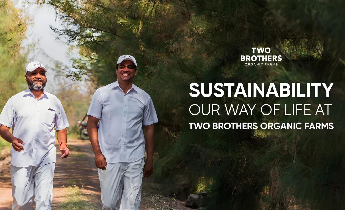
At Confetti, our branding and packaging experts analysed the Two Brothers brand story through the lens of design strategy, brand authenticity, and growth readiness. What the brand does extremely well, and where it has room to sharpen for scale, read on.
In an industry crowded with organic and clean-label promises, Two Brothers Organic Farms stands apart for solely the reason that it feels human. Every design choice, from its name to its illustrations, reflects that.
Our branding and packaging experts at Confetti found that the brand’s strength lies in its ability to communicate honesty without over-explaining it.
The name Two Brothers is perhaps the brand’s most powerful asset. It’s simple, memorable, and deeply human. Those two words carry the entire narrative of how two siblings who left corporate life to return to their ancestral farm and build something organic, pure, and real. The name itself becomes the brand’s USP: food made by people, not processed by an organisation. It’s the perfect blend of story and simplicity. A proof of the fact that sometimes, the strongest branding begins with truth.
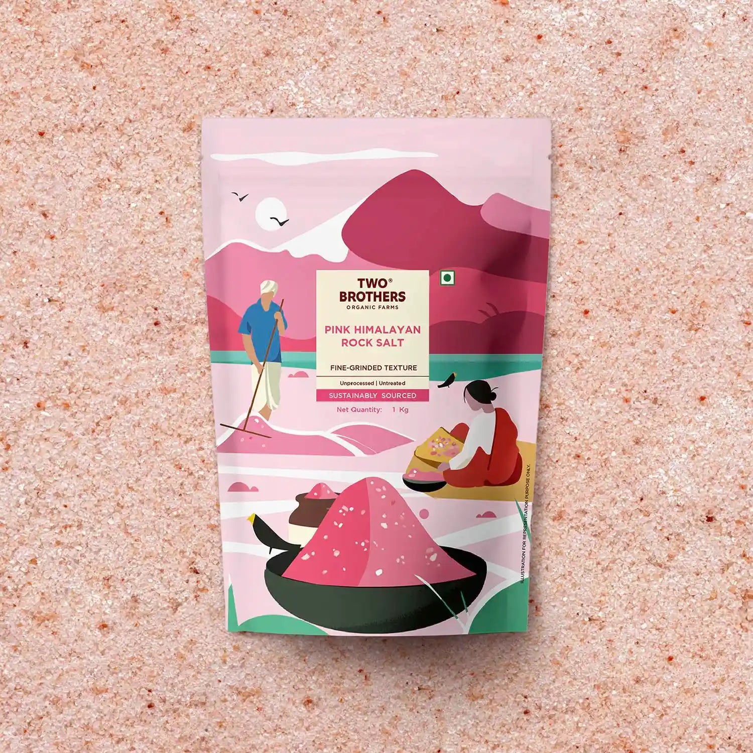
Two Brothers packaging design maintains a consistent hand-illustrated aesthetic across oils, ghee, jaggery, grains, and flours. The illustrations feel organic in texture and rhythm, which builds authenticity. Combined with the clean wordmark, it balances craft and clarity. Consumers instantly recognise the pack on a shelf because it feels artisanal yet refined.
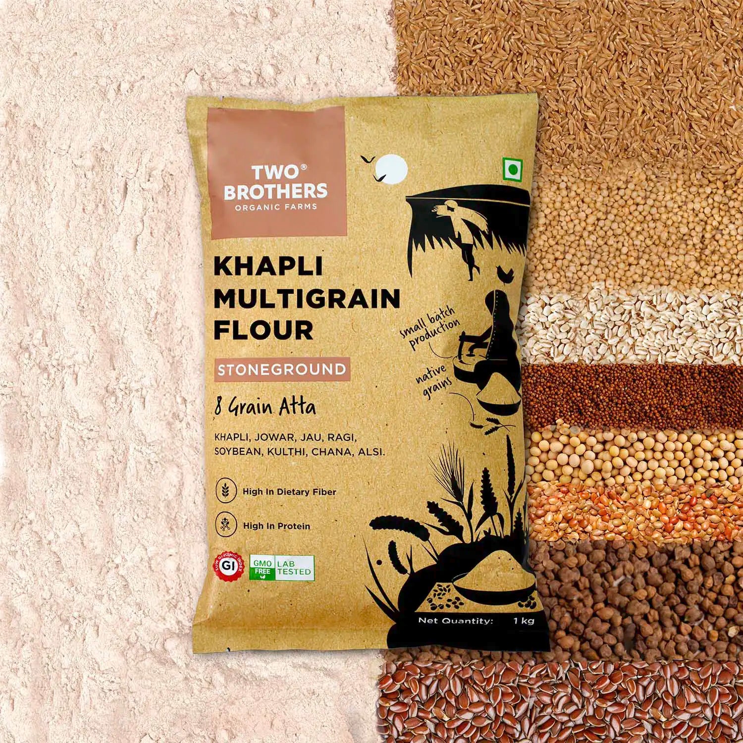
Only a handful of brands maintain design consistency across this broad set of categories. Two Brothers has extended its design system right from colour palette, illustration style, typography, and hierarchy, to over a dozen product types without experiencing any sort of visual fatigue. That discipline reflects design maturity. It also signals reliability to repeat buyers, which is critical when selling essentials at premium prices.
At ₹3,300 for a kilogram of cultured A2 ghee, the brand sits firmly in the high-end market. The packaging earns that premium by being understated, not boldly flashy or loud. The materials, negative space, and typography work together to convey value and refinement without alienating the everyday buyer. This confidence makes the Two Brothers brand look aspirational yet very approachable at the same time
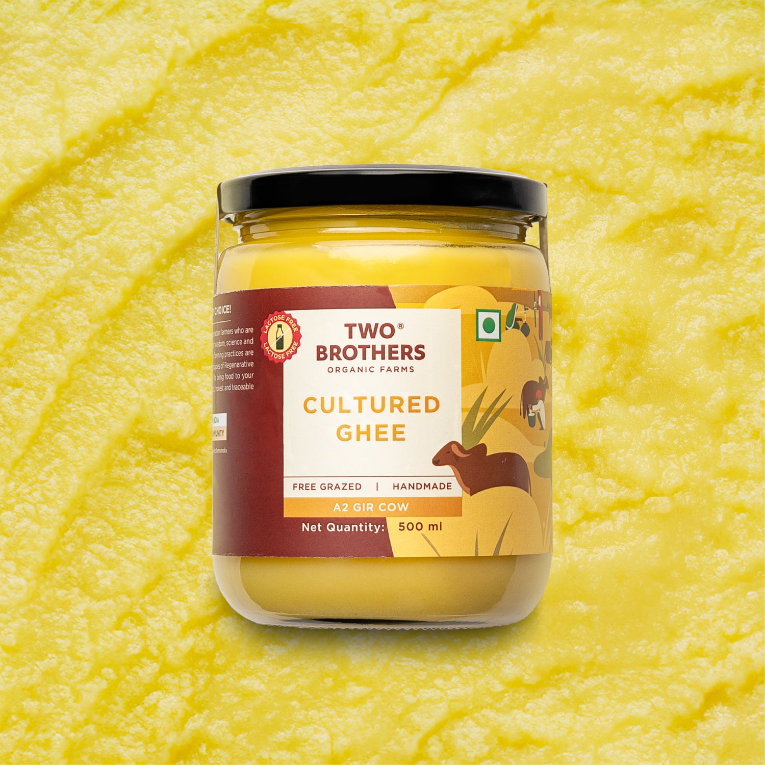
Even strong brands like Two Brothers face the design test of justification. When premium pricing meets consumer expectations, the difference must translate into value. Here, Two Brothers packaging strategy has a specific opportunity:
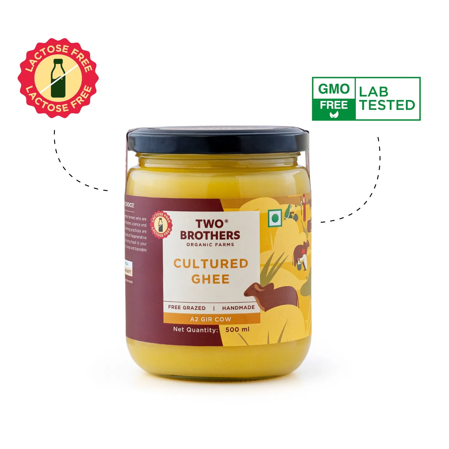
When your product is premium, consumers ask why. On some packs, the brand does an excellent job of describing features (free-grazed, handmade, organic, A2 Gir cow).
But what’s missing is the consumer-benefit articulation, “What do I get for this extra spend?” For example, cultured A2 ghee is priced at ₹3,300/kg, but the pack doesn’t always tell the buyer why it’s worth that premium. Is it better digestion, immunity, flavour, or clarity of the fat? The difference between features and benefits must be bridged.
In a price-sensitive market such as India, premium claims alone won’t suffice. The packaging needs to communicate functional value and emotional reward in a way the customer recognises instantly. Without that, even beautifully executed packs risk being perceived as “nice looking but expensive”.
Our branding and packaging experts at Confetti rate Two Brothers Organic Farms 4.7 out of 5.
The foundation is exceptional with a human-first brand story, consistent design language, and an authentic visual identity that communicates honesty & trust. The opportunity lies not in redesigning what’s already working, but in refining how the brand communicates why it’s worth the premium.
The current packaging does a strong job of highlighting features like organic, free-grazed, handmade, but it can go one step further by connecting those features to clear consumer benefits.
What does this ghee or flour do for me?
How does it make my life better, my health stronger, or my choice feel justified?
That bridge between product truth and customer relevance is what will help Two Brothers move from trusted to loved.
At Confetti, we’ve solved this exact challenge for Pawsible Foods, a sustainable pet food brand redefining nutrition choices for pet parents. The brand needed to communicate complex nutritional benefits without overwhelming pet owners.
Our packaging and design experts devised a design solution that balanced verbal communication and visual storytelling by highlighting key benefits like “supports bone health”, “improved skin & coat” and “boosts immunity” directly on the front of the pack while keeping the layout breathable and premium.
The result was packaging that informed the end consumers without overwhelming them, and inspired trust in the brand without being cluttered.
For Two Brothers brand, applying a similar approach using focused benefit cues, structured hierarchy, and measured storytelling would make its packaging feel even more purposeful. The brand already has the trust; the next phase is about turning that trust into benefit-based, action-driven purchases for its consumers.
At Confetti, we believe great packaging doesn’t just list features, it translates them into benefits that customers instantly connect with. Two Brothers brand story is a powerful example of how design rooted in authenticity can win trust; the next step is about helping that truth speak & convert into a buying behaviour.
As a branding and packaging design agency, we specialise in building systems that scale and design languages that evolve as fast as the brands behind them.
From clean-label foods to emerging wellness categories, our approach ensures that storytelling and structure work together to inform, inspire, and convert.
If you’re rethinking how your packaging communicates the value your product delivers, book a call with us. The link is right beside this article.


.svg)