%201.webp)
02
AI Snaps
.svg)
.svg)
01
Our Work

03
About Us
05
Contact Us
06
Client Success

07
Blogs
08
Careers
Book A Call


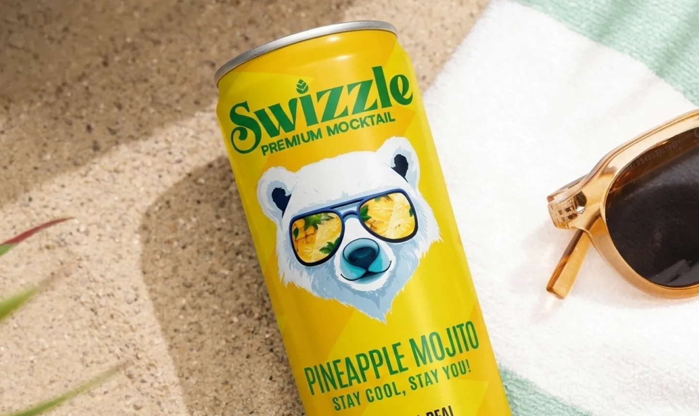
Confetti Design Studios partnered with Swizzle to elevate its branding, highlighting the brand’s commitment to premium, all-natural mocktails crafted solely from fruits and herbs. The project focused on creating a visual and verbal identity that resonates with non-alcoholic beverage enthusiasts and underscores Swizzle's promise of a distinctive taste experience

.webp)
Swizzle faced challenges in the Indian market, including competition from traditional soft drinks and alcohol-based beverages that dominated the industry. The brand also encountered price sensitivity, as premium products needed to justify their value to cost-conscious consumers. Educating the audience about the unique appeal of mocktails made exclusively from fruits and herbs required substantial marketing efforts.
.webp)
%20(1).webp)
%20(1).webp)
.webp)
To tackle these challenges, Confetti Design Studios undertook a complete brand immersion for Swizzle. The process began with a deep dive into the brand’s history to understand its origins and ethos. Confetti then engaged with the senior leadership to gain insights into their vision, values, and goals. This collaborative approach allowed the studio to craft a branding strategy that resonated with Swizzle’s identity and appealed to its target audience.

.webp)

Confetti Design Studios developed a meticulous brand strategy for Swizzle by creating detailed user personas. These personas provided a clear understanding of the target audience, primarily non-alcoholic beverage enthusiasts, and their preferences. Through this research-driven approach, Confetti gained valuable insights into consumer behavior, motivations, and expectations. This enabled the studio to align Swizzle’s branding with its audience’s needs, ensuring a stronger market connection.
.webp)
Confetti Design Studios crafted a vibrant verbal identity for Swizzle, selecting a tone that was fun, trendy, and confident. This approach was carefully tailored to resonate with Swizzle’s target audience of non-alcoholic beverage enthusiasts, capturing their youthful and modern spirit. The confident tone reflected the brand's premium nature while staying approachable and relatable. By striking this balance, Confetti ensured that Swizzle’s messaging would connect with consumers and set it apart in a competitive market.
.webp)
.webp)

As part of Swizzle’s visual identity, Confetti Design Studios chose the polar bear as its mascot for its cool, stylish appeal. Sporting sunglasses, the bear subtly reflects the refreshing and vibrant flavors of the mocktails, like lemon or strawberry, while creating intrigue on the shelves. The strategic use of white for the bear’s color, paired with a playful and vibrant background, enhanced the packaging’s overall energy. Additionally, the green logo symbolizes vitality and fresh growth, with a leaf incorporated to emphasize Swizzle’s commitment to all-natural ingredients.

.webp)


.svg)
.webp)

.svg)
.svg)
.webp)
.webp)

.webp)
.svg)