%201.webp)
02
AI Snaps
.svg)
.svg)
01
Our Work

03
About Us
05
Contact Us
06
Client Success

07
Blogs
08
Careers
Book A Call


Need Help In Building Your Brand?
Click the button below & book a call with our founder directly.

Rishabh Jain
Managing Director
SuperYou | Confetti's Verdict ⭐⭐⭐⭐½
Confetti Design Studio has analysed SuperYou to understand how India's first protein wafer brand sold over 15 million units, hit an ARR of Rs 150 crore, scaled to 4,500 retail outlets, and raised USD 8.45 million in its first year. The fastest-growing celebrity D2C food brand India has seen.
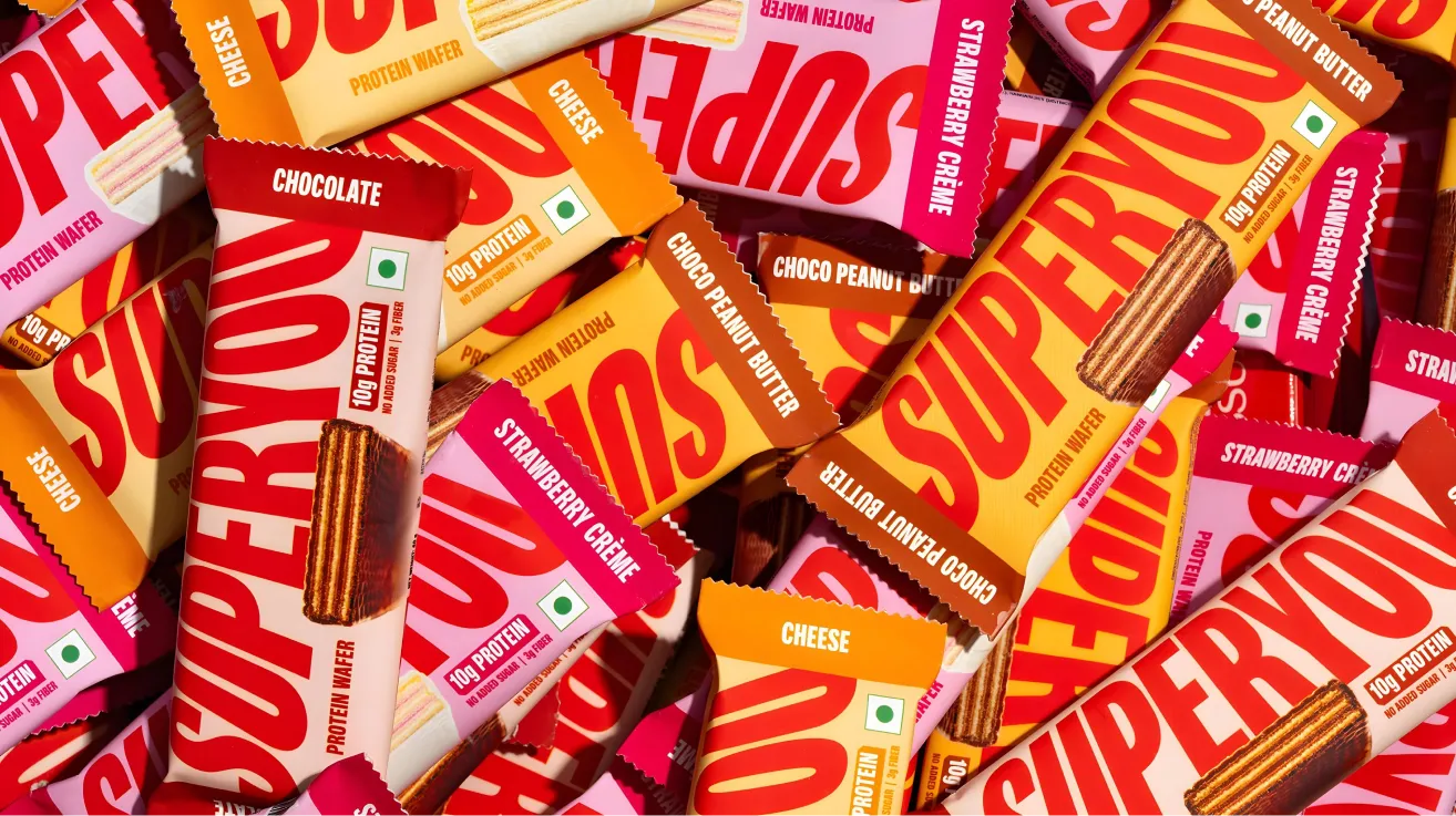
The first impression of SuperYou is confidence. The oversized wordmark stretches across the front of the pack, deliberately cropped on both sides, creating a sense of scale and self-assurance. It is not decorative, it is almost like a bold statement.
The typography, an extended sans serif with gentle tapering at the edges, carries a sleek, athletic energy without sliding into the cliches of sports nutrition design. There are no dumbbells, no neon gradients, no flexing figures. SuperYou looks more like a premium lifestyle snack than a gym supplement, which is precisely the positioning it is after.
What Confetti particularly admires is the restraint in the design. The background stays clean. The visual hierarchy is clear. The claims on-pack, 10g Protein. No Added Sugar., are functional yet understated. Nothing about SuperYou's packaging tries too hard, and that respect for the consumer's intelligence is exactly what makes it feel premium.
The balance of "chocolate first, protein second" is entirely intentional. If the protein claim were highlighted any louder, the brand would risk pulling itself into the protein bar competitive set it deliberately chose not to enter. That measured restraint is where SuperYou's packaging succeeds, and where most functional food brands lose their way.
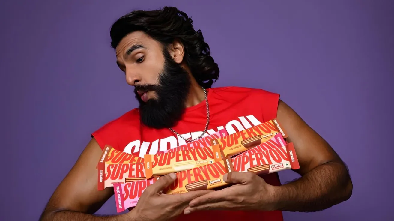
Equally important is the decision to keep Ranveer Singh's face off the physical pack. Despite him being central to the brand's marketing, his image does not appear on the product itself. This is a strategically mature call. If the celebrity association changes or a controversy emerges, the product's identity remains intact. The design is self-sufficient and tells its own story.
SuperYou did not enter an existing category. It created one.
The protein wafer bar format, a KitKat-style chocolate wafer boosted with 10g of protein, 3g of fibre, and no added sugar, did not exist in India before November 2024. By using fermented yeast protein technology rather than the standard whey or soy protein base, the brand also differentiated at an ingredient level, producing a lighter, crispier texture that no competitor had achieved.
This matters enormously from a branding perspective. Category creators do not compete on price. They set the reference point. When a consumer thinks "protein wafer" in India, they think SuperYou, because SuperYou invented the category. That first-mover advantage, combined with a distribution footprint of 4,500 stores and presence on every major quick commerce platform, has created a moat that will be difficult for competitors to breach quickly.
India's snacking market is valued at approximately Rs 50,000 crore, and the protein foods segment within it is growing rapidly as awareness of protein deficiency increases. Nearly 70% of India's population is protein-deficient, according to the brand's co-founder, citing nutrition research. SuperYou has positioned itself at the intersection of this nutritional gap and the country's existing love of chocolate snacking. That is not a niche play, but a mass market opportunity.
Most celebrity-endorsed brands operate at arm's length. The celebrity shows up for the ad shoot and the launch event, collects a fee, and moves on. SuperYou is structured differently.
Ranveer Singh holds approximately 50% of the company and is involved as a hands-on co-founder. He attends weekly meetings, helps shape the brand's tone and positioning, and personally tests every new product with his family before it reaches market. This structure gives SuperYou something that celebrity endorsement deals cannot buy: genuine creative investment from its most visible stakeholder. When Ranveer speaks about the brand, it does not sound like an advertisement. It sounds like a founder. That authenticity transfers to the audience, and it shows in the brand's content performance.
Nikunj Biyani brings a complementary depth that is equally important. As the nephew of Kishore Biyani, founder of Future Group and the architect of modern Indian retail through Big Bazaar and Foodhall, Nikunj brings over a decade of FMCG and retail distribution experience. The combination of celebrity creative energy and retail operational expertise is what turned SuperYou's launch into a commercial milestone rather than just a media moment.
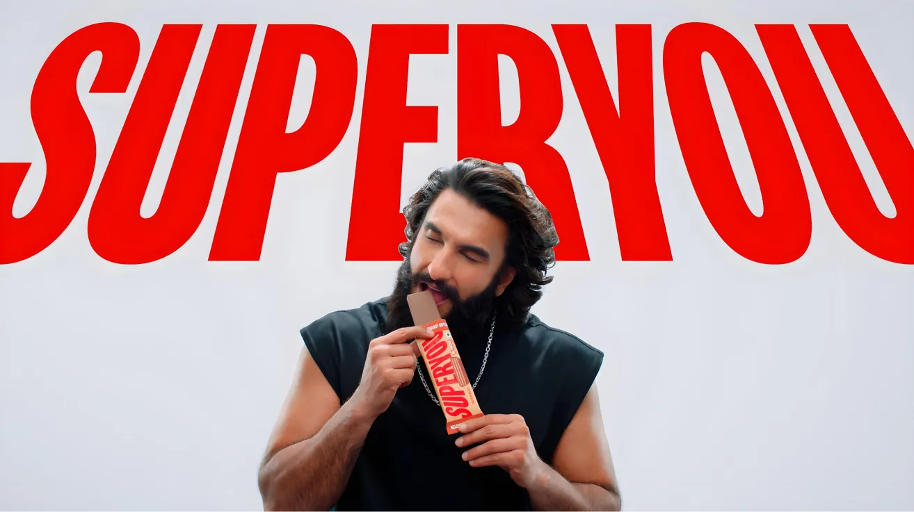
SuperYou launched with heavy celebrity-led marketing, which was the right call for generating awareness fast. Ranveer's high-octane personality, the humour in the early ads, and the scroll-friendly visual energy drove trial at scale. The packaging, bold, colourful, and modern, stood out sharply against the beige and earthy aesthetic of most wellness brands.
What is more interesting is what the brand has done since. Recognising that celebrity visibility alone cannot build long-term brand depth, SuperYou has actively shifted towards user-generated content. The brand now shows how the product fits into real life for kids going to school, for college students, for someone satisfying a sweet tooth at their desk. This UGC pivot signals a brand that is listening to what the market needs from it rather than simply amplifying what it wants to say.
This evolution from broadcast to conversation is exactly what sustains D2C brands beyond their launch window. Consumers trust other consumers. A real person's review of a protein wafer carries more weight with a first-time buyer than a celebrity endorsement, no matter how charismatic that celebrity is.
SuperYou occupies a deliberate middle ground between indulgence and health, and that is both its greatest strength and its most significant vulnerability.
On one side sits Dairy Milk, India's defining chocolate brand with deep emotional equity built over decades. On the other sits The Whole Truth, a brand that has built genuine consumer trust through radical ingredient transparency and a clean label that leaves nothing to question. SuperYou sits between them, offering more health than a standard chocolate bar but more indulgence than a clean protein snack.
When this positioning works, it captures consumers from both sides. When it is scrutinised, it risks being seen as less healthy than The Whole Truth and less satisfying than Dairy Milk. The ingredients list, which includes Maida, Maltitol, emulsifiers, and artificial flavours, is not unhealthy by any reasonable standard, but it is not clean label either. As India's health-conscious consumer becomes more ingredient-literate, this middle ground will require increasingly careful navigation.
The brand must be precise about how it frames its health claims. Positioning too far towards "clean" invites scrutiny it cannot fully withstand. Positioning too far towards "indulgence" risks losing the health-aware buyer who pays the premium. Getting this balance right across every campaign, content piece, and product extension is the central strategic challenge.
The structural question that every celebrity-founded brand eventually faces is this: when the founder's public relevance shifts, does the brand's equity shift with it?
Ranveer Singh is one of India's most culturally ubiquitous personalities right now. But digital and celebrity culture moves quickly. SuperYou needs to build brand identity that is deep enough to stand independently of any single individual's news cycle. The goal is not to remove Ranveer from the brand. It is to build enough brand world around the product itself that the two can eventually operate with some independence.
The UGC shift is a step in the right direction. The next step is building a brand community, a set of values, a visual and verbal identity, and a product portfolio that feels unmistakably SuperYou regardless of who is speaking.
SuperYou's flavour differentiation is currently one of its packaging weaknesses. The existing variants, Chocolate, Choco Peanut Butter, Cheese, Coffee, Strawberry Creme, and Cookie and Cream, appear nearly identical on shelf. The tonal colour shifts between variants are too subtle for quick recognition, particularly in physical retail where bars are displayed side by side, or in digital storefronts where thumbnail images are small.
As the brand extends into biscuits, protein powders, and breakfast cereals, this becomes a more serious structural issue. A modular visual system with distinct colour families, flavour-specific iconography, and clear category markers needs to be developed now, before the portfolio grows to a size where retrofitting becomes disruptive. The Whole Truth Foods handles this well, assigning distinct visual cues to each variant while maintaining master brand cohesion. That is the standard SuperYou should be building towards.
The immediate design priority for SuperYou is developing a packaging architecture that can grow with the product range without losing coherence. At Confetti, we faced a similar challenge when working with AIM (All in a Minute), a wellness brand with multiple functional variants across sleep, beauty, and energy categories. By assigning distinct colour palettes and pairing them with variant-specific illustrations, we created a visual system that felt unified from a distance and distinctive up close. SuperYou needs the same thinking: a flexible, future-ready design system where every new flavour, pack format, or product category feels intentional and instantly recognisable.
SuperYou currently has excellent marketing. What it is still building is a brand story. There is not yet enough storytelling about why this brand exists beyond the celebrity co-founder angle, who it is truly for, and how it fits into the daily life of its customer beyond a tasty snack moment.
The brand needs a founding philosophy that can be expressed without Ranveer in frame. Something rooted in the idea that protein should not be the preserve of gym culture, that everyday Indians deserve snacks that actually nourish them, that indulgence and nutrition are not opposites. This narrative, told consistently across packaging, content, and retail, is what turns a product people buy into a brand people believe in.
The risk of being called out on ingredients by health influencers or food bloggers is real and growing. Rather than waiting for that moment, SuperYou would be better served by getting ahead of it proactively. This does not mean reformulating immediately or abandoning the current product. It means being transparent about what is in the bar, why those ingredient choices were made, and what the brand's roadmap towards cleaner formulations looks like.
Brands that are honest about their current limitations while showing a credible path forward earn far more consumer trust than those that oversell clean credentials they have not yet earned. The Whole Truth built its entire brand on this principle. SuperYou can develop its own version of ingredient honesty that fits its character without compromising its indulgent positioning.
SuperYou is one of the most impressive D2C brand launches India has seen in recent years. Rs 150 crore ARR in the first year, 15 million units sold, and a genuinely new product category created from scratch are metrics that very few brands, celebrity-founded or otherwise, have achieved at this speed.
The packaging foundation is strong, the category positioning is smart, and the pivot towards community-led UGC content signals a brand that is thinking beyond its launch moment. The challenges ahead are real but manageable: tightening the mid-ground health positioning, building a modular design system, developing a brand narrative that stands independently of its co-founder, and addressing ingredient transparency before the market does it for them.
If you are building a snacking or FMCG brand and want to create the kind of bold design, sharp positioning, and brand architecture that turns a great product into a category-defining name, Confetti can help you build that.
Want strategic branding and packaging like this for your business?


Lorem ipsum dolor sit amet, consectetur adipiscing elit. Suspendisse varius enim in eros
Lorem ipsum dolor sit amet, consectetur adipiscing elit. Suspendisse varius enim in eros
Lorem ipsum dolor sit amet, consectetur adipiscing elit. Suspendisse varius enim in eros
.svg)
.svg)


.webp)
.webp)


.webp)
.webp)
.webp)
.webp)
.webp)


.svg)
.webp)
.svg)
.webp)


.webp)


.webp)


.svg)