%201.webp)
02
AI Snaps
.svg)
.svg)
01
Our Work

03
About Us
05
Contact Us
06
Client Success

07
Blogs
08
Careers
Book A Call


Need Help In Building Your Brand?
Click the button below & book a call with our founder directly.

Rishabh Jain
Managing Director

You must have met at least one person who says out loud that “I suck at doing personal finance”. Well, we agree, it’s no cakewalk. This is why in the last few years people have been relying more and more on a fintech app of their choice to make this overwhelming task easier.
Many fintech apps aren’t as successful as the ones sitting on top. Reason? Lack of a user-friendly design. In the world of numbers, pie charts, and tables with scores of data, the design does find its place and meaning.
A bad design can be the downfall of your amazing fintech app since it negatively affects the customer experience. All that retention, conversion, and engagement is down the drain.
Let’s take a look at 4 essential design elements for fintech app UX so yours doesn’t tank.
.webp)
It’s pretty ironic for us how simple yet complex it is to answer this question. The prime reason to focus on the design aspect of your Fintech App is to make sure that you stay relevant as the times change.
It’s like saying that you should rub a coat of resin on your masterpiece, for the same symbolic reasons; to leave a shine and protect your product from external damage, which in the case of a fintech app is standing the test of time.
The market is full of fintech apps in 2022. They pop up probably every other minute when a group of college students sit and think of an idea for a project.
However, the average customer and user of today are pretty smart. They don’t choose your app because you’ve got an awesome algorithm or how revolutionary your web3 digital wallet is.
What they prefer over most other practical things is a customized user experience while using your product; your fintech app.
Whether you’ve just conceived the idea of your fintech app, or are in a later stage of app design, it’s essential you check out these 4 essential design elements for your fintech app and optimize its user experience.

The user Journey should be at the heart of a fintech app and its UX design. After the tech giants like Amazon, Apple, and Facebook, even banks and finance tech companies started paying attention to the user journey.
If you map out your user’s journey through your fintech app, it will allow you to see and experience it from the perspective of your customers. This way you have insights that you can act upon and improve your product engagement, conversion, and retention.
Always take time to understand your users and create user personas. How?
1. Take interviews with your previous and current customers
2. Pitch a survey to the potential customers
3. Look into data from sources like social media and point of sale
.webp)
Branding and identity for a fintech app are as important as focusing on the user journey. Creating positive experiences is going to establish your voice as an authority and a solid one that will make it easier for you to communicate your product solutions.
A Fintech app with a strong brand identity is unforgettable to the customers. Some content elements that should align with your brand and vision are:
Don’t distract your users with fancy elements of graphics and text. Find a balance between these elements that sits right with the idea of being ‘on-brand’. Use icons and effective infographics to your advantage so that customers can navigate through the app as quickly as possible and easily digest the information they’re looking for.
Simple advice: avoid financial jargon and technical terms that may drive your customers away. Many fintech apps have made the mistake of being foot-deep in jargon and it has not turned out well for them.
Focus on conversion-driven copywriting to engage your customers throughout the experience of your fintech app. Doing so can ensure that they make better financial decisions and trust your product.
Colors affect 9/10 of a person’s impression and decision-making. Some color translations:
1. Blue: Calmness and trustworthiness
2. Yellow: Optimism and happiness
3. Orange: Vitality and creativity
4. White: Purity and cleanliness
5. Black: Sophistication and elegance
6. Red: Excitement and passion
7. Green: Nature and sustainability

Alike other digital products, it’s imperative to know your audience’s pain points in a fintech app to add and enhance features that the customers will find useful and appreciate. If you can figure out what makes your users tick, it’ll be really helpful in revamping your fintech app as an effective and enhanced product.
Some common examples:
1. Pain Point: Boring financial information
2. Potential Solution: Gamification
3. What makes them tick: Feeling of belongingness and connections
4. Potential Solution: Social media integration
.webp)
We can’t not talk about security when we’re talking about fintech apps. Security should be at the core of everything when you’re dealing with creating and designing a fintech app. It’s evident that no one wants to lose their hard-earned income to cyber attacks, so it’s important to enhance your security and establish credibility in the area.
Make your design align with security, not get in the way of it. Sensitive data policies should be easily accessible to the users and feel transparent so they don’t feel like they’re left in alone in a dark area.
We get it. Designing a fintech app can be overwhelming, scary even. But if you grind the right gears, it’ll be very rewarding for your brand and the customers. Some key points summing up what we’ve discussed:
1. Focus on the User Journey and User Experience
2. Don’t forget Branding
3. Security is paramount
Lorem ipsum dolor sit amet, consectetur adipiscing elit, sed do eiusmod tempor incididunt ut labore et dolore magna aliqua. Ut enim ad minim veniam, quis nostrud exercitation ullamco laboris nisi ut aliquip ex ea commodo consequat. Duis aute irure dolor in reprehenderit in voluptate velit esse cillum dolore eu fugiat nulla pariatur.
Block quote
Ordered list
Unordered list
Bold text
Emphasis
Superscript
Subscript
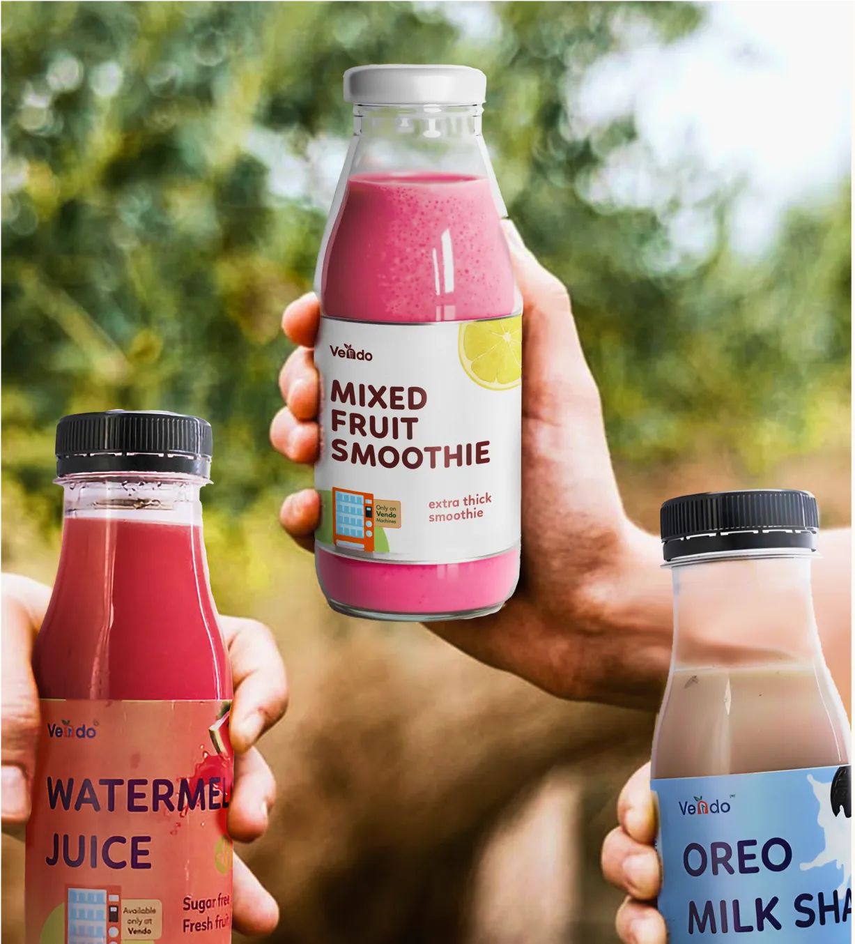
Want strategic branding and packaging like this for your business?


.webp)
.webp)


.webp)
.webp)
.webp)
.webp)
.webp)


.svg)
.webp)
.svg)
.webp)