%201.webp)
02
AI Snaps
.svg)
.svg)
01
Our Work

03
About Us
05
Contact Us
06
Client Success

07
Blogs
08
Careers
Book A Call


Need Help In Building Your Brand?
Click the button below & book a call with our founder directly.

Rishabh Jain
Managing Director
From supermarket shelves to Instagram feeds, the retro and nostalgic packaging design revival is one of the most influential trends shaping the retail landscape.
Learn with packaging design experts Confetti, why classic packaging is dominating and how you can harness this aesthetic for emotional marketing, standout shelf appeal, and long-term brand loyalty.
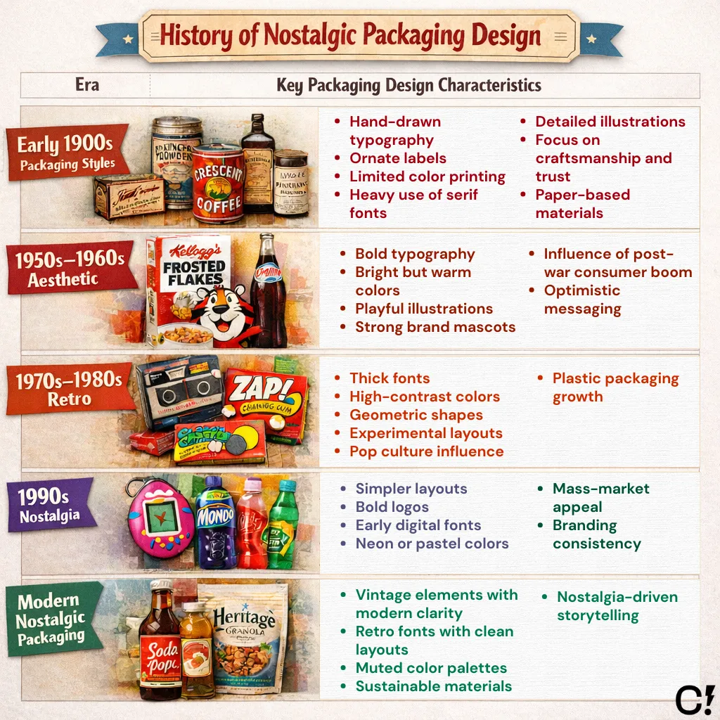
Nostalgic packaging design doesn’t intend to copy the past designs.
Instead it pulls inspiration from earlier decades, and reuses recognizable design elements to recreate the emotional feeling of a past era.
Our buying decisions are hardwired with emotion and memory.
When a customer sees nostalgic packaging, say, a mid-century cola bottle or a cereal box that reminds them of old Saturday mornings they feel comfort, happiness, and trust.
These emotional responses aren't just coincidental; they’re the foundation of why retro designs convert browsers into buyers.
The vintage-inspired product packaging you see trending now isn’t by accident.
Retro visuals use specific color palettes (think muted pastels or bold primaries), nostalgic textures like paper grain or faux aging, and typography that echoes the mid-century or pop culture eras.
These details create instant recognition and differentiation even when surrounded by minimalist packaging trends.
At Confetti, we help brands capture this timeless quality in their own branding by balancing vintage charm with modern functionality.
Today’s retail shelves are crowded with minimal, monochrome boxes. Retro package design leaps out by delivering a story and a visual “hug.”
Vintage-inspired add-ons like embossing, foil, or unique containers make the tactile experience memorable.
As a result, brands deploying these throwback packaging ideas consistently outperform with Instagrammable unboxings and higher recall rates.
That feeling comes from a few very specific design choices.
Typography is one of the strongest signals of nostalgia. Older packaging relied on character, not perfect fonts.
Common nostalgic typography features:
Color is the fastest way to signal a specific decade.
Nostalgic packaging uses softer, aged tones that feel familiar. They mimic how old packaging naturally faded over time, which signals age and reliability.
Typical nostalgic color palettes include:
Imagery in nostalgic package design is usually illustrated, not photographic.
This is a major difference from modern packaging.
The artwork tells the story and builds the brand's nostalgic world.
Common imagery styles:
Texture is what makes nostalgic packaging feel real and tactile. Modern plastic feels disposable; nostalgic materials feel substantial and reusable.
Common material and texture choices:
"Great packaging design speaks to memory before it speaks to logic. When we tap into nostalgia, we're not designing for the shelf, we're designing for the heart."
Brands from household icons to startups are rebranding by weaving old-school branding styles back into their DNA.
Retro logo design resonates with Gen Z and Millennials because they crave analog aesthetics that feel quirky, sincere, and rooted in pre-digital craftsmanship.
By evoking heritage and legacy, these designs help brands build trust, as younger audiences often perceive them as more honest and authentic.
Famous brands using nostalgic packaging design successfully include:
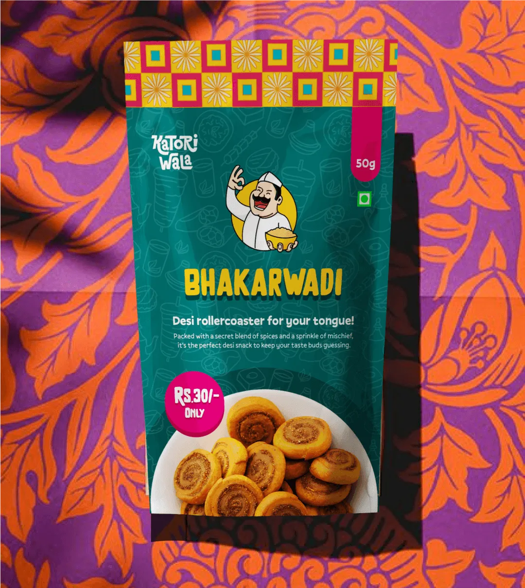
Confetti's approach to nostalgic packaging fuses whimsy with authenticity, creating brands like Katoriwala that make people smile before they even open the pack.
Look at your favorite snacks: retro food logos and colorways (like pastel '80s chips bags or blocky '90s fonts on cereals) are reclaiming shelves.
Brands leverage nostalgia marketing in FMCG for instant emotional connection and social shareability.
Some of the common ways brands are including vintage packaging design:
Product Packaging Design to Tell a Story
Story-driven visuals are reshaping product packaging design.
A beauty supplement might use 1970s botanical illustrations to suggest purity and handcraft. A beverage brand might mimic an old soda shop palette, inviting consumers to “taste history.”
Branding Packaging Design That Resonates
Successful branding packaging design carries retro elements across both physical and digital touchpoints.
A consistent throwback theme unifies the experience, building memorable, cohesive brand stories (and letting your product “go viral” on social or e-commerce).
Vintage Logo Design to Communicate Heritage
Vintage logo design helps brands signal authenticity and heritage. Understanding this nuance lets you tap the right emotional strings.
Retro logos evoke a specific era like neon gradients for ’80s throwbacks, or bubbly type for ’90s nostalgia while vintage logos signal timelessness and authenticity with aged effects, classic fonts, or distressed edges.
Packaging Illustration & Graphics That Echo the Past
Effective packaging illustration borrows classic linework and vintage color palettes, then refines them for today’s digital and retail environments.
The result feels nostalgic without appearing outdated. Essentially familiar, beloved, and contemporary.
The Unspoken Layer: Sensory & Tactile Nostalgia
Innovative brands are using multi-sensory nostalgia triggers beyond visuals.
From crinkling wax paper wrappers to matte cardboard that feels like old library books, tactile details turn packaging into memory artifacts rather than mere containers.
Nostalgia as Social Currency
Retro packaging is designed to be shareable on social media.
Vintage patterns and diner-style bottles give products built-in stories, turning customers into nostalgia ambassadors who spread the brand’s aesthetic online.

Talk to our founders about building nostalgic packaging with modern impact.
Book A Call
We’ve helped companies get retro packaging right, and watched many miss the mark.
Nostalgia is powerful, but when it’s done wrong, it feels outdated or fake.
These are the most common mistakes brands make and why they hurt the design.
Adding too many distressed textures, faded colors, or worn effects screams fake vintage rather than genuine heritage.
This makes packaging design look contrived and visually noisy, overshadowing the product itself.
Confetti Fix: At Confetti, we practice strategic restraint, using just one or two vintage elements to support the brand story. For Katoriwala, we combined playful hand-drawn type and traditional Indian colors with a clean, modern layout for nostalgic accents, not nostalgic overload.
Hard-to-read typography frustrates shoppers and reduces shelf impact.
If customers can’t read the product name quickly, they move on.
Confetti Fix: We balance decorative elements with functional typography so key information stays instantly legible. Tested at real shelf distances and lighting conditions, our work proves beauty and readability can coexist.
Nostalgia only works when the audience recognizes and feels it.
Using an era your target audience doesn’t connect with weakens the impact.
Confetti Fix: We conduct audience-driven era analysis, aligning design references with our client's specific demographic, be it Gen Z’s Y2K, Millennials’ 90s, ensuring nostalgia hits the right memory.
Older packaging didn’t need barcodes, nutrition labels, or legal text.
Forcing modern compliance into a retro design without planning breaks visual balance.
Successful designs account for regulations from the start.
Confetti Fix: We design vintage aesthetics within modern frameworks, integrating QR codes, sustainable substrates, and ergonomic structures seamlessly, so heritage feels fresh and functional.
Subtlety creates a stronger emotional response. Overusing clichés like exaggerated fonts or fake aging can feel forced.
It undermines brand credibility with superficial nostalgia.
Confetti Fix: We build narrative-driven design, using historical elements that serve the brand’s unique story, creating depth and authenticity that goes beyond mere decoration.
Adopting retro styles simply because they’re trendy, even when they contradict the brand’s core identity.
This leads to confusing consumer perception and diluted equity.
Confetti Fix: We anchor every nostalgic element in strategic brand alignment, ensuring vintage touches amplify, while never contradicting, the brand’s voice, values, and market position.
Ready to create packaging that resonates across generations? Let's bring your brand's nostalgic story to life at Confetti.design
What is nostalgic packaging design?
Nostalgic packaging design uses vintage aesthetics, retro typography, classic color palettes, and historical design elements to evoke emotional connections to past eras. It creates familiarity, trust, and emotional resonance by tapping into consumers' positive memories and associations with bygone times.
Why does nostalgic packaging work so well?
Nostalgic packaging taps into emotion and memory, which can create an instant connection with customers. It reminds people of simpler times, childhood favorites, or cultural touchpoints, making products feel more personal and familiar. Confetti often uses nostalgic elements to help brands create emotional resonance, especially in categories like food, personal care, and lifestyle.
Is retro packaging only for older brands?
Not at all. Even new brands can use retro-inspired packaging to evoke heritage, trust, or timelessness. It’s more about the feeling you want your product to give than your actual company age. At Confetti, we’ve helped both legacy and emerging brands use retro cues to stand out in modern retail environments.
What are key elements of retro packaging?
Key elements include vintage typography (serif fonts, hand-lettering), period-appropriate color palettes (muted tones, sepia, era-specific colors), classic illustrations and imagery, textured materials (kraft paper, embossing), traditional label shapes, heritage-style logos, and decorative borders or ornaments.
How do I choose the right retro era for my brand?
Start by identifying what your audience connects with. Is it 90s pop culture, 70s psychedelia, or early 2000s Y2K aesthetics? The right era should align with your product’s vibe and brand story. Confetti supports this process through brand strategy workshops and visual trend mapping to help you pick an era that makes sense and feels authentic. If you’re unsure, book a call with a branding expert who can help analyze your positioning and choose the strongest nostalgic anchor.
Can I mix modern and vintage elements?
Yes, and in fact, some of the most effective nostalgic packaging blends vintage inspiration with modern clarity. For example, you might use retro fonts with contemporary layout systems or pair vintage illustrations with clean color blocking. Confetti specializes in this balance keeping designs emotionally rich but commercially sharp.
Are there risks to using retro design?
The biggest risk is appearing outdated or gimmicky if the execution isn’t intentional. Retro design needs to feel deliberate and aligned with your brand, not like a random throwback.
What industries benefit most from nostalgic packaging?
Industries that benefit most include food and beverages (especially craft products), beauty and personal care, confectionery and sweets, alcoholic beverages (whiskey, craft beer), artisanal products, heritage brands, premium products positioning on tradition, and products targeting specific age demographics.
Want strategic branding and packaging like this for your business?


.webp)
.webp)


.webp)
.webp)
.webp)
.webp)
.webp)


.svg)
.webp)
.svg)
.webp)