%201.webp)
02
AI Snaps
.svg)
.svg)
01
Our Work

03
About Us
05
Contact Us
06
Client Success

07
Blogs
08
Careers
Book A Call


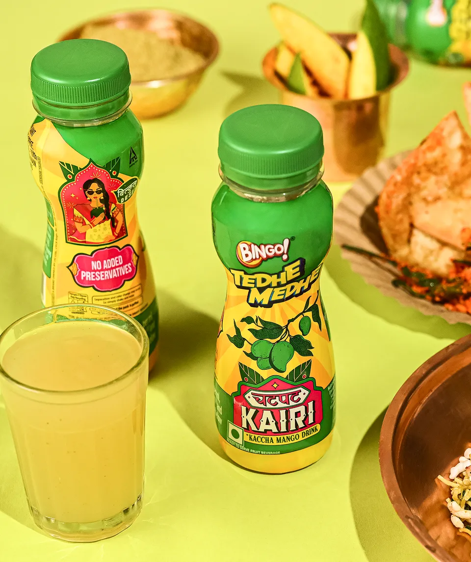
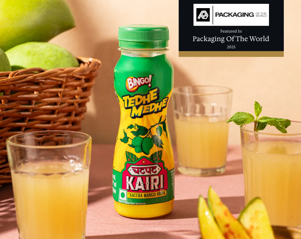
ITC Bingo, known for its quirky snacks, was stepping into the beverage category with an iconic Indian summer cooler Aam Panna. The challenge was to create a strong entry into this space as a snack brand, while making the drink feel fun, nostalgic, and different from mainstream colas and energy drinks. With a target audience of 18–30-year-olds (largely women), the brief called for a desi, homemade appeal inspired by Indian truck art, highlighting the bold kick of mint and masala, and capturing the tangy essence of chatpati kairi.
We tapped into the nostalgia of summer afternoons and the playful vibe of street-side aam panna stalls. Our design direction blended the bold, modern energy of Bingo with the quirky, colorful aesthetic of Indian truck art. The aim was to position Aam Panna as a fun, refreshing daytime drink bursting with mint, masala, and tangy freshness while telling a story that felt desi, homemade, and instantly relatable.
.webp)
.webp)
.webp)
.webp)
.webp)
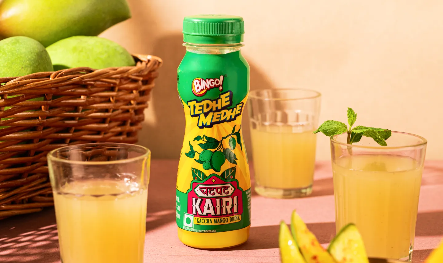
The palette was built to feel fresh, chatpata, and appetising with vibrant pops of pink, green, and yellow echoing raw mango, lime, and spices. Typography drew inspiration from hand-painted truck art and local shop signages, creating a unique product lockup that fused Devanagari (‘Chatpat’/ ‘चटपट’) with bold English lettering (‘Kairi’/ ‘कैरी’). Chunky forms, sharp shadows, and playful frames gave it a look that was traditional yet modern, loud yet approachable.
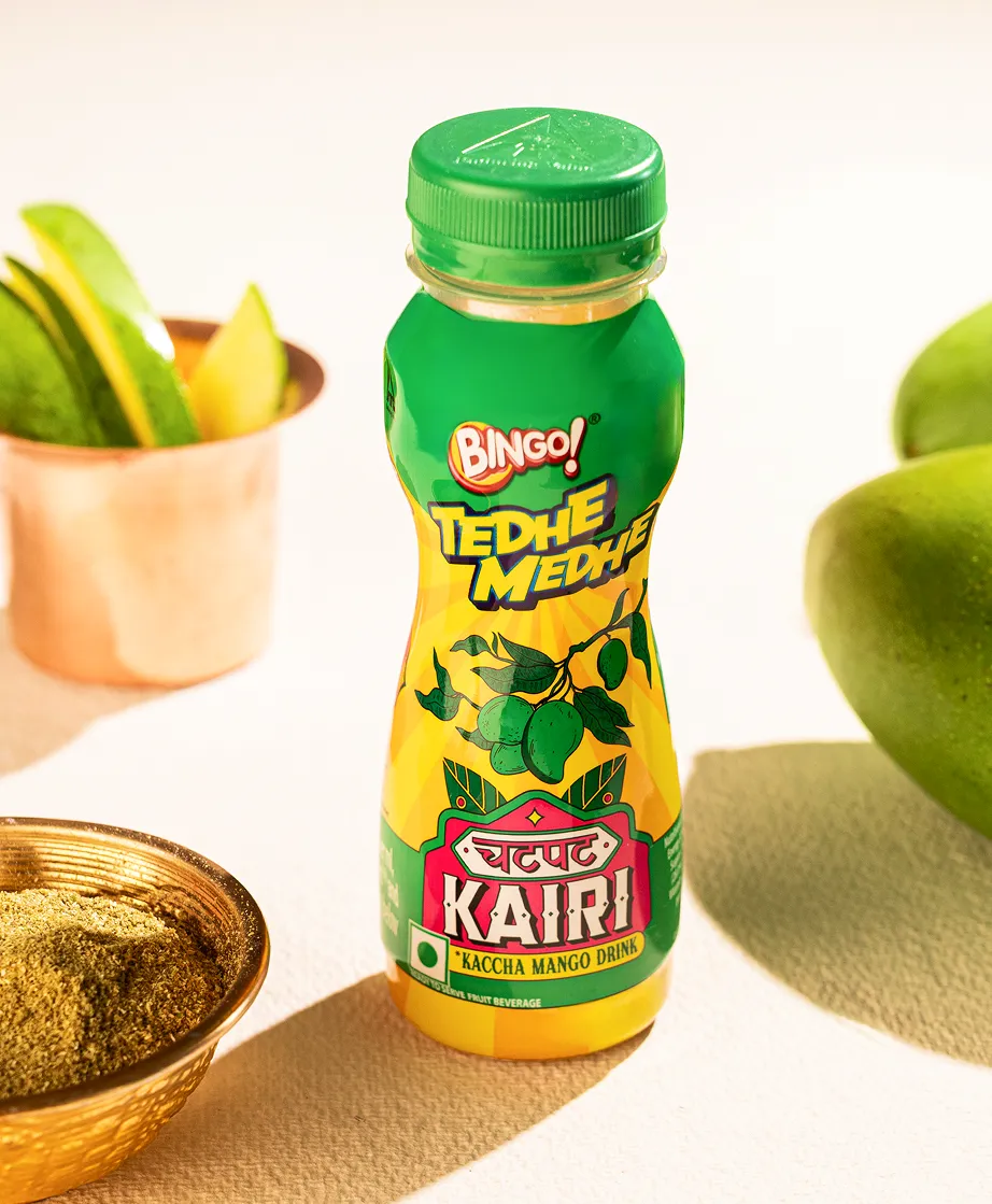
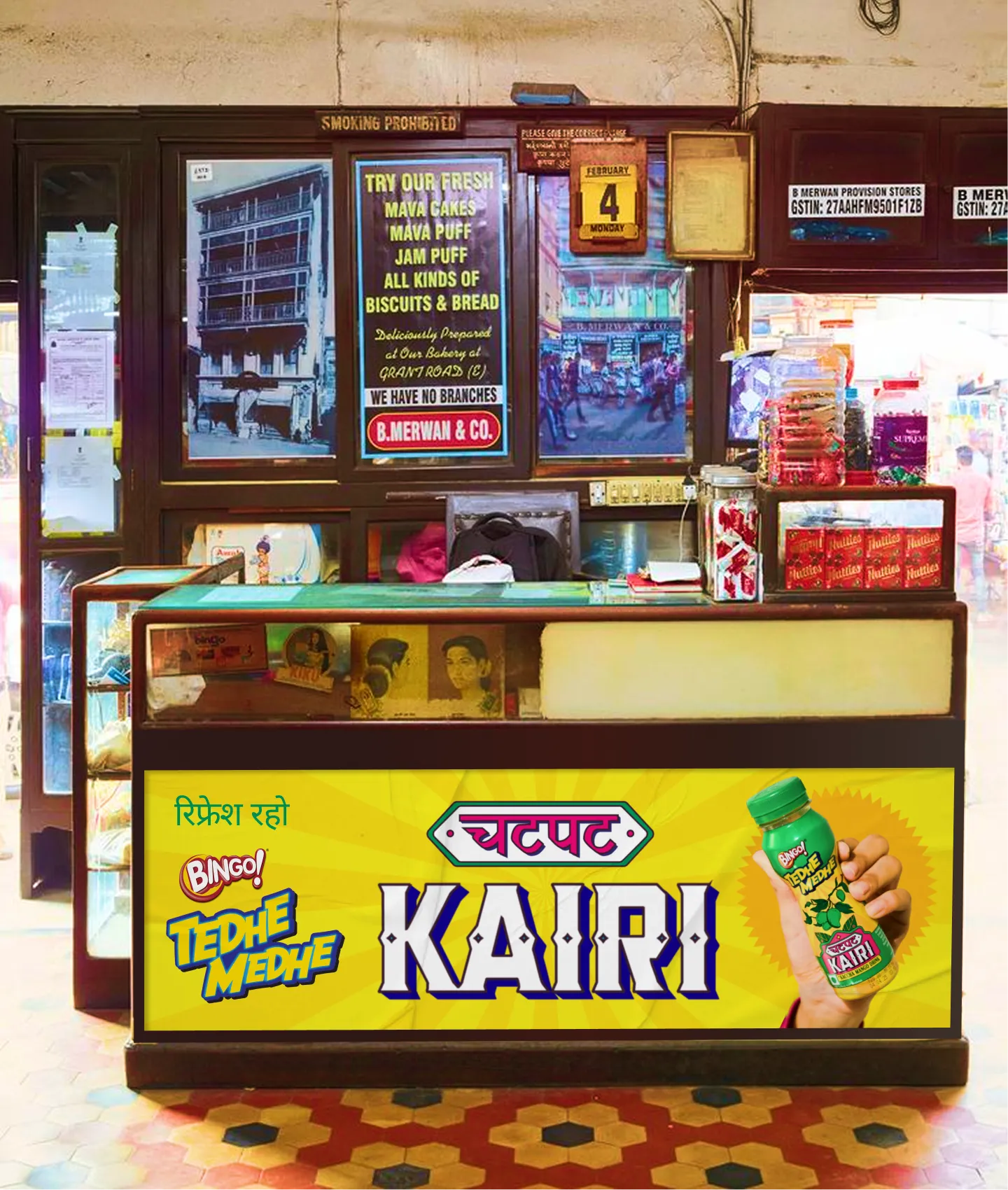
The final design was bold, desi, and tangy just like the drink itself. With the product name front and center, supported by hero illustrations of raw mangoes and quirky motifs, the packaging evoked a sense of fun and nostalgia. Bright colors, bold typography, and playful details helped it stand out on shelves while appealing to the mass market, making Aam Panna feel both familiar and exciting for a new generation.
.webp)
.webp)
.webp)
.webp)
.webp)
.webp)


.svg)
.webp)

.svg)
.svg)
.webp)
.webp)

.webp)
.svg)