%201.webp)
02
AI Snaps
.svg)
.svg)
01
Our Work

03
About Us
05
Contact Us
06
Client Success

07
Blogs
08
Careers
Book A Call


Need Help In Building Your Brand?
Click the button below & book a call with our founder directly.

Rishabh Jain
Managing Director
Brand identity design is more than a colour palette or your logo.
It’s the visual language that tells your story, builds trust, and sets expectations among your target customers
As experts in crafting brand-aligned packaging, we at Confetti Design Studio break down in simple terms how you can align packaging design with your brand identity.
%2520(1).webp)
Brand identity design is how a brand looks, sounds, and feels to the outside world.
It is the visual and verbal system that helps people recognize your brand instantly and understand what it stands for.
However, brand identity design is not to be confused with brand identity and branding.
Branding is the emotional perception people have about a business.
Brand identity is the tangible set of elements that communicate that perception.
Brand identity design is the process of designing those elements so they are recognizable and aligned with the brand’s strategy.
The main purpose of brand identity deign is to-
1. Logo Design
The logo is the anchor of brand identity design. It is the central, recognizable symbol of the brand.
It should be simple, memorable, and functional across different sizes (from a favicon to a billboard)
2. Color Palette
Colors trigger emotion faster than words.
In brand identity design, colors must be consistent, purposeful, used the same way everywhere
3. Typography
Typography is the style of fonts a brand uses.
The fonts you choose speak volumes. A Serif font (like Times New Roman) feels traditional and authoritative, while a Sans-Serif (like Helvetica) feels modern and approachable
Brand identity design defines primary font, secondary font, and font hierarchy to keep everything readable and consistent.
4. Brand Voice and Tone
While not purely visual, it's a crucial part of the identity system.
5. Imagery and Visual Style
Images are a powerful part of brand identity design. The visual style includes photography, illustrations, icons, and graphic patterns
These add personality, reinforce brand themes, and create visual interest for backgrounds, websites, and packaging.
6. Brand Guidelines
Brand guidelines are the rulebook that explain the do’s and don’ts
They explain:
"Every packaging decision, from font to color palette, either reinforces or contradicts your brand identity. After designing for brands like ITC, and Dabur,, I've seen how the most powerful packaging creates instant brand recognition while telling an authentic story that resonates with your audience at first glance.”
— Rishabh Jain, Founder, Confetti Design
Aligning brand identity design with packaging design is important because packaging is often the first real interaction a customer has with your brand.
Here’s why aligning the two is important:
1. Packaging Sells Before You Do
Packaging instantly shows who the brand is, what it stands for, and who it’s for. If
it doesn’t match the brand, it confuses customers and pushes them away.
2. It Creates Instant Recognition & Trust
Consistent colors, fonts, and visuals make your product recognizable at a glance.
Familiarity builds trust and reduces decision effort.
3. It Shapes the Full Brand Experience
From shelf to unboxing to home use, packaging is part of the brand journey.
When it matches the brand personality, the experience feels seamless.
4. It Signals Value and Price
Packaging design sets expectations. Premium brands need premium packaging; value brands need simple, efficient design.
Alignment between the brand identity design and packaging confirms the price makes sense.
5. It Makes You Stand Out
In crowded markets, packaging design is how you’re noticed.
Distinctive design helps customers spot and remember your brand.
6. It Wins the Moment of Truth
In a few seconds on the shelf, packaging must match the brand customers recognize elsewhere.
Misalignment causes doubt, confusion, and lost sales.
.webp)
At Confetti, our packaging design approach is a way to translate brand identity into a cohesive, impactful experience.
These elements can be grouped into three strategic categories.
These make your product instantly recognizable.
1. Logo & Lockup
The logo is the most direct signal of brand ownership and must always follow brand guidelines.
How It’s Reflected in Packaging:
2. Core Color Palette
Color creates instant recognition and emotional connection. Use your signature color to create instant recognition from a distance.
How It’s Reflected in Packaging:
3. Primary & Secondary Typography
All text on the package must use the approved brand typefaces.
How It’s Reflected in Packaging:
These include elements that express personality, values, and emotional tone.
4. Brand Values & Mission
Your packaging should visually and materially communicate what you stand for. With this, customers feel aligned with your purpose, and trust grows.
Examples:
5. Brand Personality
Every brand has a distinct character, and packaging design should make it obvious. Inconsistency in personality creates confusion and weakens connection.
Examples:
6. Visual Language & Graphic Elements
These are the unique visual cues that make your brand feel cohesive.
How It’s Reflected in Packaging:
7. Imagery & Photography Style
Imagery should match the brand’s established visual tone.
Key considerations:
8. Voice & Messaging (Verbal Identity)
Packaging “speaks” through its words and layout. The tone of voice used in the copy on the package must match the brand's personality.
How It’s Reflected in Packaging:
These elements make the brand promise clear and real.
9. Materials & Finishes
Customers judge quality through touch as much as sight. The wrong material choice can undermine an otherwise strong design.
Examples:
10. Unboxing Experience
The way a package opens and reveals its contents reinforces brand values. A well-designed unboxing experience signals care, quality, and intention.
Key elements:
11. Consistency Across All Products
Your packaging should function as a system, not isolated designs.
Its Important Because:
Before finalizing any packaging design, ask:

Talk to Confetti experts about creating a distinctive brand identity.
Book A Call
The iconic Tiffany Blue Box has become synonymous with luxury and exclusivity.
Trademarked since 1998, this robin's egg blue packaging with white ribbon creates immediate emotional recognition and conveys prestige before the product is even revealed.
The consistency of this design element across 150+ years reinforces brand heritage and aspirational positioning.
Apple’s packaging is a perfect reflection of its brand identity. The design is clean, minimal, and premium.
The clean white boxes with subtle product imagery reflect the brand's commitment to simplicity, premium quality, and design excellence.
Opening an Apple box feels ritualistic, intentional and refined.
This Australian skincare brand uses amber glass bottles with minimalist typography, evoking apothecary traditions and pharmaceutical precision.
The understated, uniform design across products communicates authenticity, ingredient quality, and intellectual sophistication.
It appeals to design-conscious consumers who value substance over flash.
The luxury French fragrance house uses illustrated labels with oval cartouches and intricate drawings that evoke
Parisian heritage and artistic sophistication. Each product features unique vintage-inspired imagery housed in minimalist glass vessels.
Together, the packaging communicates artisanal luxury, intellectual refinement, and timeless French elegance, transforming each item into a collectible objet d’art..
The Swedish oat milk brand uses irreverent, conversational copy on minimalist cartons to express its playful, transparent challenger identity.
Phrases like “It’s like milk but made for humans” and on-pack environmental claims communicate a witty, honest, mission-driven personality.
Bold typography, simple design, and the signature blue color create shelf standout while reinforcing its progressive positioning against traditional dairy.
The millennial-focused beauty brand uses pink bubble wrap pouches and a simple pink-on-white aesthetic that feels personal and Instagram-worthy.
This packaging reflects Glossier's identity as accessible, community-driven, and digitally native, turning customers into brand ambassadors through shareable unboxing moments.
At Confetti, we don’t design packaging in isolation.
Every decision, from materials to structure, is designed to reinforce brand positioning and connect meaningfully with your audience.
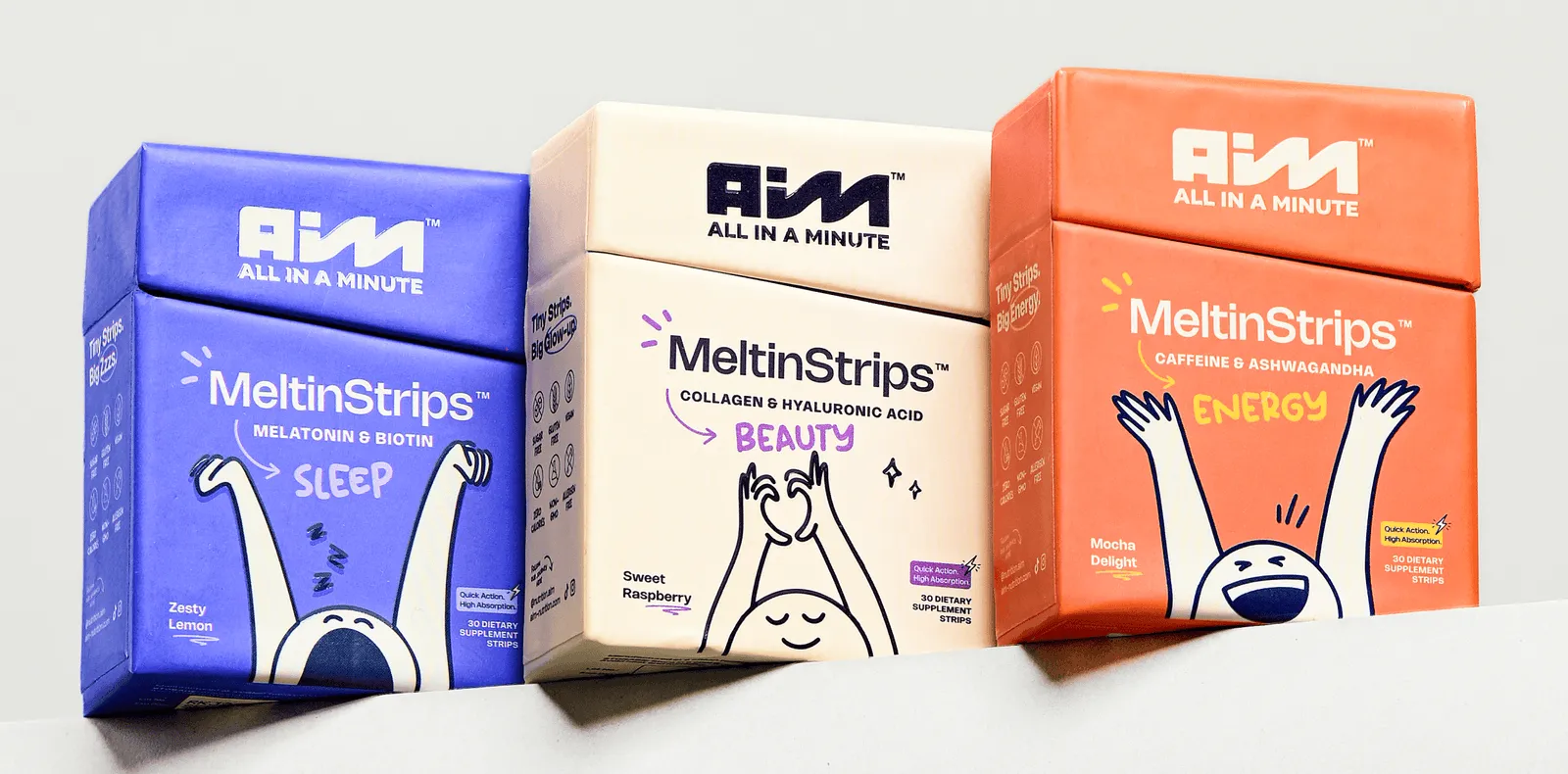
Deep Brand Immersion: We start by understanding your values, audience, and market. For example, in the case of AIM Nutrition, this meant uncovering key attributes, simplicity, trust, and empowerment, which shaped the entire packaging system.
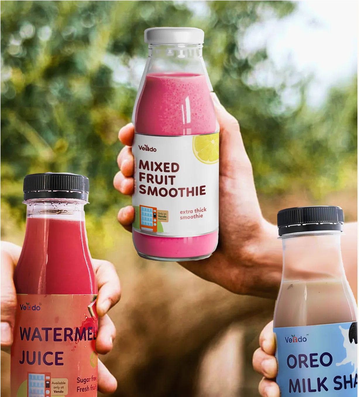
Visual Design Excellence: Thoughtful use of color, typography, and imagery builds instant recognition. For ITC B Natural Coconut Water, we replaced photography with clean illustrations to enhance transparency and shelf distinction.
Structural Innovation: Packaging structures are designed to improve usability and reflect brand evolution. With Desi Minimals, we expanded their minimal palette to create a system that feels modern, flexible, and timeless.
Our work has been featured by Packaging of the World, Dieline, and World Brand Design Society.
Confetti’s projects like AIM Nutrition, ITC Bingo Chatpat Kairi, and WhatABite showcase how brand-aligned packaging drives recognition and trust.
Get in touch with our experts and see how strategic packaging can become your strongest brand asset.
What does it mean to align design with brand identity?
Aligning design with brand identity means ensuring all visual and experiential design elements consistently reflect your brand's core values, personality, positioning, and messaging. This includes matching colors, typography, imagery style, tone, and overall aesthetic across all touchpoints to create cohesive, recognizable brand experiences.
Why is brand-design alignment important?
Brand-design alignment is the key to building recognition, establishing trust, creating professional perception, differentiating from competitors, improving marketing effectiveness, increasing brand equity, ensuring consistency across touchpoints, and ultimately driving business results through stronger brand connections with target audiences.
What are brand guidelines and why do you need them?
Brand guidelines are documented standards specifying how brand elements should be used, including logo variations, color specifications, typography rules, imagery styles, tone of voice, and application examples. They ensure consistency, enable scalability, maintain quality, guide external partners, and protect brand equity.
How often should you review brand-design alignment?
Review quarterly for tactical consistency checks, annually for comprehensive brand audits. Branding and packaging experts like Confetti can assist you with these audits and also help you align your brand identity systems with your packaging.
Can brand identity evolve while maintaining alignment?
Yes. Successful brands evolve through strategic refreshes that update visual elements while maintaining core identity. Gradual evolution (adjusting colors, modernizing typography) maintains recognition better than complete overhauls. Document changes in updated guidelines and communicate evolution internally and externally.
Want strategic branding and packaging like this for your business?


.webp)
.webp)


.webp)
.webp)
.webp)
.webp)
.webp)


.svg)
.webp)
.svg)
.webp)