%201.webp)
02
AI Snaps
.svg)
.svg)
01
Our Work

03
About Us
05
Contact Us
06
Client Success

07
Blogs
08
Careers
Book A Call


Need Help In Building Your Brand?
Click the button below & book a call with our founder directly.

Rishabh Jain
Managing Director
A practical rebranding checklist is a decision-making framework. It diagnoses before it designs, sequences execution to prevent costly rework, and protects your investment long after launch.
This guide gives you a complete, phase-by-phase rebranding checklist built specifically for how consumer brands actually operate so your rebrand delivers commercial outcomes, not just a new logo.
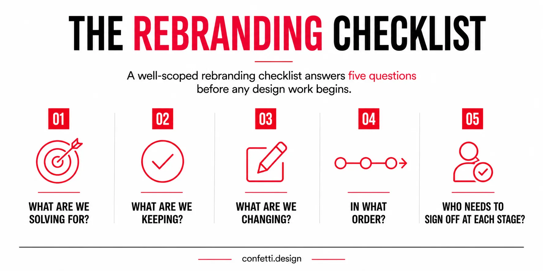
A rebranding checklist is a structured framework that covers every strategic, creative, and operational decision required to change how a brand presents itself.
It is a decision-making tool that prevents your rebrand from becoming an expensive exercise in inconsistency.
A proper rebranding checklist does three things:
A rebranding checklist must adapt to the complexity of your business.
A rebrand for a D2C skincare brand with 3 SKUs is very different from one for an FMCG brand with dozens of products, multiple packaging formats, and omnichannel distribution.
At Confetti, we've seen brands ask for a simple logo refresh, only to discover outdated packaging, an inconsistent website, and fragmented social visuals. A checklist helps you understand the full scope before you begin.
The scope conversation also separates a brand refresh from a full rebrand.
☑️A brand refresh usually updates visual elements: typography, colour palette, photography style, while keeping the brand name, core positioning, and messaging architecture intact.
☑️A rebrand, by contrast, can involve renaming, repositioning, or even a complete overhaul of the brand’s reason for being.
The checklist for each looks different. Confusing the two is how budgets double and timelines triple.
The mistake most founders make is defaulting to a full rebrand when a refresh would have solved the problem, or reaching for a refresh when the real issue is a broken positioning strategy.
Use this three-question Rebrand Scope Selector to decide:
If your answers point only to aesthetics, you need a refresh. If strategy is misaligned, you need a partial or full rebrand.
Starting creative work before answering these three questions is the most expensive mistake in the rebranding process.
📌The checklist we outline in this article is designed for a full rebrand. If you are doing a refresh, you will skip some phases. If you are doing a full repositioning, you will double down on Phase 1 and Phase 2. Either way, the structure holds.
Unlike a generic numbered list, this checklist is structured as a gated process: each phase has a clear output, and you do not move to the next phase until that output is locked.
In this phase you are establishing a factual, evidence-based diagnosis of what is broken and what needs to change.
You set the boundaries of the rebrand before the brief is written.
CHECKLIST:
☐ Define the root cause of the rebrand. Eg: "Our positioning no longer reflects the audience we serve" is a root cause.
☐ Conduct a brand audit covering: positioning accuracy, visual identity consistency, messaging clarity, touchpoint coherence, and perception gaps between how the brand presents itself and how customers describe it
☐ Gather competitive intelligence: Map direct and indirect competitors’ identity, messaging, and shelf presence. Identify whitespace: what they say and do that you don’t, and where you can clearly differentiate.
☐ Map existing brand equity: which associations, recall cues, and emotional meanings the current brand holds and in which audiences.
☐ Apply the Brand Equity Preservation Map: plot each brand element on a 2×2 grid: Recognisability (High/Low) on one axis, Positive Consumer Association (Strong/Weak) on the other.
Elements that are highly recognisable and strongly positive: protect. Elements that are unrecognised and weakly associated: retire. The middle quadrants require judgment.
☐ Define what must be protected: heritage cues, colour equity, naming associations, category signals that customers use to identify you
☐ Define what must be retired: visual conventions, messaging claims, or positioning language that no longer reflects the brand's actual offer or audience
☐ Set measurable success metrics: marketplace conversion rate, new customer acquisition cost, aided brand recall in target segment, repeat purchase rate
☐ Inventory all brand assets: Audit all current assets:logos, fonts, colour codes, templates, and physical materials and identify which are owned, licensed, or restricted.
☐ Inventory every active brand touchpoint, this becomes your rollout map in Phase 4
✅Phase 1 Gate: A written scope decision and a documented list of what to protect, evolve, and retire. No briefs issued until this is signed off by key stakeholders.
This phase defines the brand strategy before design begins, ensuring visual work is built on a clear direction.
CHECKLIST:
☐ Reconfirm or redefine the brand's positioning statement: target audience, brand competing category, core benefit it delivers, and reason a competitor cannot credibly claim the same thing
☐ Validate new positioning with real customers before committing to creative execution. Qualitative interviews (6-10 customers who represent your ideal buyer), concept testing, or structured surveys. Do not skip this.
☐ Redefine the target audience if it has shifted, and document the delta. What is different about their channel behaviour, decision-making process, and category knowledge compared to your original audience?
☐ Build a revised messaging hierarchy: primary brand claim → two to three supporting proof points → tone of voice principles
☐ Redefine brand personality using behavioural examples. "Bold" means nothing without showing what bold sounds like in a product description, a customer service response, and an Instagram caption.
☐ Assess brand architecture if the rebrand affects a portfolio. Does the new identity system need to work across sub-brands, product lines, or SKU extensions?
☐ Get written stakeholder alignment before any creative begins: leadership, investors (where relevant), and key distribution partners. Rebrands that meet internal resistance at the execution stage almost always skipped this step.
For D2C brands, positioning must work across every channel, from social media to product pages to packaging. If it only works in one, it's a campaign, not a positioning strategy.
At Confetti, we use the PIPES framework: Positioning, Identity, Packaging & Physical Presence, Experience, and Share of Voice, to test whether a brand is truly differentiated or simply looks different. True differentiation is ownable, defensible, and hard to copy. Visual distinction isn't.
✅Phase 2 Gate: A signed-off positioning document and a messaging hierarchy that at least three people who weren't in the room can apply consistently. If it requires a presentation to explain, it is not clear enough yet.
This is where strategy becomes identity. Complete every sub-phase in order: visual identity first, then packaging, then messaging and guidelines.
CHECKLIST:
☐ Logo system: primary logo, wordmark, symbol mark, and usage rules across light and dark backgrounds, minimum size limits, and exclusion zones.
☐ Colour palette: primary, secondary, and functional colours with hex, CMYK, and Pantone codes.
☐ Typography system: headline, body, and accent typefaces with clear hierarchy rules. Include web-safe alternatives for contexts where custom fonts cannot be embedded.
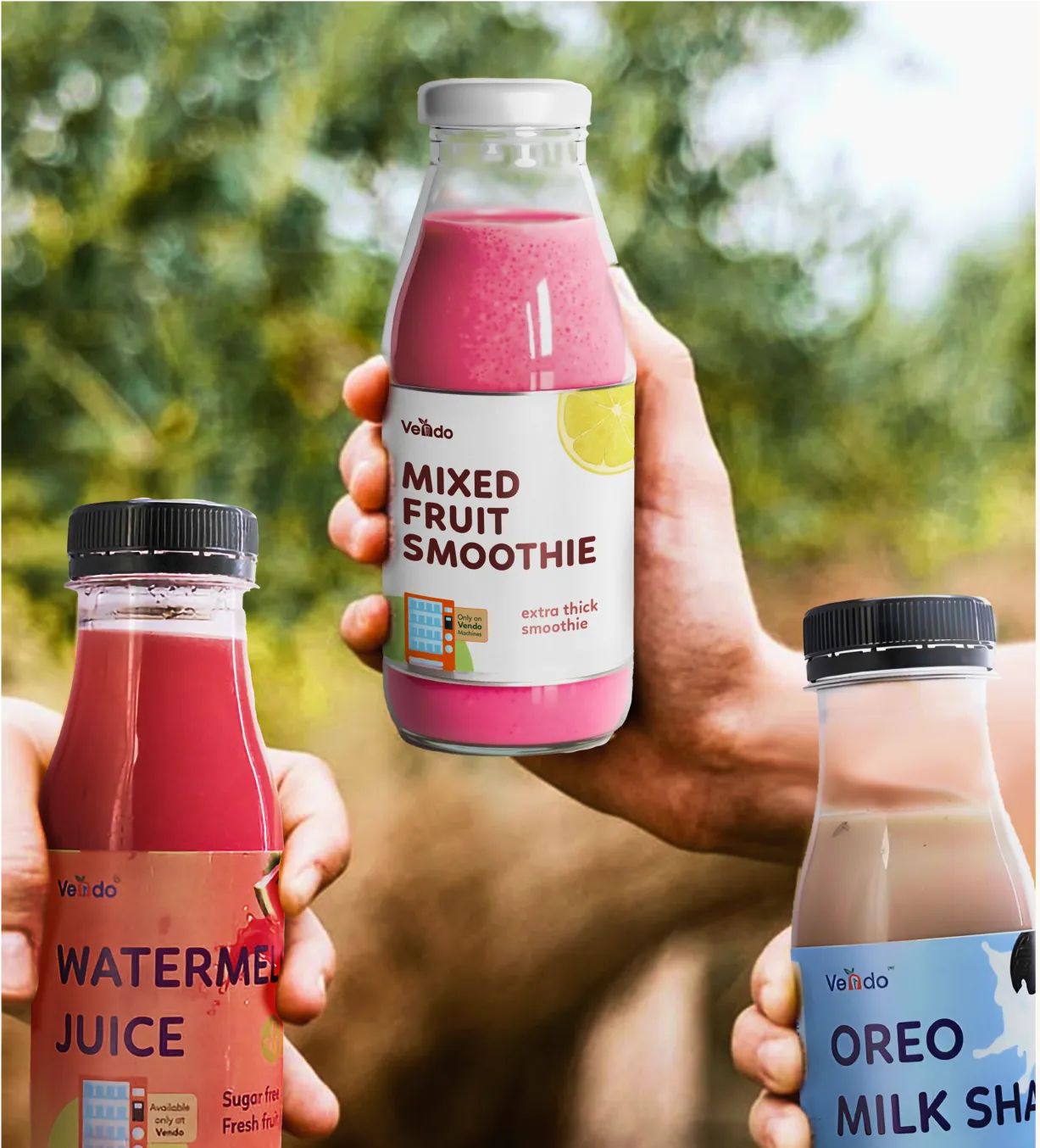
☐ Photography and imagery art direction: style, mood, lighting, subject guidelines, and negative examples. Critical for D2C brands where founder photography, product detail shots, and lifestyle imagery are primary conversion drivers.
☐ Iconography and graphic language: illustration style, pattern system, and texture usage rules, all documented so the brand can create new assets without referring back to the agency for every execution.
CHECKLIST:
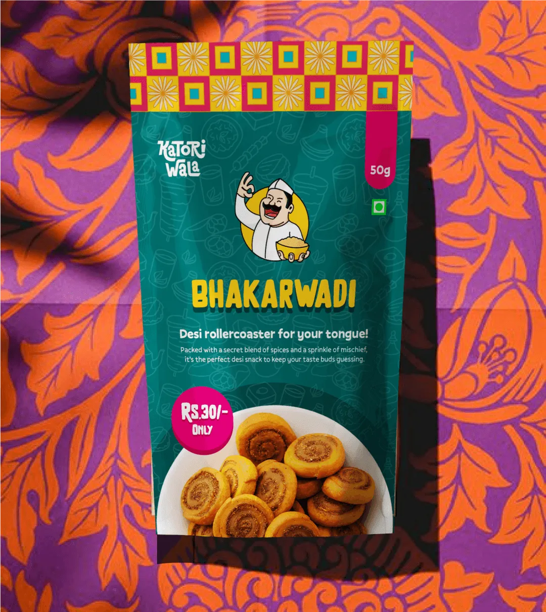
☐ Packaging design brief aligned with new positioning: what must pack communicate at shelf, as a marketplace listing thumbnail, and inside an unboxing video? Each is a different context, and the design must perform in all three.
☐ Structural packaging decisions: If the rebrand includes new formats or materials, finalize them before artwork begins. Late changes lead to costly reprints and production delays.
☐ Shelf impact testing: Test packaging where it competes, on a retail shelf or marketplace category page, not in isolation. The goal is to stand out against direct competitors.
☐ Regulatory and compliance mapping: FSSAI labelling requirements for food brands, CDSCO requirements for health and wellness products. These must be designed within.
☐ Barcode placement, QR code integration, and batch coding areas: Confirm dielines with your printer before finalising. Missing or late-checking them is a common cause of pre-press delays and extended timelines.
☐ Design clear information hierarchy: prioritising legal, nutritional, and compliance details while guiding the eye from brand to variant to benefit.
☐ Build a scalable multi-SKU architecture that distinguishes variants without losing a consistent brand system, then test it with existing and new consumers.
☐ Prototype in physical form: validating structure, unboxing, and shelf impact through real-world or simulated shelf tests.
☐ Marketplace image set: main image, lifestyle image, infographic panel, and A+ content templates all need to reflect the new identity simultaneously at launch.
CHECKLIST:
☐ Brand story document: one narrative that explains who the brand is, what has changed, and why, used by all internal teams and external partners. Written in plain language, not brand-speak.
☐ Revised tagline or brand claim (if changing): tested for recall and distinctiveness, and cleared for trademark conflicts before printing or publishing
☐ Tone of voice guidelines with positive and negative examples: For each principle, show what it looks like in a product description, a customer complaint response, and a social media caption.
☐ Brand guidelines document: compile all visual and verbal rules into a single, usable document before any execution begins.
☐ Governance rules: who approves brand application? What is the process for retail partners, marketplace teams, and external vendors using the brand assets?
✅Phase 3 gate: A completed, approved brand guidelines document. No touchpoint is updated until this document exists and has been reviewed by at least one person responsible for each execution context (marketing, packaging, digital).
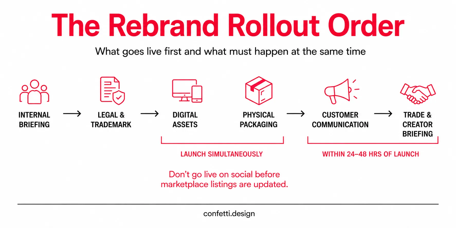
This is where most rebrands fail, when rollout is inconsistent. Old and new identities appear side by side across platforms, creating confusion and diluting the investment in strategy and design.
💡The governing principle: Internal before external. Digital before physical. All digital simultaneously.
☐ Brand training for all customer-facing teams: what changed, why it changed, and how to explain the rebrand to customers who ask. Sales, support, field, and retail teams must be briefed before the public launch.
☐ Internal brand kit distributed: updated presentation templates, email signatures, letterheads, and internal documents. Brand drift starts internally before it shows up externally.
☐ Inventory management plan: current packaging stock drawn down or clearly quarantined before new packaging begins shipping.
☐ Trademark filings submitted for new name, logo, or brand claim via IP India's trademark search portal before public launch. The filing date establishes priority. Registration takes 18–24 months, but protection begins at filing.
☐ Domain name secured, social handles reserved
☐ All existing contracts, licensing agreements, and distributor agreements reviewed for brand name and identity references that require updating
This is the single most operationally complex step for D2C brands. The list of digital touchpoints is longer than most rebrand projects account for.
☐ Website: homepage, all product pages, meta titles, OG images, favicon, and brand assets updated. Do not go live with a partial update.
☐ Marketplace listings: Amazon, Flipkart, Meesho, Blinkit, Zepto, Nykaa, and any other active platforms: main image, secondary images, A+ content, brand store, sponsored ad creative, and search banners all updated.
☐ Social media profiles: bio, profile image, highlights, pinned posts, and link-in-bio pages
☐ Email marketing: templates, header graphics, sender name display, and brand voice in all active automations and campaign sequences
☐ Paid advertising: every live creative updated before the rebrand goes public. Old brand assets running in paid media alongside a new identity is a visible inconsistency that erodes trust with new customers who encounter the brand for the first time.
☐ New packaging cleared for print production and ready to ship before the digital launch goes live. The customer journey must be consistent: new identity online, new identity in the delivery.
☐ Retail shelf: updated POS materials, shelf talkers, and display units. Notify retail partners before the rebrand goes public so they can manage the transition on their end.
☐ Unboxing experience: box, tissue, inserts, thank-you card, and brand touchpoints inside the package must all reflect the new identity. The unboxing moment is a social content opportunity, mismatched internal packaging wastes it.
☐ Customer communication plan: plan how and when to communicate the rebrand to existing customers. For D2C brands, a simple, confident message explaining what changed and why is enough, no over-explaining or defensiveness.
☐ Trade partner communication: distributors, modern trade buyers, and key retail partners need to know before the public announcement. Surprises damage commercial relationships.
☐ Influencer and creator briefing: send updated brand messaging, creative guidelines, and any relevant talking points to all ongoing partnerships before the rebrand launches.
✅Phase 4 Gate Criteria:
A common D2C rollout mistake is updating Instagram before marketplaces. Customers see the new brand on social, then find an outdated identity on product listings—creating confusion at the moment of purchase.
Launch is not the finish line. This phase protects the investment you just made.
CHECKLIST:
☐ Monitor marketplace conversion rates against pre-rebrand baseline for 8–12 weeks. A well-executed rebrand should show improvement. A decline in this window warrants immediate investigation.
☐ Track brand search volume using Google Search Console and marketplace search analytics. Watch for drops in branded search that signal recognition loss in existing customers.
☐ Collect structured customer feedback at 30 days: do new customers understand the brand? Do existing customers feel the rebrand reflects the product they've bought from you before?
☐ Monitor social sentiment: track organic mentions of your new brand identity and note tone. If the rebrand generates confusion rather than recognition, identify the specific touchpoints driving it.
☐ Conduct an internal consistency audit at 30 days and again at 90 days. Brand drift begins within weeks of launch. The 90-day audit catches it before it becomes structural.
☐ Identify and correct any touchpoints missed in the Phase 4 rollout. There will always be some.
☐ Document what worked and what didn't. A post-rebrand retrospective is the most useful input for your brand guidelines governance process going forward.
📌Brand drift is real. Most rebrands start consistent but fragment within months as teams create new assets outside the guidelines. A 90-day audit helps keep the system intact and the investment protected.

At Confetti, we treat rebranding as a strategic partnership.
We are not here to deliver a logo and leave. We are here to build a brand system that drives commercial outcomes for your business
✨Our approach begins with immersion. We engage with founders, understand their vision, and study their market. We analyse competitors, identify whitespace, and uncover opportunities that the brand is not currently exploiting.
This research phase ensures that every design decision is grounded in market reality, not personal preference.
✨We then move to strategy. We define the brand’s positioning, personality, and messaging architecture. We translate these strategic decisions into creative briefs that guide every designer on the team.
✨The creative phase is where strategy becomes tangible. We develop visual identities, packaging systems, and messaging frameworks that are scalable, consistent, and commercially viable. We test designs against real-world constraints: shelf impact, production feasibility, consumer psychology, before they go to production.
We have applied this approach across industries: FMCG, fashion, beauty, health and wellness, and D2C. We have rebranded legacy brands like ITC Aashirvaad and Cookwell, modernising them without alienating loyal customers.
We have built brand worlds for challenger brands like Slosh & Co., positioning them as category disruptors. We have refined identities for emerging brands like Desi Minimals, bringing clarity to their expression.
We focus on outcomes, not aesthetics alone. Design must earn its place through shelf impact, engagement, recall, and sales. Success is measured commercially, not visually.
We also see rebranding as continuous, not one-off. Brands evolve, and systems must stay flexible while remaining consistent and coherent over time.
Use this as your working checklist. Print it, share it with your team, and check off each item before moving to the next phase.
Phase 1: Diagnosis and Scoping
☐ Define the root cause of the rebrand (not the symptom)
☐ Conduct a full brand audit
☐ Gather competitive intelligence
☐ Map brand equity: what to protect vs. retire (use the Brand Equity Preservation Map)
☐ Apply the Rebrand Scope Selector: Refresh / Partial / Full
☐ Inventory all active touchpoints
☐ Set measurable success metrics
Phase 2: Strategy and Positioning
☐ Confirm or redefine brand positioning
☐ Validate with target customers before creative begins
☐ Redefine target audience and document the delta
☐ Build revised messaging hierarchy
☐ Define brand personality with behavioural examples
☐ Get written stakeholder sign-off
Phase 3: Identity and Creative System
☐ Logo system with usage rules
☐ Colour palette with hex, CMYK, and Pantone codes
☐ Typography system with hierarchy rules
☐ Photography and imagery art direction
☐ Packaging design brief covering shelf, thumbnail, and unboxing contexts
☐ Regulatory compliance check (FSSAI / CDSCO where applicable)
☐ Marketplace image set briefed simultaneously with packaging
☐ Brand story and messaging documents
☐ Brand guidelines document completed and approved
Phase 4: Rollout and Launch
☐ Internal brand training completed
☐ Inventory managed: no split inventory on launch
☐ Trademark filing submitted
☐ All digital touchpoints updated simultaneously
☐ All marketplace listings updated (Amazon, Flipkart, Blinkit, Zepto, Nykaa)
☐ Paid advertising creative updated
☐ New packaging cleared for production before digital launch
☐ Unboxing experience updated
☐ Customer communication executed
☐ Trade and influencer partners briefed
Phase 5: Post-Launch Monitoring
☐ 30-day consistency audit
☐ 90-day brand health review
☐ Marketplace conversion tracked vs. baseline
☐ Customer feedback collected and reviewed
☐ Brand drift assessment completed
What is a rebranding checklist?
A rebranding checklist is a tool that covers every strategic, creative, and operational decision required to change how a brand presents itself including positioning, visual identity, messaging, and all brand touchpoints. It is designed to prevent costly omissions and ensure that the rebrand is consistent from internal briefing through to customer-facing launch.
What is the first step in a rebranding process?
The first step is diagnosing why the rebrand is needed and defining its scope. Before creative work begins, you need to determine whether the problem is strategic (wrong positioning), executional (inconsistent application), or both. A brand audit and brand equity assessment are the prerequisites. Starting with visuals before this diagnosis is how rebrands fail.
How long does rebranding take for an Indian D2C or FMCG brand?
A brand refresh typically takes 6–10 weeks from strategy brief to asset delivery. A partial rebrand runs 10–16 weeks. A full rebrand covering positioning, identity, packaging, and phased rollout is realistically 4–6 months. Brands that compress this timeline tend to skip the diagnosis and customer validation stages, which is where most rebranding failures originate.
What are the biggest rebranding mistakes Indian brands make?
Three are most common: rebranding before confirming positioning with real customers, failing to manage the rollout so old and new identities coexist across platforms, and discarding brand equity that was actually driving conversion. The fourth, specific to Indian D2C brands: designing packaging for physical shelf without testing how it performs as a Blinkit or Amazon thumbnail.
Do I need to trademark my new brand identity before launching?
Yes, submit the trademark filing before the public launch, not after. In India, trademark registration is filed via IP India under the relevant class. Registration takes 18–24 months, but the filing date establishes priority. Before committing to a new name or logo, conduct a trademark search to verify that no competing registration exists in your product category. This step protects the investment in the rebrand.
Want strategic branding and packaging like this for your business?


.webp)
.webp)


.webp)
.webp)
.webp)
.webp)
.webp)


.svg)
.webp)
.svg)
.webp)