%201.webp)
02
AI Snaps
.svg)
.svg)
01
Our Work

03
About Us
05
Contact Us
06
Client Success

07
Blogs
08
Careers
Book A Call


Need Help In Building Your Brand?
Click the button below & book a call with our founder directly.

Rishabh Jain
Managing Director
Typography branding is often overlooked and can have a significant impact on your brand’s visual identity - making or breaking the overall impression you create.
Explore with us all you need to know about typography in branding, from the psychology of font selection and cultural perceptions to building a complete typography system and handling complex licensing requirements.
Studies show that typography has a strong impact on consumers’ motivation, opportunity, and ability to process brand information.
Typography branding is the judicious selection and implementation of typefaces that visually express your brand's personality, values, and tone across all touchpoints.
Just as color influences emotion, typography shapes perception, example:
Over time, this visual consistency allows people to identify a brand from text alone, even without seeing a logo.
Typography, Font and Typeface are often used interchangeably. But, for branding and design, they mean very different things.
Typeface: A typeface is the overall design style of a set of characters. It is the visual identity of the letters themselves.
Examples: Helvetica, Garamond, Futura, Roboto.
Font: A font is a specific version of a typeface, defined by weight, size, and style.
Examples: Helvetica Bold 12pt, Garamond Regular 10pt, Roboto Italic 16pt.
Typography: Typography is the art and system of arranging type to make written language readable, usable, and visually appealing. It includes decisions about:
So, typography branding does not just mean that you select a typeface. You build a typography system that works consistently across digital and print platforms.
Along with logo design and colour choice, typography is a core pillar of brand identity. It is important for the following reasons:
1. Typography Defines Brand Personality and Tone
Fonts communicate emotion instantly.
A financial services firm using a classic serif projects trust and authority. A startup using a geometric sans-serif feels innovative and user-friendly.
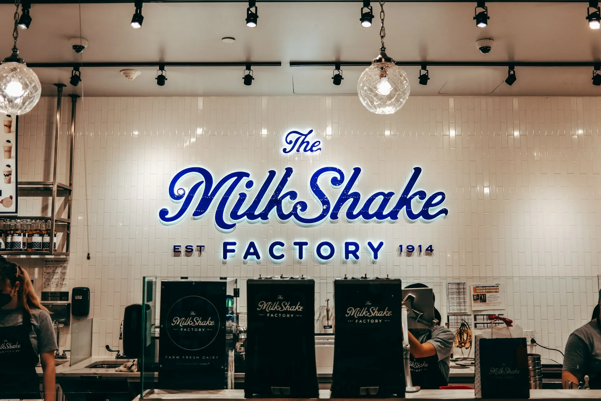
For example, for Miduty branding, we chose Poppins - a clean, versatile, approachable typeface that aligned with the brand's core values of trust, calmness, and clarity. The font didn't just look good; it communicated credibility to a quality-conscious audience.
2. Typography Builds Recognition and Consistency
Consistent typography across your website, packaging, and marketing can be used to create brand recognition.
Over time, audiences associate a particular font with your brand, making it easier for them to recognize and recall your brand in the future.
This consistency strengthens brand recall and supports omnichannel branding across digital, print, and mobile platforms.
For example, when you see the Coca-Cola logo written in its signature cursive script, you instantly recognize it without even seeing the brand name.
The same goes for brands like Disney, Nike, and Google, which have distinct and recognizable typography that sets them apart from their competitors.
3. Typography Improves Readability and User Experience
Good typography is not only aesthetic. It is functional.
It directly affects:
Poor typography can make it difficult for your audience to read and understand your messaging, resulting in confusion and disengagement.
On the other hand, using a clean and easy-to-read typeface can make it easier for your audience to engage with your content and absorb your messaging.
This is especially important in today’s digital age, where people consume vast amounts of content on screens and devices.
4. Typography Builds Trust and Professionalism
Clean, well-structured typography signals a brand’s attention to detail.
It subconsciously tells users that your brand is credible and established. Inconsistent or cluttered typography makes you look amateur and unreliable.
5. Typography Differentiates You from Competitors
In saturated markets, typography can become a brand differentiator. Custom or well-defined type systems help your brand stand apart when competitors are using generic fonts.
Luxury brands often use refined, high-contrast serif typography. Tech brands prefer minimal sans-serif systems.
Creative brands experiment with expressive typography layouts. Each choice reinforces positioning.

Typography is the visual voice of a brand. It not only impacts the brand personality, but also impacts the consumer at the psychological level.
Let’s break it down:
Each font category carries built-in psychological and cultural associations.
Choosing the wrong one can create confusion, making the visual message clash with the brand’s intent.
These feature small strokes at the ends of letters. They communicate stability, authority, heritage and professionalism.
Examples: Times New Roman, Garamond, Baskerville.
Best For: Law firms, universities, financial institutions, and luxury heritage brands
Sans-serif fonts remove decorative strokes and emphasize clean geometry to improve legibility. They signal innovation, simplicity, transparency and approachability
Examples: Helvetica, Arial, Futura, Montserrat
Best For: Tech, SaaS, and lifestyle brands.
These mimic handwriting or calligraphy. They work best for logos, headlines, or packaging accents rather than body text due to readability limits.
These fonts communicate creativity, emotion, craftsmanship, and luxury or intimacy
Best For: Beauty, fashion, wedding, and artisanal brands
These fonts are expressive and highly stylized. They reflect confidence, energy, creativity, and differentiation
Best For: Posters, entertainment branding, and campaigns where attention is the primary goal
Typography triggers emotional responses that influence trust and buying behavior:
1. Cognitive Fluency (Ease of Reading): Fonts that are easy to read create comfort. For consumers that translates into trust and positive brand perception.
Difficult or decorative fonts increase mental effort and can create frustration or doubt.
2. Visual Weight and Pressure: Thin and light fonts suggest elegance, refinement, and exclusivity. Bold and heavy fonts suggest power, urgency, and strength.
Luxury brands often use thin, high-contrast serif typography with generous spacing. Youth-focused or action-oriented brands like SuperYou use heavier weights to create excitement.
3. Shape Psychology: Rounded fonts feel friendly and safe, while angular fonts feel precise, aggressive, and fast.
This is why many hospitality and lifestyle brands favor rounded letterforms, while gaming or sports brands use sharp, angular typography.
4. Human Connection: Handwritten and organic fonts create a sense of warmth and authenticity.
They make brands feel less corporate and more personal, which is effective for handmade products and community-driven brands.
Cultural perception shapes how typography is read emotionally and symbolically. A font that feels trustworthy in New York may feel colonial in Mumbai or outdated in Tokyo.
Typography branding is visual language, and culture determines its meaning. Let’s break it down:
In North America and much of Europe:
Luxury branding in cities like Paris, Milan, and New York City often uses thin serifs with generous white space to signal exclusivity.
Markets such as Japan, China, and South Korea interpret typography through complex character systems.
Latin fonts must be redesigned and not simply translated.
Arabic typography has deep roots in calligraphy and religious art.
Ignoring this heritage risks appearing culturally insensitive. Successful brands blend modern design with traditional visual rhythms.
Successful global brands treat typography as a flexible system rather than a fixed asset.
By respecting cultural context, they build stronger emotional connections, higher trust, and more effective international brand identities.
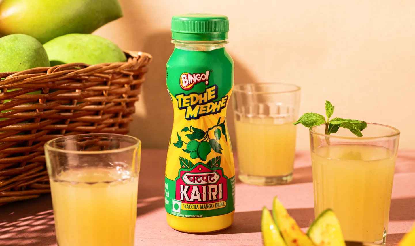
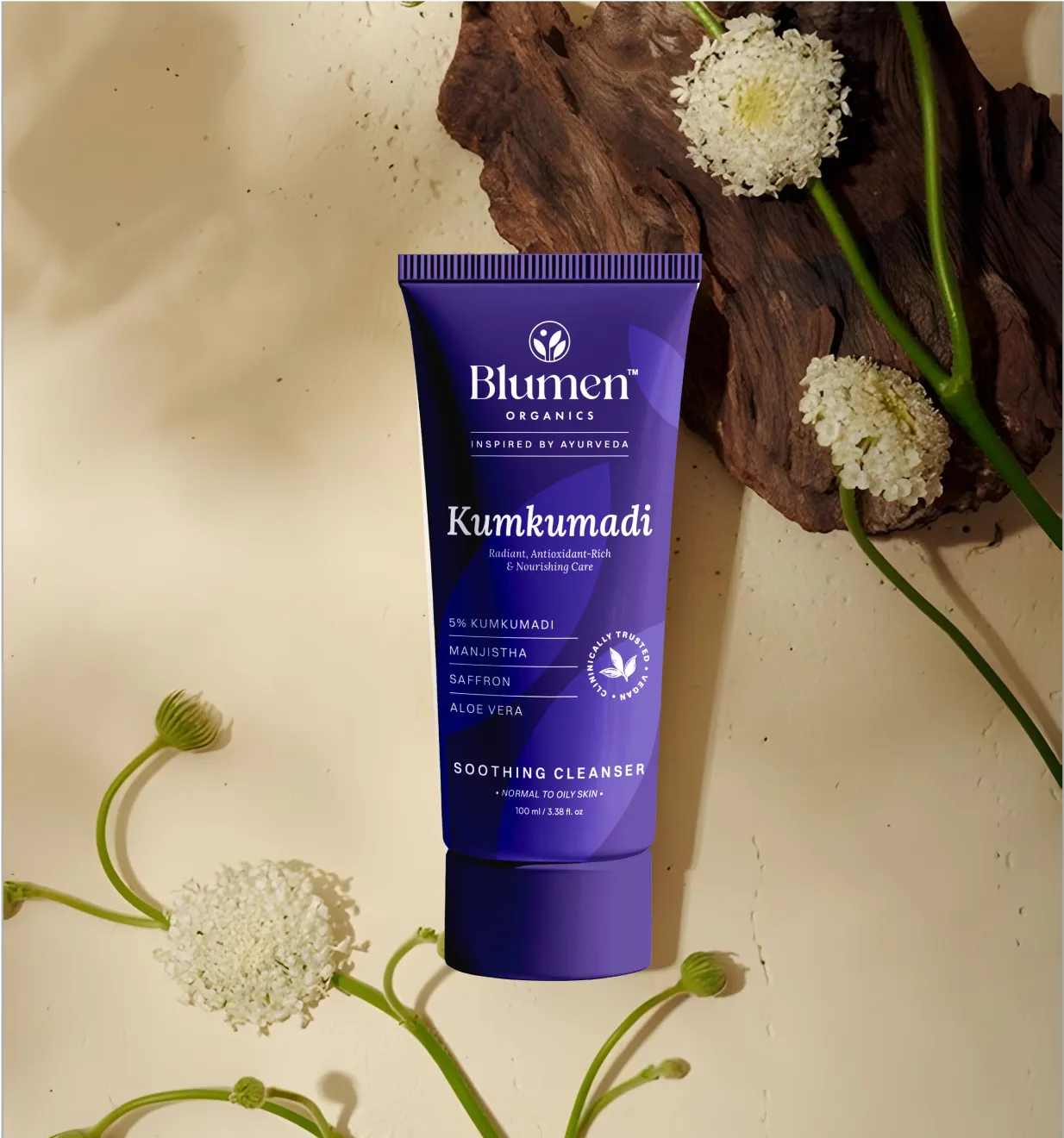
A brand typography system for packaging design defines which fonts to use and how to style them consistently on labels, boxes, bottles, and wrappers.
It helps shoppers recognize your brand, understand product information quickly, and feel the right emotional connection at the shelf.
A strong packaging typography system must be clear, legible, and adaptable across different materials, sizes, and printing methods:
A professional typography system includes 2-3 fonts, each with a defined role.
Limiting fonts prevents visual clutter and ensures clear, disciplined brand communication.
Primary Font:
It carries the strongest expression of brand personality. It is most distinctive and visually associated with your brand
Select a font that reflects brand tone (modern, luxurious, playful, authoritative).
Make sure it performs well at large sizes, remains legible at medium sizes and under different lighting conditions in retail environments.
Usage: Logo/wordmark, Logo or wordmark, product name, front-of-pack headlines, key benefit statements or promotional badges (e.g., “New”, “Organic”, “Premium”)
Secondary Font:
The secondary font supports clarity and readability. It handles all detailed information that customers need to scan quickly.
Secondary fonts should be neutral and highly legible, especially at small sizes. They must print clearly on different materials such as cardboard, plastic, foil, or glass.
Usage: Ingredients list, instructions for use, nutritional facts, subheadings, Legal and regulatory text, or Product descriptions
Tertiary Font:
Not every brand needs a tertiary font. Introduce one only if the primary and secondary fonts cannot handle a specific role.
This font may be condensed, script, or monospace depending on the need. It should be used sparingly.
Overuse weakens brand consistency and makes packaging feel cluttered.
Usage: Callout labels (e.g., “Limited Edition”), Weight or volume indicators, Batch codes or serial numbers, Campaign graphics
Typography hierarchy guides readers on what to notice first, second, and third. Without it, content becomes visually noisy and hard to scan.
For brands, having a strong hierarchy improves comprehension, user experience, and conversion.
Typography hierarchy guides shoppers on what to read first, second, and third.
On packaging, this is critical because attention spans are short and shelf competition is high.
Core Hierarchy Levels in Packaging Typography
Start with a size system: Define consistent size relationships. For example, product name at the largest size, benefits slightly smaller, and body text at the minimum legal readable size.
Use contrast intentionally: Hierarchy depends on contrast. Combine:
Use spacing as structure: White space helps separate information blocks like ingredients, warnings, and branding. Good spacing makes packaging feel premium and organized.
Apply color and case carefully: Uppercase text and brand colors can highlight key claims, but overuse reduces readability and causes visual fatigue.
Font pairing in packaging is about balance and clarity. Fonts should feel intentional together while serving different functions.
Some of the best practices include:
Serif + Sans-serif: Balances tradition and modernity.
Example: Starbucks often uses a classic serif for product names (evoking tradition) paired with a clean sans-serif for descriptive text and nutritional information.
Multiple weights of one family: Using light, regular, and bold weights from the same font family creates hierarchy without visual conflict.
Example: Apple frequently uses multiple weights of the San Francisco font on product packaging and user manuals, bold for headings, regular for body text, and light for captions.
Geometric + Humanist: Geometric fonts feel precise and modern, while humanist fonts add warmth and approachability.
Example: Coca-Cola’s limited-edition packaging sometimes combines geometric sans-serifs for modern product names with humanist serif or script fonts for secondary messaging, creating a friendly yet contemporary feel.
Font superfamilies: Some font families include serif and sans-serif versions designed to work together. These are safe and consistent choices for packaging systems.
Example: IBM Plex (a superfamily with serif, sans, and mono versions) is used in IBM packaging and branding materials, ensuring a unified look while differentiating headings from body copy.
Avoid
Always test fonts in real-world packaging conditions:
A font that looks perfect on screen may fail in print or at small sizes.
A typography system only works when it is documented clearly.
Your packaging brand guidelines should define:
✅Font names and licenses
✅Where each font is used (front pack vs back pack)
✅Hierarchy sizes and weights
✅Line spacing and letter spacing
✅Color rules for text
✅Minimum readable font size
✅ Accessibility and contrast standards
From your logo to your website, packaging, and social media, every touchpoint should have a consistent typography branding. It makes customers feel that you are stable and trustworthy.
Let’s see how:
It forms the foundation of your branding and shapes instant perception. Common typography-based logo styles include:
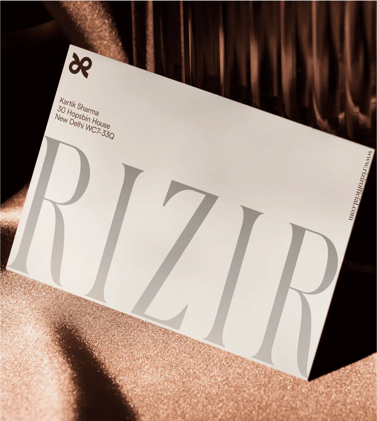
1. Wordmarks: It uses typography only (e.g. Google, Coca-Cola)
In typography branding, wordmarks rely entirely on font personality. Every curve, weight, and spacing decision makes a difference to the brand perception.
2. Lettermarks: It uses initials instead of full names (e.g., IBM, HBO, CNN).
Here the typography must focus on clarity, boldness, perfect spacing. With fewer letters, every detail becomes more visible. Kerning mistakes stand out immediately.
3. Custom Logo Typography: Some brands create unique typefaces to boost recognition. This makes it hard to copy and builds long-term brand recall.
If you choose to take this route, make sure the typeface is readable, scalable, effective across websites, business cards, billboards, and mobile screens.
Website typography directly affects user experience. Typography branding online must balance personality and readability.
1. Readability: Body text should be clean and easy to scan. Sans-serif fonts work best on screens, with sizes of 16px or larger and sufficient line spacing to reduce clutter.
Clear typography keeps users engaged.
2. Hierarchy: Use large headlines for structure, medium subheadings for sections, and clean body text for readability.
This hierarchy helps users know what to read first and improves navigation.
3. Mobile Optimization: Typography must adapt to mobile screens.
Thin fonts and tight spacing should be avoided.
Typography branding in print allows for texture, weight, and physical presence.
Packaging typography strongly influences buying decisions, and must be carefully selected.
1. Shelf Impact: Typography should match the product’s personality.
Luxury packaging often uses minimal serif fonts, while food packaging favors friendly or expressive fonts.
2. Legibility at Distance: Customers must be able to read your packaging from afar. Your message should be clear at a glance.
Font size and contrast are crucial, and thin fonts may disappear on shelves.
3. Print Quality Considerations: Fonts that look good on screen may not work in print. Typography interacts with materials: matte feels premium, glossy feels bold, and embossing or foil can add perceived value.
Always test physical samples, checking ink spread, material texture, and paper choice.
Social media is all about capturing attention in a split second. Your typography branding must stop the scroll.
1. Consistent Templates: Create typography templates for Instagram posts, stories, LinkedIn graphics, and YouTube thumbnails.
Consistent font use builds recognition even when the logo isn’t present.
2. Bold Headlines for Attention: Social feeds are crowded, so use large, high-contrast text with a clear hierarchy.
Typography on social media should focus on clarity, not decoration.
3. Adapt for Platform Culture: Each platform has its own tone:
LinkedIn favors professional typography, Instagram leans expressive, and TikTok benefits from bold, high-impact text.
Typography isn't decoration, it sets expectations, triggers emotion, and signals whether a product belongs on a premium shelf or gets scrolled past.
At Confetti Design Studio, we understand this better than most, which is why brands across categories keep coming back.
In a market where consumers make snap judgments, the brands that win aren't always the ones with the best product, they're the ones with the clearest visual language.
We at Confetti Design Studio help you break it down and implement it.
Let’s take a quick look at how brand typography and preferences change with the industry:
Fonts are software. When you buy itt, you are buying permission to use it under specific rules.
If typography is part of your brand identity, understanding font licensing is essential:
A font license is a legal agreement between you and the font creator. It defines how and where a typeface can be used.
Desktop License: Used for print, logos, packaging, PDFs, and other static images. It is installed on a limited number of computers and often restricted by the number of users. For example, if five designers use the font, you may need five licenses.
Web License: Required to embed fonts on websites and uses special web font files like WOFF or WOFF2. Pricing is often based on page views, and uploading a desktop font file to a website without a web license is usually illegal.
Many free fonts are labeled “personal use only.” This means they cannot be used for Logos, Advertising, Business websites, and Products for sale
If your typography connects to revenue, you must have a commercial license. Make sure you read the license terms.
Free Fonts (e.g., Google Fonts): Free for commercial use, easy to implement, and have no page view limits.
However, they are widely used, less distinctive, and often lack advanced features. Although safe, they may not help your brand stand out.
Premium Fonts: Offer higher design quality, better spacing and readability, and stronger brand differentiation.
They often include advanced language support and OpenType features, helping brands appear intentional and professional.
Some brands, such as Netflix and Airbnb, create their own typefaces.
Custom typography makes sense if you operate globally, need multi-language support, want full design control, or seek a unique visual asset.
The biggest benefit is ownership: your font becomes exclusive intellectual property with no recurring license fees.
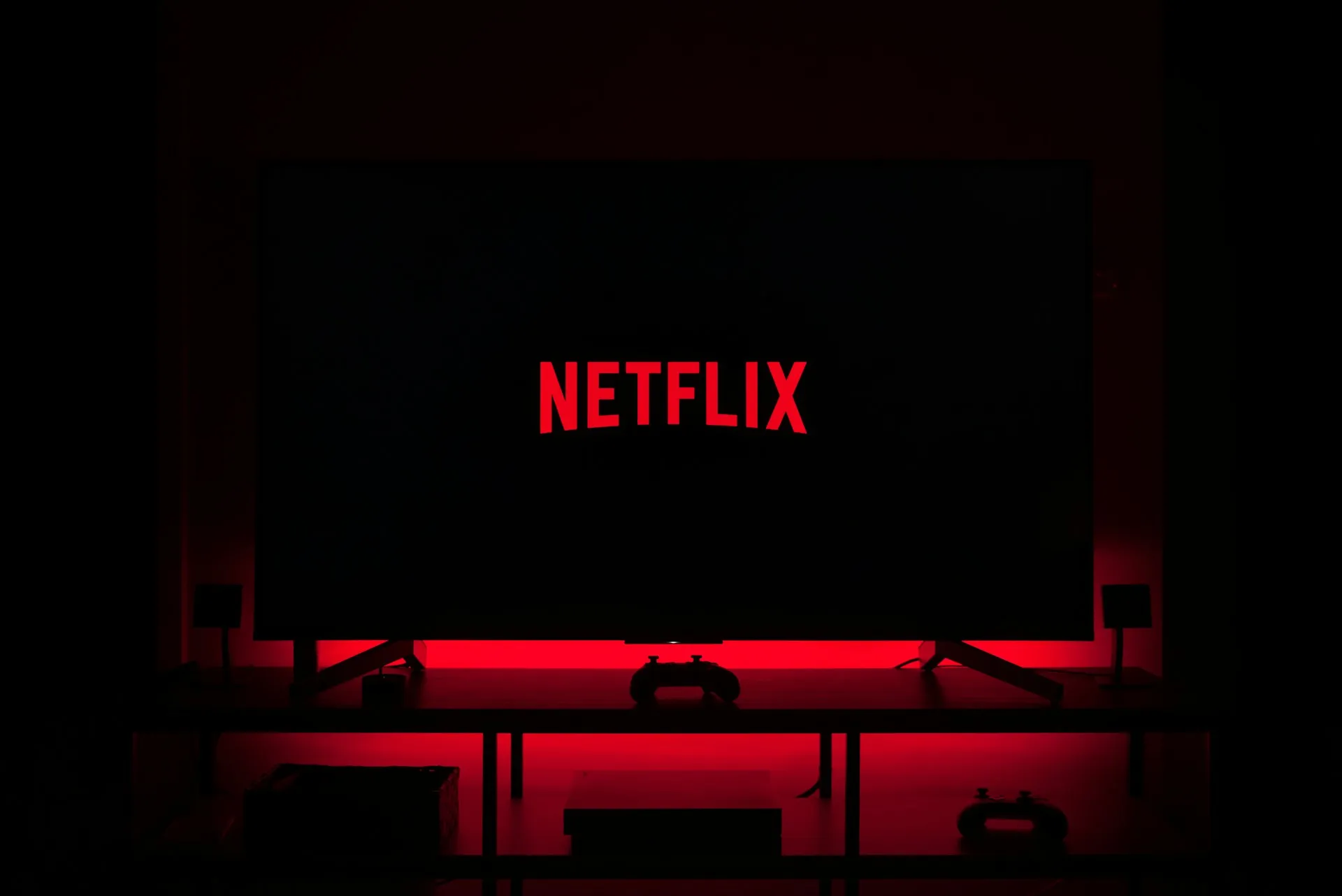
Netflix relies on a custom condensed sans-serif wordmark that makes a strong statement without the need for symbols or icons.
Netflix’s typography communicates confidence. The condensed forms feel urgent and modern, matching the brand’s promise of endless, premium entertainment with a global appeal
Glossier became known for its minimalist, direct-to-consumer aesthetic built on clean typography and generous white space. Its branding avoids visual noise and feels calm, modern, and approachable.
Glossier’s typography feels friendly and digitally native. It reflects the brand’s philosophy of “skin first, makeup second” and creates a trustworthy, welcoming visual space for customers.
In its 2021 brand refresh, M&M’s introduced a custom typeface called All Together to express fun, personality, and inclusivity.
M&M’s typography turns letterforms into brand ambassadors. Every character reinforces joy, color, and togetherness, making the typeface as expressive as the candy itself.
What is typography branding?
Typography branding is the selection and consistent application of typefaces that visually signal your brand's personality, values, and identity across all touchpoints and customer interactions.
How to choose fonts for brand identity?
Choose brand fonts by analyzing your brand personality, target audience preferences, industry standards, and ensuring versatility across digital and print platforms while maintaining legibility and uniqueness.
How many fonts should a brand use?
At Confetti, we recommend that brands limit typography to 2-3 font families: one primary font for headlines and branding, one secondary font for subheadings, and one highly readable font for body copy.
Can I use free fonts for my brand?
Yes, free fonts like Google Fonts can work for branding, but premium fonts offer greater uniqueness and differentiation. Choose a font based on your brand positioning and budget.
Should my logo font match my brand fonts?
Not necessarily. Logo fonts can be unique custom designs while brand fonts handle communication needs. However, they should complement each other and share similar personality traits.
Want strategic branding and packaging like this for your business?


.webp)
.webp)


.webp)
.webp)
.webp)
.webp)
.webp)


.svg)
.webp)
.svg)
.webp)