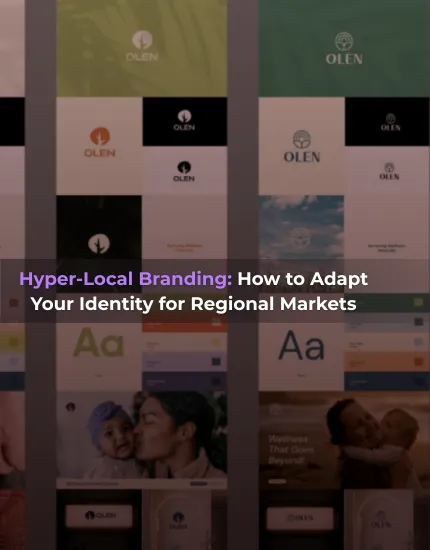
%201.webp)
02
AI Snaps
.svg)
.svg)
01
Our Work

03
About Us
05
Contact Us
06
Client Success

07
Blogs
08
Careers
Book A Call


Need Help In Building Your Brand?
Click the button below & book a call with our founder directly.

Rishabh Jain
Managing Director
The SuperYou vs WholeTruth branding battle represents one of the most fascinating case studies in India's ₹50,000 crore snacking market.
While both brands target health-conscious audiences, their approaches to branding, packaging, and market positioning is very different.
Explore how these two brands have carved distinct identities in the competitive wellness snack space.

In India's health and wellness food market, SuperYou and WholeTruth represent two sharply different branding philosophies.
From an FMCG branding and packaging perspective at Confetti, the differences are striking.
Before we break it down, here’s a quick snapshot of how the two brands stack up:
WholeTruth positions itself less like a product company and more like a consumer awareness movement focussed on a mission of “complete honesty.”
The brand aims to expose misleading labels, hidden ingredients, and half truths common in packaged foods.
Founder-led storytelling plays a central role here, with consistent education around food science and label literacy.
SuperYou positions itself as a performance-oriented, science-led health brand.
It focuses on improving energy, metabolic health, and everyday performance using expert-designed formulations.
Celebrity co-founder Ranveer Singh adds mass visibility, while the brand narrative leans toward “better alternatives to your indulgence” rather than strict clean eating.
Both brands are aimed at the same broad demographic with differences in what the target audience wants.
WholeTruth primarily appeals to:
SuperYou attracts:
This is where SuperYou vs WholeTruth branding becomes immediately visible.
WholeTruth’s brand voice is direct and educational, inviting dialogue and debate.
The narrative is founder-driven with a strong emphasis on consumer empowerment, encouraging people to question labels, ingredients, and marketing claims.
Its marketing relies heavily on organic education. They collaborate with nutritionists, educators, and fitness professionals.
Education is focussed on ingredient explainers, myth-busting posts, and long-form content are used to build credibility over time.
SuperYou’s, on the other hand, is calm, confident, and aspirational. Its voice is polished and expert-led. Its clear focus is performance rather than activism.
The communication is designed for mass appeal, prioritizing credibility, trust, and broad accessibility.
For marketing, SuperYou invests more in high-production campaigns, influencer marketing, and visual storytelling.
SuperYou partners with athletes, fitness creators, and lifestyle influencers aligned with performance and aesthetics.
Content highlights benefits like protein content, energy, and convenience rather than industry criticism.
Visual identity reinforces each brand’s philosophy. Here’s how each visual identity element differs for SuperYou Vs WholeTruth
Color psychology:
WholeTruth uses earthy, muted tones that signal honesty and simplicity.
SuperYou uses bold, energetic colors like red that signal science, vitality, and confidence.
Typography:
WholeTruth favors clean, highly readable fonts with information clarity.
SuperYou uses modern, structured typography designed to feel premium and performance-led.
Logo and consistency:
WholeTruth’s logo is minimal and understated, aiming at gaining trust.
SuperYou’s logo (in uppercase) is bold, aspirational, and designed for strong shelf and digital presence.
SuperYou maintains tight visual consistency across packaging, ads, and social media.
WholeTruth allows slight visual rawness to reinforce authenticity.
Packaging design is a major differentiator in SuperYou vs WholeTruth branding.
From a functionality perspective, WholeTruth uses packaging as an educational surface. SuperYou uses it as a brand statement.
Label readability:
WholeTruth prioritizes front-of-pack ingredient transparency with large, legible text.
SuperYou balances readability with aesthetics, highlighting benefits like protein content without overwhelming the design.
Design philosophy:
WholeTruth designs for trust first.
SuperYou designs for desirability first.
Shelf presence:
SuperYou is built to stand out, both online and offline, competing visually with indulgent snacks.
WholeTruth blends in intentionally, signaling “no gimmicks” and appealing to conscious buyers.
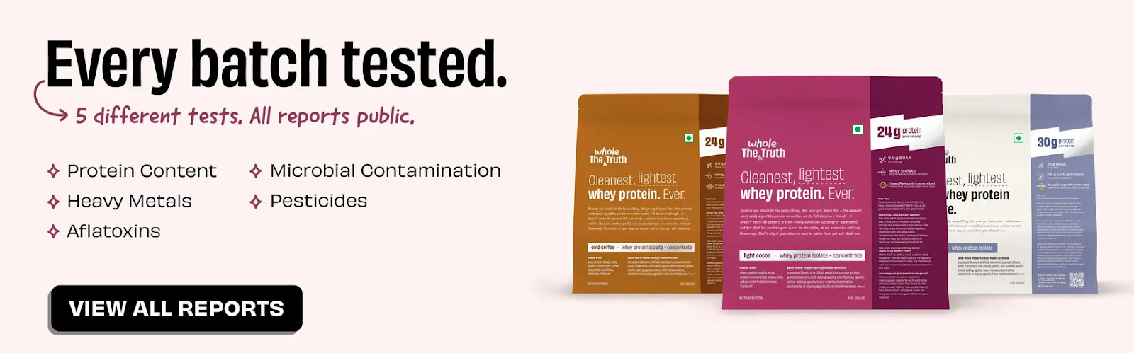
WholeTruth centers its philosophy on full ingredient disclosure, with clear explanations of what is excluded and why.
It relies on simple sourcing narratives and builds trust through openness and transparency, positioning honesty as its primary differentiator.
SuperYou, by contrast, emphasizes scientific formulation and expert validation.
It highlights functional ingredients such as bio-fermented yeast protein and builds trust through authority, credibility, and performance claims rather than ingredient minimalism.
Functional claims are where the philosophical gap between SuperYou and WholeTruth becomes most obvious.
WholeTruth deliberately avoids aggressive functional promises.
Instead of claiming performance outcomes, it focuses on the absence of harmful ingredients such as added sugar, preservatives, or fillers.
Functional value is implied through clean nutrition rather than explicitly promised.
SuperYou positions itself as a solution-oriented, performance brand. It makes explicit functional claims around metabolism, energy, gut health, and protein absorption.
Product communication highlights measurable metrics such as protein quantity - PDCAAS scores, fiber content, probiotic CFU counts, and bio-fermented yeast protein.
This appeals strongly to consumers who believe in optimization, quantified health, and science-backed nutrition.
“Premium pricing only works when the value is easy to understand. Packaging design plays a critical role in making that value clear at first glance. When it does, price feels justified; when it doesn’t, price becomes a hurdle.”
— Rishab Jain, Founder, Confetti Design Studio
Pricing reinforces how each brand defines value.
Premium vs accessible branding:
SuperYou embraces premium cues in packaging, design, and messaging. However, it does also offer relatively accessible pricing, especially at the ₹55 per bar range.
WholeTruth maintains mid-to-premium pricing while positioning itself as an ethical necessity rather than a luxury.
Cost justification:
SuperYou justifies pricing through science, expert formulation, and performance technology.
WholeTruth justifies pricing through ingredient quality, sourcing transparency, and honesty.
Brand values influence emotional trust beyond product performance.
Sustainability and Environmental Impact
WholeTruth communicates sustainability more openly, including packaging choices, eco-friendly unboxing, and ingredient sourcing.
SuperYou focuses more on individual health outcomes than environmental storytelling.
Ethical positioning
WholeTruth openly discusses ethics, misinformation, and responsibility in the food industry.
SuperYou embeds ethics more quietly within its system, without making it a central narrative.
Accessibility and inclusivity
WholeTruth feels inclusive and community-driven, especially for consumers early in their health journey.
SuperYou feels more aspirational, motivating consumers to level up physically and mentally
Product breadth reflects brand intent.
WholeTruth offers a broad clean-label portfolio across bars, spreads, cereals, and supplements.
It follows a depth-over-diversity approach, expanding slowly while maintaining brand consistency.
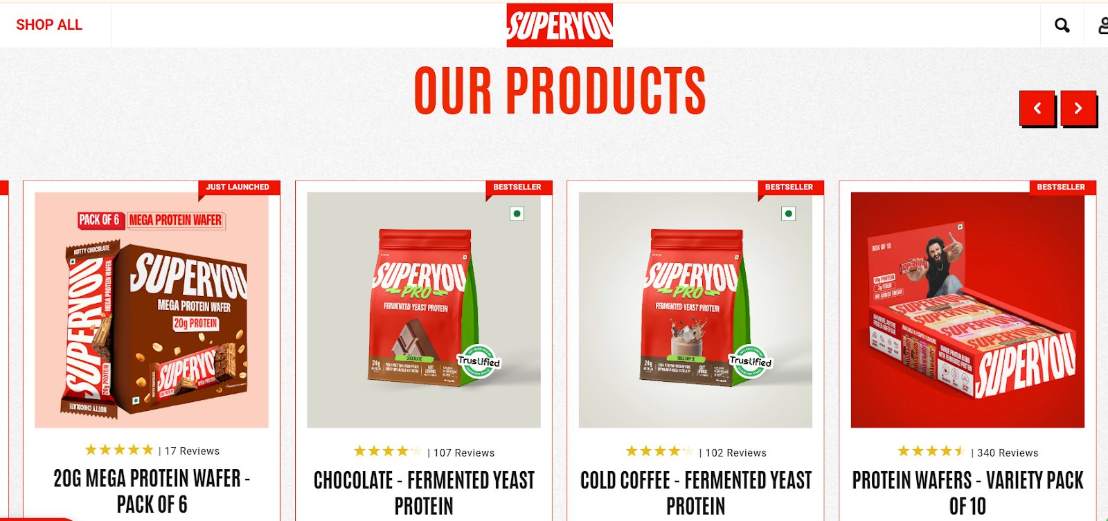
SuperYou maintains a focused but fast-expanding portfolio across protein wafers, chips, and fermented protein powders.
It uses a performance-first architecture that allows category hopping.
Both brands innovate, but in very different ways.
SuperYou differentiates through product science, novel protein sources, and performance narratives.
Its innovation is visible and benefit-led. Yeast-based protein and fermentation technology allow it to compete beyond traditional whey or soy.
For WholeTruth, honesty itself becomes the feature.
Innovation here lies in transparency, labeling clarity, and trust-building rather than new food tech.
Confetti helps food brands uncover a clear point of differentiation through ingredients, function, or education and express it through packaging and visual identities that stand out instantly on crowded shelves.
Community strategy shapes retention.
Email and owned channels
WholeTruth uses email as an educational platform, often resembling newsletters or learning resources.
SuperYou uses email to guide usage, routines, and optimization.
Social proof
WholeTruth highlights conversations, debates, and founder engagement.
SuperYou highlights results, transformations, and performance outcomes.
And lastly, we talk about brand sentiment for WholeTruth and SuperYou.
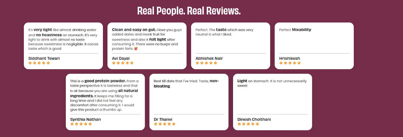
Online reviews
WholeTruth reviews frequently praise honesty, clarity, and ingredient trust.
SuperYou reviews often praise taste, effectiveness, and premium feel.
Social platform tone
WholeTruth is actively debated and defended, especially on platforms like Twitter and Reddit.
SuperYou is discussed with curiosity and respect, often centered on taste and celebrity association.
Trust indicators
WholeTruth earns trust emotionally through consistency and values.
SuperYou earns trust intellectually through structure, science, and performance framing.

Talk to our founders about building brands customers remember.
Book A Call
After analyzing both brands through our expertise in food and beverage branding, at Confetti our verdict is clear: both brands win, but they're playing entirely different games.
They succeed because their branding, packaging, and messaging are tightly aligned with their goals.
As shown in the table below, each brand wins in specific areas, and those wins matter because they directly reinforce their positioning and consumer trust.
Half-hearted positioning fails. Both SuperYou and WholeTruth succeed because they made definitive choices and stuck to it.
From the branding comparison of Whole Truth and Super You, a D2C brand has two options:
The Whole Truth Way: Focus on full ingredient transparency, premium pricing, and trust built through education, targeting serious health enthusiasts.
SuperYou Way: Prioritize taste and convenience, use celebrity/influencer reach, aim for mass appeal, and accept some credibility trade-offs with informed consumers.
Through our work with leading F&B brands, we at Confetti Design Studio have learned that packaging design isn't decoration, it's positioning made tangible.
On a crowded shelf, packaging must communicate positioning instantly, even before the product is understood.
Our Packaging Design Framework for Health Brands:
SuperYou used Ranveer Singh for instant reach and credibility, but risked borrowing his identity.
The best strategy is to move gradually from celebrity-led awareness and build consumer ownership. People must say, “This is my brand,” not the celebrity’s.
SuperYou’s shift toward UGC shows smart understanding of when to decouple celebrity from brand.
You don’t need full transparency, the key is clarity.
Be honest about trade-offs. Define your standard clearly and avoid half-truths; they erode trust fastest.
Be transparent where trust matters, such as ingredients, nutrition, and claims.
Use lifestyle cues where adoption matters like taste, format, and usage, but never mix the two in the same message..
Branding works best when trust and relatability grow together - a balance of scientific truth and human storytelling.
WholeTruth uses founder-led narratives to make complex science accessible, while SuperYou leans heavily on emotional appeal with limited scientific depth.
Packaging design is a primary brand touchpoint that communicates values before consumption.
WholeTruth’s information-rich, transparent packaging builds trust, while SuperYou’s vibrant design drives shelf impact and trial.
Effective packaging design aligns education, aesthetics, and brand intent.
In health branding, visual identity, product claims, pricing, and communication must align perfectly.
Any gap between brand promise and execution erodes trust instantly.
Consistency across design, messaging, and behavior compounds brand credibility.
What is the main difference between SuperYou and WholeTruth branding?
The main difference lies in brand positioning: SuperYou focuses on health solutions with sophisticated branding, while WholeTruth emphasizes transparency and authenticity with founder-led storytelling.
Which brand has better packaging design?
Both brands excel in packaging but serve different purposes. SuperYou's packaging design emphasizes premium aesthetics with clean, modern design appealing to gift-givers and shelf presence. WholeTruth's packaging prioritizes information transparency with detailed ingredient breakdowns and honest nutritional communication.
What can new food brands learn from SuperYou and WholeTruth?
New brands should learn the importance of clear positioning, authentic storytelling, consistent visual identity, and community building. Both brands demonstrate that success comes from genuine differentiation, not copying competitors, and maintaining brand values across all touchpoints.
Which branding approach is more effective for D2C food brands?
Effectiveness depends on target audience and market positioning. Premium, health-focused consumers respond to SuperYou's polished approach, while transparency-seeking, skeptical consumers prefer WholeTruth's authentic style. Most successful brands blend elements of both: professional presentation with genuine transparency.
Want strategic branding and packaging like this for your business?


.webp)
.webp)


.webp)
.webp)
.webp)
.webp)
.webp)


.svg)
.webp)
.svg)
.webp)