%201.webp)
02
AI Snaps
.svg)
.svg)
01
Our Work

03
About Us
05
Contact Us
06
Client Success

07
Blogs
08
Careers
Book A Call


Need Help In Building Your Brand?
Click the button below & book a call with our founder directly.

Rishabh Jain
Managing Director
India’s coffee conversation has changed dramatically over the last decade. What was once dominated by instant coffee jars and mass-market blends now includes brands like Sleepy Owl, Rage Coffee, Blue Tokai, Third Wave Coffee, Davidoff, and a growing list of speciality-first players competing for attention.
Sleepy Owl sits at an interesting intersection in this ecosystem. It is not a café brand, yet it operates in the same mental space as café-led coffee companies. It does not position itself as a hardcore speciality roaster, yet it educates consumers far more than legacy instant coffee brands ever did.
As branding and packaging experts at Confetti, we analysed Sleepy Owl through the lens of how Indian coffee consumption is evolving. Not just what people drink, but how brands build recall, trust, and long-term differentiation in a category that is expanding faster than ever.
Here is what Sleepy Owl gets right, where its design choices begin to plateau, and what the brand needs to consider as the category matures.
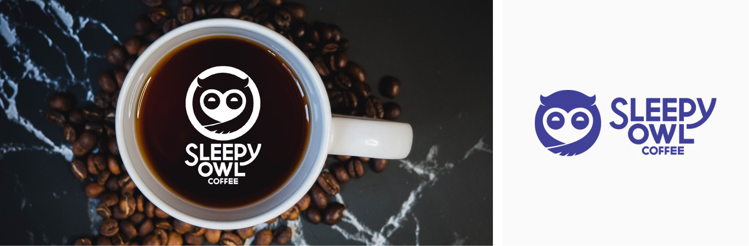
One of Sleepy Owl’s strongest recent moves has been its rebranding. The updated logo is far more iconic, memorable, and scalable than before. Most importantly, it is colour independent.
This is rare as most coffee brands can only exist in one colour system. Change the colour and the logo collapses. Sleepy Owl’s logo works across blue, green, red, and neutral palettes without losing recognition. That places it closer to global icons like Nike or Adidas than most Indian FMCG coffee brands. This flexibility allows Sleepy Owl to build product-level differentiation without fragmenting the brand.
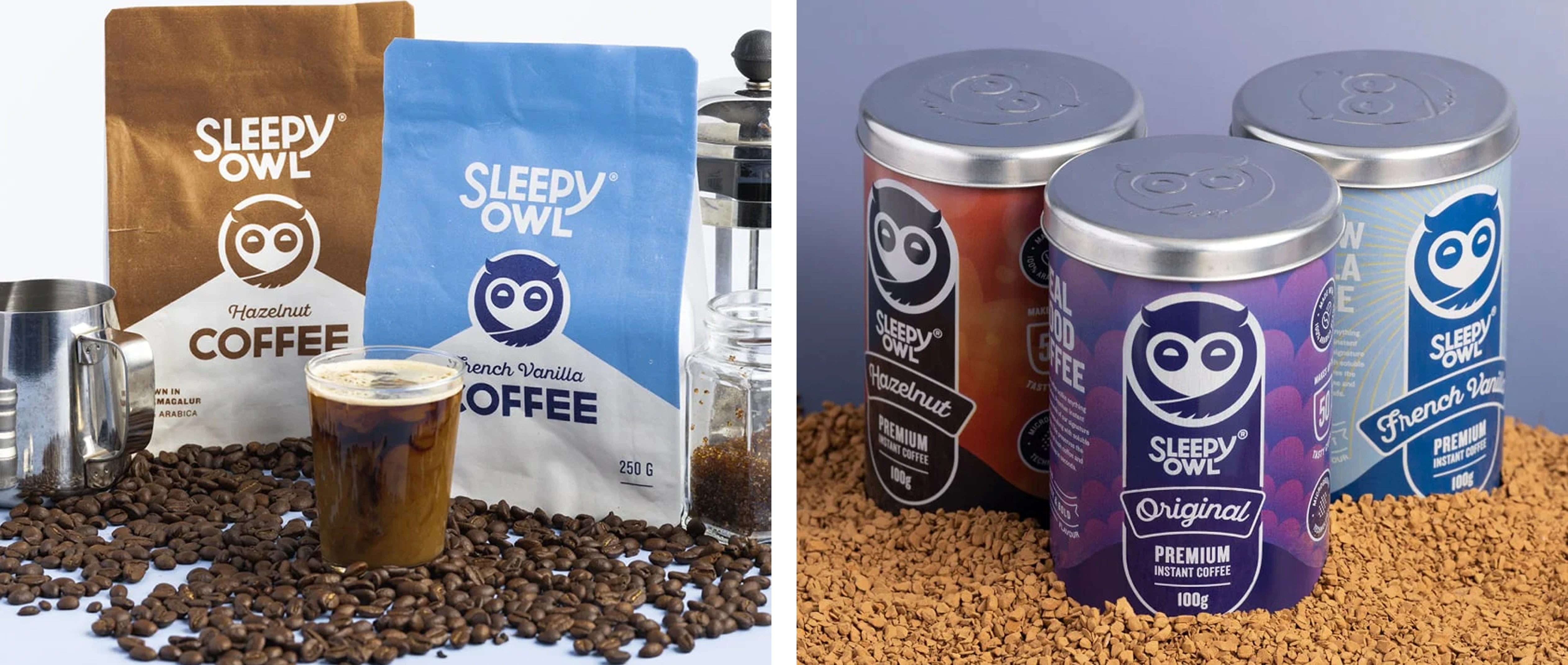
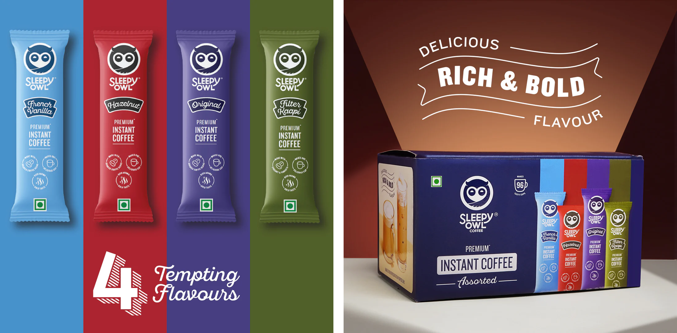
Sleepy Owl’s instant coffee sachets and outer boxes follow a very clean design logic. The hierarchy is simple. Brand name first. Product type next. Value additions are clearly stated. There is literally no visual clutter.
For a category where customers often make quick purchase decisions, this level of clarity works. It feels organised and considered. The outer packaging mirrors the same restraint, creating consistency across touchpoints. That said, this restraint is also where the system begins to feel conservative.
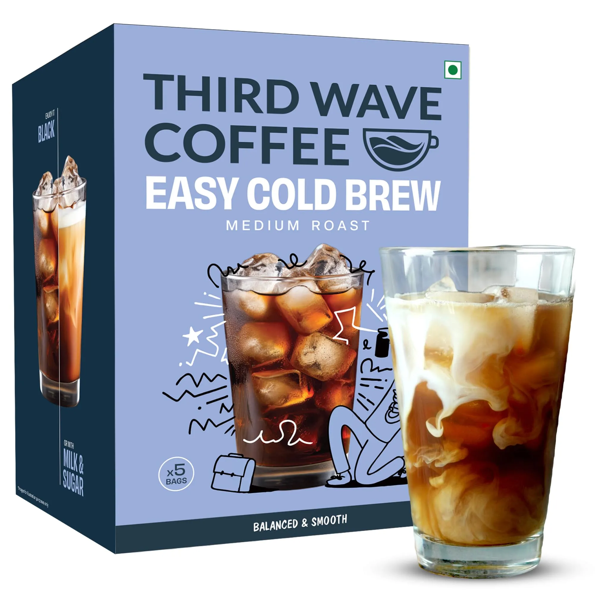
Sleepy Owl’s cold brew range is where the brand shifts gears. This is the product that made the brand viral, and the packaging reflects that confidence. The bold use of blue, red, and white has become distinctly Sleepy Owl. In the Indian coffee ecosystem, blue now belongs to them. No other coffee brand owns that colour association as strongly.
Beyond colour, the communication is strong. Brewing instructions, usage tips, and education are built into the packaging itself. Inside the packs, brochures and guides continue that conversation. Even on their website, brewing videos reinforce the same learning-first approach.
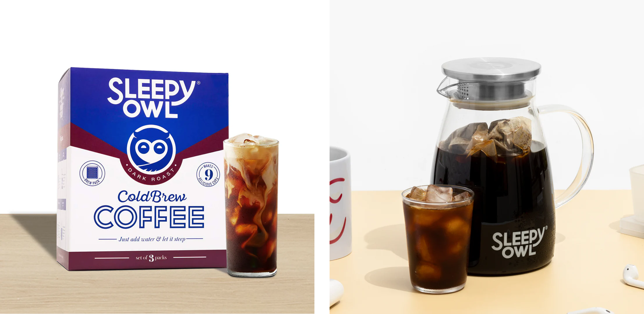
This is where Sleepy Owl separates itself clearly from brands like Nescafé, which largely stop at product delivery. Sleepy Owl goes further by teaching customers how to enjoy the product.
Sleepy Owl’s biggest challenge is not poor design. It is risk aversion.
The instant coffee packaging, while clean and functional, does not stand out in a rapidly evolving market. It sits in the middle. Not forgettable, but not memorable either. This was acceptable when the category was smaller. It is no longer enough.
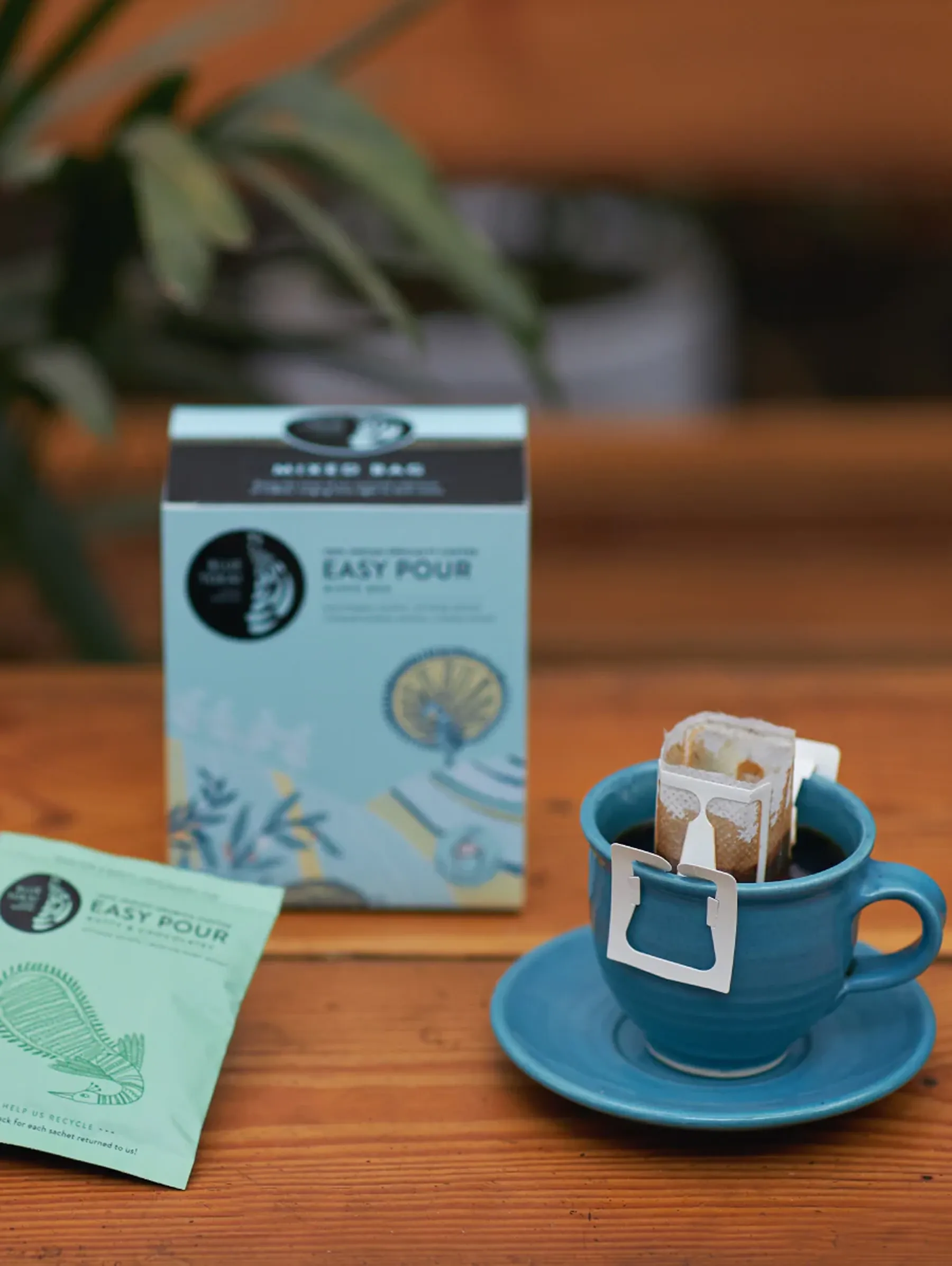
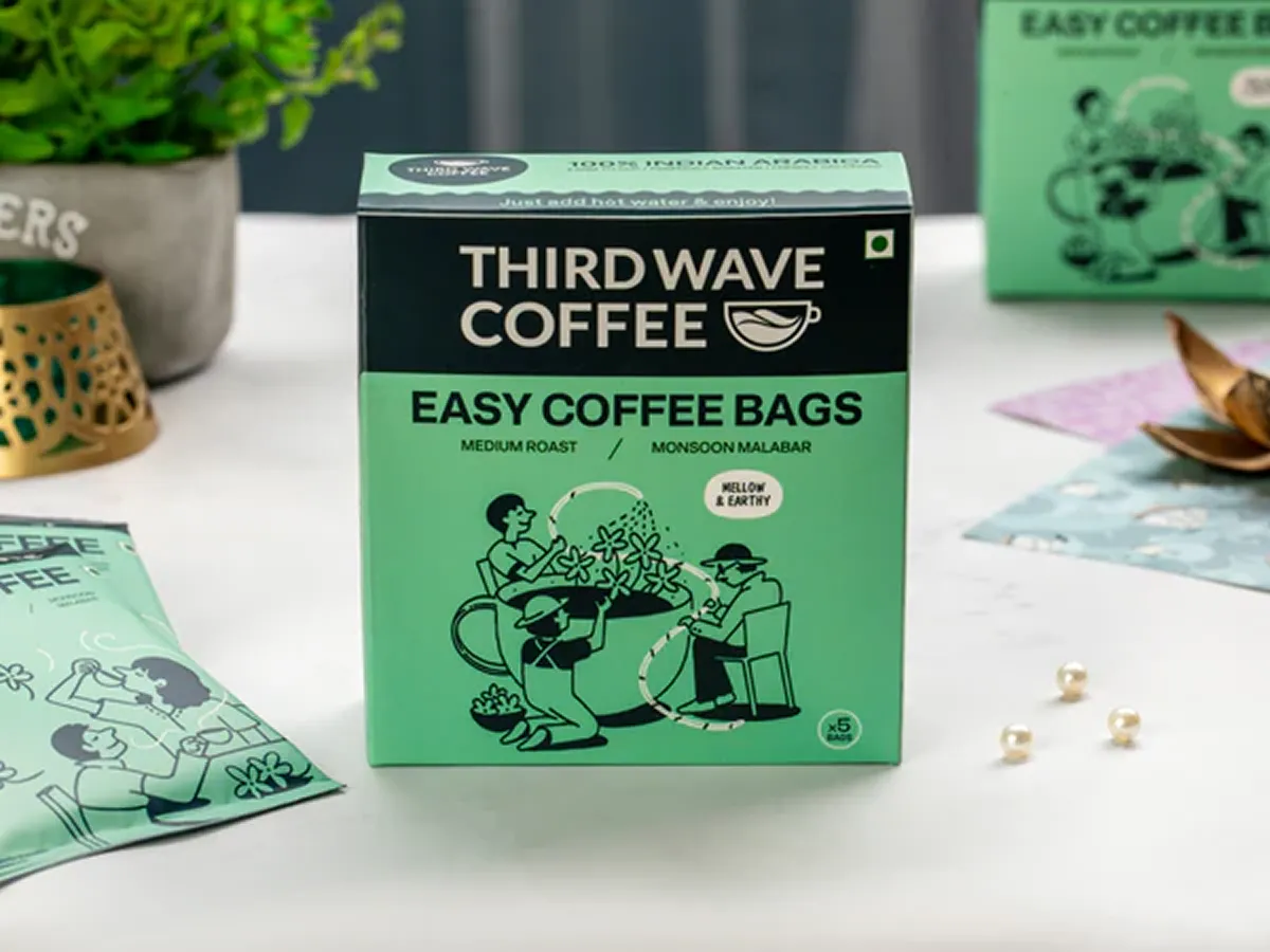
What once differentiated Sleepy Owl, such as cold brew bags and accessible premium coffee, is now being replicated by competitors like Blue Tokai and Third Wave Coffee. The space has caught up.
At the same time, other brands have expanded the experience beyond packaging. Café-led brands allow customers to interact with the brand physically. The product becomes part of a lifestyle, not just a pantry item.
Sleepy Owl currently exists only as a product. There is no offline experience, no physical brand world to step into. This is not a flaw, but it is a limitation. In a category driven by ritual and habit, experience matters.
Our branding and packaging experts at Confetti rate Sleepy Owl a 3.5 out of 5.
The brand has strong fundamentals, a flexible logo system, and an iconic cold brew identity that still leads the market. Where it falls short is in taking bold design risks outside that one hero product. If Sleepy Owl wants to move into its next chapter, it needs to decide whether it remains a product-led brand or evolves into an experience-led one.
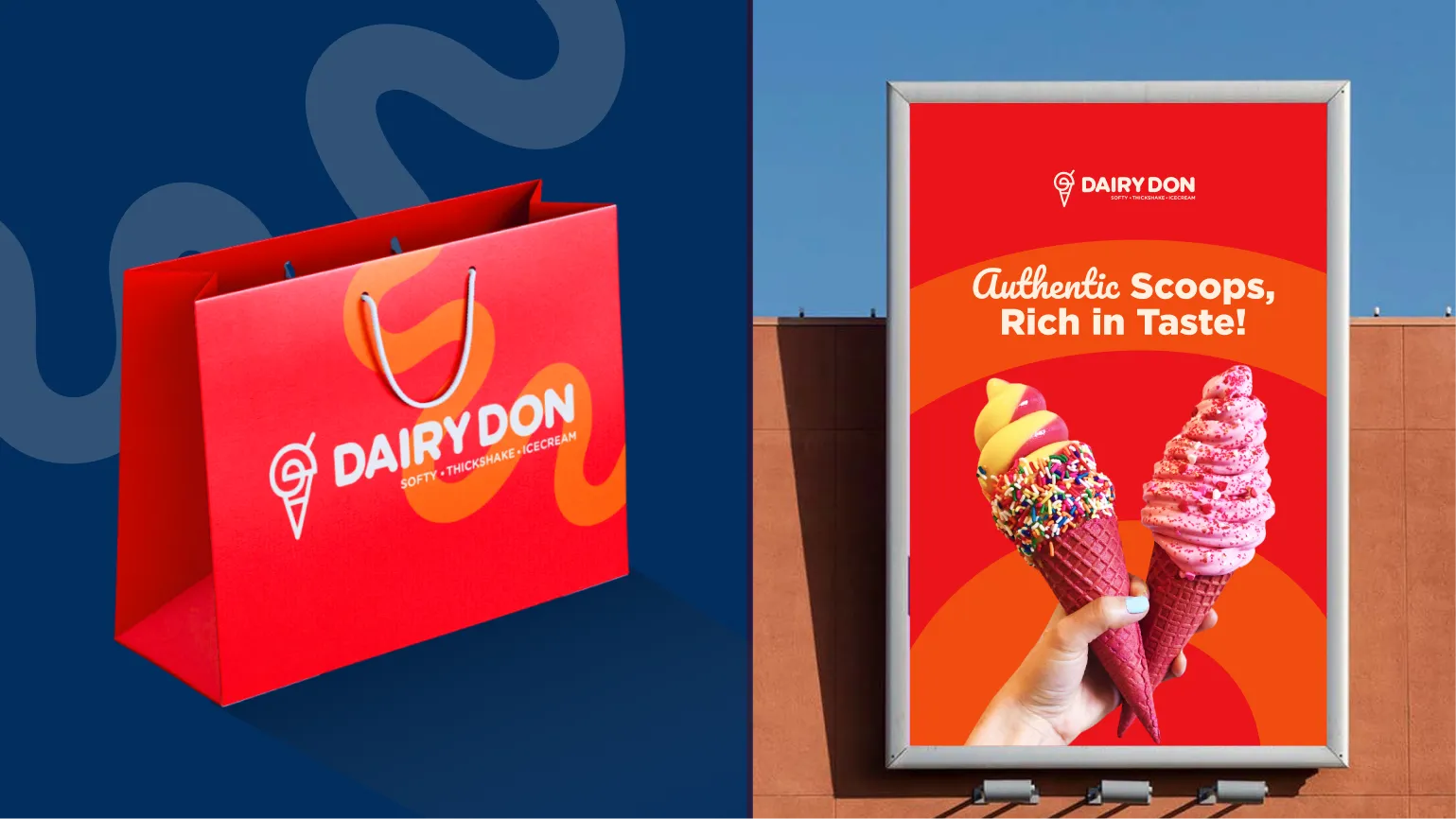
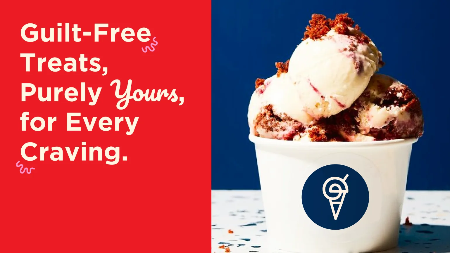
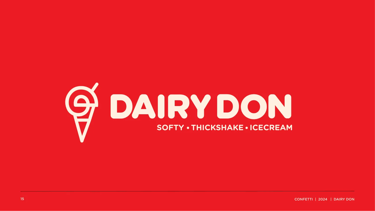
A useful parallel is our work with Dairy Don, an ice cream brand where we designed not just packaging, but a complete brand experience. The goal was to ensure that the offline and online worlds felt equally strong and recognisable
That kind of thinking becomes crucial when brands want to scale beyond shelves. If Sleepy Owl ever chooses to explore physical touchpoints, cafés, pop-ups, or immersive retail, its brand system will need to stretch further than it currently does..
Confetti is a branding and packaging agency that builds brands designed to last, not just launch. We work with consumer brands to create identities, packaging systems, and experiences that scale with clarity and confidence.
If you are rethinking your brand architecture or preparing for your next phase of growth, the link to book a call is right beside this article.
Want strategic branding and packaging like this for your business?


.webp)
.webp)


.webp)
.webp)
.webp)
.webp)
.webp)


.svg)
.webp)
.svg)
.webp)

.svg)