%201.webp)
02
AI Snaps
.svg)
.svg)
01
Our Work

03
About Us
05
Contact Us
06
Client Success

07
Blogs
08
Careers
Book A Call


Need Help In Building Your Brand?
Click the button below & book a call with our founder directly.

Rishabh Jain
Managing Director
Plum Skincare | Confetti's Verdict ⭐⭐⭐⭐
Confetti Design Studio has analysed Plum to understand how a vegan skincare brand founded in 2013 on Shankar Prasad's provident fund grew to Rs 419 crore in revenue in FY25, turning profitable for the first time with a net profit of Rs 25 crore after a loss of Rs 84 crore in FY24. The brand has raised USD 51.8 million across three rounds from A91 Partners, Unilever Ventures, and Faering Capital at a valuation of Rs 1,900 crore, and operates across over 1,000 assisted outlets in 250 Indian cities alongside a dominant online presence.
Most skincare brand names fall into predictable patterns. Some reach for clinical authority with scientific-sounding coined words meanwhile others invoke nature through botanical references or Sanskrit. Some borrow prestige through European-sounding names. Plum did none of this, and the result is a brand name that beats most of its competitors on every practical naming criterion.
The name is a single syllable. It is easy to pronounce across every Indian language. It carries no ambiguity and requires no explanation. And at a register below conscious recognition, it works as a skincare promise in its own right with plump skin, nourished skin, healthy skin. The word sits in the same emotional territory as the product benefit without being obvious about it. That unconscious alignment between name and category promise is genuinely difficult to engineer and almost impossible to replicate once a competitor has copied the structural approach.
In a category where brand names increasingly chase sophistication or scientific credibility, the warmth and approachability of a real, familiar, pleasant-sounding word is a meaningful differentiator. The name makes Plum feel like a friend's recommendation rather than a clinical prescription, which is precisely the register that Indian skincare consumers at the mass-premium tier respond to most strongly.
When Shankar Prasad launched Plum in 2013 as India's first vegan beauty brand, veganism in Indian skincare was not a category. It was a fringe conviction. Most consumers did not know what cruelty-free meant in a product context, and the market for toxin-free, plant-based beauty was negligibly small.
Twelve years later, that founding conviction has become the fastest-growing segment in Indian beauty. The brand did not pivot to meet a trend. The trend caught up with the brand. This is one of the rarest commercial advantages available to a founder which is building for a future that most of the market had not yet seen coming. Plum's position as the original Indian vegan beauty brand gives it a credibility in this space that no competitor can replicate by simply updating their claims. You cannot be the pioneer retrospectively.
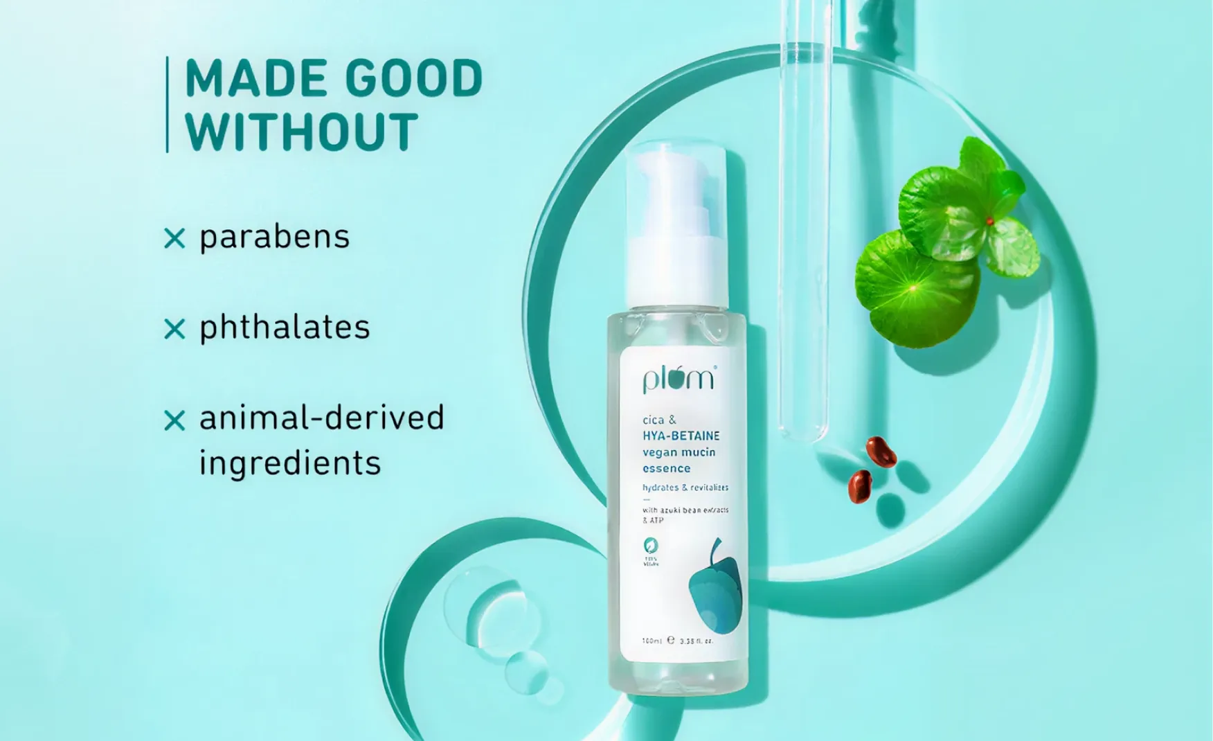
The 100% vegan, cruelty-free, and toxin-free commitment across the entire range is also operationally significant. It is not a marketing filter applied to selected products. It is a product development constraint that every Plum SKU must pass before launch. This consistency is what allows the brand to make the clean beauty claim without qualification, which is commercially valuable in an environment where greenwashing has made consumers increasingly sceptical of selective sustainability claims.
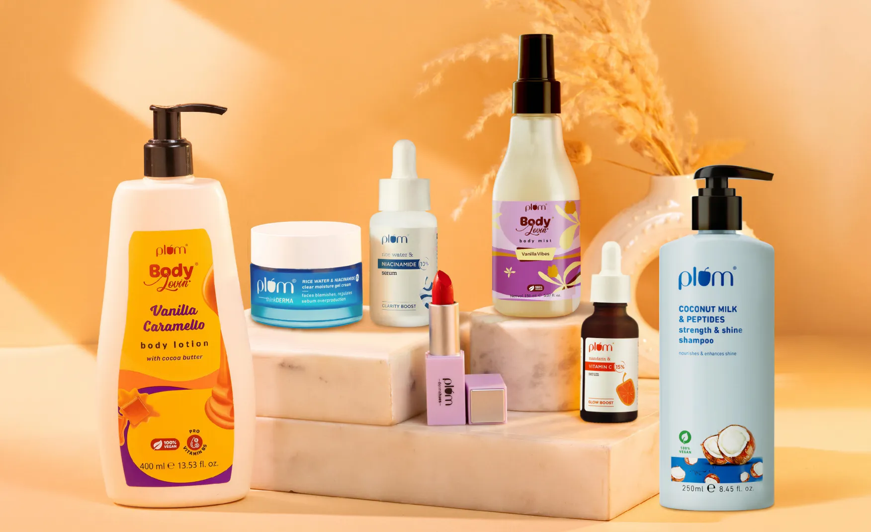
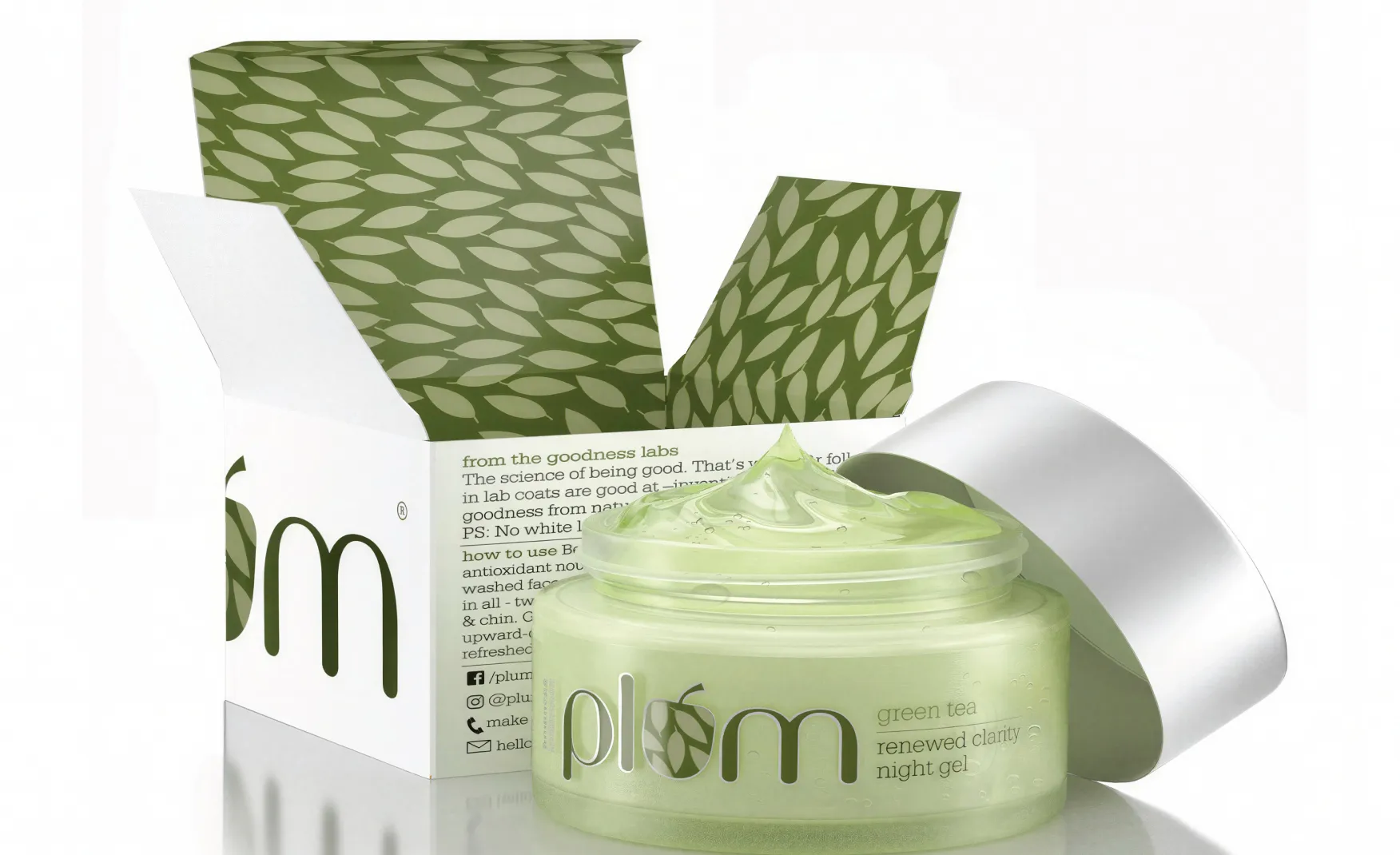
In a skincare category that routinely reaches for either clinical minimalism or maximalist botanical illustration, Plum has found a middle register that serves its audience precisely. The packaging design is clean without being cold, approachable without being naive, and distinctly consistent across a product range that spans multiple categories.
The colour-coded category system is the most commercially intelligent decision in the packaging architecture. Blues and purples for face care, greens for natural-focused ranges, coffee tones for body care, these are distinctions that help a consumer navigate the range rather than distinctions that signal premium versus everyday. The effect is a brand that feels organised and thoughtful at shelf level, which builds the kind of low-key trust that drives repeat purchase rather than the high-impact first impression that drives trial alone.
The typography is clean and consistent and the white space is generous. In a drug store or modern trade environment where competing skincare brands are often fighting each other visually with bright colours, exaggerated claims, and competing illustration styles, Plum's visual restraint reads as confidence rather than conservatism.
The Indian skincare consumer in 2025 is significantly more ingredient-literate than they were five years ago. They know what niacinamide does. They understand SPF ratings. They research actives before they purchase. Plum has been a consistent contributor to that education, and the brand is now reaping the loyalty dividend of having been a trusted information source rather than just a seller.
With over a million Instagram followers and a content strategy built around dermatologist collaborations, skincare routine explanations, and ingredient breakdowns, Plum has built the kind of audience that follows a brand for its knowledge rather than purely for its products. This is a fundamentally different and more durable relationship than transactional brand following. When a consumer trusts a brand's content, they tend to trust its product claims. And when they trust its product claims, customer acquisition cost drops and repeat purchase rate rises
The brand's advertising spend of Rs 139 crore in FY25, while large, represented a 7.5% reduction from FY24 while revenue grew 22.5%. This improving efficiency is the commercial signature of a brand building genuine equity rather than simply buying attention.
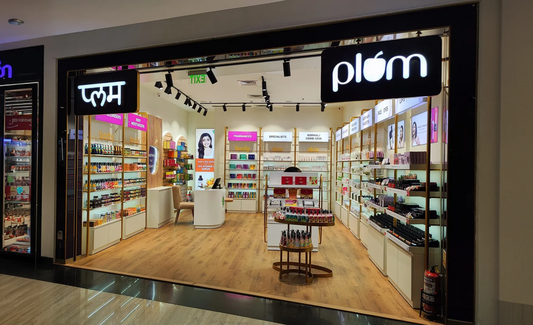
Most D2C beauty brands of Plum's vintage are still primarily online. Plum has built a materially different distribution architecture, with 30% of revenue coming from offline retail across 1,000 assisted outlets in 250 cities. This offline presence does something that online-only distribution cannot, it puts the product in front of consumers who have not yet encountered the brand digitally.
The assisted outlet channel, covering Shoppers Stop and comparable modern trade environments, places Plum in a brand-discovery context where a consumer can physically handle the packaging, read the label, and make a purchase decision in the same moment. For a brand whose packaging communicates trust and clarity rather than impulse excitement, this physical encounter is an advantage. The product's design does the conversion work that a digital ad does for online purchases, but at the point of maximum purchase intent.
The 10,000-plus unassisted outlets, covering grocery stores and pharmacies, extend this presence into daily shopping environments where the consumer is not in a beauty-specific mindset. This is the kind of distribution that builds category-level habits rather than brand-specific loyalties, and it is what allows Plum to compete with legacy brands that have decades of offline distribution relationships behind them.
This is the most commercially significant design gap in the Plum portfolio, and it is the one that will become increasingly visible as the brand moves into markets where shelf time and brand recognition in secondary viewing contexts matter more.
Every Plum product is housed in a standard industry silhouette. The tubs are round tubs. The bottles are standard pump bottles. The tubes are tubes. If the Plum label were removed from any product and replaced with a competitor's label, nothing in the container's shape would tell the consumer they were holding a Plum product. The brand's entire visual recognition system operates through colour and label, which works effectively at face-on shelf viewing but disappears in any other context. A Plum bottle glimpsed from the side in a bathroom cabinet, or partially obscured in a flat-lay photograph, is indistinguishable from dozens of competitors at the same price point. Recognition requires full label visibility. That is a fragile position for a brand with ambitions beyond the current tier.
Plum spent Rs 139 crore on advertising in FY25, representing 35% of total expenditure. This is a significant investment in a brand that has been operating for twelve years and has built genuine consumer trust. The FY25 profitability was achieved partly through reducing this spend from Rs 150.5 crore in FY24, a 7.5% reduction that contributed to the Rs 109 crore improvement in net profit.
The structural question this raises is how much of Plum's revenue requires paid media to sustain it and how much flows from genuine brand pull. A brand with deep consumer loyalty and strong organic recall should be reducing its advertising-to-revenue ratio over time as the owned audience grows. The direction in FY25 is positive. The level remains high for a brand at this stage of its journey. As the category becomes more competitive and customer acquisition costs continue rising across the Indian D2C beauty space, the brands that built equity-driven organic demand earlier will have a structural cost advantage over those that built paid-demand-driven growth.
Plum has positioned itself as the honest, modern, everyday Indian skincare brand. It is a real and defensible position, but it is also the most contested ground in the Indian beauty category right now.
Minimalist has claimed clinical simplicity.
Dot & Key has claimed fun, tropical indulgence.
Mamaearth has claimed natural and safe for families.
The Derma Co. has claimed dermatologist-approved clinical efficacy.
Forest Essentials has claimed luxury Ayurveda.
Plum occupies a thoughtful, reliable space between these poles. The risk is not that the positioning is wrong. It is that the positioning is accessible enough to be approached from multiple directions simultaneously by well-funded competitors. As the Indian skincare category matures and consumers become more willing to pick the specialist brand for each concern rather than the dependable generalist brand for all of them, Plum needs to either sharpen what it specifically owns or expand its design identity in ways that make it more distinctive than the trusted option. Trusted is good. Trusted and recognisable is better. Trusted, recognisable, and distinctive is what earns the top shelf.
The single most valuable design investment available to Plum right now is the development of a proprietary bottle silhouette for its core skincare range. This does not mean a dramatic departure from functional packaging. It means a considered structural decision that makes one Plum product format instantly identifiable by shape alone, without reading the label.
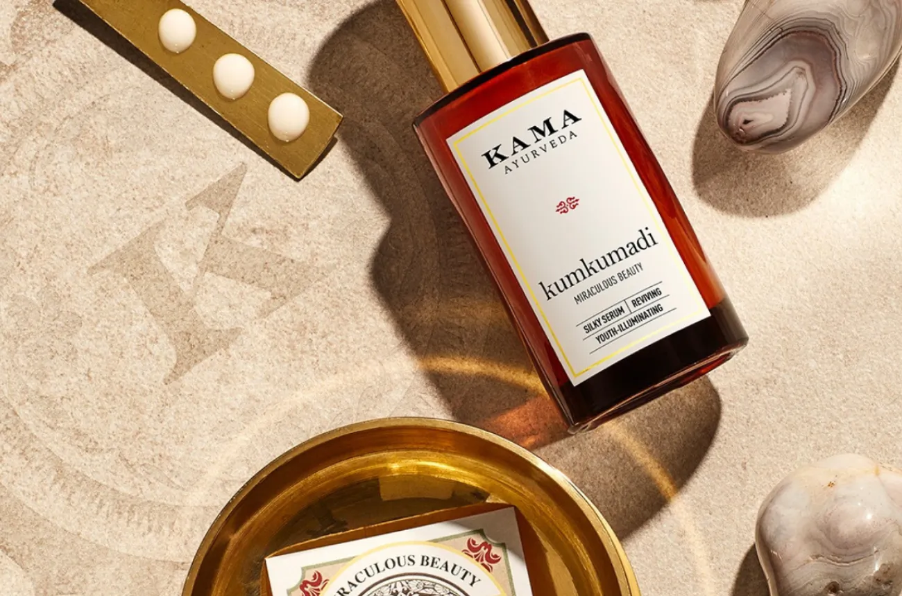
At Confetti, we worked with Vaahe Spices, a premium spice brand where the entire category defaulted to pouches and cardboard boxes. We introduced aluminium tin packaging. That single structural decision transformed how the brand was perceived at shelf and in consumer spaces. The tin became Vaahe's signature. Shoppers spotted it before reading the label. A similar investment for Plum, a gently distinctive bottle profile for the face serum or moisturiser line, would give the brand a physical recognition cue that its current packaging system cannot provide. Brands like Rhode and Kama Ayurveda have demonstrated what a distinctive container shape does for premium recall in beauty. Plum has the scale, the retail presence, and the consumer trust to make that investment land.
The colour-coded category differentiation within Plum's packaging works well at the individual product level. The opportunity is to extend this into a more explicitly communicated sub-brand architecture that gives each functional range a clearer identity and a stronger reason to exist as a distinct offering.
Plum's range now spans skincare, haircare, body care, and makeup. Each of these is a full category in its own right, with different consumer needs, different competitor sets, and different purchase occasions. A formal sub-brand system, where each range has its own visual vocabulary within the Plum master brand frame, would allow each category to speak more directly to its target consumer while the master brand provides the trust umbrella. This is the architecture that Wellbeing Nutrition has used effectively across its very different product ranges. It allows a brand to be simultaneously specialist and coherent.
Plum's digital content and online brand building are already strong. The gap is in how the brand shows up in the physical environments where 30% of its revenue is generated. A standard pump bottle on a Shoppers Stop shelf competes visually against every other standard pump bottle on that shelf. The packaging needs to work harder in three-dimensional retail contexts where the consumer is browsing rather than searching.
This means developing retail-specific packaging decisions: a distinctive cap profile, a more pronounced label die-cut, or a structural element that creates texture and catch on shelf. These are not expensive interventions relative to the revenue they protect. They are the design details that turn a brand people trust into a brand people notice before they remember they need it. In a beauty retail environment, the brand that earns the unprompted reach is the brand that does not depend on being top of mind from a prior digital encounter.
Plum has earned its position as one of the most trusted skincare brands in India. The founding decision to build a 100% vegan brand before the market existed for it, the consistent design language that communicates honesty and accessibility rather than aspiration, the digital content programme that built genuine consumer education, and the omnichannel distribution that put the product in front of every type of Indian beauty buyer: all of these are real achievements that have compounded into a Rs 419 crore revenue business that turned profitable in FY25.
The next phase of growth requires moving from trusted to iconic. That shift requires one specific design investment that the brand has not yet made: a proprietary packaging identity that works by shape as well as by colour and label. The Rs 1,900 crore valuation and the first-ever net profit of Rs 25 crore give the brand both the commercial credibility and the financial foundation to make that investment now, at exactly the moment when its category position is strong enough to carry a bolder design expression.
If you are building a skincare, beauty, or personal care brand and want to create the kind of packaging system and brand architecture that earns both shelf recognition and long-term consumer loyalty, Confetti can help you build that.
Want strategic branding and packaging like this for your business?


Lorem ipsum dolor sit amet, consectetur adipiscing elit. Suspendisse varius enim in eros
Lorem ipsum dolor sit amet, consectetur adipiscing elit. Suspendisse varius enim in eros
Lorem ipsum dolor sit amet, consectetur adipiscing elit. Suspendisse varius enim in eros
.svg)
.svg)


.webp)
.webp)


.webp)
.webp)
.webp)
.webp)
.webp)


.svg)
.webp)
.svg)
.webp)


.webp)


.webp)


.svg)