%201.webp)
02
AI Snaps
.svg)
.svg)
01
Our Work
03
About Us
04
Brand Audit
05
Contact Us
06
Client Success
12
07
Blogs
08
Careers
Book A Call
.svg)



.svg)
Need Help In Building Your Brand?
Click the button below & book a call with our founder directly.

Rishabh Jain
Managing Director
A fashion label's brand identity takes an entirely different approach when compared to other categories.
This Confetti guide tells you what actually goes into a fashion label's identity system. We look at the core elements and guide you through creating your own identity.

For a fashion label, brand identity is way more than a logo or a visual system. It is the entire ecosystem of meaning that surrounds a brand. It's the personality, values, purpose, and the emotional resonance a brand cultivates in the consumer's heart and mind.
For most categories, that list of touchpoints is relatively short. For a fashion label, it's unusually long:
All carry the identity simultaneously, and all of them need to function as one coherent system rather than a collection of separately designed assets.
While rooted in visual cues like logos, typography, and colour palettes, a fashion label's identity is defined by a more profound architecture, one that balances three critical characteristics: relevance, authenticity, and distinctiveness.
Fashion branding is harder than most because brands must constantly evolve while remaining instantly recognizable.
Every season brings new collections, campaigns, and trends, yet customers still expect consistency.
🧩An Audience That Knows
Fashion audiences are also highly visually literate. They encounter hundreds of brand images daily across social media, e-commerce, magazines, and stores.
Good design is now the baseline. What creates lasting recognition is a distinctive point of view that's authentic and difficult to copy.
🧩Identity Across Scales and Contexts
A mark that reads beautifully as a large storefront sign or a hero product photo can fail completely when reduced to the size of a woven label sewn into a collar, a scale most brand identity guidance never actually tests against.
A fashion label's identity system needs to survive both extremes, and everything in between, a hangtag, a social thumbnail, a full-page lookbook spread, without losing coherence at any of them.
🧩Change Versus Consistency Tension
Fashion thrives on constant novelty, but strong brands are built through consistency. This creates a core conflict: businesses must reinvent themselves while remaining instantly recognisable.
Every decision, from new creative directors to logo redesigns or fast-fashion collaborations, tests this balance. So, a collaboration with a fast-fashion partner may generate buzz, but it may dilute the exclusivity that justified the premium price
🧩Fast Fashion's Identity Vacuum
Many fast-fashion brands lack a distinctive identity because they compete by copying trends rather than creating them. PrettyLittleThing's luxury-inspired rebrand changed its aesthetic but not its business model, confusing customers without adding authenticity.
In a market where products look interchangeable, brands that build a consistent visual language and worldview are more likely to achieve long-term recognition.
🧩Brand Dilution Through Acquisition
Ownership changes often erode a brand's identity when its core values are undocumented. Sass & Bide lost its distinctive design language after Myer's acquisition, becoming harder to differentiate and suffering significant revenue decline.
Similar patterns affected Marcs, Willow, and Lover. Acquisitions succeed only when commercial strategy protects, not replaces, the heritage and creative essence that built the brand.
"Fashion identity has to survive a customer's Instagram feed, not just a lookbook. A brand can look stunning in a single curated shoot and still fail to register at all in the fast, cluttered scroll where most customers actually encounter it first."
Rishabh Jain, Founder at Confetti Design Studio
At Confetti, we think about a fashion label's identity across four connected cores, each of which needs to work in concert with the others rather than as an isolated design task.
Visual identity is the most recognisable part of a fashion brand. It allows consumers to identify your fashion label instantly:
🎨Logo and wordmark: Whether a monogram, wordmark, or symbol, the logo should remain clear and legible at every size, from a storefront sign to a woven garment label or zipper pull. A fashion logo that only works in large digital applications is incomplete.
🎨Colour palette: Colours communicate personality and positioning. Neutral palettes often signal timeless luxury, while bold colours can express youthful energy, creativity, or streetwear culture.
🎨Typography: Typefaces shape perception just as much as logos. Elegant serif fonts often reinforce craftsmanship and heritage, while clean sans-serifs suggest modernity and minimalism.
🎨Visual language: Photography style, layouts, illustration, iconography, graphic treatments, and art direction should work together to create a distinctive and consistent aesthetic.
Brands such as Chanel, Jacquemus, and Aime Leon Dore demonstrate how consistent visual systems create immediate recognition across campaigns, stores, packaging, and digital channels.
Strong visual design is only effective when supported by a clear strategic direction. Before developing any identity, fashion labels should define:
📝Brand Positioning & Values: Start your fashion label by defining who their audience is, what they value, and how they live. This strategic clarity ensures the visual identity is not just decorative but is a direct expression of the brand's core purpose.
📝Brand Codes: These are the consistent motifs, colours, or tones that remain constant across all collections, acting as the brand's visual DNA. For heritage houses like Hermès or Dior, these codes are unshakable; they represent history, craft, and permanence, allowing the brand to evolve without losing its identity.
📝Storytelling: Modern consumers seek brands that tell authentic stories. Consumers increasingly connect with brands that communicate authentic narratives around craftsmanship, heritage, innovation, sustainability, or culture rather than simply promoting products.
These critical decisions determine why the brand exists, who it serves, and what makes it different from competitors.
A fashion label is experienced through far more than its products. Every interaction should communicate the same personality, including:
🔊Brand Voice: The consistent personality and tone used in all messaging, from website copy to social media captions. This voice could be friendly and conversational, or professional and authoritative.
🔊Digital Presence: Digital presence is particularly important because many consumers encounter fashion brands online long before visiting a physical store. Photography, motion graphics, video editing, social content, and e-commerce experiences should all reinforce the same creative direction.
🔊Sustainability & Ethics: Increasingly, sustainability is not just a trend but a defining feature of a fashion brand's identity. Communicating values like ethical sourcing and transparency authentically is key to reinforcing consumer trust.
Fashion identities are ultimately experienced through physical products. Every tangible touchpoint contributes to brand perception, including:
🏷️Garment Labels & Care Labels
The label sewn into a garment carries the brand's name and its promise. Care labels reflect your brand's attention to detail and your commitment to protecting the customer's investment. A thoughtfully designed label conveys quality and craftsmanship.
🏷️Hangtags
Hangtags are the first piece of brand communication a customer encounters in-store. They carry the logo, the story, and often the price. A premium hangtag like thick card stock, foil stamping, thoughtful typography communicates value and craftsmanship.
🏷️Packaging & Shopping Bags
Packaging is the brand's portable billboard. A distinctive shopping bag turns every customer into a walking ambassador. The material, structure, and finish of the bag communicate the brand's position, from minimalist luxury like Desi Minimals to streetwear irreverence.
🏷️Dust Bags & Tissue Paper
For premium and luxury labels, dust bags signal care and permanence. They protect the garment and elevate the ownership experience. Tissue paper with custom printing adds another layer of brand immersion during unboxing.
🏷️Hangers & In-Store Display
The physical presentation of garments in-store like hangers, rails, mannequins, extends the brand's visual language into the retail environment. Consistent materials, finishes, and forms reinforce the brand's aesthetic.
🏷️Unboxing Experience
The ritual of opening a package is the final touchpoint in the purchase journey. The order of reveal, the textures, the sounds, all contribute to the emotional impact. A carefully designed unboxing experience turns a transaction into a memory.
These four elements are interconnected rather than independent.
At Confetti, we design fashion brand identities that consider every element, from the logo to the dust bag, ensuring the experience is cohesive, intentional, and unmistakably the brand.
A fashion brand identity starts with strategy, not logos or packaging. The strongest brands build a clear, consistent identity across every touchpoint.
Here's a practical framework to create one that lasts:
Every successful fashion brand occupies a clearly defined space in the customer's mind. Before exploring logos or mood boards, decide where your label belongs and who it is designed for.
Are you building:
Each position demands a different visual language, tone of voice, pricing strategy, photography style, and customer experience. Borrowing aesthetics from a category your brand does not genuinely belong to quickly feels inauthentic, particularly to fashion consumers who are highly attuned to visual trends.
This strategic foundation should also define your target audience, brand values, personality, and long-term vision.
Fashion branding lives on products before it appears on social media. Many identity systems are designed primarily for websites and presentations, then adapted to garments later. The process should be reversed.
Every core identity element should first be tested where customers actually experience it:
A logo that performs beautifully as an ecommerce or D2C website header may become unreadable when woven into a small fabric label.
Testing these applications early avoids costly production changes after manufacturing has begun.
A fashion brand is experienced through dozens of physical touchpoints beyond the garment itself.
Garment tags, care labels, hangers, and packaging all need to share a defined system, consistent typography, consistent hierarchy, consistent material logic, rather than being designed independently by whoever happens to be responsible for each element at the time.
Create a unified system that defines:
When every touchpoint follows the same visual principles, customers experience one cohesive brand rather than a collection of disconnected assets.
For many emerging fashion labels, consumers discover the brand online long before they touch the product.
Your website, Instagram feed, product photography, videos, email marketing, and digital advertising should all feel like natural extensions of the physical brand.
Brand consistency should extend across:
The goal is that someone moving from Instagram to your website and then receiving your packaging experiences one continuous brand rather than separate creative executions.
A strong fashion brand becomes memorable through both visual and verbal consistency.
Distinctive brand codes such as signature colours, patterns, fabric choices, hardware finishes, stitching details, packaging materials, photography style, typography, and graphic motifs act as visual shortcuts that allow consumers to recognise the brand even without seeing the logo.
At the same time, a consistent brand voice ensures that the brand’s personality is communicated clearly across every customer touchpoint, including website copy, product descriptions, email campaigns, social media, customer service, and packaging messages.
Whether the tone is refined, playful, conversational, or understated, both the visual identity and language should reflect the brand’s character and audience expectations.
Luxury brands such as Hermès, Burberry, and Missoni demonstrate how strong brand codes and a consistent voice can remain recognisable for decades while allowing collections and creative expressions to evolve.
Fashion exists in one of the world's most visually crowded industries.
A brand identity should therefore be evaluated in realistic environments rather than in isolation.
Test your identity by placing it alongside competing brands across:
Ask a simple question:
Would someone scrolling quickly stop because your brand looks genuinely different, or would it blend into everything around it?
This exercise often reveals similarities that are difficult to notice when reviewing a design on its own.
Collections change every season, but the identity system should remain recognisable. Strong fashion brands distinguish between fixed assets and flexible assets.
This structure allows creative evolution without sacrificing recognition.
A strong fashion brand requires clear systems to maintain consistency as it grows.
As photographers, designers, manufacturers, agencies, and retail partners contribute to the customer experience, detailed brand guidelines ensure every touchpoint reflects the same identity.
A comprehensive brand guideline should define:
These systems allow brands to scale across collections, markets, and collaborations without losing recognition.
While fashion trends evolve, brand identity should provide long-term continuity.
The most enduring fashion labels refine their expression over time while preserving the distinctive qualities that customers recognise and trust. Every campaign, collection, collaboration, and customer interaction plays a role in strengthening or weakening brand equity.
💡A good collection may drive sales for a season. A strong brand identity builds recognition for decades.
At Confetti, we help fashion brands build identity systems that go beyond logos and packaging. Through strategic positioning and scalable design systems, we create distinctive brands that stay consistent across garments, retail, digital, and every customer touchpoint.

Here are examples across different brand types that demonstrate what enduring identity looks like in practice:
Saint Laurent's success is built on maintaining a consistent vision, precise designs, and characteristic cool sensuality. Their focused identity, combined with timeless appeal, is a major contributor to its success.
Knowing exactly who it is and remaining true to that vision, has become a competitive advantage. The brand's clean silhouettes and restrained aesthetic resonate with consumers seeking understated, high-quality pieces.
👉Consistency is not stagnation. It is the discipline of knowing who you are and refusing to chase every trend. Saint Laurent proves that a clear, unwavering identity can be a brand's most powerful asset.
Desi Minimals, a brand Confetti partnered with, is built on a simple but powerful positioning: "Less noise. More you." The brand stands for presence over performance, offering essentials that support everyday life instead of chasing trends.
The verbal identity mirrors the clothing: soft, minimal, and grounded. The tone is friendly without trying too hard, conversational without being careless. The language avoids clutter, complexity, and performance.
Every element of the identity reinforces confidence through ease, making dressing feel like a calm, intentional everyday ritual.
👉Desi Minimals shows that a brand does not need to shout to be heard. Clarity of positioning, consistency of voice, and restraint in execution can create a brand identity that is both distinctive and deeply resonant.
Sabyasachi Mukherjee built a brand from a modest three-person studio in Kolkata into a global luxury label that now sits comfortably alongside international maisons.
The "Sabyasachi bride" is not just a cultural phenomenon; it is one of the most sophisticated case studies in modern luxury of how a brand can scale desire without ever losing its rarity.
His philosophy is counterintuitive: "The secret to maximalism is restraint". This has meant rejecting shortcuts, no mass over-distribution, no hurried expansion.
The brand's stores feel like cultural museums; its business decisions are designed for longevity, not velocity.
👉Restraint is a strategic choice. It can be the most powerful tool for building enduring brand equity.
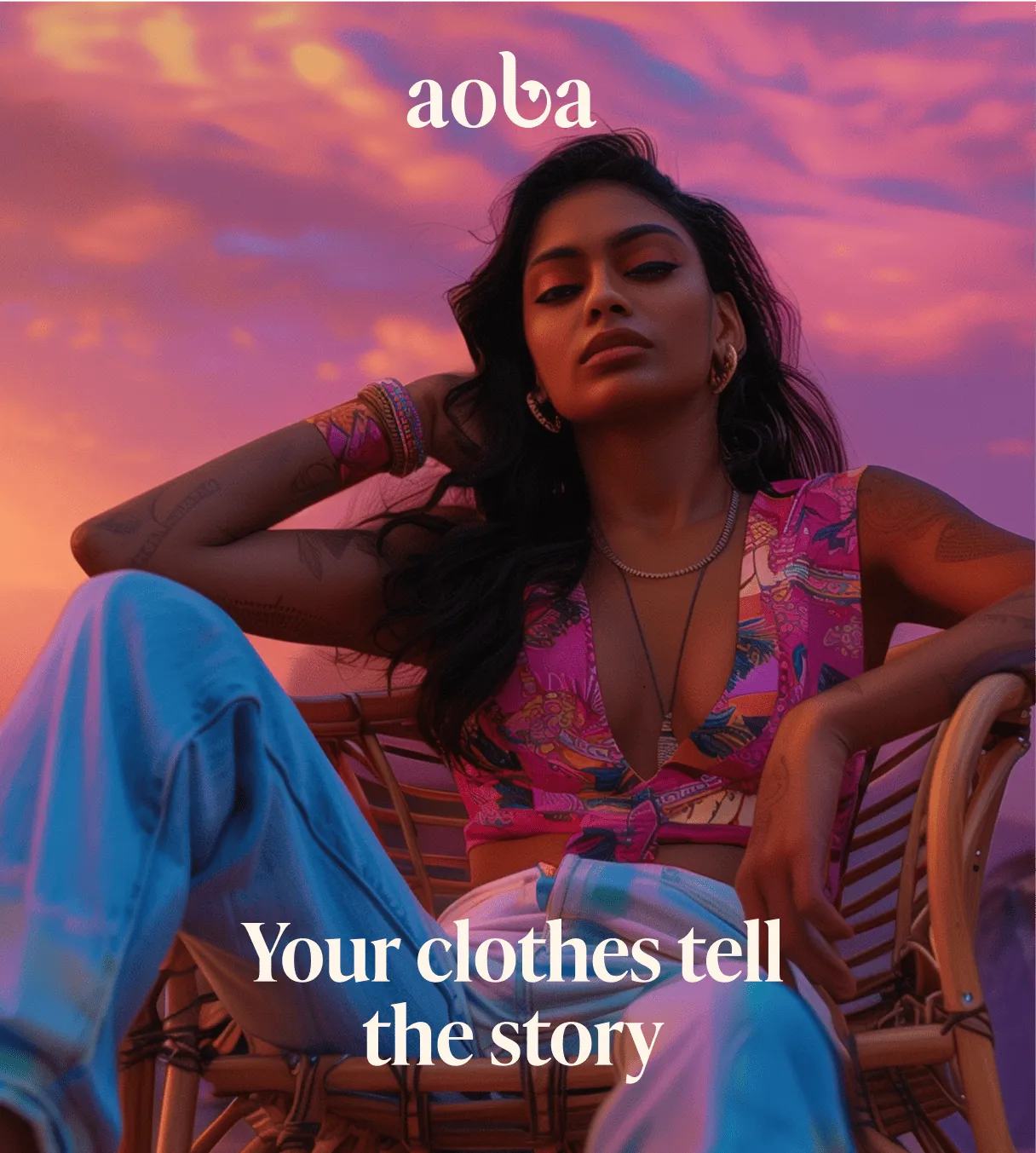
AOBA, a tropical-inspired beachwear and resort wear brand, partnered with Confetti to overcome a key market challenge: limited awareness of resort wear as a lifestyle category in India.
Confetti transformed Erotissch into AOBA through strategic renaming, market research, brand positioning, and a refreshed visual identity. Built around confidence, adventure, and island living, AOBA was repositioned as a premium yet relatable lifestyle choice.
The new identity blended cultural insights with vibrant design, creating a brand that celebrates individuality, exclusivity, and the joy of escape.
👉Category creation requires more than great product, it requires a brand identity that educates, inspires, and makes the unfamiliar feel attainable. By grounding a tropical escape brand in Indian cultural insights, Confetti transformed a niche category into an aspirational lifestyle choice.
Chorus evolved from Moonray and Chanakya International, the heritage atelier founded in 1984 and known for embroidery collaborations with global houses including Dior.
Co-founded by Karishma Swali and her daughter Avantika Swali, Moonray brought Gen Z energy to artisanal craft, blending upcycled denim and traditional embroidery into contemporary silhouettes.
In 2025, Moonray became Chorus, a multidisciplinary atelier spanning couture, ready-to-wear, wellness, home, and a café. Its three-storey Kala Ghoda flagship in Mumbai reflects Karishma’s vision of craft as a force that extends beyond fashion into culture and the arts.
👉Chorus demonstrates how a brand can evolve from a single product category into a complete lifestyle ecosystem while staying rooted in its craft heritage. The identity system expands without fragmenting.
Fashion identity does not travel intact. It must adapt to each market's consumer behaviour and cultural expectations.
The brands that succeed across regions understand this and design their identity systems accordingly.
India's D2C fashion boom has flipped the traditional identity-building sequence. New labels now launch identity-first on Instagram, building a visual world and audience before any physical retail presence exists.
This is the inverse of how traditional fashion houses historically operated, starting from a physical flagship and expanding outward.
What this means for design priorities:
A garment tag or unboxing experience that undersells a customer's digital impression creates a jarring mismatch, one that shows up in reviews and repeat purchase behaviour quickly.
Modest fashion and abaya-adjacent categories represent a distinct identity challenge that Western branding content rarely addresses.
These brands need identity systems that read as contemporary and desirable while respecting cultural and modesty considerations: a balance generic "minimalist luxury" templates often fail to achieve.
Critical considerations:
The region's modest fashion market is growing rapidly, driven by a young, affluent consumer base. The challenge is designing for aspiration within cultural parameters that many brands misunderstand.
We create timeless fashion brand identities, not fleeting logos or trends.
Strategic systems built to stay consistent across every touchpoint, from social media to garment tags, packaging, and beyond.
✅ We start with strategy, not decoration
Logo design is approached as a long-term strategic decision grounded in positioning and scalability, not as a purely visual exercise. Before we design anything, we define who the audience is, what they value, and where the brand fits.
✅ We build category-creating identities
AOBA came to us after Shark Tank with a niche resort wear category that Indian consumers barely understood. We rebranded the label, conducted comprehensive market research, and positioned it as a premium lifestyle choice, making tropical resort wear relatable and aspirational in the Indian market.
✅ We design for both digital and physical
Desi Minimals needed an identity that worked across Instagram, packaging, and garment labels. We built a visual and verbal system that was calm, grounded, and distinct—mirroring the brand's belief that style should feel effortless.
✅ We craft identities that scale
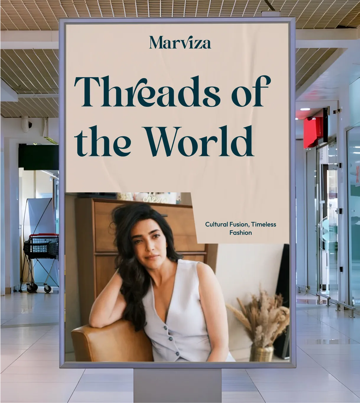
Marviza, a luxury fashion brand, needed a distinctive visual identity blending timeless elegance with modern subversion. We developed a comprehensive brand strategy by deeply analyzing its target audience, ensuring the brand's messaging and visuals resonated effectively.
✅ We handle every touchpoint
From logo and colour palette to garment labels, packaging, and unboxing experience—we design the complete physical brand experience.
⚠️ Designing the logo before defining brand positioning:
Without knowing whether the brand represents quiet luxury, streetwear, contemporary fashion, or another category, the design lacks strategic direction. A logo should reflect the brand’s personality, audience, and market position, not simply look visually appealing.
⚠️ Ignoring small-scale applications
A logo that works digitally may fail on hangtags, labels, buttons, or garment details where clarity is essential. Testing designs in real-world applications helps avoid costly production issues later.
⚠️ Following short-lived trends
Trend-driven visuals may look modern today but quickly lose relevance. A strong fashion identity balances current appeal with timeless elements that support long-term brand recognition.
⚠️ Treating physical elements as secondary
Tags, labels, packaging, and other materials are not just functional, they communicate quality, craftsmanship, and brand values. These details play a major role in the customer experience.
⚠️ Neglecting brand voice
A strong visual identity needs a matching tone of communication. Without clear guidelines, messaging can become inconsistent across campaigns, social platforms, and customer interactions.
⚠️ Skipping audience definition
A successful identity starts with understanding the target customer—their lifestyle, preferences, buying behaviour, and emotional connection with fashion. Design decisions should be built around that insight.
⚠️ Overlooking material details
Packaging textures, paper quality, finishes, and garment details influence how customers perceive value. Premium branding requires consistency between visual promises and physical experiences.
⚠️ Building an identity that cannot scale
A flexible identity system should work across future collections, collaborations, retail spaces, and new product categories without losing recognition.
⚠️ Weak garment label design
Labels remain with customers long after purchase and act as a continuous brand reminder. A poorly designed label can reduce the perceived value of the garment.
⚠️ Using generic price tags
Price tags are part of the final buying moment. Their design, material, and finish should match the brand’s positioning and reinforce the value customers expect.
What is brand identity for a fashion label?
Brand identity for a fashion label is the complete, consistent system of visual and verbal elements, logo, typography, color, material choices, and tone, across every touchpoint the brand controls, including garment tags, packaging, and digital presence. It's a full system, not a single logo.
How is fashion branding different from general brand identity design?
Fashion branding has to function across an unusually wide range of physical touchpoints, garment tags, care labels, hangers, dust bags, alongside digital presence, and has to survive extreme scale differences, from a tiny woven label to a large storefront sign, that most other categories don't face to the same degree.
What makes a fashion logo work at small scale, like on a garment tag?
A logo that works at small scale is usually simplified enough to remain legible without fine detail getting lost, and has been tested specifically at that scale during the design process rather than only approved as a large digital asset. Complex marks with fine linework or small text often fail this test even when they look strong on a screen.
How much does fashion brand identity design cost?
Cost varies significantly based on scope, whether the project covers just a mark and core visual system, or a full identity build across packaging, garment tags, and digital presence. A brand consultancy can typically scope this accurately once the specific touchpoints and product range are defined.
Does a fashion label need a different identity for digital vs. physical touchpoints?
No, and it shouldn't. The strongest fashion identities use one consistent system across both, adapted appropriately for each context, rather than maintaining two separately styled versions of the brand. A meaningful gap between a label's digital presence and its physical product creates a credibility problem customers notice.
Want strategic branding and packaging like this for your business?





.webp)
.webp)


.webp)
.webp)
.webp)
.webp)
.webp)







.svg)
.webp)