%201.webp)
02
AI Snaps
.svg)
.svg)
01
Our Work

03
About Us
05
Contact Us
06
Client Success

07
Blogs
08
Careers
Book A Call



.svg)
Need Help In Building Your Brand?
Click the button below & book a call with our founder directly.

Rishabh Jain
Managing Director
Jewelry packaging design elements are the visual, structural, material, and functional details that work together to present and protect your piece of jewelry.
This guide is built to be used, not just read by jewelry brand owners. We take you through what the essentials are and why and how you can make the choice of what to include.
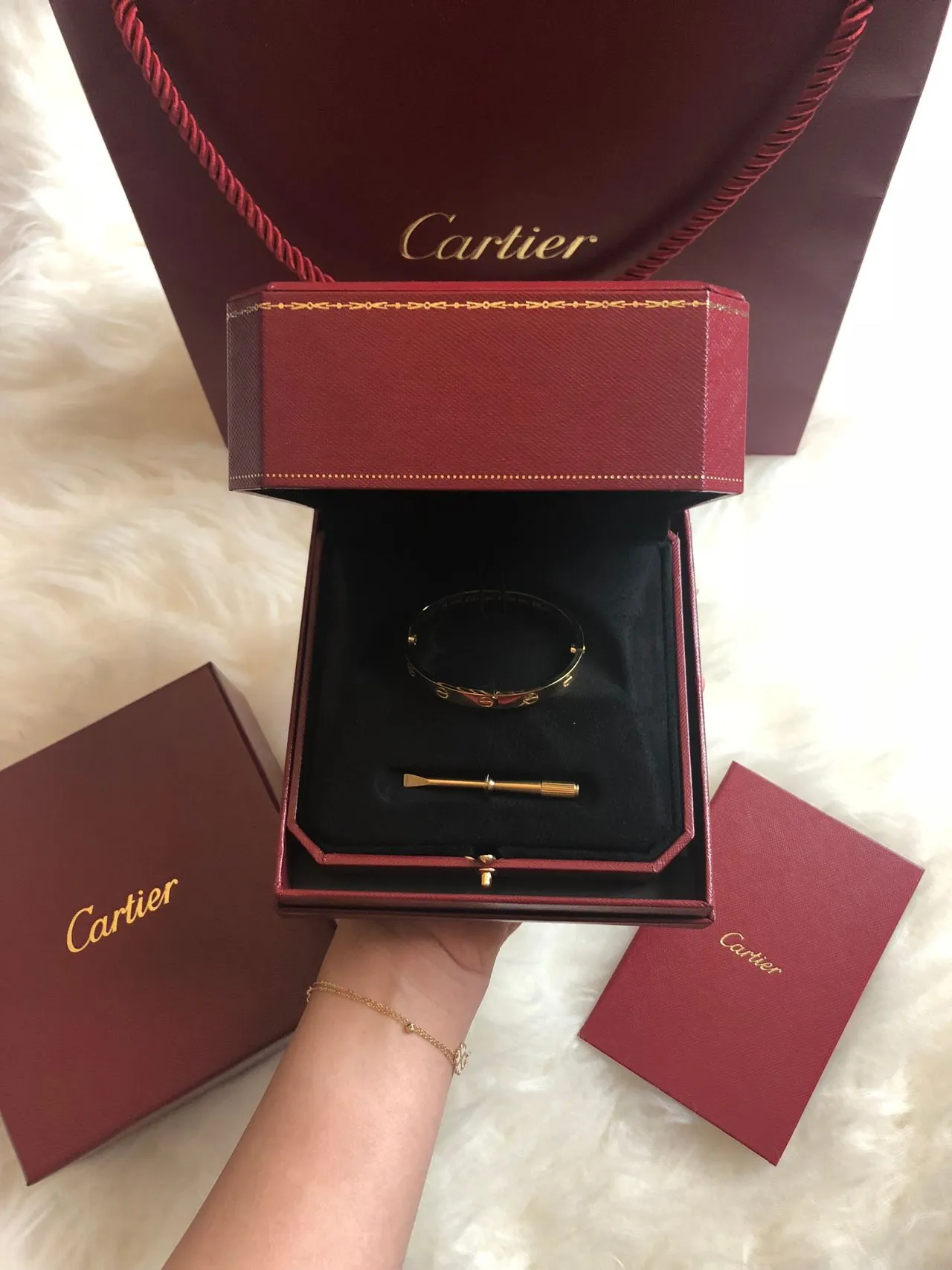
Jewelry packaging is a working system, a sequence of components that together protect the product, communicate the brand, and shape how the customer experiences the moment of reveal.
These elements are important because jewelry is disproportionately gifted. That means packaging is frequently the first thing a recipient experiences, before they've even seen the piece inside.
A weak unboxing moment reflects on the gift-giver as much as the brand. That's a job most product categories never ask their packaging to do.
Every jewelry packaging brief we build organizes around the same four layers, the 4 P's: Protect, Present, Prove, Personalize.
Jewelry packaging is a system where every component has a job. Here are the main elements you can consider:
The jewelry box is usually the most important physical element in the whole system.
It is the first physical touchpoint many customers experience after purchasing from a jewelry brand. Its structure, material, proportions and opening mechanism can influence how the product is perceived.
✨Box Structure
The choice should reflect the jewelry, price point, sales channel, shipping requirements and desired customer experience.
Other structures, such as book-style, shoulder-neck, hinged and cylindrical boxes, can help make packaging part of a collection’s identity, particularly for limited editions.
For e-commerce, structural design must also consider courier handling, storage, dimensional weight and protective shipping cartons.
✨Materials and Finishes
Sustainability should also influence structure. Boucheron redesigned its jewelry case using aluminum and wool felt, reducing components and weight while improving recyclability.
✨Interior Design
The interior should secure the jewelry while keeping it visually dominant:
Bulky cushions or poorly positioned fasteners can diminish the presentation.
For brands with multiple categories, modular inserts can allow one outer box to accommodate rings, earrings, necklaces and bracelets, reducing packaging complexity while maintaining consistency.
✨Box Size and Proportion
The box should be sized around the jewelry, insert and necessary protection.
Oversized boxes create waste and excessive shipping volume, while undersized boxes can make the product feel constrained. Well-fitted packaging improves both presentation and operational efficiency.
✨Opening Experience
A magnetic closure, drawer, ribbon, sleeve or concealed mechanism can create memorable moments. The goal is not to add unnecessary details, but to create a distinctive interaction customers associate with the brand.
Finally, designing the box for reuse, as a storage, travel or display case, can extend its life and reinforce the perception of value.
Material choice determines how the box feels in the customer's hands, how well it protects the jewelry, how efficiently it can be produced and shipped, and how closely the packaging aligns with the brand's positioning.
The right material balances aesthetics, protection, cost, durability and sustainability rather than optimising for appearance alone.
✨Material Choice
The key question is Which material delivers the right combination of handfeel, protection, cost, production requirements and brand perception?
✨Interior Materials
Interior materials should secure the jewelry, keep it visible and prevent movement, scratches or tangling.
Common options include velvet, fabric, moulded fibre, paperboard and foam alternatives. The choice depends on the jewelry type: rings need slots, earrings need holders, and necklaces need anti-tangle support.
For silver and tarnish-prone metals, anti-tarnish materials or treatments can provide extra protection.
Interior materials should also support the outer box’s sustainability. Removable inserts make packaging easier to reuse, separate and recycle.
✨Sustainable Jewelry Packaging Materials
Sustainable packaging is not just about replacing plastic with paper. It also means reducing materials, simplifying components, improving durability and making packaging easier to reuse or recycle.
When choosing sustainable materials, consider:
International brands should also consider regulations such as the EU Packaging and Packaging Waste Regulation, which applies from 12 August 2026. (EUR-Lex)
✨Protecting Jewelry During Transit
Jewelry packaging must protect products throughout shipping, from fulfilment centres to final delivery.
Corrugated cartons offer stronger protection, while padded mailers may suit lightweight, well-protected products. Sleeves, belly bands and paper wraps can add branding without excessive packaging.
Before production, test the packaging for drops, vibration, closure security, abrasion, moisture and fit. A damaged box ultimately means the packaging has failed.
The Four-Way Balance
Every material decision balances four things at once: appearance, protection, cost, and durability. Optimizing for one in isolation, usually appearance, is the most common way a packaging budget gets misallocated, because the other three quietly fail later.
Jewelry packaging should communicate the brand even without a visible logo.
✨Logo Placement, Size and Application
The logo should have enough space around it to stay clear and intentional. Centre placement works well for symmetrical, rigid boxes and creates a formal look.
For smaller applications, a monogram or symbol can work better than a full wordmark.
Logo finishes:
Choose the finish based on the box material. For example, metallic foil suits dark rigid board but may look excessive on highly textured surfaces.
✨Brand Colours and Typography
Colour consistency is important when packaging includes boxes, pouches, bags, tissue paper, cards and shipping materials.
A defined Pantone spot colour can help maintain a signature brand colour, while CMYK works well for photographs and multi-colour designs. Physical proofs are still important because materials, coatings and printing can affect colour.
Typography should also remain consistent. A clear type hierarchy, spacing and proportions can create a sophisticated look without relying on excessive decoration.
✨Build a Recognisable Visual System
Strong jewelry packaging should remain recognisable even without the logo. Brand identity can come from:
Monograms are especially effective for jewelry brands because they work well across small surfaces. Monica Rich Kosann, for example, uses an Art Deco-inspired monogram throughout its wider brand identity.
✨Make Every Packaging Component Feel Like One Brand
A common mistake is designing the jewelry box, pouch, bag and inserts separately. While each may look good alone, the overall experience can feel disconnected.
A stronger approach creates consistent rules for logo use, colour, typography, imagery, patterns, materials and finishes across all packaging.
Not every component needs to look identical. A pouch can be simpler, a care card more informational and a shipping box more minimal. They simply need enough shared elements to feel like one brand.
The goal is recognition without repetition, packaging should feel unmistakably yours even when the logo is hidden or absent.
Color palette communicates positioning as much as any other element in this list.
Tiffany & Co.'s distinctive blue is a great example of how colour can become a proprietary brand asset.
✨Colour Consistency Across the Entire Packaging System
Colour should stay consistent across boxes, pouches, bags, tissue paper, ribbons, cards, shipping materials and digital touchpoints.
Pantone or spot colours can help maintain consistency, while CMYK is better for photographs and multi-colour artwork.
Always approve colours using physical proofs, as materials, coatings, printing and lighting can affect the final appearance.
✨Cultural Context
Colour meanings vary across cultures and markets. This is especially important for international jewelry brands and occasions such as weddings, gifting and festivals.
Test your palette in each target market and use cultural conventions thoughtfully—either by following, adapting or intentionally challenging them.
Typography and finishing form the detail layer of jewelry packaging.
They influence how the package feels visually and physically, but neither should be added simply because a technique looks impressive in a presentation mockup.
✨Sets the Tone
Typography communicates personality before the customer consciously evaluates the words.
The important consideration is consistency with the wider brand identity. A heritage jewelry house, a contemporary fine jewelry label and a youth-focused fashion jewelry brand should not automatically use the same typographic approach.
Legibility also matters. A typeface that looks elegant on the lid of a large jewelry box may become difficult to read on a small care card, certificate or jewelry pouch. Typography should therefore be tested at every size and across every packaging component.
✨Finishes Add Tactile and Visual Detail
The insert is the point where packaging design meets the actual jewelry. It needs to protect the product during handling and transportation while presenting it in a way that makes the opening moment feel considered.
✨Match the Insert to the Jewelry
Different jewelry categories require different presentation systems.
A single insert may not suit every jewelry type. For brands with multiple products, a modular insert system allows one outer box to use interchangeable inserts for rings, necklaces, earrings and bracelets.
✨ Insert Materials
For brands prioritising lower-impact packaging, moulded fibre, recyclable paper-based materials and other bio-based alternatives like Papira can reduce dependence on conventional plastic-based foams.
✨ Insert Specifications
A ring slot that is too wide can let the piece move, while a shallow necklace channel may cause tangling during transit. Inserts that are too thick or hard can also affect closure or damage delicate jewelry.
Therefore, inserts should be developed using real jewelry samples. Test the fit, closure, handling and shipping, and check the presentation when the box is opened.
At Confetti, we approach jewelry inserts as part of the complete packaging system. The objective is simple: the jewelry should arrive securely, sit correctly and become the immediate visual focus when the box is opened.
The jewelry box may be the primary packaging, but the rest of the packaging system continues the brand experience.
✨Jewelry Pouches
A jewelry pouch can serve several purposes. It may be the primary packaging for an accessible jewelry line, an additional layer inside a premium box, a travel case or a storage solution for the customer.
The material should match the brand identity, not simply signal luxury.
Jewelry branding can stay subtle through woven labels, printed logos, foil stamping, embroidery or branded pulls.
Pouches also have long-term value because customers can reuse them for storage or travel, keeping the brand visible beyond the purchase.
✨Shopping Bags
Shopping bags are a visible part of the retail experience and should match the jewelry box through paper, handles, colour, typography and logo treatment.
FSC-certified paper can support responsible sourcing, while foil, embossing and quality printing can add a premium feel. Garrard, for example, uses FSC-certified paper and avoids ribbons to improve recyclability.
The important consideration is proportion.
A heavily branded shopping bag is not automatically more effective. For luxury jewelry, restrained branding, generous space and high-quality materials can communicate more than a large logo and multiple decorative elements.
✨Shipping Packaging for Jewelry E-commerce
For e-commerce, shipping packaging is often the customer's first physical brand experience. It must protect the jewelry and build anticipation.
Layers may include a mailer or carton, protective paper, tissue, jewelry box or pouch, care card and thank-you note. Each should serve a clear purpose.
Test packaging for compression, drops, abrasion and vibration to ensure it survives real shipping conditions.
A useful approach is to separate presentation from protection: let the jewelry box focus on the brand experience while the outer carton provides transit protection.
For jewelry, packaging needs to help communicate authenticity, purity and product information.
✨Certificates and Product Documentation
Certificates of authenticity, product cards, invoices, warranty documents and gemstone information can all become part of the packaging system.
Where appropriate, certificates can include details such as:
The certificate should feel consistent with the brand. Typography, paper stock, colour and layout can follow the same identity system as the jewelry box without compromising the clarity of the information.
✨Hallmarking and Purity Information
For Indian jewelry brands, BIS hallmarking and HUID information are particularly important trust elements for applicable hallmarked jewelry.
UAE gold is purity-verified, with common grades including 750 (18K), 875 (21K), 916 (22K) and 999 (24K). Bareeq Certification can also indicate compliance with purity, pricing transparency and ethical trading standards.
Rather than burying relevant information in fine print, brands can explain it clearly through product cards or accompanying documentation.
The design challenge is to make the information accessible without turning the jewelry packaging into a compliance document. A concise explanation, supported by a QR code where appropriate, can help customers understand what they are looking at and where they can verify it.
For brands operating in international markets, you must check certification and labelling requirements for each market before packaging artwork is finalised.
✨Care, Warranty and Brand Story Cards
Sustainability should be considered when the packaging system is designed.
Consider the entire system: material quantity, sourcing, durability, reusability, recyclability, component separation and shipping weight.
✨ Reduce Before You Replace
Simply replacing plastic with paper does not automatically make packaging sustainable. First, consider whether components can be removed, combined or reused.
For example, one box could use interchangeable inserts, or a rigid box could be designed for long-term jewelry storage.
✨ Material Alternatives
Premium jewelry brands can explore FSC-certified paper, recycled paperboard, cork, moulded fibre and bio-based materials. Papira and Eco Sponge are examples of fibre-based alternatives to conventional foam.
The “most sustainable” material depends on the product, lifespan, production, transport and end-of-life options.
✨Avoid Unsubstantiated Sustainability Claims
Avoid broad claims such as “eco-friendly,” “green” or “sustainable” unless they can be supported. Instead, communicate specific facts, such as recycled-content percentages, FSC certification or the use of recyclable materials.
Names, initials, monograms, engraved messages and personalised cards can make the experience feel more considered, particularly for bridal, anniversary and gifting purchases.
✨Monograms and Signature Symbols
A monogram can strengthen brand identity while adding a personal touch. It works especially well on ring boxes, pouches, ribbons and cards, where a full logo may feel too large.
Monica Rich Kosann uses an Art Deco-inspired monogram across its packaging and customer experience, creating a distinctive and recognisable brand signature.
✨Personalization Options
Depending on the business model and production volume, personalization can include:
Not every option needs to be available for every order.
For many brands, a simple personalised card or removable monogram tag can deliver the emotional benefit without creating unnecessary production complexity.
✨Seasonal and Occasion-Based Packaging
Jewelry is closely linked to gifting, making seasonal packaging useful for occasions such as Eid, Diwali, Valentine's Day, weddings and anniversaries.
The key is to adapt the core brand identity rather than replace it. Seasonal sleeves, colours, inserts or gift cards can add an occasion-specific touch without redesigning the entire system.
Personalization should also feel intentional. Instead of adding a customer's name everywhere, one thoughtful detail can make the package feel personal and special.
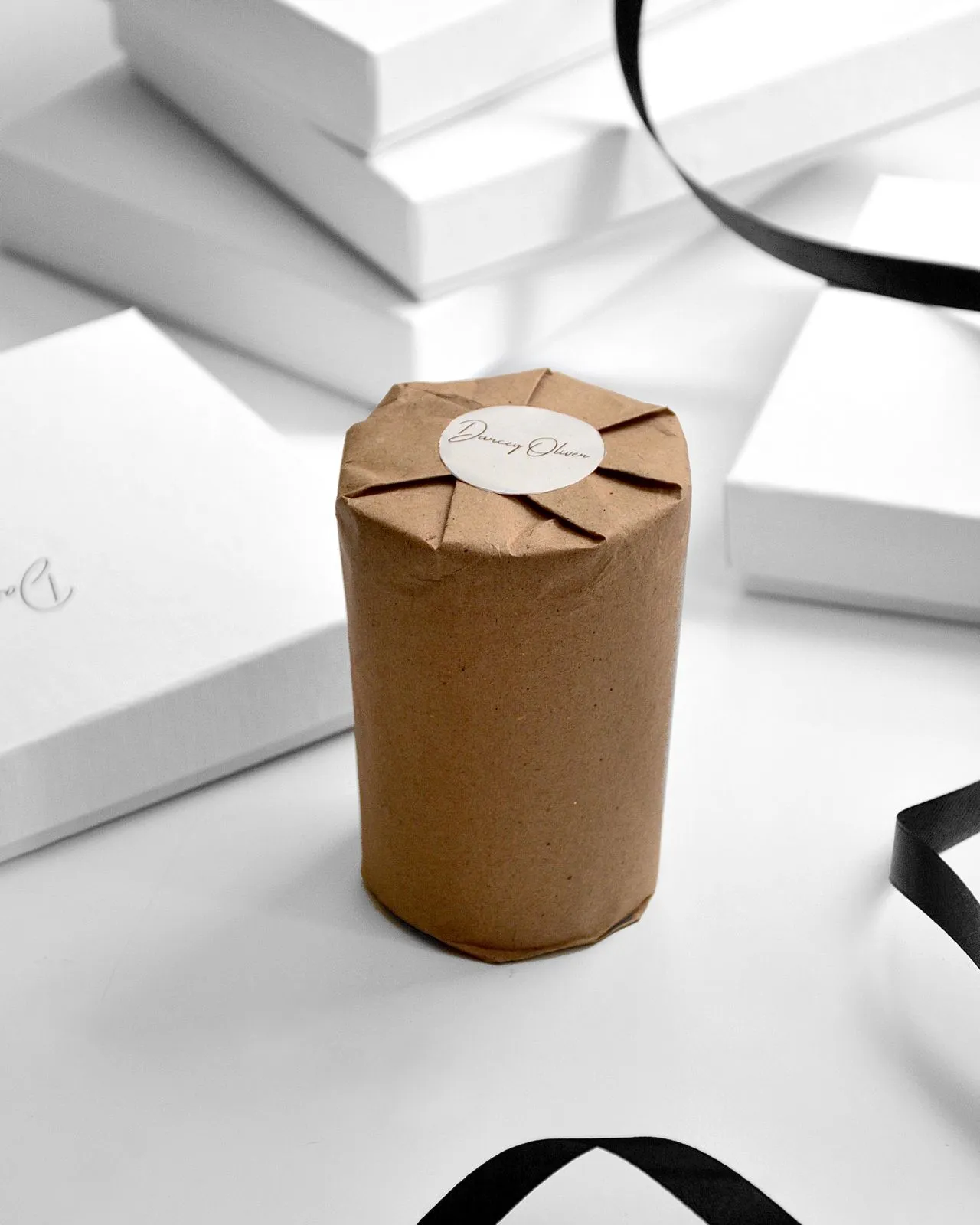
In the luxury sector, emotional value consistently outweighs functional value.
Packaging is the primary vessel for delivering that emotion, and every element must be deliberately chosen to reinforce the brand's positioning
The traditional velvet-covered box is evolving into more distinctive forms. Geometric shapes, soft corners, hexagons, hearts and custom silhouettes can create stronger brand recognition.
Messika uses diamond-inspired geometric forms, while Godavari Diamonds incorporates early-20th-century-inspired curves into its boxes.
The raw luxury movement is also gaining traction. Unique materials such as geode, agate and quartz can also create an exclusive, unrepeatable experience. The appeal is exclusivity.
Materials communicate luxury through weight, texture and handfeel.
For luxury jewelry, the right finish can instantly elevate perceived quality.
Warm minimalism is increasingly important, with textured papers, blind embossing and subtle finishes replacing excessive decoration.
Tactile contrast is also gaining attention. Boucheron combines a cool, rigid anodized aluminum exterior with a soft Merino wool felt interior, creating a distinctive “hard outside, soft inside” experience.
Colour helps communicate positioning, emotion and recognition.
Luxury brands are exploring stronger colour contrasts, while monochromatic palettes remain popular for contemporary designs. Soft off-whites, creams and greys paired with dark interiors can keep the jewelry as the visual focus.
Consistent colour ownership can also become a powerful brand asset, as seen with Cartier’s iconic red packaging.
Unboxing should be treated as a designed sequence, with each layer building anticipation:
Shipping box → tissue → ribbon → jewelry box → insert → certificate → jewelry
Closures, textures, seals and reveals can make the experience feel more deliberate and memorable.
Luxury packaging can remain premium while using more sustainable materials. Options include:
The key is not simply choosing a “sustainable” material but ensuring it still delivers the weight, finish, texture and experience expected from luxury packaging.
At Confetti, we don’t approach jewelry packaging as a standalone asset. It is the physical expression of the entire brand system, visual identity, and customer experience.
✅The System-First Approach
We design packaging as a connected system. Before drawing a dieline or selecting a material, we establish the core brand codes including positioning, visual identity, colour palette, typography, and tone.
These codes then extend across the box, insert, pouch, certificate, shopping bag, and shipping box. Every element speaks the same visual language, creating a cohesive experience from the first brand interaction to the unboxing moment.
✅Packaging as a Complete Experience
Packaging is touched, opened, turned, and discovered over time.
We design for this entire journey: what the customer sees first, how the pack opens, how information is revealed, and what each interaction communicates.
✅Applied Across Categories
Whether we are working with a heritage brand communicating tradition or a contemporary label focused on modern, everyday wearability, the goal remains the same: packaging must protect the product, communicate the brand, and create a memorable moment of reveal.
The result is a jewelry packaging system rooted in strategy, designed as a connected experience, and built to perform.
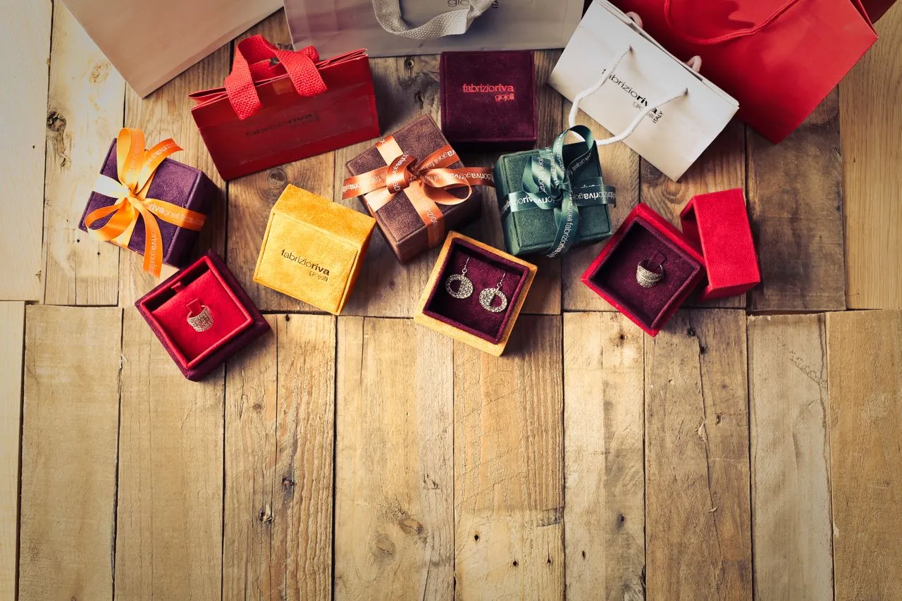
Every jewelry brand has the same list of packaging components to choose from. As an experienced branding and packaging design agency, here’s how we recommend you can make the right choice:
▶️Start With the Unboxing Sequence, Not the Components
Start by defining the ideal unboxing experience, then work backwards to the components that deliver it.
The unboxing moment has replaced the in-store counter experience.
Outer shipping box → tissue paper → ribbon reveal → box opening → insert presentation → certificate display → final reveal of the piece.
Each layer should build anticipation, not diminish it.
Define the feeling first. The components follow.
▶️Align Material Choices With Brand Positioning
Material is the primary signal of value. The handfeel, weight, and texture communicate the brand's position.
A minimalist, contemporary brand might opt for a matte, monochromatic box with a clean, sans-serif font.
A heritage brand should use visual richness: gold foil stamping on deep navy or burgundy, velvet interiors, embossed logos. The material and finish must match the positioning. A mismatch creates confusion.
▶️Consider the Product Type and Purchase Context
Different jewelry products have different packaging requirements. The choice of components should reflect what is being packaged and how it will be purchased.
The packaging design should also account for repeated handling.
Unlike packaging that is discarded immediately, jewelry boxes may be stored, reopened for gifting, or kept with the piece for years.
A premium-looking box that feels flimsy or poorly constructed can damage perceived value at exactly the moment when the customer is forming a lasting impression.
▶️Follow Consumer Trends, Not Just Personal Preference
Consumer preferences in jewelry packaging are shifting. Brands that ignore these shifts risk irrelevance.
Sustainability is increasingly being expected, even in luxury. The unboxing experience drives loyalty.
Social media shapes expectations. Driven by the visual demands of social media and a generation that values hyper-personalization, the "standard" box is no longer enough.
Unboxing videos get over 14 billion views a year on YouTube, with jewelry consistently in the top five categories.
Self-gifting is growing. New 2025 data shows self-gifting now hits 35% of the market. Packaging designed for self-purchase is increasingly important.
▶️The Decision Matrix
Use this framework to evaluate which elements belong in your packaging system.
Score each component against your brand positioning, product requirements, and consumer expectations.
❌Common Mistakes in Element Selection
What are jewelry packaging design elements?
Jewelry packaging design elements are the visual, structural, material, and functional details: boxes, inserts, materials, branding, certificates, care cards, and shipping packaging, that work together to protect a piece and communicate brand quality and trust.
What is the difference between a jewelry box and jewelry packaging?
A jewelry box is one physical component. Jewelry packaging is the full system around it like inserts, pouches, certificates, care cards, ribbon, tissue paper, and shipping materials, all working together as one connected brand experience.
Do I need a certificate of authenticity in my jewelry packaging?
Yes, especially for gold and precious metal pieces. A certificate builds buyer trust, supports resale or insurance value, and in India and the UAE, connects directly to mandatory purity and hallmarking disclosure requirements.
What makes jewelry packaging feel luxurious?
Consistency across materials, finishes, typography, and structure, combined with restraint rather than excess. Luxury packaging comes from disciplined, considered choices holding together as one system, not from adding premium finishes everywhere.
What makes jewelry packaging sustainable?
Genuinely reduced environmental impact: recycled or FSC-certified materials, minimal packaging, reduced plastic, considered from the start of design, not added as messaging after a conventional design is finalized.
How do I choose the right packaging elements for a small jewelry business?
Prioritize based on your actual sales channel, price point, and order volume rather than copying a luxury competitor's full system. A focused, well-executed subset of elements consistently applied outperforms an incomplete version of a more elaborate system.
Want strategic branding and packaging like this for your business?





.webp)
.webp)


.webp)
.webp)
.webp)
.webp)
.webp)






.svg)
.webp)
.svg)
.webp)