%201.webp)
02
AI Snaps
.svg)
.svg)
01
Our Work

03
About Us
05
Contact Us
06
Client Success

07
Blogs
08
Careers
Book A Call


Need Help In Building Your Brand?
Click the button below & book a call with our founder directly.

Rishabh Jain
Managing Director
Effective packaging design for shelf visibility combines many factors from colour to contrast, clear hierarchy, structural differentiation and more.
As an agency that has been recognised for its retail packaging designs, we help you break down shelf appeal packaging with this clear, structured guide.
Simply put, shelf visibility in packaging design means how easily and quickly a product is noticed, recognised, and understood on a crowded retail shelf. No external help from a salesperson, no promotion, no signage.
It's the ability of your packaging to stop the eye within a sea of competing products.
No, they are not.
Shelf visibility is about being seen. It's the moment a shopper's eye lands on your product rather than the one next to it.
Shelf appeal is about what happens next. It's the feeling your packaging creates once noticed, the desire to pick it up, read it, and ultimately buy it.
As a brand, you need both. Visibility without appeal is wasted attention. Appeal without visibility means you never get the chance to use it.
Most brands spend months, sometimes years, perfecting their product.
They obsess over the formula, the flavour, the quality. Then, at the final stage, packaging appears. This results in a brilliant product in a packaging that nobody notices.
Data suggest that over 70% purchase decisions are made when a shopper enters the store. The decision happens on the shelf, in real time, in seconds.
Products with strong shelf visibility and appeal can outsell structurally similar competitors by significant margins, not because the product inside is better, but because the packaging communicates value faster.
This is a simple benchmark used by packaging designers and brand managers to test shelf impact.
The premise is: can a shopper who has never seen your product before identify the brand, the product type, and the key benefit in 3 seconds or less, at arm's length?
If the answer is no, your packaging has a visibility problem.
Shoppers spend only a few seconds scanning a shelf section before moving on or making a selection. If your packaging doesn't communicate fast, nothing else matters.
The principles of shelf visibility were born in physical retail. But they also apply just as powerfully in digital environments.
In an online grocery or marketplaces, your pack has even less space to work with. A thumbnail image, often smaller than a postage stamp, has to communicate brand, product, variant and key benefit at a glance.
The same design principles apply: strong colour contrast, clear hierarchy, bold typography, distinctive structure.
What changes is the scale. Designs that rely on fine detail, subtle textures or layered information tend to disappear at thumbnail size.
The most effective packaging today is designed to work at every scale, from a full-size shelf facing to a 100x100 pixel product image.
Packaging is just aesthetics, it's about perception, governed by science.
The "science" of shelf appeal is rooted in neuro-marketing and visual psychology - a study of how the human brain processes sensory information in a high-stimulus environment like a retail aisle.
Before a customer "decides" to look at a product, their brain has already scanned the shelf.
This happens in the preattentive phase or The "Blink" Phase, a subconscious scan that takes about 200 milliseconds.
The human eye moves in quick, unconscious jumps called saccades, filtering what it sees between them. It prioritises contrast, movement, familiarity, and anomalies.
In retail, shoppers scan shelves in a loose Z-pattern, pausing only on items that break visual monotony.
If your packaging blends in, it gets skipped, not due to poor creativity, but how the brain works.
Key Takeaway: Your packaging must create a visual interruption on first glance, through colour, shape, scale, or something unexpected.
Even when a product is noticed, it can still fail.
A shopper may see your pack but move on in seconds, not because it was missed, but because it wasn’t understood.
That’s where visual hierarchy comes in. It guides the eye through your pack in a clear order.
If done well, a shopper grasps your brand, product, and key message in under 3 seconds. Done poorly, it feels like visual chaos and they move on.
The classic hierarchy for retail packaging works like this:
The first three have to work at shelf distance, at a glance, in motion, in imperfect lighting.
The fourth is for the shopper who's already picked the product up and is reading it closely.
Colour contrast is one of the most powerful tools in packaging and also one of the most misunderstood.
It’s not about bold colours, but differentiation - how your pack looks relative to the shelf.
If the category leans dark and moody, a bright, clean design stands out. If it’s full of bright colours, deeper tones or neutrals can be more disruptive.
The brain notices deviation from patterns. A single white pack among colourful ones draws the eye, and vice versa.
Contrast also matters within the pack. Strong contrast between text and background improves legibility at a distance. Weak contrast makes even a noticed product hard to read.
Finally, lighting matters. Retail environments render colour differently, fluorescent, warm, or LED lighting can all shift perception. Testing packaging under real conditions is thus essential.
Most brands compete on the flat face of a pack, smart ones compete on its shape.
Structural differentiation, through silhouette, form, or proportions, creates visibility that graphics alone can’t. It’s noticeable from angles, in peripheral vision, and signals quality or innovation.
That’s why flexible formats like custom pouches or stand-up designs are gaining ground. They break away from the standard box or bottle and stand out more naturally.
Structure also affects how products sit on the shelf. Variations in height, width, or angle can disrupt uniform rows. Even small differences become powerful when repeated across multiple facings.
The key shift: treating structure and graphics as one unified design problem, not separate tasks.
Some products win by looking familiar, signalling they belong to a trusted category. Others win by standing out completely, using distinctiveness to spark curiosity.
Both work, but for different reasons, categories, and audiences.
Established brands can push boundaries because recognition carries them. New or challenger brands often need to signal category cues first, while still creating distinction.
You must choose deliberately.

In packaging design, there are five elements that, when working together, give packaging its best possible chance of being noticed, understood, and chosen:
Colour is processed before anything else, before words, and even shape. It’s your fastest communication tool, so using it strategically is foundational.
A dominant brand colour is the starting point: Cadbury’s purple, Heinz’s red, Tiffany’s blue.
These act as instant identifiers, doing the job before a shopper reads a word.
But effective colour strategy goes beyond recognition. It starts with a clear view of the shelf:
Those answers should drive decisions.
A few principles worth internalising:
And again, remember, lighting changes everything.
Colours shift under fluorescent, warm, or LED retail environments. Always test in real conditions, what you miss before print can’t be fixed after.
Try a simple test: print your packaging at actual size, place it on a table, and step back about 90cm.
Can you clearly read the brand name, product name, and key claim? If not, it’s a typography problem.
Packaging typography has one main purpose: fast communication in real-world conditions.
The core rules are simple:
If a shopper has to work to read it, they won’t.
The best packaging communicates in pictures first, words second.
A strong hero image can signal freshness, quality, or appetite appeal faster than any headline.
But imagery must earn its place, it should communicate something text can’t, and do it instantly.
A few principles that hold in retail setting:
The principle remains: If the eye has to work harder, it often moves on.
Shelf-ready packaging (SRP) is one of the most effective and underused ways to boost shelf visibility. And increasingly, it’s becoming a retailer requirement.
SRP is designed to go straight from delivery to shelf, no unpacking needed. But its real advantage is its visibility.
A well-designed SRP tray creates a branded block on the shelf. It turns the outer packaging into a display surface, reinforcing colour, imagery, and messaging. It also ensures products are consistently presented: aligned, visible, and at the right angle.
Effective SRP typically delivers on five fronts:
The key is to design SRP from the start. When primary and secondary packaging work together, they create a unified shelf presence.
SRP can effectively double your visibility without paying for extra facings if implemented well.
This is where many brands fail and where the commercial impact is highest.
On shelf, products don’t exist alone. They sit beside their own variants and competing brands.
The real question isn’t “does this pack look good?” but “does this range work together to create a strong, clear presence?”
That’s where brand architecture comes in.
It’s the system (colour, typography, structure, iconography) that makes a range feel like one family while keeping each variant easy to identify.
If you get it right, multiple SKUs work as a block. Shoppers find what they need quickly, the brand feels confident, and retailers are more likely to allocate space.
If it doesn’t land, confusion creeps in: wrong picks, frustration, and reduced trust. Retailers notice that too.
The core principles:
A simple test: line up all your SKUs. Can you instantly tell them apart? Do they clearly belong together?
If the answer to any of those is uncertain, the brand architecture needs attention.
The strongest packaging on shelf is the result of all five working together: a distinctive colour palette that creates contrast on shelf, typography that communicates at distance, imagery that builds desire at a glance, a structure that presents the product consistently, and a range architecture that makes the brand unmissable when viewed as a whole.
When any one of these elements is weak, it pulls against the others.
The principles of shelf visibility are universal. The application of those principles varies.
What works on a premium skincare shelf in a department store is very different from what works in the breakfast cereal aisle of a supermarket.
The shopper is different. The category cues are different. The competitive landscape is different. And the consequences of getting it wrong are different.
Let’s see how the rules of shelf visibility play out in practice: across food, health and beauty, and FMCG grocery:
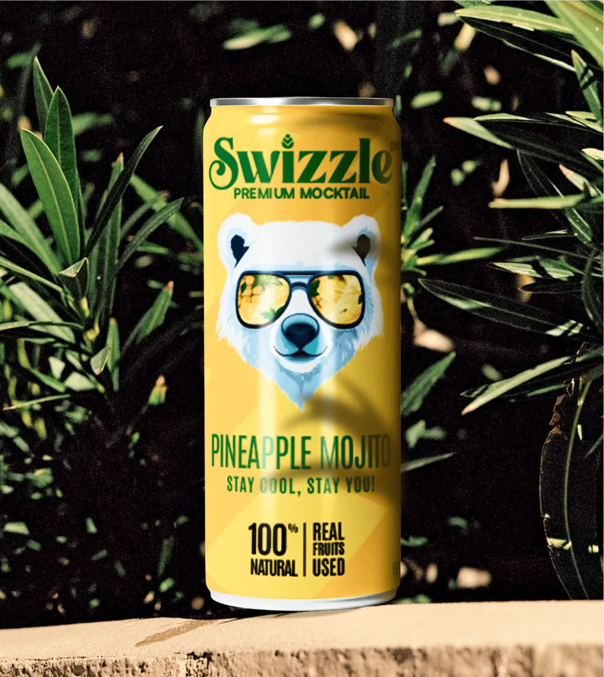
Food is one of the most emotionally charged purchase categories.
Shoppers make split-second judgements about taste, freshness, quality, and occasion. Your packaging must communicate all of that, fast.
Appetite appeal is essential
Colours, textures, and imagery trigger appetite responses before rational thought.
The key isn’t “right or wrong,” but matching the visual cues to your product and category expectations.
Show the product to build confidence
Clear windows, transparent panels, and cut-throughs let shoppers see what they’re buying.
Especially in fresh food, snacks, confectionery, and bakery, visibility often drives purchase intent more than any headline claim. Transparency is becoming a functional communication.
Clean label design communicates trust
Shoppers today scrutinise ingredients, provenance, and processes.
Packaging must respond with simpler, less cluttered designs: fewer claims, plainer layouts, and honest ingredient panels.
Less text often builds more credibility. A single, confident message, and letting the product speak and feels trustworthy.
Key points for food packaging shelf visibility:
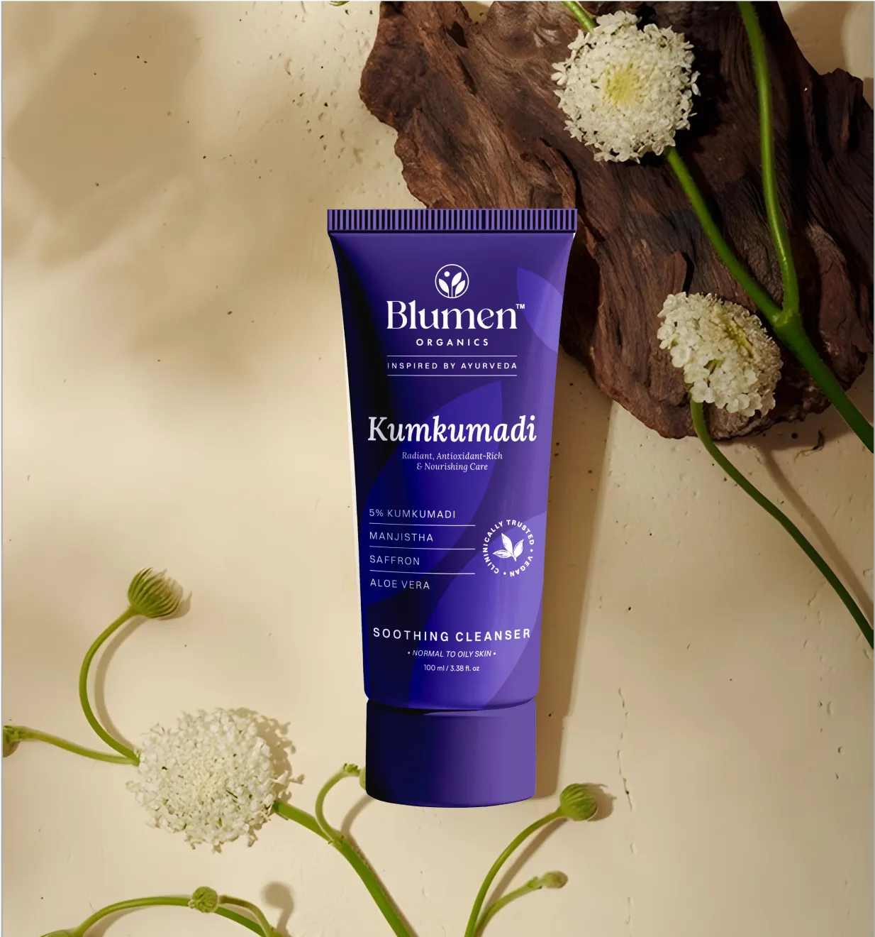
Here, packaging isn’t just about the product, it’s about the shopper’s identity. Health, beauty, and personal care packs are identity-led, not merely product-led.
White space signals premium quality
In premium beauty, generous, uncluttered white space communicates confidence and quality.
Luxury brands know: the less you put on the pack, the more premium it feels.
For challenger brands, a clean, well-typeset pack can elevate perception at a fraction of the cost of foil embossing or elaborate finishes.
Balancing clinical credibility and desirability
Skincare and personal care often need to communicate efficacy while remaining aspirational. Products with active ingredients must feel trustworthy but also desirable.
The best designs suggest precision and expertise, through structured layouts, restrained colour palettes, and thoughtful typography.
Sustainability as a design opportunity
Shoppers increasingly expect eco-conscious packaging. Natural textures, earthy colours, minimal printing, refillable formats, all signal responsibility.
The key is to treat sustainability not as compliance, but as a design brief. Constraints from eco-friendly materials can inspire distinctive, desirable packaging that stands out on shelf.
Key points for health, beauty and personal care shelf visibility:
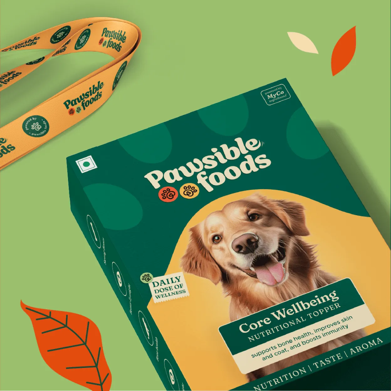
Here the stakes for shelf visibility are highest.
Margins are tight, competition is fierce, and shoppers move quickly. A small design misstep can cost shelf space, or even a SKU’s place in the range.
FMCG Packaging has three critical jobs:
Brand blocking creates presence
A single facing rarely wins. A unified block of four, six, or eight SKUs presenting consistent colour, structure, and design.
This builds category dominance and makes the brand hard to miss. Achieving it requires disciplined, range-level design, not isolated SKU-level thinking.
Planogram compliance matters.
Retailers dictate how products must sit on shelf. Pack dimensions, stacking, SRP trays, and replenishment requirements all affect visibility.
A beautiful pack that fails planogram standards won’t make the shelf. The most effective briefs integrate these requirements from the start, aligning creative and structural decisions with how the product is sold.
Private label pressures demand distinction
Branded products now compete directly with high-quality private labels, which often come at lower price points with sophisticated design.
The old “premium look = premium price” logic is no longer sufficient. Today, branded packaging must communicate what private labels can’t: personality, story, provenance, and a distinctive visual identity that conveys brand equity.
Key points for FMCG and grocery shelf visibility:
One principle that applies across industries is:
Packaging design for shelf visibility has to start with the shelf, not the studio.
A brand that conducts a thorough shelf audit: walking the stores, photographing real shelves, mapping colour territories, and spotting visual gaps, will almost always produce more effective packaging than one that doesn’t.

Shelf visibilityis a strategic input that dictates every decision from substrate to structure.
At Confetti Design Studio, we embed it into the brief before a single sketch is made.
Our methodology:
Competitive shelf audit: We understand where your product will sit in retail, documenting color patterns, structural silhouettes, and typographic hierarchies across every competing SKU.
We map luminance values, identify visual clusters, and pinpoint the openings in the shelf landscape where a new entry can achieve maximum contrast.
Visual hierarchy map: From that audit, we build a visual hierarchy map. This document establishes the fixed order of elements before any design work begins.
The brand icon, the product descriptor, the benefit callout.
We define their relative scale, placement, and color interaction based on shopper eye-tracking data and category norms. The map becomes the design’s constitution. Every concept must respect it.
Brand architecture: This ensures the work scales. A single SKU that performs well on shelf is a tactical win.
A system that performs across multiple formats, flavors, and retail channels is a strategic asset. We design for visual cohesion without visual repetition.
Each variant must be individually visible while remaining unmistakably part of the family.
We work at the intersection of strategy and design because the brief is where visibility lives or dies.
If the brief asks for “elegant and subtle,” the resulting package will fail on the shelf. We push clients to define success in measurable terms: contrast targets, read distances, structural differentiation.
Only then does design begin.
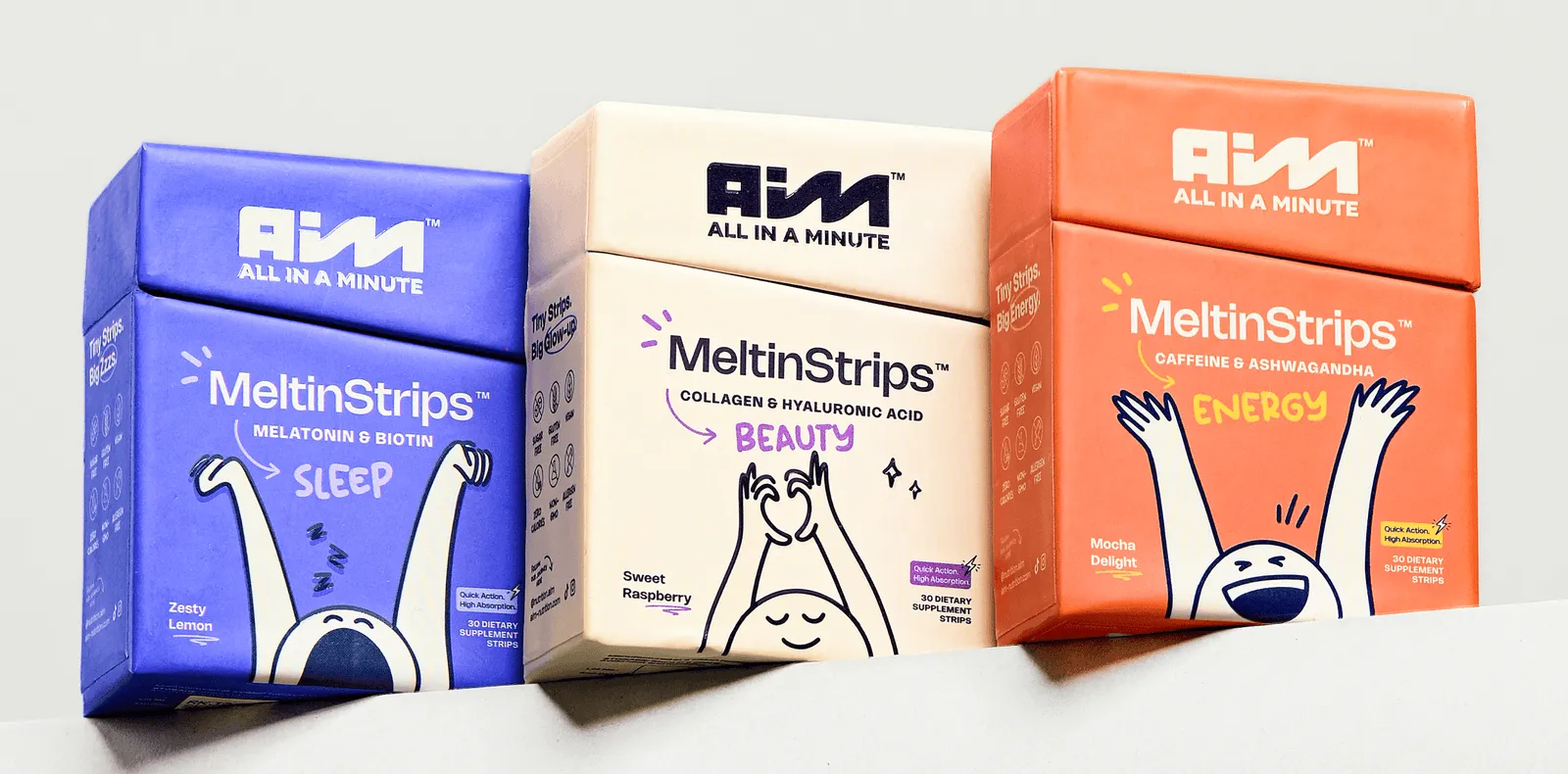
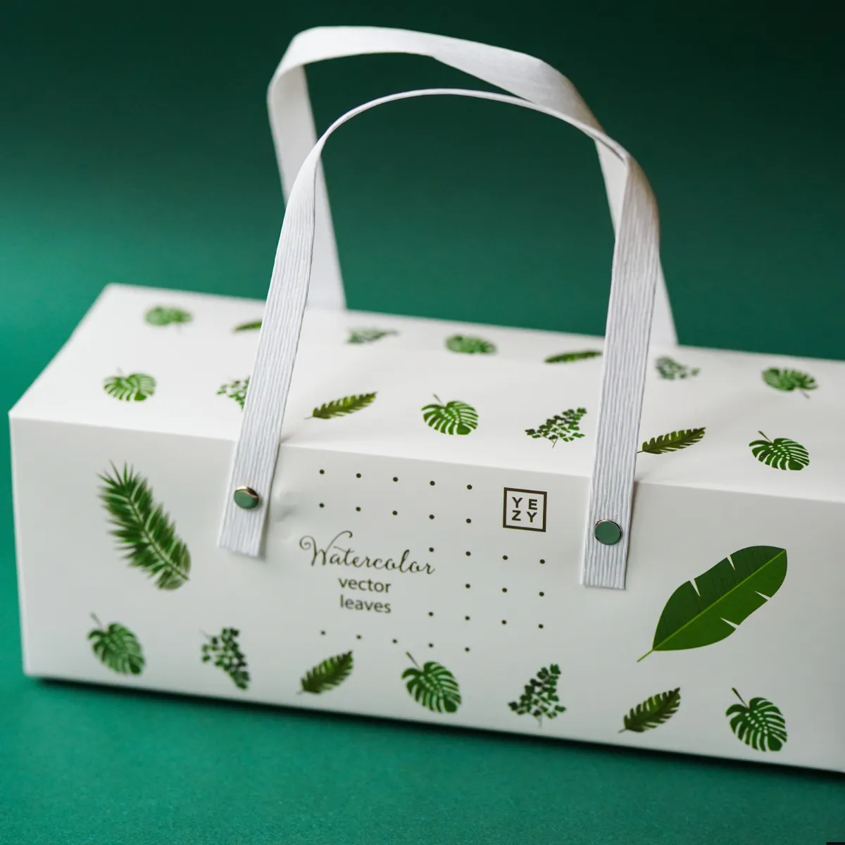
See how Confetti has helped brands create packaging that commands shelf attention
❌Mistake 1: Designing for the boardroom, not the shelf.
Presenting designs in a sterile, perfectly lit studio or as digital mockups without ever testing them in an actual retail environment leads to packages that look stunning in a meeting but vanish under fluorescent store lighting, surrounded by competitors.
❌Mistake 2: Too many messages competing for attention.
When you cram a logo, a tagline, three benefit seals, a recipe idea, and a promotional sticker onto the front of pack, you force the shopper’s brain to work too hard, causing them to skip your product entirely.
❌Mistake 3: Following category norms so closely the brand is invisible.
Copying the dominant color palette, structural format, and visual language of the market leader positions you as a generic alternative rather than a distinct choice, guaranteeing you blend into the visual noise.
❌Mistake 4: Ignoring how lighting affects colour on retail shelves.
Designing under ideal daylight-balanced lamps while ignoring the warm, directional, or harsh fluorescent lighting common in grocery and big-box stores causes carefully chosen colors to shift, muddy, or lose contrast where it matters most.
❌Mistake 5: Forgetting the 3-second test (can you read the brand name and key claim in 3 seconds?).
If a shopper cannot identify your brand and primary differentiator within the time it takes to glance at the shelf, your package has already failed to earn a place in their consideration set.
❌Mistake 6: Designing SKUs in isolation instead of as a system.
Creating each flavor or variant independently results in a fragmented shelf presence where individual products compete against each other rather than forming a cohesive block that dominates the category.
❌Mistake 7: Ignoring shelf-ready packaging requirements until it’s too late.
Overlooking retailer mandates for tray sizing, case stacking, pallet optimization, or easy-tear perforations forces last-minute design compromises that can destroy carefully planned visual hierarchy and structural impact.
❌Mistake 8: Prioritizing aesthetics over accessibility for aging or low-vision shoppers.
Using low-contrast text, ultra-thin typefaces, or small point sizes excludes a growing demographic segment and violates basic readability principles, reducing your addressable market before the product ever reaches the cart.
❌Mistake 9: Neglecting the back panel as a secondary visibility tool.
Treating the back of the package as purely functional waste space ignores that many shoppers pick up products to rotate them, giving you a second opportunity to reinforce branding and key claims when the package is handled.
❌Mistake 10: Failing to account for online-to-offline visual translation.
Designing for physical shelf without ensuring the same assets (colors, typography, focal elements) translate clearly as a thumbnail on mobile marketplaces creates a fractured brand identity that loses recognition across the omnichannel journey.
You don’t launch a product without testing the formulation; the same discipline applies to packaging.
Pre-print testing identifies failures while they are still fixable, before you commit to tooling, substrates, and a production run measured in tens of thousands of units.
Here are some methods ranging from low-cost, informal checks to advanced simulation tools. Use them in combination:
This is the closest you can get to reality without a production run.
If your pack disappears at any of these distances, it fails the shelf test. This method ensures the design works in context, not just in concept.
Physical testing catches environmental factors, but digital tools reveal perceptual patterns the naked eye misses.
Virtual shelf simulation: Platforms like EyeSee, Tobii Pro, and Shelfgram let you place packaging on a digital shelf, controlling variables such as height, adjacency, and lighting.
AI-assisted heat mapping: Neural networks trained on thousands of eye-tracking studies predict where shoppers’ gazes will land in the first few seconds. Heat maps show high-, medium-, and low-attention zones. If your brand name falls in a “cold” zone, you have objective evidence to adjust visual hierarchy before printing.
Consumer research validation:
While these tools carry costs, they’re small compared to a failed launch. Pre-print validation significantly reduces the risk of redesigns within the first year.
You don’t need a lab or software to catch hierarchy issues. The 3-second test exposes failures before production.
How to run it:
Interpret results:
Best practices:
The 3-second test costs nothing but time—and it should be mandatory before final artwork.
Sustainability and shelf visibility are not mutually exclusive. They’re complementary design constraints. When handled professionally, they create packaging that stands out by breaking category expectations.
Materials as design assets:
Communicating sustainability effectively:
Examples of effective sustainable packaging:
Lesson: Treat eco-materials as a starting point, not a limitation. Apply the same principles of contrast, hierarchy, and legibility as with any high-impact packaging.
With skillful design, sustainable materials can become your greatest competitive advantage on shelf.
What makes packaging stand out on a retail shelf?
Strong shelf visibility comes from a combination of bold colour contrast, clear visual hierarchy, distinctive structure and legible typography. The goal is for shoppers to identify the brand, product and key benefit within 3 seconds at shelf distance.
What is shelf-ready packaging (SRP) and how does it help visibility?
Shelf-ready packaging (SRP) is designed to move directly from delivery box to shelf with no repacking. It improves visibility by keeping products upright, grouped and neatly displayed, while also making in-store replenishment faster and easier for retail staff.
What colours work best for packaging visibility on shelf?
High contrast colours such as bold brights on white, or deep tones on neutral backgrounds perform best for shelf impact. The most effective choice depends on your category: aim to be distinctive within your competitive set while still being recognisable as belonging to your category.
How do I test whether my packaging design will be visible on shelf?
Run a shelf simulation test: print proofs of your design alongside your top 5 competitors and view them at the distance a shopper would approach in-store (around 60–90cm). Ask people unfamiliar with your brand to identify your product and its key message within 3 seconds.
Want strategic branding and packaging like this for your business?


.webp)
.webp)


.webp)
.webp)
.webp)
.webp)
.webp)


.svg)
.webp)
.svg)
.webp)