%201.webp)
02
AI Snaps
.svg)
.svg)
01
Our Work

03
About Us
05
Contact Us
06
Client Success

07
Blogs
08
Careers
Book A Call


Need Help In Building Your Brand?
Click the button below & book a call with our founder directly.

Rishabh Jain
Managing Director
Many brands make critical packaging design mistakes that silently kill sales, damage brand reputation, and waste thousands in production costs.
Be it illegible fonts or missing regulatory information, we cover all the packaging design errors along with examples and actionable solutions to fix each problem before your packaging goes to print.
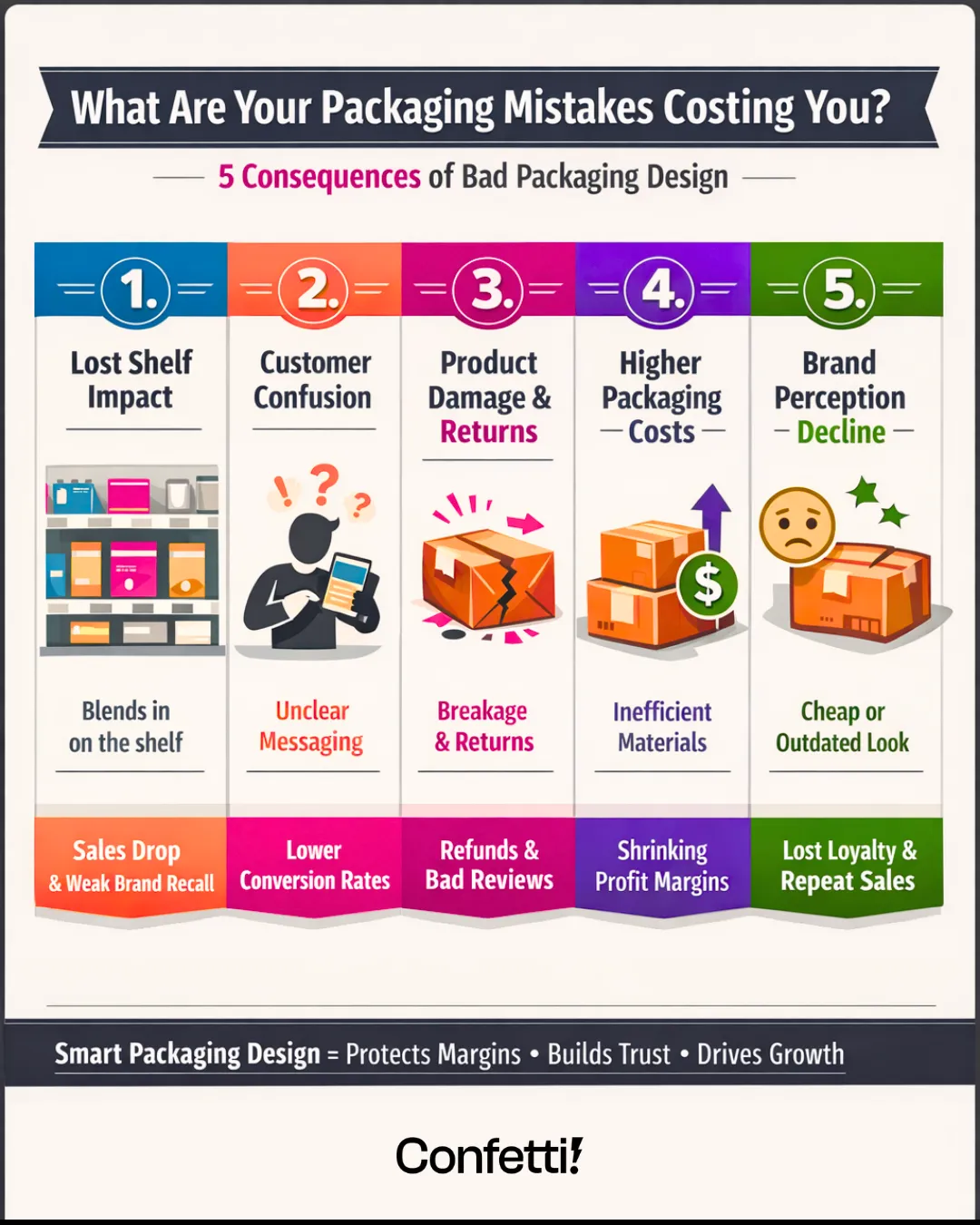
Over 70% of purchase decisions happen at the shelf, and packaging design is often the only communication a shopper sees before deciding.
It is thus important to understand the most common packaging design mistakes and how brands can fix them to improve shelf performance, clarity, and compliance:
Many brands try to fit every product detail, certification, claim, and message onto the front panel.
This creates visual clutter, making it difficult for customers to understand the product quickly.
Signs:
❌Too many fonts and graphic styles
❌No visual hierarchy
❌Text packed into every available space
❌Competing calls-to-action
❌No breathing room or whitespace
Consequence:
Shoppers process visual cues extremely fast. If a pack looks confusing, the brain treats it as requiring high effort and moves on.
It also hurts shelf readability, can make the product appear cheaper or less trustworthy, and stops key benefits from standing out.
Confetti Fix:
✅Clear visual hierarchy:
This ensures the customer understands the product within seconds.
✅3-Second Rule: A shopper should understand in 3 seconds what the product is, its benefits and target customers.
✅Strategic whitespace: Improves readability and visual impact. Leave 20–30% of the design area uncluttered to highlight important elements.
✅Limited fonts: Use a maximum of 2–3 font families to maintain clarity and brand consistency.
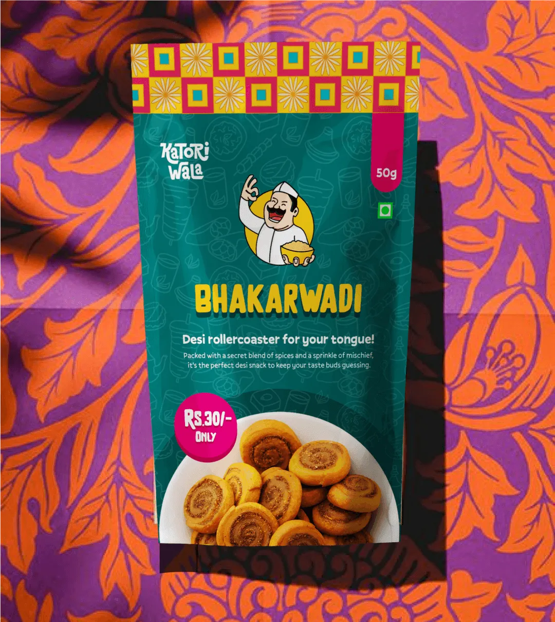
Real-World Example:
Apple's packaging is the gold standard for simplicity.
Their iPhone boxes feature massive whitespace, minimal text, and just the product image.
Packaging design sometimes prioritises aesthetics over usability.
Decorative fonts or low-contrast colours that look attractive on screen may fail on real shelves.
Common issues:
❌Light text on light backgrounds
❌Text placed over complex images
❌Small font sizes
❌Thin typefaces that disappear in print
Consequence:
If customers cannot read packaging quickly, they ignore the product.
Poor legibility also signals low product quality, poor brand professionalism and lack of attention to customer experience
Also, a large portion of shoppers have reduced vision or colour-perception differences, making contrast even more important.
Confetti Fix:
✅High contrast colour combinations: Follow accessibility standards like those recommended by the World Wide Web Consortium (W3C) for minimum contrast ratios.
✅Readable typefaces:
✅Practical minimum font sizes:
✅Test in real conditions: Print packaging at actual size and test under store lighting, from multiple viewing distances and in product photos for ecommerce listings
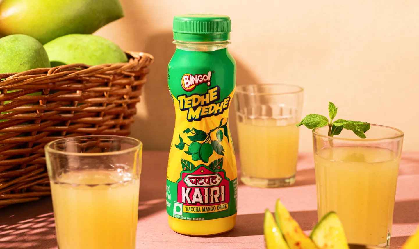
Real-World Example:
Coca-Cola's white text on red background, instantly readable from across the store.
Typos, grammar mistakes, or inconsistent typography can slip through when packaging is rushed or not reviewed carefully.
Scenarios:
❌Incorrect ingredient names
❌Misspelled product claims
❌Inconsistent capitalisation or punctuation
❌Poor kerning or line spacing
Consequence:
Consumers often interpret mistakes as signs of poor quality control and inaccuracies in product information
In regulated industries such as food or supplements, errors can also lead to compliance violations or recalls.
Confetti Fix:
✅Implement a structured review process: A reliable packaging approval workflow should include Designer self-review, internal peer review, product or technical expert validation. compliance or legal review and final proofreading.
✅Create a packaging approval checklist: Verify details such as -
Brands sometimes mimic the market leader or follow category design conventions too closely.
The result is “sea of sameness” packaging where every product looks similar.
Common signs:
❌Identical colour palettes
❌Stock imagery used across multiple brands
❌Similar layout structures
❌Predictable claims and messaging
Consequence:
When packaging lacks differentiation, customers struggle to remember the brand. In such cases, price becomes the main purchase driver and brand loyalty declines/
Distinctive packaging design improves brand recall and shelf recognition.
Confetti Fix:
✅Conduct a competitive packaging audit: Review 10–15 competitor products and analyse their dominant colours, common design patterns and messaging styles.
Look for opportunities where your brand can visually stand apart.
✅Develop distinctive brand assets: These can be elements such as colors, illustration styles, distinct typography and recognisable packaging structure.
✅Tell a unique brand story: Instead of generic claims like “premium quality,” highlight authentic differentiators such as:
Real-World Example:
Kind Bars entered the crowded snack bar market and created transparent packaging showing the actual nuts and ingredients inside.
This differentiated them instantly. Sales exploded because they looked completely different from everything else on the shelf.
Packaging may look attractive on a design screen but fail to stand out in the real retail environment.
Reasons:
❌Muted colour schemes
❌Small product names
❌Low contrast design
❌ Lack of focal points
Consequence:
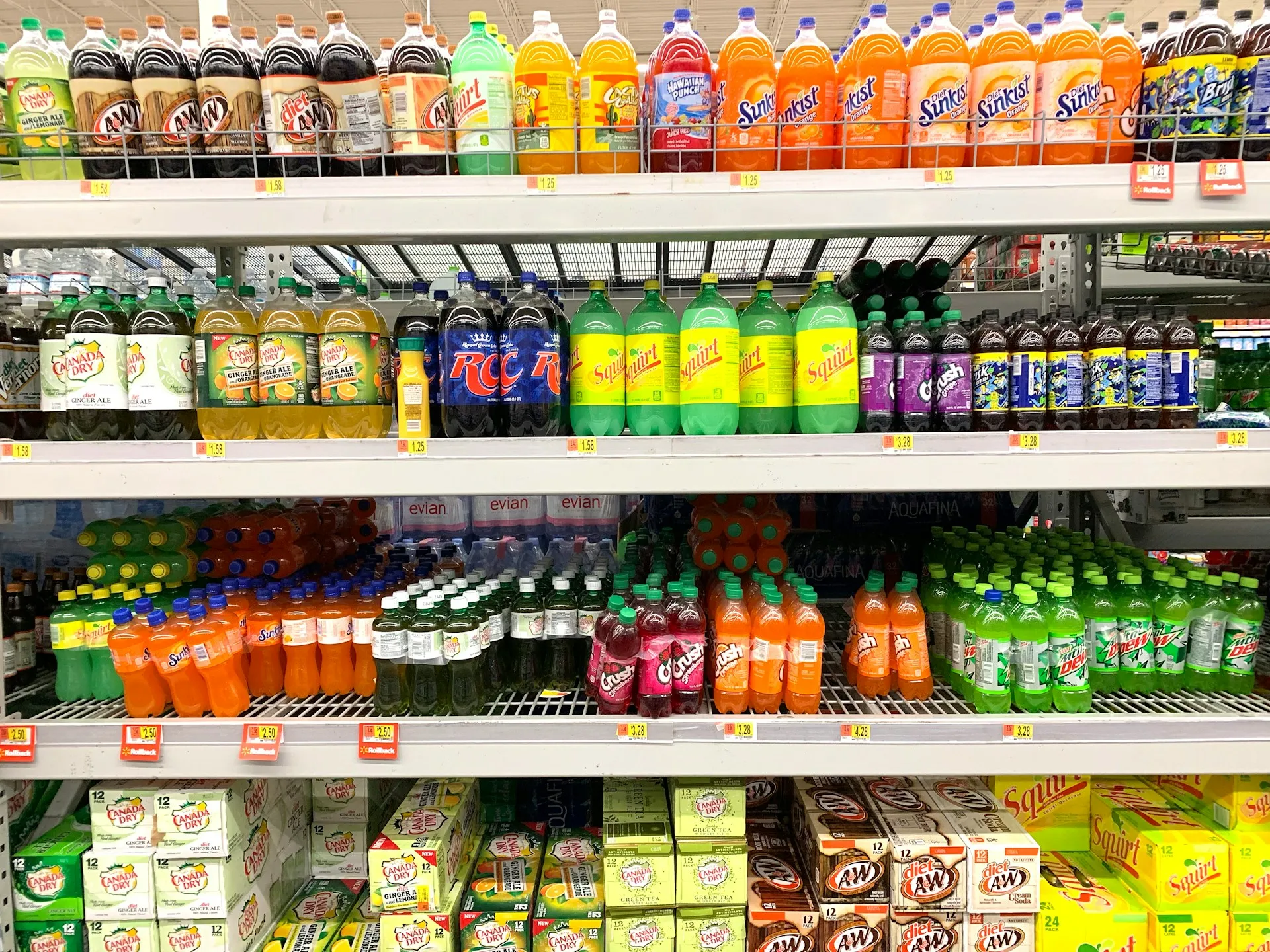
Shoppers spend 3–7 seconds scanning a shelf section. Products that fail to attract attention within that time are rarely picked up.
Confetti Fix:
✅Design for the “billboard effect”: Your primary display panel should communicate the product instantly.
Prioritise: Brand name + Product category or type + Key differentiator
✅Perform the 10-Foot Test: Place the package 10 feet away and check:
✅Use strategic colour contrast: Bold complementary colour combinations create stronger visual impact on crowded shelves.
✅Consider structural design: Unique shapes or structural packaging elements can improve visibility even before graphics are noticed.
Real-World Example:
Tide laundry detergent uses bright orange, a color almost no other detergent brand uses.
From across the store, you can spot Tide instantly contributing to their shelf dominance.
Some brands choose colours based purely on aesthetics instead of strategic meaning.
This can create emotional mismatch between the product and customer expectations.
Errors:
❌Bright neon colours for premium products
❌Dull colours for children’s brands
❌Clinical colours for indulgent foods
Consequence:
Colour is one of the fastest ways consumers form impressions about a product.
Studies in consumer behaviour show that colour influences up to 90% of initial product judgments.
When colour choices conflict with the brand message, customers experience subconscious confusion.
Confetti Fix:
✅Align colours with brand positioning: Common associations:
✅Use the 60-30-10 rule: A balanced colour palette looks like =
60% dominant colour + 30% supporting colour + 10% accent colour
✅Ensure cross-channel consistency: Packaging colours should match website design, advertising materials and social media visuals.
Consistency reinforces brand recognition.
Real-World Example:
Tiffany & Co.'s robin's egg blue is so integral to their luxury positioning that it's trademarked.
If they switched to hot pink or bright yellow, they'd destroy their luxury perception instantly.
Some brands overlook mandatory labeling elements such as:
❌Nutrition facts
❌ingredient lists
❌allergen declarations
❌regulatory certifications
❌manufacturing details
Risks:
Missing compliance information can lead to product recalls, regulatory penalties, retailer delisting and legal action.
For food and health products, missing allergen warnings can pose serious consumer safety risks.
Confetti Fix:
✅Understand regulatory requirements: Depending on the product category and country, packaging may require approval from agencies such as Food regulators, consumer safety authorities, etc.
✅Create a compliance checklist: Before final artwork approval, verify:
✅Design dedicated information panels: Most regulatory details should be placed on the back or side panels, organised clearly without disrupting the front-of-pack design.
Packaging sometimes relies on vague claims or unclear product descriptions.
Issues:
❌Buzzwords without explanation
❌exaggerated claims
❌imagery that does not reflect the product contents
❌unclear instructions
Consequence:
Customers want quick, honest information. If packaging creates confusion, they often abandon the purchase.
Misleading messaging can also lead to negative reviews, regulatory scrutiny and long-term brand trust issues
Confetti Fix:
✅Answer five essential questions: Your packaging should clearly communicate -
✅Replace vague claims with measurable benefits such as “50% less sugar than regular soda”, “Lasts up to 8 hours”, etc.
✅Use clear language: Avoid complex jargon and technical phrases. Simple language improves comprehension and builds trust.
✅Validate messaging through testing: Show the packaging to potential customers and ask them to explain what the product does. If they struggle, the messaging needs refinement.
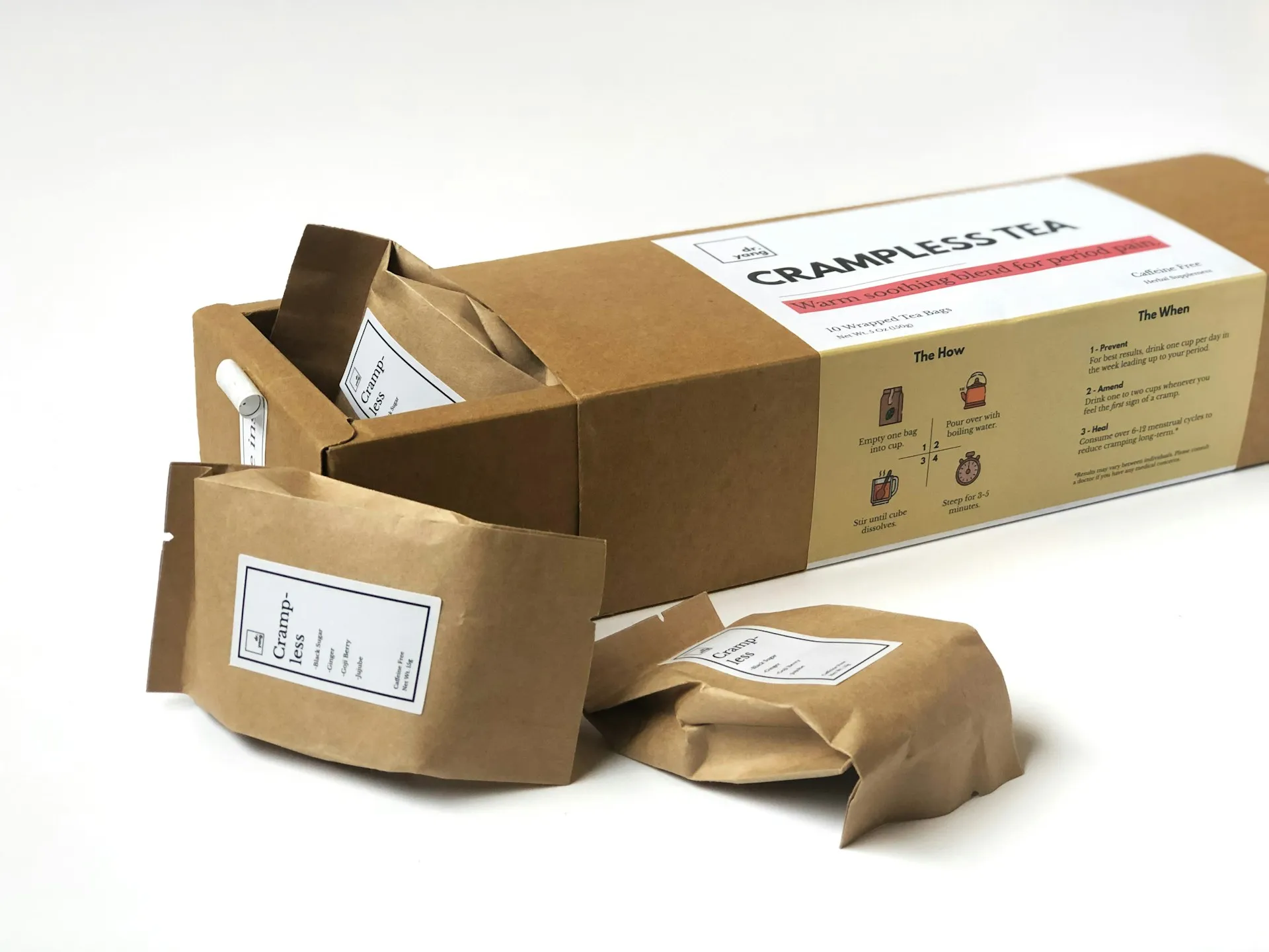
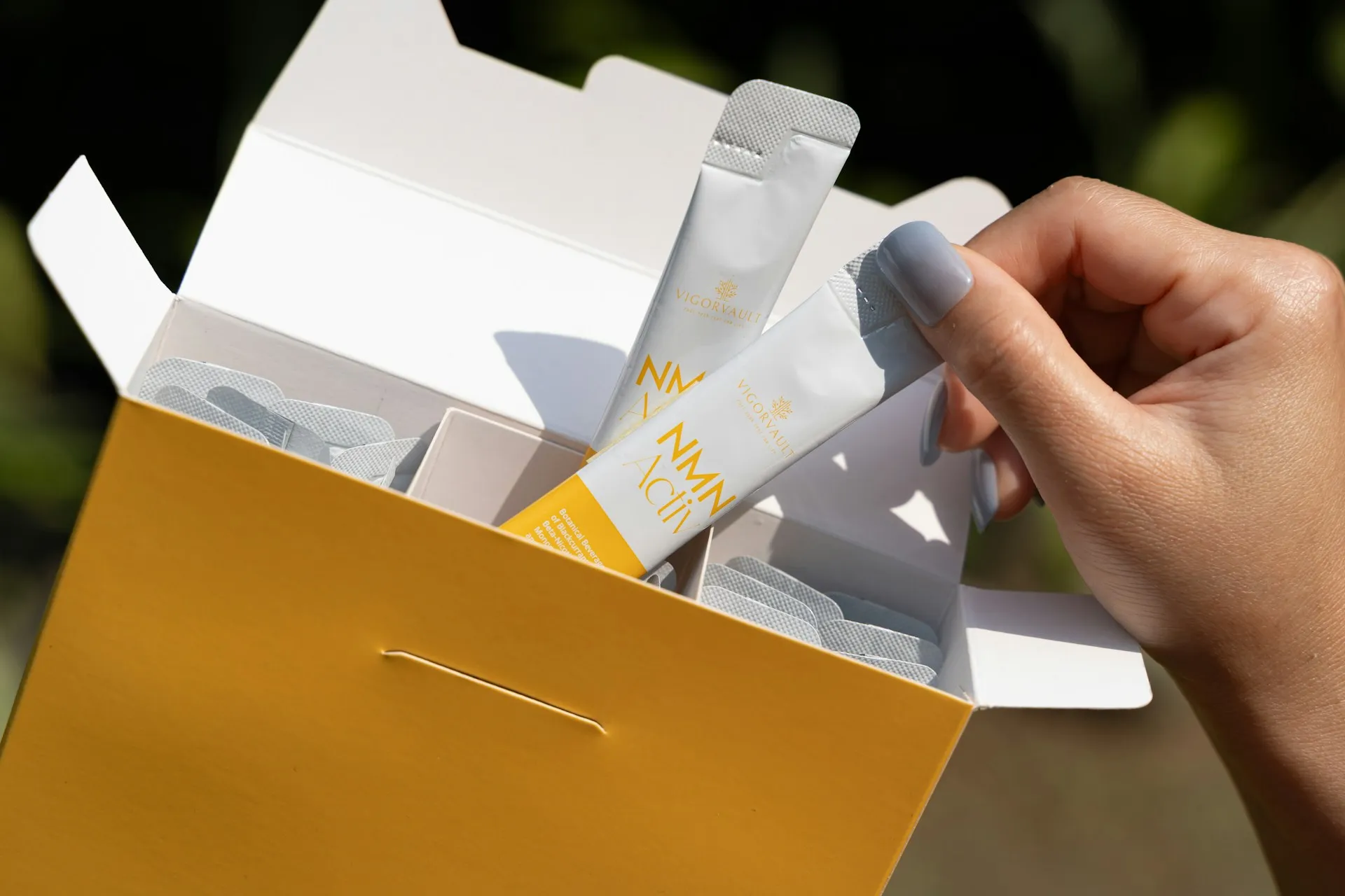
A package might look beautiful on the shelf, but if it is difficult to open, messy to pour, or uncomfortable to hold, customers will quickly become frustrated.
Packaging is something people interact with repeatedly. Every frustrating interaction damages brand perception.
Common issues:
❌Packages that require scissors or knives to open
❌Containers that leak or spill during use
❌Resealable packs that stop sealing after the first use
❌Bottles that tip over easily
❌Plastic clamshell packs that cause “wrap rage”
❌Poor structural design turns the product experience into a daily irritation.
Consequence:
Research shows 40% of consumers report injuring themselves while opening packaging.
Difficult packaging leads to negative reviews, higher return rates, customer frustration and brand switching.
Customers remember bad packaging experiences long after the purchase.
Confetti Fix:
✅Design for the entire user journey: Start by mapping how customers interact with the package:
If any step feels difficult or confusing, the design needs to be improved.
✅Test packaging with real users: Give prototypes to people with different abilities and age groups. Watch where they struggle.
If customers need instructions or tools to open the package, the design has failed.
✅Prioritize resealability: For products used over time, reseal features must work reliably.
Zippers, lids, or flip caps should open easily and close securely.
✅Design for real home environments: Consider things like - Will it fit in a fridge door? Or Will it stand upright in cupboards?
Great packaging supports everyday routines.
Real-World Example:
Heinz redesigned their ketchup bottle from glass to plastic squeeze bottles after decades of customer frustration with the classic glass bottle design.
The new packaging addressed multiple UX issues: easier to dispense, less waste, no need to shake violently, better portion control.
It is easy to fall in love with a beautiful packaging design mockup.
But if that design complicates manufacturing, increases costs, or fails to protect the product, it becomes a liability.
This mistake often occurs when designers focus only on aesthetics and ignore production realities.
Issues:
❌Weak structural design
❌Awkward handling design
❌Compromised usability
❌Overcomplicated structure
Consequence:
Packaging that prioritizes appearance over function can cause product damage, manufacturing inefficiencies, high packaging costs and poor user experiences
Customers value functionality more than visual beauty.
Confetti Fix:
✅Balance form and function from the beginning: Graphic designers and structural designers must collaborate to create solutions that work both visually and physically.
✅Understand manufacturing constraints: Considerfilling line capabilities, standard carton sizes, shipping efficiency, and material availability
Designing within these limits prevents expensive redesigns later.
✅Prototype early and test physically: Digital mockups often hide real-world problems.
Create prototypes and test them by:
Only real testing reveals structural weaknesses.
✅Let function inspire design: Some of the most iconic packaging features started as functional improvements.
Examples include ergonomic grips, easy-open tear tabs.
One of the biggest mistakes in packaging design is creating packaging based on personal taste rather than customer needs.
Designers may love minimal aesthetics or trendy styles. But if it doesn't resonate with the actual buyer, the packaging will fail.
Problems:
❌Inconvenient packaging format
❌Hard-to-understand instructions
❌Accessibility not considered
❌Cultural mismatch design
❌Irrelevant features included
Consequence:
Ignoring audience needs can lead to confusing messaging, wrong visual tone, and poor usability for certain age groups.
When customers feel the packaging is “not for them,” they simply choose another product.
Confetti Fix:
✅Build detailed customer personas: Go beyond basic demographics and study age group, shopping habits, income level, and product usage behavior.
Understanding these factors helps create packaging that resonates emotionally.
✅Match visual tone to the audience: The tone should feel familiar and comfortable to the intended buyer.
✅Observe real shopping behavior: Spend time in retail stores where your product sells.
Watch how shoppers scan shelves, compare products and read packaging.
Real-world observation reveals insights surveys often miss.
✅Respect cultural context: Colors, symbols, and imagery can carry different meanings in different regions.
Localized design decisions can significantly improve market acceptance.
Real-World Example:
Dove soap understood their target audience was real women tired of unrealistic beauty standards.
Their packaging reflects this. They use clear language, avoid supermodel imagery, and emphasize real results.
Excessive packaging has become a major concern for modern consumers.
Oversized boxes, multiple plastic layers, and unnecessary fillers create waste and signal environmental irresponsibility.
Today’s buyers are more conscious about sustainability than ever before.
Signs:
❌Excessive packaging layers
❌Unnecessary material usage
❌Non-recyclable materials
❌Inefficient material selection
Consequence:
Over-packaging creates several problems including environmental criticism, higher shipping costs, increased material waste and negative social media reactions
Poor material choices also create performance issues such as breakage or leakage.
Confetti Fix:
✅Right-size your packaging: Use the smallest package that safely protects the product.
Reducing empty space lowers both material use and shipping costs.
✅Choose materials strategically: Material selection should match product needs:
Avoid using premium materials when they are not necessary.
✅Adopt sustainable materials: Options include recycled cardboard, molded pulp inserts, biodegradable plastics and compostable packing materials
Sustainability can become a competitive advantage.
✅Communicate sustainability clearly: If your packaging is eco-friendly, highlight it on the package.
Simple messages like “100% recycled packaging” or “20% less packaging material” can strengthen brand trust.
Real-World Example:
Patagonia uses minimal, recyclable packaging aligned with their environmental values.
They provide repair kits to extend product life instead of encouraging replacement.
Package size affects how customers perceive value.
A box that looks too large may feel deceptive if the product inside is small. A package that is too small can disappear on crowded shelves.
Structure also influences usability. A tall, narrow bottle may look elegant but fall over easily during use.
❌ Incorrect package dimensions
❌ Too large or small packaging
❌ Poor internal fit
❌ Wasted space inside
❌ Weak structural design
❌ Unstable stacking performance
❌ Inefficient shape design
Consequence:
Packaging size influences:
Poor size decisions create both marketing and operational problems.
Confetti Fix:
✅Test consumer perception: Show packaging alongside competitors and ask customers:
Small structural adjustments can change perception dramatically.
✅Design for retail environments: Measure typical retail fixtures such as shelf heights, peg hooks and refrigerator displays
Packaging should fit easily into these spaces.
✅Optimize supply chain efficiency.
Packages should stack efficiently on pallets and shipping cartons.
Efficient shapes reduce transportation costs and material waste.
The primary purpose of packaging is protection.
If the product arrives damaged, leaking, or spoiled, the entire packaging system has failed.
Problems:
❌Insufficient cushioning or Weak box structure
❌Oversized box, no support
❌Poor sealing quality
❌No tamper protection
❌Wrong material choice
Consequence:
Poor protection leads to customer complaints, product returns, retailer penalties and negative reviews
Each damaged product erodes customer trust.
Confetti Fix:
✅Simulate real supply chain conditions: Products must survive drops, stacking pressure, vibration during shipping and temperature changes
Testing ensures the packaging can handle these stresses.
✅Identify all potential threats: Consider whether your product needs protection from moisture, oxygen, sunlight, physical impact or temperature fluctuations
Materials and structures must address these risks.
✅Test in real logistics environments: Ship prototypes through your actual distribution network.
Real shipments reveal issues that laboratory testing may miss.
Today, many customers encounter products online before seeing them in stores.
Your packaging must work not only on physical shelves but also on tiny e-commerce thumbnails.
Errors:
❌Text and key information unreadable at small sizes
❌Packaging design elements too subtle
❌Poor or low resolution product images
❌Inaccurate or incomplete product listings
Consequence:
On e-commerce platforms, products appear in small grid layouts alongside competitors. Customers scan quickly and choose products that are visually clear and recognizable.
Confetti Fix:
✅Run the thumbnail test: Shrink the packaging design to a small image.
Check whether customers can still identify the brand name, product type and key benefit
If the message disappears, simplify the design.
✅Use strong visual hierarchy: Ensure the most important elements remain readable even at small sizes.
Bold typography and clear contrast help improve visibility.
✅Provide high-quality digital assets: E-commerce listings should include -
These assets complement the packaging and help customers understand the product.
Launching packaging without proper testing is one of the most expensive mistakes brands make.
Problems that could have been identified early often appear only after mass production.
Consequence: Skipping testing can result in
❌packaging failures
❌barcode scanning issues
❌structural defects
❌costly recalls
Fixing packaging after launch is far more expensive than testing beforehand.
Confetti Fix:
✅Conduct consumer testing: Show packaging concepts to real customers before finalizing the design.
Ask whether they understand the product and whether the packaging appeals to them.
✅Create physical prototypes: Digital renders cannot replicate real materials.
Printing and assembling prototypes reveals issues with colors, textures and structural stability
✅Run pilot production batches: Small production runs help identify manufacturing problems before scaling.
✅Test in real retail environments: Observe how shoppers interact with the packaging on shelves. This provides valuable insights before full launch.
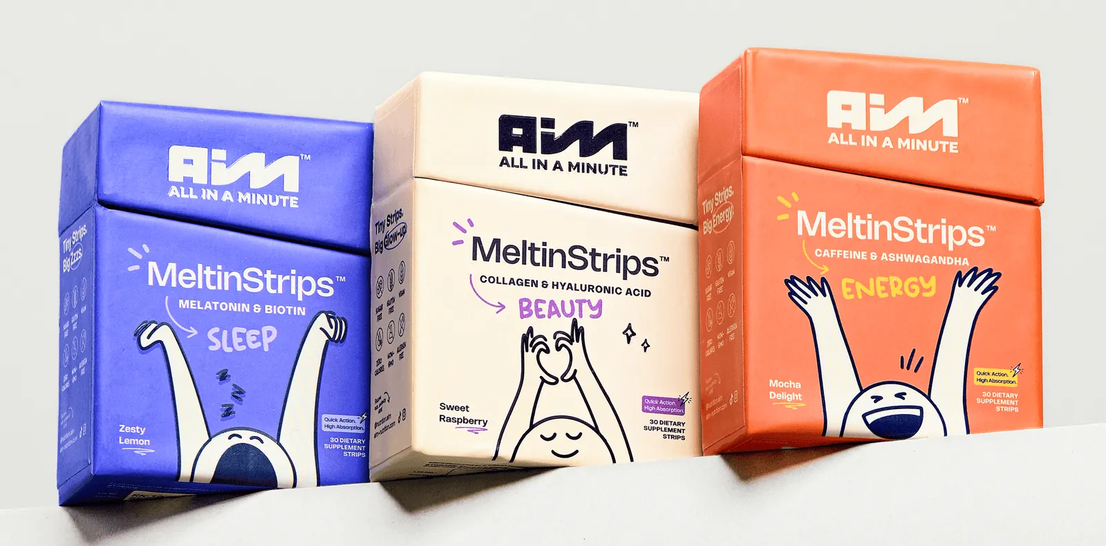
Brands with multiple products often struggle with inconsistent packaging.
When each SKU looks completely different, customers cannot easily recognize the brand.
Errors:
❌Mismatched color schemes and imagery style
❌Inconsistent logo and typography usage
❌Uneven packaging layouts
❌Unaligned product identity
Consequence:
Inconsistent branding causes weaker brand recognition, fragmented shelf presence and reduced cross-selling opportunities
A strong visual system makes the entire product line more recognizable.
Confetti Fix:
✅Create comprehensive brand guidelines: Define clear rules for logo placement, color palette, typography, imagery style and packaging layout.
These guidelines ensure consistency across all products.
✅Develop a flexible design system: A strong packaging system includes -
This allows variety without losing brand identity.
✅Conduct regular packaging audits: Review all products together periodically.
Check whether every SKU still aligns with the brand system.
Even experienced brands can make costly packaging mistakes that hurt sales and damage reputation.
Branding and packaging design experts like Confetti Design Studio, can help you prevent such errors.
Cost Reduction: Confetti helped brands reduce packaging costs by 15-30% through strategic right-sizing and material optimization, without compromising product protection or brand appeal.
Increased Shelf Performance: Brands saw measurable improvements in shelf visibility and customer engagement after implementing Confetti's design recommendations.
Sustainability Wins: Companies achieved higher sustainability scores and positive customer perception by adopting Confetti's eco-friendly packaging strategies.
Enhanced Customer Satisfaction: Fixing structural design flaws and user experience issues led to fewer returns, better reviews, and increased repeat purchases.
Confetti combines deep strategic branding knowledge with practical packaging expertise.
We don't just make packaging look good, we ensure it performs in real-world conditions.
Our approach addresses both aesthetics and functionality, preventing the common mistake of prioritizing one over the other.
Confetti has worked with industry leaders including ITC, Dabur and many other innovative brands.
Each partnership focused on identifying and fixing packaging mistakes that could have cost millions in lost sales, returns, or recalls.
☑️ Target audience research completed with detailed buyer personas
☑️ Competitor packaging analysis done across 10-15 similar products
☑️ Brand guidelines reviewed and packaging alignment confirmed
☑️ Budget and timeline established with realistic milestones
☑️ Sustainability goals defined with measurable targets
☑️ Distribution channels and shelf space requirements identified
☑️ Product protection and shipping requirements documented
☑️ Legal and regulatory requirements identified by product category
☑️ Success metrics defined (sales lift, brand perception, cost reduction)
☑️ Typography tested for readability at 3, 6, and 10-foot distances
☑️ Color psychology applied based on target audience preferences
☑️ Material selection justified for product protection and brand positioning
☑️ Structural design validated for stability and user experience
☑️ Regulatory requirements confirmed
☑️ Contrast ratios verified (minimum 4.5:1 for text readability)
☑️ Brand consistency maintained across entire product line
☑️ Information hierarchy established with strategic whitespace
☑️ Spelling, grammar, and translations professionally proofread (3+ reviewers)
☑️ Barcode placement and scanability verified
☑️ Opening mechanisms designed for ease of use
☑️ Recycling instructions and sustainability messaging clear
☑️ Manufacturing feasibility and cost per unit confirmed
☑️ Visual differentiation from competitors confirmed
☑️ Finish durability assessed (scratch resistance, fade resistance)
☑️ Physical prototypes created and tested
☑️ Drop testing conducted from realistic heights
☑️ Shelf mockup testing done with competitor products displayed
☑️ Legal and compliance review completed
☑️ Production samples approved by quality assurance team
☑️ Color accuracy verified between digital files and printed samples
☑️ Barcode scanning tested at multiple angles and lighting conditions
☑️ Shipping simulation completed (products shipped and received intact)
☑️ Mobile device and e-commerce visibility confirmed
☑️ Retailer-specific requirements met (labeling, sizing, barcodes)
☑️ Final cost per unit confirmed within budget parameters
What are the most common packaging design mistakes?
Some of the most common packaging design errors include poor hierarchy, cluttered visuals, lack of brand consistency, and weak messaging. These product packaging mistakes often result in packaging layout problems and poor label design issues that confuse consumers and reduce shelf appeal. Ignoring these elements leads to packaging that kills sales, no matter how great the product inside is.
Can bad packaging really affect my sales?
Absolutely. Bad packaging design can significantly hurt your sales by making your product less appealing, harder to understand, or forgettable. When customers make split-second decisions in-store or online, packaging design fails can directly impact purchase behavior. In fact, understanding how packaging affects buying decisions is critical to improving visibility and conversions. Studies show that 52% of consumers have switched brands due to new packaging, and poor packaging can lead to lost sales, high return rates, and damaged brand reputation.
How do I test if my packaging is working or not?
To assess effectiveness, conduct A/B testing, gather customer feedback, and observe in-store behavior. Slow-moving products with good marketing may signal mistakes in product branding or packaging layout problems. Testing helps identify areas where fixing packaging design could improve visibility, appeal, and sales performance.
How can I redesign my packaging to increase product visibility?
Redesigning starts by fixing obvious product packaging mistakes—like unclear labels, weak calls-to-action, or inconsistent design. Use data-backed packaging design tips for better sales: simplify your layout, amplify your brand story, and prioritize clarity. Solving common packaging design errors can instantly improve shelf impact and consumer trust.
How much does it cost to fix packaging design errors?
The cost to fix packaging design issues depends on the scope—simple label redesigns may cost less, while full packaging overhauls involve higher investment. However, addressing bad packaging design examples early can prevent long-term losses and is often more cost-effective than continuing with packaging that underperforms in sales.
Can you help if I only want to fix the label, not the whole design?
Yes! You don’t need a full redesign to make a big impact. Fixing poor label design issues—like unclear ingredient info, weak branding, or inconsistent typography—can boost clarity and trust. Whether you're addressing packaging layout problems or simply refreshing your label, Confetti Design offers flexible solutions tailored to your needs.
What are the biggest packaging design mistakes for e-commerce products?
The biggest e-commerce packaging mistakes include: poor photography visibility, inadequate product protection during shipping, excessive packaging materials, and designs that don't translate well to online thumbnails.
Want strategic branding and packaging like this for your business?


.webp)
.webp)


.webp)
.webp)
.webp)
.webp)
.webp)


.svg)
.webp)
.svg)
.webp)