%201.webp)
02
AI Snaps
.svg)
.svg)
01
Our Work
03
About Us
04
Brand Audit
05
Contact Us
06
Client Success
12
07
Blogs
08
Careers
Book A Call
.svg)



.svg)
Need Help In Building Your Brand?
Click the button below & book a call with our founder directly.

Rishabh Jain
Managing Director
A founder preparing to brief a skincare brand identity project must know what it actually looks like, and how much of it can be decided in-house versus handed to someone else.
That's the question this guide answers. We assume you already understand what a logo, a color palette, and a brand identity are. We help you decide, in what order, and when a professional design partner earns its cost.
Your skincare brand identity shapes how customers recognise, understand and perceive the brand across its packaging, website, product pages, social media, advertising and unboxing experience.
It includes the visual identity, verbal tone, positioning and the rules that keep them consistent.
Skincare is harder than most categories for three structural reasons:
1. Higher trust burden
A customer buying a niacinamide serum cannot verify its efficacy before purchase. They are relying on the information, presentation and credibility signals available through the product page and packaging.
That makes choices such as typography, colour, imagery, ingredient communication and packaging quality more consequential.
Although colour, shape, imagery, material and convenience can influence perceived quality, brand image and purchase decisions, claims still need evidence.
A polished identity cannot compensate for unclear product information or unsupported efficacy claims.
2. Visually crowded category
Skincare has developed a recognisable visual language: minimal layouts, muted colours, clean typography and ingredient-led communication.
This code now reads as the industry standard, which means it no longer functions as a differentiator. Minimalist packaging signals restraint, but not identity, it scales sameness instead of differentiation.
Research supports the value of simplicity, particularly for unfamiliar brands, but also shows that distinctive visual elements can strengthen brand identity beyond simple minimalism.
The design challenge is to decide which visual assets make your brand recognisable when the common category codes are removed.
3. Identity has to work everywhere
The identity has to work across more contexts than almost any other category. A skincare brand appears on a 120-pixel e-commerce thumbnail, a packaging label, a social media grid, an unboxing insert, a retail shelf, and a founder's LinkedIn post.
Getting this wrong has a commercial consequence. Drunk Elephant's sales dropped 65% in a year after the brand drifted toward a younger audience, costing it credibility with its original consumers. 82°E saw revenue fall 30% in a year, not because the product failed, but because positioning and trust architecture weren't aligned with what the market would pay for.
Before choosing a logo, colour palette or packaging style, settle what the skincare brand is actually claiming to be:
Without those decisions, design tends to fall back on familiar skincare codes that can look polished without being distinctive.
▶️Category frame
A brand can compete through clinical efficacy, clean beauty, natural wellness, luxury or another defined territory. Each position creates different expectations for how the identity should communicate.
Let’s take the example of The Ordinary. Its own brand materials emphasise ingredient-focused products, clear communication and accessible pricing, and those decisions are reflected in its straightforward naming and visual approach.
▶️Price architecture
A ₹500 moisturiser and a ₹4,000 serum do not have the same positioning challenge. A higher price creates stronger expectations around perceived quality, trust and the overall brand experience.
Review the relationship between:
▶️Target consumer and purchase trigger
A first-time customer may need reassurance and education. A repeat buyer may care more about easy recognition and convenience. A gifting customer has a different expectation again.
The identity should establish a clear core position rather than attempting to communicate every possible use case equally.
▶️Brand architecture
If the roadmap includes cleansers, serums, moisturisers and treatments, the identity should be built as a system.
Define the rules for product naming, variant colours, typography, imagery and hierarchy before the range expands.
▶️Resolve positioning before design
Show the current brand to someone unfamiliar with it and ask them to estimate its price level, identify its category position and describe its main promise.
If the answers are inconsistent, the problem is not necessarily the design. The positioning may still be unclear.
A logo is only one part of a skincare brand identity.
The working system is a set of documented decisions that allow anyone (designer, marketer, packaging supplier, or social media manager) to apply the brand correctly.
The identity should include the versions needed for different applications:
An icon-only version may be needed for social avatars or app icons, while a one-colour version is useful for applications where full-colour reproduction is not possible.
A palette needs more than a list of colour codes. Define which colours are primary, secondary and accent colours, where each should appear, and how they work across print and digital.
Include CMYK, Pantone where relevant, RGB and HEX values, along with digital contrast guidance where accessibility is important.
Without usage rules, every new application becomes another colour decision.
Set the typefaces and hierarchy for headlines, subheads, body copy, captions and packaging information. Include sizing guidance for print and digital applications.
Commercial font licensing should also be confirmed. A typeface used in an identity is not automatically licensed for every packaging, website or marketing application.
Skincare brands need a clear voice for ingredient communication, product education and claims. Define how the brand speaks, the vocabulary it uses, the tone across different situations and the language it avoids.
Claims such as efficacy statements should also be handled consistently with the brand's regulatory requirements and supporting evidence.
Photography, illustration, iconography and layout should follow a defined visual direction. This matters particularly for skincare because product photography is used repeatedly across product pages, social content, ads and marketplace listings.
For example, Confetti's work for House of Anasha connected Cormorant typography and a blue-led palette to the brand's intended premium, sophisticated positioning rather than selecting them simply as attractive design choices.
The brand guidelines document should bring the system together: logo use, colours, typography, imagery, layouts, applications and common mistakes.
The real test is whether a non-designer can use the document to make the correct decision.
As the team expands, more people and suppliers will touch the identity. Define who can approve new applications, where master assets are stored, which files are current and how new packaging or digital assets are reviewed.
A single-SKU brand can make every identity decision in isolation, because there's nothing else it needs to relate to yet. That changes the moment a second and third product enters the plan.
Now the identity has to do two things at once: stay recognizably one brand, and let each product read as clearly distinct on a shelf or in a routine.
Master identity template with variant layers
One master file per application, with shared layers for the brand mark, category navigation, and mandatory copy, and variant-specific layers for product name, key ingredient, colour, and descriptor.
A new SKU should require changing the variant layers, not rebuilding the identity.
Variant differentiation rules
How does the range signal difference without losing family recognition? Colour is the most common mechanism, but it breaks down past a certain number of SKUs.
Go-To, the Australian skincare brand, grew from a tightly edited five-product range to a 30-plus SKU business spanning skincare, makeup, and fragrance. They partnered with a design agency to develop a scalable system that could accommodate new formats and categories across both DTC and wholesale.
Tier architecture
If the brand operates across multiple price tiers, the identity system defines the visual rules that separate them while holding the portfolio together.
A premium line and a core range should not look like they came from different companies, but they must be instantly distinguishable.
Check: Can a new SKU be added by changing the variant layers, or does it require a new design conversation? If it requires a conversation, the brand doesn't have a system. It has a series of projects that will fracture at scale.
The right option depends on how clear the strategy is, how complex the project is, and how far the identity needs to scale.
A strong freelancer can be a good fit for a single-SKU or small-range brand with clear positioning, one decision-maker and a defined scope.
You may need a logo, core visual identity, packaging direction and basic guidelines without the research, stakeholder management or brand architecture involved in a larger engagement.
Provide a strong brief and confirm exactly what is included: concepts, revisions, source files, logo variations, colour and typography specifications, usage rights and guidelines.
An in-house designer is useful when identity and content work are continuous rather than project-based. They already understand the products, team and day-to-day requirements, which can make ongoing execution faster.
The limitation is scope. An in-house designer may be responsible for execution rather than positioning, research or broader brand strategy. If the strategic foundation is unclear, adding another designer does not necessarily solve the underlying problem.
A studio like Confetti Design Studio becomes more useful when the project involves multiple SKUs, several stakeholders, repositioning, new markets or coordinated packaging and digital applications.
An agency compresses time and provides parallel expertise in strategy, design, packaging, and digital under one engagement.
A full skincare brand build, including strategy, identity, packaging, and website,can cost you $20,000 to $80,000 depending on scope. Pick an agency when the scope includes strategy, brand architecture, naming, identity, and coordinated launch, especially if the work touches revenue.
Ask three questions before choosing a partner:
Is the positioning clear? If not, start with strategy.
Is the scope contained? If it is one product and a few defined applications, a freelancer may be sufficient.
Does the identity need to grow? If you are planning several products, channels or markets, look for a partner that builds a documented system rather than delivering only final logo files.
The most important question when reviewing a proposal is: what happens when the second SKU, new channel or new market arrives?
A useful identity system should already have an answer.

Talk to our team about what your brand identity actually needs right now
Book A Call
Most identity failures don't surface at launch. They surface six, twelve, or twenty-four months later, when the brand has grown into a system that no longer holds together.
❌Designing for the mockup, not the context
A logo that reads beautifully on a presentation slide may fail as a favicon, a packaging seal, or a 200-pixel thumbnail. The identity should be tested across every context it will encounter before it is finalised.
❌Treating minimalism as a strategy
Minimalism signals restraint, but not identity. A minimalist product can be premium or budget, skincare or fragrance. When every brand in the category adopts the same minimalist code: clean wordmark, neutral palette, ingredient-first hierarchy, the code stops differentiating. The brands that stand out are the ones whose identity expresses something specific that competitors don't.
❌Skipping the verbal identity
A luxury-looking brand with casual, abbreviation-heavy copy is jarring. The visual and verbal systems have to be designed together.
❌No guidelines, or guidelines nobody uses
Missing or incomplete brand guidelines is the most common cause of inconsistency. Multiple people designing without coordination, the founder making one-off decisions, and assets accumulating without audit all compound the drift. The system is only as good as its documentation.
❌Redesigning the logo and stopping there
A new logo on the same weak positioning produces the same commercial result with a fresh coat of paint. Raeka Beauty spent $150,000 on a rebrand: 30 times what it launched with and alienated its core audience, slashing margins from 70% to under 50%.
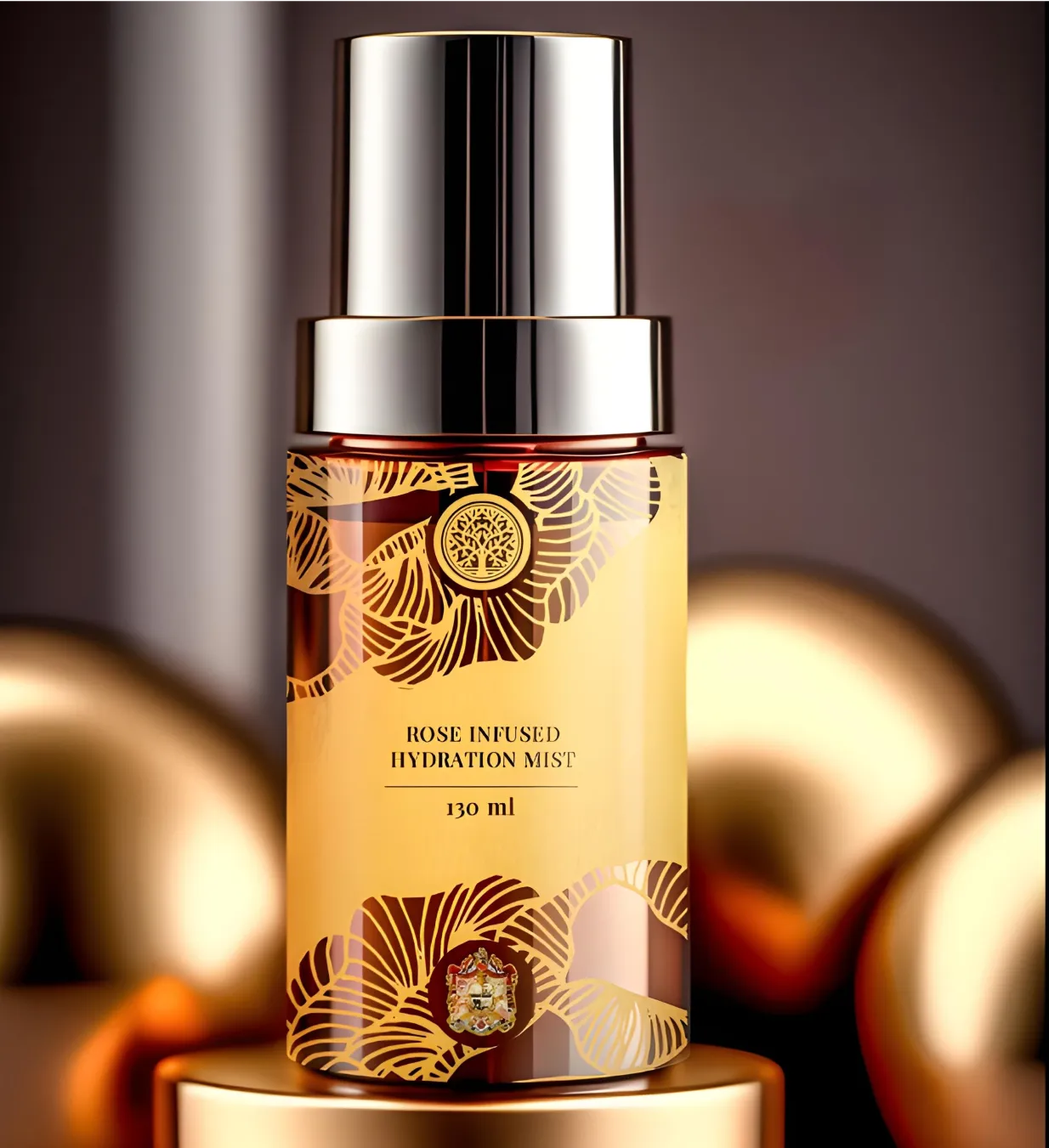
Identity work at Confetti starts with positioning, because the visual decisions depend on decisions that don't exist yet if strategy is skipped. We work in that order deliberately.
For Forest Essentials, a luxury Ayurvedic skincare brand, we designed an exclusive packaging collection for the Jaipur Royal family. Eight distinct designs, each balancing luxury, heritage, and artistry with scope running from SKU database development through to final execution.
At that level, identity isn't a logo applied to a box. It's a system that has to hold across royal gifting, retail presentation, and a portfolio of distinct products without losing coherence.
That pattern runs through our skincare work:
We don't hand over a logo and call it identity. We hand over the rules that let your team apply the brand correctly without asking us first.
If you're evaluating identity design and want to understand what scope fits your stage of growth, a short conversation about your positioning and range plans is usually enough to clarify whether you need a mark, an identity system, or strategy underneath both.
What's the difference between a skincare logo and a full brand identity?
A logo is one visual mark. A full identity is the system around it: colour, typography, packaging application rules, photography style, and tone of voice, that keeps the brand recognizable across a package, a website, a retailer's shelf, and a customer's own photo of it.
How much does skincare brand identity design cost?
Cost depends heavily on scope. A single-SKU logo and basic style guide from a freelancer is a different project than a multi-product identity system built to scale across a growing range, with the latter typically involving more strategic and systems work upfront.
Can I build my skincare brand identity myself before hiring a designer?
Positioning, deciding what the brand claims to be and to whom, is work you can and should do internally before briefing anyone. The visual execution of that positioning is where design expertise becomes genuinely valuable, especially once more than one product is involved.
How long does a skincare brand identity project take?
Timelines vary by scope and how settled the positioning already is going in. A project that starts with an undecided positioning takes longer than one where positioning is resolved before the creative brief is written, since design work often stalls waiting on that decision otherwise.
Should I rebrand or refresh my existing skincare identity?
A refresh: tightening typography, updating a color palette, refining packaging application is usually sufficient if the positioning is still working and the goal is modernizing execution. A full rebrand is worth considering only if the positioning itself has genuinely changed or the current identity is actively working against the brand's growth.
Does a skincare brand identity need to change before international expansion?
Not necessarily change, but it needs review like claims language, cultural color associations, and regulatory labeling requirements can differ by market, and an identity system built without that awareness sometimes needs adaptation before it launches somewhere new.
What should I look for when evaluating a branding agency for a skincare brand?
Ask specifically whether the engagement produces a documented system with usage guidelines for future products and channels, or just final logo files for the current one. The difference determines whether the identity can scale without a redesign as the brand grows.
Want strategic branding and packaging like this for your business?





.webp)
.webp)


.webp)
.webp)
.webp)
.webp)
.webp)







.svg)
.webp)