%201.webp)
02
AI Snaps
.svg)
.svg)
01
Our Work

03
About Us
05
Contact Us
06
Client Success

07
Blogs
08
Careers
Book A Call


Need Help In Building Your Brand?
Click the button below & book a call with our founder directly.

Rishabh Jain
Managing Director

Notifications get your users’ attention, and sometimes they choose to ignore it. Not because they dont care about their order update, but because the notification felt too obtrusive. Since notifications are an integral part of an app or product which shows the users alerts and updates, it’s highly important to understand the types of notifications a user may see on a daily basis. Let’s dive in.
.webp)
Badges are small indicators that sit on top of another icon either containing a number or another type of text to show that there is an activity, update or notification sent from an app. Usually these badges contain numbers in them to display the number of unread notifications you have from an app.
Once the user has opened the notifications or interacted with them, the badge disappears, only to appear again when there’s more activity or notifications.
Badges don’t demand a lot of concentration from the user. In a way, they are minimal and don’t feel obtrusive or overwhelming. Badges are also regarded as positive as getting a reward inciting curiosity within the user. For example, your tweet likes, shares and mentions from Twitter can show up as badges on the Twitter icon.
Although minimal and obtrusive, badge notifications do require the user to take extra steps. Since the badge is not a complete notification but an alert for the notification, the users need to eventually need to open the corresponding app to see what they’ve got.
Push notifications are banner alerts that appear on your smartphone’s lock screen and the notification panel, showing up a variety of information about the alert and app it’s from. Push notifications are the most common type of notifications among various apps and services.
Push notifications, since they are larger compared to badges and come in a banner format, are difficult to be ignored. Users notice push notifications so it ensures that they haven’t missed out on your alert..
Since the push notification is hard to ignore, it can require too much attention from the users, forcing them to check it out. Push notifications are overused, as mentioned earlier, in every other app or service that wants to send you alerts.
Users tend to get annoyed by frequent push notifications, except messages and emails.
.webp)
An email notification is like a push notification but larger in size. Email notifications usually cover up (when expanded) a part of the email message or the full email itself (if concise). Almost all email apps use these types of notifications.
User stays in control whether to open the email or not. Reading the collapsed email notification the user can judge by the sender, title and priority if the email is worth opening.
Email notifications increase the user reaction time since users may end up reading the full or part of email from the expanded notification itself. Plus, some emails do get lost when stacked on top of each other. If you receive 10+ emails a day, you’d know.
If the user decides to open the full email, it requires the user to switch context as well. This may not be very convenient if you’re interacting on a smartphone or smartwatch.
.webp)
Toast Notifications are the pill shaped alerts that pop up on your system UI, usually at the top or bottom of the screen, notifying the user of any system actions or activities that are taking place in the background such as ‘network switching’. Toast notifications disappear in anywhere from 5-10 seconds.
The user doesn’t need to switch context to read more on the alert and it doesn’t distract the user from their overall UI experience as they appear and disappear in a short span.
Users may end up missing important information because of the nature of toast notification. There’s a possibility that the alert disappears before the user had a chance to read it through.
.webp)
.webp)
Overlay notifications are usually full-screen or dialog-based window notifications that appear on your device asking the user to interact with the app. Such a notification sits on top of your current screen, regardless of what app you were using. They stay on the screen until and unless the user has taken an action.
There’s a 100% that users will see this notification, because there’s no other way around it, making it impossible to miss such a notification.
A notification like this can usually become a roadblock for your users interrupting their flow since it demands the user to take an action. And at times, these overlay notifications are app-specific, so there’s a minor chance that the user may miss the alert if they don’t choose to open the corresponding app.
We discussed 5 types of UI notifications that users experience on a daily basis. The key to make the experience more rich for users is to create an effective strategy for designing notifications. They are:
Lorem ipsum dolor sit amet, consectetur adipiscing elit, sed do eiusmod tempor incididunt ut labore et dolore magna aliqua. Ut enim ad minim veniam, quis nostrud exercitation ullamco laboris nisi ut aliquip ex ea commodo consequat. Duis aute irure dolor in reprehenderit in voluptate velit esse cillum dolore eu fugiat nulla pariatur.
Block quote
Ordered list
Unordered list
Bold text
Emphasis
Superscript
Subscript
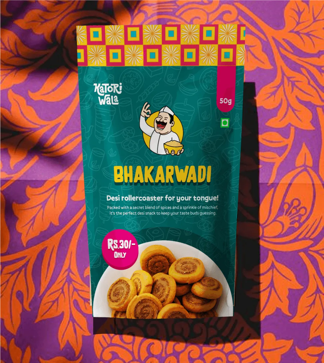
Want strategic branding and packaging like this for your business?


.webp)
.webp)


.webp)
.webp)
.webp)
.webp)
.webp)


.svg)
.webp)
.svg)
.webp)