%201.webp)
02
AI Snaps
.svg)
.svg)
01
Our Work

03
About Us
05
Contact Us
06
Client Success

07
Blogs
08
Careers
Book A Call


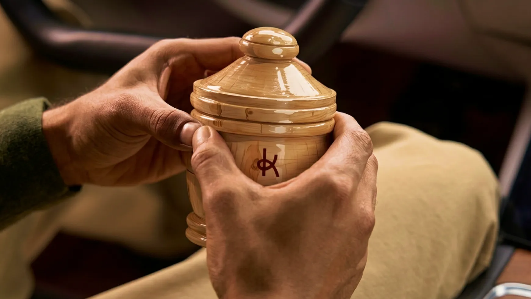
Vedashree is a car and home perfume brand from Kannauj, Uttar Pradesh, the scent capital of India. For centuries, Kannauj has been the source of some of the finest attars and fragrances in the world, produced through a traditional craft with genuine quality and a loyal base of offline customers who could tell the difference.
Confetti Design Studio partnered with Vedashree to rebrand their entire identity by building a brand identity that could compete on digital shelves, and create a packaging system capable of carrying a heritage perfume house into a category that barely knew it existed. The result was Kooji, a complete rebrand.
Scent cannot travel through a screen and that is the most fundamental problem every fragrance brand faces the moment it moves onto Amazon or Flipkart, and it is a problem that most of them solve badly. They list ingredients, describe notes, and hope the buyer makes the leap of faith to purchase the same. But, in a category built on sensory experience, the visual identity ends up doing almost all the work, and Vedashree's existing visual identity wasn't doing any of it.
Three or four brands already dominated the digital car perfume shelf. They had arrived earlier, spent more on advertising, and built enough recognition to pull customers by default. Vedashree had better product quality than some of them and a provenance story those brands couldn't match but sadly none of that was visible online and the brand looked like every other functional freshener in the aisle.
The specific problems Confetti was brought in to solve:

No brand presence on digital platforms despite strong offline reputation
Visual identity that communicated function but not feeling, character, or origin
A packaging system with no coherence across SKUs or product lines
No way to differentiate from larger, better-funded category leaders on a product grid
A Kannauj craft story that was invisible in every consumer touchpoint
No scalable system to extend into home fresheners, body perfumes, or future verticals
The core insight was that the brand was failing because nobody had built a visual language for it that matched what the product actually was.

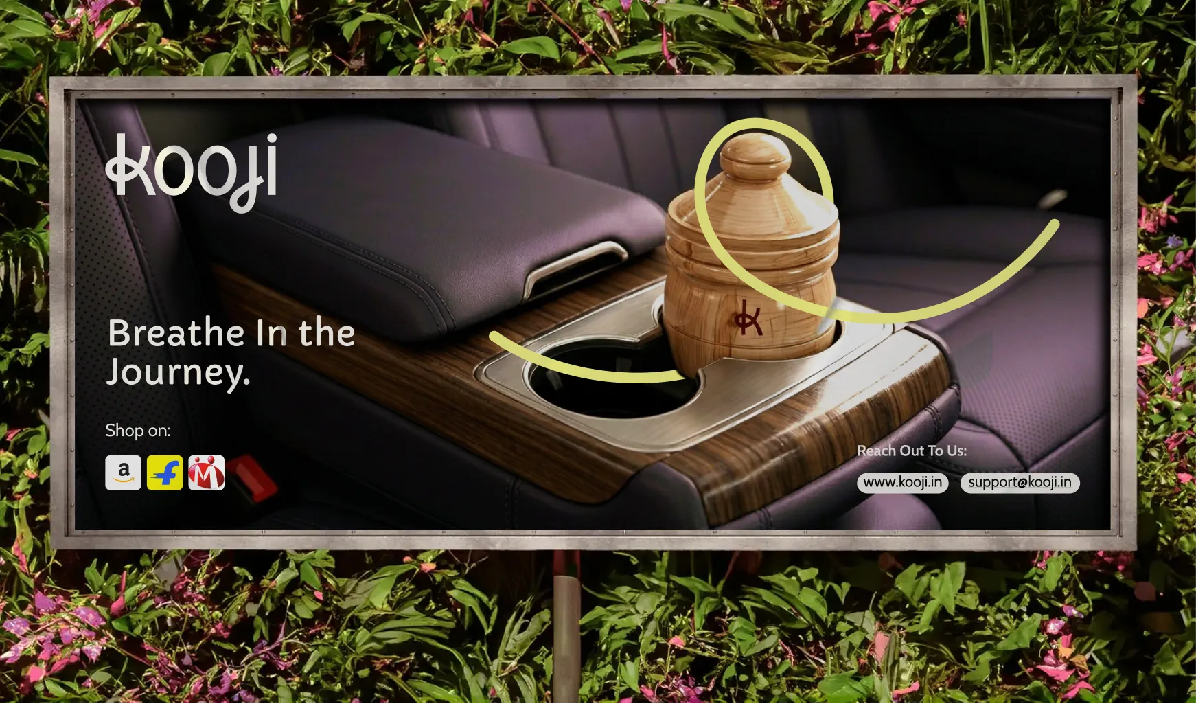
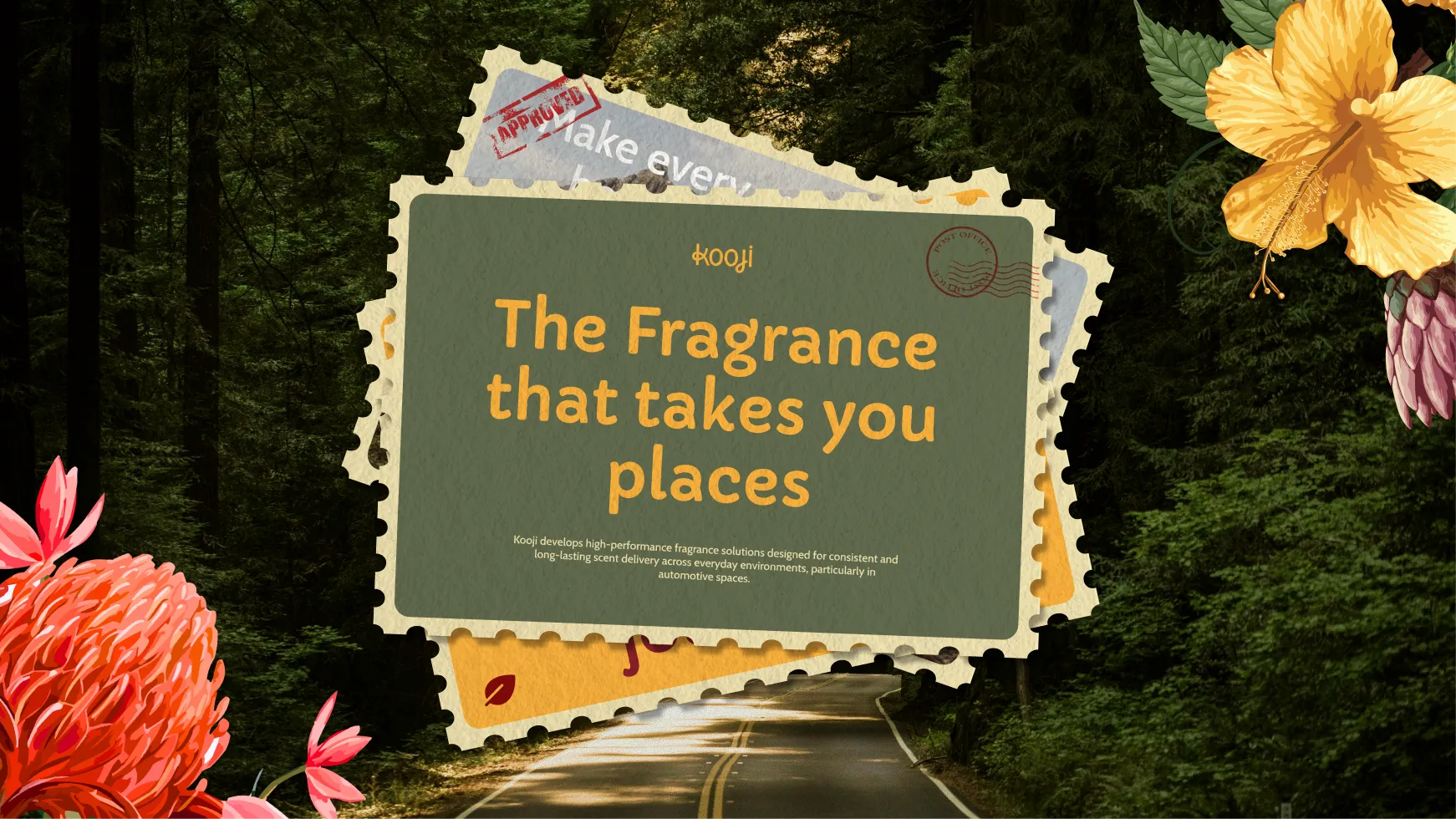
Confetti's strategic shift was a single decision that changed everything downstream: stop communicating what the product smells like, and start showing where it takes you. The scent is invisible, but the journey it evokes is not and this idea became the spine of the entire brand.
Kooji came from Coogee beach in Sydney, a place close to the founder's own life. It is a name that carries memory, movement, and a particular quality of openness that the brand needed. Easy to say, impossible to forget, and completely unclaimed in the Indian fragrance space.
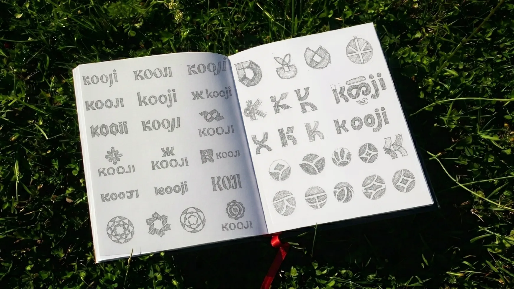
The logo is the most considered thing in the entire identity. Each letter was drawn from a Google Maps screenshot of Indian roads, the actual roads the founders drive on every day. The curves, the junctions, the specific geometry of Indian street networks found their way directly into the letterforms. The loop in the 'k' and the 'j' was always a road to signify that the brand literally grew out of the journeys it was built to accompany.
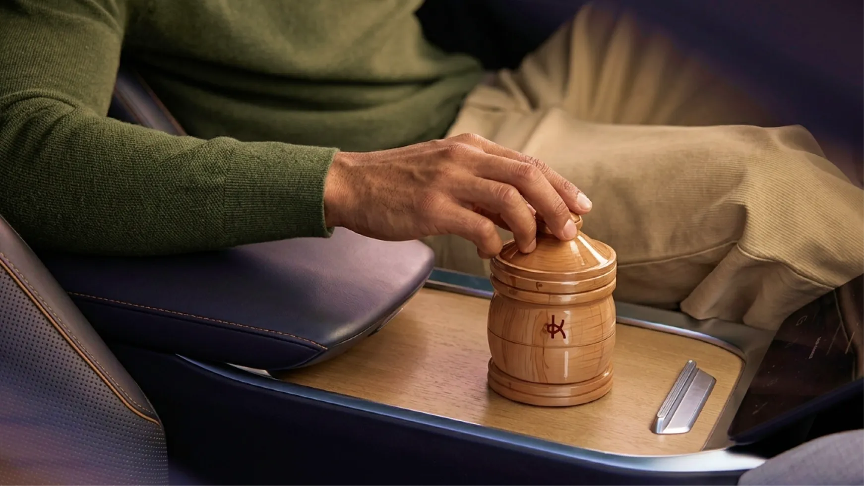
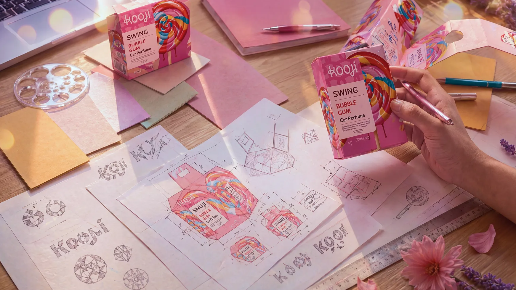
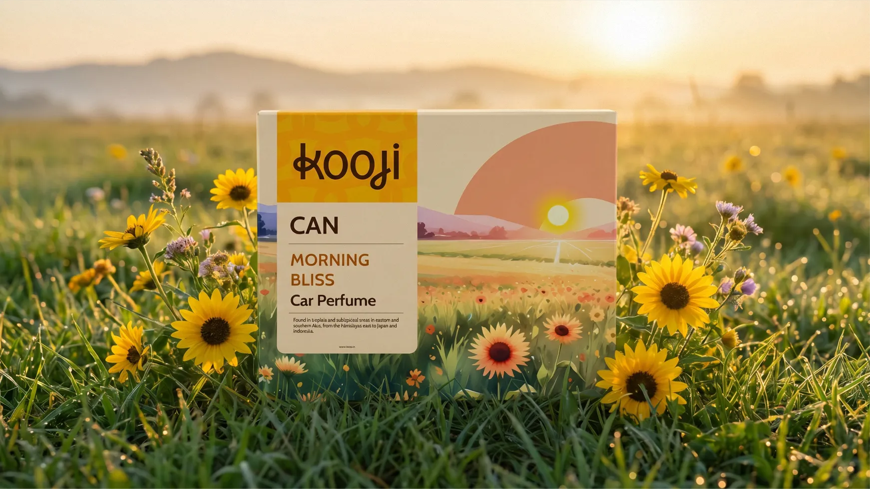
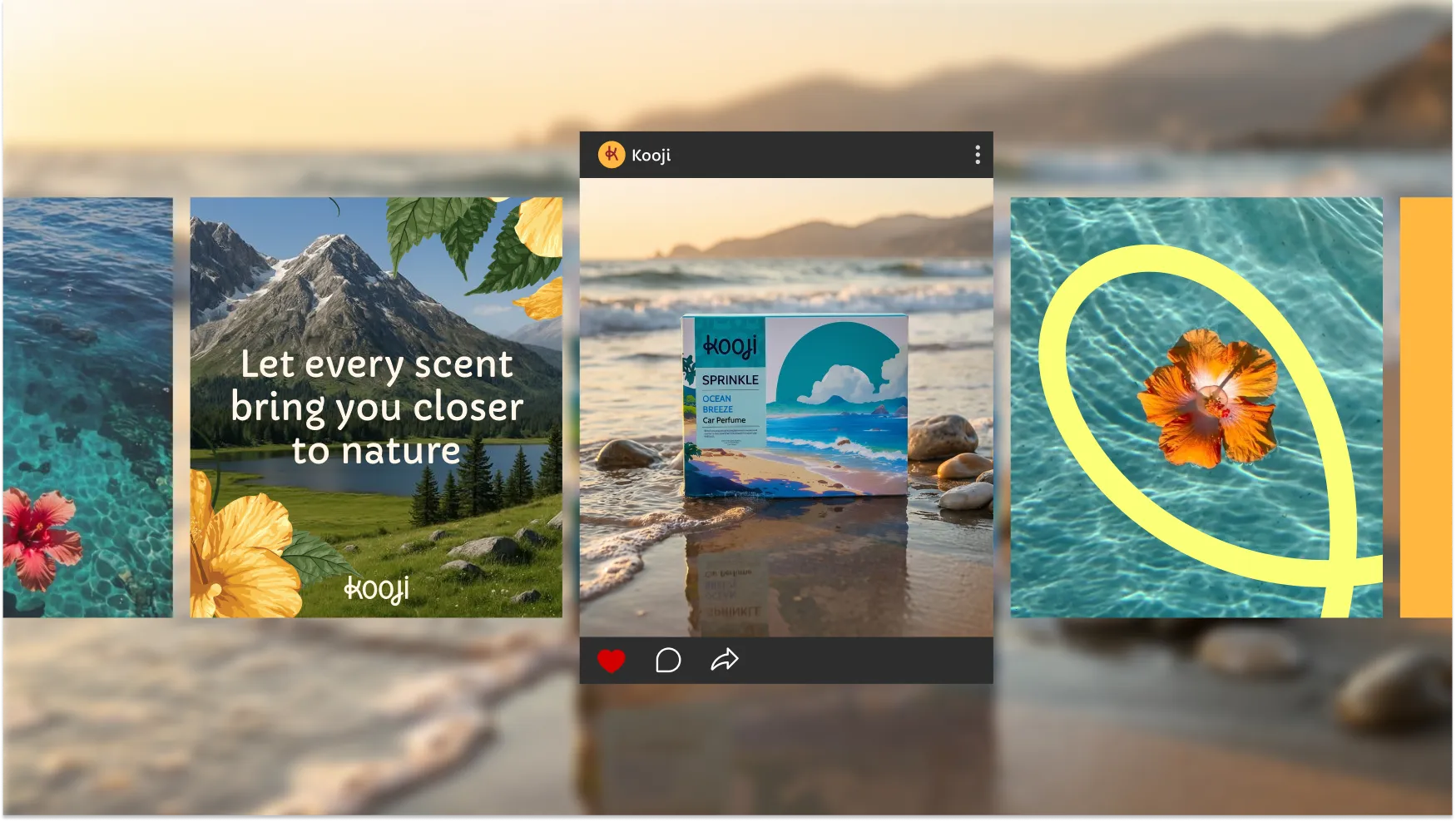
The packaging system Confetti built runs across three product lines, Can, Sprinkle, and Swing, and twenty-four SKUs. The structural logic is identical across all of them but the visual world inside that structure changes entirely per scent.
Midnight Garden is the specific garden that blooms at night, illustrated in watercolour that feels like a memory of a place you have been. Ocean Breeze is the salt air on an Indian coastline at 7am, before anyone else is on the beach. Camphor Puff renders in cold crystalline 3D. Old Musk sits in warm painterly strokes. The illustration style for each SKU was chosen because the medium itself communicates the scent's character. The label is not describing the fragrance, in fact the label is the fragrance made visible. The result is a system that holds together as a range and explodes outward as individual worlds.
The brand palette is vibrant and celebratory in a specifically Indian with Vivid Auburn red, Pastel Orange, Sunny yellow, botanical florals that feel like a festival. The brand is warm and alive, not quiet or artisanal in the way Western natural brands tend to be.
The art direction throughout is moody and cinematic. Dark backgrounds, near black and deep charcoal, with warmth coming from single amber light sources with a lantern, street light through rain, headlights on a road at night. Photography feels like stills from a perfume film rather than an e-commerce catalogue. When watercolour illustration appears it carries the same register, atmospheric, slightly dissolved at the edges, like a memory.
The structural logic of the packaging was designed from the start with Kooji's expansion in mind. The same template can absorb home fresheners, body perfumes, and any future vertical without requiring a redesign. The brand system carries the Kannauj heritage forward into new categories without losing the identity that was built for this one.
Before Confetti's work, Vedashree had craft, provenance, and product quality that most category leaders couldn't match but unfortunately none of it was legible on a screen. After the rebrand, Kooji is a brand that communicates its entire world within the first second of contact.
The logo tells a story before anyone reads a line of copy. The packaging system is coherent enough to build recognition across a full product grid and individual enough that each SKU feels like its own thing. The Kannauj heritage, the craft tradition, the quality that was always there, all of it now has a visual language that carries it into a digital shelf and makes it legible to a buyer who has never been to Kannauj and never will be.
The larger shift is in what the brand can do next. Kooji is not a packaged-up version of Vedashree's existing identity. It is a system built to grow. The template extends, the illustration language scales, the colour system is flexible enough to carry new scents, new product categories, and new markets without requiring another full rebrand. That kind of foundation is what separates a brand from a label.
If you are building a brand in a sensory category and the visual identity isn't carrying the weight of what the product actually is, Confetti can show you exactly what it takes to close that gap.
.svg)
I just got all these boxes, these boxes for the swing, you did a great job and the photoshoot looks very nice, this looks amazing, no one can put it down.
.webp)


.svg)
.webp)


.svg)
.svg)
.webp)
.webp)

.webp)

.svg)