%201.webp)
02
AI Snaps
.svg)
.svg)
01
Our Work

03
About Us
05
Contact Us
06
Client Success

07
Blogs
08
Careers
Book A Call


Confetti Design Studio collaborated with Miduty to elevate its digital presence through a thoughtfully crafted UI/UX design. From developing user personas to structuring an intuitive information architecture, creating detailed wireframes, and defining a harmonious color scheme and typography, each step aligned with Miduty's mission to empower women. The final design seamlessly blended functionality with aesthetics, delivering an experience that delighted the clients and resonated with their audience.


Confetti Design Studio initiated Miduty's UI/UX development by crafting user personas highlighting the audience's key pain points, such as declining confidence, unmet skincare promises, and the challenge of finding trustworthy products.
Understanding their needs for reliable solutions that fit effortlessly into busy lives, Confetti designed a user-centric experience that builds trust and empowers women through seamless functionality and authenticity.
Confetti Design Studio developed a comprehensive information architecture for Miduty, ensuring seamless navigation and user-friendly experiences. Key pages were strategically structured, including the product page, product details page, homepage, about us, and terms and conditions.
This was done to provide clear, intuitive access to essential information. This thoughtful organization enhanced usability and aligned with Miduty's goal of delivering a streamlined and empowering digital experience.
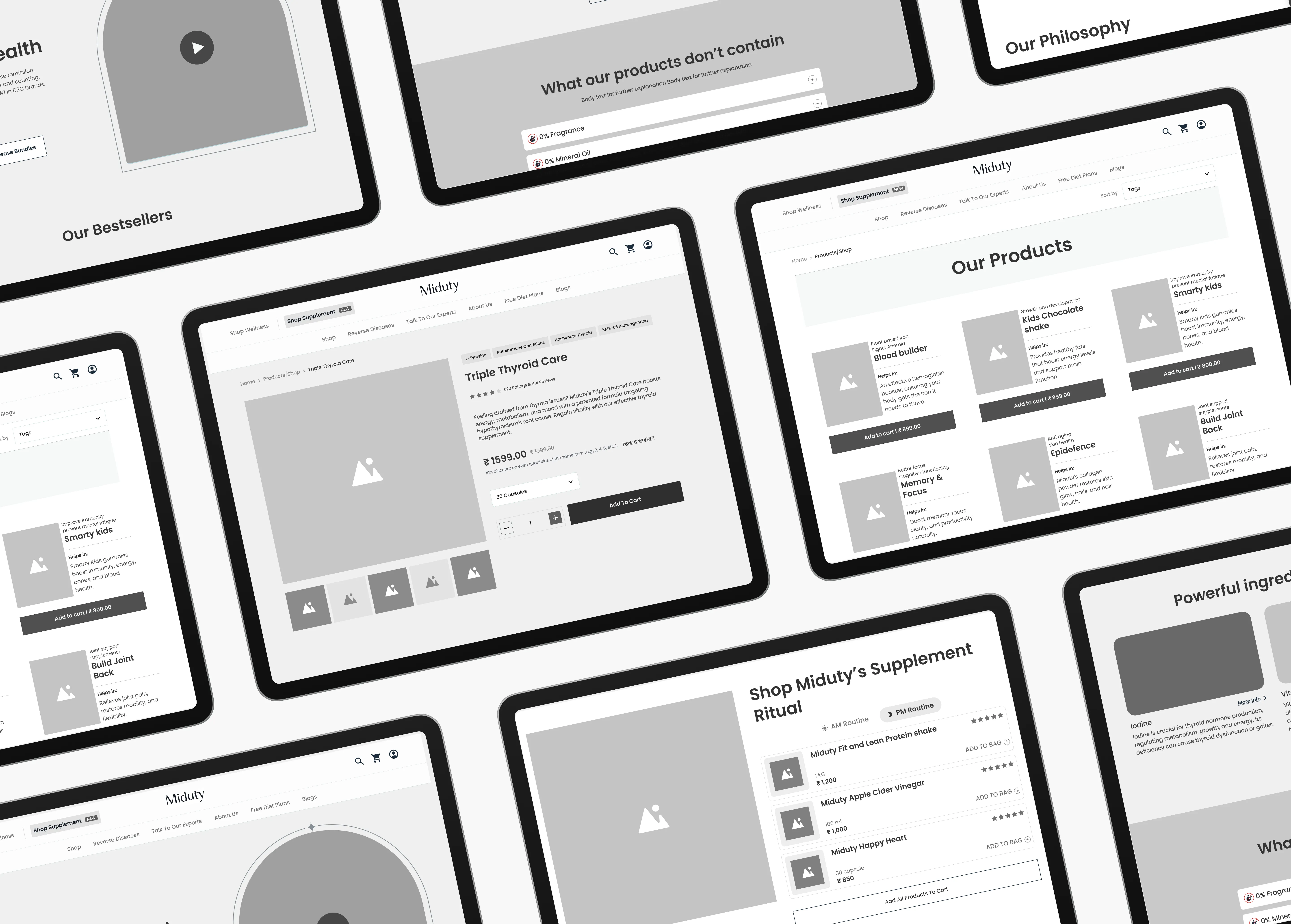
Confetti Design Studio created detailed wireframes as part of Miduty's UI/UX development, providing a clear visual blueprint for the website's layout and functionality.
These wireframes served as a foundation for designing a user-centric interface, ensuring that each element supported intuitive navigation and seamless interaction. This step was crucial in aligning the digital experience with Miduty's mission of empowering and simplifying self-care for women.
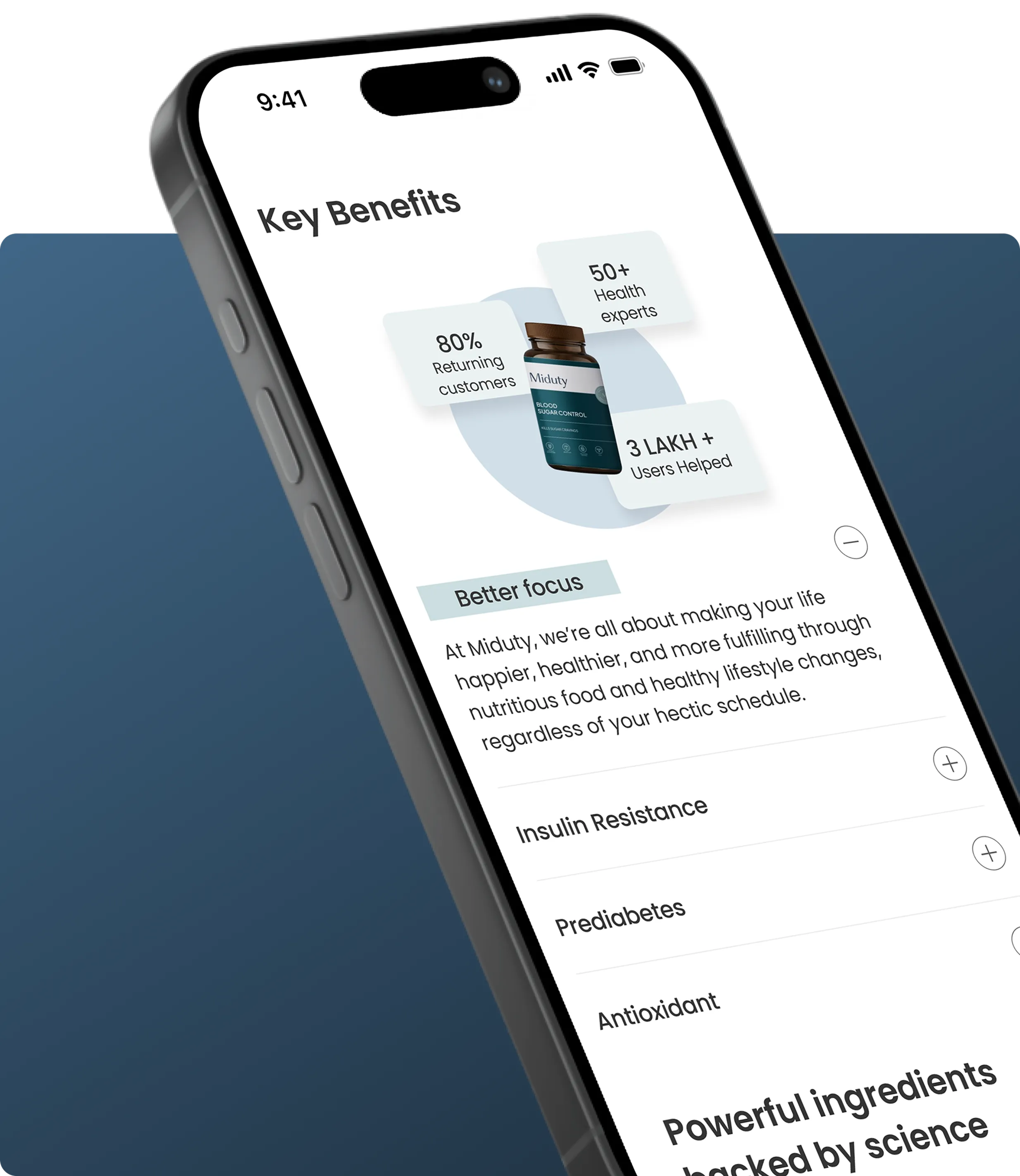
Confetti Design Studio developed a refined color scheme and typography for Miduty's UI/UX design, featuring black, blue, aqua, and white. These colors were chosen to evoke trust, calmness, and clarity while maintaining a professional and modern aesthetic.
The use of Poppins typography further enhanced the design with its clean, versatile, and approachable style, ensuring a cohesive and visually appealing interface that resonates with Miduty’s brand identity and audience expectations.

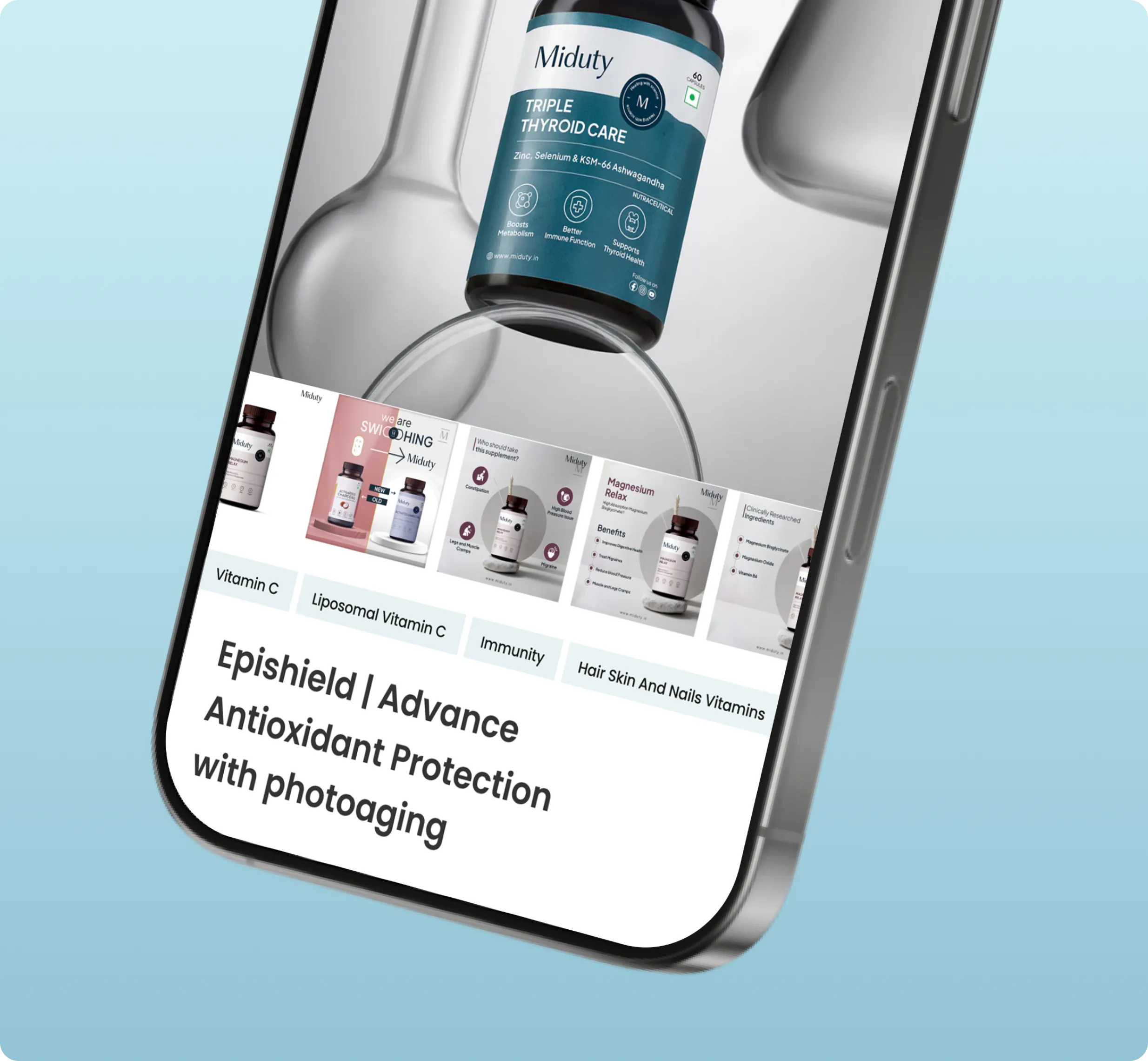
Confetti Design Studio presented the final UI/UX screens to Miduty, showcasing a seamless blend of functionality and aesthetic appeal. The carefully crafted design reflected Miduty's brand identity, offering an intuitive and empowering digital experience.
The clients were thoroughly impressed and delighted with the results, praising the design's alignment with their vision and its potential to resonate with their target audience.


.svg)
.webp)

.svg)
.svg)
.webp)

.webp)


.webp)


.svg)