%201.webp)
02
AI Snaps
.svg)
.svg)
01
Our Work

03
About Us
05
Contact Us
06
Client Success

07
Blogs
08
Careers
Book A Call


Need Help In Building Your Brand?
Click the button below & book a call with our founder directly.

Rishabh Jain
Managing Director
Effective ayurvedic packaging design is not about looking "natural." It is about making the right consumer, on the right channel, reach for your product over the one next to it.
This Confetti guide covers what separates Ayurvedic packaging that sells from packaging that only signals and what you need to get right before you brief a designer.
Ayurvedic packaging is primarily a commercial problem with visual consequences. The visual decisions you make impact if the product gets picked up, trusted, purchased, and repurchased.
Unlike prescription medicines, most Ayurvedic products are bought without a doctor's recommendation or a pharmacist's guidance.
Whether someone is buying an ashwagandha supplement, chyawanprash, or a kumkumadi face oil, the packaging has to do the work of building confidence on its own.
Here are the problems packaging solves:
☑️Standing Out on the Shelf
Established brands like Dabur, Himalaya, Baidyanath, and Patanjali compete alongside dozens of fast-growing D2C brands.
Your packaging must quickly communicate what the product is, why it matters, and why it's the better choice.
Dabur recently refreshed its entire ayurvedic medicine range with bold designs, vibrant colours, and improved readability specifically to strengthen shelf appeal. That’s a response to intensifying competition.
☑️Packaging Builds Trust
Ayurveda is seen as both time-tested and, by some, outdated. Packaging shapes that perception.
Materials, typography, colours, finishes, and structure all signal quality and credibility. Premium brands like Forest essentials and Kama Ayurveda have demonstrated this exceptionally well.
☑️Different Customers Need Different Signals
The category has three distinct buyer segments, and they have different packaging expectations:
☑️Compliance Can Strengthen Your Brand
AYUSH labelling requirements, the Drugs and Cosmetics Act, and FSSAI regulations must be designed into the very first draft.
Clear, well-integrated compliance information builds credibility and reinforces trust. Tiny fonts, cluttered layouts, and hard-to-find declarations undermine confidence.
☑️Design for the Right Sales Channel
Packaging is experienced differently in pharmacies, supermarkets, Amazon, Quick commerce channels, and D2C stores.
A design that works as an online thumbnail may disappear on a retail shelf. Prioritise the channel that drives most of your sales.
☑️Strong Product Architecture Drives Growth
Too many Ayurvedic brands launch multiple formulations, dosha-specific products, and variants that look almost identical, creating confusion at the point of purchase.
Clear product packaging architecture helps shoppers find the right product, understand the differences, and buy with confidence.
Good packaging doesn't just sell one SKU, it helps sell the entire portfolio.
☑️Your Most Consistent Marketing Asset
Packaging design is your highest-leverage marketing investment in Ayurveda. It works 24/7, on every shelf, in every cart, on every unboxing video.
It does not require ad spend to keep working. It does not require impressions to earn attention. It just sits there, doing its job, every single time someone walks past it.

In our experience working across Indian FMCG and D2C brands, three distinct territories exist in ayurvedic packaging, each with its own commercial use case and its own failure mode.
Most brands drift between them without clear intention and end up in none of them well. Here is how to choose deliberately:
This territory draws directly from Ayurveda's textual and ritual traditions.
Visual language: Deep jewel tones (burgundy, forest green, saffron, gold), hand-drawn botanical illustrations, classical serif or Devanagari typography, traditional motifs including lotus, ashoka chakra, neem, and medicinal plants and visual references to classical Ayurvedic manuscripts.
Signals: Tradition, authenticity, ritual, premium pricing.
Works for: Premium brands positioning on authenticity, tradition, and luxury. In our packaging design work with Forest Essentials for the Jaipur Royal family blended luxury, heritage, and artistry, using in-depth research into Rajasthani heritage and the traditions of the Jaipur Royal family. The packaging needed to exude luxury and uniqueness, aligning with royal heritage.
Does not work for: Quick commerce impulse buys, mass market price-sensitive buyers at INR 100–250 MRP, or brands targeting young urban consumers who find heritage visual language heavy and inaccessible.
The risk: Heritage-inspired packaging can easily become decorative rather than meaningful. When every brand relies on the same motifs, the visual language loses its impact.
The answer is specificity. Draw from your own traditions, ingredients, and regional heritage—not generic "Indian" imagery.
Best Examples: Forest Essentials, Ayurvridhi
When to choose:
This territory strips away ornamentation entirely. It looks more like a pharmaceutical product than a traditional remedy.
Visual language: White and light neutral backgrounds, clean sans-serif typography, ingredient-forward hierarchy, QR codes linking to efficacy data, minimal or no illustration.
Signals: Safety, efficacy, scientific validation, professionalism.
Works for: Nutraceuticals, dietary supplements, AYUSH-regulated ayurvedic medicine, and modern wellness brands targeting urban millennials who are ingredient-literate and brand-sceptical.
Does not work for: Ritual or lifestyle positioning, premium gifting, export markets where Indian visual identity is the primary selling point.
Best Examples: Dabur (Refreshed Ayurvedic Range), Welherb
The risk: Clinical-modern can feel cold, intimidating, or generic. If every supplement brand looks the same, you lose distinction. The challenge is bringing warmth and humanity into a clinical framework without compromising credibility.
When to choose it:
This territory bridges the two above. It uses traditional visual cues but executes them with contemporary design principles.
Visual language: Soft muted palettes (oat, sage, dusty rose, warm terracotta), clean layouts with considered white space, modern sans-serif with personality, minimal but intentional illustration, product photography, modern typography, premium materials.
Signals: Accessible premium, modern Indian identity, wellness as a lifestyle choice rather than a medical intervention.
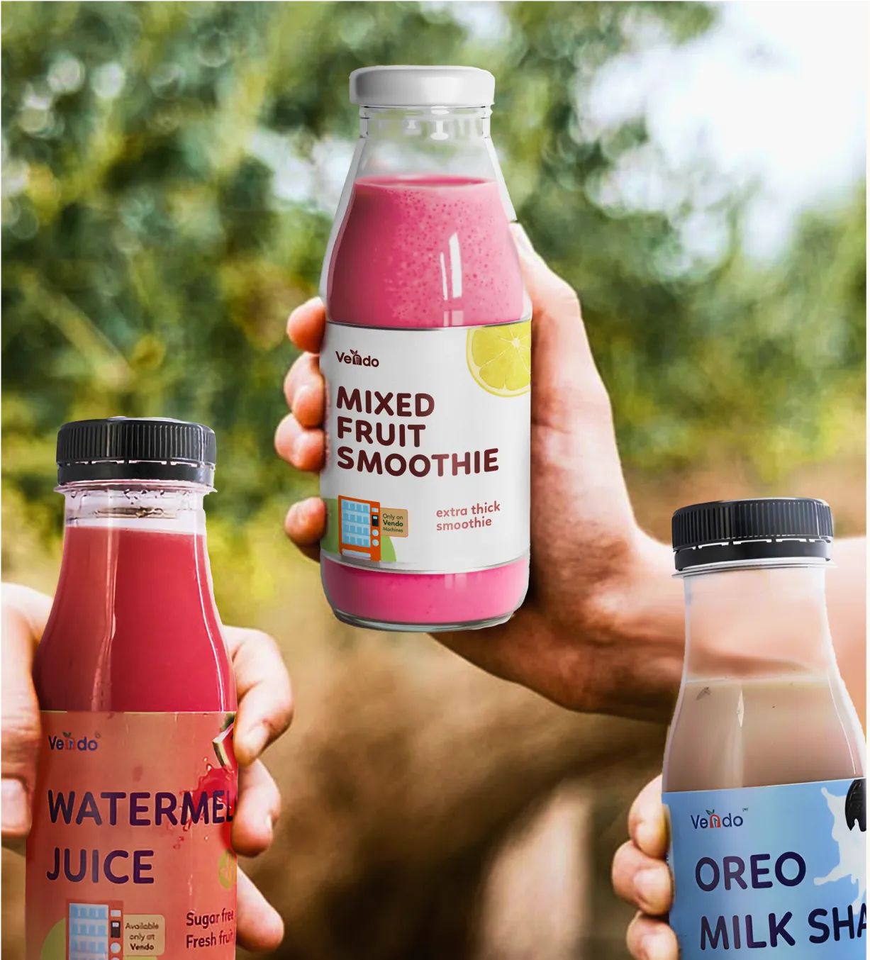
Works for: D2C skincare and beauty, mid-tier personal care, urban Gen Z and millennial buyers shopping across D2C and quick commerce.
Best Examples: Ayuza Wellness, Blue Nectar
The risk: Lifestyle-contemporary is where most brands end up by default. Without strong strategic direction, it becomes the visual equivalent of "nothing:" not traditional enough to signal authenticity, not modern enough to signal innovation.
When to choose it:

🔍Heritage-Ceremonial is overcrowded.
🔍Clinical-Modern requires genuine efficacy credentials to be credible.
🔍Lifestyle-Contemporary has the most room.
Lifestyle-Contemporary is the fastest-growing buyer segment (the "Ayurveda-Modern Hybrid" buyer spending INR 1,000–4,000 per month on wellness), and the least visual noise.
Yet most new ayurvedic brands default to Heritage-Cremonial because it feels authentic, not because it is the right strategic choice.
Your brand territory shouldn't be driven by personal preference. It should be driven by what your customer needs to believe before they're willing to buy.
Evaluate your:
Then choose the territory that aligns with those factors and execute it consistently. Strategy wins when it's backed by discipline.
The India ayurvedic wellness market is growing at 16.2% CAGR. That growth is being driven by consumers who prefer natural, chemical-free, plant-based alternatives over synthetic products.
This consumer is not looking for "traditional" packaging. They are looking for packaging that signals purity, transparency, and efficacy.
Colour communicates these attributes through association.
What Works
Earthy tones: terracotta, ochre, deep green, warm brown, cream, remain the most effective colour language for signalling naturalness and authenticity.
Pastel hues are emerging as a differentiator in the mass-premium space. Reliance Retail's Puraveda uses bespoke packaging in pastel hues, tying the visual language to the products. The approach signals softness, purity, and modernity without losing the natural association.
Deep, saturated colour on dark backgrounds signals premium. A clinical white background signals safety.
Light, airy palettes signal accessible and modern. Bright, high-contrast colours signal mass market energy and shelf impact.
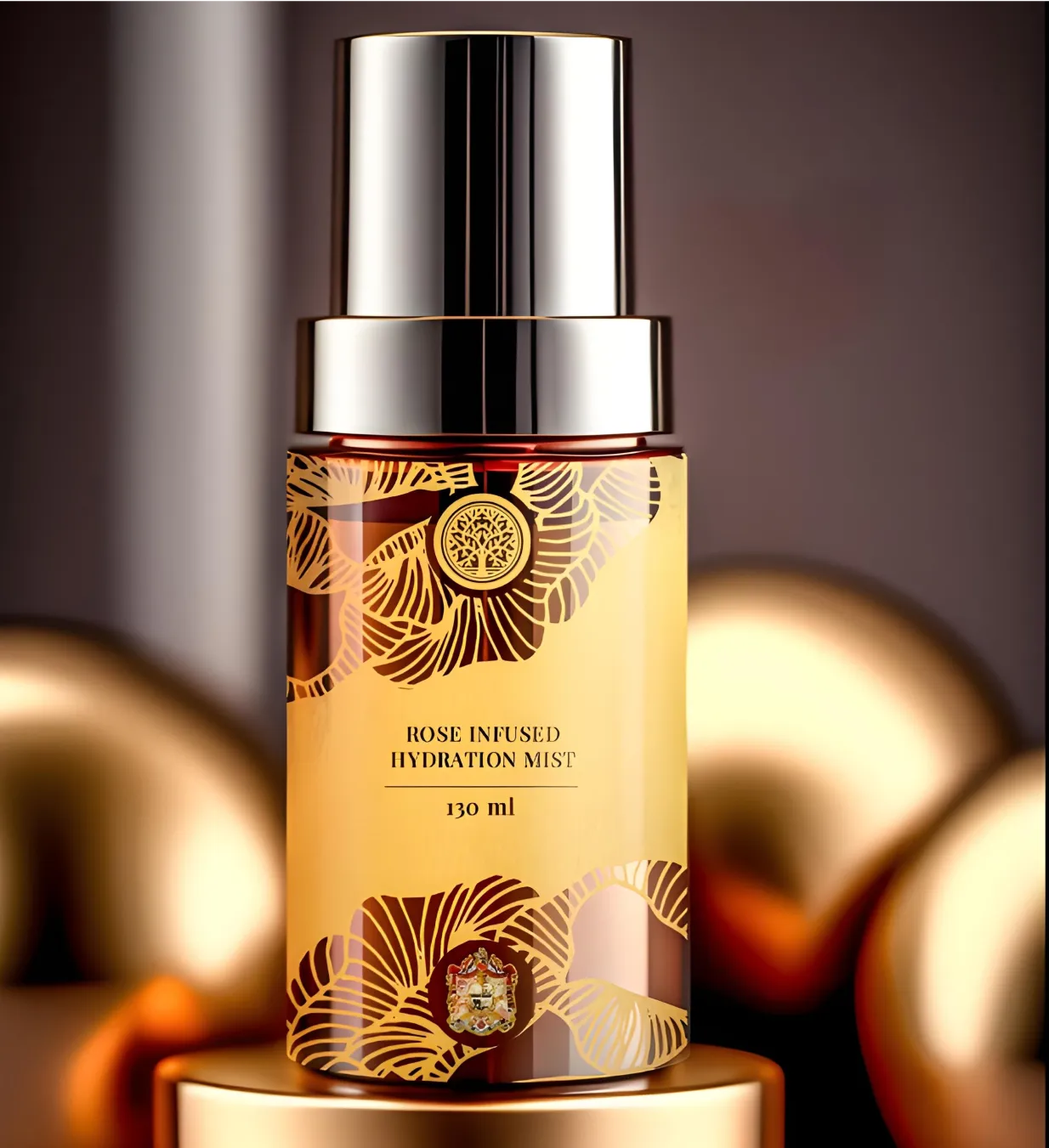
Gold accents, used sparingly, signal luxury and premium positioning without overwhelming the pack. Forest Essentials uses gold detailing to communicate royal sophistication.
What’s Overused
The default colour associations in this category are well-established: deep green, brown, gold, etc. This combination has become the visual shorthand for "ayurvedic".
Red and gold together. This signals "traditional Indian" but has been so thoroughly exploited that it now reads as generic rather than specific. Unless your brand has a genuine connection to this colour language, avoid it.
When every brand on the shelf uses the same colour palette, no brand stands out. The consumer cannot distinguish one from another at a glance.
Solution:
Colour is not just about the pack, its about the system. Effective ayurvedic colour strategy uses:
Do not rely on a single "ayurvedic" colour palette. Build a proprietary colour system that belongs to the brand alone.
If your brand has multiple SKUs, colour should help consumers navigate the range, not confuse them. Product-specific palettes, make each SKU identifiable at a glance while maintaining a cohesive brand system.
Another problem here is the quick commerce problem for brands that want to grow on quick commerce.
Earthy, low-contrast palettes may look refined on retail shelves but often disappear as 100×100 pixel thumbnails on Blinkit or Zepto. For Ayurvedic brands growing through quick commerce, that's a conversion problem.
What works is a quick commerce packaging design that balances cultural authenticity with the visual clarity digital retail demands.

Talk to Confetti experts about transforming your Ayurvedic brand with thoughtful design.
Book A Call
Typography should make information easier to understand, not harder.
One of the most common mistakes is using too many typefaces on a single pack. A decorative serif for the logo, script lettering for the tagline, multiple sans-serifs for product information, and another display font for ingredients may each seem justified individually.
Together, they create confusion.
A simple two-typeface system is usually enough.
Authenticity shouldn't come at the cost of clarity.
Many Ayurvedic brands use Sanskrit names or Devanagari script to reinforce their heritage. While this can strengthen credibility for some consumers, it can also create unnecessary barriers for others.
A better approach is to pair traditional terminology with transliteration or plain-language explanations.
For example, instead of relying only on the Sanskrit name, explain what the ingredient is and why it matters.
This preserves authenticity while making the product more accessible to a broader audience.
Premium packaging uses white space strategically in a way that reflects that important information has been prioritised.
Crowded layouts packed with benefit icons, certification badges, ingredient lists, and marketing claims often make products feel cheaper, even when the formulation is excellent.
Give your most important information room to stand out.
Many founders want the front panel to communicate every benefit, every ingredient, every certification, and every competitive advantage.
The result is predictable. Nothing stands out.
Choose one primary benefit. Highlight the ingredient that supports it. Present the information clearly. Let the remaining details support the decision instead of competing for attention.
Clear typography, logical hierarchy, readable compliance information, and honest presentation all reinforce the same message: this is a brand with nothing to hide.
Ayurvedic products in India fall under the purview of AYUSH regulations and the Drugs and Cosmetics Act, 1940.
Mandatory label elements include:
💡These elements require dedicated real estate on the label. Allocate a structured back or side panel, designed in the same typographic system as the front, set in legible minimum type sizes, and positioned in a consistent location across the entire range. This protects the front panel for brand communication while ensuring compliance is visible, clean, and readable.
Confusing AYUSH and FSSAI Requirements:
If your product is manufactured under an Ayurvedic (ASU&H) manufacturing licence it is regulated as an Ayurvedic medicine under the Drugs & Cosmetics Act, 1940
If your product has an FSSAI licence, it is considered a food supplement and must comply with FSSAI labelling requirements and regulations.
For Ayurveda Aahar (ayurvedic food products), the labelling must be in accordance with the Food Safety and Standards (Labelling and Display) Regulations, 2020. Every label must clearly specify
Ayurvedic Cosmetics Vs Ayurvedic Medicines
Ayurvedic cosmetics (skincare, haircare, personal care products) are regulated as cosmetics under Schedule Q and have relatively lighter mandatory label requirements, primarily manufacturer details, ingredient list, net quantity, and date of manufacture/expiry.
Ayurvedic medicines are regulated under Schedule E and carry more extensive mandatory content including dosage, contraindications, and classical formulation references. The design constraints are materially different.
This is where most ayurvedic packaging strategies break down. One pack does not fit all channels. The physical context changes everything about how packaging is seen, handled, and evaluated.
Kirana stores are cramped, poorly lit, and crowded with products. Your packaging must earn attention from a cluttered shelf in low light, often stacked vertically or displayed behind a counter.
What works: Bold, high-contrast colour. Large, legible typography. Clear product differentiation. Packaging that can be stacked, displayed, and stored efficiently.
What fails: Subtle design that requires close inspection. Small type. Delicate materials that damage easily. Packaging that does not stack well.
📌Kirana is the backbone of Indian retail. Design for brutal simplicity: if shopkeepers can't recognize your product from 3ft away, they won't recommend it. If consumers can't read it in low light, they won't buy it.
Modern trade retail like Apollo, MedPlus, Nykaa physical stores, Health & Glow, have better lighting, more organised shelves, and consumers who browse rather than just grab.
That also means more competition from adjacent products. It must hold its own against Kama Ayurveda, Forest Essentials, and Dabur. both premium and well established brands.
What works: More refined design. Clear category signalling. Information hierarchy that supports comparison shopping. Premium materials that signal quality.
What fails: Packaging that looks cheap next to premium competitors. Illegible information. Design that does not signal the category clearly.
📌 Focus on premium materials, thoughtful finishes, and design that signals quality at a glance. Pharmacy environments have an additional dynamic: clinical-modern packaging signals are rewarded here because the environment itself primes the buyer for a health decision framing rather than a lifestyle or beauty decision framing.
D2C packaging serves: the product itself and the unboxing experience. On a screen, the product is seen, not touched, not held, not opened. The packaging must photograph well, communicate clearly in thumbnail size, and tell a story that makes the consumer click "add to cart."
What works: Clean, photogenic design. Clear product differentiation in thumbnails. Unboxing experience that feels premium and intentional. Packaging that tells a story the consumer can share.
What fails: Design that does not photograph well. Information that is illegible at thumbnail size. Packaging that feels cheap when opened.
Unboxing principle: Packaging is experienced over time, not in a single glance. At Confetti, we design for the full physical sequence: what the customer touches first, what they see as the pack is opened, and how information reveals itself through that interaction.
📌For ayurvedic brands, the unboxing moment is an opportunity to reinforce the brand story: the ritual, the tradition, the care that went into the formulation. A generic box with a label does not do that.
Quick commerce is now the fastest-growing channel for ayurvedic personal care and wellness in urban India but packaging needs here are entirely different.
What works: Packaging that is immediately identifiable in a tiny thumbnail, protects the product during rapid delivery and feels appropriate for the speed and convenience of the transaction.
What fails: Packaging that requires assembly or fussy opening, damages easily in transit., does not communicate clearly at small sizes.
📌Prioritise clarity at small scale, durability in transit, and ease of use upon arrival. The consumer may not remember your brand name, but they will remember the product and the experience.
Ayurveda is built on the concept of doshas: Vata, Pitta, Kapha, the three biological energies that govern the body.
It is one of the most distinctive differentiators available to an ayurvedic brand and one of the most underused packaging design tools in the category.
Most brands list "formulated for Vata/Pitta/Kapha" somewhere in the copy.
Almost none have built a packaging system that makes the dosha differentiation visible, intuitive, and navigable without requiring the buyer to already know what their dosha is.
Consumers don't want to solve a puzzle before making a purchase. They want packaging that helps them make the right choice quickly.
Use packaging to visually differentiate dosha-based product lines.
Fixed brand architecture:
Every product should immediately feel like it belongs to the same family.Maintain consistency across:
Without these constants, the range looks like unrelated products rather than a cohesive brand.
Variable differentiation system:
Once the family resemblance is established, each dosha should be instantly recognisable.
Colour is usually the most intuitive differentiator because consumers understand it before they read any text.
While there are no universal rules, many brands successfully draw on familiar Ayurvedic associations:
Colour isn't the only option. Illustration styles, patterns, icons, or graphic motifs can reinforce the distinction, but the key is consistency across the entire range.
The goal is simple: a shopper should recognise the correct dosha from several feet away.
Navigable language:
Not every customer understands Ayurvedic terminology.
Packaging should serve both experienced practitioners and first-time buyers.
Instead of displaying only the dosha name, pair it with a clear functional benefit.
For example:
The expert immediately recognises the dosha. The new customer understands what the product is designed to do.
Both audiences can navigate the range with confidence.
💡A clear product architecture improves usability, repeat purchases and increases basket size. When customers can easily identify related products within the same system, they're more likely to explore the wider range instead of buying a single SKU.
The philosophy of Ayurveda is rooted in living in harmony with nature, so buyers naturally expect the packaging to reflect the same values.
When it does, it reinforces the brand's credibility. When it doesn't, it creates doubt.
The strongest sustainability strategies are consistent from product to packaging.
When the formulation, materials, messaging, and overall brand experience reinforce the same environmental values, consumers notice the difference.
Many founders treat eco-friendly packaging as a branding exercise. They add a "recyclable" icon, switch to kraft paper, or replace glossy finishes with matte ones and assume the job is done.
Consumers are smarter than that. Here’s what you need to consider with sustainable ayurvedic packaging design:
Sustainability Should Reinforce Your Brand
Packaging made from responsibly sourced materials, reduced plastic usage, refill systems, or recyclable formats naturally aligns with the philosophy of Ayurveda and strengthens brand credibility.
In a crowded wellness market, credible sustainability claims can influence purchase decisions, especially among premium urban consumers who actively compare brands before buying.
When Sustainability Becomes Greenwashing
The fastest way to lose credibility is to make sustainability claims the packaging doesn't support.
Consumers quickly notice contradictions.
These choices don't strengthen trust. They weaken it.
In the most credible sustainable packaging systems, the material, structure, finish, and messaging all reinforce the same story.
Choosing Materials Means Choosing Trade-offs
Every packaging material solves one problem while creating another.
The right material depends as much on pricing, distribution, and operations as on sustainability goals.
Sustainability Has to Work Commercially
Sustainable packaging almost always carries a higher unit cost.
For a premium Ayurvedic brand, that additional investment may reinforce the positioning and justify a higher price.
For products competing in the ₹150 to ₹300 price range, a significant packaging cost increase can quickly erode margins unless pricing, manufacturing, or distribution economics change alongside it.
Make Sustainability Visible
One of the biggest mistakes founders make is investing in sustainable materials without communicating them.
If consumers can't see, feel, or understand what makes the packaging more sustainable, much of that investment goes unnoticed.
Good sustainable packaging makes the decision tangible through:
Build Sustainability Into the System
The strongest Ayurvedic brands build sustainability into packaging from the start—from materials and printing to shipping, refills, and disposal.
When every decision supports the same environmental story, consumers notice the consistency, and consistency builds trust.
The best packaging balances sustainability, product protection, usability, and commercial viability.
Every ayurvedic packaging project at Confetti begins with a question:
What does this packaging need to achieve in the real world? Not "what should it look like," but "what commercial problem does it need to solve?"
✅The Strategic Foundation
We map the brand's positioning, price point, target consumer, and distribution channels first. These determine: the visual territory, the colour strategy, the typography, the materials, the structural design.
For Forest Essentials, we created exclusive packaging for the Jaipur Royal family, blending luxury, tradition, and craftsmanship.
Inspired by extensive research into Rajasthani heritage and the family's women-led legacy, artistic traditions, and use of natural ingredients, the designs reflected both royal elegance and the brand's Ayurvedic ethos.
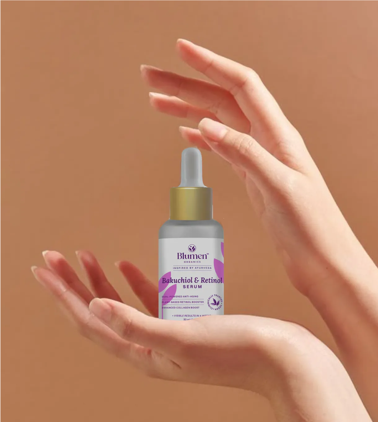
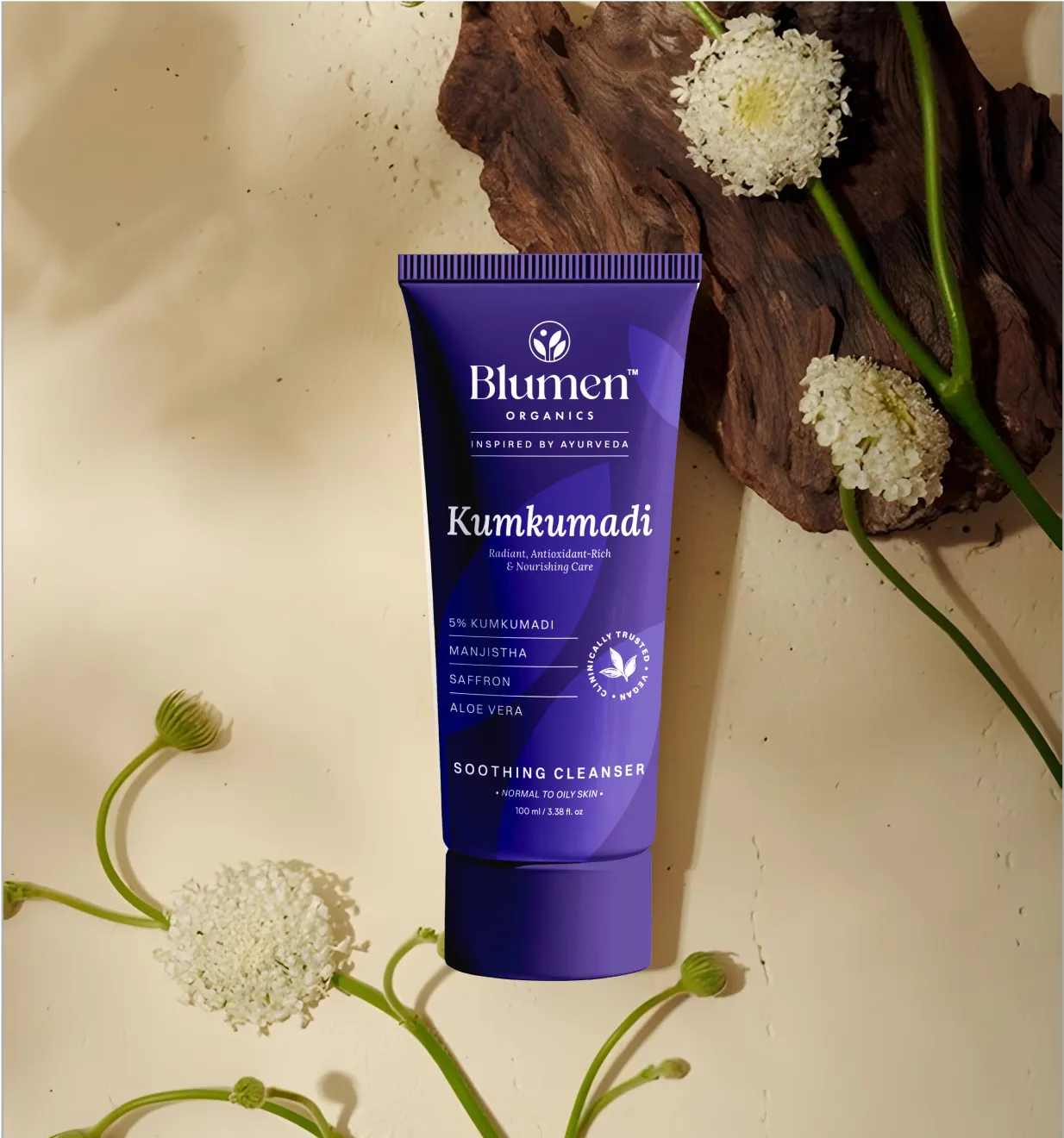
For Blumen Organics, we created a brand identity that reflected its holistic philosophy of nurturing long-term skin health. Positioned as a wellness companion, the brand blends Ayurveda with science, while the visual identity paired modern elegance with Ayurvedic warmth through tactile, eco-conscious packaging.
✅The Information Architecture
We build packaging around information hierarchy, not aesthetic preference alone.
What does the consumer need to see first? Second? Third? What needs to be legible from across the aisle? What needs to be read at arm's length? What needs to be verified at home?
We create a content inventory that captures all the textual and visual elements required for the packaging. This approach enables us to blend visuals and written content seamlessly.
✅The Channel-Specific Execution
We design for the physical environment the packaging will live in. Offline packaging is designed as a complete physical system, not a digital layout adapted for print at the end of the process.
Everything is considered in the context of how the packaging will be noticed, handled, opened, and evaluated in actual retail conditions.
✅The Unboxing Framework
We apply a structured four-point unboxing framework to ensure the journey feels intentional and on-brand at every stage.
What does the customer touch first? What do they see as the pack is opened? How does information reveal itself through that interaction?
✅The compliance integration
We integrate AYUSH and FSSAI compliance requirements into the design from the start. Mandatory declarations are part of the layout architecture, not an afterthought. The result is packaging that is both beautiful and legally compliant.
🎯The result is packaging that does not just look good, but also works. It earns attention on the shelf. It builds trust with the consumer. It communicates the brand story clearly. It drives purchase.
❌ Designing for heritage instead of the sales channel
Packaging that looks beautiful in a presentation can disappear on a pharmacy shelf or a Blinkit listing. Always test designs in the retail environment where they'll compete.
❌ Blending into the category
Earthy colours, Sanskrit motifs, and botanical illustrations are common across Ayurvedic brands. If your pack looks like everyone else's, shoppers won't remember it. Build a distinctive visual identity, not a generic one.
❌ Poor information hierarchy
Cramming every benefit, ingredient, certification, and claim onto the front panel creates visual clutter. Prioritise what shoppers need to know first and let the rest support the decision.
❌ Using too many typefaces
Multiple fonts don't make packaging feel premium. They make it harder to read. A simple typography system with one display typeface and one clean sans-serif is usually more effective.
❌ Retrofitting AYUSH compliance into completed artwork
Mandatory AYUSH and regulatory information should be planned from the start, not squeezed in after the design is complete. Clear compliance builds trust.
❌ Launching multiple SKUs without a packaging system
If every variant looks unrelated, customers recognise products but not your brand. Use consistent layouts with clear colour or graphic differentiation across the range.
❌ Treating sustainability as a marketing claim
A recyclable icon or kraft label doesn't make packaging sustainable. Materials, structure, and messaging should all support the same environmental story.
❌ Ignoring the back panel
Health-conscious buyers often turn the pack over before purchasing. Use the back panel to explain ingredients, sourcing, usage, and brand values instead of treating it as a compliance dumping ground.
❌Applying luxury visual language at a mass market price point
Deep backgrounds, gold foiling, and elaborate botanical illustrations signal luxury, as seen with Forest Essentials. In the mass market, those same cues conflict with price, creating a trust gap instead of signaling quality.
❌Treating packaging as a one-time project.
Designing packaging once and never updating it leaves brands looking dated while competitors move ahead. Treat packaging as a living asset, refresh it regularly, evolve it with the brand.
Great Ayurvedic products deserve exceptional packaging. Whether you're launching a new herbal line or refreshing an existing brand, Confetti creates packaging that blends traditional wisdom with contemporary aesthetics.
What makes a good ayurvedic packaging design?
Good Ayurvedic packaging builds trust, works across every sales channel, meets AYUSH requirements without clutter, and stays consistent across the product range. Great aesthetics alone aren't enough, if the pack fails on a pharmacy shelf or a Blinkit thumbnail, it isn't effective. The real test is commercial performance.
What colours are best for ayurvedic product packaging?
There is no single colour for Ayurvedic packaging. Heritage brands use saffron, green, and gold, while clinical and D2C brands favour cleaner, more contemporary palettes. The right choice should differentiate your brand within its price tier and sales channel.
What are the labelling requirements for ayurvedic products in India?
Ayurvedic medicines must display key regulatory information, including the formulation name, manufacturer details, licence number, batch number, manufacturing and expiry dates, net contents, ingredients, dosage, and warnings. Ayurvedic cosmetics have lighter requirements but still require manufacturer details, ingredients, and date markings. Products classified as foods or nutraceuticals may also need to comply with FSSAI regulations.
How much does ayurvedic packaging design cost in India?
A single SKU label design from a freelancer can cost INR 5,000–25,000. A full packaging system for a D2C brand launch including multiple SKUs, structural design, range architecture, print-ready artwork, from a specialist packaging design agency usually starts at INR 2 lakh and can run to INR 8 lakh or more depending on scope and complexity.
Want strategic branding and packaging like this for your business?


.webp)
.webp)


.webp)
.webp)
.webp)
.webp)
.webp)


.svg)
.webp)
.svg)
.webp)