%201.webp)
02
AI Snaps
.svg)
.svg)
01
Our Work

03
About Us
05
Contact Us
06
Client Success

07
Blogs
08
Careers
Book A Call


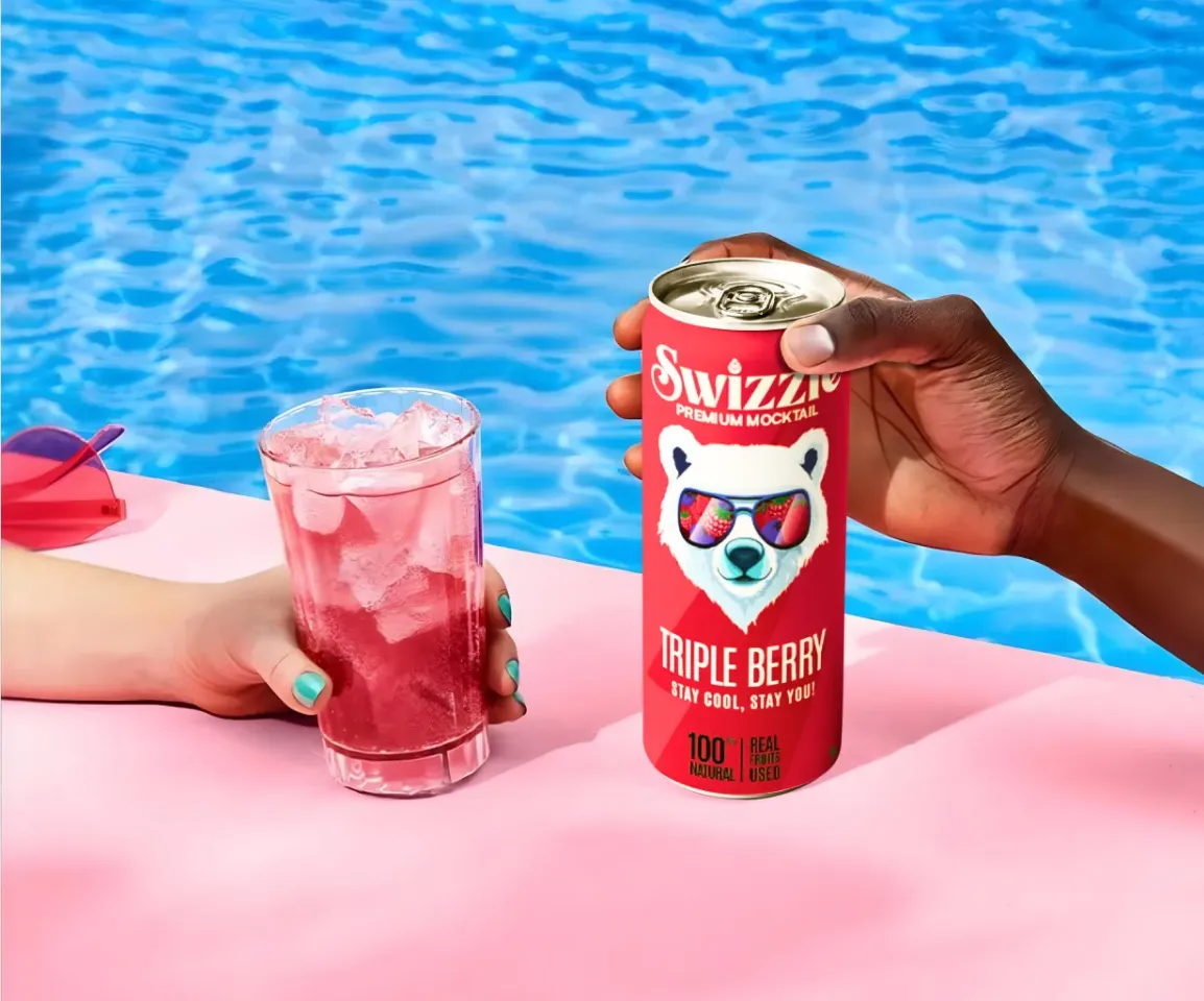
On Zepto, Blinkit, and Instamart, customers are not browsing. They are moving fast, scanning dense grids with high intent and very little patience. A product has roughly a second to register before the scroll moves on. In that environment, the packaging decisions that drive discovery and trial are narrower and more specific than anywhere else a brand shows up.
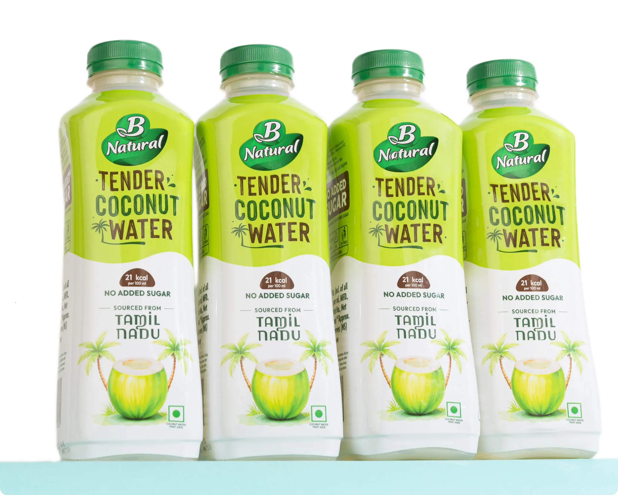
Brands that have figured this out are easy to spot. Slurrp Farm uses bright colours, playful illustration, and large typography so parents can identify kids' snacks instantly while scrolling. Yoga Bar prioritises bold brand presence and clear product naming so its protein bars do not disappear among dozens of similar SKUs. In staples and dairy, Tata Sampann and Epigamia use clean layouts and restrained colour systems to signal trust and quality at a glance. Paper Boat's juice packs hold their own through distinctive illustration and nostalgic visual cues that remain recognisable even compressed to a two-centimetre tile on a mobile screen.
None of this is accidental. These are packaging decisions made specifically for how products appear in quick commerce grids, and at Confetti Design Studio, this is how every quick commerce packaging project is approached from the start.
The defining challenge of quick commerce packaging is visual compression. Whether it is a 5 kg bag of wheat flour or a single 1 kg pack of the same product, everything on screen appears at roughly the same small size. Physical dominance disappears entirely. What remains is clarity, contrast, and the ability to communicate brand and product value within a tile that is often no wider than two to three centimetres on a mobile screen.
Quick commerce is built on convenience and speed, and consumer behaviour on these platforms reflects that. Decisions happen faster here than on any other retail channel. Packaging that requires a consumer to zoom in, read carefully, or pause to interpret what they are looking at has already been lost. The pack has to do all of its communicating instantly, which means hierarchy, contrast, and immediate category signalling are not design preferences. They are functional requirements.
In offline retail, material, weight, finish, and form all contribute to how a product is perceived. In quick commerce, none of those cues exist. A premium tactile finish, an embossed logo, or a beautifully structured container communicates nothing on a Blinkit listing. The visual system has to carry the entire brand impression on its own, and it has to do so at a fraction of the scale it was originally designed at.
Unlike offline retail where shelf placement and pack size create natural hierarchy, quick commerce places every brand at the same size in the same format, directly next to its competitors. A brand is not just competing for attention in general. It is competing against specific products, at the same scale, in the same grid, simultaneously. Packaging that has not been evaluated in that context has not been properly evaluated at all.
At Confetti, quick commerce packaging is not treated as a scaled-down version of offline packaging or a simple adaptation of an existing design. It is designed and tested specifically for digital retail behaviour on platforms like Zepto, Blinkit, and Instamart.
Even for quick commerce brands, material decisions matter. They affect how the product photographs for listing images, how it performs through last-mile delivery, and how it feels when it arrives. We identify materials that support the brand's positioning, hold up through fulfilment, and photograph consistently across the product imagery the listing will need.
For delivery-first brands, the unboxing moment is often the first physical interaction a customer has with the product. We design for that interaction deliberately, ensuring the experience feels considered and on-brand rather than incidental, using the same structured unboxing framework applied across our packaging process.
We design across all surfaces of the pack, not just the front panel. For quick commerce brands, back of pack and side panel design also feeds into secondary listing images, which play a meaningful role in purchase decisions once a consumer clicks through to a product page.
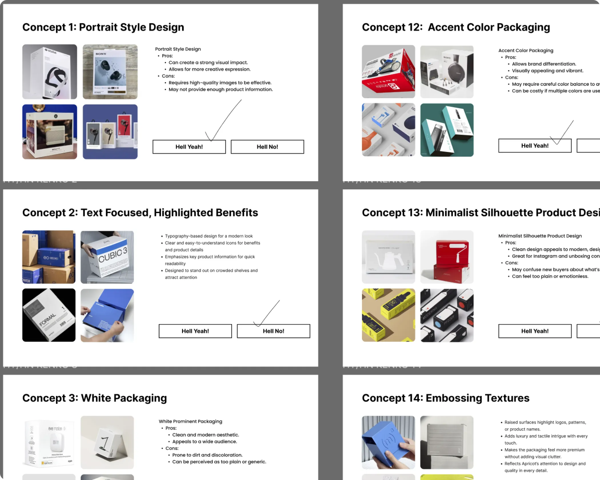
Once the front of the pack is designed, we create mock screens that mirror real Zepto, Blinkit, or Instamart listings. The client's product is placed alongside competing brands from the same category, exactly as a consumer would encounter it while scrolling. We test whether the brand name is readable at thumbnail size, whether the product category is immediately clear, and whether the pack stands out or blends in when viewed next to competitors in a real grid.
This is where issues that are completely invisible in a full-size artwork view become obvious, and addressing them at this stage rather than after the product goes live is one of the most commercially valuable parts of the entire process.

Confetti’s team is trusted by global leaders, and it’s time we join forces with you to create your Iconic brand!
Tap the button below and talk to our founders directly.
.webp)

Quick commerce packaging underperforms most often when it is approved without ever being seen in the environment where customers will actually encounter it.
Quick commerce has become one of the fastest-growing acquisition channels for FMCG brands in India. For many categories, including snacks, beverages, dairy, personal care, and staples, Zepto, Blinkit, and Instamart are now primary points of discovery for a large and growing consumer segment. In that context, packaging that does not perform in a quick commerce grid is packaging that is actively costing the brand sales.
The brands winning on these platforms are not necessarily the ones with the biggest marketing budgets. They are the ones whose packaging works hardest at the smallest scale, communicating brand, product, and reason to buy within the fraction of a second available before a scroll moves on. That outcome does not happen by chance. It is a design decision made deliberately, early in the process, and tested rigorously before the product goes live. At Confetti, quick commerce packaging is built with that commercial reality at the centre of every decision, from the first layout exploration to the final listing mock approval.
Every quick commerce packaging project at Confetti is shaped by the specific platforms, category dynamics, and consumer behaviour relevant to the brand we are working with. We bring digital realism into the process from the start, test against real platform conditions, and deliver packaging that is designed to perform where quick commerce buying decisions are actually made. If you are launching on Zepto, Blinkit, or Instamart, or finding that your current packaging is not standing out the way it should in quick commerce grids, that is the conversation worth having. Get in touch with Confetti to talk about quick commerce packaging design for your category.
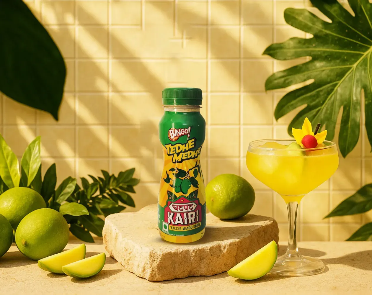
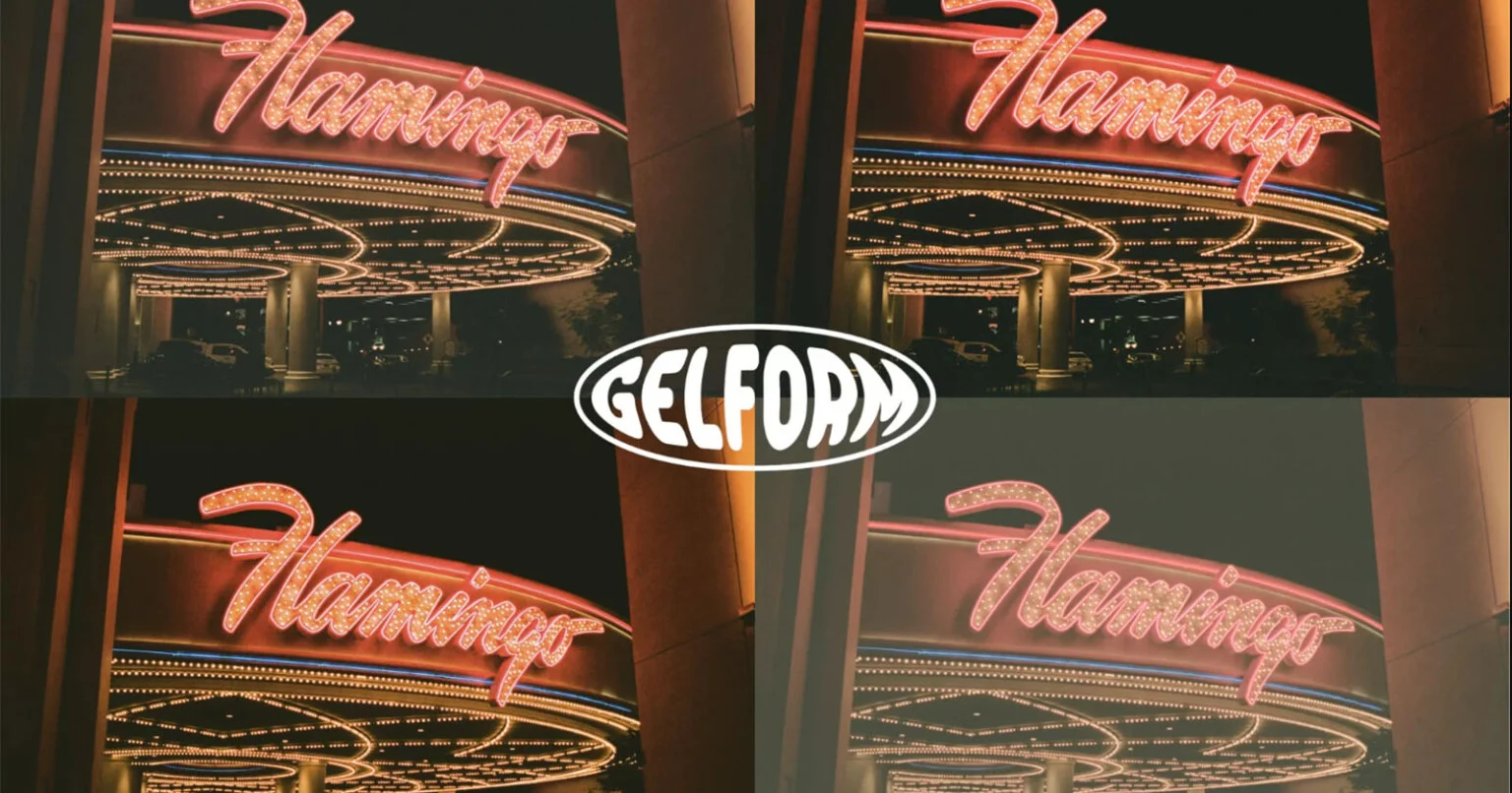
We worked with Bingo (by ITC) to help them launch India’s next viral beverage; Aam Panna
%201.webp)
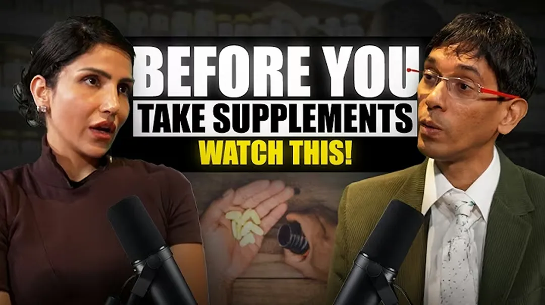
Global award-winning Identity & packaging design for US's health & lifestyle startup AIM Nutrition
-p-2000%201.webp)
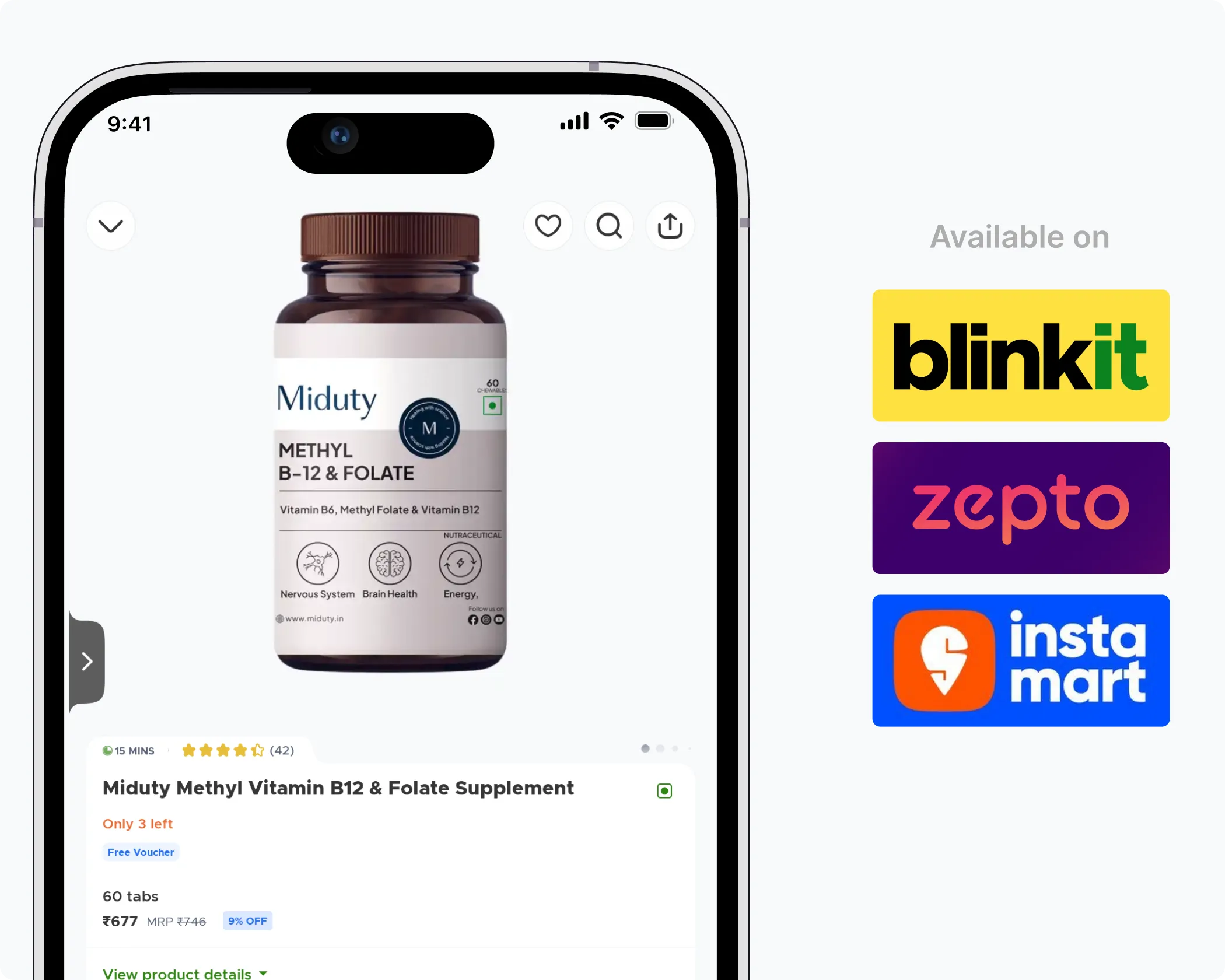
Building India’s fastest growing D2C supplements brand, Miduty by redesigning their branding, packaging & e-commerce website
Packaging for quick-commerce has to work at extreme speed. Decisions are made in seconds, often without the customer reading details or comparing options closely. On platforms like Blinkit or Zepto, visibility, colour recognition, and instant brand recall matter far more than layered product differentiation. The pack needs to be unmistakable at a glance, even when seen briefly on a small screen in a fast scroll.
At Confetti, we treat quick-commerce as a separate design lens altogether, because what works for e-commerce or retail shelves often doesn’t translate here. If you’re exploring quick-commerce or unsure how strong your brand is in this environment, hopping on a short call with our experts can help evaluate the opportunity and the design trade-offs early.
For fast-scroll environments, the front of the pack has to do all the work. Bold colour, strong contrast, and an instantly readable brand mark are what stop the scroll. There’s no time for nuance or dense information. The customer needs to understand what the product is and who it’s from in two to three seconds, or it’s gone. This is why clear ownership of colour and simple, confident visuals matter so much in quick-commerce.
Brands like Olly show how effective colour ownership can be in this space, especially when products are seen as thumbnails in a crowded grid. At Confetti, we design with that time pressure in mind and actively test whether a pack communicates fast enough. If you want to see how quickly your packaging lands in a quick-commerce context, hopping on a short call with our experts is the easiest way to test it together.
We test quick-commerce packaging by placing it into real platform-style mockups and competitor grids to see how it behaves in context, not in isolation. Screens on platforms like Zepto and Blinkit are far more crowded than most brands expect, which is where visibility issues usually surface. At Confetti, this kind of platform simulation is part of our testing process and typically takes around one week, allowing us to benchmark colour, contrast, and brand recall realistically. If you want to see how your pack stacks up against real competitors in a fast-scroll environment, hopping on a short call with our experts is the most practical way to walk through that together.
The same packaging design can work across offline, e-commerce, and quick-commerce, but only if the core identity is strong and built to adapt. Successful D2C brands don’t create three separate designs for three channels. They create one clear system that holds together while adjusting emphasis, scale, and hierarchy depending on where it appears. Without that flexibility, brands either lose recognition or end up constantly redesigning.
At Confetti, adaptability is planned from the start, not added later as a fix. We design packaging systems that can stretch across shelves, screens, and fast-scroll environments without losing their core signals. If you want to understand how flexible your current design really is, hopping on a short call with our experts can help assess where it works and where it might need support.
Online marketplace testing should happen before final artwork is locked, while there’s still room to adjust without disrupting timelines or budgets. Testing early shows how the packaging performs in real digital environments, where scale, clutter, and platform layouts can quickly expose weaknesses. At Confetti, this testing runs alongside offline checks and usually takes around one week, helping us align both channels before sign-off. If you want to plan this efficiently without slowing the project down, hopping on a short call with our team can help line up the right testing window.


Lorem ipsum dolor sit amet, consectetur adipiscing elit. Suspendisse varius enim in eros
Lorem ipsum dolor sit amet, consectetur adipiscing elit. Suspendisse varius enim in eros
Lorem ipsum dolor sit amet, consectetur adipiscing elit. Suspendisse varius enim in eros
.svg)
.svg)


.svg)
.webp)


.webp)


.webp)


.webp)