%201.webp)
02
AI Snaps
.svg)
.svg)
01
Our Work
03
About Us
04
Brand Audit
05
Contact Us
06
Client Success
12
07
Blogs
08
Careers
Book A Call
.svg)



.svg)
Need Help In Building Your Brand?
Click the button below & book a call with our founder directly.

Rishabh Jain
Managing Director
Jewelry branding has to prove the product is what it claims to be, in a category where most buyers can't verify that themselves.
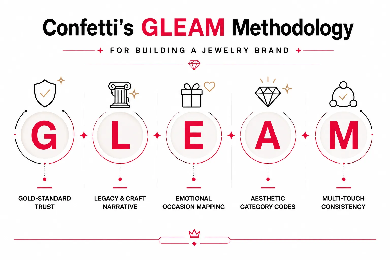
This Confetti guide takes you through the essential (GLEAM) elements of branding in jewelry, how to evaluate a partner before you commit a budget and examples you need to learn from.
Unlike products bought primarily for utility, jewelry is closely tied to identity, emotion, status, relationships, milestones, and, especially in markets such as India and the Gulf, cultural traditions.
So, jewelry branding is not only expected to make the product desirable, but also to make the purchase feel trustworthy, meaningful, and worth remembering.
👉Trust Is Part of the Product
Jewelry buyers need confidence in purity, quality, certification, pricing, craftsmanship, and after-sales service, especially for high-value purchases.
Established jewellers often inherit trust through relationships and reputation. A newer branded jewelry house has to earn the same trust with strangers, without the relationship history to fall back on.
So, trust has to be engineered into the brand itself: how a hallmark is displayed, how a certificate is designed, how clearly a return policy is communicated.
👉The Product Carries Emotional and Cultural Meaning
Jewelry is often tied to moments of emotional and cultural significance. A necklace can represent heritage, a ring relationship, or a pendant personal expression.
So, jewelry branding has to go beyond product features and understand what the piece means to the person buying it.
A brand targeting bridal jewelry may need to communicate heritage, craftsmanship, celebration, and permanence. A contemporary fine jewelry brand targeting younger consumers may instead build its identity around individuality, everyday wear, self-expression, or personal milestones.
👉Jewelry Is Both Heritage and Self-Expression
Jewelry has traditionally represented investment, status, gifting, and heritage. Today, younger consumers also use it for personal style, self-expression, and individuality.
This creates an interesting branding challenge.
A brand may need to respect the cultural significance of gold while making its products feel contemporary. It may need to communicate craftsmanship and heritage without appearing old-fashioned. It may need to feel premium without becoming distant or inaccessible.
Brands such as Tanishq have built strong recognition by combining Indian cultural contexts with contemporary design and communication, while global houses such as Cartier show how visual codes, storytelling, craftsmanship, and heritage create recognisable brand expressions.
👉The Purchase Journey Is Highly Visual
Jewelry customers may discover a brand through Instagram, search, recommendations, or a physical store before making a purchase.
This makes consistency across every touchpoint important. The same brand identity should appear in social media, websites, photography, packaging, and retail.
In jewelry, branding does more than differentiate products. It shapes what the piece comes to represent.
So the key question is not:
❌What jewelry do we sell?
It is:
✔️Why should someone choose this particular jewelry brand?
That answer might come from distinctive design, heritage, a founder story, cultural perspective, or a modern interpretation of tradition. It should then shape everything from visual identity and photography to packaging, retail, digital communication, and campaigns.
Strategy comes first. Brand identity gives that strategy a recognisable form.
The best performing jewelry brands do not simply make products desirable. They give people a reason to desire that particular brand.

Branding in jewellery has to deal with a different set of challenges, so at Confetti, our brand strategy for jewellery is guided by the GLEAM system.
Trust is central to jewelry branding.
Customers are not only judging the design; they are also asking whether the materials are genuine, the price is justified, and the brand will stand behind the product.
Hallmarking, certification, purity information, invoices, warranties, and after-sales policies are all brand touchpoints that can strengthen or weaken customer confidence.
In India, BIS hallmarking provides third-party assurance of precious metal purity. For hallmarked gold jewelry, the current hallmark includes the BIS Standard Mark, the purity or fineness mark, and a six-character alphanumeric Hallmark Unique Identification (HUID) number. Customers can use the BIS CARE app to verify the HUID of a hallmarked item.
The UAE has its own regulatory framework for precious metals and jewelry. Dubai Municipality's Dubai Central Laboratory Department plays a role in conformity assessment and inspection of gold and jewelry businesses, while UAE regulations establish requirements around precious metals and gemstones.
👉For a jewelry brand, the opportunity is to make these systems easier for customers to understand.
A certificate, for example, can explain what it verifies, where the relevant identification or hallmark can be found, and how the customer can check the information where an official verification system is available.
The same principle applies to pricing.
Where applicable, customers should be able to understand the relationship between the jewelry's weight, metal value, making charges, gemstone value, and taxes. UAE tax guidance, for example, specifically addresses transactions involving gold jewelry and separate making charges.
🎯A well-designed certification card, purity card, packaging insert, care guide, invoice, or digital product page can therefore become part of the brand experience.
A packaging insert that explains, in plain language, what the HUID or Bareeq mark actually means and how to verify it helps boost purchase confidence. This is the highest-leverage, lowest-competition move for a jewelry brand right now, as few brands are doing it deliberately.
Jewelry brands should audit every point where customers look for proof or reassurance. The objective is to make important information easier to find, understand, and verify.
Includes:
At Confetti, we treat certification and documentation as part of the jewelry brand experience rather than as generic paperwork added at the end of the project.
We can build these elements into the broader brand system, including purity cards, certification holders, packaging inserts, care guides, warranty cards, invoices, and digital product communication.
The design approach remains consistent with the brand's positioning. A heritage jewelry house may require a more refined and traditional information system, while a contemporary jewelry brand may benefit from a simpler, more educational approach.
The goal is the same in both cases: make the evidence of quality feel as considered as the jewelry itself.
Jewelry has a natural advantage when it comes to storytelling.
Craftsmanship, materials, regional techniques, family histories, and the people behind a piece can all give a brand something meaningful to talk about.
But "Handcrafted with love since [year]" is probably the single most repeated phrase in jewelry branding. Repetition has drained it of meaning, it no longer tells a buyer anything specific about what makes this brand different from the one next door.
💡A strong craft narrative gives customers something concrete to understand and remember.
It might be a particular setting technique, a regional karigari tradition, a long-standing relationship with artisans, a distinctive approach to sourcing, or a design philosophy that has shaped the collection.
The same principle applies to newer brands that do not have generations of history. A new jewelry brand’s narrative can come from how the pieces are designed, where materials are sourced, how they are made, why certain techniques are used, or what the brand believes modern jewelry should represent.
The visual positioning needs the same level of clarity.
A bridal jewelry brand rooted in cultural heritage may use rich colours, ornate details, traditional motifs, and decorative typography to convey ceremony and continuity. A contemporary everyday-jewelry brand may use restrained typography, whitespace, minimal graphics, and simple packaging to signal modernity and individuality.
The visual language reflects a clear position rather than combining traditional and contemporary cues simply because both look premium.
Start by identifying what is actually distinctive and provable about the brand's heritage, craftsmanship, sourcing, or design approach.
For newer brands, build the narrative around genuine differentiators rather than borrowed heritage. This could be the materials used, the relationship with makers, the design philosophy, the intended way of wearing the jewelry, or the reason the brand was created.
The chosen story should then remain consistent across the website, product descriptions, packaging, campaigns, social media, and retail experience.
The same applies to the traditional versus contemporary positioning.
Decide what the brand should communicate first, then select the visual cues that support it. If both traditional and contemporary collections are important, use a clear collection or brand architecture rather than allowing the identity to shift unpredictably between aesthetics.
At Confetti, we help jewelry brands identify the stories and characteristics they can genuinely own, then translate them into a distinctive verbal and visual identity.
For heritage brands, this may involve uncovering specific craftsmanship traditions, regional influences, founder history, artisan relationships, or cultural references that have real substance. For newer brands, we look for differentiation in their design philosophy, sourcing, production, customer, or approach to modern jewelry rather than manufacturing a history that does not exist.
We then translate that positioning across the brand system, including messaging, typography, colour, imagery, packaging, product communication, website, and campaign direction.
The objective is to make a jewelry brand’s point of view recognisable.
A strong jewelry brand should leave customers with more than the impression that the pieces are beautiful. They should be able to understand where the brand comes from, what it believes in, and what makes its approach different.
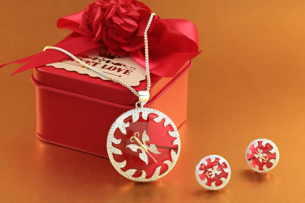
Jewelry is deeply tied to occasions and occasions shape who buys, when they buy, why they buy, and what they expect from a brand.
Weddings, engagements, anniversaries, Diwali, Eid, Akshaya Tritiya, birthdays, and personal milestones each create different purchase motivations. Understanding these motivations is the foundation of an effective occasion strategy.
The jewelry buyer has changed significantly over the past decade. Traditionally, jewelry was bought as a store of value, investment, or family inheritance. Today, it is increasingly about identity, self-expression, and personal style.
Every jewelry category has established visual and verbal codes.
Bridal jewelry leans toward gold, intricate detailing, and ornate imagery. Everyday jewelry is lighter, minimal, and relatable. Festival campaigns use colour, celebration, and family.
These codes are important but following them blindly makes brands indistinguishable.
Strong opportunity is to identify what competitors aren’t saying.
Tanishq’s Rivaah, for example, reframed bridal jewelry around the modern Indian woman rather than tradition alone. CaratLane made everyday jewelry feel accessible and impulse-friendly rather than purely heirloom-driven. Both created distinction by claiming a sharper territory.
👉Audit 10–15 competing brands across their websites, social media, packaging, and campaigns. Map what they say, how they say it, and which occasions they own. The gaps reveal potential territory for your brand.
The rise of everyday and self-purchased jewelry makes occasion mapping even more important. Brands such as Tanishq, CaratLane, Giva, and BlueStone increasingly position jewelry around everyday style, gifting, relationships, and personal milestones, not just traditional ceremonies.
Occasion strategy should influence collections, product focus, campaign narratives, packaging, merchandising, and brand voice.
Understand the emotional reason behind the purchase and build the product and brand experience around it.
Map the occasions that matter to your customers and identify the role jewelry plays in each one.
This mapping should impact your collection launches, campaign themes, product selection, photography, offers, packaging, gifting formats, and retail displays.
Occasion-led branding goes beyond seasonal decoration: the product, story, and experience should feel genuinely relevant to the occasion.
Brands should also look beyond weddings and festivals to everyday wear, self-purchase, birthdays, milestones, Valentine’s Day, and other personal moments.
At Confetti, we map the occasions and emotional triggers that influence a jewelry brand's customers and use them to shape communication and brand expression.
This includes identifying priority occasions, developing campaign narratives, creating seasonal or occasion-specific packaging, defining gifting experiences, and deciding how different collections should be presented throughout the year.
Our Eid campaign work is an example of this approach. Rather than treating jewelry as a product that was simply being promoted during Eid, the campaign positioned the jewelry itself as the gift, making the product directly relevant to the emotional purpose of the occasion.
The objective is to ensure that occasion-based marketing feels like a natural extension of the brand rather than a temporary campaign layered onto it.
Jewelry is a highly coded category. Its visual language immediately signals whether a brand feels traditional, contemporary, ceremonial, accessible, or luxurious.
Traditional branding often uses ornate details, gold palettes, heritage motifs, and decorative typography to communicate craftsmanship and cultural continuity.
Contemporary brands use restraint: minimal typography, whitespace, clean layouts, and editorial imagery, to signal modernity and individuality.
Neither approach is better. A brand should not try to appeal to everyone. Clear positioning should shape a distinctive, consistent visual identity.
Tanishq, for example, balances tradition with contemporary design, while Mia by Tanishq has a more modern, everyday positioning.
Swarovski offers another lesson: as wider distribution increased accessibility, the brand refreshed its identity around its signature octagon and bolder visual language to maintain distinction.
Logo and Monogram Systems
The logo is the most visible element of a jewelry brand’s identity. It should communicate trust, quality, and distinction at a glance.
Monograms work particularly well because they can function as signatures across packaging, engraving, and other touchpoints.
Examples:
Colour Palette
Colour in jewelry branding signals positioning, price point, and emotional territory.
Traditional brands often use gold, rich reds, and warm tones.
Chow Tai Fook’s “Timeless Red,” developed with Pantone, anchors its visual system alongside Legacy Gold, Jade Black, and Porcelain White, turning colour into a distinctive brand asset.
Contemporary brands often use restraint.
VELLORA combines muted beige, soft gold, and deep black for a warm, enduring luxury feel, while Mariam Jewelry uses blush and gold for a softer, expressive identity.
Borqan uses emerald green for richness and rarity, gold for luxury and brilliance, and sand beige inspired by Jordan’s desert landscape.
Typography
Typography in jewelry branding must balance elegance with clarity. A font that works beautifully on a billboard may not read on a product label or a 50px social media avatar.
Contemporary brands often pair sans-serif and serif typefaces to establish tension between timeless and innovative. Traditional brands may use serifs and decorative letterforms to signal craftsmanship and heritage.
The System, Not a Collection
A visual identity is a system. Each element, logo, colour, typography, has defined usage rules. The system works across packaging, digital, social media, retail, and product engravings.
A jewelry brand style guide is a comprehensive document that defines visual identity, including logo usage, colour palette, typography, photography standards, and brand voice.
Decide what the brand needs to communicate before deciding how it should look.
If the positioning is rooted in heritage, bridal jewelry, craftsmanship, or cultural continuity, the identity should have enough visual richness and distinctive codes to communicate those qualities.
If the brand is focused on contemporary design, everyday jewelry, self-purchase, or younger consumers, the identity may need greater restraint and flexibility.
If both directions are commercially important, create a clear structure for them.
This could mean distinct collections, sub-brands, packaging systems, or defined visual rules that allow variation without breaking the parent brand.
Distinguish flexibility from inconsistency.
A strong jewelry identity can evolve across collections and occasions, but customers should still recognise the same brand underneath.
A cohesive visual identity signals craftsmanship, reliability, and luxury which are all qualities that justify premium pricing.
At Confetti, we start by defining the position the jewelry brand needs to own before developing its visual identity.
We assess the target customer, product category, price point, occasion, competitive landscape, and desired perception to determine whether the brand should lean traditional, contemporary, or combine both through a deliberate brand architecture.
We then translate that decision into the complete identity system, including typography, colour, graphic language, imagery, packaging, product presentation, digital presence, and campaign direction.
We aim to create a visual language that makes the brand's positioning immediately recognisable and difficult to confuse with its competitors.
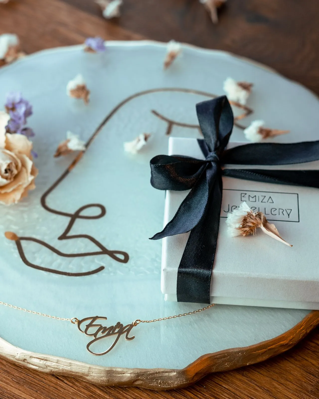
Jewelry buyers now research online and frequently purchase in-store, or somewhere in between.
That means the brand has to look and feel identical across a phone screen, a glass display counter, and a physical unboxing moment, because trust breaks exactly at the handoff between channels.
Beautiful photography and a sophisticated digital presence lose impact if the store feels dated, product information is inconsistent, or packaging feels generic.
💡Consistency means every touchpoint should share the same brand codes, tone, visual language, and level of quality.
Packaging design is particularly important because it is where the digital promise becomes a physical experience. The customer finally gets to hold something that represents the brand. For a high-value and highly emotional product such as jewelry, that transition can reinforce trust or undermine it.
The unboxing also has a social dimension. Jewelry is frequently purchased as a gift, and the packaging becomes part of the act of giving. It is seen, handled, photographed, reopened, stored, and sometimes kept long after the jewelry itself has been worn.
Map the complete customer journey and identify how the brand should appear at every major interaction.
This should include:
Packaging also needs to solve functional problems specific to jewelry:
A premium-looking box that feels flimsy or poorly constructed can damage perceived value at exactly the moment when the customer is forming a lasting impression.
The practical test: does the experience feel like the same brand from the first Instagram interaction to the moment the jewelry is opened?
At Confetti, we build jewelry brands as connected systems rather than designing individual touchpoints in isolation.
We establish the core brand codes first, then translate them across digital, retail, packaging, and customer-facing communication. This allows an Instagram post, website, retail display, jewelry box, certificate, and care card to feel like parts of the same brand without making them visually identical.
For packaging, we consider both the brand experience and the physical requirements of the product. This includes structural design, materials, internal presentation, finishes, information hierarchy, certificates, inserts, pouches, and the overall unboxing sequence.
We treat packaging as an important part of the product experience, not as something designed after the identity is complete.
We aim to make every handoff feel intentional: screen to store, store to purchase, purchase to unboxing, and unboxing to long-term ownership.
When those experiences work together, consistency becomes more than visual polish. It becomes a signal that the brand is as considered and trustworthy as the jewelry itself.
These four mistakes repeatedly weaken the trust a jewelry brand is trying to build.
Hiding Certification Instead of Featuring It
Treating hallmark or certification details as fine print makes customers do the verification work themselves. In a high-value purchase, that can quickly create doubt.
Hallmarking is widely viewed positively by consumers, yet enforcement gaps and cases involving incorrect purity or HUID misuse show why transparency matters.
☑️What to do instead: Make certification visible and easy to understand across packaging, product pages, and stores. Trust grows when customers can verify claims without having to ask.
Generic “Heritage” Language With No Specific Story
Phrases like “handcrafted with love” or “years of heritage” are so common that they rarely differentiate a brand. A credible story needs specific details about the craft, technique, region, sourcing, or people behind the product.
The debate around Ralph Lauren using traditional Indian jhumkas as “vintage accessories” illustrates the risk of generic cultural framing: describing a design only by its age can strip away its geographic and cultural identity.
☑️What to do instead: Replace generic heritage language with specific, verifiable stories about what the brand actually does differently.
Inconsistent Online and In-Store Experiences
When website information, WhatsApp conversations, and showroom details contradict one another, customers begin questioning the entire business.
For example, a ring listed online at ₹98,500 with one weight and certification may be quoted differently on WhatsApp and again in-store. The issue is not simply price, it is credibility.
☑️What to do instead: Keep product data, pricing, tone, and visual identity consistent across every channel. The customer should experience the same brand from Instagram to checkout.
Packaging That Looks Premium but Fails Functionally
Premium packaging cannot compensate for poor protection. If a piece arrives scratched, tangled, or damaged, the packaging has failed regardless of how beautiful it looks.
Packaging problems often come from incorrect sizing, weak materials, or insufficient internal support.
☑️What to do instead: Solve structure before graphics. Test packaging with real products under real shipping conditions, and specify materials, dimensions, and tolerances precisely.
If you are evaluating a trusted packaging design and branding partner for your jewellery brand, you need a specific approach
❓Have you designed trust or certification touchpoints before, specifically, not just packaging in general?
❓Do you understand hallmarking and disclosure requirements in our market, or is that something we will need to explain to you from scratch?
❓Can we see packaging work built for jewelry's particular structural needs: secure fittings, humidity resistance, transit protection?
❓Do you have a point of view on traditional versus contemporary positioning for our brand, or will you default to generic luxury cues that could belong to any category?
❓Have you designed occasion-based campaigns or collections?
❓How do you approach unboxing sequences specifically?
❓Have you audited jewelry brands before, and can you articulate what makes one succeed and another fail?
A portfolio full of jewelry logos with no visible packaging, no certification design, and no occasion-based campaign work is a sign the partner has designed jewelry marks, not jewelry brands. Those are very different deliverables, and the gap between them is exactly where trust-building work either happens or doesn't.
Additional red flags:
Nicobar: Bootstrapped Growth as Design Strategy
A lifestyle brand that grew to ₹200 crore revenue with 31 stores and 40% e-commerce contribution, all without external funding, discounts, or borrowed design language.
Every visual communication directs attention to the product itself, no influencers, no celebrity faces. The brand's restraint communicates confidence and has proven you can win without discounting, a rare feat.
📌Lesson: Discipline in brand building, product-led growth and financial restraint, can be more distinctive than any campaign. When you don't follow category norms, you create your own space.
Palmonas: Celebrity as Co-Founder, Not Just a Face
A three-year-old jewellery brand that turned Bollywood actor Shraddha Kapoor into a 21% equity partner with a ₹4 crore investment.
However, our audit of the brand revealed that the visual identity is generic. If you strip away the celebrity face and little remains recognisable.
📌Lesson: A celebrity equity partner drives explosive growth, but a weak visual system beneath it leaves the brand exposed. Growth without brand equity is harder to sustain.
Tacori: Narrative, Character, and Wit in Visual Identity
The LA-based family-owned jewellery brand refreshed its identity with jewel tones led by Tacori blue, a fresh font, and cinematic lifestyle storytelling.
The goal: "more expressive, more distinctive" people are responding to a clearer point of view, not just a new look. The refresh proved that narrative and character matter as much as aesthetics in modern jewellery branding.
📌Lesson: A brand refresh should communicate personality and narrative, not just update aesthetics. Distinctiveness comes from point of view, not polish.
Outhouse: Building a World, Not Following a Blueprint
Sisters Kaabia and Sasha Grewal built Outhouse on an intentionally paradoxical name, "a space that exists outside convention". Their visual language is "strong, futuristic and a celebration of surrealism".
Pieces are handcrafted with 22-karat gold plating at their New Delhi atelier, worn by global celebrities like Lady Gaga and Katy Perry. The brand is a philosophy, not a product line.
📌Lesson: A distinctive brand world rooted in a clear philosophy can attract global recognition without chasing trends. Build a world, not just a collection.
Zoya by Titan: Design Weight Over Gold Weight
Zoya positioned itself above the traditional gold-dominated market, building stores that resemble ateliers.
Collections are built around narratives , from ancient stepwells to Greco-Roman motifs , where design, not diamond size, carries the weight. Growing 40–50% annually, the brand proves that luxury in India can transcend weight-based pricing.
📌Lesson: In luxury jewellery, differentiation comes from design narrative and intentionality, not scale or celebrity endorsements. Story creates value.
Forevermark: Targeting the Self-Buying Woman
De Beers-owned Forevermark is repositioning diamonds as accessible luxury for women who buy for themselves, not just occasions.
Its Mumbai flagship includes a social space for brunches and curated events, not just a sales floor. Average ticket size: ₹1.5 lakh. Purpose-driven retail makes the brand about community and self-expression, not transactions.
📌Lesson: Experience-driven retail and purpose-driven messaging can build loyalty in a category traditionally defined by gifting cycles. Sell a feeling, not just a product.
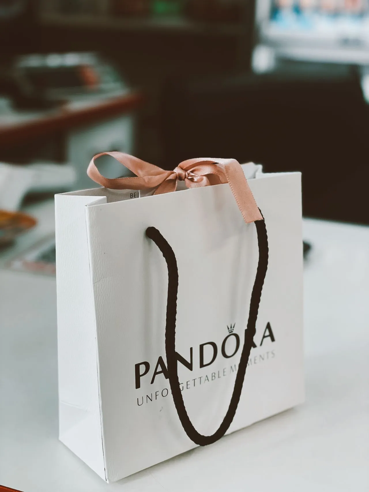
Pandora: Emotional Connection as a Business Model
Pandora faced a diluted brand narrative that confused consumers and reduced interest. CEO Alexander Lacik rebuilt the brand by committing to a clear, coherent message across all touchpoints.
The "captive" business model recruits a customer once and builds the relationship over years as they return to expand charm collections. The brand now stands as one of the most valuable jewelry brands globally.
📌Lesson: Brand coherence, not product or pricing, is the foundation of long-term growth. When consumers lose sight of what you stand for, you lose relevance.
What is jewelry branding and why does it matter?
Jewelry branding is the strategic and visual identity work that shapes how a jewelry business is perceived: logo, packaging, verbal identity, and trust signals like certification. It matters more than in most categories because buyers can't independently verify purity or craftsmanship, so the brand itself carries the burden of proof.
How much does professional jewelry brand identity design cost?
Costs typically range from $1,000–$20,000 for a freelancer covering basic logo and identity work, up to $50,000 and above for a full-service agency covering strategy, packaging, certification design, and application testing. The right tier depends on whether you need a full trust-building system or a lighter starting identity.
Is BIS hallmarking mandatory for all gold jewelry brands in India?
BIS hallmarking is mandatory for gold jewelry from 9K to 24K across 380 notified districts in India as of 2026, verified through the HUID system. Some items are exempt, including certain traditional Kundan, Polki, and Jadau pieces and jewelry under 2 grams — but coverage is broad and expanding.
What certification do jewelry brands need to sell gold in the UAE?
Gold jewelry sold in the UAE must carry a hallmark verified by the Dubai Central Laboratories Department confirming purity. Retailers can also pursue the voluntary Bareeq Certification, which signals compliance with purity, pricing transparency, and ethical trading standards beyond the baseline legal requirement.
How do I choose the right branding agency for a jewelry business?
Look for a partner with direct experience designing trust and certification touchpoints, not just logos. Ask about their understanding of hallmarking requirements in your market, review packaging work built for jewelry's specific structural needs, and confirm they have a clear point of view on traditional versus contemporary positioning for your brand.
Want strategic branding and packaging like this for your business?





.webp)
.webp)


.webp)
.webp)
.webp)
.webp)
.webp)







.svg)
.webp)