02
AI Snaps


01
Our Work
03
About Us
04
Brand Audit
05
Contact Us
06
Client Success
07
07
Blogs
08
Careers
Book A Call




Need Help In Building Your Brand?
Click the button below & book a call with our founder directly.

Rishabh Jain
Managing Director
When the hardware is similar, what makes one electronics brand stand out from another?
In a market crowded with lookalike products, competing on specifications and price alone is a race to the bottom. Strong consumer electronics branding creates the difference through positioning, naming, design, packaging and customer experience.
Here we explore how consumer electronics brands can build a distinctive identity, earn customer trust and stand out in an increasingly commoditised market.
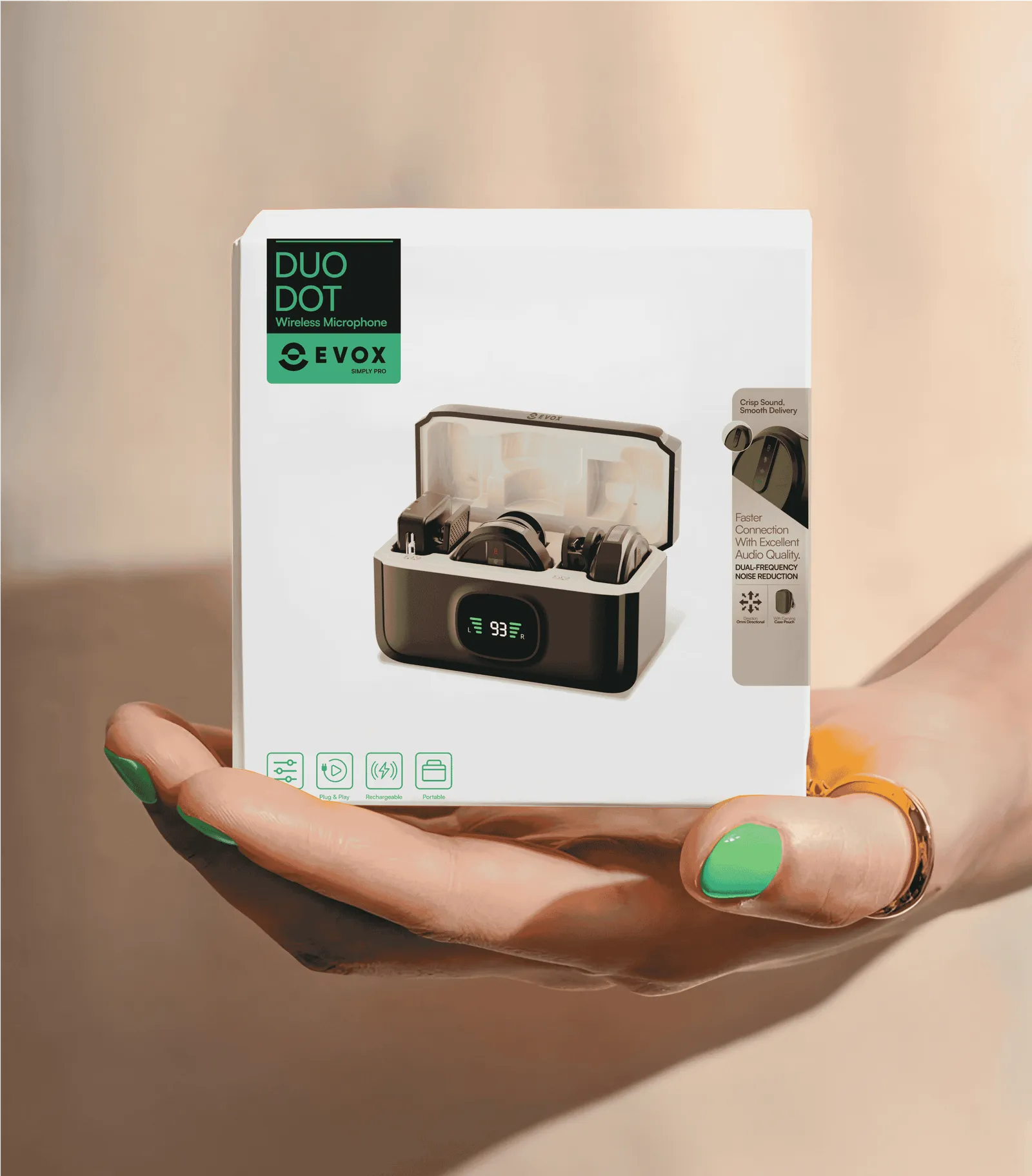
Consumer electronics is a category where products often share similar designs, components and specifications.
Keyboards, screen ratios, camera layouts and device interfaces follow familiar patterns because manufacturers are solving similar usability and engineering problems.
This creates a challenge for brands.A specification advantage can be matched by competitors, and product designs change with every new model.
Branding gives customers a reason to choose your product over another when the technical differences are small.
These dynamics that make electronics branding different:
1. Product Differentiation Is Limited
Many electronics brands use similar components, manufacturing partners and industrial design approaches.
A better processor, battery or feature may provide an advantage for one product cycle, but competitors can introduce comparable specifications. A clear brand position and recognisable assets can create longer-term differentiation.
2. The Product Is the Brand's Biggest Touchpoint
Unlike categories where the brand appears mainly on a label or package, electronics carry the identity through their physical design, interface, sounds, packaging and everyday behaviour.
Branding must work across all these experiences.
3. Short Product Cycles Require Consistency
New models can arrive every 6-12 months. If each launch introduces a completely different visual direction, the brand loses recognition.
A consistent identity allows products to evolve while remaining recognisable across generations.
4. Trust Influences the Purchase and the Experience After It
Buyers check reviews, warranties, return policies and service support before committing. After the purchase, firmware updates, repairs, replacements and customer service shape the brand's reputation.
Clear communication and reliable after-sales support help reduce perceived purchase risk.
For Confetti's Evox audio branding project, the challenge was to position the brand around professional-grade sound for creators without the premium price tag.
The strategy established what the brand stood for in a competitive audio market before the visual identity was developed.
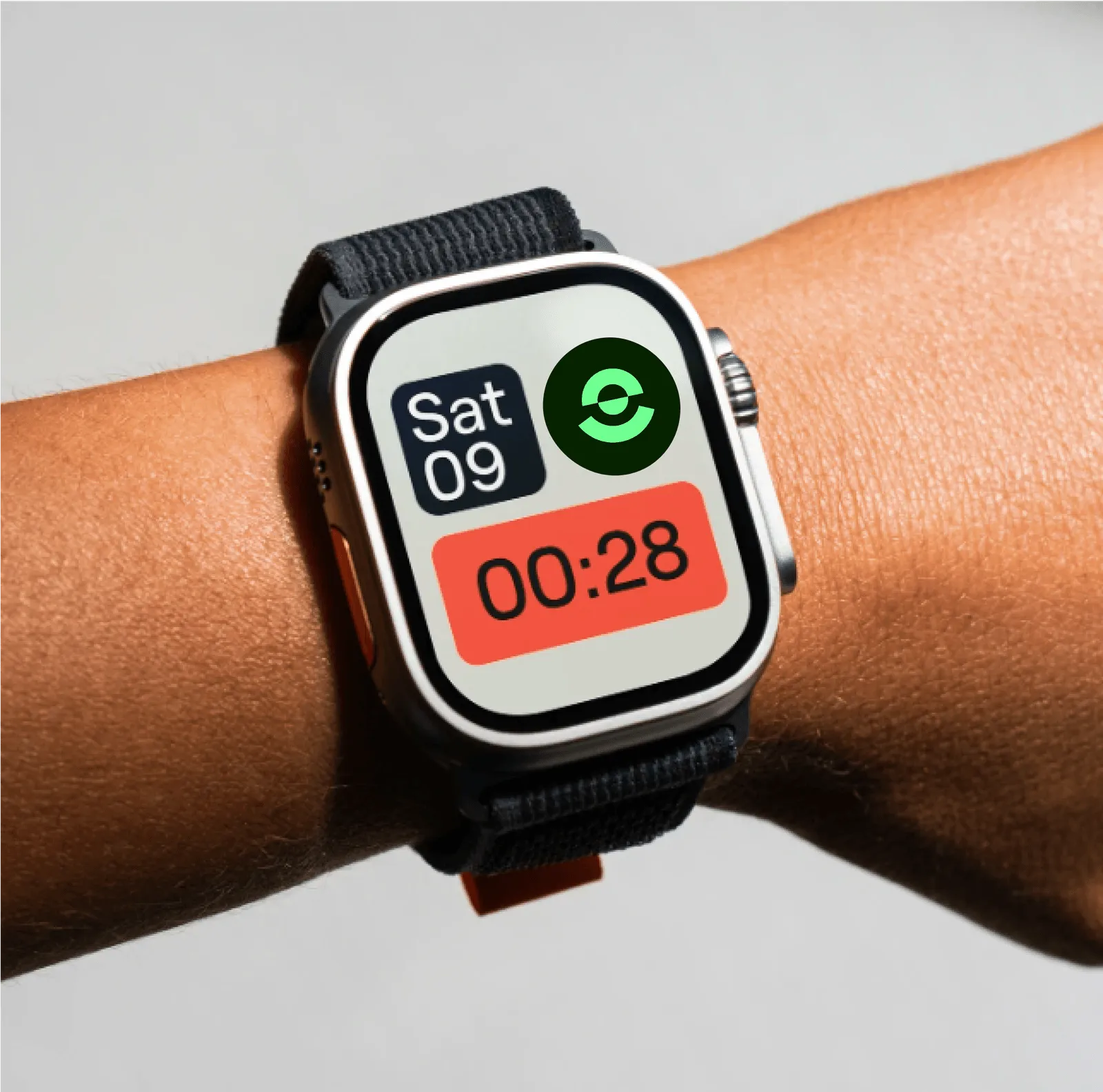
Building a strong consumer electronics brand needs a clear position, a consistent identity and a system that can support future products.
The process starts with positioning, followed by identity, packaging and brand architecture.
Most consumer electronics brands compete through one of three positioning approaches.
Spec-led positioning works when the brand has a meaningful technical advantage, such as proprietary audio tuning, battery technology or sensors.
Without one, competing on specifications can quickly become a race to offer more features at lower prices.
Lifestyle-led positioning suits products such as headphones, earbuds and smartwatches, where design and self-expression influence buying decisions.
It relies on design, colour, collaborations and culture.
Use-case-led positioning focuses on a specific audience, such as creators, gamers, runners or people working from home.
For Evox, Confetti positioned the audio brand around creators who wanted professional-grade sound without the premium price. Innovation, affordability and commitment to creators shaped the brand's direction.
In electronics, the device itself is a major brand touchpoint. Its form, materials, colours and interface communicate the brand alongside its logo and packaging.
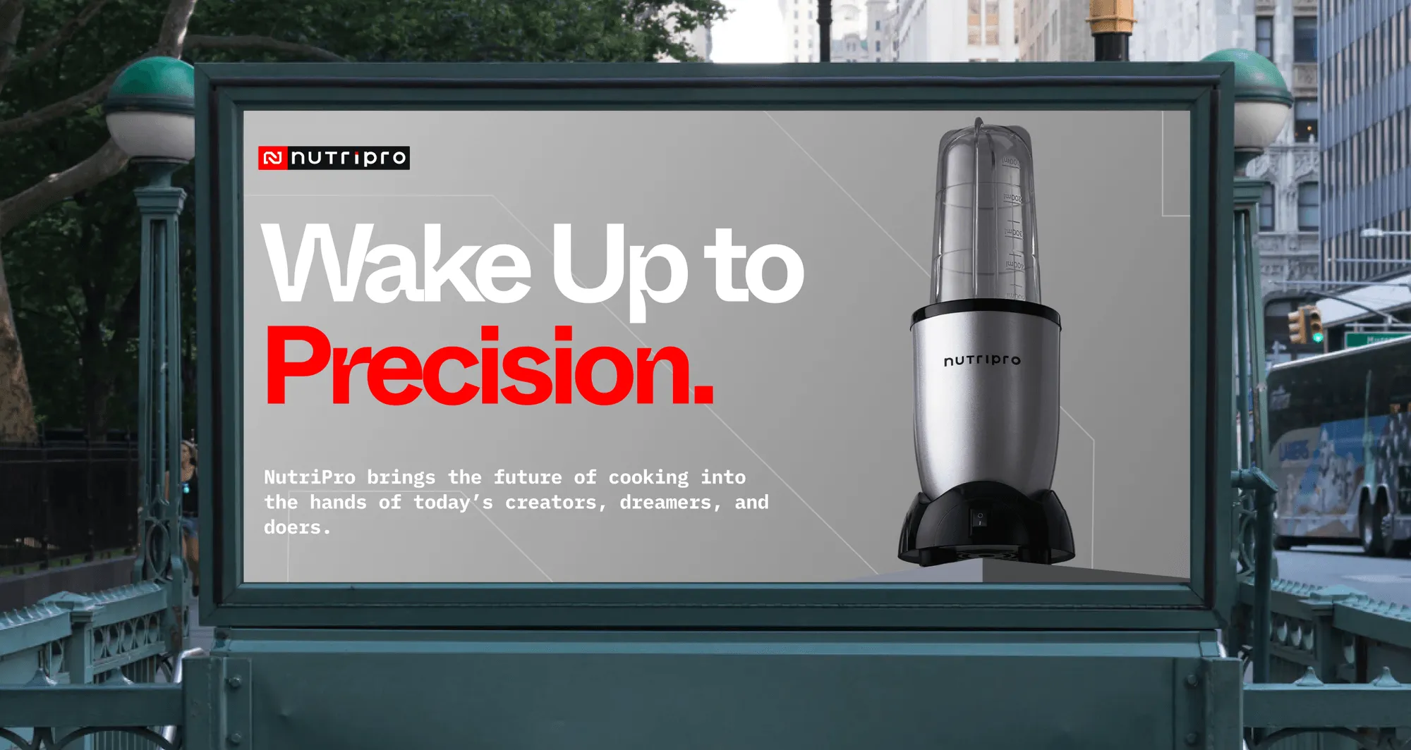
For NutriPro, the identity used a sleek wordmark and monogram, crimson, charcoal and electric indigo, and typography that combined a futuristic look with clarity.
The identity was designed to communicate performance and modernity across the appliance and its packaging.
A single product can establish a brand, but future models, price tiers and product categories test whether its positioning is strong enough to extend.
Build the identity and product architecture around a customer need rather than a narrow product category.
A brand built around better sound for creators can extend beyond one audio device. A brand built only around smart speakers may struggle when the category changes.
ESYNC's positioning around "e-mobility for everyone", rather than simply EV chargers, follows the same principle.
👉Choose one primary positioning route and make the identity, product experience and future range support it.
Spec claims and lifestyle communication can reinforce the position, but they should not compete with it.
A brand needs a system that can accommodate new models, generations, price tiers and product categories without confusing customers.
Most electronics brands use one of three approaches:
Avoid creating names that only make sense internally.
A model name should help customers understand where a product sits in the range, whether it is an entry-level option, a professional model or an upgrade to an existing product.
Organise products into series based on either use case or price tier. A creator, gaming and fitness series helps customers identify who each product serves. An entry, core and pro structure makes differences in product tiers easier to understand.
Model numbers can then distinguish generations within each family instead of carrying the entire burden of explaining the product.
A sub-brand makes sense when a product line serves a genuinely different audience, price tier or market position. Otherwise, separate identities can divide marketing investment and weaken recognition of the master brand.
For most growing electronics businesses, a clear product series under one master brand is easier to manage.
Before approving a naming system, check that names are:
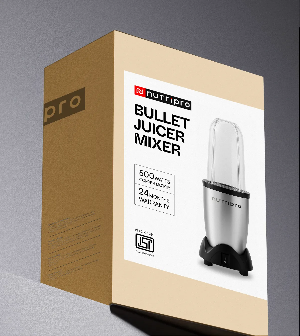
For NutriPro, Confetti developed a flexible packaging system for appliances including blenders, mixers, frothers and bullet juicers.
Product-specific stickers changed while the base packaging remained consistent, allowing the range to grow without redesigning the entire pack.
👉Build the naming architecture before the next product launch.
An electronics brand appears on more surfaces than most consumer brands, and some of them are very small. The identity has to be designed for that range.
A consumer electronics identity must work across three environments: the physical product, its packaging and digital channels. Each has different design requirements.
The device itself is one of the brand's most important touchpoints. Its shape, finish, materials, colour and interface can all contribute to recognition.
A distinctive product detail or consistent use of brand colours can communicate identity without relying on a prominent logo.
WHOOP demonstrates this through its screenless wearable and distinctive green recovery ring. The product experience and visual signal work together to create recognition.
Packaging has to protect a high-value product, communicate key features and carry the brand identity. It must also work at retail shelves and online.
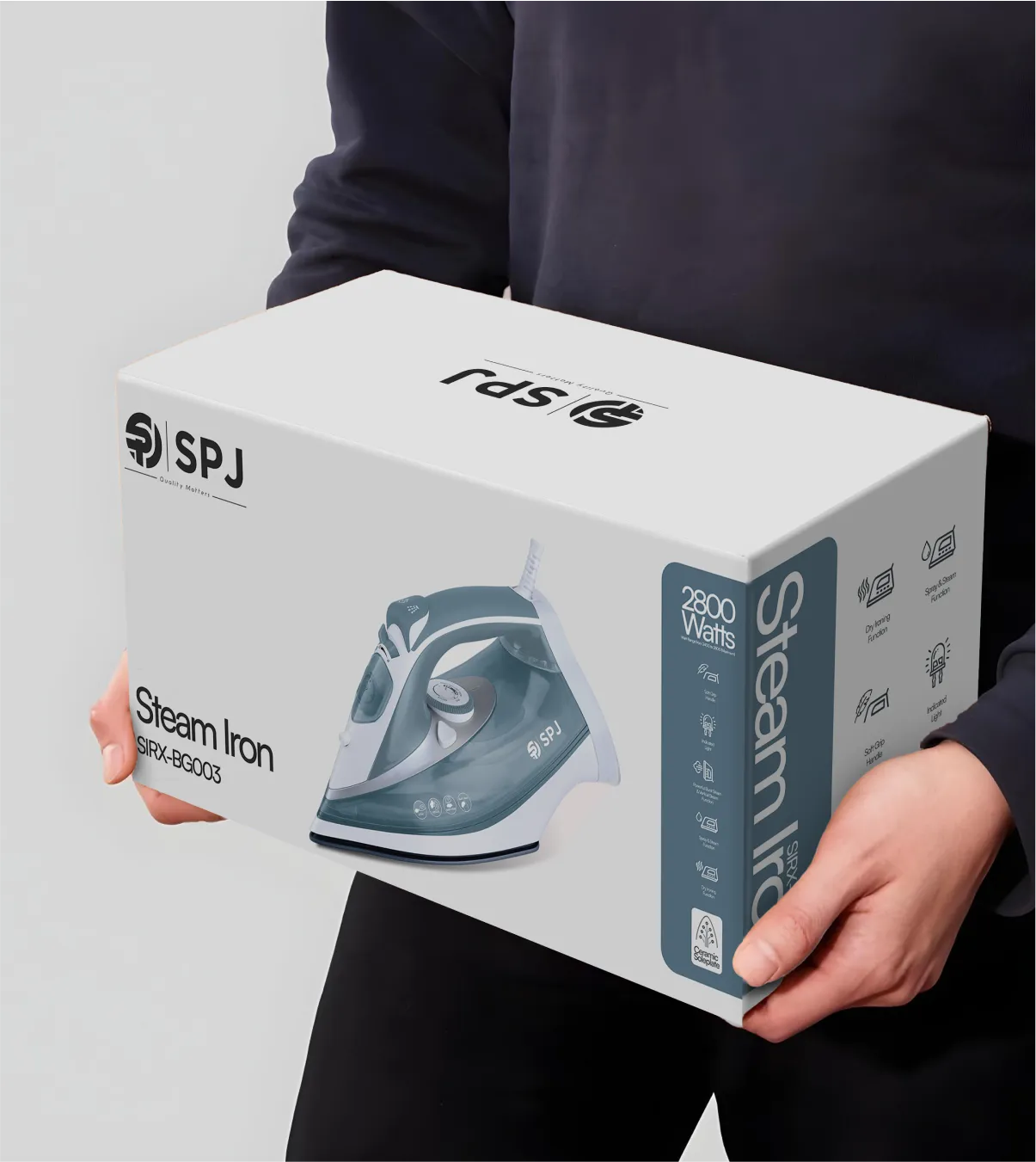
For SPJ, we developed packaging for smart TVs, air conditioners and kitchen appliances using a consistent palette of green, blue and white.
Clean typography, high-resolution product images and simple feature icons helped create a recognisable system across different product categories.
Establish a clear hierarchy so customers can identify the brand, product and main features quickly.
The identity must remain clear across website banners, marketplace listings, product images, app icons and other digital touchpoints. At thumbnail size, detailed graphics and small text become difficult to recognise.
Use a strong product image, clear brand cue and simple visual hierarchy. Test the identity at actual listing sizes rather than approving it only through large-format mockups.
👉A strong electronics identity is recognisable on the device, clear on the pack and consistent on screen.
Electronics packaging design must protect a high-value product during transit, meet regulatory requirements and create a positive first experience when the customer opens the box.
These three responsibilities need to be considered together from the start.
Electronics products are often fragile and travel through courier networks where packages face drops, pressure and repeated handling.
Inserts, trays and cushioning must hold the device and accessories securely without adding unnecessary shipping weight.
Material choices also affect cost and sustainability. Moulded pulp and paper-based inserts can replace plastic trays in some applications, provided they offer sufficient protection for the product's weight and shape.
For SPJ, packaging was designed to be sturdy enough to prevent transit damage while remaining lightweight to reduce shipping costs.
Electronics packaging may need Legal Metrology declarations, manufacturer or importer details, manufacturing dates, applicable BIS certification marks and product-specific warnings.
Export markets can require additional marks, such as CE and FCC, depending on the product and destination.
These requirements should be confirmed with the compliance team before artwork begins.
Create a dedicated area for mandatory information rather than squeezing it into the design after approval.
The unboxing experience and opening sequence is part of the product experience. The device should be easy to access, accessories should be organised, and instructions should help customers get started without confusion.
A quick-start guide, QR code linking to an app and clearly presented setup instructions are also brand touchpoints.
SPJ's packaging approach combined product protection with simplified instructions and visual guides to make setup easier.
Retail packaging needs a clear front-facing hierarchy that helps shoppers identify the product and its features.
E-commerce packaging must also survive shipping, open easily and work in listing images and unboxing videos. Some brands need separate solutions for retail display and direct-to-consumer delivery.
A packaging system with fixed and flexible design elements makes it easier to add new models, colours and product variants without redesigning every box.
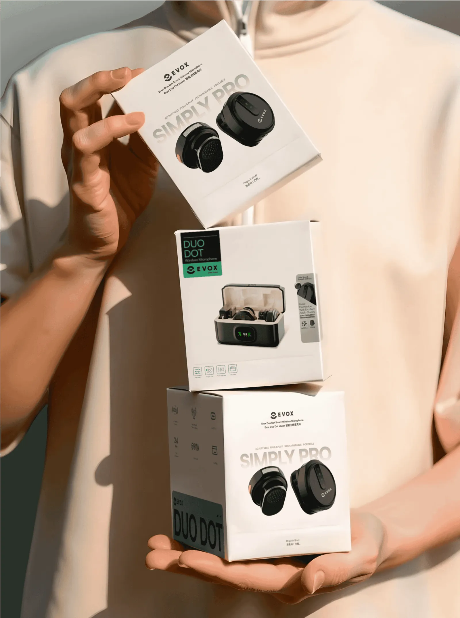
For Evox, packaging was developed alongside the brand identity so the product and its packaging shared one visual direction.
👉Good electronics packaging protects the product, makes compliance manageable and reinforces the brand from delivery to first use.

In consumer electronics, customers are taking a risk: Will it work as promised? Will the brand provide support if something goes wrong? Can its performance claims be trusted?
For challenger brands competing against established names, visible proof and reliable after-sales support can reduce this perceived risk.
Warranty, service and certifications should therefore be part of the brand experience:
A warranty can differentiate a brand when its terms are clear and meaningful. State how long it lasts, what it covers and how customers can make a claim.
Include this information on product pages, marketplace listings and packaging.
Godrej, for example, built a campaign around a five-year comprehensive warranty with no hidden costs, using the promise to demonstrate its commitment to customers.
Service centre access, replacement timelines, repair support and app-based assistance all influence how customers experience an electronics brand.
A brand that offers accessible support and handles complaints consistently reinforces its promise long after the purchase.
ESYNC's positioning around technical credibility and emotional relatability reflected the need to make customers feel confident choosing its products.
Only promote service commitments that the business can reliably deliver.
Certifications, product test results, verified reviews and accurate performance ratings help customers assess an unfamiliar brand.
Display relevant proof on product pages and listings, and make the supporting details easy to find.
Be precise about claims such as water resistance, battery life and performance. Explain the conditions behind them where relevant.
Overstated claims can damage trust when customers discover a gap between marketing and actual product performance.
Trust signals should continue beyond the product page.
Packaging can include warranty information, service contacts, registration instructions and smart packaging design elements like QR code for support. After launch, respond to reviews and complaints promptly, using a consistent and helpful brand voice.
The brand promise must also match the product's actual quality, price and service capability. A premium image cannot compensate for an unreliable product or poor support.
👉In consumer electronics, trust is built through promises customers can verify and service they can experience. Make that proof visible before purchase.
The examples below are useful not because they are famous, but because each one demonstrates a different mechanism for making a capable product feel distinct.
Nothing: Transparency as a system
Nothing’s transparent design and dot-matrix typeface are a system that appears on the device, the pack, and the interface.
It extends across price tiers through the CMF sub-brand without losing recognition.
📌Distinctive asset is strongest when it can travel across the range without being redesigned.
WHOOP: Subtraction as positioning
WHOOP removed the screen, kept the strap black, and let one green recovery ring carry the brand.
A single design decision became the whole positioning, because the product avoided a fight with Apple, Samsung, and Garmin that it could not win, and became a coach you wear rather than a gadget you look at.
📌Distinctiveness in electronics is often about what the brand refuses to do, not what it adds.
Teenage Engineering: Product as brand
Teenage Engineering’s playful, retro-futuristic design language is the brand asset.
The products are recognisable before the logo is read, and the identity extends into collaborations with Nothing and IKEA without diluting the core.
📌The product itself can be the strongest brand element, and the identity should be built to let it carry the recognition.
Sonos: Seamless Experience over hardware hype
While competitors emphasized loud bass and flashy lights, Sonos built its brand around effortless, whole-home audio, calm modern living, seamless integration, and multi-room connectivity.
It positioned its speakers as permanent home fixtures rather than temporary gadgets.
📌Build your brand around ecosystems and ease of use. Consumers value reliability and frictionless integration into their daily environment far more than isolated hardware gimmicks.
Skullcandy: Owning a subculture identity
During the rise of MP3 players, Skullcandy’s earbuds were physically basic compared to audiophile brands like Sennheiser or Sony.
While competitors focused on audio quality, Skullcandy differentiated itself through skate, snow, and alternative music culture, using bold skull imagery, neon colors, and rebellious messaging to build a distinctive youth-oriented brand.
📌Don't try to appeal to everyone; own a niche. Deeply serving a specific subculture with authentic tone and visual identity beats trying to out-engineer legacy giants.
Confetti’s own electronics work follows the same logic.
How do consumer electronics brands differentiate when products are similar?
When hardware comes from similar suppliers, specs stop separating brands. Differentiation comes from a clear position (a use case, a lifestyle or a genuine technical edge), consistent range naming, a recognisable product colour or form detail, packaging and unboxing, the companion app, and a visible warranty and service promise. These last longer than any spec advantage.
What makes a good electronics brand identity?
It works at very small sizes and in one colour, because it has to sit on earbuds, chargers and app icons. It carries one or two cues across every model, such as a colour or a light signature. And it holds together across the product, the pack, the listing images and the app interface, not only the logo file.
How should electronics products be named?
Use a series and tier structure that tells shoppers what each model is for and how it compares. Avoid unexplained model numbers and stacked suffixes like "Pro Max Neo". Names should work in marketplace titles, be trademarkable across the classes you sell in, and allow new models to slot into existing families.
How important is packaging for electronics sold online?
Very. The box protects the product in transit, appears in listing images, and creates the first impression at unboxing, which often drives reviews. Online electronics packaging should be shipper-ready, photograph well, guide the reader to setup or the app, and carry compliance information clearly without crowding the main panel.
Should an electronics brand use sub-brands?
Only when a product line targets a genuinely different buyer, price tier or use case and needs its own identity to compete. Otherwise, sub-brands split attention and marketing spend. A series structure under one master brand is usually clearer for challenger brands with a growing but focused range.
When should a consumer electronics brand rebrand?
When the current position limits the market you're moving into, the range has become confusing, or the brand has no cue shoppers recognise. Don't rebrand to fix product quality, returns or service problems. Fix those first, then refresh the brand once the product and service can support the promise.
Want strategic branding and packaging like this for your business?