%201.webp)
02
AI Snaps
.svg)
.svg)
01
Our Work

03
About Us
05
Contact Us
06
Client Success

07
Blogs
08
Careers
Book A Call


Need Help In Building Your Brand?
Click the button below & book a call with our founder directly.

Rishabh Jain
Managing Director
Minimalism vs maximalism in branding, wondering - Clean, quiet, and restrained or bold, layered, and expressive?
Both minimalist and maximalist brand identity offer powerful ways to connect with audiences that appeal to different emotions, industries, and consumer expectations. So, which branding style is right for you?
In this guide, we break down when each works, who's doing it best, and how to make the right call for your brand.
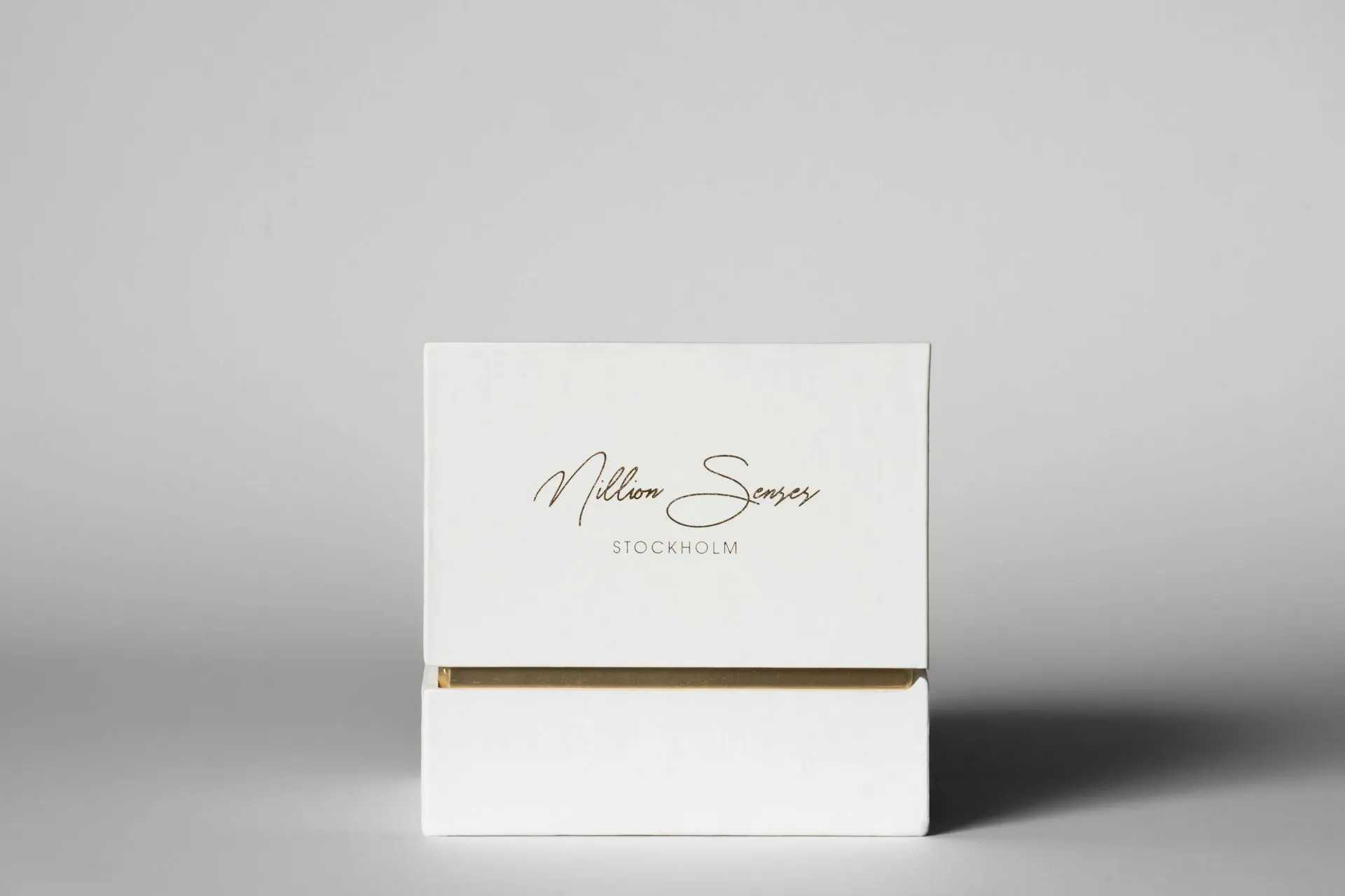
Minimalism in branding is the discipline of removing the non-essential so that only the essential remains and becomes unmistakable.
This design philosophy is built on the idea that every element on screen, on packaging, or in a logo must earn its place. If it doesn't serve a clear purpose, it doesn’t belong.
End Result: A brand identity that’s calm, refined, and, when done right, instantly recognisable and trustworthy.
Controlled restraint that communicates more.
Minimalism works especially well in industries where trust, usability, and premium perception matter. These include wellness, tech, SaaS, and luxury.
Minimalist brand design built on the following non-negotiable principles:
1. Purpose-Driven Simplicity: Every element must serve a function. If it does not improve clarity, recognition, or usability, it is removed.
Applies to everything, from logo and website layout to packaging design.
2. Strategic Use of White Space: White space is not empty. It directs attention to what matters most.
It improves readability, highlights key elements and creates a premium, uncluttered feel.
3. Tight Colour Palette: Minimalist brands typically use 1–2 primary colours. These are anchored by neutral bases like black, white, or grey.
This builds visual consistency and strong brand recall across touchpoints.
4. Clean, Functional Typography: The main function of typography is clarity, not decoration. Common choices include sans-serif or simple serif fonts.
Hierarchy is created through size, spacing, and weight, not visual noise.
5. Single Visual Focus: Minimalist design prioritises one dominant element.
This could be the product, logo or the key message. Everything else supports it.
6. Reduced Cognitive Load: Research by Nielsen Norman Group suggests that reducing cognitive load improves comprehension and usability.
Minimalist branding leverages that and with fewer elements, the customer has to make fewer decision choices, which leads to faster understanding and better user experience.
7. Consistency Across All Touchpoints: Minimalism only works when applied everywhere.
From packaging to digital interfaces, the brand must feel cohesive. If consistency breaks, the simplicity loses its impact.
Minimalist branding is effective because it aligns with how people process information and form perceptions.
It signals confidence and quality. To prospective customers, it reflects that your brand doesn't need to shout and show you have nothing to prove.
Minimalism also makes decisions easier for customers. By cutting visual clutter.your brand messages land faster and to your customer, the next steps feel obvious.
Plus, simpler systems support brand scalability across touchpoints. A minimalist identity system is much easier to apply consistently across touchpoints, from a business card to a billboard.
The risk: “Blanding”
Not all minimalism works.
A common mistake is stripping away too much, leading to generic visuals, lack of differentiation, and weak brand recall.
This is especially common in SaaS and D2C brands using identical colours, fonts, and layouts.
The difference between strong minimalism and bland branding is brand strategy.
Maximalist branding as a design philosophy is rooted in the idea that visuals, personality, and expressive energy are not noise, they're the message.
Maximalism in branding uses visual richness, layered storytelling, and expressive design.Every colour, pattern, typeface, and message works together to create a distinct brand world.
When carefully implemented, it creates brand identities that are impossible to ignore, and audiences that is genuinely connected to what a brand stands for.
It is: curated intensity with intent.
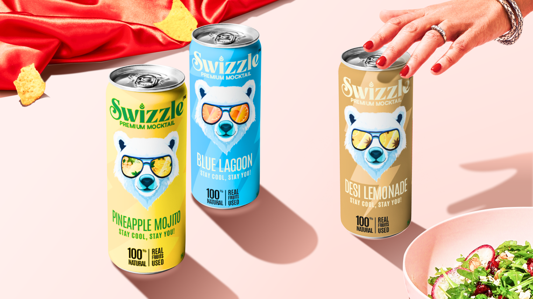
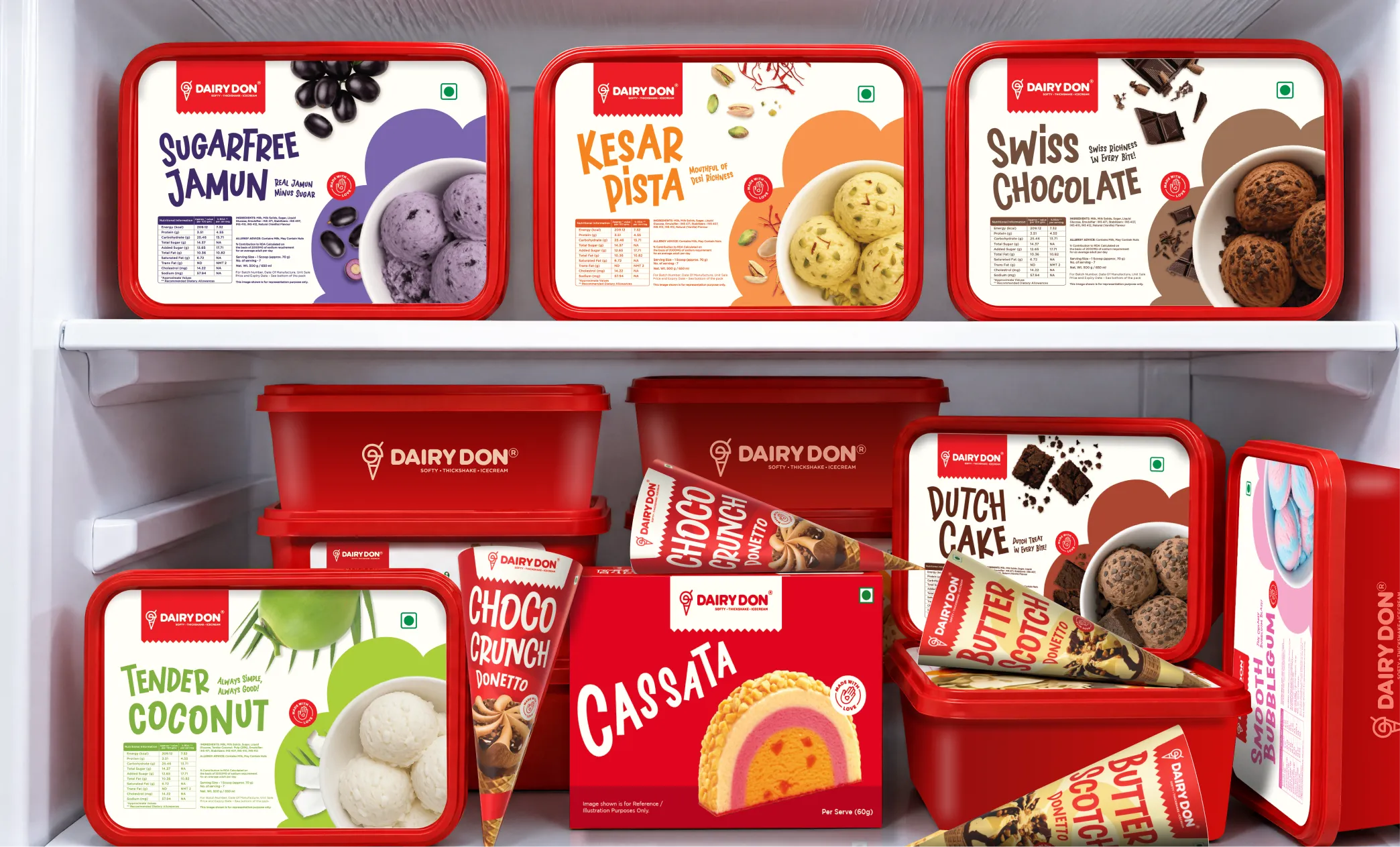
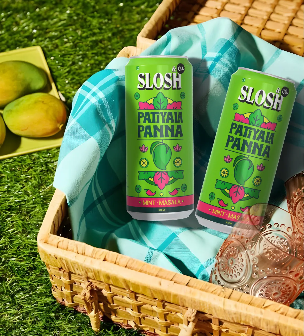
It is especially effective for brands that rely on personality, storytelling, and self-expression like clothing, food, etc.
Maximalism follows a different discipline. Instead of editing down, it builds up with control.
1. Layered Visual Composition: Maximalist design uses multiple elements including colours, patterns, typography and imagery
The goal is to provide depth without looking clutter. A strong structure, often using grids or repetition, ensures everything feels connected.
2. Bold and Expansive Colour Systems: Unlike minimalist palettes, maximalism embraces:
Colour becomes a primary tool for emotion and differentiation.
3. Expressive Typography: Typography carries personality and maximalism embraces that.
Mixing font styles (serif, sans-serif, display), oversized headlines and handwritten or experimental typography are commonly used.
4. Pattern, Texture, and Ornamentation: Surfaces are intentionally rich. The design attracts attention and invites exploration.
This can include illustrations, motifs, collage-style layering and tactile or print-inspired textures
5. Narrative-Led Design: Maximalist branding often tells a story. Every element contributes to brand personality and one of voice.
Packaging, websites, and campaigns become storytelling platforms,and not merely communication tools.
6. Controlled Density, Not Chaos: The key differentiator is intent.
Without structure, maximalism becomes overwhelming. With structure, it becomes immersive.
Maximalism works because it makes you feel something, and that’s what makes brands memorable.
When a brand is bold, loud, and full of personality, it’s harder to ignore and even harder to forget.
It also helps people express who they are. Choosing a maximalist brand often feels like making a statement. It says something about your taste, your attitude, your identity. This is especially true for Gen Z.
They’ve grown up surrounded by content, so they quickly tune out anything that feels generic. Brands with strong, expressive visuals stand out because they feel more real and less “perfect.”
But maximalism isn’t just throwing everything together. Without a structure, it can get messy.
The Risk: Maximalism Becomes Noise
Maximalism can fail if it lacks structure.
Common pitfalls can include visual overload, inconsistent identity and confusing messaging.
The best brands avoid this by anchoring their system with:
If you look at the table carefully, you’ll observe that the differences between minimalist and maximalist branding aren't just visual, they're strategic.
Minimalism and maximalism are two different answers to the same fundamental question: what do you want your audience to feel when they encounter your brand?
Choosing between minimalism and maximalism is a brand strategy decision.
Instead of asking which is better, the question that needs to be answered is:
What does your brand need to communicate, to whom, and in what context?
Minimalism is most effective when your brand needs to reduce friction and build trust quickly.
1. Your Audience Makes Trust-Driven Decisions: If your customers compare options, read reviews, and evaluate credibility, minimalism helps.
Minimalism removes distraction, improves clarity and signals confidence. This holds good for SaaS, healthcare, B2B and similar brands.
2. You Want Your Identity to Age Well: Minimalist identities age better.
A clean wordmark and a tight colour palette remain relevant across years, reducing the need for frequent redesigns.
3. Your Product or Service Is Inherently Complex: If your offering is technical or layered, your brand should simplify the experience.
Minimalist branding does this by making the audience feel calm and capable, not overwhelmed
4. You Require Consistent Scalability Minimalist systems are easier to apply across packaging, websites, apps, marketing assets.
Fewer elements mean fewer chances for errors and inconsistencies.
5. You’re Entering a Crowded Category Where Credibility Is a Competitive Edge: In trust-driven categories, polished and restrained design signals seriousness and professionalism.
It signals that you take your brand seriously, which attracts serious customers.
Blanding happens when brands chase minimalism but forget to be distinctive.
Neutral colors, clean sans-serifs, lots of whitespace: it all looks modern, but it also makes everyone look the same.
Minimalism creates space, but something memorable needs to fill it: a bold color, a unique mark, a bit of personality. Without that, simple turns into generic.
There’s another downside: you go too minimal and a brand can feel cold or distant, especially when it needs warmth and human connection.
The rule is simple: minimalism should feel intentional, not empty. If the customer feels there’s nothing there, it’s not minimal, it becomes forgettable.
Maximalism is powerful when your brand needs to stand out and connect emotionally.
1. Your Brand Has a Strong Personality: If your brand is bold, theatrical, joyful, and luxurious, it can't be contained in a clean two-colour wordmark.
Maximalism gives you range to express it.
2. Your Audience Buys with Emotion and Identity: In categories like
consumers aren't just buying a product, they're buying into a world, a set of values, a way of seeing themselves. Maximalism helps build that world.
3. You Compete in High-Noise Environments: On platforms like Instagram, TikTok, or Pinterest, you're competing for milliseconds of attention against an infinite scroll of content.
Maximalism helps you stop the scroll, stand out instantly, and drive engagement.
4. You Want Cultural Relevance and Shareability: Brands that aim to start conversations and build communities, benefit from maximalism in branding.
If word of mouth and cultural presence are part of your growth strategy, maximalism is the way to go
5. You Target Younger Audiences: Gen Z and younger millennials often prefer authentic, and expressive design.
Maximalism aligns with these expectations.
Maximalism can be powerful but only when executed thoughtfully.
Brands that get it wrong usually mistake “more stuff” for “more personality.” That’s not how it works.
Here’s where it breaks:
No anchor: Strong maximalist brands always have something consistent to hold onto—a symbol, colour, or motif. Without it, everything feels loud but forgettable.
Trend over truth: Jumping on maximalism because it’s popular rarely works. If it doesn’t reflect the brand’s real personality, it feels forced—and people can sense that.
No system underneath: Even the boldest visuals need structure—rules for colours, type, layout. Without that, things quickly become messy and impossible to scale.
Hard to read: If people can’t understand what you’re saying, the design has failed—no matter how eye-catching it is.
For years, brands were pushed to choose a side: Clean and restrained Vs. Bold and expressive.
Today, increasingly, the most interesting choice is: neither. And both.
When a brand design doesn't fit neatly on either side of the minimalism-maximalism spectrum, the answer lies somewhere in the middle
Minimal maximalism, expressive minimalism, bold minimalism: is a hybrid design philosophy that combines a minimal structural framework with maximalist expressive moments.
You are essentially using restraint as the foundation and boldness as the hero element. The two together amplify each other. So, almost everything is quiet, which makes the one loud element absolutely impossible to ignore.
Spotify Wrapped
Spotify's core product design is clean and restrained with minimal chrome, dark backgrounds, and efficient UI.
And then, once a year, “Wrapped” happens. An explosion of bold gradients, oversized typography, clashing neons, and maximalist energy that floods social media for weeks.
The same brand. Two completely different visual registers.
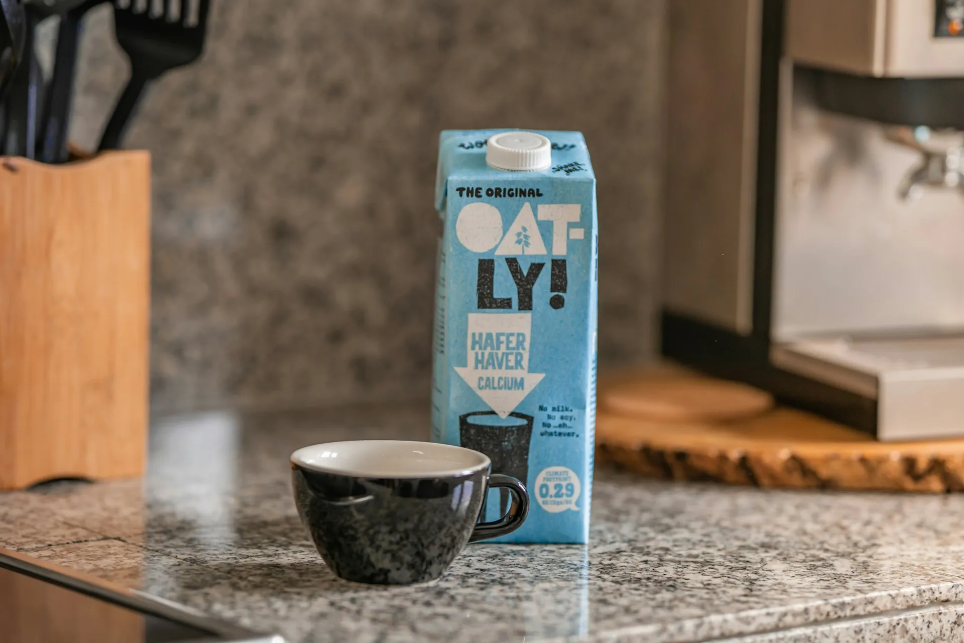
Oatly
Oatly’s packaging structure is minimal: a simple carton, clean layout, limited colour per SKU.
But within that structure, every inch of surface area is filled with dense, hand-written, personality-led copy.
The form is minimal. The expression is anything but. It's maximalism operating within a minimal container.
Supreme (Clothing Brand)
The logo is maximally simple with red box, white Futura text.
But every drop, every campaign, every collaboration builds an entirely maximalist cultural world around that minimal anchor.
The brand's visual identity is a single bold mark and everything that radiates from it is expressive, layered, and culturally charged.
A Clean, Non-Negotiable Core: Strong hybrid brands maintain a consistent foundation. This can be a logo, grid, typography, and primary colors. These never change.
This stable core keeps the brand cohesive and recognizable.
Controlled Zones of Expression: Maximalist elements are used selectively in areas like campaigns, packaging, social media, or seasonal content.
They serve a specific purpose rather than appearing everywhere.
Designed Contrast (Not Random Variety): Bold, expressive elements work because they are balanced with space and supported by a structured system.
The impact comes from intentional restraint, not randomness.
Most brands blending both approaches adopt one of these patterns:
Most brands approach branding and packaging agency with a mood board with requests like “We want something like this, but for us.”
It's a perfectly natural starting point. But it's also, almost always, the wrong one.
What matters isn’t how your brand should look. It’s who your brand is for and what you need them to feel.
That’s the difference between a brand that looks good and one that actually works.
In FMCG, minimalism and maximalism compete side by side, often on the same shelf. A calm wellness product might sit next to a loud snack brand, both fighting for attention.
There’s no “better” style. There’s only the right fit.
If a premium product looks too playful, it loses trust. If a kids’ product looks too serious, it loses interest. Getting it right is about alignment, not aesthetics.
At Confetti Design Studio, the conversation about minimalism vs. maximalism always starts in the same place: not visuals, but with clarity.
Every project is built on three simple questions:
❓Who is it for: What does the audience already trust, notice, and respond to?
❓What’s the gap: How are competitors showing up and where can the brand stand apart?
❓Who is the brand: Playful or serious? Calm or energetic? The design has to reflect this truth.
Only after this do visual decisions begin- colour, typography, layout, and whether the brand leans minimal, maximal, or hybrid.
Our process is designed to remove guesswork and back every design decision with clear reasoning.
1. Discovery & brand audit: The process starts by evaluating the current brand against its audience, personality, and competition. The gap between how it looks and how it should feel becomes the brief.
2. Competitive landscape analysis: Next comes a deep dive into how competitors show up visually. This reveals gaps in the market—and where the brand can stand out.
3. Mood boards & visual direction: Instead of one idea, multiple directions are explored—each tied to strategy. You see not just what works, but why it works.
4. Identity system build: Once a direction is chosen, a full visual system is created—logo, colours, typography, and rules for how the brand shows up everywhere. It’s built for consistency, not just aesthetics.
5. Packaging & retail application: Finally, the identity is tested where it matters most—on the shelf. Every element is designed to grab attention and communicate fast, often within seconds.
Confetti works across the full spectrum, from bold, high-energy brands like ITC Bingo to calm, premium ones like Miduty.
The common thread? Every brand looks right for its audience.
Because in the end, this isn’t about minimalism or maximalism. It’s about making the right people feel the right thing, instantly.
Branding and design change constantly and here are the developments that brands must know :
The honest truth is “minimalism got overused”.
Every startup, every challenger brand, every DTC product launch in the 2010s followed the same toolkit: a clean sans-serif, a neutral palette, and a logo with nothing extraneous on it.
The result: A sea of brands that all looked thoughtful, and none of which looked different. Audiences noticed how every brand was trying to look premium by looking like nothing.
Two rebrands made the industry sit up and pay attention.
The message was clear: restraint has limits.
At the start of 2026, Forbes said: maximalism is entering the mainstream.
And it couldn’t be farther from the truth.
Gen Z grew up online, surrounded by endless content. They quickly spot generic brands and connect with ones that feel alive.
Bold color, expressive type, and strong visual personality signal authenticity.
Social media amplifies this. On TikTok and Instagram Reels, restraint doesn’t stop the scroll, bold does.
Even AI is playing a role. Tools that make rich, layered visual content faster and cheaper have lowered the barrier to maximalist production, meaning more brands can now afford to go big.
The smartest brands aren't picking a side. They're building identities that can do both.
A clean, ownable core identity, consistent, scalable, instantly recognisable. Paired with bold, expressive campaign moments that flex when the brief demands it.
Pinterest's 2026 trend forecast said it well: audiences are moving toward bold self-expression and away from perfection for its own sake.
The brands that will win aren't the ones that look the most refined. They're the ones that feel the most real.
What is the main difference between minimalism and maximalism in branding?
Minimalist branding uses simplicity, white space, and restraint to communicate clarity and trust. Maximalist branding uses rich visuals, bold colours, and layered elements to project personality and energy. The key difference is not quality, it's intent.
Which is better for brand identity, minimalism or maximalism?
Neither is universally better. Minimalism works best for brands that want to project premium, modern, or trustworthy qualities, especially in tech, finance, and wellness. Maximalism works best for brands that thrive on personality and expression like fashion, beauty, food, and youth-culture brands.
Can a brand be both minimalist and maximalist?
Yes, the "minimalist maximalism" hybrid is a growing trend. Brands like Spotify (clean app UI, explosive Wrapped campaign visuals) and Oatly (simple packaging structure, maximalist illustration and copy) show how brands can hold a minimal identity framework while allowing bold, expressive moments in campaigns.
How do I know if minimalism or maximalism is right for my brand?
Start by asking three questions: Who is my audience? What do I want them to feel? What space do I compete in? If you're targeting audiences who value clarity and sophistication, lean minimal. If your audience craves personality and expression, go maximalist. If you're unsure, a brand strategy session with a design studio like Confetti can help you choose with confidence.
What is "blanding" in branding?
"Blanding" is the term used for over-minimalism — when brands strip their identities back so far they become indistinguishable from competitors. It's a risk of poorly executed minimalism, where simplicity becomes invisibility. Many brands are now actively moving away from blanding toward bolder, more distinctive identities.
Want strategic branding and packaging like this for your business?


.webp)
.webp)


.webp)
.webp)
.webp)
.webp)
.webp)


.svg)
.webp)
.svg)
.webp)