%201.webp)
02
AI Snaps
.svg)
.svg)
01
Our Work

03
About Us
05
Contact Us
06
Client Success

07
Blogs
08
Careers
Book A Call


Need Help In Building Your Brand?
Click the button below & book a call with our founder directly.

Rishabh Jain
Managing Director
Packaging design causing reprints is one of the most preventable and most expensive problems in any product launch. Yet it keeps happening.
Your launch is days away. The boxes arrive. You open one and something’s off. Wrong colour, missing claim, barcode won’t scan.
Everything stops. Reprints begin. Weeks of work and budget vanish overnight.
Most packaging reprints aren’t print failures. They come from avoidable design and file errors made early.
At Confetti Design Studio, we break down these mistakes, their true cost and how to prevent them.
Before diving into the mistakes themselves, it's worth separating two terms that often get conflated.
A reorder is planned and budgeted. A reprint is not. It’s sudden, urgent and usually costly, caused by errors in design or file setup.
A reprint means wasted printed stock, new printing plates, emergency design revisions and most damagingly lost time at the worst possible moment in your product's journey.
Studies suggest packaging artwork errors cost businesses thousands, often $5,000 to $50,000 or more per incident in material waste, labour and delays.
Multiple stakeholders including designers, brand managers, legal and marketing each reviewing different aspects of the artwork at different times creates significant review complexity.
Digital-first teams, while strong on brand, often lack the print production expertise needed to catch critical file errors.
And a fast turnaround culture means proofing stages that should be non-negotiable regularly get skipped.
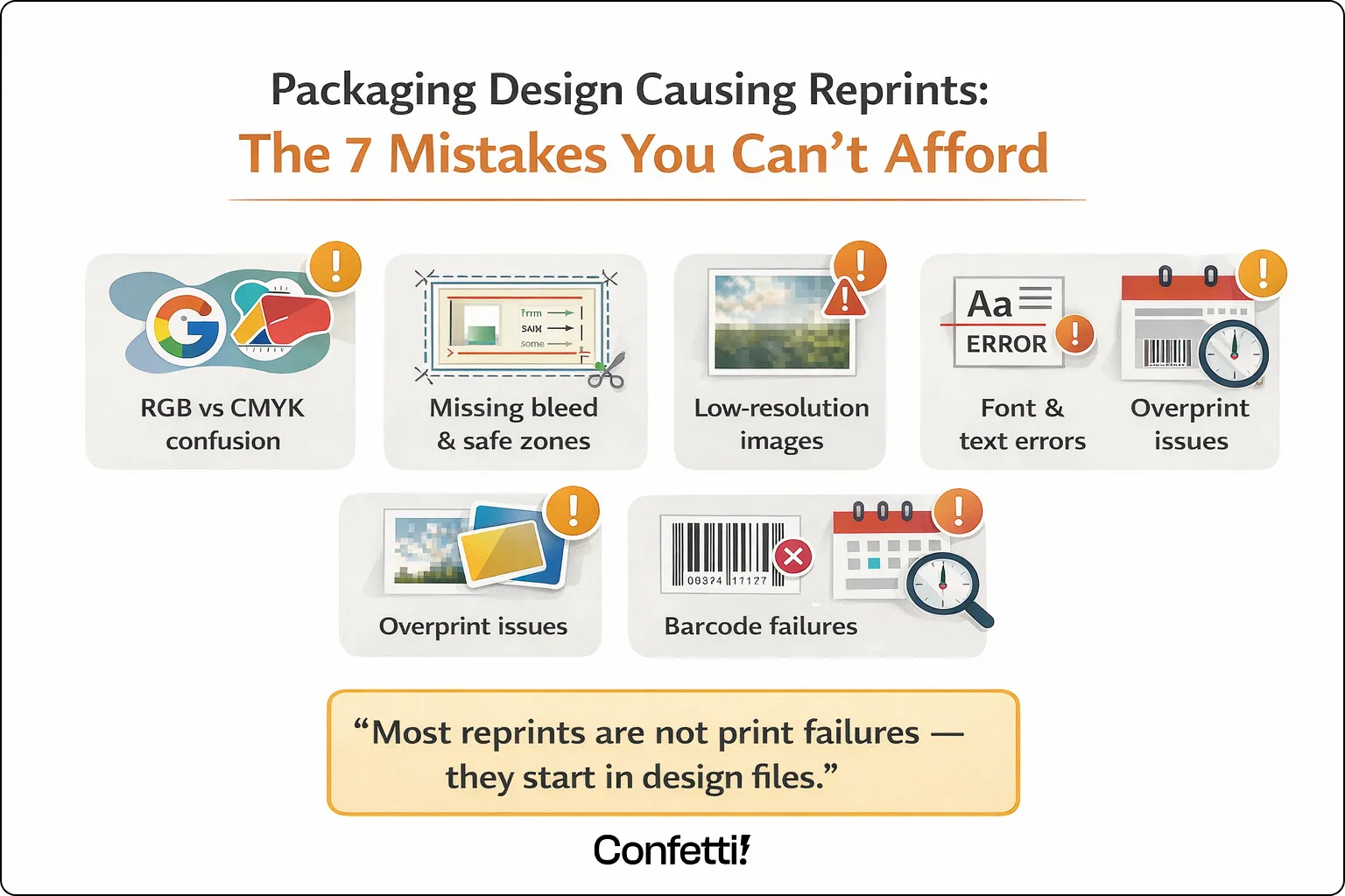
Most packaging reprints trace back to the same handful of recurring mistakes. Understanding what they are and why they happen is the first step to making sure they never reach your press.
This is one of the most frequent and costly mistakes in packaging design and it's entirely preventable. RGB is a colour model built for screens.
It produces vibrant, luminous colours by mixing red, green and blue light. CMYK is the model used in commercial printing, mixing Cyan, Magenta, Yellow and Black inks on a physical substrate.
When a designer creates artwork in RGB and submits it without converting to CMYK, the results on press can be dramatic.
Vibrant digital blues shift to dull, flat tones. Greens go muddy. Skin tones go orange. The colours that looked perfect on screen simply do not exist in the CMYK gamut.
The fix: Always design packaging artwork in CMYK from the very start, not as a conversion step at the end.
For brand-critical colours, specify Pantone (PMS) spot colours to guarantee consistency across print runs and suppliers.
Every piece of printed packaging is cut after it comes off the press. Cutting machinery is precise, but not pixel-perfect. There's always a small margin of movement.
Bleed (typically 3mm beyond the trim line) accounts for this by extending your background colours and images beyond the cut line.
So that if the cut runs slightly wide, there's no white edge appearing on the finished pack.
It defines how far inside the trim line your critical text, logos, and key design elements must sit, to ensure they're never accidentally clipped during cutting.
Without correct bleed settings, you get white edges. Without a safe zone, you get clipped logos and truncated copy. Both cause reprints.
The fix: Always request a dieline from your printer before artwork is created. Use their print-ready templates from the outset, so your file is set up correctly before a single element is placed.
Images that look crisp and sharp on a screen can print blurred and pixelated. The reason is resolution. Screens display images at around 72 DPI (dots per inch).
Commercial print requires a minimum of 300 DPI at the final printed size. A logo pulled from a website or an image downloaded at screen resolution, simply doesn't contain enough information to print cleanly.
The fix: Request all image assets at 300 DPI minimum. Where possible, use vector file formats, AI, EPS or PDF for logos, icons and type.
Vector artwork is resolution-independent and will print sharply at any size.
Font errors are quieter than colour mistakes and harder to catch in a visual review which is exactly what makes them dangerous.
Missing font files cause text to reflow or substitute with an entirely different typeface.
Incorrect point sizes can push copy outside safe zones or cause regulatory text to fall below legally mandated minimum sizes.
The fix: Outline all fonts before sending files to print, so the font data is baked into the artwork and cannot substitute.
Use a locked PDF for final sign-off to prevent any last-minute text edits from being made to the live file.
This is one of the most invisible and therefore most dangerous errors in packaging file preparation.
Overprint and knockout settings tell the printing press how to handle colours that sit on top of one another.
"Knockout" is the standard: the top colour replaces the one beneath it, as you'd expect. "Overprint" tells the press to mix the two colours together.
The problem arises when overprint is accidentally applied to black text sitting on a coloured background. In the standard design software view, everything looks fine.
On press, the black ink mixes with the background colour meaning text can disappear entirely, or take on an unintended hue.
It's the kind of error that passes every visual review and only reveals itself when the physical print arrives.
The fix: Always check overprint settings using the Overprint Preview mode in Adobe Acrobat or Illustrator before submitting files. This is a non-negotiable final check for any print-ready file.
A barcode that won't scan at retail is not a cosmetic problem, it's a commercial one. Distributors can and do refuse products with non-compliant barcodes.
Point-of-sale systems reject them. Retail listing agreements can be put at risk.
Barcode failures in packaging are typically caused by poor colour contrast between the bars and the background or dimensions that have been scaled below the minimum permitted size.
A barcode that scans perfectly on a laser printer proof may fail entirely on a flexographic or litho press if the contrast or sizing hasn't been verified against print-specific standards.
The fix: Always verify barcodes using a barcode verifier or GS1-compliant software before going to print.
Never scale a barcode below the minimum size specified by GS1 standards. Confirm colour contrast is sufficient for the intended substrate and print process.
Under time pressure, which is most of the time brands regularly skip physical proofing in favour of digital sign-off. It's understandable.
Digital approvals are faster, cheaper and feel sufficient when everyone is staring at the same PDF on the same call.
But a digital proof cannot replicate how ink behaves on a physical substrate. It cannot show you how a metallic finish interacts with a particular laminate.
It cannot accurately represent how a dark background shifts when printed on a kraft versus white board. It cannot tell you whether a varnish is creating an unintended sheen on your photography.
Skipping the physical proof is one of the single biggest contributors to packaging reprints across every category and every size of brand.
The fix: Build physical proofing time into every project timeline. Treat it as a non-negotiable stage, not an optional extra.
For new packaging designs or any significant structural or colour change, a physical press proof should always be approved before the full print run proceeds.
Most brands, when they think about the cost of a reprint, think about the print invoice. The reality is considerably more painful.
The direct costs of a reprint are significant enough on their own. New printing plates can run into thousands of pounds per colour.
Wasted substrate and already-printed stock is written off entirely. If the reprint needs to be turned around urgently and it almost always does, rush print surcharges apply.
Add express delivery to meet a retail or launch deadline and the invoice for a single avoidable error can reach tens of thousands of pounds.
The hidden costs are where the real damage accumulates. Internal team time project managers, designers, brand managers, legal is consumed managing the reprint process instead of moving the business forward.
Launch timelines slip and with them, retail windows are missed or retailer penalties are triggered for late delivery.
The brand's credibility with its print suppliers takes a hit. Emergency design revisions generate additional agency fees.
For brands operating in regulated categories food, pharma, cosmetics the stakes are higher still.
A labelling compliance error doesn't just mean a reprint; it can mean product withdrawal, regulatory scrutiny and the kind of brand exposure that no PR budget can easily recover from.
One reprint, painful as it is, can be absorbed. The more corrosive problem is when reprints happen repeatedly.
When the absence of a structured approval and proofing workflow means the same categories of error recur across different products, different campaigns and different launches.
Each reprint can mean two to six weeks of delay in a compressed go-to-market timeline.
Compounded across a product portfolio, that lost time translates directly into lost revenue, missed seasonal windows.
And a perpetual sense of firefighting that drains the energy and focus of the entire commercial team.
This is not a one-off mistake. For brands without the right process in place, it's a systemic problem and it needs a systemic solution.
Most brands assume reprints are a printing problem. In reality, they’re almost always a design and decision-making problem that started weeks earlier.
Good packaging isn’t just about how it looks on screen. It’s about how accurately it translates to print, under real production conditions, without surprises.
— Rishabh Jain, Founder, Confetti Design Studio
Product packaging design causing reprints is a challenge across every category.
But certain industries carry a significantly higher risk due to their regulatory environment, production volume, or design complexity. Here is where the stakes are highest.
Food packaging carries some of the most stringent labelling requirements of any category.
Regulatory claims, allergen warnings and nutritional panels are all subject to strict formatting rules, minimum type sizes and legally mandated content.
Date coding and batch number placement errors are among the most common triggers for food packaging reprints and depending on the product.
A labelling error can escalate from a reprint into a full product recall.
Safety warnings and ingredient lists in multiple languages add significant complexity to beauty and personal care packaging.
Mistranslations, missing safety phrases or non-compliant ingredient ordering can all trigger reprints.
Colour accuracy is also critically important in this category, where premium brand positioning depends on consistent, precise colour reproduction across every SKU and every market.
E-commerce packaging tends to operate at high volume, with rapid artwork updates driven by seasonal campaigns, product launches and subscription box refreshes.
This combination of speed and frequency creates fertile ground for file setup errors.
Small batch reprints in this context are disproportionately expensive per unit; the costs of new plates and setup aren't spread across a large run.
This is the highest-risk category of all. Labelling errors in pharmaceutical and medical packaging don't just cause reprints, they can trigger full product recalls and regulatory action from bodies including the MHRA and FDA.
The margin for error is effectively zero. Pharmaceutical packaging demands the most rigorous artwork approval and compliance review processes of any category.
And the consequences of getting it wrong extend far beyond any commercial cost.
The good news is that the overwhelming majority of packaging reprints are preventable.
Not through luck or greater care in the moment, but through a structured, repeatable approach to artwork preparation and approval.
A pre-submission checklist is one of the simplest and most effective tools available. Before any packaging file is submitted to print, every item on the list should be confirmed and signed off:
Before submitting files to print:
This checklist should not be a formality. It should be a gate, no file moves forward without it being completed.
Every piece of packaging should pass through a clearly defined, documented approval chain.
A robust workflow typically moves through the following stages: Design → Brand Review → Legal and Regulatory Review → Print Supplier Review → Physical Proof Sign-Off.
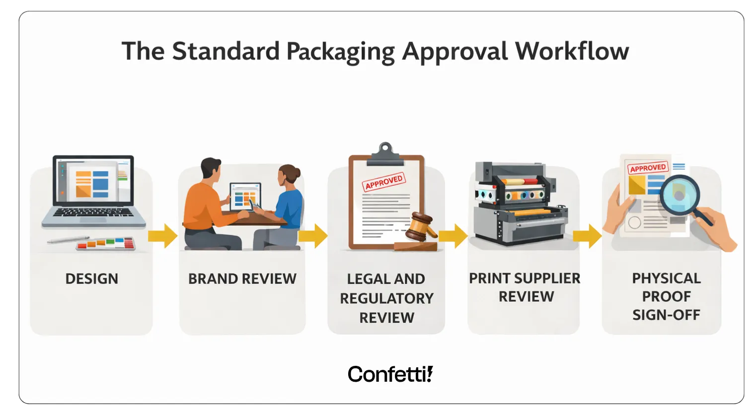
Each stage should require documented sign-off, not a verbal confirmation, not a reply-all email, but a recorded approval that creates an audit trail.
Artwork management platforms can automate version control, track who approved what and ensure that the file submitted to print is demonstrably.
The same file that received final approval. No more "I thought someone else had checked that."
Graphic design expertise and packaging production expertise are not the same thing.
A designer with a strong brand portfolio may have limited experience with dielines, trapping, spot colour specification or the specific file setup requirements of different print processes.
These are not aesthetic considerations, they're technical ones, and getting them wrong costs money.
When briefing design studios or evaluating suppliers, ask direct questions: Does your team understand dielines?
Do your designers specify colours in Pantone? Do you supply print-ready files as standard? The answers tell you a great deal about what to expect when your artwork goes to press.
For brands managing multiple SKUs, variants or markets, automated artwork comparison tools offer a significant layer of protection.
Platforms such as GlobalVision and ManageArtworks compare approved artwork against final submitted files pixel by pixel.
Flagging differences that human review would almost certainly miss a transposed digit in a batch number, a single missing word in an allergen statement, a colour value that's drifted between versions.
These tools are particularly valuable for high-SKU brands where the volume of artwork reviews would otherwise require enormous amounts of manual resources.
They don't replace human judgement, but they close the gaps that human review reliably leaves open.
At Confetti Design Studio, we approach packaging with this reality in mind. We have worked with brands across categories.
Such as food and beverage, personal care, cosmetics and consumer goods to create packaging that is visually compelling and production-ready from the outset.
Print Ready by Default : Every design is delivered with precise technical specifications, including correct CMYK or Pantone values, appropriate bleed, and properly structured files.
This ensures that approved designs translate accurately in print.
Deep Understanding of Dielines and Production Constraints: Dielines are treated as a core part of the design process.
The team collaborates directly with print suppliers to identify and resolve potential technical issues before files go into production.
Structured Approvals and Version Control: Packaging projects often involve multiple stakeholders such as brand, legal, regulatory, and vendors.
Confetti follows a clear approval workflow and maintains strict version control, reducing the risk of outdated or incorrect files being used.
Compliance Aware Design Process : For regulated categories, Confetti works alongside legal and compliance teams to ensure all mandatory information is accurate and correctly placed before final sign-off.
This helps minimize compliance risks and avoids last-minute changes.
The Outcome: Brands that work with Confetti reduce the risk of reprints and production delays.
They are able to move to market faster, with confidence that their packaging is not only well-designed but also technically sound and ready for production.
What are the most common causes of packaging reprints?
Incorrect colour mode (RGB instead of CMYK), low-resolution images, missing bleed and safe zones, font errors, regulatory copy mistakes and incorrect barcode setup.
Most reprints stem from file preparation errors, not print quality failures.
How much does a packaging reprint typically cost?
Direct costs range from a few hundred pounds for small runs to tens of thousands for large or multi-colour jobs.
Hidden costs including launch delays, missed retail windows, and internal team time often exceed the print bill itself.
How can I avoid packaging reprints?
Use a structured approval workflow with checkpoints for design, brand, legal, and production review, combined with physical proofing before sign-off.
A pre-submission artwork checklist used as a firm gate, not a guideline, is one of the most effective immediate steps.
What is the difference between a digital proof and a physical proof for packaging?
A digital proof shows how artwork looks on screen but cannot replicate how ink behaves on a physical substrate.
A physical press proof is produced on the actual machine with the actual materials and is always recommended for new designs or significant updates.
Can packaging misprints be fixed without a full reprint?
Sometimes. High-opacity cover-up labels can address minor text or barcode errors at lower cost.
However, this is not suitable for regulated categories where the original label must be fully replaced to remain compliant.
What file format should I use for packaging artwork?
Print-ready PDF (PDF/X-1a or PDF/X-4) is the industry standard. Fonts should be embedded or outlined, images at 300 DPI minimum, and colours set to agreed CMYK or Pantone specifications.
Always confirm requirements with your print supplier first.
How do overprint settings cause packaging errors?
If black text is accidentally set to overprint on a coloured background, it can become invisible or shift colour on press.
The error is invisible in standard design view and must be checked using Overprint Preview mode before file submission.
Want strategic branding and packaging like this for your business?


.webp)
.webp)


.webp)
.webp)
.webp)
.webp)
.webp)


.svg)
.webp)
.svg)
.webp)