%201.webp)
02
AI Snaps
.svg)
.svg)
01
Our Work

03
About Us
05
Contact Us
06
Client Success

07
Blogs
08
Careers
Book A Call


Need Help In Building Your Brand?
Click the button below & book a call with our founder directly.

Rishabh Jain
Managing Director
Most brands must consider a packaging design audit, at some point in their journey. The best approach is to do it proactively before anything goes wrong.
This Confetti guide walks you through the complete packaging design audit process. We include the step by step packaging review process and a checklist you can use.
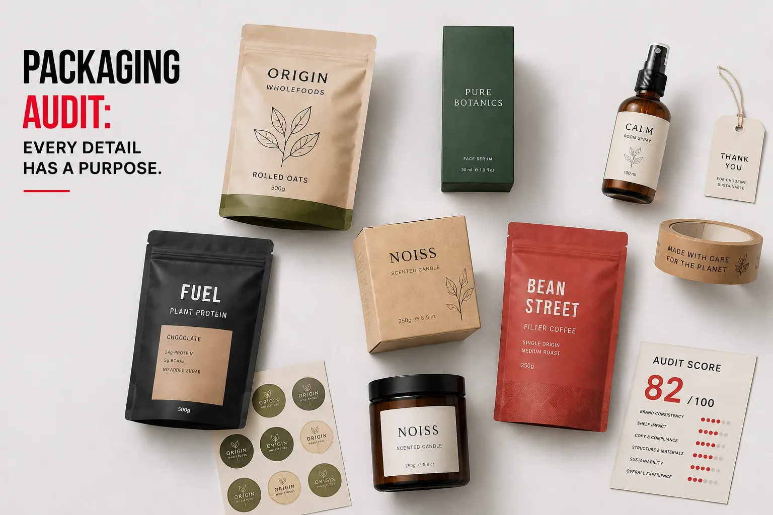
A packaging design audit is a structured review of all your packaging across four dimensions:
It tells you exactly where your packaging is winning, where it’s leaking value, and what specific changes will deliver the highest return.
However, a packaging audit is not a redesign, not an opinion session, and not a quick visual check.
There are two types:
Most brands benefit from running an internal audit annually and an external, agency-led audit from experts like Confetti Design every 2–3 years or whenever something important changes for your brand.
You don't need to wait for a crisis. The right time to audit is before the problem costs you money.
There are certain triggers that demand immediate attention. Let’s break them down:
🚨Sales are declining despite consistent marketing spend and no change in product formula
🚨Quick commerce conversion lags behind your retail performance. Your product packaging sells well on store shelves but struggles on Blinkit, Zepto, or Amazon.
🚨Your SKU range has grown, but the packaging design system hasn't been able to keep up
🚨Your brand has evolved. Your packaging hasn’t. You repositioned from mass to premium, launched a new visual identity, but the old packaging remains on shelf.
🚨A direct competitor has redesigned and it's product visibly is outperforming yours on the retail shelf
🚨Customer reviews mention packaging whether it's hard to open, looks cheap, or is confusing
🚨Regulatory changes have occurred: FSSAI requirements Legal, labelling rules etc. If you haven’t reviewed your label compliance audit in the past 12 months, you’re exposed.
🚨You’ve committed to new environmental goals, your current materials need assessment against those claims.
🚨Your team can’t explain why the current design exists. No strategy document. No rationale for colour choices. No typography hierarchy.
Packaging design mistakes often accumulate quietly. By the time they show up in sales data, they've been damaging brand equity for months.
A packaging audit is a phased process that moves from desk research to physical testing to a scored final report.
This process applies whether you're running the audit internally or working with an agency. The depth varies; the structure doesn't.
Before you evaluate anything, you need a complete picture of what exists.
Most brands discover gaps here. Common ones include: discontinued versions still in warehouse stock, digital files that don't match the printed packs, variants that were never updated after a brand refresh.
✅What to do:
This step reveals the most common problem: packaging that has drifted away from the brand over time.
Every pack update, even minor ones, introduces small deviations.
A shade of blue shifts slightly in a reprint. A secondary typeface gets swapped because the original wasn't available.
Over dozens of SKUs and several years, these micro-deviations compound into a fragmented brand system.
✅What to evaluate:
Inconsistent packaging looks amateur. Worse, it creates confusion. A customer who buys two different products from your brand shouldn’t wonder if they came from the same company.
If you don’t have formal brand guidelines, this step becomes more challenging.
A pack that looks good by itself may disappear on a crowded retail shelf. So, it's important to assess how it performs on the platforms its meant for:
✅Physical retail:
✅E-commerce and quick-commerce:
For deeper shelf strategies, read packaging design for shelf visibility.
Compliance failures can result in product recalls, retailer rejection, or regulatory fines.
For brands in food, beverage, nutraceuticals, and cosmetics: categories where regulations shift, this review should happen at minimum once a year, regardless of whether the packaging has changed.
✅What to check:
For India-specific compliance, our packaging labelling requirements guide for Indian brands covers the full FSSAI, Legal Metrology, and BIS requirements in one place.
A packaging design audit isn't only about what the pack looks like. It's also about what it does.
Structural failures are costly. Damaged product on shelf, high return rates, and consumer frustration. Material choices affect cost, sustainability, and brand positioning simultaneously.
✅What to evaluate:
The goal of benchmarking is to understand what colour territories, format conventions, and claim hierarchies dominate the category, and then identify where your packaging can own something distinct.
✅What to do:
For brands curious about how established names handle this, our The Whole Truth packaging audit breaks down how brands manage category positioning through design, where they succeed and where the gaps are.
Design teams see packaging through a production lens. Consumers see it through a purchasing lens.
Those two perspectives rarely align perfectly and the gap between them is where the most valuable audit insights come from.
✅Consumer feedback methods:
✅Sources to pull from:
This feedback often surfaces issues that no internal design review would catch, a font size that's unreadable for older consumers, a colour that photographs badly, a seal that's frustrating to open.
An audit without an action plan is wasted effort.This step transforms findings into work.
Use a RAG (Red / Amber / Green) scoring system to assess each audit area:
Then categorise every flagged issue into one of three paths:

Get in touch our founder directly!
Book A Call
Here is every checklist item from Steps 1–8 Use it as a working document. Assign a team member per section, date the review, and track status.
1. INVENTORY ALL PACKAGING CHECKPOINTS
☑️All primary packaging SKUs collected
☑️Physical samples collected for every format
☑️All secondary packaging (sleeves, cartons, displays) documented
☑️All tertiary (shipping) packaging included
☑️All inserts, leaflets, or collateral listed
☑️Dimensions recorded for each variant
☑️Material type noted for each item
☑️Print run date and batch numbers logged
☑️Supplier details attached to each line
☑️Print-ready digital files confirmed and located
☑️Channel mapping done (where each pack appears)
☑️Version history checked, no outdated variants in active use
2. VISUAL IDENTITY & BRAND CONSISTENCY
☑️Brand guidelines exist (yes/no)
☑️Logo placement consistent across all SKUs
☑️Logo clear space respected on every pack
☑️Colour values verified against brand guidelines (Pantone/CMYK)
☑️Correct typefaces used at correct weights throughout
☑️Visual hierarchy lands in under 3 seconds: brand → product → benefit
☑️Imagery/illustration style consistent across the range
☑️Brand voice/tone consistent across copy
☑️All SKUs placed together, they read as one cohesive family
☑️No rogue brand elements introduced by printers or third parties
3. SHELF & E-COMMERCE PERFORMANCE
☑️Brand name legible at 1.5–2 metres distance
☑️Flavour/variant identified within 3 seconds
☑️Pack creates a strong visual block (tested with 4–6 units together)
☑️Pack stands out from adjacent competitors
☑️Colour contrast sufficient for category
☑️Side panel contains identifying info for faced-out displays
☑️Top flap/tuck flap contains brand name
☑️Key benefit/claim visible without rotating pack
☑️Pricing/bar code area clean and scannable
☑️Thumbnail performance tested on mobile at actual listing size
☑️Pack performs on e-commerce PDP without requiring zoom
☑️Unboxing experience reviewed if relevant
4. COPY, CLAIMS & COMPLIANCE
☑️FSSAI logo and licence number present (food category)
☑️Nutritional information table in prescribed format
☑️Allergen declaration present and bolded
☑️MRP printed as “MRP Rs. ___ (inclusive of all taxes)”
☑️Net quantity declared in correct unit (g/ml)
☑️Manufacturer name and address complete
☑️Country of origin stated (“Manufactured in India”)
☑️Month and year of packing / best before
☑️Batch number or lot code location specified
☑️Language requirements met for each target market (bilingual labels where required)
☑️Barcode size, format, and placement verified for scannability
☑️No unapproved health or therapeutic claims
☑️No misleading “green” claims without evidence
5. STRUCTURE & MATERIALS
☑️Board/paper GSM meets product weight requirement
☑️Flap or closure stays closed without tape
☑️Seal strength tested for wet/dry products
☑️Stack compression test passed
☑️Drop test (1m, all faces) passed
☑️Vibration test passed (simulated transport)
☑️Humidity/temperature exposure tested
☑️Barcode verified scannable with test equipment
☑️Print registration accurate (no cutoff text/logos)
☑️Coating/lamination free of bubbles or delamination
☑️No sharp edges or pinch points (safety)
☑️No excess material layers identified
☑️Material meets applicable safety standards (food-contact, cosmetic, pharmaceutical)
6. COMPETITOR BENCHMARKING
☑️3 competitors selected (leader, challenger, premium)
☑️Anonymous purchase of all competitor packs
☑️Visual hierarchy comparison completed
☑️Material quality comparison completed
☑️Information clarity comparison completed
☑️Sustainability communication compared
☑️Unboxing experience compared
☑️Format conventions noted: conformist vs. disruptive opportunities identified
☑️Areas where you blend in vs. stand out clearly identified
☑️Differentiation score assigned for each attribute
☑️Lagging areas identified and prioritised
7. CONSUMER & RETAILER FEEDBACK
☑️Retailer feedback gathered from sales team
☑️Shelf-test completed with target consumers (n≥20)
☑️5-second recall test completed
☑️Thumbnail test completed
☑️First-open recordings captured (n≥10)
☑️Customer review data filtered for packaging mentions
☑️Returns/complaints data checked for packaging-related causes
☑️Social media and UGC reviewed
☑️Delight moments documented
☑️Qualitative score assigned for user experience
☑️Retailer/store manager interviews conducted (n≥3)
☑️Pain points documented with verbatim quotes
8. SCORING & ACTION PLAN
☑️RAG rating assigned for each of the 7 audit areas
☑️Each issue categorised: quick fix / partial redesign / full redesign
☑️Action items assigned to owners with clear deadlines
☑️Brief prepared for any design work required
☑️Stakeholder presentation completed (key findings + priorities)
☑️Follow-up audit date scheduled (12–18 months)
At Confetti, we've run packaging audits for brands across FMCG, nutraceuticals, D2C, and personal care. What we've learned: the biggest issues are rarely the most obvious ones.
Our audit process doesn't begin by looking at what looks good or bad. It begins by asking what the packaging needs to do commercially: which channels, which consumer, which price position, which competitive set.
Only after that context is established do we evaluate the packaging against it.
A colour that's off-brand in isolation might be exactly right for a specific retail environment. A logo that feels too small on a studio screen might perform perfectly on a shelf.
For Miduty, our audit identified a fragmented visual system across a growing supplement range. The brand had strong clinical credibility, the packaging wasn't reflecting it.
The redesign created a structured, scalable packaging architecture that now holds across 30+ SKUs and has been featured on Dieline.
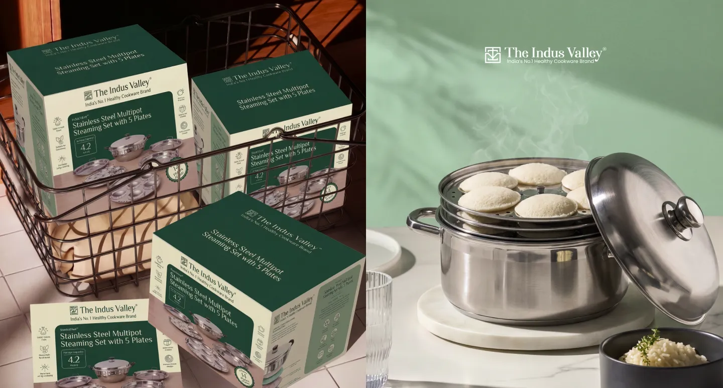
For The Indus Valley, the audit revealed that the existing packaging was losing the brand's product differentiation on shelf. We created a product-first packaging system that cuts through clutter and holds consistently as the range scales.
If you're at the point where packaging performance is a real concern, our packaging design strategy guide is a useful next step before briefing an agency.
You have the audit report. It’s full of scores, findings, and recommendations. Now what?
The audit doesn’t make decisions for you. It gives you evidence so you can make the right one.
Based on that evidence, you will take one of three paths. Each has a different scope, budget, timeline, and outcome.
This is the best possible outcome. Your packaging’s core strategy is sound. The issues your audit uncovered are surface-level execution errors, not structural flaws. A redesign would be expensive overkill. You just need corrections.
When to take this path:
Your audit shows high scores on visual identity, shelf performance, and material integrity. The problems are isolated: a barcode that doesn’t scan, a missing FSSAI logo, a colour that printed off-register on one batch, a typo in the ingredient list. Nothing requires new structural tooling or a visual identity overhaul.
What happens on this path:
You generate a simple fix list. Each item has an owner and a deadline. Most fixes take hours or days, not weeks. Artwork files get updated.
A new print run gets scheduled with corrections in place. Your existing stock gets a sticker overlay if the error is regulatory (like a missing allergen declaration).
You do not change your material supplier. You do not change your structural design. You do not commission new photography or illustration.
Common fixes on this path:
Timeline: 1–4 weeks
Budget: Minimal (designer hours + reprint costs)
This is the most common path. Your packaging works in some ways but fails in others.
The strategy is not broken, but the execution needs a disciplined refresh. You do not throw everything away. You keep what works and fix what doesn’t.
When to take this path:
Your audit shows mixed scores.
Visual identity scores high, but shelf impact analysis reveals poor standout against new competitors.
Or your material audit shows you are over-paying for substrate that doesn’t add consumer value, but the design itself is fine.
Or your packaging for online retail scores well, but your quick commerce thumbnail is illegible.
Or your packaging family architecture is inconsistent across SKUs. Colours drift, logo placement shifts.
What happens on this path:
You isolate the specific components that need change. This could be:
The key word is partial. You are not starting from zero. You are iterating on a proven foundation.
Timeline: 6–12 weeks
Budget: Moderate (design fees + new tooling if structural + possible reprints)
You only take this path when the audit proves your current packaging is fundamentally broken.
When to take this path:
Your audit scores low across multiple pillars.
The brand positioning has shifted, maybe you moved from mass-market to premium, or from playful to serious and the packaging no longer reflects who you are.
Consumer feedback is consistently negative. Competitors have leapfrogged you.
Your visual identity system is non-existent or so inconsistent that it cannot be salvaged with partial fixes.
What happens on this path:
You start with a new creative brief. The brief is not based on opinion. It is based on the audit findings.
You know exactly what failed in the old design. You know what consumers rejected. You know where competitors outperformed you. That knowledge becomes your guardrails.
A full redesign usually includes:
Risk warning:
A full redesign without an audit is gambling. You might spend ₹5–15 lakhs on new tooling and design fees, only to discover the new pack fails for reasons you never diagnosed.
The audit is your insurance policy. It ensures you are fixing the right problems.
Timeline: 3–6 months
Budget: Significant (strategy + design + structural engineering + tooling + new print runs)
What is a packaging design audit?
A packaging design audit is a structured review of your packaging across visual identity, brand consistency, shelf performance, regulatory compliance, and material integrity. It identifies what's working, what's failing, and what's missing, before those gaps show up as lost sales, retailer rejections, or compliance issues.
How often should you conduct a packaging audit?
Run an internal audit annually, especially if your SKU count is growing. Commission an external, agency-led audit every 2–3 years, or sooner if you're entering a new retail channel, relaunching a product, updating brand guidelines, or responding to consistent consumer or retailer complaints. Don't wait for a crisis.
What's the difference between a packaging audit and a packaging redesign?
An audit is a diagnostic. A redesign is the response. Brands that skip the audit and go straight to redesign frequently reproduce the same structural problems in new packaging because they never identified the root causes. An audit makes the redesign brief more precise, faster, and less expensive. Read more on when to audit vs. when to redesign.
What does a packaging design audit checklist include?
A complete checklist covers: SKU inventory and version control, visual identity and brand consistency, shelf visibility and e-commerce thumbnail performance, copy accuracy and regulatory compliance, barcode and certification verification, structural integrity and material suitability, competitor benchmarking, and consumer/retailer feedback. Each area should be RAG-scored and prioritised for action.
Can I run a packaging audit myself, or do I need an agency?
An internal audit using a structured checklist is a strong starting point especially for smaller brands or for a quick annual review. Involve both your marketing team (for brand consistency) and your sales or operations team (for channel performance and compliance). For a design-strategic evaluation: shelf psychology, competitive positioning, e-commerce performance, an experienced packaging design agency like Confetti will provide substantially more actionable insight.
Want strategic branding and packaging like this for your business?


.webp)
.webp)


.webp)
.webp)
.webp)
.webp)
.webp)


.svg)
.webp)
.svg)
.webp)