%201.webp)
02
AI Snaps
.svg)
.svg)
01
Our Work

03
About Us
05
Contact Us
06
Client Success

07
Blogs
08
Careers
Book A Call


Need Help In Building Your Brand?
Click the button below & book a call with our founder directly.

Rishabh Jain
Managing Director
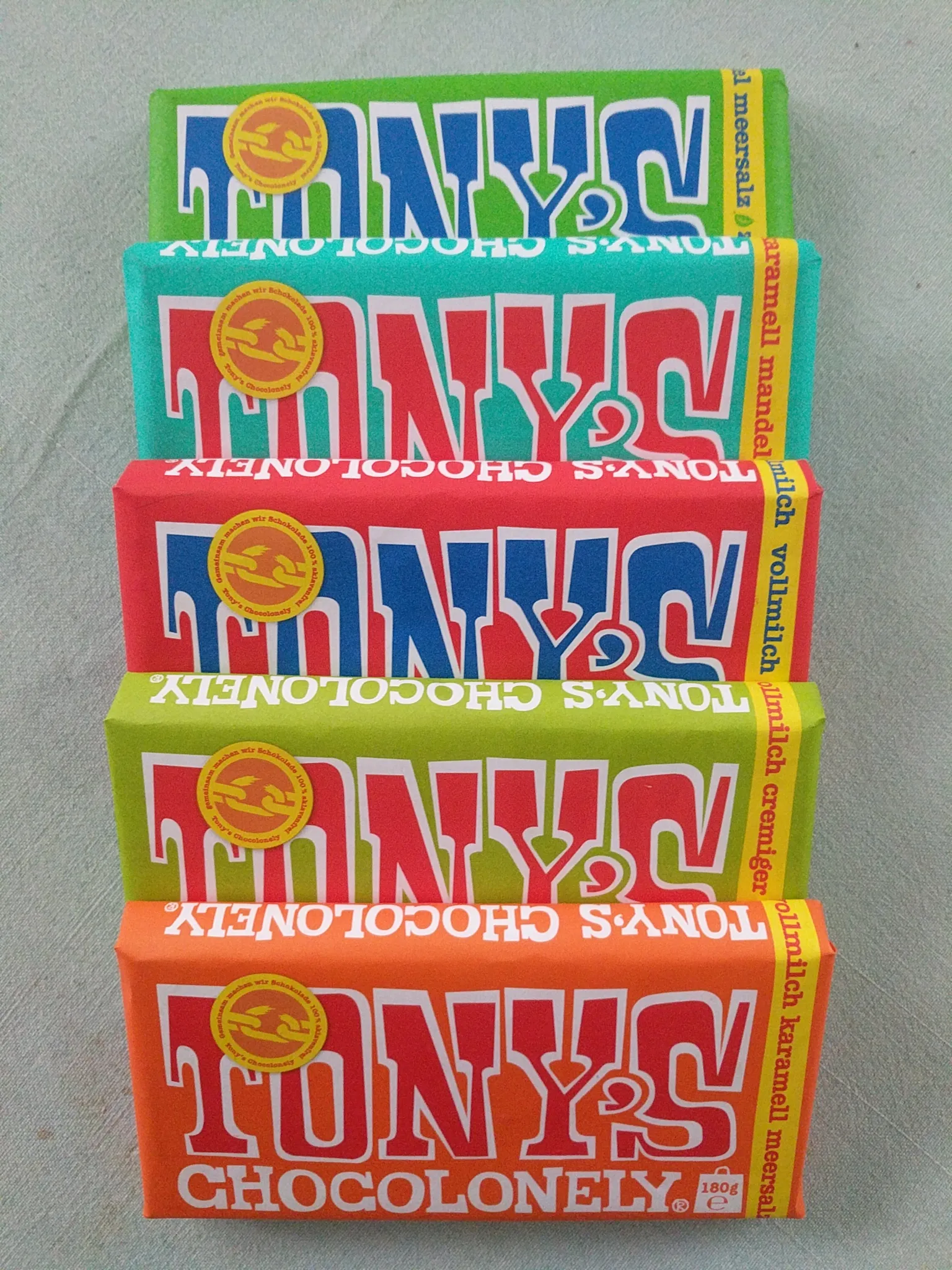
Chocolate packaging design is not only a creative choice but also a commercial decision.
Your packaging design determines whether your product gets picked up, how much consumers are willing to pay for it, and whether they’ll buy it again.
This Confetti guide is not a regular inspiration gallery for chocolate box designs, it's a practical resource that helps brands make smarter packaging decisions that drive both appeal and sales.
.png)
The global chocolate bar packaging market was worth USD 13.9 billion in 2025 and is projected to reach USD 22.0 billion by 2033. That is a CAGR of 5.9%.
That growth is driven by a commercial reality: packaging impacts your numbers. Here’s how:
✔️Packaging drives purchase behavior before taste does:
Consumers rate chocolates in premium packaging as having more intense flavors and appearing more luxurious, which translates directly into higher purchase intentions.
That means your packaging isn’t just representing your chocolate. It’s altering how it tastes.
If you underinvest in packaging, and you’re leaving margin on the table.
✔️Packaging captures attention offline & online:
On a physical shelf, buyers form a preference within 3 seconds of visual exposure. Online, the product thumbnail is the only first impression and it has even less time to work.
If your packaging doesn't stop someone's eye in that window, the rest of the design work is irrelevant.
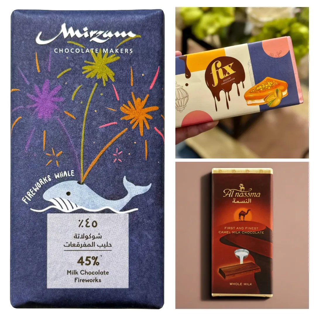
Fix Dessert Chocolatier in Dubai, their pistachio-kunafa chocolate bar earned over 13.8 billion TikTok views in the first quarter of 2025.
This wasn’t because of the recipe alone, but because the packaging was built for visual storytelling.
The distinctive cross-section, the vivid green filling, the premium gold accents it was designed to be filmed.
That is what packaging can do when it is treated as a commercial tool.
✔️Tactile quality creates measurable sales lift
Research study found that consumers are 50% more likely to purchase a product after touching its premium packaging just twice. After four touches, the likelihood increases to 90%.
A product held in heavier packaging is rated as more effective, more premium, and worth more money, even when the product inside is identical.
✔️Packaging design is a justification of your price point:
A chocolate bar in a standard polyester wrapper will sell for ₹60–80. The same bar in a matte kraft sleeve with embossed typography will justify ₹180–220.
In a rigid gift box with a ribbon, the perceived value doubles again. The chocolate didn't change. The packaging did.
For luxury chocolate packaging:, this means investing in packaging design will have direct P&L implications.
✔️Packaging as means to convey your USP
Packaging is also one of the most effective ways of conveying why and where you stand out. In a time where ingredient transparency has become critical, your packaging helps you clearly communicate this.
A good example is The Whole Truth chocolate packaging, which clearly highlights what goes into the product and what doesn’t.
Using clean, minimal design, the brand calls out ingredients like cocoa, dates, and nuts while emphasizing the absence of refined sugar, preservatives, and artificial additives. This reinforces its USP of “no hidden ingredients” and builds consumer trust at the point of purchase.
At Confetti, that is how we approached packaging for What A Bite’s protein snack. The vibrant orange-and-white palette, torn-paper flavor labels, and prominent “50% protein” badge was designed to communicate value, build trust, and accelerate purchase decisions in the protein snacks aisle.
The same principle applies to chocolate packaging. Every color, every finish, every structural element is either helping you sell or hurting your unit economics.
Most chocolate packaging is designed for one thing: looking good. That’s a weak starting point.
Across hundreds of branding and packaging projects at Confetti, we’ve seen the same pattern repeat.
Brands ask for packaging that feels “premium” or has “shelf presence.” Designers deliver, yet the launch underperforms, not because the design was bad, but because the brief was incomplete.
Every piece of chocolate packaging must do four jobs at once:
STOP
First, packaging has to get noticed. On a retail shelf, that happens in seconds. Online, it’s even faster, A quick thumb-scroll where the pack competes as a tiny thumbnail.
Stopping power comes from contrast, scale, hierarchy, and recognition. A deep burgundy pack on a shelf of pastel pinks. A foil finish that catches light differently than matte neighbours
We evaluate stopping power at Confetti using our Packaging Resonance Score, which assesses each design across five factors including shelf or unboxing distinctiveness
SIGNAL
Once attention is captured, packaging must instantly communicate what the product is, who it’s for, and what it’s worth.
A matte black bar with foil accents signals premium gifting. A bright illustrated pouch signals casual snacking. Neither is wrong but the signal must match the product and audience.
Confused signals create confused consumers.
SELL
Good packaging drives purchase. Material choices, structure, and finishes shape perceived value.
A rigid box, magnetic closure, or thoughtful unboxing experience can increase quality perception and justify a higher price. If packaging isn’t improving conversion, it’s not doing its job.
The sell job is measured at the checkout counter or the cart page. If packaging isn’t driving conversion, it’s failing Job 3 regardless of how beautiful Job 1 and 2 are.
SUSTAIN
Sustainability operates at two levels. First, literal sustainability: eco-friendly chocolate packaging and compostable chocolate wrapper materials are shifting from nice-to-have to table stakes.
Second, experiential sustainability: packaging that creates a memorable unboxing moment generates social sharing, repeat purchase intent, and brand advocacy.
At Confetti, we design the unboxing journey as a structured sequence. Every interaction from the moment someone picks up the pack to what they find inside is mapped and intentional, using material, layout, and finishing to create flow
This is the framework we use before any visual direction is set.
If you cannot clearly answer what job this packaging is primarily built to do and for whom, the design process will produce something that looks fine but performs poorly.
Format is the single most powerful tier signal in chocolate packaging. Here is a decision framework based on channel, price point, and brand positioning.
The chocolate bar wrapper is the most competitive design canvas in the category with the lowest cost of entry. But they offer minimal structural strength and almost no "giftability."
The sleeve sits between a wrapper and a carton: a paperboard shell that slides over the flow-wrapped bar. It adds a premium feel with minimal material cost.
We recommend it for brands that need more storytelling real estate than a wrapper allows but don't require a full box. Three distinct directions work here:
Mirzam Chocolate in Dubai uses full-bleed, destination-inspired narrative illustration on their bar wrappers. The packaging tells the story of cacao origin through visual artistry. The wrapper becomes the product story, not just its container.
Folding cartons are made from paperboard. They ship flat, assemble quickly, and balance cost with a solid print surface.
Folding cartons can be plain tuck-end boxes, reverse tuck, or auto-bottom styles.
They accept windows, emboss, and spot UV well. But, folding cartons won't feel as substantial in the hand as a rigid box.
Rigid packaging is a retention strategy. Consumers keep and reuse beautiful boxes which extend brand presence in the home long after the chocolate is consumed.
They arrive pre-assembled, ready to pack but cost higher. They offer elevated brand positioning, superior structural strength, and a tactile weight that signals luxury.
Rigid boxes are the standard for any chocolate gift box.
Magnetic closures add a deliberate tactile moment. The subtle "click" on opening communicates precision. That sensory cue is a quality signal and it costs far less to add than most brands expect.
For example, premium chocolate brand Norman Love Confections redesigned into a sleek magnetic closure box with a book-like opening to elevate the giving experience.
For deeper thinking on what luxury packaging materials communicate to buyers, the psychology runs deeper than just aesthetics.
Stand-up pouches with resealable zippers are growing in snack and D2C segments.
They offer lower cost than rigid formats, excellent barrier protection (especially with foil lining), and the convenience of resealing.
Pouches also ship flat, which reduces freight costs compared to rigid boxes.
For small-batch or subscription-based chocolate brands, pouches offer lower minimum order quantities and faster turnaround.
Tins provide the ultimate barrier protection. 100% effective against UV light, air, and moisture. They are infinitely recyclable and reused by consumers, extending brand exposure.
For chocolate products distributed in hot climates or through long supply chains, tins offer superior protection against melting and bloom.
The downside is cost and weight. Tins are more expensive than paperboard options, and heavier shipping costs can erode margins. But for brands where product integrity and reusability drive loyalty, tins deliver a strong return.
Window box chocolate packaging that reveals the product builds trust. It removes a key friction point for premium and artisanal chocolates where the visual texture of the product is part of the appeal.
Window placement is the crucial decision here. It should frame the most visually compelling part of the product like the handcrafted surface of a truffle, the marble pattern of a bark chocolate.
Artisanal praline brands use window packaging to show hand-crafted texture. The window is a proof-of-quality signal
Gifting chocolate (boxed products, Easter eggs, seasonal novelties) has experienced strong value growth of 13% and volume growth of 3%, making it the standout segment in the category.
Limited editions drive urgency and enable packaging investment that standard SKUs cannot justify.
The window of launch is very important here. The most effective window of releasing seasonal packaging is 4-6 weeks prior.
For example: In the UAE, where sales spike by up to 150% during Ramadan and Eid, seasonal packaging strategy defines the revenue.
On shelf - physical and digital, every design choice communicates something. The challenge is ensuring it communicates what you intend.
Let’s break down the visual language of chocolate packaging into its components and how to make each one work commercially, not just aesthetically:
Most common mistake: defaulting to brown, gold, and deep red because they "feel like chocolate." They do. They also feel like every other chocolate brand on the shelf.
Effective color strategy uses the category palette as a baseline, then breaks one element deliberately. At Confetti, we help chocolate brands build custom palettes for each chocolate client based on flavor profile, target audience, and channel
For dark and single-origin chocolate, deep tones like burgundy, emerald green, or matte charcoal with metallic accents create the right expectation.
For milk chocolate, warmer and softer tones align with sweetness expectations. For a playful brand, bright colors signal approachability.
Brand examples that prove the principle:
If four of your five closest competitors use the same palette, your packaging is invisible regardless of how well it is designed.
Typography is the most underleveraged tool in chocolate packaging. Color catches the eye. But typography tells the story.
The choice of font shapes brand perception instantly:
Font selection also carries functional consequences. Overly elaborate designs may look artistic but frustrate buyers trying to quickly identify flavors or ingredients.
Legibility at shelf distance matters. In e-commerce thumbnails, readable typography can be the difference between a click and a scroll.
For a broader look at how typography shapes brand perception, the same principles apply across food and FMCG categories.
Three visual narrative approaches dominate successful chocolate packaging:
Which approach to choose depends entirely on what your differentiating story is not on what looks good in a mood board.
For example: The illustrations tell the story of Ghanaian cocoa farms in a way photography cannot. The Chocolate Gallery NYC transforms each package into a collectible work of art.
Finishes are the silent persuaders. They do not speak in slogans. They speak through texture, reflectivity, and contrast.
Two structurally identical boxes can feel worlds apart once finishes enter the scene.
The right chocolate packaging strategy shifts based on where you sell and who you sell to.
Here’s a channel-by-channel, brand-type-by-brand-type breakdown of what works, what fails, and why.
Mass-market packaging must solve three problems simultaneously: manufacturing at scale, shelf impact in crowded categories, and price signaling at a glance.
☑️What works:
❌What fails:
At Confetti, we build packaging architectures that maintain brand consistency across flavour variants while allowing each SKU to stop the shopper independently. The goal is repeat purchase, not artistic recognition.
Artisanal chocolate consumers are informed buyers. They want proof, not promises.
Use packaging to display certifications, origin details, and production methods as design elements, not fine-print footnotes.
☑️What works:
Example: The NearyNógs Irish collection, uses understated packaging that lets the bean-to-bar craft speak for itself, with an emphasis on ethical sourcing and direct trade.
❌What fails:
Our audit of how The Whole Truth built India's most trusted clean-label food brand through radical packaging transparency is a useful reference.
Premium gifting packaging is purchased for its ability to communicate the buyer's sentiment.
The design must make the buyer look thoughtful, generous, and tasteful.
The occasion: birthdays, anniversaries, Valentine's Day, Mother's Day, Diwali, Christmas, dictates the visual language.
☑️What works:
❌What fails:
At Confetti, we approach premium chocolate packaging by first defining the gifting occasion and the buyer's emotional objective, then engineering the package to deliver that feeling physically.
D2C chocolate packaging has two distinct jobs: conversion on a screen and delight on the doorstep. Both require different design thinking than retail.
The thumbnail requires: strong contrast, legible brand mark at small size, appetite-triggering visual at compressed scale.
The doorstep experience requires: structural integrity in transit, brand continuity across outer packaging, and a considered unboxing moment.
☑️What works:
❌What fails:
D2C packaging is a direct-response marketing channel. Every gram of weight adds shipping cost. Every unboxing moment is a shareable asset. Optimise for both.
Example: Compartés (California) solves both. Their art-forward packaging photographs as well as it presents in person. The Instagram post and the physical product deliver the same visual story.
Corporate gifting is B2B packaging with B2C expectations. The buyer is a procurement manager or an executive assistant.
The end recipient is an employee, client, or partner. The packaging must satisfy both.
☑️What works:
❌What fails:
Corporate gifting chocolate packaging is a relationship tool. It needs to make the giver look thoughtful and the recipient feel valued.
The design should lean into understated luxury. Quality that is felt, not announced.
68% of consumers now choose products with eco-friendly packaging and this applies to all products including chocolates.
The question is not whether to use sustainable materials. It is how to communicate your sustainable choices in a way that builds brand equity.
The Sustainability Signal Spectrum:
Example: Alter Eco uses fully compostable wrappers and communicates this explicitly on every pack. The sustainability is the story.
One caution: greenwashing in chocolate packaging is increasingly called out.
Claims must be specific and verifiable. "Recyclable where facilities exist" is not the same as "recyclable." The difference is important and consumers who feel misled do not come back.
The UAE chocolate market is worth USD 510.5 million in 2025 and is projected to reach USD 800 million by 2032.
Understanding what drives this market and what it demands from packaging is essential for any brand operating here.
Fix Dessert Chocolatier's pistachio-kunafa bar earned 13.8 billion TikTok views in the first quarter of 2025. Dubai Duty Free sold over 1.2 million units of "Dubai chocolate" bars in 2024 alone.
This was not accidental virality.
The packaging was built to be photographed. The thick, richly filled cross-section. The vivid green pistachio reveal. The gold accent detailing.
Every visual element was designed to perform on camera because in Dubai's market, social media shareability is a packaging requirement, not a bonus.
This has permanently raised the standard for what chocolate packaging must achieve in the UAE. Your packaging now competes not just on the shelf — it competes on the feed.
Chocolate in the UAE is not primarily an impulse snack. It is a gift. Ramadan, Eid, Diwali, National Day, Valentine’s Day, Mother’s Day, corporate occasions, each event drives distinct packaging requirements.
This means brands need modular packaging systems: A core identity that adapts seasonally without requiring a full structural repackage.
UAE chocolate sales spike by up to 150% during Ramadan and Eid.
Brands that don't have pre-built seasonal packaging systems consistently lose this revenue.
They're either scrambling to produce packaging on time, or they're selling festive chocolate in standard packaging, which signals indifference to the occasion.
These three channels in the UAE require genuinely different packaging strategies. Treating them the same is a design mistake.
🛒Mall retail: Premium chocolate packaging in the world’s largest shopping centre must compete for attention among Patchi, Godiva, Pierre Marcolini, and La Maison du Chocolat.
Shelf presence requires distinctive structural design and finishes that read as premium from five feet away.
🛒Duty-free: (Dubai International Airport) is one of the highest-volume single-location chocolate retail environments in the world. Packaging here must communicate "destination" ; it must read as a souvenir, a gift that carries geographic meaning.
The packaging must answer: why does this feel like it belongs to Dubai? Local ingredients, cultural design cues, and UAE provenance markers all serve this function.
🛒D2C and delivery in the UAE comes with a functional constraint most international brands underestimate: the desert climate.
Temperature-controlled packaging is not optional during summer months (regularly exceeding 40°C). Structural integrity for last-mile delivery in heat is a design requirement. The unboxing experience since delivery is the primary brand touchpoint needs corresponding investment.
🛒Corporate gifting: B2B chocolate packaging in the UAE requires modularity. The same basic box structure must accommodate company logos, personalised messages, and varying chocolate quantities without extending production timelines.
Compact, high-value formats are replacing bulky hampers as corporate buyers prioritise perceived quality over volume.
If you are developing packaging for the Dubai and UAE market specifically, the brief is genuinely different from a standard retail packaging project.
These brands show what strong chocolate packaging looks like:
For premium gifting and D2C brands, the unboxing is the product experience. It is what gets filmed, photographed, and shared.
A beautifully designed outer box that reveals a careless interior is a broken brand promise.
The unboxing sequence for premium chocolate should be designed as a multi-step experience:
Each phase can either build anticipation or deflate it. A lid that lifts too quickly feels cheap. A seal that tears unevenly feels frustrating. A tray that requires digging feels unconsidered.
These are not design errors. They are strategy errors that show up in the design.
.png)
What makes good chocolate packaging design?
Good chocolate packaging does four things: stops the buyer's eye in a competitive environment, signals the correct quality tier and purchase occasion within three seconds, triggers the buying decision (impulse, gift, or habitual purchase), and protects the product across its shelf life.
What packaging materials are best for chocolate?
The right material depends on channel and tier. For retail bars: food-grade BOPP or polyester film with matte or gloss lamination. For premium gifting: rigid cardboard with soft-touch coating, foil, or emboss finish. For artisanal and D2C brands: FSC-certified paperboard with plant-based inks and compostable inner wraps. In humid climates like Dubai, moisture-barrier film and anti-fog treatment on window packaging are functional requirements.
How is chocolate packaging design in Dubai different?
Dubai packaging requires solving four problems simultaneously: a multicultural audience with no single dominant visual language; a gifting culture spanning multiple seasonal calendars; multiple retail channels (mall, duty-free, D2C) each with different design requirements; and social shareability standards raised permanently by the viral Dubai chocolate phenomenon.
Can small chocolate brands compete with large players on packaging?
Yes, through strategic differentiation, not budget matching. Small brands win on distinctiveness, authenticity, and story clarity. An artisanal brand with a clear origin narrative, considered illustration, and well-executed print finish will outperform a generic large-brand product on shelf within its target segment. The brief matters more than the budget. A clear positioning brief produces better packaging than an expensive one built in a vague direction.
What is the best packaging for chocolate gifts?
Format communicates before design does. Rigid or magnetic closure boxes signal premium gifting. The unboxing sequence should be designed as a multi-step experience. In UAE and Middle East gifting contexts, gold finishes, premium ribbon, and personalisation capability (custom messaging, logo) are expected in both corporate and festive gifting. The box is often kept. Design for its second life.
Want strategic branding and packaging like this for your business?


.webp)
.webp)


.webp)
.webp)
.webp)
.webp)
.webp)


.svg)
.webp)
.svg)
.webp)