%201.webp)
02
AI Snaps
.svg)
.svg)
01
Our Work

03
About Us
05
Contact Us
06
Client Success

07
Blogs
08
Careers
Book A Call


Need Help In Building Your Brand?
Click the button below & book a call with our founder directly.

Rishabh Jain
Managing Director
The Whole Truth | Confetti's Verdict ⭐⭐⭐⭐½
Confetti Design Studio has analysed The Whole Truth Foods to understand how a clean-label snacking brand built entirely around ingredient transparency grew revenue 3X to Rs 219.83 crore in FY25, raised USD 66 million across four rounds including a Series D led by Sofina and Sauce.vc, and earned a valuation of Rs 2,133 crore. In a market built on misleading labels, The Whole Truth made honesty its only competitive advantage, and it worked

Most food brands treat the ingredient list as a legal obligation. The Whole Truth turned it into the centrepiece of its brand identity.
The brand's founding insight came from Shashank Mehta's personal frustration: healthy food products in India were riddled with misleading claims, buried fine print, and ingredients that contradicted the health positioning on the front of the pack. The Whole Truth's response was uncompromising. Every ingredient appears on the front of the pack, not hidden on the back. The original tagline, "This is a protein bar made of dates, nuts, cocoa, and nothing else", was not a marketing line. It was a product description. That distinction is what made it so powerful.
This transparency-first approach has had a measurable cultural effect. Confetti consistently hears from new clients that they want to be "the Whole Truth of their category," whether that is juices, coffee, or dairy. No other Indian food brand in recent memory has become a positioning benchmark for an entire generation of D2C founders. That level of cultural influence is extraordinarily difficult to manufacture and cannot be replicated through media spend.
The brand's tagline, "No lies, no half-truths, only the whole truth", is one of the strongest pieces of brand copy in Indian FMCG. It does not describe a product. It describes a moral stance. Buying The Whole Truth feels less like a transaction and more like an alignment of values.
.png)
The Whole Truth's packaging is one of the most coherent design systems in Indian food and beverage. Every element earns its place.
The handwritten script layered over the main typeface is one of the most important decisions in the brand's visual identity. It gives warmth and approachability to what could easily have been a sterile, clinical aesthetic. It reads as though a human personally annotated the pack, which is precisely the feeling a transparency-led brand needs to project. In a category where most competitors lean into bold colours and exaggerated health claims, The Whole Truth's packaging feels like a note from a friend.
The custom illustrations replace the stock or AI-generated visuals that most brands default to. Minimal yet expressive, they add individuality and reinforce the handcrafted feel without adding visual noise. Combined with the restrained colour palette and generous white space, they create a visual hierarchy that guides rather than overwhelms.
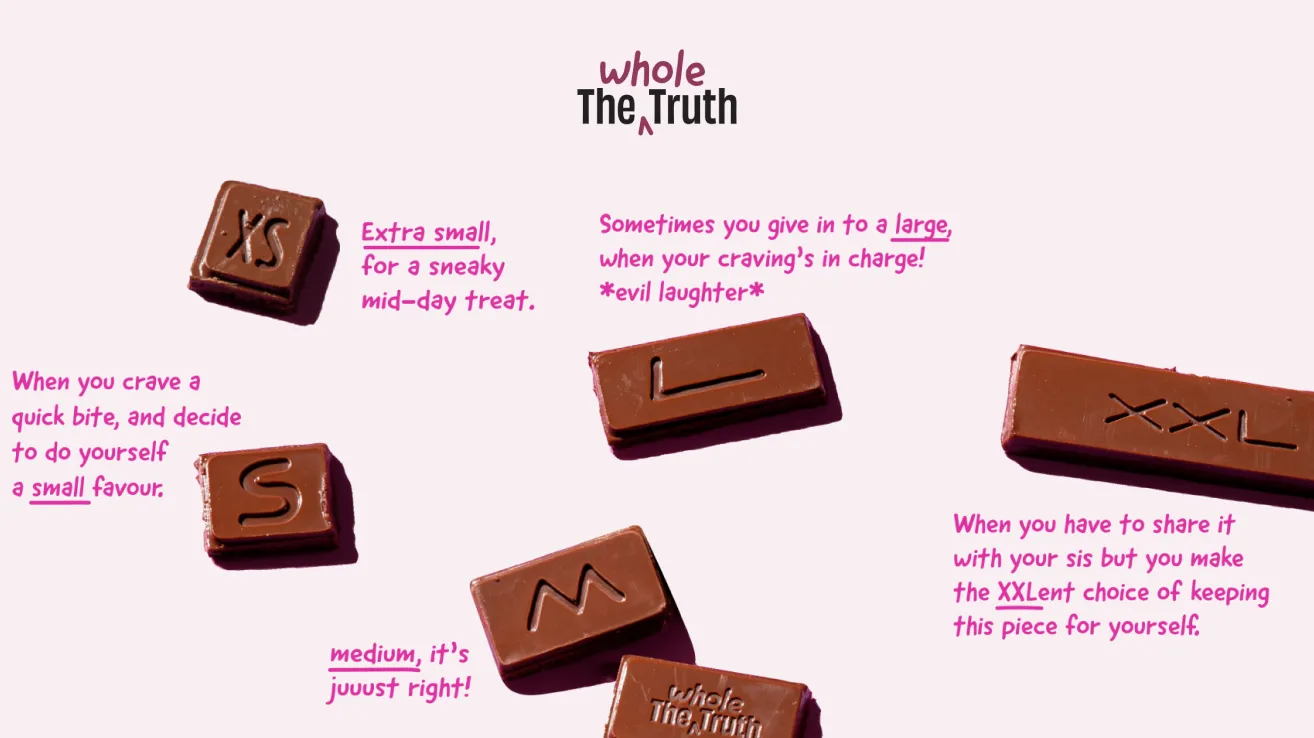
A particularly thoughtful product design detail is the chocolate bar format. Rather than standard segmented chocolate pieces, The Whole Truth's bars feature asymmetric pieces labelled S, M, L, and XL. Whether or not consumers actually share them, the design communicates playfulness, generosity, and intentionality. It is the kind of detail that demonstrates the brand thinks deeply about the full product experience, not just the packaging surface.
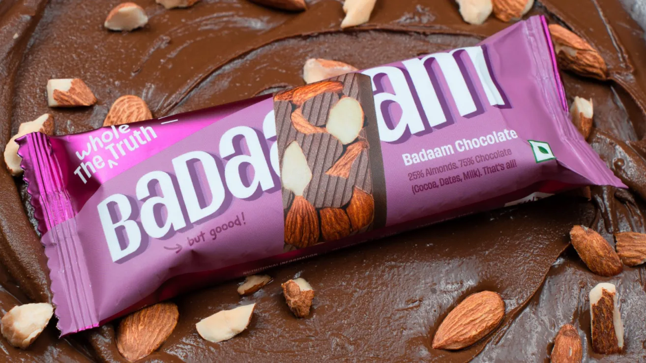
One of the hardest challenges in building a food brand is maintaining visual coherence as the product range expands. The Whole Truth has managed this better than almost any Indian D2C brand at its scale.
From protein bars to whey protein, muesli, spreads, dark chocolate, and gift boxes, the brand's clean base, consistent type treatment, and minimal palette create unity across every touchpoint. A consumer encountering a new SKU for the first time knows immediately that it is The Whole Truth. That instant recognition is a packaging system working exactly as it should.
This scalability is not accidental. It is the result of a clearly defined design system with rules that every new product must adhere to. For a brand that now spans dozens of SKUs across multiple categories, the consistency of the visual identity is one of its most commercially valuable assets.
The February 2026 launch of the kids' nutrition range, branded as The Whole Truth Next Gen, further stress-tests this design discipline: whether the same clean base and typographic restraint can translate into a format for children without resorting to the cartoon mascots and colour overload that define virtually every other kids' food brand in India.
The Whole Truth does not just sell products. It sells knowledge, and that distinction has built a depth of consumer trust that advertising cannot replicate.
The brand's content strategy spans podcast episodes on food myths, ingredient decoder series, honest comparisons with competitor products, and nutritional education that actively helps consumers make better choices regardless of which brand they ultimately buy. This is an extremely confident content approach. It trusts that a more informed consumer will choose The Whole Truth, because The Whole Truth has nothing to hide.
The brand voice is direct, intelligent, and never condescending. The copy does not try to sound smarter than the consumer. It respects them. This tone extends from the packaging to social media to email, creating a consistent brand personality that feels like a person rather than a corporation.
The cumulative effect of this content investment is what the brand's own philosophy describes: "When people believe in your truth, they don't just buy your products, they tell your story for you." The Whole Truth has built a community of believers, not just buyers, and that community is its most durable competitive advantage.
The Whole Truth is not cheap, and it is not trying to be.
At Rs 110 for a protein bar, Rs 500 for a peanut butter, and Rs 2,000 for a protein tub, the brand sits firmly in the premium segment. But its pricing strategy is not built around aspirational positioning or luxury signalling. It is built around trust as a value proposition. When a consumer pays a premium for The Whole Truth, they are not paying for a fancier product. They are paying for the certainty that the label is accurate, the ingredients are what they say they are, and the brand has not cut corners to reduce costs.
This framing of premium pricing as a form of consumer protection is one of the most intelligent brand positioning decisions in Indian food and beverage. It turns a potential objection into a reason to buy.
In February 2026, The Whole Truth entered children's nutrition under the Next Gen banner, with a range that includes milk mixes for children from age two upwards, snack bars in Mango, Almond Cocoa, and Mixed Berry flavours designed for school tiffins, and Protein Blocks for active children who need fuel around sports and physical activity. The range was developed over three years.
The strategic logic is self-evident because you see how children's nutrition in India is perhaps the single food category with the most broken consumer trust. Brands compete on cartoon mascots, height-and-strength claims, and fear-based marketing aimed at parents who are desperate to do the right thing but lack the information to evaluate what is actually in the product. The Whole Truth's entry into this category with its additive-free, no-refined-sugar, no-synthetic-vitamin standard, and its explicit commitment to communicating without guilt or mascots, applies the brand's founding philosophy to an audience that needs it more than any other to be honest.
This is also one of the most commercially significant expansions the brand has made as the parents who already trust The Whole Truth for their own nutrition are a pre-converted audience for a children's range. The trust the brand has built with adult consumers transfers directly into the most emotionally charged purchasing decision that consumer makes which is primarily around what to feed their child. If the product quality matches the promise, and the packaging applies the same design discipline as the adult range without diluting it into child-friendly clichés, the Next Gen range has the potential to open a category that no other Indian clean-label brand has credibly entered.
.png)
The Whole Truth's greatest strength is also its most significant vulnerability. Having built its entire brand equity on the promise of radical honesty, any perceived deviation from that standard will be scrutinised far more harshly than it would be for a conventional brand.
This risk has already materialised. The Advertising Standards Council of India required the brand to remove certain claims, including "cleanest, most easily digestible protein on earth", for being unsubstantiated. Separately, consumer conversations on Reddit have raised questions about specific ingredient claims. For most brands, these would be minor compliance issues. For The Whole Truth, they are existential reputational events because the entire brand promise is built on the idea that this brand, above all others, tells you the truth.
As the brand scales into Tier 2 cities and broadens its product range, maintaining ingredient purity at volume will become increasingly complex. The yardstick by which The Whole Truth is measured is categorically different from any other snacking brand. A slip that another brand would weather easily could cause disproportionate damage here.
.png)
The Whole Truth's simpler SKUs, particularly the protein bars and muesli boxes, demonstrate how powerful its design system can be when white space is given room to breathe. The more complex SKUs, particularly the whey protein range, reveal what happens when the transparency philosophy is applied without sufficient information hierarchy.
Paragraphs of explanation covering ingredients, sourcing philosophy, and nutritional context appear on both the front and back of the pack. The intention is admirable. The execution occasionally becomes communication overload, where every piece of information competes for attention and none of it lands with the clarity it deserves.
The solution is not to reduce information but to structure it more deliberately: a clear lead message, supporting detail in a secondary tier, and extended storytelling reserved for the brand's digital channels.
The Whole Truth built its brand primarily through its own website, which accounts for 80 to 85% of its sales. This D2C concentration has been a strength in the brand-building phase, allowing full control over the consumer experience and direct relationships with buyers. But as the brand expands into physical retail nationwide, it enters a fundamentally different environment.
In a physical retail shelf context, the brand cannot rely on its website's editorial storytelling, its email sequences, or its content ecosystem to do the work. The packaging must communicate the full brand promise in seconds, to a consumer who has never encountered The Whole Truth before and has no prior relationship with the brand's values. This is the design challenge the brand must solve as physical distribution accelerates.
.png)
At Confetti, we navigated a similar challenge when working with Pawsible Foods, a sustainable pet nutrition brand with a rich brand story that could not afford to be text-heavy on pack. We built a communication system that distributed storytelling across visuals and words, blending a bold purposeful tone with a clean, spacious layout so that every element worked together rather than competing. The same discipline applies to The Whole Truth's more complex SKUs. The goal is not less transparency. It is transparency delivered with better pacing, clearer hierarchy, and more intentional use of visual space.
As physical distribution expands, The Whole Truth needs a packaging framework that performs in an environment where it cannot rely on its digital ecosystem. This means tighter lead messaging, stronger visual cut-through at shelf level, and variant differentiation that works at the small sizes at which products are actually viewed in store. The core design system is already strong enough to support this. What is needed is a set of retail-specific executions that amplify its best qualities for the offline context.
The Whole Truth's next and most significant opportunity is to evolve beyond a product brand into a genuine wellness authority. The content infrastructure is already partially in place. The podcast episodes, the ingredient decoders, the nutritional education content: all of this is the foundation of something larger.
The brand has the credibility, the audience, and the philosophy to become the definitive voice on food honesty in India. A structured content platform, a community of deeply engaged advocates, and a certification or seal of approval that other brands could aspire to would collectively transform The Whole Truth from a brand people buy from into an institution people trust. That is the scale of cultural authority this brand is capable of building.
The Whole Truth is one of the most important brand stories in Indian food and beverage. It did not just build a clean-label snacking brand. It created a new standard against which every other food brand in India is now measured.
The packaging system is coherent and scalable. The brand voice is consistent and intelligent. The content strategy has built genuine believers rather than passive consumers. The financial metrics, Rs 219.83 crore in FY25 and a valuation of Rs 2,133 crore, validate what the brand instinctively understood from day one, that in a market built on confusion, radical honesty is not just a moral position. It is definitely a solid business strategy.
The February 2026 entry into children's nutrition with the Next Gen range is the most ambitious extension of that philosophy yet: a bet that the category most in need of radical honesty is also the one where The Whole Truth's design standards and brand values will resonate most powerfully with the parent making the purchase decision.
If you are building a snacking or FMCG brand and want to create the kind of bold design, sharp positioning, and brand architecture that turns a great product into a category-defining name, Confetti can help you build that.
Want strategic branding and packaging like this for your business?


Lorem ipsum dolor sit amet, consectetur adipiscing elit. Suspendisse varius enim in eros
Lorem ipsum dolor sit amet, consectetur adipiscing elit. Suspendisse varius enim in eros
Lorem ipsum dolor sit amet, consectetur adipiscing elit. Suspendisse varius enim in eros
.svg)
.svg)


.webp)
.webp)


.webp)
.webp)
.webp)
.webp)
.webp)


.svg)
.webp)
.svg)
.webp)


.webp)


.webp)


.svg)