%201.webp)
02
AI Snaps
.svg)
.svg)
01
Our Work

03
About Us
05
Contact Us
06
Client Success

07
Blogs
08
Careers
Book A Call


Need Help In Building Your Brand?
Click the button below & book a call with our founder directly.

Rishabh Jain
Managing Director
Packaging design trends are faster than ever with brands looking for creative ways to capture the attention of their target customers while staying true to their core values.
Our packaging design experts at Confetti have identified the breakthrough trends separating market leaders from forgotten products, with proven examples and actionable implementation tips.
Modern packaging design has moved way beyond visual appeal.
It now directly influences brand trust, customer engagement, sustainability goals, and purchase decisions.
As one of the leading packaging design agencies, these are some of the trends that we’ve been observing and implementing:
.webp)
Nostalgic packaging design is back. It blends retro design cues from past decades with modern layouts, printing methods, and materials.
However, nostalgia does not mean copying old designs. Brands reinterpret them with cleaner typography, refined color palettes, and contemporary finishes.
✅Nostalgia creates instant emotional connection and trust.
✅Younger consumers view vintage styles as authentic and visually distinctive.
✅Brands stand out in crowded shelves dominated by hyper-modern designs.
✅Supports storytelling around heritage, craftsmanship, and authenticity.
Key Design Elements:
Example: Coca-Cola’s “Share a Coke” Retro Edition
Coca-Cola brings back its classic 1960s glass bottle shape and vintage logo, featuring heritage red-and-white color blocking and retro script typography.
Modern twist: Personalized names, blending traditional and contemporary slang, connect multiple generations.
The textured label mimics vintage paper while staying fully recyclable and food-safe.
This packaging trend focuses on showing the product clearly and communicating information directly.
This includes physical transparency and verbal transparency in packaging design and through simple ingredient lists + straightforward claims.
✅Consumers demand authenticity and clarity about what they are buying.
✅Visible products increase confidence and reduce perceived risk.
✅Supports clean-label and wellness positioning.
✅Builds long-term trust rather than short-term marketing hype.
Key Design Features
Example: Whole Truth Branding & Packaging
Our audit of the brand breaks down how The Whole Truth positions itself as a radically transparent nutrition brand.
It challenges conventional packaged food marketing with a bold “nothing to hide” philosophy.
The design system centers on oversized, high-impact typography that lists ingredients prominently on the front of the pack. This transforms what’s typically hidden on the back into the primary visual element.
Smart packaging integrates digital touchpoints such as QR codes, NFC chips, or augmented reality markers into physical packaging.
These allow customers to access extended information, interactive experiences, and authentication tools using their smartphones.
✅Connects physical products with digital ecosystems.
✅Provides space for information that cannot fit on labels.
✅Supports traceability, storytelling, and product education.
✅Enables brands to collect first-party consumer data ethically.
Key Design Features:
Example: Diageo – Johnnie Walker Blue Label Smart Bottle
Johnnie Walker Blue Label features an NFC chip in the bottle closure.
A smartphone tap verifies authenticity, controls counterfeiting, and unlocks the whisky’s journey from distillery to shelf, including aging details and tasting notes.
Customers can also access cocktail recipes, mixology videos, and brand event registration.
This allows the physical label to remain minimal, and the rich content lives entirely in the connected experience.
This trend is not just about using recyclable plastic.
It reflects a shift toward environmentally responsible packaging systems and compliance with global sustainability regulations.
✅Strong influence on purchase decisions.
✅Aligns with ESG and sustainability commitments.
✅Reduces long-term packaging costs through material innovation.
✅Improves brand reputation and social responsibility perception.
Key Materials Used
Example: Phool’s Sustainable Incense Packaging Innovation
Our experts at Confetti, audited packaging of Phool, an Indian biomaterials‑led incense and wellness brand that transforms floral waste into premium incense products and packaging.
Phool’s packaging stands out because it blends sustainability with minimalist design, using eco‑friendly materials like recycled paper and reusable cork containers for incense sticks.
The packaging reflects the brand’s ethos: modern yet rooted in traditional Indian symbolism, such as floral patterns and cultural motifs, which resonate with spiritual wellness and mindful consumption.
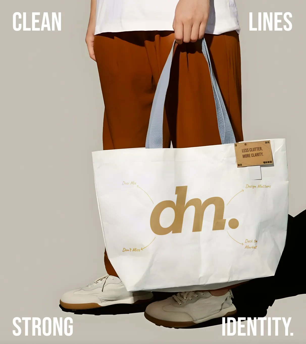
This packaging design trend is all about removing visual noise and keeping only essential information.
It emphasizes clarity, usability, and calm aesthetics inspired by functional design principles.
✅Cuts through visual clutter in retail environments.
✅Signals premium quality and brand confidence.
✅Improves readability and accessibility.
✅Supports sustainability by reducing ink and material usage.
Key Design Features:
Example: Aesop Skincare Amber Glass Bottles
The iconic amber glass bottles feature identical shapes across their entire product line.
Labels use simple black text on white backgrounds with product name and key ingredients.
No imagery, no gradients, no unnecessary design flourishes, just essential information.
The bottles themselves are designed for easy dispensing and refilling, extending product lifecycle.
Typography-driven branding and packaging puts letterforms at the center of the design.
Rather than photos or detailed illustrations, brands lean on bold fonts, custom typefaces, and handwritten styles.
Rough brush strokes, scribbles, and imperfect lettering give a handmade, human touch.
✅Creates instant brand recognition and emotional tone.
✅Handwritten and raw styles communicate authenticity in a world of AI-generated visuals.
✅Bold type cuts through shelf clutter and improves brand recall.
✅It supports accessibility by prioritising readability and clarity.
Key Design Elements:
Example: Oatly’s Playful Typography
Oatly made quirky, conversational copy the hero of its oat milk cartons.
Oversized sans-serif statements like “It’s like milk but made for humans” break traditional rules with sideways text, varying sizes, and awkward, handwritten-like spacing.
Ingredient lists and nutritional info use casual, handwritten-style fonts, as if jotted by a friendly person.
This typography-first approach set Oatly apart in the crowded alternative milk space, creating a cult following with an “ugly-beautiful,” authentic, anti-corporate vibe.
This trend takes inspiration from vintage pharmacies, herbal remedies, and botanical textbooks.
It combines detailed plant illustrations, structured label layouts, and classic serif typography.
It is mainly used to position products as carefully crafted remedies rather than mass-produced goods.
✅Botanical visuals signal natural ingredients and wellness.
✅Apothecary design cues communicate trust, science, and heritage.
✅It appeals strongly to skincare, food, beverage, and supplement brands.
✅Products feel display-worthy, not disposable.
Key Design Features:
Example: Grown Alchemist SkinCare
The brand uses apothecary-inspired minimalist bottles with botanical nomenclature.
Labels combine elegant serif type for product names with detailed scientific ingredient listings.
Products read, for example, “Hydra-Restore Cream: Camellia & Geranium Blossom,” with Latin names beneath.
Frosted glass bottles and black letterpress-style printing evoke vintage pharmacy stock.
This trend in packaging uses light-reactive finishes that shift colour depending on angle and lighting.
These finishes range from subtle pearlescent sheens to full-spectrum rainbow foils and chrome effects.
✅Highly photogenic and ideal for social media and unboxing content
✅Creates shelf impact through motion and light
✅Signals innovation, futurism, and premium value
✅Encourages limited-edition and collectible packaging strategies
Key Design Elements
Example: Fenty Beauty Galaxy Collection Packaging
Fenty Beauty’s Galaxy eyeshadow palette uses full holographic outer packaging with purple-to-blue color shifts.
The finish changes from violet to turquoise to silver depending on the light.
Chrome-finished internal mirrors enhance the luxurious unboxing experience, perfect for Instagram-worthy moments.
Product names are debossed and filled with iridescent foil, giving a luminous 3D effect.
Sensory packaging engages touch, sound, and sometimes smell.
It transforms packaging into a multi-sensory experience through textures, coatings, closures, and materials.
✅Multi-sensory experiences improve memory and emotional connection
✅Physical interaction increases perceived quality and purchase intent
✅Supports premium pricing through tangible craftsmanship
✅Creates distinctive unboxing rituals
Key Sensory Elements
Example: Jo Malone London Cologne Packaging
Their boxes use thick, textured cream cardstock with a subtle linen finish for a luxurious feel.
Each box is hand-tied with grosgrain ribbon, creating a tactile and auditory unboxing ritual.
Debossed labels add a tactile signature, while the magnetic closure gives a satisfying “snap.”
Scented tissue paper rustles distinctively, turning an ordinary purchase into a multi-sensory, shareable ritual.
This trend involves using bright, high-saturation colours and unexpected combinations to trigger joy and excitement.
It embraces maximalism instead of minimalism and is designed for instant mood elevation and visual energy.
✅Stands out strongly in retail and digital feeds
✅Appeals to Gen Z and younger consumers
✅Encourages social sharing and brand personality
✅Transforms functional products into lifestyle accessories
Key Design Elements
Example: Starface Hydro-Stars Acne Patches
Starface transformed acne patches into playful, fashion accessories.
Packaging features bold gradients, from hot pink to electric yellow to cyber blue, with star-shaped patches in rainbow colors.
Maximalist geometric shapes, overlapping patterns, and high-contrast color blocking fill the design.
This color-forward, mood-boosting approach helped Starface resonate strongly with Gen Z, making users happy before they even using the product.
Color becomes the primary way customers identify product variants instead of text or imagery.
Each SKU owns a distinct color, creating a simple and intuitive navigation system.
✅The human brain processes color far faster than words.
✅Repeat buyers shop by memory (“the blue one”) instead of reading labels.
✅Creates powerful shelf impact through a recognizable brand rainbow.
Key Design Elements
Example: Method Cleaning Products Color System
Method Cleaning Products use a smart color-coding system to stand out in stores.
All-purpose cleaners commonly come in pink bottles, like the popular pink grapefruit scent.
Bathroom cleaners frequently use blue, such as eucalyptus mint varieties. Wood-safe options appear in various colors, without a dedicated amber signature.
This visual consistency helps customers spot Method products quickly by color and shape alone.
In retail displays, the lineup forms an eye-catching block that boosts perceived premium value in the cleaning aisle
This trend implies packaging that looks handmade through imperfect textures, natural materials, and visible “human touch” details.
✅Signals authenticity and craftsmanship.
✅Justifies premium pricing.
✅Creates emotional trust in an age of automation and AI.
Key Design Elements
Example: Death Wish Coffee
Death Wish Coffee bags are matte black kraft with a hand-stamped metallic skull logo, each slightly different.
Red wax seals and hand-written roast dates reinforce the artisanal touch. Rough-cut edges and hand-numbered batches make each bag feel unique.
These cues highlight craftsmanship, creating a premium, collectible experience even at scale.
This uses unexpected shapes, collapsible designs, transformable formats, and space-efficient engineering to surprise and delight target customers.
The structure itself becomes the brand differentiator, making products impossible to ignore on shelf.
✅Solves real problems like storage and transport
✅Creates “wow” moments that drive word-of-mouth
✅Reduces shipping space and environmental impact
Key Innovations
Example: Heinz Ketchup Fry Box with Integrated Dipping Compartment
Heinz redesigned fast-food French fry boxes to include a built-in ketchup dipping well shaped like their iconic keystone logo.
The standard rectangular fry box gained a small compartment perfectly sized for a ketchup packet or pump dispense.
The keystone-shaped well is visually branded and functionally brilliant, no more balancing ketchup on napkins.
When empty, the box collapses flat for efficient disposal and recycling (90% smaller than traditional fry containers).
Hyper-local packaging celebrates specific geographic communities through regional imagery, local dialects, neighborhood references, and cultural authenticity.
This trend deeply embeds local visual language, historical references, and community pride.
✅Builds strong community pride
✅Creates insider recognition
✅Feels authentic to tourists and locals alike
Key Design Elements
Example: Parlor Coffee Roasters Brooklyn Neighborhood Series
It taps into Brooklyn's local vibe with artist-designed packaging for its blends, often featuring neighborhood-inspired motifs.
Williamsburg bags draw from street art and urban energy, evoking music spots and indie shops.
Bushwick editions nod to industrial roots with gritty warehouse vibes and community-focused bilingual touches.
Park Slope designs showcase cozy brownstones alongside literary nods to its bookish heritage.
It incorporates emojis, internet aesthetics, meme culture, and screen-based visual language into physical design.
This includes actual emoji usage, cursor icons, loading bars, notification bubbles, and visual elements borrowed from digital interfaces.
✅Speaks Gen Z’s native visual language
✅Crosses language barriers
✅Photographs well for social media
Key Design Elements
Example: Doritos Emoji Bags
Doritos released limited-edition bags covered in snack-relevant emojis (e.g., 🔥🌮 for spicy nacho), with zero traditional flavor text on front panels.
QR codes unlocked AR filters for Snapchat sharing, where users "ate" virtual chips, pure Gen Z engagement.
This drove 25M+ impressions as fans posted emoji-decoded flavor guesses online.
Full-wrap narrative packaging treats every surface as storytelling real estate, creating immersive experiences across all six sides.
The packaging unfolds like a story as consumers rotate it, revealing layers of brand narrative, product details, and visual rewards.
✅Encourages interaction and exploration.
✅Maximizes shelf visibility from every angle.
✅Enhances unboxing and video content.
Key Narrative Strategies
Example: Tony's Chocolonely Unequal Bar Wrapper Story
Tony’s Chocolonely turns its chocolate wrapper into a 360° storytelling tool.
The front shows its signature uneven chunk design symbolizing inequality in cocoa farming. The sides explain this concept and map their direct-trade supply chain.
The back shares their manifesto and sourcing principles, while the inside reveals cocoa regions in Ghana and Ivory Coast. Even the bottom lists partner cooperatives by name.
The result: packaging that doubles as advocacy, reinforcing their mission, justifying premium pricing, and building loyal, values-driven customers.
Artist collaborations partner established brands with visual artists, illustrators, designers, or cultural creators for limited-edition packaging.
These "handshake" partnerships merge brand equity with artist credibility, creating collectible packaging that transcends traditional marketing.
✅Creates collectibility and urgency.
✅Blends art with commerce
✅Builds cultural credibility
Key Collaboration Models
Example: Absolut Vodka Limited Edition Artist Series
Since 1985, Absolut has released 800+ artist-designed bottles, inviting creatives to reinterpret its iconic silhouette.
Collaborators have included Andy Warhol, Keith Haring, Damien Hirst, and most recently Beeple, who created NFT-connected bottles in 2024.
Artists retain creative control within the fixed bottle shape, turning each release into a collectible, some early editions now sell for thousands at auction.
If you’re considering a packaging refresh, here’s how to implement current packaging design trends in a way that feels authentic, commercially viable, and built for long-term brand growth.
Before exploring new packaging ideas, take a step back and assess your brand’s foundation:
What does your brand stand for, Who is your target audience, Where do you sit in the market, What emotional response should your packaging create, etc.
Once you have the clarity, choose the trend that enhances your identity. For example:
Also study your competitors. If your category is saturated with minimalism, standing out with botanical graphics, holographic accents, or structural innovation could give you shelf impact and social shareability.
Not every packaging trend requires a full structural overhaul. Some updates are cost-effective but high-impact such as typography refinements, color-as-SKU systems, label redesigns and limited-edition artist collaborations.
More complex innovations like smart packaging or structural surprises require greater investment.
When evaluating ROI, consider:
A smart strategy would be to Phase your rollout
Launch one trend-led SKU as a test before committing to a full brand redesign. Validate performance, then scale.
Translating trends into commercially viable packaging is where expertise matters.
At confetti.design, we don’t just apply trends, we interpret them through your brand lens.
There’s a difference between:
Great packaging design lives in those nuances.
When you brief our team, we start with strategy:
From there, we prototype and test. Whether you're exploring handwritten mark-making aesthetics or hyper local identity systems, we validate ideas before production.
Our process ensures your chosen trend resonates with real consumers, not just mood boards.

Talk to Confetti experts about packaging design trends worth adopting or avoiding.
Book a Strategy Call
Trends are powerful tools but only when aligned with your brand.
The goal is to unmistakably look at you, not blindly follow a trend. Be more relevant, more exciting, and more engaging than before.
At confetti.design, we transform emerging packaging design trends into strategic brand assets that drive visibility, engagement, and growth.
Here are our predictions and speculations for the next ten years in the world of packaging design:
Personalization will become the norm:
In the next decade, expect to see more brands using packaging design to create a personalized experience for their customers.
This could include incorporating custom messaging, images, or even personalized packaging designs for each customer..
Minimalism will continue to be popular:
Minimalism has been a popular trend in packaging design for several years now, and it shows no signs of slowing down.
Simple, elegant designs that convey the essence of the product without being too busy or cluttered will continue to be in demand.
Biometric packaging will emerge:
Biometric packaging could personalize the packaging experience using biometric data.
For example, a beverage bottle might feature a grip designed to match the size and shape of the consumer’s hand.
3D printing will revolutionize packaging design:
3D printing technology is rapidly advancing, and we can expect to see it used more extensively in packaging design.
3D printing could be used to create custom packaging designs, unique shapes, and even entirely new packaging materials.
Augmented reality (AR) will become more widespread:
Augmented reality (AR) will shape the future of packaging design by creating immersive, interactive experiences.
It will enable product demonstrations and virtual try-ons, helping brands engage consumers, build loyalty, and boost sales.
Smart packaging will become more prevalent:
Smart packaging uses sensors and advanced technology to give consumers real-time information about a product.
For example, a food package can monitor freshness and warn when the food is about to spoil.
Voice-activated packaging will be introduced:
As voice assistants become more prevalent in our homes, we can expect to see voice-activated packaging become a reality.
Consumers could use their voice to interact with the packaging, request information about the product, or even place an order.
What is the biggest packaging design trend in 2026?
Sustainable packaging using recyclable, biodegradable, and reduced-material designs is the biggest trend. Brands are prioritizing eco-friendly materials while keeping packaging visually simple and modern.
How do packaging design trends affect sales?
Trendy packaging improves shelf visibility and attracts attention, which can influence buying decisions. Strong packaging design also communicates brand value and builds customer trust.
Are minimalist or maximalist packaging designs more effective?
Both can be effective depending on the brand and target audience. Minimalist designs convey premium simplicity, while maximalist designs grab attention through bold colors and graphics.
How can small businesses afford trendy packaging?
Small businesses can use digital printing, simple label designs, and sustainable stock packaging to reduce costs. Working with templates or local designers can also help create trendy packaging without large budgets.
What makes packaging design Gen Z-friendly?
Gen Z-friendly packaging often uses bold colors, playful typography, digital culture elements like emojis, and sustainable materials. Interactive features such as QR codes or shareable designs also appeal to this audience.
Want strategic branding and packaging like this for your business?


.webp)
.webp)


.webp)
.webp)
.webp)
.webp)
.webp)


.svg)
.webp)
.svg)
.webp)