%201.webp)
02
AI Snaps
.svg)
.svg)
01
Our Work
03
About Us
04
Brand Audit
05
Contact Us
06
Client Success
12
07
Blogs
08
Careers
Book A Call
.svg)



.svg)
Need Help In Building Your Brand?
Click the button below & book a call with our founder directly.

Rishabh Jain
Managing Director
Logo design vs. branding is a decision that determines whether your business looks consistent or scattered across every place a customer meets it. A logo is one visual mark, branding is the full strategic system.
Learn with us the real differences and when exactly you need a logo versus full branding, along with an honest cost and timeline expectations.
A logo is a single graphic asset. It can be a wordmark, symbol, or combination of both, that identifies your business at a glance. It's the visual signature that appears on your packaging, website header, invoice, and social media profile.
It's a marker, when someone sees the Nike swoosh, they recognize the company.
Most logo designs fall into 4 practical categories. Just know which one fits your situation:
Wordmark: Your company name set in a distinctive typeface.
For example, Coca-Cola’s red and white colour scheme and unique script logo are also highly recognizable.
Clean, scalable, and easy to apply across packaging and digital touchpoints. Works best when your name is short and memorable.
Icon or Symbol: A standalone graphic mark with no text.
For instance, Apple's bitten fruit, Nike’s “swoosh” logo. These require heavy brand investment before they carry meaning on their own. Early-stage companies rarely earn this.
Combination Mark: Text plus icon, used together or separately.
For example, Burger King, Lacoste, and most D2C labels you see on shelves use this. It's the safest structure because it works even when your audience doesn't yet know your name.
Emblem: Text contained within a symbol, badges, crests, seals.
You can observe a few brands like Stella Artois, Harley-Davidson. Emblems feel heritage-driven and work well for FMCG brands leaning into craft or tradition. They're harder to reproduce at small sizes, so packaging hierarchy is important.
Branding is the system that gives your logo meaning. It's the strategic and creative framework that covers your positioning, your tone of voice, your values, your full visual identity, and how consistently all of it shows up across every place a customer meets you.
A logo identifies you, branding decides what that identification is worth. When a customer chooses your product over a competitor on the same shelf, branding does that.
Branding operates on 5 layers:
Brand Strategy: This defines your positioning, who you serve, what you promise, why you're different. It includes your value proposition, target audience, competitive frame, and brand architecture if you have multiple products or sub-brands.
Verbal Identity: This is how your brand speaks. Tone of voice, messaging hierarchy, taglines, naming conventions, the words you use and avoid. For example, a D2C skincare brand might sound clinical and precise.
An FMCG snack brand might sound irreverent. Both are valid and need to be consistent across your packaging, Instagram captions, and customer service emails.
Visual Identity System: This covers your color palette and the rationale behind it, typography hierarchy, photography and illustration style, iconography, packaging system, and digital UI components. A logo is one asset inside this system.
For instance, McDonald's golden arches work because they are inside a consistent visual world, red and yellow, bold sans-serif type, clean layouts, that has been reinforced for decades.
Brand Guidelines: This documents how the brand identity is applied: logo clear space, minimum sizes, color codes, type scales, do's and don'ts.
Brand guidelines prevent drift and without them, your packaging looks one way, your website another. The brand becomes a patchwork.
Customer Experience Consistency: This is the hardest layer to control and the most consequential layer.
Branding is defined by how you answer support tickets, how your packaging feels when unboxed, how your checkout flow works, and how you handle a refund. A beautifully designed brand that delivers a frustrating experience creates lack of harmony.
.webp)
This helps you understand which one you're actually briefing.
📌 A logo is a deliverable and branding is the reasoning that made it necessary. That’s why at Confetti when brands reach out to us, we ask valid questions to understand if your brand needs just a logo or complete branding at this phase.
A logo is a single asset. A symbol, a wordmark, or a combination of the two, delivered in the formats your printer, your packaging vendor, and your app developer will ask for.
It's the most visible piece of a brand.
Branding is the system around it:
For example, a D2C snack brand can commission a logo in two weeks. It still won't know whether it's competing on health, indulgence, or price until the branding work answers that first.
📌 A logo can be designed in isolation. Branding can't, because every part of it has to agree with the others.
A logo answers a narrow, tactical question:
❓Can someone recognise this brand in half a second, on a shelf or a compressed app tile
That's a recognition problem, and it's solved visually.
Branding answers a business question first:
❓Why should this brand exist, and why should this customer pick it over the next five options in the category
If you get that wrong, a good logo won't fix it. It would just be making the wrong direction easier to recognise.
For instance, two protein bar brands use identical ingredients. One is positioned as a high-performance snack for gym-goers., the other is positioned as a convenient breakfast for busy professionals.
Branding decides that split, and the logo then decides whether the performance brand reads bold and high-contrast or restrained and clinical.
Without branding first, a designer is choosing between those directions on instinct.
📌 Purpose is a business call. The logo is a downstream decision from it.
A standalone logo engagement usually runs 1–3 weeks: a few directions, revisions, and final files. The process is mostly quick, contained, and easy to brief.
Branding takes longer because it runs in two phases.
If you design a logo before your brand strategy is clear, you end up redoing it.
You create the logo first then you figure out your positioning (what your brand actually stands for, who it's for, how it's different).
That positioning often doesn't match the logo you already made. So you have to redesign the logo to fit it.
📌 Sequencing branding before the logo is what keeps a three-week logo phase from turning into three months of rework.
For a D2C or FMCG brand in India, a logo engagement usually lands between 250-2000 USD (₹25,000- and ₹1.5 lakh INR). The range depends on how many directions you explore and how many formats you need.
Branding runs higher, roughly 4000-15000 USD (₹4–11 lakh), because it covers strategy, identity, packaging across your SKU range, and guidelines.
Many founders or decision makers in the company consider the logo as a cheap entry point into branding. But you should understand that a logo built without strategy usually gets replaced once the positioning work happens. And that second logo costs more than doing the branding properly the first time.
📌 Ask any branding or logo design agency to split the quote. It tells you how much you're paying for direction versus a single asset.
Get in touch our team before you spend on the wrong one.
Book A Call
A logo is a design call, made inside a system that's already been approved. The design lead decides whether the mark works at shelf scale and thumbnail scale, and signs it off.
Branding is a leadership call. It's a business decision with design consequences, and it needs someone who understands the market.
Usually the founder in an early-stage brand, or a marketing lead once the team grows.
📌 When a design lead starts making branding calls without founder input, the brand's direction drifts one asset at a time.
A logo has a narrow failure mode. It stops working at small sizes, or it reads as dated next to newer competitors. The fix is contained: redrawing or simplifying the mark, keeping everything underneath it the same.
Branding fails differently. The positioning stops matching how the market actually buys, or the audience shifts in a way the original research didn't anticipate. The messaging hierarchy, packaging system, and guidelines all have to be rebuilt around it.
For example, a brand that repositioned from premium to accessible doesn't just need a softer logo. It needs new packaging language, new copy, and a new set of rules for how the brand shows up.
📌 A logo refresh is a project, a branding change is a complete reset.
A logo answers a recognition question: Can someone tell this is us?
Branding answers a preference question: Given five similar options, why us?
Both are important, but they fail in different places. A weak logo makes a strong brand hard to spot. Weak branding makes a strong logo meaningless, because there's nothing behind it for a customer to prefer.
📌 Recognition without a reason to choose is just familiarity. Familiarity alone doesn't win a repeat purchase.
A logo can't explain why the brand deserves attention, i. It can only signal that the brand exists.
Branding can't stay consistent without a mark to anchor it. You can have brilliant brand positioning written down, but if it never becomes an actual logo, colors, and visual style, customers can't see it. On a store shelf, they just see the packaging.
So if your competitor has a distinct, memorable look (even if their strategy is weaker than yours), they'll stand out more than you will, because a look is something people can actually notice, while thinking that's never made visual isn't.
📌 Each one covers the other's blind spot. Commissioning only one is choosing which gap to leave open.
A logo is judged on recognition at the sizes customers actually encounter it. If it doesn't hold up there, it doesn't work, regardless of how it looks in a presentation.
Branding is judged on slower, market-level signals. This can include uUnaided recall in surveys, h. How clearly customers can articulate what makes you different or w. Whether the brand looks consistent across a hundred touchpoints.
📌 Confetti tests identity assets at the scale customers actually see them, including thumbnail size on quick commerce platforms.
A logo fails visibly.
Branding fails quietly, which is why it's more expensive.
📌 A bad logo costs you a redesign. Bad branding costs you a rebrand.
A logo has a long shelf life, 5-7 years, sometimes longer, unless digital formats force a simplification earlier.
Branding needs revisiting more often, but not all at once. Positioning should be revisited every 2–3 years, or sooner if a new competitor redefines the category.
Identity gets refreshed every 12–18 months through smaller updates: a packaging refresh, a seasonal extension, a logo simplification for digital use.
📌 Most logo refreshes happen inside a branding system that's still working. They don't touch the strategy at all.
Treating a logo as the whole of branding leads to two costly mistakes. You either polish a mark while the rest of the business stays fragmented, or you buy a full brand system before your positioning is worth documenting.
Both burn budgets. One wastes money on decoration, the other spends on strategy that isn't ready to be written yet.
A D2C founder decides the brand “doesn't look professional enough.” They commission a cleaner logo. Three months later, the files arrive, the mark goes on packaging, the website, ad creatives.
🔴Then the disconnect shows up. The packaging copy sounds clinical, Instagram voice sounds playful, website reads like a different company entirely, customer service emails use a third tone. Nothing coheres.
This isIt's an absence of strategy. What a logo means is more important than what it looks like. Without a defined positioning, voice, and visual system behind it, the logo triggers nothing meaningful.
Mailchimp's 2018 rebrand shows what happens when you fix the system instead of just the mark. The company rebuilt the wordmark, typography, color palette, illustration framework, and photography direction into one coherent visual language .
The winking chimp was simplified for scale, the script wordmark became bold sans-serif, and the design framework was created to allow expression within consistency.
Early-stage D2C or FMCG founders often assume "doing branding" means commissioning a complete brand book, strategy, visual identity, guidelines, packaging, right at the start. This costs more and takes 3–6 months.
🔴At this stage, you don't have real answers yet. You don't know who your repeat customers are. Your positioning is a guess made in a meeting room.
That money would be better spent on product testing and customer acquisition activities that generate real data.
Visual identity should express a strategy. A "premium" brand looks different from a "friendly" one but only if you already know which one you are. Without that, the designer is just guessing or using personal taste. It might look nice. It probably won't be right.
📌 A logo problem shows up as "it doesn't look right." A branding problem shows up as "it doesn't convert," and no amount of redesigning the mark will fix it.
.webp)
Not every business is ready for full branding. And spending on it too early is just as wasteful as skipping it entirely.
Consider these signs to decide when you only need a logo:
✅You're pre-launch and still validating the idea
If you haven't sold to real customers yet, you don't have enough market feedback to build positioning around. A logo lets you launch and start learning; the fuller system can wait until you know what's working.
✅You're running a single product line
One SKU or one tight product range doesn't need a brand architecture yet. A brand system costs you more when you're managing multiple products, sub-brands, or a growing catalogue that needs consistent rules across all of it.
✅Your budget is genuinely under ₹50,000–₹1,00,000 for this phase
Full branding engagements usually start well above this. If that's your real ceiling right now, a logo done well and a one-page tone note will take you further than a half-funded attempt at a complete system.
✅Nobody internally or externally has flagged inconsistency yet
If your team, customers, and partners aren't confused about who you are or what you stand for, you don't have a branding problem to solve yet, you have a logo need.
✅You're testing a concept
A side project, a pilot SKU launched to check demand, or an idea you're validating before raising money or scaling doesn't need the investment of a full brand strategy. Save that spend for once the idea has proven itself.
The common thread across all five: you're still in a phase where the cost of being wrong is low, and speed is more important more than permanence.
📌 If your only touchpoint right now is a name and a product photo, you don't need a brand system yet. You need a logo to put on that photo.
.webp)
Here's what actually signals you need the full system:
✅You're expanding into new markets or geographies
A brand voice and visual identity that worked for one city or one customer segment, will not translate cleanly to a new region, language context, or buyer profile. Expansion without repositioning is how brands end up feeling right at home and generic at other places.
✅Customer perception is inconsistent or confused
If different customers describe your brand in contradictory ways, "premium" from one, "budget" from another, "not sure what they actually do" from a third, it's a positioning problem, and positioning is a branding exercise.
✅You're entering quick commerce or organised retail
This is the biggest branding trigger for D2C brands in India right now. On a Blinkit or Zepto shelf, your pack has under three seconds to communicate category, quality tier, and differentiation, with zero brand story to lean on.
A logo alone can't carry that weight. You need a packaging system, colour-coding logic for SKU variants, and shelf-level visual hierarchy, all branding decisions.
✅You're planning to raise funds
Investors read brand maturity as a proxy for business maturity, especially at Series A and beyond. A brand that looks internally consistent, has clear positioning, and can articulate its differentiation in one sentence signals a founder who's thought rigorously about the business.
✅You're merging multiple products or sub-brands under one identity.
If you've grown through line extensions, acquisitions, or simply launching new SKUs faster than your identity system can absorb them, you need brand architecture: rules for how a master brand and its sub-brands relate visually and verbally.
✅You've redesigned your logo before and nothing changed
If you've already been through one or two logo refreshes and your conversion, recall, or customer perception hasn't moved, the logo was never the problem. The strategy underneath it was.
If more than one of these applies, a new logo will not fix what's actually broken and you'll likely be back here again in twelve months, having spent money without solving the underlying problem.
📌 A logo redesign fixes how you look. Full branding fixes why customers pick you over the brand next to you on the shelf and only one of those actually moves revenue.
At Confetti, when a brand reaches out asking for "a logo," the first conversation is about where the business actually is:
❓pre-launch or scaling
❓single product or multiple
❓testing an idea
❓preparing to walk into quick commerce with a live SKU
We won't sell a full branding engagement to a founder who genuinely just needs a clean, well-executed mark right now. And we won't hand over a logo file to a brand that's about to launch on quick commerce with no packaging system, no shelf strategy, and no verbal identity to back it up.
We've seen what happens six months later when that gap surfaces as a rebrand request anyway.
We look at stage, product complexity, market entry plans, and existing brand perception before recommending a scope because scoping the wrong engagement wastes a client's budget and our team's time equally.
Here's exactly what that looks like once we've made that call:
If the diagnosis points to a logo-only scope, we deliver:
If the diagnosis points to full branding, we deliver:
Across brand strategy, brand identity, packaging, unboxing experience, and go-to-market execution, we've worked with everything from single-founder D2C brands validating their first SKU to established FMCG names like ITC, Dabur, and Forest Essentials navigating full repositioning.
We work with D2C and FMCG brands across India, the UAE, the UK, the US, and Australia, and the same principle holds regardless of market: packaging that has to win a three-second shelf decision in Mumbai faces the same fundamentals as one competing for attention in a Dubai hypermarket or a UK supermarket aisle.
The channel context shifts. What doesn't shift is the need to get strategy right before locking in the visual system.
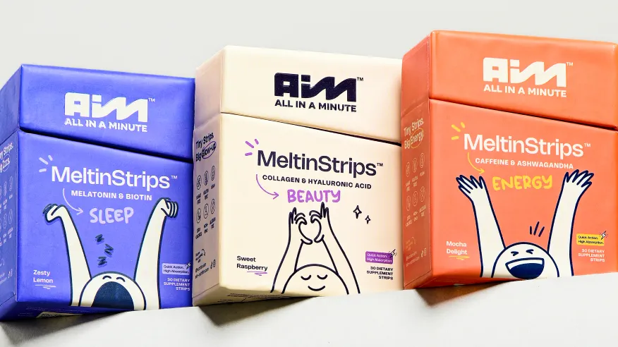
📌 For AIM, Confetti's process started with brand strategy. That strategic foundation drove every brand decision downstream: a verbal identity that feels friendly and energetic.
A logo designed for instant recognisability, and a colour-coded packaging system across AIM's Sleep, Beauty, and Energy variants. Each element ties back to the same core brand promise: "wellness in one minute."
Is a logo part of branding or separate from it?
A logo is one component within branding, branding is the full strategic system (positioning, voice, visual identity), and the logo is a single visual asset inside that system. A logo can exist without a defined brand strategy behind it, which is where inconsistency problems usually start.
Can I get a logo without full branding?
Yes, a standalone logo project makes sense for early-stage businesses testing an idea or validating a market before committing to a full identity system. It's a lighter, faster deliverable, but it won't solve consistency problems across packaging, messaging, or customer experience.
Do I need to rebrand if I redesign my logo?
Not necessarily. A logo refresh can modernize a mark without touching underlying strategy, provided the brand's positioning and messaging are already working. Rebranding is a bigger undertaking triggered by strategic shifts, new market, merger, or repositioning.
How much more does branding cost than just a logo?
Branding projects usually cost more than a standalone logo because they include strategy work, a full visual identity system, and guidelines. The right comparison isn't price, it's deliverables: what a logo-only budget buys versus what a branding budget buys.
What comes first, logo or brand strategy?
Brand strategy should come first when both are being built from scratch, the logo is a visual expression of decisions (positioning, personality, audience) that strategy defines. Skipping straight to logo design without that groundwork is the most common reason logos get redesigned repeatedly.
Is branding just visual identity, or does it include more?
Branding includes visual identity but extends to voice, messaging, positioning, and the consistency of customer experience across every touchpoint, website, packaging, ads, and support. Visual identity is the most visible layer, not the whole system.
When should a startup invest in full branding instead of just a logo?
Once a startup has validated its product-market fit and is scaling, entering new channels, raising funding, or expanding into retail/quick commerce, inconsistent or undifferentiated branding starts costing real conversions and recall, which is the point full branding investment pays off.
Want strategic branding and packaging like this for your business?





.webp)
.webp)


.webp)
.webp)
.webp)
.webp)
.webp)







.svg)
.webp)


