02
AI Snaps


01
Our Work
03
About Us
04
Brand Audit
05
Contact Us
06
Client Success
07
07
Blogs
08
Careers
Book A Call




Need Help In Building Your Brand?
Click the button below & book a call with our founder directly.

Rishabh Jain
Managing Director
In a crowded retail shelf or quick commerce grid, shoppers rely on familiar visual cues, not brand names, to make quick choices. Distinctive brand assets are the colours, shapes, characters, patterns and typography customers instantly associate with your brand.
This Confetti guide helps FMCG and D2C founders, brand managers and marketers identify, measure, build, extend and protect distinctive brand assets across packaging and SKUs.
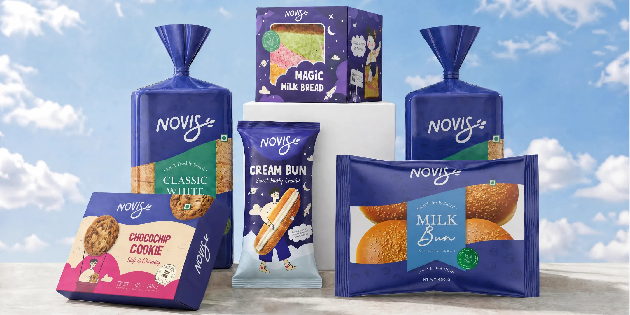
Distinctive brand assets are visual or verbal cues that help customers recognise a brand without needing to see its name or logo. They include colours, shapes, characters, packaging structures, typefaces, patterns and sounds.
The term is associated with the Ehrenberg-Bass Institute and Jenni Romaniuk's book, Building Distinctive Brand Assets. The central idea is: a brand asset becomes valuable when customers learn to associate it with one specific brand through consistent use over time.
For FMCG brands, this is important because shoppers often make decisions quickly. A recognisable colour, pack shape or illustration can help a product stand out and be identified on a crowded supermarket shelf or a small e-commerce thumbnail.
Both are important, but a familiar cue shared by several brands may create confusion.
Differentiation gives customers a reason to choose your product, such as better ingredients, product performance or a specific benefit.
Distinctiveness helps customers recognise and find your product among competing options.
A brand needs both. Strong product benefits mean little if shoppers cannot recognise the product, while familiar packaging cannot compensate for a product that fails to deliver value.
Every brand has elements such as a logo, colour palette, typography and packaging design. But they only become distinctive assets when customers consistently associate them with the brand.
A newly launched FMCG brand may have a complete visual identity, but it has not yet built meaningful recognition. That takes repeated exposure and consistent use.
Remove the logo and brand name from your packaging. Show customers the remaining colours, shapes, illustrations or other visual cues.
Can they identify your brand?
If not, you may have brand elements, but they have not yet become distinctive assets. Identify which cues customers already recognise, strengthen those that have potential and avoid discarding valuable recognition during a redesign.
Almost anything a customer can see, hear or touch can become an asset. In FMCG, the most common types include:
Some brands use a combination of elements rather than relying on one cue. Nivea's blue packaging, white lettering and familiar tin shape work together to create recognition.
Cadbury's purple has become strongly associated with its chocolate range, although its history also shows that consumer recognition and legal trademark protection are separate challenges.
Characters and shapes can be especially effective in crowded FMCG categories because they offer recognition beyond the brand name.
Confetti's work illustrates how these elements can become repeatable systems:
Choose the asset class that the category gives you room to own. A category saturated with colour will reward a shape.
A category full of photography will reward a character. A category with no sonic presence is an open field for a sound asset, if the brand has the budget to repeat it.

Distinctive brand assets can be impactful across every category, but they are especially important in FMCG, where purchases are frequent, decisions are quick and shoppers rarely spend much time evaluating every product.
Customers often rely on familiar visual cues to find and recognise brands.
1. Shoppers make decisions quickly
On a supermarket shelf, customers may have only a few seconds to choose between competing products. They are unlikely to read every claim or compare every ingredient.
Familiar colours, shapes, characters and packaging details help them identify brands faster.
Strong distinctive assets make products easier to find. Without them, brands may have to rely more heavily on promotions, discounts and repeated advertising to attract attention.
2. Packaging must work at thumbnail size
FMCG discovery increasingly happens on e-commerce and quick-commerce platforms such as Amazon, Blinkit, Zepto and Instamart. Here, packaging appears as a small product image rather than a full-size pack.
Fine typography, subtle illustrations and small details can disappear when an image is reduced. Bold shapes, recognisable colour fields and distinctive characters are more likely to remain visible.
3. Consistent assets improve advertising recall
When advertising and packaging use the same visual cues, customers can connect what they see in a campaign with the product they encounter later.
Using different colours, imagery and design styles across channels weakens that connection and makes recognition harder to build.
4. Recognition compounds as the brand grows
Every new SKU, retail outlet, marketplace listing and market creates another opportunity to reinforce brand recognition. Consistent assets help customers identify the same brand across different products and buying environments.
This is particularly valuable for global FMCG brands serving multilingual audiences. A distinctive shape, character or colour can travel across markets more easily than a message that needs translation.
Identify the one or two cues customers associate most strongly with your brand and use them consistently. You do not need a mascot or custom packaging shape to build distinctiveness. You need recognisable assets that work wherever customers encounter your products.

A brand team may recognise its logo, colours and packaging instantly, but that does not mean customers do. The Fame and Uniqueness Grid, helps measure which brand elements people actually associate with your business.
Show category buyers individual brand cues, such as a colour, pack shape, character, pattern or typeface, without the brand name. Ask which brand comes to mind.
Two measures determine the result:
Together, these measures place each asset into one of four groups.
The four quadrants and what to do:
The framework helps separate assets customers genuinely recognise from elements that simply appeal to the internal team.
A colour may be more strongly linked to your brand than the logo you spent months developing.
For established FMCG brands, conduct research with a representative sample of category buyers. Test your own assets alongside competitor cues, with brand names removed, and compare the results.
Growing brands can start with a smaller directional exercise using 30–50 category buyers. Show them five or six candidate assets and record their associations. This is useful for early insight, but it is not a substitute for representative research.
The grid measures recognition and association, not whether people like an asset. That distinction matters when planning a redesign.
Before replacing a colour, character or packaging shape, find out whether customers already associate it with your brand. Protect strong assets, invest in promising ones and reconsider those that contribute little to recognition.

New brands cannot rely on customer recognition they have not yet built. They need to choose distinctive cues, connect them to the brand strategy and use them consistently until customers learn to recognise them.
1. Start with brand positioning
Define what the brand stands for, who it serves and what makes it relevant. The visual and verbal assets should express that idea rather than follow design trends.
For AIM, Confetti began with brand immersion, positioning, user personas and a strategic framework before developing the identity and packaging. The audience's need for convenient wellness shaped the creative direction.
2. Find an opportunity in your category
Study competitors' packaging, colours, shapes, characters and typography. Identify the conventions that are already common and look for elements your brand can make its own.
The goal is not to look different for its own sake. It is to choose cues that stand out while remaining relevant to your brand positioning.
3. Choose a few repeatable cues
Start with one or two strong assets rather than introducing too many competing elements. Choose cues that are simple to reproduce across packaging, advertising, retail and digital platforms.
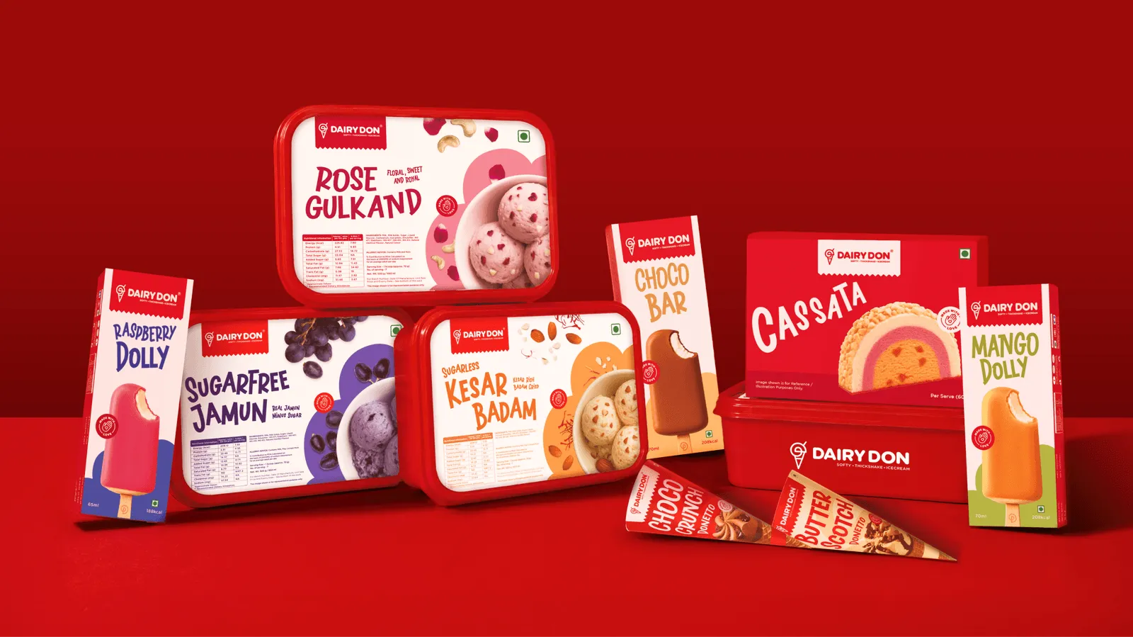
For Dairy Don, Confetti developed a continuous-line monogram that adapts into different product expressions, including a scoop, cone, sundae and shake. One recognisable device connects multiple product formats without creating a separate identity for each.
4. Test before scaling
Show candidate assets to category buyers without the brand name. Check whether they associate the cues with competitors or recognise something distinctive about your brand.
For a new brand, the initial goal is to identify ownable cues; fame develops through repeated exposure.
5. Repeat the assets consistently
Use the selected cues across every SKU, campaign, marketplace listing and customer touchpoint.
Develop guidelines that define their colours, proportions, placement and permitted variations.
Confetti's work for Novis uses illustrated flavour characters and a consistent packaging structure across 12 SKUs, allowing individual products to stand out while remaining part of one brand family.
6. Give recognition time to build
Distinctive assets develop through repeated use, not a single launch campaign. Changing colours, illustrations or packaging structures too frequently interrupts customer learning.
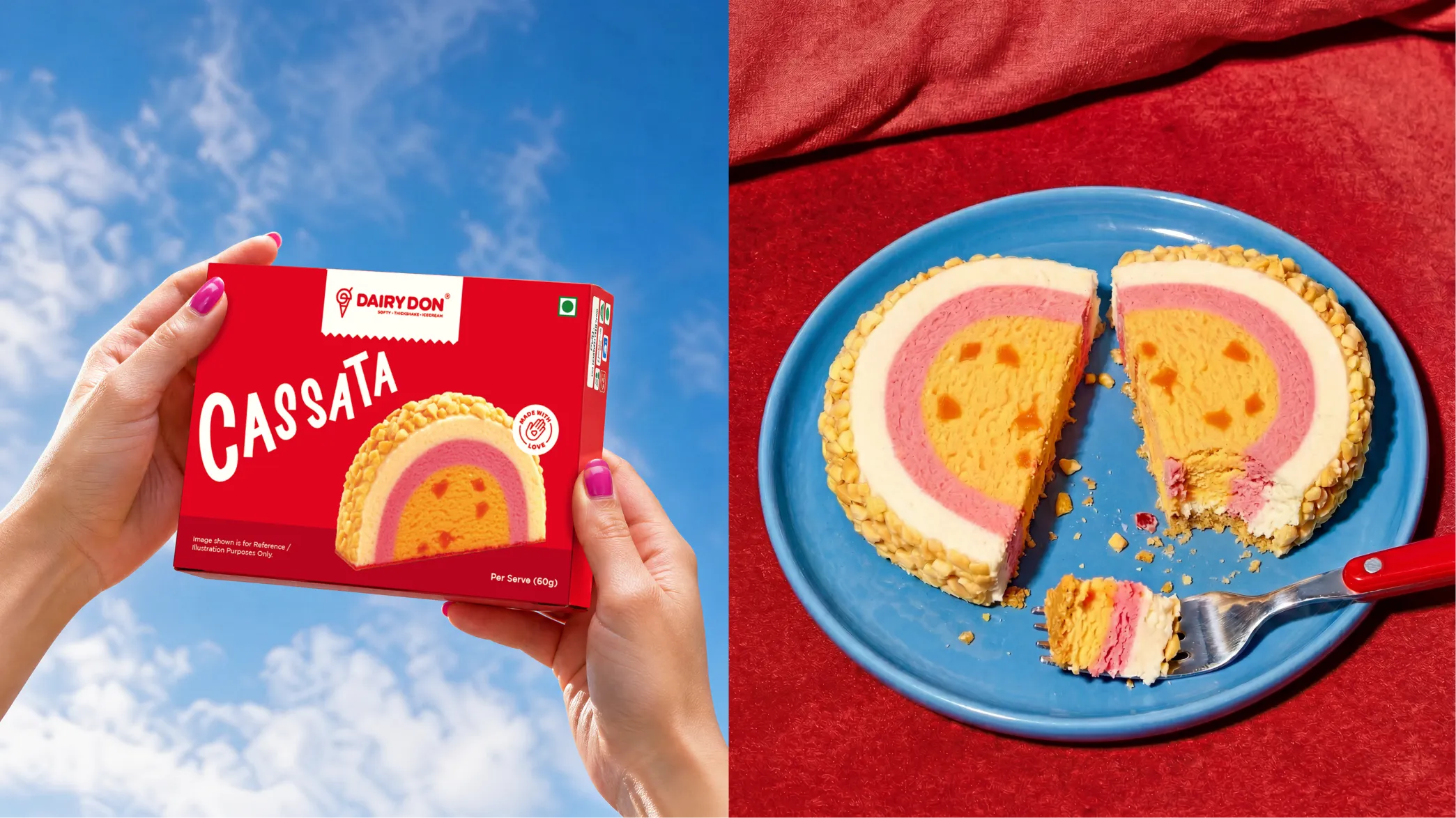
A single product can build recognition, but a consistent packaging system helps that recognition grow across an entire range.
The challenge is to make every SKU distinctive while ensuring customers recognise them as part of the same brand.
1. Separate fixed assets from flexible elements
Decide which elements must remain consistent across every SKU and which can change to distinguish variants.
Fixed elements may include the logo, primary graphic device, typography, layout and pack structure.
Flexible elements may include flavour colours, illustrations, product names and secondary graphics.
These rules prevent every new product from developing a separate visual identity.
2. Create a consistent packaging hierarchy
Keep important brand assets in predictable positions so customers can recognise the range quickly. Product names, variant information and supporting claims should follow a clear hierarchy rather than competing for attention.
For Novis, Confetti developed a packaging system across 12 SKUs, using a consistent layout with individual illustrated characters for each flavour. This allows variants to stand apart while maintaining a recognisable brand family.
3. Differentiate variants without fragmenting the range
A large catalogue makes this especially important. Dairy Don had more than 30 flavours, including several chocolate variants and multiple flavours within similar colour families.
Confetti created individual colour stories to distinguish products while keeping the wider range connected through one identity.
The same principle applies to multi-category brands. Confetti's packaging work across ITC Bingo, B Natural and Aashirvaad involved updating visual hierarchies, typography, illustrations and colour systems across different products.
4. Test assets across retail and digital channels
Check every pack in three contexts:
5. Protect the system through guidelines
Document logo placement, colour specifications, typography, illustration rules, pack hierarchy and examples of correct and incorrect applications. Include print requirements so suppliers can reproduce the assets consistently across materials and markets.
For FMCG brands, distinctive assets become valuable when customers encounter the same recognisable cues across every product and channel.
Build a packaging system that allows the range to grow without making the brand look different with every new SKU.

A redesign can improve your brand's appearance, but it can also destroy recognition if customers lose the visual cues they rely on.
Before changing packaging or identity, identify which assets are worth protecting and which need improvement.
A refresh usually carries less recognition risk than a full rebrand. The greater the change, the more carefully you need to test its effect on customer recall.
1. Audit existing assets before briefing designers
Use the Fame and Uniqueness Grid to identify which colours, shapes, characters, symbols and other cues customers actually associate with your brand. Record which assets must stay and which can change.
2. Classify assets as protect, evolve or retire
Protect high-fame, high-uniqueness assets. Give distinctive but less familiar cues more consistent exposure. Consider replacing elements that customers neither recognise nor associate uniquely with your brand.
3. Test before rollout
Place the new packaging beside competitors on a shelf and in an e-commerce thumbnail grid. Remove the logo and ask customers whether they can still identify the brand. A design that looks better in a presentation may perform poorly in real buying conditions.
4. Prepare customers and sales teams
Brief retailers, distributors and sales teams before new packaging arrives. Where useful, use a temporary “new look” message on shelves and digital listings to help existing customers recognise the updated product.
5. Protect the assets that remain
Document logo, colour, character, typography and packaging rules in brand guidelines. Register eligible trademarks and distinctive designs where appropriate, with advice from an intellectual property specialist.
Confetti is a strategy-led branding and packaging design studio with more than 200 projects delivered across FMCG, food and beverage, beauty, wellness and lifestyle brands.
Our approach focuses on building brand assets that remain recognisable as products and businesses grow.
For established brands, we begin by reviewing the strategy, identity, packaging and digital presence. Our brand audits help identify which elements customers already recognise, which lack consistency and what needs to change.
The aim is to protect existing brand equity rather than replace familiar assets unnecessarily.
A distinctive asset should work beyond one logo or hero pack. It needs to remain recognisable across products, formats, channels and future launches.
Our work demonstrates this in different ways:
For new brands, assets need to come from a clear brand positioning rather than visual preference. For AIM, for example, we developed the positioning, customer personas and strategic framework before creating the identity and packaging around the idea of wellness that fits into one minute at a time.
We carry distinctive assets through brand identity, packaging design, templates and guidelines so that new SKUs and marketing materials reinforce recognition rather than create a different look each time.
Our work has received recognition from the World Brand Design Society and has been featured by Packaging of the World and Dieline.
Not every brand needs new assets. Some need stronger repetition, better packaging hierarchy or clearer guidelines.
Through brand strategy, brand identity and packaging design, we help identify what should be protected, developed or changed before the next design goes into production.
What are distinctive brand assets?
Distinctive brand assets are non-name cues, such as colours, shapes, characters, logos, patterns and sounds, that customers link only to your brand. They help shoppers spot you quickly, especially on crowded shelves and small e-commerce thumbnails. An element becomes an asset only once enough category buyers recognise it and don't confuse it with a competitor.
What are examples of distinctive brand assets?
Well-known examples include Coca-Cola's contour bottle, McDonald's golden arches, Cadbury's purple, the Amul girl, Ben & Jerry's Vermont cows and hand-drawn lettering, and Vans' checkerboard. Each works because shoppers recognise it without reading the brand name, and because the brand has used it consistently for years.
How do you build distinctive brand assets?
Pick one or two cues that competitors in your category don't use, such as a colour, shape, character or pattern. Tie them to your brand idea, apply them consistently across every SKU, channel and ad, and keep them for years. Assets are learned through repetition, so changing them often resets recognition.
What is the difference between distinctiveness and differentiation?
Brand differentiation is about why customers should choose you: a better product, price or benefit. Distinctiveness is about whether they can recognise you quickly. FMCG brands need both, but packaging and advertising rely heavily on distinctiveness, because shoppers decide in seconds and rarely read claims before picking a product up. (~50 words)
Can you change packaging without losing brand assets?
Yes, if you audit first. Identify which cues customers actually recognise and keep them, then change the rest: hierarchy, structure, claims or SKU navigation. Problems start when a redesign removes the cues loyal buyers use to find the product, as Tropicana's 2009 carton change showed.
Are brand assets the same as brand codes?
Largely, yes. "Brand codes" is the term agencies and planners often use for the same idea: recurring cues, such as colour, shape, typography or sound, that signal a brand without its name. "Distinctive brand assets" is the research term used by Ehrenberg-Bass, which also defines how to measure them.
Want strategic branding and packaging like this for your business?