02
AI Snaps


01
Our Work
03
About Us
04
Brand Audit
05
Contact Us
06
Client Success
07
07
Blogs
08
Careers
Book A Call




Need Help In Building Your Brand?
Click the button below & book a call with our founder directly.

Rishabh Jain
Managing Director
You can have a logo, colour palette, website and packaging, yet your brand can still feel disconnected. When your products, sales decks and social media tell different stories, the problem is a lack of alignment.
This Confetti guide explores the 15 elements of branding across five layers: strategic, verbal, visual, physical and experiential. Discover how to make them work together, what to prioritise at each stage and how to audit your existing brand.
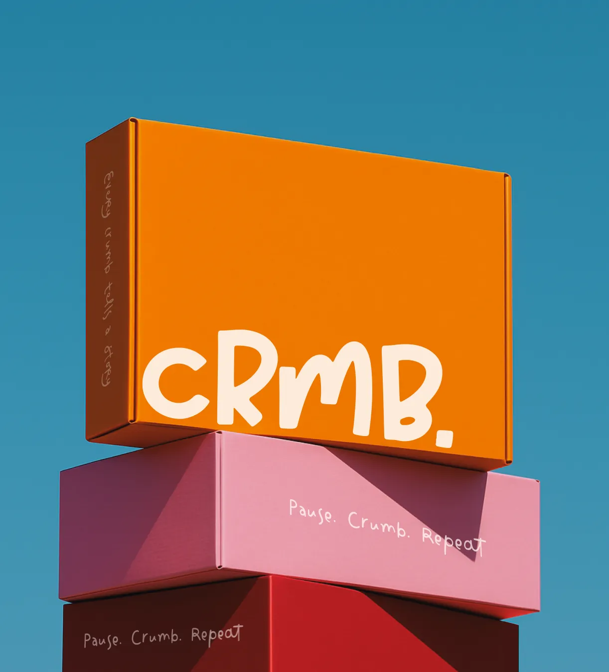
Brand elements are the tangible and intangible assets that identify a brand and carry its meaning into the market. They include the name, logo, colour palette, typography, tagline, voice, packaging, digital touchpoints, and the strategic choices underneath them like purpose, positioning, and personality.
Three terms are closely connected but mean different things:
Your brand strategy, including its purpose, positioning and personality, guides how these elements are developed and used.
In Strategic Brand Management, Kevin Lane Keller identifies six criteria for choosing effective brand elements:
The first three help build customer recognition and preference. The last three help the brand grow and protect its identity over time.
Individual brand elements work together to create a consistent brand experience. A logo that does not reflect the positioning, colours that change across product variants or a different tone of voice on packaging and the website can weaken recognition.
A brand element audit helps identify where the problem lies. Is the positioning unclear, is the visual identity inconsistent, or do existing assets lack clear guidelines?
The answer determines whether your business needs a strategic repositioning, identity redesign, packaging refresh or better brand guidelines.
👉Make sure every element has a clear purpose and works with the others to build recognition, trust and long-term brand value.
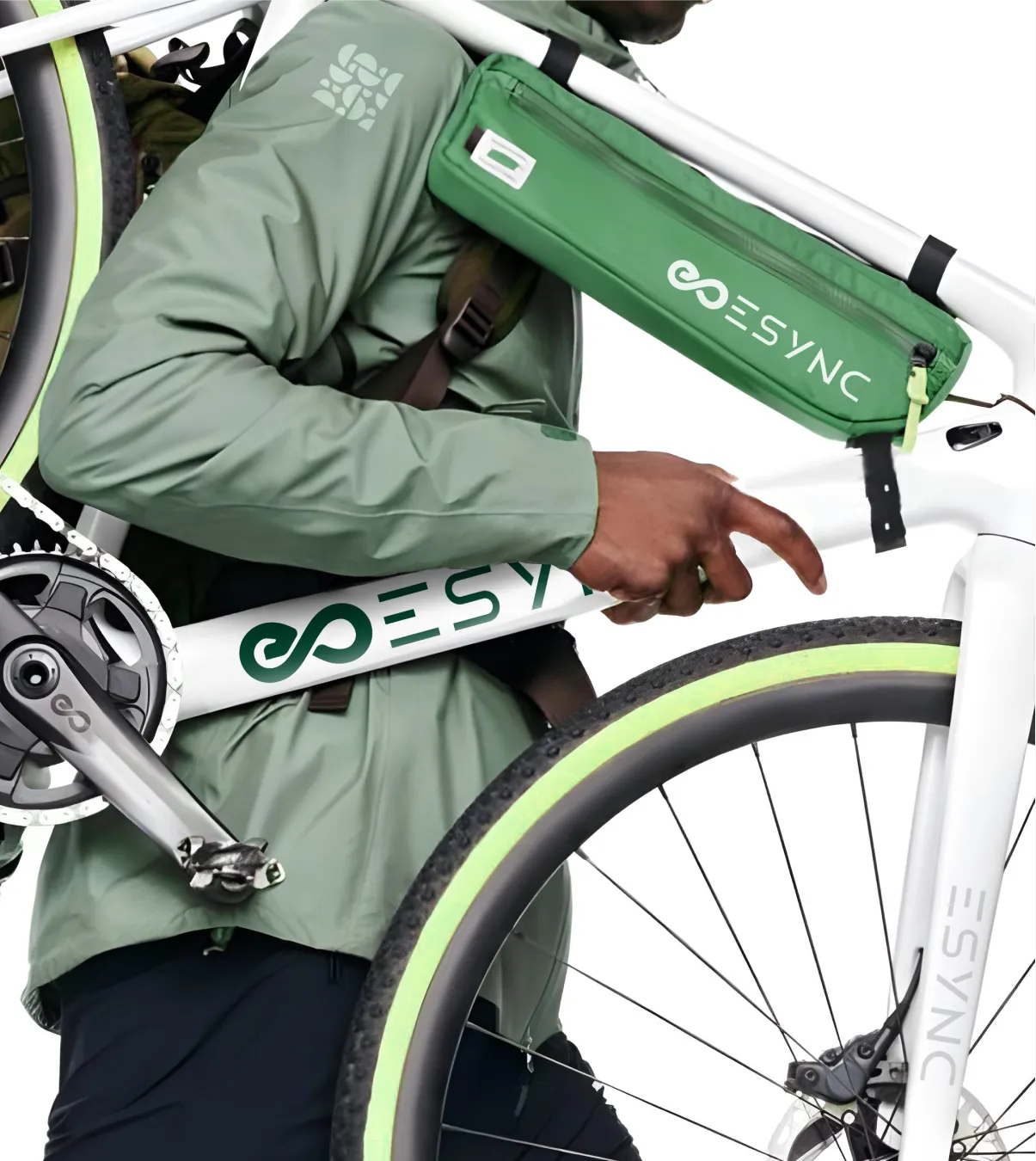
Brand elements work in layers, with each layer guiding the decisions that follow. Organising them this way helps you build a consistent identity and identify what needs fixing when the brand feels disconnected.
1. Strategic core: Purpose, values, positioning and personality.
Defines what the brand stands for, who it serves and why customers should choose it. Every other brand decision should reflect this foundation.
2. Verbal identity: Brand name, tagline, tone of voice and messaging.
Turns the strategy into language customers can recognise and remember. The name and communication style should express the brand's positioning and personality.
3. Visual identity: Logo, colour palette, typography, imagery, graphic devices and characters.
Makes the brand recognisable across products, marketing and communication channels. These elements need clear rules so the identity remains consistent as the business grows.
4. Physical and sensory identity: Packaging, unboxing and other physical brand cues.
Brings the brand into the customer's hands. For consumer businesses, packaging plays an important role in purchase decisions, product recognition and the experience after purchase.
5. Experience and brand system: Websites, digital touchpoints, customer experience, guidelines and brand governance.
Determines how customers experience the brand across channels and how internal teams, suppliers and agencies apply its identity consistently.
Here’s how these five players work together.
The layers should be built from the strategic core outward. They also help diagnose problems in reverse.
A weak product listing may point to poor packaging hierarchy, while inconsistent packaging across a range may reveal gaps in visual guidelines.
👉Before changing an individual brand element, identify the layer causing the problem. A new logo cannot fix weak positioning, and a new positioning cannot fix packaging that fails to communicate at shelf or thumbnail size.
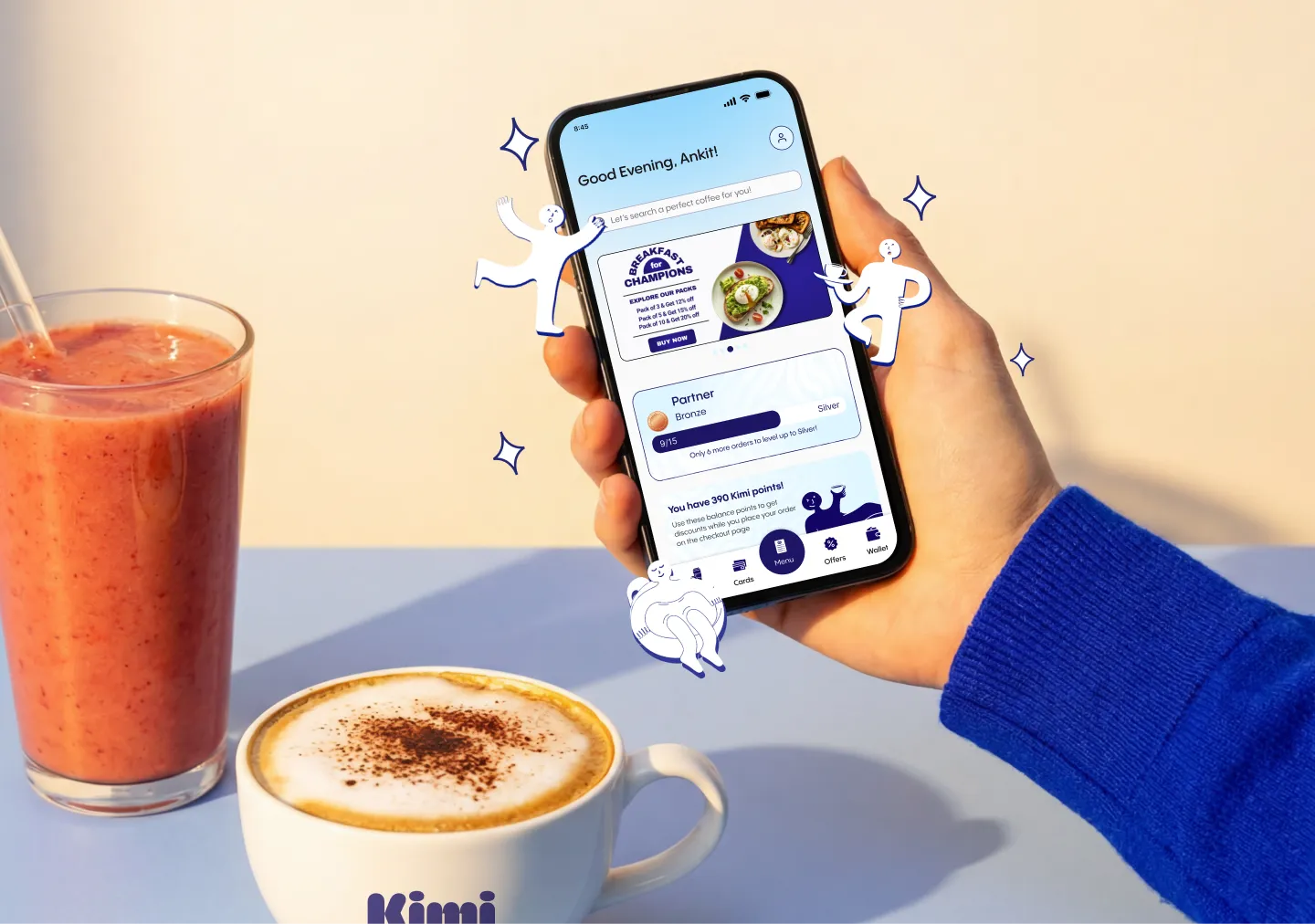
These form the foundation of your identity. Customers may not see them directly, but they influence how the brand communicates, looks and behaves across every touchpoint.
Purpose explains why the business exists beyond making money. Values define the principles that guide its decisions and behaviour.
They matter when they influence real business choices, not just statements on an About page. Patagonia, for example, reflects its environmental commitment through product repair programmes, material choices and marketing.
Check: can you point to a product, packaging or business decision that changed because of your brand values? If not, they may not be clearly guiding the brand.
Positioning defines the place you want your brand to occupy in the customer's mind compared with competitors. It clarifies your target audience, category and reason to choose you.
A strong position also sets boundaries and helps the business decide what to communicate, which customers to target and what not to offer.
Tesla positioned itself on technology and performance before sustainability became the category's default message.
For Desi Minimals, Confetti built the positioning around comfort and intentional living rather than trend-following. The idea, expressed through the line “Less noise. More you,” guided the identity, packaging and verbal style.
Brand personality describes the human traits associated with your business, such as playful, authoritative, warm or adventurous. Archetypes provide a framework for defining these traits and applying them consistently.
For Sugar Sweet Delight, Confetti used the Jester archetype to shape the tagline, verbal identity, bright colour palette and custom illustrations.
A defined personality helps designers, copywriters and marketing teams make consistent decisions without reinventing the brand for every campaign.

Verbal brand elements give your brand a recognisable way to speak. They include the name, tagline, voice, tone and messaging.
Develop these alongside the visual identity so the brand looks and sounds consistent across packaging, websites, advertising and customer communication.
A brand name is one of the most durable identity elements and can be difficult and expensive to change. It should be memorable, easy to pronounce in your target markets, legally protectable and flexible enough to support future growth.
For international brands, check how the name sounds and reads in different languages. English names may not translate or transliterate well into Arabic or other scripts.
For Kooji, Confetti renamed a heritage fragrance business from Kannauj to create a distinctive name that could appeal to a wider market and support its future growth.
A tagline is a compressed expression of the positioning. It should be short enough to remember, specific enough to mean something, and flexible enough to survive a few years of campaign work.
For Sugar Sweet Delight, the tagline “The Best Brings a Smile” reflects its playful personality and carries across packaging, menus, signage and advertising.
Unlike a brand name, a tagline can evolve as positioning and communication needs change.
Brand voice is the consistent personality expressed through language. Tone adapts that voice to different situations, while messaging defines the main ideas and proof points communicated across channels.
For House of Anasha, Confetti developed a conversational yet expert-driven voice that helped the natural skincare brand explain ingredients without sounding overly clinical.
Useful voice guidelines should include writing examples, preferred and avoided words, and guidance for product descriptions, campaigns, social media and customer support.
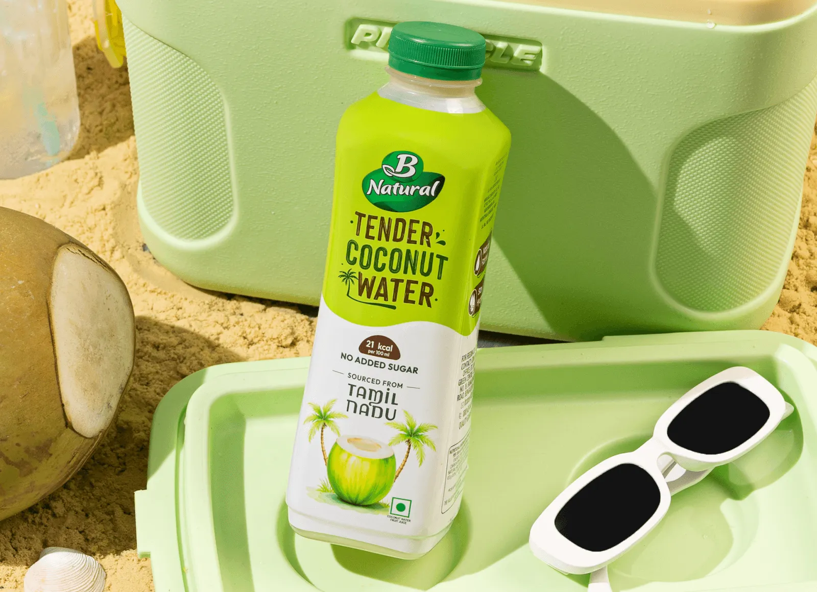
These are the elements most people mean when they talk about branding. They're also where inconsistency appears first, because they show on every surface.
The logo is the brand's visual signature. It may be a wordmark, symbol, lettermark or combination, but it must remain clear across different sizes and applications.
A complete logo system includes variations for different layouts, backgrounds and uses, with guidelines for spacing and minimum sizes.
For Kooji, Confetti developed a distinctive logo inspired by roads connected to the founders' lives, giving the identity a personal connection to the brand's story.
Colour helps customers recognise a brand quickly. A strong palette should stand out within its category while reflecting the brand's positioning. It should also include defined specifications for print and digital use.
For Miduty, a women's skincare and wellness brand, we used black, blue, aqua and white to signal trust and clarity in a category where buyers had been let down by product promises
Typography influences how a brand feels and how easily its communication can be read. A typography system typically defines headline and body fonts, sizes, weights and hierarchy across different applications.
For ITC Bingo Chatpat Kairi, Confetti combined Devanagari and English lettering inspired by hand-painted truck art to create a distinctive identity for the beverage extension.
Imagery includes product photography, lifestyle images, illustrations and art direction.
Define rules for lighting, composition, colour treatment and styling so campaigns and product images maintain a consistent look.
Secondary visual assets such as patterns, shapes, illustrations and mascots extend recognition beyond the logo.
Ben & Jerry's hand-drawn lettering and Vermont-inspired illustrations show how distinctive graphics can become lasting brand assets.
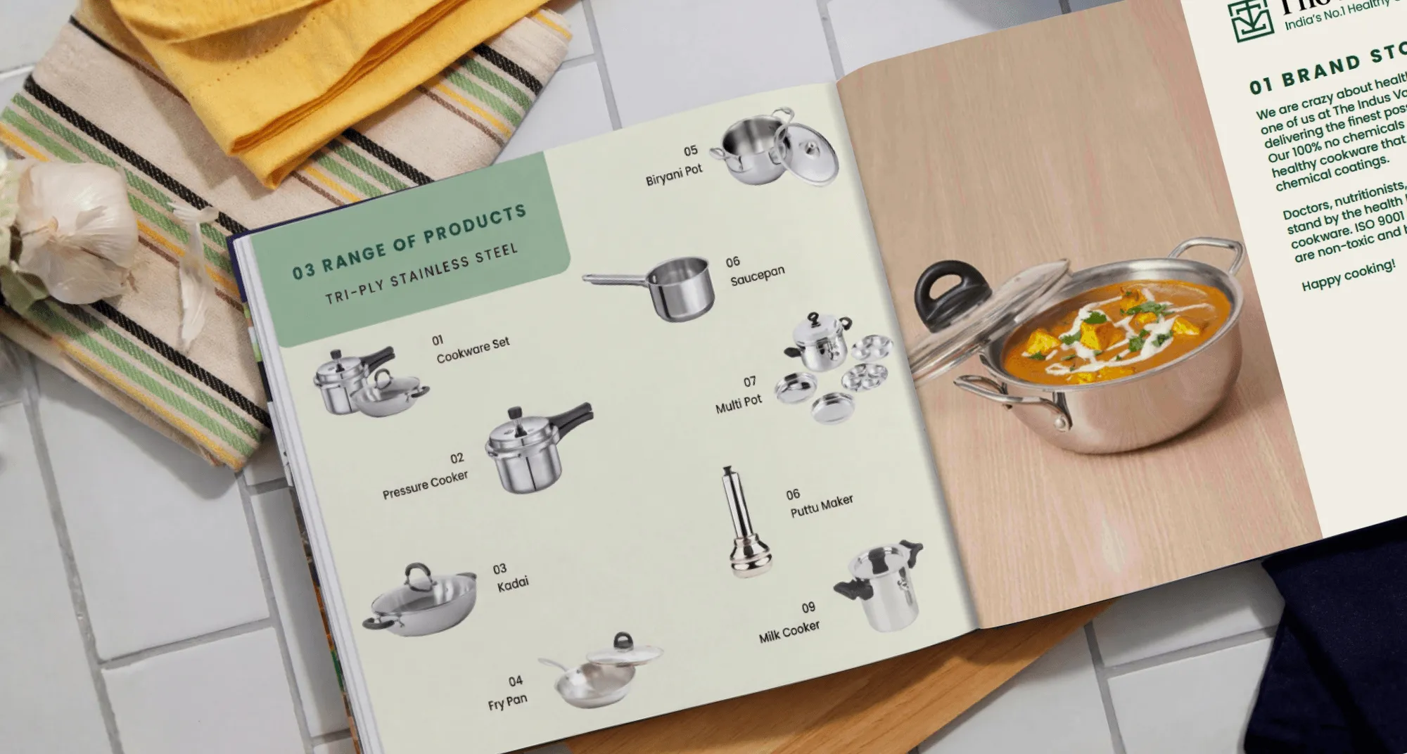
Physical and sensory elements bring the brand identity into the customer's hands.
For product businesses, packaging and unboxing are important opportunities to communicate quality, build recognition and create a memorable customer experience.
Packaging design is one of the most visible brand elements. It needs to identify the brand, communicate product benefits, organise mandatory information and make the product stand out at the point of purchase.
It must also work across different channels.
Retail shelves require clear hierarchy and variant recognition, while e-commerce and quick-commerce listings need strong visibility at thumbnail size. Materials, finishes and structural design must also support the product's price and practical requirements.
For The Indus Valley, Confetti improved the packaging hierarchy by prioritising the product, followed by the brand, key features and technical details. The new system also made it easier to maintain consistency across future products.
In our audit of The Ordinary, we looked at how the brand combined chemist-style naming and lab-reagent bottles into one packaging system that's recognisable from across a shop.
Both examples rely on the same principle: the packaging follows rules strict enough to be recognisable and flexible enough to absorb new products.
Unboxing extends the brand experience beyond the product itself. Packaging materials, textures, inserts, tissue, finishes and the order in which items are revealed all influence how customers perceive the purchase.
For D2C, luxury and gifting brands, this physical experience can strengthen customer satisfaction and encourage social sharing.
Sensory cues go further: a signature scent in a store, a particular texture on a pack, a sound in an app. They're harder to build and harder to protect, but they're difficult for competitors to copy once customers associate them with you.
At Confetti, we use a Packaging Resonance Score to evaluate clarity, emotional impact, finishing, and alignment for high-end D2C and luxury brands, treating the unboxing experience as a measurable brand element rather than an afterthought.

The final layer determines how customers experience your brand across channels and how consistently your team applies its identity as the business grows.
Your website, marketplace listings, social media, emails and customer service interactions are all brand touchpoints. Each should reinforce the same identity and brand promise.
For Loomsona, a premium bedding brand, our challenge was helping customers understand the quality of the fabric without being able to touch it. The website used large contextual images, close-up photography and educational content to communicate product quality and build confidence.
Website design and development for such projects is extended through Suplex, Confetti's sister studio, which builds digital experiences using the same brand guidelines as the wider identity and packaging.
Brand guidelines define how every brand element should be used. They cover logo placement, colour specifications, typography, imagery, tone of voice, packaging templates and digital applications.
Without clear guidelines, different designers, agencies, printers and internal teams make their own interpretations. Over time, this weakens consistency and recognition.
Good guidelines should help people make everyday decisions, such as designing a new SKU, briefing a photographer or creating a product page.
Kooji's packaging system is an example of this approach. One consistent template works across three product lines and 24 SKUs, while allowing the brand to extend into new categories without starting its brand identity again.
Make consistency repeatable. Digital touchpoints bring the brand to life, while guidelines ensure every team and supplier can deliver the same brand experience as the business expands.

Building all 15 brand elements at once is not usually necessary. The right priorities depend on your business stage, growth plans and the problems you need to solve.
Start with the strategic core: purpose, positioning, target audience and personality. Then develop the brand name, logo, colour palette, typography and, for product businesses, packaging.
Create basic brand guidelines so your team and suppliers can apply the identity consistently. More advanced elements, such as custom illustrations, characters and detailed packaging architecture, can follow as the business grows.
Prioritise the elements that help the brand work across different buying environments. These include packaging architecture, SKU differentiation, product photography, digital assets and complete brand guidelines.
A visual identity that works on social media may not work on a retail shelf or marketplace thumbnail. Build a system that adapts to each channel without losing recognition.
Focus on protecting the brand elements customers already recognise. Jenni Romaniuk's Building Distinctive Brand Assets offers a useful framework for evaluating them through two measures:
Elements that score highly on both are valuable recognition assets and should be used consistently. Elements with potential but low recognition need more exposure, while those that are neither distinctive nor recognised may need reconsideration.
This approach helps prevent redesigns from removing familiar colours, symbols or packaging cues simply because the internal team wants something new.
Start with brand architecture. Decide whether the new product should sit under the existing master brand, use a sub-brand or have a separate brand identity.
Then determine which existing elements can transfer and which need to adapt to the new category.
📌Fix the lowest broken layer first. Weak positioning needs strategic work before visual design. Inconsistent packaging needs a stronger system, not necessarily a new logo. And a brand expanding across markets needs guidelines before adding more channels.
Build the elements your business needs now, while making sure they can support where the brand is going next.
Before investing in new elements, check how the existing ones perform. Answer each question honestly with a yes or no.
▶️A score of 12 or more means the foundations are in place, and the work is protecting your strongest elements and scaling the system.
▶️Between 6 and 11, the brand usually needs a refresh of its weakest layer, often the visual system or packaging architecture.
▶️Below 6, it's worth going back to the strategic core before changing anything visible, because new visual elements on an unclear strategy will drift the same way the old ones did.

We are a strategy-led branding and packaging design studio working with FMCG, F&B, beauty, wellness, fashion, and D2C brands.
Our services cover brand strategy and identity, packaging design for shelf and e-commerce, brand audits, and website design for consumer brands.
With over 200+ projects and works across markets including India, the UAE, the UK, the USA, and Australia, here’s the sequence Confetti works to:
What are the essential elements of good branding?
Good branding starts with a clear strategic core: purpose, positioning and personality. That core is expressed through verbal elements (name, tagline, voice), visual elements (logo, colour, typography, imagery) and physical touchpoints like packaging. What makes it work is consistency: every element follows the same strategy, documented in brand guidelines.
What is the difference between brand elements and brand identity?
Brand elements are the individual building blocks, such as a logo, colour or tagline. Brand identity is the complete, coordinated system those elements form, along with the rules for using them. You can have elements without an identity, scattered assets that don't connect, but a strong identity always depends on well-chosen elements. (~55 words)
What are the 7 key elements of brand strategy?
Frameworks vary, but most brand strategies cover seven areas: purpose, target audience, competitive positioning, value proposition, brand personality, messaging and the brand promise. Together they define what the brand stands for and who it serves. Every visual and verbal element should be traceable back to these strategic decisions.
Which brand elements should a startup create first?
Start with the strategic core: positioning, audience and personality. Then build a name, logo, colour palette and typography, and, for product brands, launch packaging. A short brand guideline keeps these consistent as you grow. Imagery systems, characters and full packaging architecture can follow once the brand has traction.
How many elements should a brand have?
There's no fixed number. Most established brands manage 10–15 core elements across strategic, verbal, visual, physical and experiential layers. What matters more is that a few of them become truly distinctive (a colour, a shape, a character) and are used consistently enough that customers recognise the brand without seeing the name.
Is packaging a brand element?
Yes. For product brands, packaging is often the most important brand element, because it's where customers first see, touch and choose the brand. It brings together the logo, colour, typography, imagery and messaging in one physical format, and it must also work on shelves, in e-commerce thumbnails and during unboxing.
Want strategic branding and packaging like this for your business?