%201.webp)
02
AI Snaps
.svg)
.svg)
01
Our Work
03
About Us
04
Brand Audit
05
Contact Us
06
Client Success
12
07
Blogs
08
Careers
Book A Call
.svg)



.svg)
Need Help In Building Your Brand?
Click the button below & book a call with our founder directly.

Rishabh Jain
Managing Director
A limited edition packaging design borrows relevance from scarcity itself: a collaboration, a milestone, a drop that exists because the brand chose to make it rare.
This guide covers special edition and limited edition packaging design in its entirety. We discuss its types, key principles involved and strong examples and what works for them.
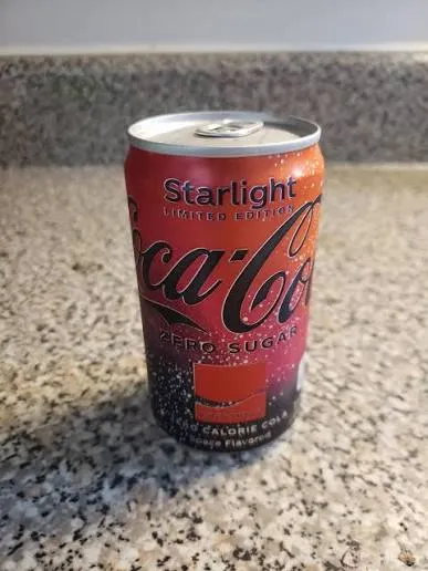
A packaging edition becomes "limited" when the brand intentionally restricts availability: by quantity, by time, or by channel. This restriction is not an operational constraint. It is a strategic signal to the consumer.
✅Quantity limitation means a fixed number of units is produced. The finite run communicates that the brand invested in something special for a select audience.
✅Time limitation means the edition is available only for a defined window. Seasonal drops, festival editions, and campaign-linked releases all use time as the limiting factor. The window creates urgency, buy now or miss out.
✅Channel limitation means the edition is available only through specific retailers, platforms, or regions. This creates exclusivity and drives footfall to strategic partners.
While the product itself remains unchanged, the package undergoes structural or visual design modifications. Rather than serving as a routine packaging update, it is an intentional use of scarcity to enhance exclusivity and consumer appeal.
That scarcity is the entire point. It's what separates a limited edition from a permanent line extension and from seasonal packaging design that predictably returns every year.
Three triggers cover most limited edition projects worth planning around:
Each of these operates on a different kind of urgency.
There's a fourth category worth naming separately, even though it's less common: the hybrid edition, one that combines two triggers at once, a milestone collaboration, for instance, where an anniversary is marked through a partnership rather than a solo release.
Hybrids can work well precisely because they stack two sources of relevance, but they also carry double the coordination risk, since both the partner relationship and the internal milestone timeline need to align.
Limited edition packaging is a commercial lever with measurable returns across multiple dimensions.
⚡Sales acceleration
Scarcity drives urgency. A product that is time-limited or quantity-limited becomes more desirable. Limited editions consistently generate strong engagement because they tap into seasonal moments and offer shoppers something timely and design-led.
Who Gives A Crap's Sweet Edition became the brand's best-performing Aldi Special Buy to date in terms of sell-through speed. Nutella sold 7 million jars in 30 days through its "Nutella Unica" campaign without changing the product formulation, just the packaging
⚡Customer acquisition and loyalty
Limited editions recruit new shoppers who might never otherwise try the brand. Once shoppers trial a limited edition, many become repeat buyers of the core range.
Well-designed limited editions encourage collectible behaviour, repeat purchase, and stronger brand affiliation.
⚡Brand equity building and long-term value
When limited editions work, they build mental availability, emotional relevance, and even brand pride. They can signal heritage, shift perception, or tease a repositioning.
In the luxury market, limited bottles can reach secondary resale markets, reinforcing brand equity and justifying higher margins.
⚡Content and social currency
Packaging now has to travel across Instagram, TikTok, livestreams, and collector forums.
Owning a "limited drop" is clout. Consumers don't just eat the product, they post it, unbox it, and tag the brand.
The packaging design becomes part of the content loop.
⚡Cost-effective differentiation
Production costs for limited editions can be kept relatively low while the potential for discoverability is high, people sharing their collectible in social posts, bypassing much of the hard work and considerable dollars required to market to a large audience.
Short-run designs tied to seasons, events, or cultural moments stimulate sales without changing the core product formulation.
The most successful limited edition packs are designed around a clear business objective, whether that is attracting new customers, celebrating a milestone, strengthening brand affinity, or creating urgency through scarcity.
Here are the three most effective limited edition packaging approaches for FMCG brands:
Collaboration editions unite two brands, artists, designers, influencers, or licensed properties to create packaging that combines the strengths of both partners.
When done well, they introduce your brands to new audiences, generate media attention, and create products consumers want to buy and share.
Successful collaborations happen when both collaborators provide meaningful contributions through creative direction, storytelling, or cultural relevance.
For food and beverage brands, the collaboration should enhance appetite appeal and clearly communicate the product category. Strong visual design should attract attention without creating confusion.
Operational planning is equally important. Before design begins, both partners should clearly define ownership of the artwork, licensing rights, marketing usage, production responsibilities, and future reuse of creative assets.
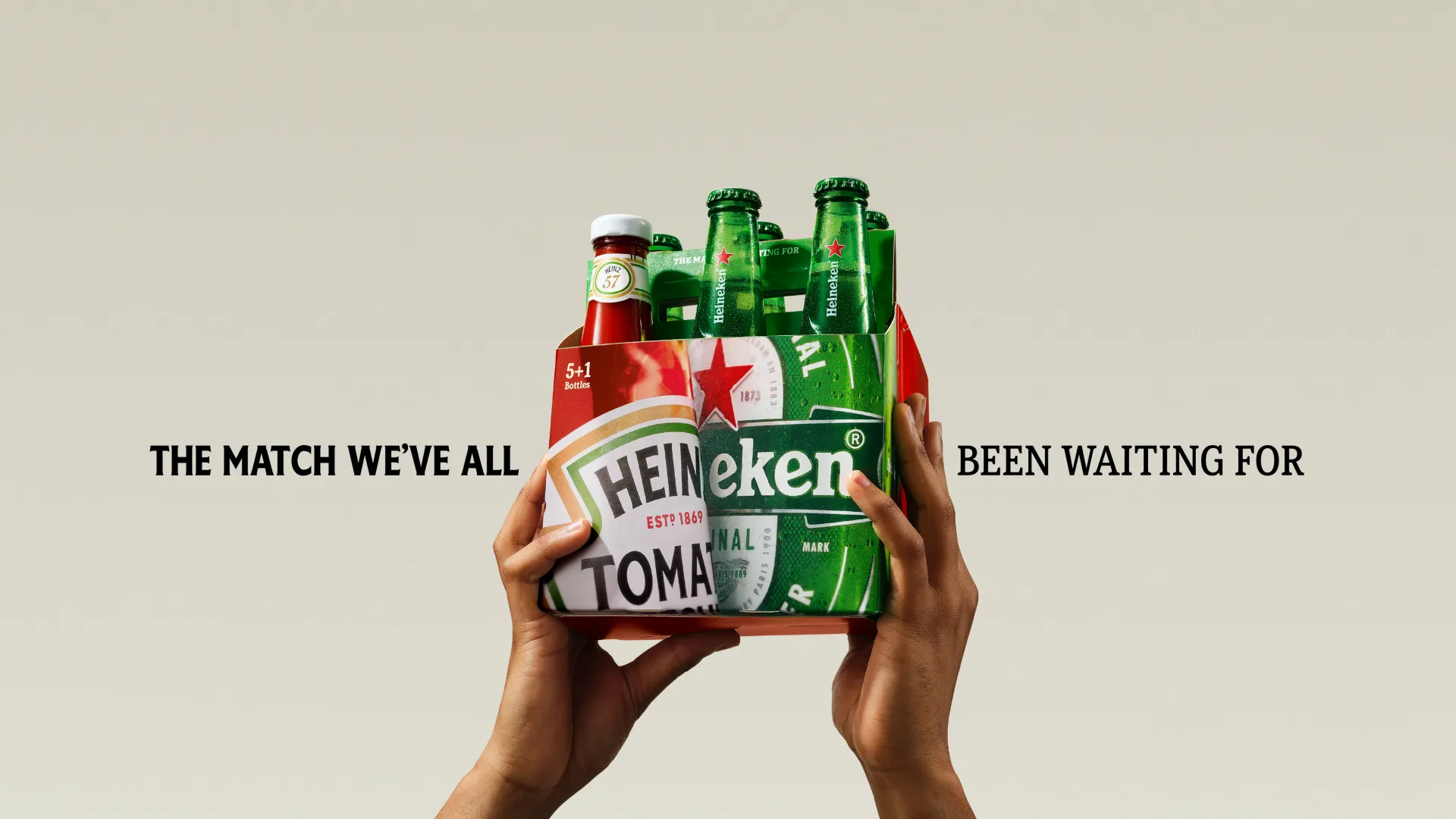
Examples: HEINZ × Heineken, where the packaging itself became the creative idea, and Oreo × Pokémon, which turned collectible embossed cookies and themed packaging into a global consumer hunt.
Milestone editions celebrate significant moments in a brand's journey, such as anniversaries, production milestones, market expansions, or founder stories. Unlike collaborations, these editions already have a built-in narrative, making them easier to communicate authentically.
Use your anniversary editions as an opportunity to tell a story about the brand's evolution, values, or relationship with its customers.
Many brands revisit early packaging designs, original logos, historic advertising, or founder stories to create an emotional connection between the past and the present. This approach strengthens authenticity while reinforcing the heritage that consumers already trust.
For founder-led and direct-to-consumer brands, milestone editions can also highlight pivotal moments, such as the first product, first customer, or the inspiration behind the brand.
Examples: For Bergenbier's 30th Anniversary packaging, every can featured a different design inspired by shared memories.
Drop-based editions use real scarcity to drive demand. Products are released in limited quantities with no guarantee of a restock, creating urgency and encouraging quick purchases and social sharing.
The strategy only works if the scarcity is genuine. If you reissue or extend "limited" editions, it weakens consumer trust and reduces the impact of future drops.
Success also depends on tight coordination across marketing, production, inventory, and distribution so products are available when demand peaks.
For brands with strong operations and loyal communities, drop-based editions build excitement, strengthen loyalty, and create a sense of exclusivity.
Beverage, sneaker, lifestyle, and FMCG brands are increasingly using this model for limited releases and exclusive launches.
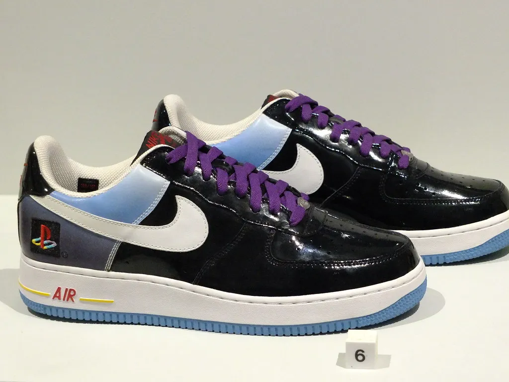
The best limited edition strategy depends on what your brand is trying to achieve.
A heritage FMCG brand may benefit most from celebrating its history, while an emerging challenger brand may gain greater visibility through a creative collaboration.
Brands with highly engaged communities and dependable operations may achieve the strongest commercial impact through carefully managed product drops.
💡Whichever approach you choose, the packaging design should support a clear business objective, remain recognisably part of the core brand, and offer consumers a compelling reason to buy now rather than later.
When strategy and design work together, limited edition packaging becomes a powerful tool for building brand awareness, strengthening loyalty, and creating memorable brand experiences
Not every limited-edition release delivers the desired results. Here are a few essential principles that you must adhere to while designing limited edition packaging:
👉Retain Core Brand Elements
Overly novel designs, especially those departing from core brand cues, can impair product search and reduce shopping satisfaction. The solution is to retain core elements such as colour and packaging structure to maintain familiarity and deliver novelty without disrupting customer recognition.
Coca-Cola's "Share a Coke" campaign is the benchmark. By replacing the logo with 250 popular names, the campaign sparked a 2% sales increase in the U.S., reversing a decade-long decline.
👉Design for Disruption
Limited editions need to be disruptive and distinctive. They have to jump out on the shelf as well as on socials. In mass-market environments, bold, unexpected designs prompt customers to pause in the aisle.
This is not about being different for the sake of it. It is about earning attention in a crowded environment where most shoppers are on autopilot.
👉Tell a Story
The best limited editions don't just change colour, they shift tone. They contribute to culture rather than just chasing it.
Lay's "Mitti Ki Chitthi" packs in India featured illustrations of farmers and a QR code linking to a short film about soil health. The design carried a sense of gratitude: earthy illustrations of farmers, golden warmth of the soil. The packaging became a storytelling medium.
👉Create Scarcity Signals
Numbered drops, pre-order windows, waitlists, influencer countdowns, these signals amplify the perception of scarcity.
A product that is numbered feels rare, personal, even collectible. This is not deception. It is a signal that the brand has invested in something special, and the window to access it is limited.
👉Partner Strategically
Collaborations amplify reach and relevance. HEINZ x Heineken created a limited edition six-pack that merged two iconic brands into a single split carrier.
The typographic merge: "HEIN" from Heinz running into "eken" from Heineken, created a fused logotype that belonged to neither brand alone. Dove x Crumbl worked because the emotional overlap: indulgence, comfort, self-love, made the unlikely pairing sing.
👉Design for the Full Experience
Packaging is not just what goes on the shelf. It is what gets unboxed, photographed, shared, and displayed. Who Gives A Crap's Sweet Edition transformed the case into a gingerbread house that shoppers could happily leave on display.
The wrappers found a second life as alternative wrapping paper. The packaging became part of the customer's life, not just their shopping trip.
Lay's introduced a limited-edition pack series in India featuring illustrations of farmers, part of an ongoing initiative to connect consumers with the people who grow the potatoes for its chips.
The packs include a QR code linking to "Mitti Ki Chitthi," a short film portraying the relationship between farmers and the land. The design was meant to feel like a letter from the earth itself, celebrating the hands and the land behind every chip. It turned packaging into a storytelling medium.
💡The limited edition was not about the product. It was about purpose. The packaging carried meaning that extended beyond the shelf, making purpose visible in the everyday moment of picking up a pack of chips.
Nutella sold 7 million jars in just 30 days with its "Nutella Unica" campaign. Each jar featured a unique identification code and maintained the iconic Nutella branding, while everything else was AI-generated art.
The campaign transformed an everyday grocery item into a limited-edition art piece without changing the product formula, price point, or distribution channels.
💡Nutella understood that limited editions don't require changing the product. They require changing the perception. The AI-generated art made every jar unique — a collectible rather than a commodity.
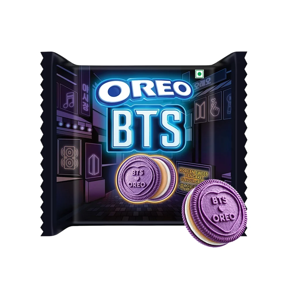
Oreo partnered with BTS on a limited-edition launch across 80+ markets, turning the product into a fan collectible.
Inspired by Korean culture, the range features a brown sugar pancake flavour, 13 BTS-designed cookie embossments, street market-inspired packaging, and a QR activation inviting fans to contribute to the "world's largest love letter" to BTS.
Design for fandom, not just consumption. Every detail. from flavour to packaging, was created to drive collectability, engagement, and social sharing.
💡Oreo recognised that BTS fans value the experience as much as the product. By making every touchpoint interactive and collectible, the brand created a campaign that sparked conversation and deepened fan connection.
Since 2005, Absolut Vodka has transformed its bottle into an annual collectible through collaborations with renowned artists, reinforcing its cultural relevance and premium positioning.
Each limited-edition release grants artists complete creative freedom, resulting in distinctive designs such as Olly Alexander's Absolut Mosaik with its ribbed glass and mosaic artwork, and Johan Renck's Absolut Exposure, the brand's first photography-based bottle featuring Lydia Hearst in three characters.
While celebrating artistic innovation, the bottles continue to contain Absolut Original Vodka with subtle semi-transparent colour accents.
💡Absolut doesn't treat limited editions as one-offs. The annual artist series is a tradition that collectors anticipate. By giving artists complete creative freedom, the brand earns cultural credibility that advertising alone cannot buy.
Johnnie Walker launched a '1 of 1 design' campaign exclusive to Dubai Duty Free shoppers, creating 50,000 one-of-a-kind bottle designs.
Each bottle features individually illustrated designs inspired by Dubai by day and Dubai by night. The campaign represents a bold leap in label design, harnessing AI to create truly unique bottles at scale.
Every bottle is genuinely one of a kind, not a numbered run of identical designs.
💡Johnnie Walker turned exclusivity into a personal experience by creating 50,000 AI-generated unique bottle designs. This delivers true individuality at scale, making each purchase feel special while positioning the brand as an innovator.
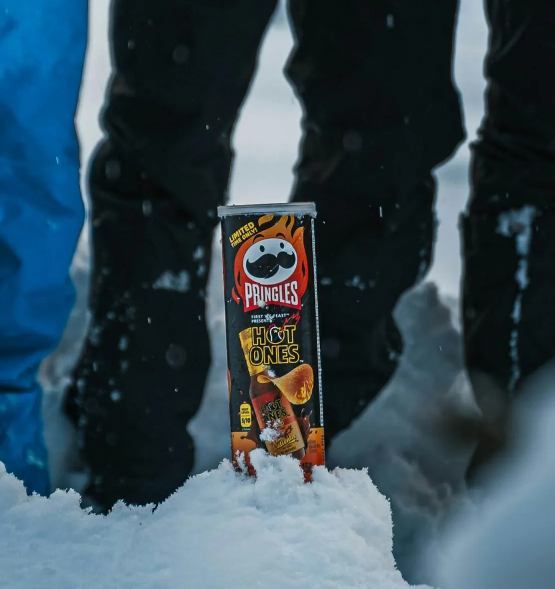
The purpose of a limited edition is to generate excitement without weakening the brand equity you've spent years building.
Limited editions should feel new while keeping the parent brand instantly recognizable. Too much change can attract attention but weaken brand value, as shoppers rely on familiar visual cues for quick recognition.
Start by identifying the visual elements that make your brand instantly recognisable. These are the assets that should remain consistent across every limited edition, regardless of the theme or collaboration.
Depending on the brand, these may include:
For example, Coca-Cola can experiment extensively with graphics because its red colour, Spencerian script, and contour bottle are already deeply embedded in consumers' minds.
✨The goal is to determine which elements are fixed and which can evolve.
Limited editions should introduce novelty without abandoning the visual identity consumers already trust.
Instead of redesigning every element, focus creative exploration on secondary components such as:
Keeping the core brand architecture intact allows consumers to enjoy something new while immediately recognising the product.
✨The limited edition should feel like an extension of the existing brand, not an entirely different one.
The most impactful limited editions are developed within a broader packaging design system that defines how the brand behaves across products, markets, and campaigns.
A packaging design system establishes:
This approach gives designers creative freedom while ensuring each limited edition reinforces the parent brand.
✨Clear boundaries also reduce revisions and keep design reviews more objective and strategically focused.
The limited edition must remain recognisable under real shopping conditions, including:
One simple test is particularly valuable:
Can an existing customer recognise the parent brand within two or three seconds without reading the product name?
If the answer is no, the design has probably moved too far away from the core identity.
✨Conduct shelf tests and digital thumbnail tests before approving limited edition packaging because visual impact changes dramatically once products compete with dozens of neighbouring packs.
Every limited edition introduces some degree of creative variation. However, frequent changes that ignore the brand's core identity can gradually weaken recognition.
Consumers build memory through repetition. If every special edition introduces a different logo treatment, typography, colour palette, or packaging style, those memories become fragmented rather than reinforced.
✨This does not mean brands should avoid experimentation. Instead, they should ensure that every limited edition strengthens the same underlying brand assets rather than replacing them.
Brands such as Hellmann's demonstrate this balance effectively. Seasonal campaigns and collaborations introduce fresh graphics while consistently preserving the brand's distinctive blue-and-yellow identity, allowing consumers to recognise the product immediately despite changing creative themes.
Most limited edition content stops at the creative concept. The harder, less glamorous part is production discipline, and it's where most limited editions actually succeed or fail.
Here are a few things to keep in mind:
☑️Avoid High MOQs:
Traditional printing methods like flexographic, offset, and gravure require expensive setup, making large minimum order quantities (MOQs) necessary.
Ordering excessive inventory increases storage costs, ties up working capital, and risks unsold stock if demand is lower than expected.
☑️Choose Digital Printing:
For short runs, digital printing is often the better option. It eliminates the need for printing plates, supports multiple artwork variations in one run, and enables faster production.
Although unit costs are higher, overall costs are often lower due to reduced inventory, less waste, shorter lead times, and greater flexibility.
☑️Use Existing Packaging:
Rather than creating new packaging structures, retain existing bottles, jars, or cartons and update only the graphics.
Limited-edition labels, sleeves, neck tags, or selective premium finishes such as foil or spot UV can create a distinctive look without the cost of new tooling or molds.
☑️Protect Core Operations:
Small promotional runs can disrupt high-volume production.
Many brands use co-packers to customize finished products separately, allowing primary manufacturing lines to remain focused on core SKUs while improving flexibility and reducing operational risk.
☑️Plan Before Launch:
Finalize production quantity, distribution channels, launch dates, geographic availability, and reprint policies before the campaign begins.
Genuine scarcity builds trust, while extending production after launch can weaken the perceived exclusivity.
☑️Align Distribution:
Distribution should reinforce the product's exclusive positioning.
Selling through selected retailers, direct-to-consumer channels, premium stores, or regional launches helps strengthen scarcity while improving inventory control.
☑️Measure Success:
Define campaign metrics before launch such as:
Predefined metrics allow brands to evaluate the campaign objectively instead of redefining success after results are known.
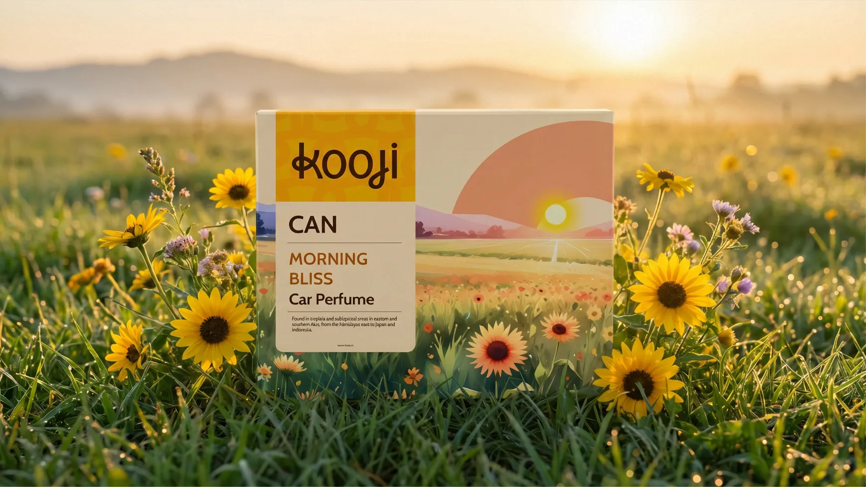
A limited edition should feel like a special version of your brand, not a different brand wearing your name.
So, we treat them as strategic design interventions, moments that reshape how people see and feel about the brand.
✅ We start with strategy, not decoration
Before we design anything, we define what the limited edition is meant to achieve. Is it driving trial? Building loyalty? Shifting perception? Teasing a repositioning? The design follows the intent, not the other way around.
✅ We retain what makes the brand recognisable
Core elements, colour, structure, key visual assets, remain intact. The limited edition delivers novelty without disrupting customer recognition. The brand stays unmistakably itself.
✅ We design for disruption
Limited editions need to jump out on shelf and on socials. We design for both environments, the shelf where the purchase happens and the feed where the sharing happens.
✅ We tell a story
The best limited editions don't just change colour. They shift tone. They contribute to culture. We design packaging that carries meaning, not just a seasonal badge.
✅ We build adaptable systems
A single limited edition that doesn't connect to anything is a missed opportunity. We design limited editions that feed back into the brand, building mental availability, emotional relevance, and brand pride.
✅ We handle everything from concept to production
Limited editions require precision: the right quantity, the right materials, the right window. We manage the entire process, from concept development and structural design to artwork and production guidance.
Limited edition packaging is not about selling more. It is about saying more. About expressing something deeper about what the brand is and what it's becoming.
What is limited edition packaging design?
Limited edition packaging is a deliberately scarce packaging variant, driven by a collaboration, milestone, or drop, rather than a recurring calendar event. Its value comes from genuine scarcity, a fixed run, a defined window, or a one-time partnership that won't be repeated.
How is limited edition packaging different from seasonal packaging?
Seasonal packaging is tied to a recurring calendar event, a holiday or festival, and customers expect it to return each year. A limited edition runs on scarcity itself, a collaboration, milestone, or drop, with no calendar trigger and often no promise of a repeat.
How long should a limited edition packaging run last?
There's no universal answer, but the run length should be decided before launch and held to, rather than extended in response to demand. A run that quietly gets extended undermines the scarcity that made the edition valuable in the first place.
Does a limited edition need to look completely different from the core brand?
No, and it usually shouldn't. The strongest limited editions stay identifiable as the parent brand within a couple of seconds, even while introducing a genuinely different creative direction. A limited edition that abandons the core identity entirely risks building recognition for a one-off design rather than for the brand itself.
Is limited edition packaging worth it for a small D2C brand?
It can be, particularly as a lower-risk way to test a bolder creative direction before committing to a permanent redesign. The key requirement is genuine production discipline, a smaller brand attempting a "limited" run without real supply constraints risks damaging trust faster than a brand with the scale to manage a large one.
How do you measure whether a limited edition was successful?
Define success before launch, not after, using metrics like sell-through speed, waitlist size for a future run, or social mentions relative to the standard product. Without a pre-defined benchmark, it's too easy to retroactively call any outcome a win, which prevents the brand from learning whether the format is worth repeating.
Want strategic branding and packaging like this for your business?





.webp)
.webp)


.webp)
.webp)
.webp)
.webp)
.webp)







.svg)
.webp)