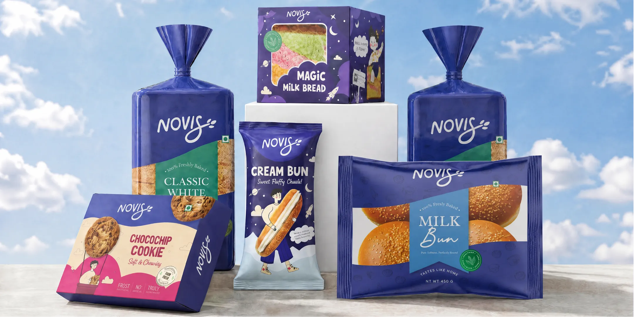
%201.webp)
02
AI Snaps
.svg)
.svg)
01
Our Work
03
About Us
04
Brand Audit
05
Contact Us
06
Client Success
12
07
Blogs
08
Careers
Book A Call
.svg)



.svg)
Need Help In Building Your Brand?
Click the button below & book a call with our founder directly.

Rishabh Jain
Managing Director
A packaging design system creates consistency across products, making launches faster, branding stronger, and redesigns less frequent.
This Confetti guide explains what a packaging design system is and what it contains. Also learn about different architecture models, and how you can build one from the ground up.
.webp)
A packaging design system is a set of rules, visual components, and decision frameworks that determine how every product in your brand's range looks and behaves.
It's like an operating system your packaging runs on. It applies to every SKU, from the 1st product to the 100th. It defines:
It is not a logo file. It is not a colour palette PDF. It is not a brand guidelines document.
Where a style guide tells you which logo to use and which blue to pick, a packaging design system tells you how those elements behave across substrates, formats, and categories.
It defines the hierarchy of information, the placement of the master brand versus sub-brands, the handling of variant differentiation, and the structural logic that governs scale and production.
Brand guidelines answer: What does the brand look like?
A packaging design system answers: How does the brand behave on pack, for every product, in every channel, for every variant we'll ever launch?
Brand guidelines are the starting point. The packaging design system is the layer that makes those guidelines executable at scale.
1. Visual brand architecture
Defines how the main brand, sub-brands, and variants appear together. Decides whether the brand name or flavour stands out more and keeps products visually organised.
2. Layout grid and information hierarchy
A fixed layout system that decides where key elements go: logo, flavour name, legal text, and weight. It keeps all packaging consistent.
3. Component library
A collection of reusable design assets like colours, fonts, icons, patterns, and packaging templates that can be used across products.
4. Rules for variant differentiation
Guidelines for showing product differences while keeping the same brand identity, using colours, icons, or labels.
5. Enforcement and governance mechanisms
Clear rules, approvals, and quality checks that ensure packaging stays consistent across all product launches.
Your first product launches with strong packaging. The second SKU comes six months later, with a different agency, slightly different feel. By the fourth variant, each product looks like it belongs to a different brand.
And by the time it becomes obvious, the portfolio requires a full redesign which costs significantly more than building a system upfront.
👎Shelf blocking disappears
When your SKUs look visually inconsistent, customers stop seeing one clear brand and start seeing separate competing products.
This weakens your brand recognition on shelves and can reduce repeat purchases.
👎Variant navigation fails
Shoppers in a kirana store or Blinkit search results cannot tell the difference between your 250ml and 500ml variants, or your Classic and Lite SKUs.
Confusion at the point of decision is the most expensive marketing failure you can have.
👎Team and agency changes break consistency
Every new designer, every new vendor, every new internal hire asks the same question: "Do you have brand guidelines?"
A logo file and a colour code are not enough. Without a system, each new person makes interpretive decisions that drift further from the original intent.
👎Performance marketing spending increases to compensate
When packaging doesn't build recognition on its own, brands spend more on ads to remind consumers what they look like.
A strong packaging system is, in part, a way to reduce your dependence on paid media for brand recall.
The cost of a packaging design system is definite, the cost of not having one, open-ended.
👎Direct Financial Costs
Without standardised dielines and component libraries, every SKU becomes a separate design project.
New variants need fresh artwork, repeated approvals, and extra prepress work, increasing errors, waste, and production downtime.
👎Compliance updates become expensive
A small label change on one package can force unnecessary revisions or inventory write-offs across the portfolio because updates cannot be managed centrally.
👎High opportunity cost
Many brands avoid building a packaging design system because of the upfront cost. But over time, the opposite is true. Not having a system becomes more expensive.
When brands redesign each SKU separately, costs keep repeating across the portfolio. Over several years, this usually exceeds the cost of creating one scalable system from the start.
A strong packaging system reduces repetitive work, speeds up new SKU launches, lowers print errors, and improves consistency.
It also helps consumers identify variants more easily, strengthening shelf recognition and supporting category growth.
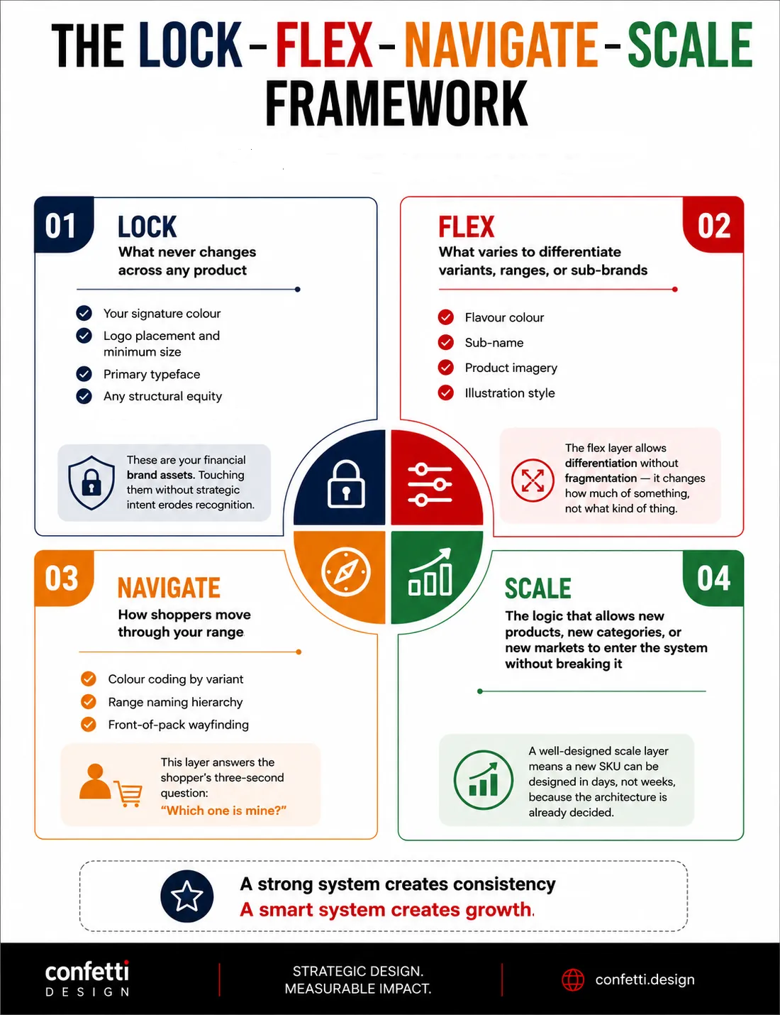
A packaging design system has four distinct components. We call this model:
Lock–Flex–Navigate–Scale
Understanding each component helps you brief design agencies with precision, evaluate design work critically, and protect equity through team changes.
These are the visual elements that make your brand recognisable before the consumer reads a single word.
Examples:
Cadbury's purple is a Lock element. It does not change by variant, by market, or by format. It is a financial asset in the strictest sense, worth protecting with the same discipline you'd apply to a trademark.
The same logic applies to Coca-Cola's contour bottle, Aashirvaad's wheat field motif, and Himalaya's green. These elements generate recognition before the consumer's brain processes language.
In our Indus Valley system, the copper-accent colour and the brand mark position on the front panel never move. Everything else can flex. That lock preserves brand equities on pack even when the product range doubles.
The Flex layer differentiates variants without breaking the system's visual coherence.It changes how much of something, not what kind of thing.
The rule is simple: flex exactly one perceptual variable at a time. If the strawberry variant uses a pink accent band, the mango variant uses a yellow band, but the background pattern, logo position, and typography hierarchy stay frozen.
Change two variables simultaneously and shoppers lose the thread. Change three and you have a different brand.
An example of controlled flex is how we handled variants for Kooji, where vibrant illustrations flexed by scent cue while the brand architecture remained locked.
Information architecture governs what appears on each panel and in what order of priority.
The three-second test is the practical measure: can a new shopper, standing at 1.5 metres from the shelf, identify in 3 seconds:
If not, the Navigate layer needs rework.
Poor SKU navigation is why shoppers pick up the wrong variant, hesitate, or walk away. Good navigation uses visual contrast to create a clear path.
The Forest Essentials system uses consistent lateral banding across its skincare range, with product type written in the same typographic position every time.
On-pack hierarchy for FMCG:
Regulatory requirements are non-negotiable and a packaging system that hasn't designed around them will fail in production. Be it FSSAI-compliant packaging design or nutraceutical packaging mandatory particulars, your system must accommodate.
Adaptations Across Channels
A well-built packaging system includes adaptation rules for each channel. These are documented guidelines for how the visual language translates.
What changes in the hero image for Blinkit? Which elements must be legible at thumbnail? What does the unboxing surface area communicate?
The same product is seen in four completely different contexts:
Most packaging systems are designed for one channel and expected to work in all four. That usually doesn’t work.
Adaptations Across SKUs
A well-designed scale layer also means a new SKU can be designed in days, not weeks, because the architecture is already decided.
Scale answers: What happens when we launch a larger pack size? A gift set? A completely new sub-brand? A DTC-only variant?
Scale requires modularity. The layout grid must accommodate longer variant names. The colour palette must have unused slots for future flavour families.
The structural dielines must share tooling wherever possible. Without a scale layer, every line extension triggers a fresh round of design, approval, and production engineering, costing time and money that should have been amortised across the system.
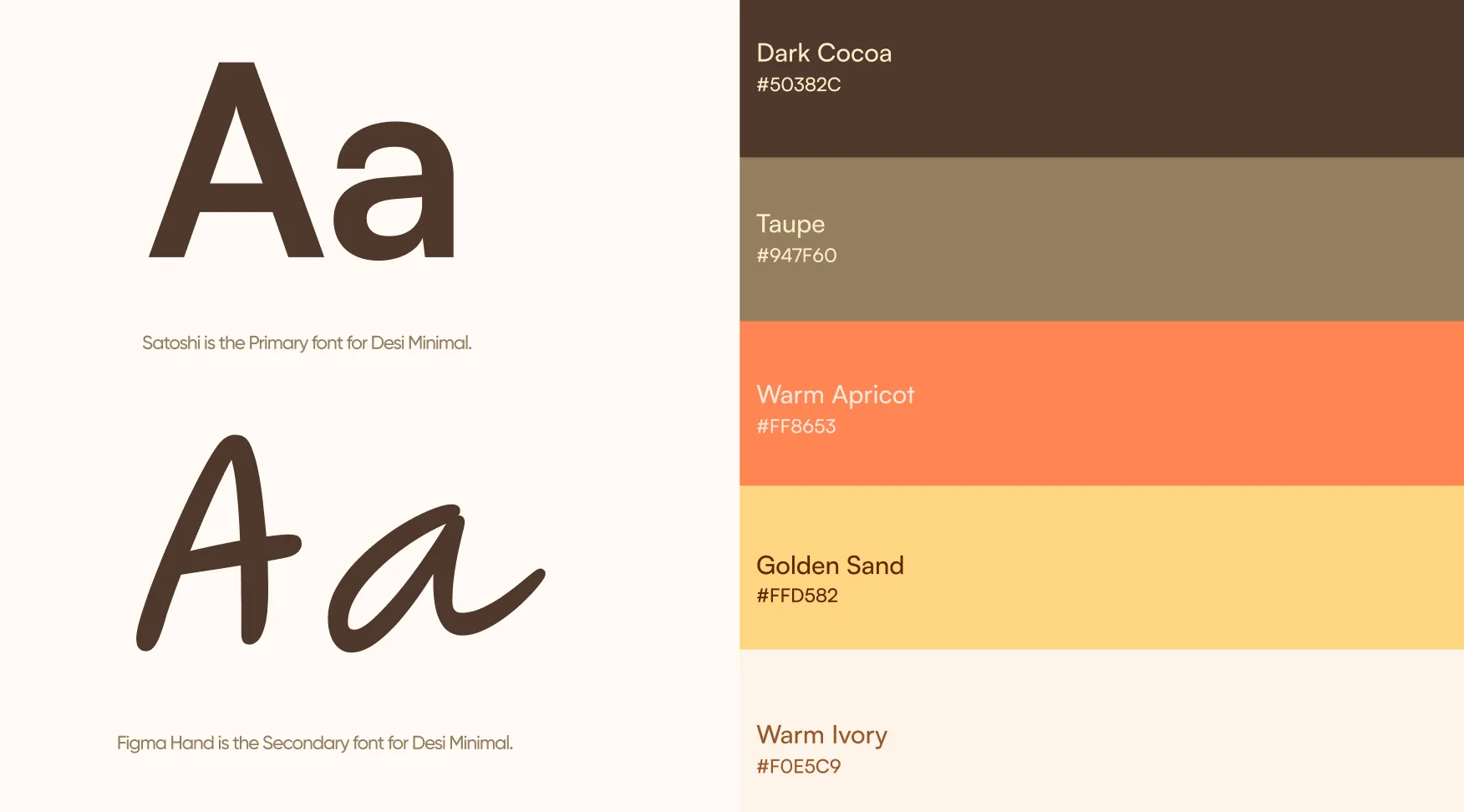
Packaging architecture is the visual translation of your brand architecture. The same strategic relationships that organise your portfolio logically must be visible on pack.
Three dominant models exist. Each makes different assumptions about brand strength, category structure, and consumer behaviour.
Let’s understand these before choosing the right one:
Every SKU looks unmistakably like the same brand. Variant differentiation is minimal and tightly controlled.
Colour, typography, layout, and imagery remain locked. Variation is signalled through secondary cues such as flavour badges or accent panels.
It works when:
It breaks when:
Risk:
Variant differentiation packaging can become muddy if secondary cues are not distinct enough. Premium sub-brands may feel constrained if they cannot develop their own visual weight.
Example: Kashi uses a tightly unified design system across cereals, bars, and frozen meals, helping consumers quickly trust new products. However, extending the brand into categories like beverages or personal care could create visual tension.
For the Indian market, Amul fits this model across its dairy portfolio. Other popular examples are Mars, Nescafé, and Cadbury.
A standardised architecture with customisable expressions per category or range. The Lock layer defines brand anchors; the Flex layer has wider latitude.
Each product or sub-brand operates as an independent visual entity.
It works when:
It breaks when:
Risk:
Flexible systems must be simple enough to scale across categories and distinctive enough to own shelf space.
Generic flexible systems produce private-label-looking packaging: technically consistent, commercially invisible.
Example: Califia Farms created a flexible brand system across almond milk, cold brew, oat milk, and creamers, each with a distinct look while remaining clearly Califia. Its success comes from consistent core elements: bottle shape, script logo, and illustration style, that unify the brand while allowing category-specific variation.
In India, Tata operates as an endorsed hybrid rather than a pure house of brands, but individual Tata subsidiaries like Tata Salt and Tata Tea have distinct visual identities.
This is the most commercially powerful model when executed well. It focuses on rigidity where it protects brand equity; flexibility where it enables range expression.
It works when:
It breaks when:
Risks:
The relationship can become parasitic. A weak endorser damages sub-brand perception. A strong sub-brand may eventually drop the endorsement if the parent company adds no value.
Example: Marriott hotels use this model. Each property brand is distinct, but the Marriott endorsement signals a guaranteed standard
Most established FMCG brands in India operate hybrid systems, even if they don't call them that. The system is a deliberate architecture that maximises both recognition and navigation.

Talk to Confetti experts about scalable, shelf-ready packaging that strengthens brand consistency and recall
!
Book A Call
Most brands commission a packaging system after the damage is done.
By then, the cost has already compounded across production delays, retailer penalties, and lost shelf share.
These triggers are diagnostic. If three or more apply to your portfolio, your current approach is not sustainable:
🪧The second SKU: As soon as you launch a second product, a system decision is being made deliberately or by accident. The briefing assumptions, the agency, the budget, the timeline: all of these implicitly define the system's rules.
🪧 Portfolio fragmentation: Different products in your range no longer look like they belong to the same brand. You're losing aesthetics along with shelf blocking, brand recall, and consumer trust.
🪧 Team or agency change: Every time a new designer, vendor, or agency joins a project, they make interpretive decisions about how the brand should look on pack because they lack proper directions.
🪧 New channel entry: Your brand’s moving from retail-only to Amazon, or selling on quick commerce. Your packaging system needs channel-specific adaptation rules that didn't previously exist.
🪧Compliance updates become expensive: Without a structured system, even small regulatory changes require manual edits across every SKU, leading to repeated approvals, delays, and potential inventory waste.
🪧Packaging costs rise with scale: As portfolios grow, fragmented dielines, materials, and print setups reduce efficiency. Brands lose purchasing leverage and spend more on production and waste.
🪧 No shared system language: Your teams cannot consistently answer basic questions about colours, typography, or brand rules. This means the business is operating on habits instead of a defined packaging system. That makes execution inconsistent and impossible to scale or enforce.
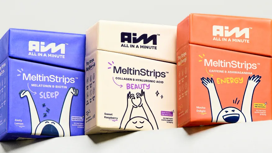
Building a packaging design system is an operational and strategic exercise.
The process we follow at Confetti moves from audit to architecture to asset creation to governance. Each step eliminates a specific failure mode.
Do not design anything yet. Start by mapping what already exists.
Then map the intended portfolio for the next 2-3 years. Design for where the brand is going, not just where it is today. A system built for four SKUs that breaks at twelve is not a system.
This is also the moment to align with your packaging design strategy, ensuring the system serves your commercial objectives and not just your aesthetic preferences.
Select the visual brand architecture model that matches your business strategy: monolithic, hybrid, or flexible.
The choice must be explicit and documented before any design work begins.
Give a clear rationale like "We chose a hybrid system because we operate in two adjacent categories with a combined 14 SKUs, and our innovation pipeline projects 8 new products in the next 18 months."
That sentence makes every subsequent design decision easier.
Now the visual work begins.
Develop the full design language: colour system, typographic hierarchy, imagery approach, graphic device or motif system.
Build for the most complex use case first: if the system works for your most product-dense shelf set, it will work for everything simpler.
Test across all channels simultaneously.
The packaging colour psychology decisions, hierarchy calls, and material choices must all be stress-tested in context, not just in a studio mockup.
The System Stress Test:
Before launching the system, run it through five pressure scenarios: a new flavour variant, a premium line extension, a value-tier version, a new category, and a limited edition.
If the system handles all five without visual contradiction or structural breakdown, it is robust. If it breaks on any of them, the architecture needs adjustment before rollout.
A system without documentation is a system waiting to be ignored.
Create a master asset repository that contains:
This library is not a static PDF. It is a living, version-controlled asset that lives where your design team works.
Then assign ownership. Who approves deviations from the system? Without this, every urgent deadline creates a small compromise. Those compromises compound. In two years, you have visual drift again.
Deliver the system in a usable digital format.
At Confetti, our handover typically includes: a master guidelines PDF, a component library in vector format, master template files for each structural format pre-configured with locked layers and variable overrides, and a pre-print checklist.
This toolkit allows your team to produce new SKUs without returning to us for every minor variant.
India is very different from a Western market when it comes to packaging design.
A packaging design system built for the US or Europe will fragment here within months unless it accounts for:
☑️Fast-changing regulations: India’s packaging rules are complex and constantly evolving across FSSAI, Legal Metrology, and sustainability mandates.
Without a systemised structure, even small compliance updates can trigger portfolio-wide redesigns, approvals, and stock losses.
☑️Fragmented retail environments: Packaging in India must work across kirana stores, modern retail, and quick-commerce dark stores simultaneously.
A single system needs to handle different shelf sizes, storage conditions, and operational constraints without losing consistency.
☑️Multilingual packaging complexity: Indian packaging often requires two to four languages, each with different script behaviours and spacing needs.
Effective systems use modular typography rules instead of rigid global guidelines built only for English.
☑️Regional visual sensitivity: Colours, symbols, and aesthetics carry different meanings across regions.
Strong packaging systems balance neutral core branding with flexible regional adaptations where needed.
☑️Denser shelf competition: Indian retail shelves are more crowded and visually compressed than many Western markets.
Packaging systems therefore need stronger variant differentiation and clearer navigation to avoid shopper confusion.
The answer is not to simplify the design until it becomes generic.
The answer is to build a packaging design system with enough modularity to handle regulatory overlays without breaking the visual cohesion.
At Confetti, our packaging design approach for Indian brands includes:
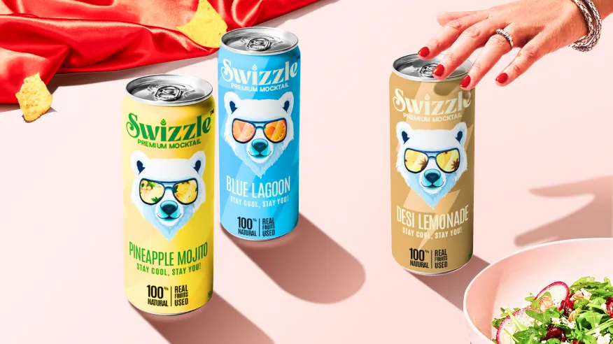
We approach packaging system briefs as a commercial architecture problem, not a design exploration.
We use our Packaging Resonance Score to evaluate every system we build across five dimensions:
This ensures the system isn't just visually coherent, it's commercially effective.
A system that scores consistently across all five dimensions across the full portfolio is a system that builds compounding brand equity.
Our category-specialist designers lead each packaging system project:
Instead of a designer who waits for direction and responds to feedback, our category-specialist designers actively guide decisions, challenge assumptions where necessary, and suggest better alternatives grounded in real category knowledge.
We evaluate every system across all four channels simultaneously:
Retail shelf, ecommerce thumbnail, quick commerce product image, and D2C shipping experience.
Channel adaptation is built into the system from the very start.
The documentation we deliver is not a brand manual. It is an operational playbook.
A working reference that enables a production team, a printer, or a new agency to execute to specification without constant creative interpretation. A document that gets consulted every time a new SKU launches is a system. A document that gets filed and ignored is not.
If your brand is managing more than 4 SKUs without a documented system, every new product launch is compounding the eventual redesign cost.
We at Confetti can help you define, build, and document a system that scales. Start with a call.
.webp)
🚨Mistake 1: Treating guidelines as systems
A visual style guide is not a packaging system. Real systems define locked grids, hierarchy rules, reusable components, and governance standards. Without that structure, every designer interprets the brand differently.
A simple test: can the guidelines clearly define where a flavour name sits on a 200ml pouch? If the answer is “it depends,” the system is not enforceable.
🚨Mistake 2: Over-controlling the design
Systems that lock every colour, layout, and typography rule create packaging that feels repetitive and inflexible. Variants lose distinction and sub-brands cannot evolve.
Strong systems define what can flex and what must stay fixed. For example, a mango variant may change accent colours while retaining the same logo placement and structural layout.
🚨Mistake 3: No governance
Many systems fail not during creation, but after launch. Marketing teams approve off-system designs, suppliers change substrates, and production gradually drifts away from the original rules.
Sustaining a system requires ownership, print audits, approval workflows, and regular compliance checks.
🚨Mistake 4: Changing too much at once
The Tropicana redesign is the classic failure case. The brand simultaneously changed its logo, layout, colour palette, cap design, and iconic straw-in-orange visual. Consumers no longer recognised the product, contributing to a reported 20% sales drop within two months.
Effective redesigns evolve one visual variable at a time while preserving recognisable brand equity.
🚨Mistake 5: Ignoring production realities
A system that works in mockups but fails on press is unusable. Common issues include colours that cannot print on recycled substrates, typography that fills in during gravure printing, and dielines incompatible with supplier machinery.
IKEA faced related operational issues when weak documentation and oversight created production inconsistencies without clear correction mechanisms.
🚨Mistake 6: Failing to test scalability
Many systems work for five SKUs but collapse at fifty. Unexpected problems emerge: long variant names, new pack formats, or promotional labels that break hierarchy rules.
Scalable systems are stress-tested against edge cases before rollout, not after launch.
🚨Mistake 7: Treating the system as finished
Packaging systems are living infrastructure, not one-time projects. Regulations change, formats evolve, and production technologies improve. Systems that are never updated eventually become obsolete.
The strongest brands manage packaging systems like software: reviewing regularly, updating component libraries, and refining guidelines based on production feedback.
🚨Mistake 8: No governance
Many systems fail not during creation, but after launch. Marketing teams approve off-system designs, suppliers change substrates, and production gradually drifts away from the original rules.
Sustaining a system requires ownership, print audits, approval workflows, and clear authority over deviations. Without governance, the system erodes through constant small compromises.
🚨Mistake 7: Treating compliance as an afterthought
In markets like India, packaging regulations are central to the system. FSSAI declarations, allergen warnings, barcode zones, and legal weight requirements must be built into the information architecture from the beginning.
If compliance is added later, brands often face expensive redesigns, reprints, and operational delays.
What is a packaging design system?
A packaging design system is a structured framework that governs how a brand's packaging looks and behaves across its entire product portfolio.
It defines what stays fixed across all SKUs, what adapts per variant, how the range navigates for consumers, and how the system absorbs new products without losing coherence.
What is the difference between brand guidelines and a packaging design system?
Brand guidelines define what the brand looks like like logo usage, colours, typeface. A packaging design system defines how those elements behave on pack, across SKU variants, formats, and channels.
Brand guidelines are static. A packaging design system is a living decision framework that governs every new product launch and every channel adaptation.
When does a brand need a packaging design system?
Ideally at the point of first product launch. Other triggers are: launching a second SKU, noticing visual drift across existing products, experiencing a team or agency change, or entering a new sales channel (retail, ecommerce, or quick commerce).
Building a system before these triggers is always less expensive than redesigning after.
How does a packaging design system affect shelf performance?
A well-built system creates a visual "block" on shelf, a recognisable brand footprint that shoppers can identify before reading a word.
It also enables variant navigation, allowing shoppers to find the right product within a range at 1.5–3 metres. Without a system, individual SKUs compete visually with each other rather than building a collective brand presence.
Can one packaging design system work across retail and quick commerce?
Yes, if it is designed to from the start. Retail packaging communicates at distance on a physical shelf.
Quick commerce relies almost entirely on product photography, not physical pack design. A system that accounts for both channels includes specific adaptation rules for how the visual language translates into product photography for platforms like Blinkit and Zepto.
How long does it take to build a packaging design system?
Timeline varies with portfolio complexity. For a brand with 6–12 SKUs across one or two categories, a well-executed system usually takes 6–10 weeks.
The output lasts years and dramatically reduces the time required for every subsequent launch. For a full view of timelines across branding and packaging projects, our complete branding timeline guide provides realistic benchmarks.
What makes a packaging system scalable?
A scalable packaging system has predefined rules for new SKUs: locked master brand elements, controlled flex variables (colour, descriptor), and modular dielines.
It answers “where does the new variant fit?” without redesign. This allows line extensions in days, not weeks. See our multi-SKU packaging strategy for how this works.
Want strategic branding and packaging like this for your business?





.webp)
.webp)


.webp)
.webp)
.webp)
.webp)
.webp)







.svg)
.webp)