%201.webp)
02
AI Snaps
.svg)
.svg)
01
Our Work
03
About Us
04
Brand Audit
05
Contact Us
06
Client Success
12
07
Blogs
08
Careers
Book A Call
.svg)



.svg)
Need Help In Building Your Brand?
Click the button below & book a call with our founder directly.

Rishabh Jain
Managing Director
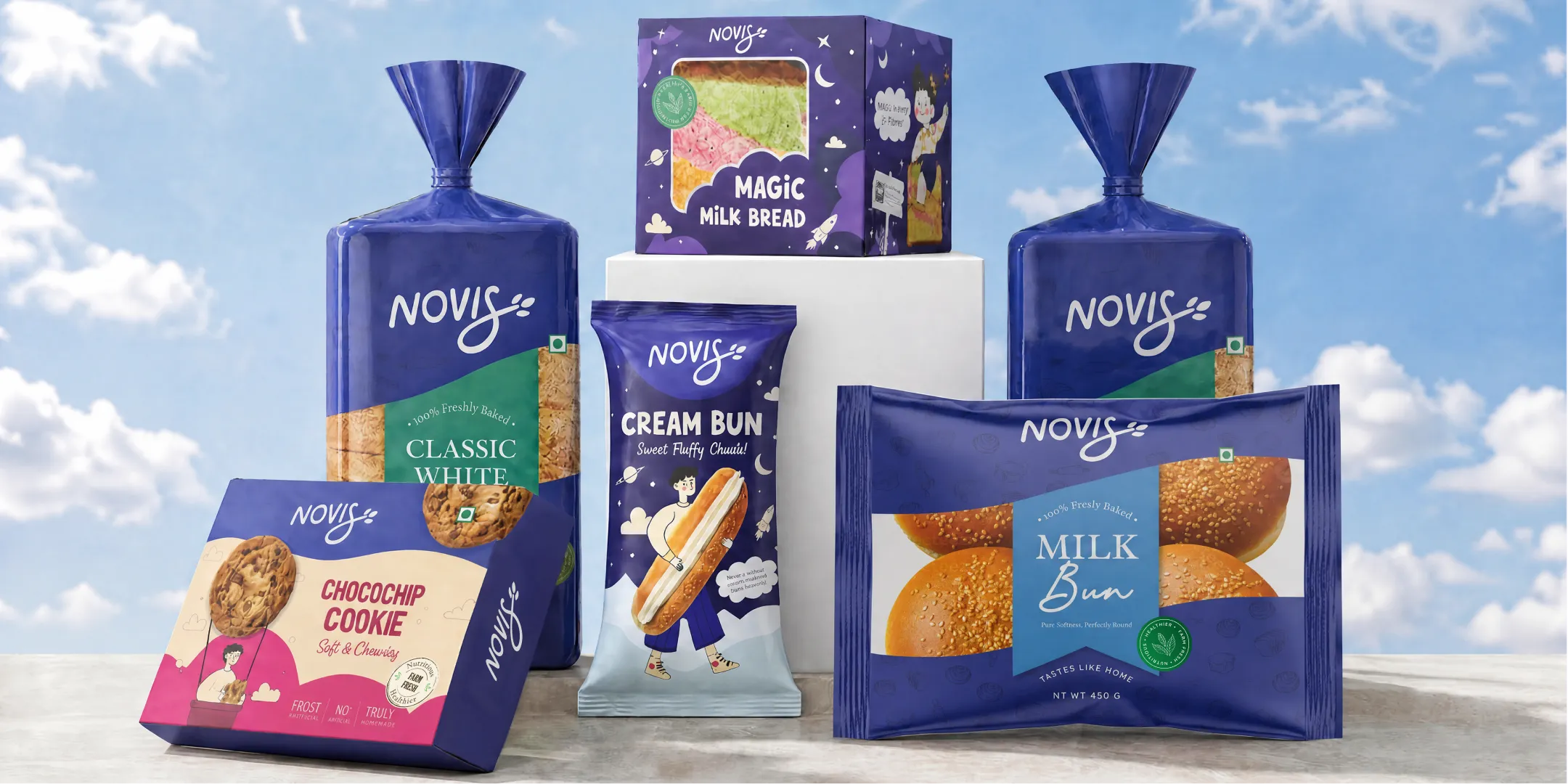
For food startups, creative food packaging is a storytelling tool that shapes how your brand is seen and remembered. Packaging design is your silent salesperson, a brand ambassador, and a crucial part of your marketing.
In this guide, we’ll walk you through packaging design for startups, from food container packaging design to food packaging labels design, helping you build a visual identity that sticks.
Established brands apply a finished identity to a new product. Food startups build the identity and the pack at the same time, with less money and less time.
Every packaging decision ends up defining the brand, so the order in which you make those decisions are important as much as the decisions themselves.
Here is how it is differ for a startup:
Sequencing: Name, positioning, and visual identity need to be settled before pack layouts begin. If the logo changes after the pack is designed, the pack has to be redone.
Budget: Established brands spread design and print costs across a portfolio. You carry them on one or two SKUs, which leaves little room for a second print run.
Timeline: Launch dates are usually tied to a retail listing, a festive season, or a funding milestone. A missed date often means a missed slot.
Decision weight: A colour, a claim, or a pack size also says who you are. There is no existing system to fall back on.
The larger risk is a problem that surfaces after production is committed.
Three failures show up most often:
An established brand absorbs one bad print run. A startup with one hero SKU often cannot, which is why the packaging brief for a new food brand has to cover identity, print specifications, and label content together.
📌 Lock the brand identity and the mandatory label content before pack layouts begin, and treat the printer's proof as a checkpoint for errors.
Food packaging is a technical problem first because the pack decides whether your product survives its shelf life. Barrier properties, seal strength, and structural integrity limit which materials and formats you can use. Visual design works inside those limits.
Most founders begin with how the pack should look but the better starting point is what the product needs protection from.
Many shelf life failures are packaging failures that get read as product failures:
OTR measures how much oxygen passes through a material, in cc/m²/day. A crunchy snack usually needs a single-digit figure. A material that misses it will fail the product, however good the recipe is.
A metallized BOPP laminate can give many dry snacks a shelf life of around six months and meets what most retailers expect for distribution. The material has to be chosen before printing.
Structural Integrity
A leaking pouch, a crushed carton, or a seal that fails in heat becomes your financial liability. If you launch in India or the UAE, the pack has to survive heat, humidity, and several stages of logistics. Three checks cover most of the risk:
These decisions belong to food packaging design tips that rarely get covered, yet they decide whether a product can be distributed at all. They are important just as much for small batch food packaging, where a failed first run uses up a large share of your budget.
Before you commission any visual design, write a one-page technical brief covering barrier requirements, target shelf life, and distribution conditions. Give it to your designer and your packaging supplier so the material and format are chosen to meet the brief.
📌Choose the material to fit the product's shelf life and route to market, then design the pack on top of it.
Food labelling rules decide where information goes, how big it must be, and how much space is left for design. So the regulatory layer comes first. If you design first and add the mandatory panels later, you'll usually have to rebuild the artwork.
Label rules that constrain the layout
The exact rules depend on where you sell. In the US, the FDA sets them. In India, FSSAI does, under its Labelling and Display Regulations. Both prescribe what must appear and how.
🔷 Net quantity: The FDA requires it in the bottom 30 percent of the principal display panel, in both US customary and metric units. FSSAI sets minimum text heights that scale with pack surface area.
🔷 Nutrition panel: Both regimes require it in a prescribed format. It needs a fixed amount of space, which is hard to find on sachets and single-serve pouches.
🔷 Allergens: The FDA lists nine major allergens, with sesame added in 2023. FSSAI also requires an allergen declaration. Wording and placement follow the rules, not your brand voice.
🔷 Other mandatory elements: Product name, ingredient list, and manufacturer details apply in both markets. India adds the veg or non-veg symbol, the FSSAI logo, and the licence number.
Material and structure limits
Product type also narrows your structural options. A moisture-sensitive product needs a high-barrier film, which can rule out a clear window or certain finishes.
The shelf life target sets the material, and the material sets the print method and what finishes are possible.
Tamper evidence works the same way. Jars, bottles, and cartons often need a shrink band or induction seal, and many retailers expect one. The seal takes up space and changes where labels and closures can go. Requirements vary by product and market, so confirm them before layout starts.
⚠️What skipping this step costs
A missing allergen line, a net weight in the wrong position, or a nutrition panel below the minimum size means reprinting the full run. Stock that has already shipped may need relabelling, and a regulator can ask for non-compliant units to be withdrawn. Launch dates slip, and the startup pays for the same print job twice.
This is the most common and most expensive packaging mistake among new food brands.
📌That’s why we at Confetti help food brands in designing the packaging with utmost care by considering regulatory and compliance.
Using a plain kraft pouch, a home-printed sticker, a logo stamp, for food startup packaging sounds practical but it stops working the moment you are down with a retail buyer.
Buyers and category heads read generic packaging as a signal. It suggests a brand with little funding, no design process, and no clear plan for consistent supply. That reading affects shelf placement decisions.
Here is what a DIY pack tends to tell a buyer:
If at all you are worried about the budget then there are three places to look:
None of these touch the visual identity. The brand still looks funded and deliberate, and the spend goes into decisions that reduce reprints later.

Talk to our team before you commit to a print run
Book A Call
A tight budget means the work happens in a fixed order, and money goes to the stage that carries the most weight at each point.
The order to follow:
Where spending more pays off❓
Shelf standout: colour, hierarchy, and a readable product name at arm's length affect whether a shopper picks the pack up. Spend on getting these right.
Photography-readiness: if you sell on your own site or on marketplaces, the pack has to photograph cleanly. Check how the design handles glare, matte versus gloss finishes, and a small thumbnail view.
Where it does not❓
Elaborate structural packaging for an unproven SKU: custom shapes, rigid boxes, and specialty closures add tooling cost before you know the product will sell. A stock format with strong graphics gives you the same launch presence at a fraction of the cost.
Print and material decisions that keep reprints cheap: Your first pack will change. Ingredient claims get updated, a flavour gets dropped, and a retailer asks for a different panel layout. Plan for that from the start.
📌 Fix the brand identity first, spend on the pack shoppers see, and leave the extras until the product proves itself.
Most food startups do not launch into one channel. The same product goes onto a retail shelf, a marketplace listing, and your own website within weeks of each other. The pack has to work in all three.
That means one design is judged in two very different conditions.
What changes between the two❓
Colour and contrast: a soft palette can look refined on a shelf under store lighting and disappear in a thumbnail. High contrast between the background, product name, and flavour cue holds up in both. Test the design in greyscale to check the hierarchy still reads.
Product name size: shoppers on a marketplace see the pack at roughly the size of a postage stamp. If the name and flavour are not legible at that size, the listing loses clicks before the shopper reads a word of your copy.
Finish and glare: gloss and metallic finishes catch light on shelf and cause reflections in photography. Matte or soft-touch finishes photograph more consistently.
Front panel focus: a screen shows one face of the pack. Keep the brand, product name, and one key claim on the front, and move secondary details to the side and back panels.
Shape and orientation: a pack that stands upright on a shelf can look awkward in a flat-lay photo. Check how the format sits in both positions.
🔶Unboxing for DTC
If you ship directly to consumers, the shipper is the first physical contact. This applies even when the product is also sold in stores.
Keep it proportionate. A budget-conscious approach is one branded shipper and one insert.
📌 Design the front panel to work as a thumbnail first, then check it holds up on a shelf.
Let’s break down the food packaging design process into clear, actionable steps. This is the roadmap that takes your product from a simple pouch or box to a fully realized retail-ready package.
Before you design your own food packaging, you need to understand your market. Who are your customers? What do they care about? What are your competitors doing? This research helps you find gaps in the market and opportunities to stand out. It’s also a chance to spot trends and see what’s working (or not) in your category.
What does your brand stand for? What story do you want to tell? Your packaging should reflect your unique value and personality. This is where you set clear goals for your food product packaging design—whether it’s to look premium, eco-friendly, playful, or trustworthy.
Not all packaging is created equal. The shape and type of your food container packaging design matter for both function and shelf appeal. Pouch, jar, box, or bottle, each has its own advantages and challenges. The right choice depends on your product, your brand, and your customers’ expectations.
Now it’s time to design your food packaging labels. This is where you bring your brand to life with colors, fonts, icons, and storytelling. Your label should be easy to read, visually appealing, and packed with the right information. Don’t forget to include your logo, product name, ingredients, and any special claims.
Choosing the right materials and print vendors is a big part of the food packaging process. You need materials that are safe, durable, and fit your brand’s values—whether that means eco-friendly options or premium finishes. Working closely with your print vendor ensures your design looks great in real life.
Before you go to full production, you’ll want to see and touch your packaging. Mockups (whether digital or physical) let you check colors, finishes, and overall look and feel. This is your chance to make tweaks and get final approval from your team.
Once your design is approved, it’s time for production. Your packaging is printed, cut, and assembled, with quality checks at every stage. When everything is perfect, your product is ready for the shelf—and for customers to discover.
Use this list as a final check before you approve files for print:
✔️Compliance sign-off
Confirm that the label carries every mandatory element required in your market, such as the FSSAI requirements in India. Check the:
Verify minimum font sizes and panel placement against the current regulation, and have someone who did not design the label read it line by line.
✔️Structural and material testing
Test the pack with the actual product. Confirm that seals hold, closures work, and the material protects against moisture, light, and oxygen for the full shelf life.
Run a transit test with a filled carton, and check that the printed surface does not scuff or fade in handling.
✔️Print-run sizing
Confirm that the quantity matches your first three to six months of expected sales, and that the supplier's minimum order does not push you past it.
Check that variable panels, such as batch and date fields, can be updated without reprinting the full pack. Ask for a physical proof and check the colour against the approved file.
✔️Retailer-specific requirements
If you plan to sell through modern trade, quick commerce, or marketplaces, get the listing and packaging requirements in writing before finalising.
Verify barcode format and placement, carton and case dimensions, and any shelf-ready or labelling rules. Confirm these early, since a rejection after printing means a reprint.
✔️Photography-readiness
Photograph a finished pack. Check how it looks in a marketplace-size thumbnail, whether the finish causes glare, and whether the front panel still reads clearly on a phone screen.
📌A checklist only helps if each line is checked against the real pack, the real regulation, and the real buyer requirement.
At Confetti, we’ve helped countless food startups and established brands bring their packaging to life. Our process is built on deep research, creative thinking, and close collaboration.
Here’s how we make the food packaging design process smooth and effective for our clients.
1. In-Depth Immersion
We start by getting to know your brand inside out. What’s your vision? Who are your customers? What makes you unique? This deep dive helps us craft a packaging strategy that truly reflects your values, just like we did for Pawsible Foods, where we highlighted their commitment to sustainability and innovation.
2. Creative Concept Development
Next, we brainstorm ideas and develop creative concepts. We explore colors, fonts, shapes, and imagery that will make your product stand out on the shelf. Our team works closely with you to refine these ideas until we find the perfect fit.
3. Design Refinement and Prototyping
Once we have a winning concept, we refine the design and create prototypes. These mockups let you see and feel your packaging before it goes to print, so you can be confident in the final result.
4. Compliance and Production Support
We make sure your packaging meets all legal and industry standards, and we coordinate with trusted print vendors to ensure high-quality results. Our team is with you every step of the way, from design to shelf.
5. Launch and Ongoing Support
When your product launches, we don’t just walk away. We help you monitor performance, gather feedback, and make improvements for future packaging updates.
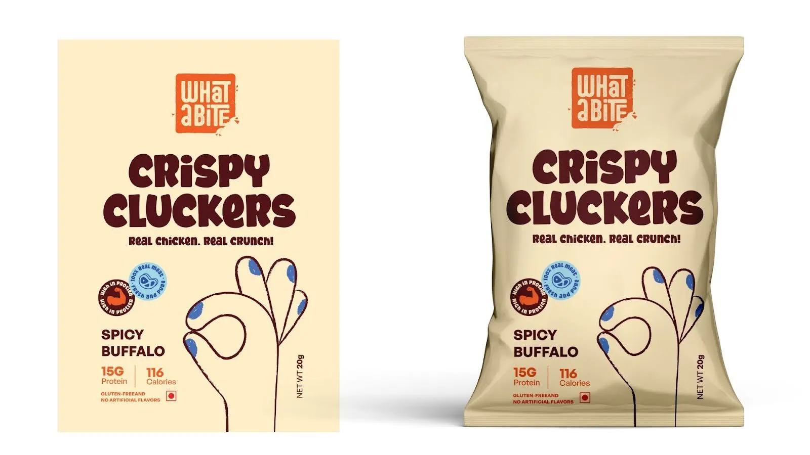
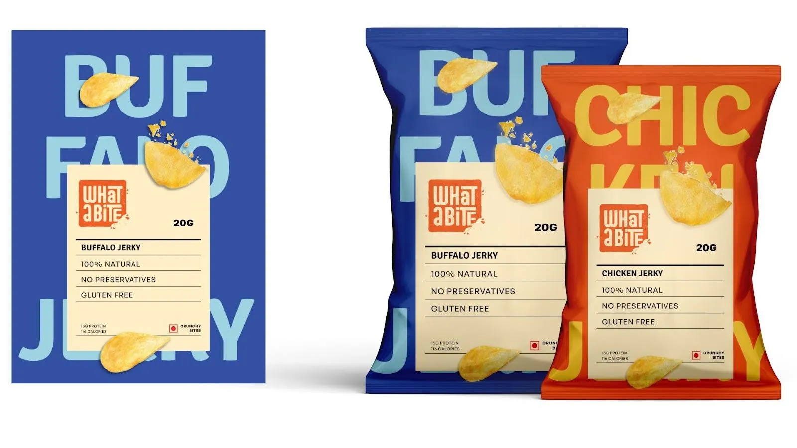
📌For What a Bite, we built a bold and energetic brand identity around protein-packed snacking. We developed the colour palette, typography, and visual language to bring the brand to life across its packaging. The result is a distinctive, playful look that stands out on shelf while balancing indulgence, nutrition, and trust.
Do I need a food-safe certification before designing my packaging?
Certification applies to your food business and the packaging material, not to the design itself. You need the relevant food licence for your market, such as FSSAI in India, and packaging that is food-grade for direct contact.
Get both in place early, because the licence number and mandatory declarations shape the label layout before design begins.
What packaging mistakes do food startups make most often?
Common mistakes include adding mandatory information after the artwork is finished, using colours that fail in a small product photo, launching too many SKUs at once, ordering large print runs before testing, and skipping physical samples.
Most of these lead to reprints or retailer rejection, which cost more than getting the first pack right.
How long does packaging design take for a new food product?
Timelines depend on scope. A single pack with an existing brand can take a few weeks, while a multi-SKU range with new branding takes longer.
Compliance checks, feedback rounds, and printer proofs add time. Plan design, sampling, and print as separate stages, and start well before your launch or retailer listing date.
Should packaging design happen before or after branding?
Branding comes first. Logo, colour, and typography appear on every pack, label, and product page, so changing them later means redoing the packaging.
Many startups run both together, which works if the identity is fixed before pack layouts begin. Finalise the identity, then apply it to your primary pack.
A strong brand doesn’t have to blow the budget. Confetti specializes in cost-effective packaging design solutions that use smart materials, standard dielines, and creative systems that scale. We believe in design that grows with you, without compromising on shelf impact.
You can start simple, but if you're aiming for retail, regulatory compliance, and consistent scaling, working with a studio like Confetti can make a significant difference. We help startups move from MVP-level packaging to fully scalable packaging design systems, without losing their unique brand voice.
Paper-based options like kraft paper or cardboard are affordable, customizable, and eco-friendly. They typically cost between $0.10 to $1.50 per unit, making them a smart choice for startups.
Want strategic branding and packaging like this for your business?





.webp)
.webp)


.webp)
.webp)
.webp)
.webp)
.webp)







.svg)
.webp)