%201.webp)
02
AI Snaps
.svg)
.svg)
01
Our Work
03
About Us
04
Brand Audit
05
Contact Us
06
Client Success
12
07
Blogs
08
Careers
Book A Call
.svg)



.svg)
Need Help In Building Your Brand?
Click the button below & book a call with our founder directly.

Rishabh Jain
Managing Director
The target audience for packaging design is defined by the shopping situation the shopper is in when they see your pack. Two people with the same age and income can behave very differently depending on the situation.
This blog breaks down the audience dimensions that actually change packaging decisions and shows you how to translate that insight into a brief your designer can execute against.
A customer persona is a fictional representation of your ideal customer. It’s created by analyzing data such as demographics, interests, and behavior.
It provides a clear understanding of your target audience, including their pain points, desires, and motivations. This understanding helps you create packaging that appeals to consumers' emotions and encourages them to purchase your product.
You create customer personas to:
📌A persona built purely on age, income and interests won't tell a designer what to enlarge on the front panel or what a first-time buyer needs explained. That's where decision context comes.
Packaging design has to work in a moment: a two-second glance on a crowded shelf, a thumbnail on a quick-commerce app, a refill decision made while standing in the kitchen.
Those moments don't care about your persona's income bracket.
They care about what the shopper is trying to get done, how much attention they have, and what they already believe about your category.
Demographic data is easy to collect, so briefs lean on it. The customer persona fills up with age, gender, income and city tier, and the brief asks for something "premium, youthful and modern."
That describes a mood, it does not tell a designer what to enlarge, what to cut or what the pack must say first.
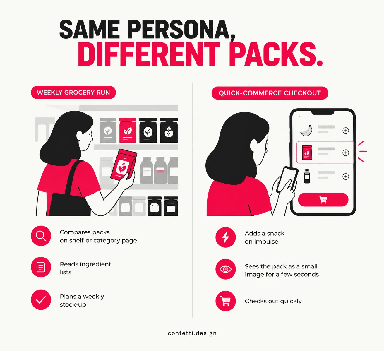
For example, take two shoppers who are both 35, live in the same city and earn about the same. One is planning a weekly grocery run, comparing packs on a shelf or category page and reading ingredient lists. The other is at a quick-commerce checkout adding a snack on impulse, and sees the pack as a small image for a second or two.
Same persona, different packs.
A generic persona answers who, packaging research has to answer where, when, how fast and with what prior knowledge.
6 questions cover most of what a designer can use:
📌Each answer maps to a lever the designer controls: hierarchy, colour, structure or information. A shopper with three seconds needs one dominant message.
A shopper new to the category needs the product type stated plainly on the front. A gifter needs a pack that looks finished without a wrapper.

Talk to our team about research that shapes real design decisions.
Book A Call
Three audience dimensions change what a pack has to do: the occasion the shopper is buying for, the channel where they meet the pack, and how well they already know the category.
Each one maps to a specific design decision, such as what goes on the front panel, how much the pack explains, and how much detail it can carry.
A planned buyer arrives with a shortlist and uses the pack to confirm a choice. Ingredients, claims, pack size and price-per-unit cues are important to this shopper, and the pack can carry more information because the shopper is willing to read it.
An impulse buyer has no shortlist. The pack has to get noticed first, and one strong cue does that better than five: a dominant colour, a clear product image or a single claim.
Gifting changes the brief again. A gifter needs the pack to look finished without wrapping and to signal quality to someone who may never have heard of the brand. A self-use buyer cares more about how the pack opens, reseals and stores.
One product can be in all four occasions. Pick the one that drives most of your volume and give it the front panel. The others get the back panel, side panels and secondary carton.
The same shopper behaves differently depending on where the pack appears.
Repeat buyers of your own brand rely on recognition. They find the pack by colour, shape and logo position, which is why a redesign that changes all three can cost you customers who never decided to leave.
Design follows from this pattern. New-to-category buyers need a plain-language descriptor on the front and simple variant naming. Repeat buyers need consistent brand assets.
That’s why we at Confetti design packaging by exactly understanding the buyers.
Each audience input controls one part of the design:
Start with hierarchy
Sort everything the pack says into three tiers: what must be read in about two seconds, what a shopper reads once interested, and what is important only after purchase.
Impulse buyers stop at the first tier. Planned buyers go to the second. Usage, storage and batch details are in the third, on the back or side panels.
Then set a legibility floor for the channel
Shrink the artwork to the size it appears in a phone grid and check that the product name, variant and quantity can still be read. Anything that fails gets larger or comes off the front.
Fluency decides how much copy earns its place. A new-to-category audience needs a plain descriptor and a visible usage cue. A familiar audience needs less copy and stronger brand distinctiveness.
Example:
Take a millet granola from a D2C brand. In the first brief, the buyer is on a quick-commerce app, already knows granola and is adding it on impulse.
In the second, the buyer is new to millet-based products and is reading the brand's website and marketplace listing before ordering.
In the first version, everything that cannot survive at thumbnail size comes off the front. The benefit is where the eye lands first, and the colour block carries recognition on repeat orders.
In the second, the front opens up. A first-time buyer does not know what a millet granola tastes like or why it differs from oats, so the descriptor and ingredient cue answer that. Proof points and usage move into the back panel and the secondary listing images, where a reader who wants detail will look.
One pack often has to serve both.
Most brands reach this point and make the same mistake. They conclude that if audiences differ, the packaging should differ completely. So they build a second look, then a third, and within two years the shelf presence reads as three unrelated brands sharing a logo.
Different segments do want different things. But the fix is a packaging system with deliberate flex points, fixed elements that hold recognition, and flexible elements that adapt to context.
This is where audience-driven design decisions stop being a research exercise and become an architecture decision.
There are three workable structures, each solves the multi-segment problem differently:
1. Variant architecture within a single master brand
One brand, one visual system, variants distinguished by colour, format, or a variant marker. This is the default for most FMCG and D2C ranges, and it works because recognition stays intact while the shopper still gets a clear signal of which version is for them.
The constraint is that the master brand has to be strong enough to carry the range. If the brand codes are weak, variants fragment anyway.
2. Sub-brand or range architecture
The parent brand endorses a distinct range, a premium line, a functional line, a channel-specific line. The parent provides trust, the sub-brand provides the specific promise.
This lets a brand serve a gifting audience and a value audience without either feeling like it's using the wrong product. The cost is real: sub-brands need their own investment to earn recognition, and they dilute the parent if there are too many.
3. Pack format as the segment signal
Same brand, same visual codes, different structure, a single-serve sachet, a refill pouch, a gift box. Format does the segmenting work, which lets the graphic system stay consistent.
This is the approach when segments differ by occasion rather than by identity, because format communicates use case faster than colour or copy.
What you should avoid is the fourth, unplanned approach: a different design per segment with no governing system. It's drifting, and it shows up on the shelf as incoherence.
Two categories decide this, and they need to be written down before a designer touches a new SKU or segment.
What stays fixed (Lock):
What's allowed to flex per segment or variant:
🔴Designing for the buyer when the buyer and the user are different people
Plenty of categories split the buyer from the user, and a pack that speaks only to the user often fails to get bought at all.
For example, pet food is bought by the owner and eaten by the pet. Kids' snacks are bought by a parent and eaten by a child, and the two respond to different cues entirely: the child wants character illustration and bright colour, the parent wants a protein count and a "no added sugar" claim visible without opening the pack.
Gifting splits this further into three people: the buyer, the recipient, and sometimes a giver who isn't the one paying.
A pack built only for the end user misses the person actually making the purchase decision. A baby-care brand that designs purely around what looks appealing to a baby, when babies do not buy anything, ignores the parent standing in the aisle comparing ingredient safety claims.
The design brief has to name both roles and decide, deliberately, who the front panel persuades and who the back panel reassures.
🔴Designing for the founder's own taste rather than the audience's actual decision context
Founder taste is the most common failure mode in D2C packaging, and it is the hardest one to catch internally, because the founder usually is inside the demographic the brand is meant to serve.
Take a founder launching a premium gifting-category product, say an artisanal chocolate or a curated gift box. On paper, the founder matches the target demographic closely: similar age, similar income, similar taste in aesthetics.
But the founder is not the one buying the product as a gift for someone else. The actual gift-buyer is choosing packaging that will make a good impression on a third person they may not know well, under time pressure, often at a price point they're slightly unsure about.
It gets fixed by putting the actual pack in front of actual gift-buyers, not by iterating on the founder's preferred direction.
🔴Ignoring channel-specific comprehension needs
A pack tested only on a shelf, or only on a desk in a studio, regularly fails the moment it appears anywhere else. The most common version: a design that reads clearly at arm's length on a physical shelf, with fine typography, subtle colour contrast and small supporting icons, and then goes onto a quick-commerce app as a thumbnail roughly the size of a postage stamp.
At that size, the fine type disappears, the subtle contrast flattens, and the icons blur into noise. The shopper sees a coloured blob with no readable name.
The fix is simple, shrink the artwork to the smallest size it will actually appear at, on the actual devices it appears on, and check whether the brand name, variant and quantity are still legible.
At Confetti, the research phase only counts as done once it turns into specific, documented design decisions someone can check the artwork against.
Here's how we do it:
🔷 We map the real decision context first.
Where the shopper encounters the product, what occasion drives the purchase, how much category knowledge they bring, and who the buyer is versus who uses it.
🔷 We feed that mapping into our Lock, Flex, Navigate and Scale framework.
Audience findings turn into a defined hierarchy on pack, not a mood board.
🔷 We assign category-specialist designers.
A founder-led D2C snack brief and an established FMCG portfolio brief carry different audience risks. We put someone who's worked in that category before on the project.
🔷 We test across all four channels a shopper actually uses.
Physical shelf at 1.5 to 3 metres, e-commerce listing, quick-commerce thumbnail, and the unboxing moment for D2C.
🔷 We score every system on our Packaging Resonance Score before it ships.
A design that looks good in a studio mockup but fails at thumbnail size goes back to the hierarchy stage. It doesn't go to print.
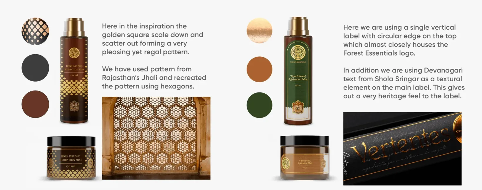
📌When Forest Essentials needed exclusive packaging for the Jaipur Royal family, they reached out to Confetti. The brief wasn't the brand's regular consumer, it was a single, specific recipient with a distinct heritage and set of expectations.
We researched Rajasthani heritage and the Royal family's own traditions, natural-ingredient preferences and artistic sensibilities before a single concept was sketched, then built an SKU database and content inventory to keep the range organised.
That research produced eight design directions grounded in what this particular audience would recognise as authentic, narrowed with the client to three, and refined into the final packaging.
How do I identify my target audience for packaging design?
Start with decision context, not demographics. Map where the shopper encounters the pack, whether the purchase is planned or impulse, how familiar they are with the category, and who buys versus who uses the product. These answers tell a designer what to do; age and income alone don't.
Does target audience matter more than category convention in packaging design?
Both are important, but the audience decides how far you can depart from convention. A category-fluent audience recognises innovation as intentional. A new-to-category audience needs familiar cues to understand what the product even is. Audience insight tells you how much convention you can safely break.
What's the difference between designing for the buyer and designing for the user?
The buyer decides whether to purchase; the user experiences the product afterward. In pet food, kids' snacks or gifting, these are different people with different needs. The front panel usually has to persuade the buyer, while structural details like ease of opening or dosing serve the user.
How does the target audience change packaging design for e-commerce vs. retail?
Retail shoppers see the pack at 1.5 to 3 metres and can pick it up; e-commerce shoppers see a thumbnail and zoom into listing images. The same audience needs different priorities: shelf-ready structure and facing for retail, legibility at small size and detailed secondary images for e-commerce.
Should packaging look different for different customer segments within the same brand?
Not entirely different, but yes, in defined ways. Change one perceptual variable, such as a claim or accent colour, per segment while keeping brand colour, logo position and structure fixed. A full redesign per segment damages shelf recognition more than it improves conversion.
What packaging mistakes happen when you don't research your target audience properly?
The most common: designing for the founder's own taste instead of the actual buyer, targeting the end user while ignoring who makes the purchase decision, and testing only on a shelf while the pack fails as an unreadable thumbnail on a quick-commerce app.
Can one packaging design work for multiple customer segments?
Often, yes, if the system separates what stays fixed (brand colour, logo, structure) from what flexes (claim, accent colour, copy density) per segment. It only breaks down when segments need contradictory information hierarchies, such as an impulse buyer and a heavy researcher sharing one front panel.
Want strategic branding and packaging like this for your business?





.webp)
.webp)


.webp)
.webp)
.webp)
.webp)
.webp)







.svg)
.webp)