%201.webp)
02
AI Snaps
.svg)
.svg)
01
Our Work

03
About Us
05
Contact Us
06
Client Success

07
Blogs
08
Careers
Book A Call


Need Help In Building Your Brand?
Click the button below & book a call with our founder directly.

Rishabh Jain
Managing Director
Creating an unboxing experience for luxury brands goes way beyond having stunning visuals. This is the first time your end customer interacts with the brand.
It defines perceived value, sets expectations, builds anticipation, and signals craftsmanship before the actual product is revealed.
In this post , we take you through how to design a luxury unboxing experience, what elements are needed and tell you how luxury brands like Rolex use it to elevate perception, drive engagement, and build lasting loyalty.
Standard packaging has only one job: get the product from point A to point B without damage.
Luxury unboxing solves a different problem. It extends the brand experience into a physical, sensory moment that begins before the customer even sees what's inside.
Research suggests that about 72% of consumers say packaging design influences their decision to repurchase. For luxury brands, that number carries even more weight.
Your customer has spent significantly more than the market average. The packaging design and moment of unboxing has to justify that decision the moment they touch the box.
Customer experience begins the moment the package arrives.
▶️The weight of the box in your hand
▶️The resistance of the lid as it lifts
▶️The sound of tissue paper folding back.
These are designed signals that tell the buyer, before anything is revealed, that what's inside is worth it.
Standard packaging is optimised for logistics: protect the product, keep costs low, ship at volume. The unboxing takes three seconds.
Luxury packaging is optimised for the ritual. The reveal is slowed down deliberately. Each layer: outer sleeve, rigid box, inner tissue, product, creates a sequence.
That sequence is where perceived value is built or destroyed.
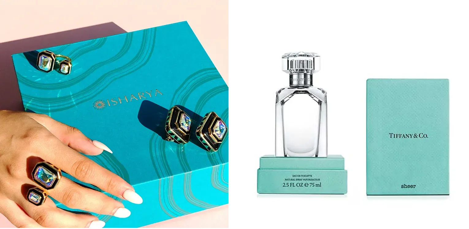
Consider Tiffany & Co. Their robin egg blue box, Pantone 1837, named after the year the company was founded is recognised globally without a logo.
People keep the box long after the jewellery has been worn in. The box has become a cultural object in its own right.
Hermès orange. Chanel black and white. These are brand architecture decisions maintained over decades.
Vogue Business has noted that luxury unboxing videos regularly hit millions of organic views on TikTok and YouTube, driven almost entirely by the packaging, not the product inside.
The box becomes part of the brand identity: customers create free marketing content because they want to share the experience of opening it.
Standard packaging cannot create that. A brown mailer or a generic white box, however functional, has no emotional charge. There is nothing to share. There is no ritual.
Here’s a comparison:
According to a study published in the Journal of Consumer Psychology, the anticipation of a reward activates the brain's dopamine system more intensely than the reward itself.
Luxury brands (whether consciously or by instinct) have been exploiting this for decades. The unboxing sequence is, neurologically, a dopamine delivery system.
Luxury unboxing hijacks three hardwired psychological triggers: anticipation, effort justification, and sensory anchoring.
You’re not opening a box. You’re completing a ritual your brain interprets as proof of value.
Here’s how it works:
Anticipation Loops
When a package arrives, dopamine starts rising. But standard packaging kills that loop immediately - Tear, open, see product, done.
Luxury unboxing experience stretches anticipation across multiple reveals. Each layer (outer box, tissue, inner sleeve, ribbon, final reveal) resets the dopamine hit.
The longer the anticipation phase, within reason, the greater the emotional impact of the reveal.
Research in consumer psychology shows that prolonged anticipation increases perceived value by 15–20% before the product is even touched. You’re selling the wait.
Effort Justification
The brain hates wasted effort. If someone works to open something,pulling a ribbon, lifting a heavy lid, unwrapping tissue, they unconsciously assign higher value to what’s inside.
This is the IKEA effect applied to unboxing. Standard packaging requires zero effort.
Luxury packaging requires small, deliberate actions. Those actions create cognitive dissonance if the product doesn't feel valuable. So the brain resolves it by deciding the product must be exceptional.
Sensory Anchoring
Luxury packaging uses sensory elements to feel memorable. Those tactile signals become anchors.
If the box feels cheap, no amount of product quality fully recovers that first impression.
Scarcity and Belonging
Luxury packaging often mimics how you’d open a gift from someone who knows you well. It’s not shrink-wrapped. It’s not screaming for attention. That restraint signals scarcity: this product isn’t for everyone.
For the customer, opening that box becomes an act of belonging. They’re in the group that gets the full ritual. That’s why luxury unboxing directly feeds brand loyalty. The packaging isn’t just protecting a product. It’s admitting someone into a tribe.
The rule states that people judge an experience by its most intense moment (peak) and its end. Luxury unboxing designs both. The peak is the moment the product emerges from its final layer.
The end is how the box closes or how the customer places the empty box on a shelf. Standard packaging has no peak and a forgettable end.
Luxury has a curated peak and an end that leaves the box visible in the room.
A luxury unboxing experience isn’t one big gesture. It’s specific, repeatable elements working in sequence.
If you miss one, the ritual collapses into ordinary packaging.
Each element below works independently. But the unboxing experience is cumulative:
Rigid setup boxes made from thick greyboard wrapped in printed or textured paper are the standard for luxury.
They don't flex. They don't collapse. When you pick one up, the weight alone communicates that care was taken.
The three structural formats most used in luxury packaging:
The layered reveal architecture: outer sleeve, base box, inner tissue, product, insert card, is a sequence designed to extend anticipation and control what the customer sees, and when.
Material selection is where luxury packaging is most frequently undermined. A beautifully printed box on thin, flexible board feels cheap regardless of what's printed on it.
The materials that carry the most weight, literally and perceptually:
Finish choices matter as much as base materials.
Use one or two of these finishes deliberately. More than two and the packaging starts competing with itself.
Each layer inside the box should reveal a new piece of the story, not just protect the product. Common sequence:
Each layer extends the moment. Each layer also serves a functional purpose. The tissue prevents scratches. The insert immobilizes the product. Luxury doesn’t separate form from function.
The inside of the box is the moment of reveal. The exterior of the packaging needs to attract. The interior needs to reward.
Interior colour decisions follow one of two strategies:
Typography inside the box should follow the same discipline as everywhere else in the brand: one typeface, correct sizing, proper tracking.
Overcrowding the interior base with product information, legal copy, or brand messaging destroys the visual calm.
If text must appear, make it minimal. A single line. A brand name, a year, a founding statement.
The insert is the only moment in the unboxing sequence where the brand can speak directly to the customer in words.
The strongest insert strategies work across three categories:
Product provenance: where this product was made, by whom, with what materials, using which techniques. For brands that make things by hand or with skilled craftsmanship, this is not boasting, it is evidence.
A card that says "This bag was made by hand at our workshop in Florence, using vegetable-tanned leather aged for 60 days" gives the customer a reason to value what they hold.
Brand narrative: the founding story, the design philosophy, the values that shaped the product. Not the full brand history. Two or three sentences that give the product context and meaning.
This is the insert card version of the founder's letter.
Digital bridge: a QR code that links to a video, a styling guide, a behind-the-scenes production film, or an augmented reality product experience. This is not gimmicky if the destination earns the click.
A 90-second film of the product being made, accessible only by customers who purchased it, transforms the insert from print into an access pass.
The physical quality of the insert card must match the box. The insert does not need to be expensive to produce, it needs to be consistent with every other material decision in the pack.
Most brands ignore what happens after the product comes out. The customer either closes the box awkwardly or tosses it.
Luxury packaging designs the close.
Magnetic lids that snap satisfyingly. Boxes that stack neatly. Inserts that hold the product again for storage.
If the box can’t be reclosed beautifully, it becomes trash. If it can, it becomes furniture.
Predictable luxury is boring. Every unboxing needs one element the customer didn’t see coming. It doesn’t have to be expensive.
Examples:
That unexpected moment is what gets photographed. It’s what gets remembered weeks later.
Let’s break down the unboxing experiences of the top luxury brands around the world:
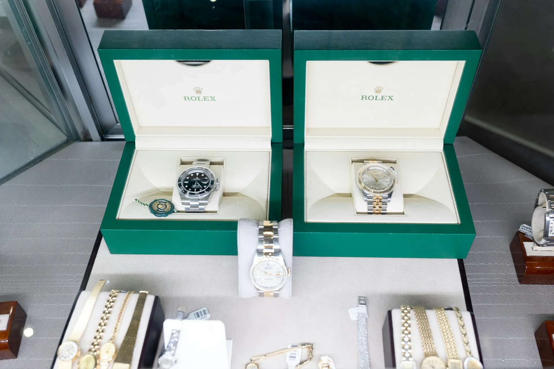
Rolex uses multiple box styles depending on the watch model: classic hinged, slide-top, clamshell, drawer-style, and magnetic closure designs.
Materials range from lacquered wood to reinforced cardboard to metallic accents. The 2025 redesign introduced a new green outer box with a gold foil stamped crown logo, replacing the old cream-colored box.
The new boxes also incorporate sustainability details: sustainable plywood, recycled cardboard, recycled leather, and water-based adhesives.
The back latch is now visible brass rather than covered in leather. Some collectors note the new boxes feel less plush than the old ones, a reminder that material upgrades don't always land.
Takeaway: Match packaging complexity to product price. Entry-level models get simpler boxes. Premium pieces get elaborate construction.
Louis Vuitton's unboxing experience is built on one discipline: nothing is an afterthought.
Every component matches the product inside. A Monogram canvas bag receives a beige dust bag and matching box.
A Damier Azur piece arrives with a white-based dust bag and navy trim. The layered sequence of box, tissue paper, dust bag, ribbon, builds anticipation at each stage.
In 2016, LV made its first major packaging overhaul in decades.
The iconic dark brown was replaced with "Safran Impérial" a bold saffron-orange highlighted by royal blue ribbons, a colour tied directly to the brand's trunk-making origins.
Magnetic closures replaced drawer boxes.
NFC tags and QR codes now let customers verify authenticity and access brand content: physical ritual, digital extension.
Takeaway: When every component is matched and consistent, customers can authenticate quality by feel alone before a product is seen.
Chanel's packaging is a lesson in what to remove, not what to add.
The defining characteristic of Chanel's unboxing is its classic black and white colour scheme. It is strictly followed across every shopping bag, gift box, and interior lining.
No seasonal updates. No limited-edition colourways.
The single white camellia attached to Chanel's black ribbon-tied boxes has become one of the most instantly recognisable emblems across all of Chanel's accessories, clothing, and jewellery and is now a registered trademark.
At US boutiques, the full ritual : ribbon, camellia, white dust bag, magnetic box, is reserved for Classic Flap and 2.55 purchases only.
The tiering is deliberate: the complete ceremony marks the pinnacle of the product hierarchy.
Takeaway: A two-colour system and one motif, held without deviation for decades, is more powerful than any elaborate packaging concept. Luxury is often the discipline to not change.
No case study in luxury packaging is complete without Tiffany. It is the most complete demonstration of what a packaging system can become when executed with unwavering consistency for nearly two centuries.
Tiffany Blue was trademarked in 1998 and standardised by the Pantone Matching System to ensure the hue appears identically across all packaging, advertising, and store interiors worldwide.
The custom Pantone colour is called "1837 Blue" named for the year the company was founded.
The colour is not commercially available. The packaging is trademarked. The white satin ribbon is trademarked.
Even the term "Tiffany Blue Box" is a registered trademark.
The exclusivity policy holds: you cannot buy the box. You can only receive it with a purchase. The rigid box uses 1,200–1,500gsm board with soft-touch lamination, a tactile experience that signals quality before the product is revealed.
Takeaway: Consistency held for nearly two centuries builds an asset no budget can buy retroactively. The box is now more recognisable than most of the products inside it.
Hermès orange is perhaps the most instructive packaging story in luxury, because it was not designed. It was discovered.
In the brand's own words: "This warm citrus colour became symbolic of the House after the Second World War. Its appearance goes back to 1942, when there was a shortage of cream-coloured cardboard boxes.
The supplier resorted to what he had left. It happened to be orange. Generations of boxes have followed on since then."
Hermès orange carries no Pantone number. Slight variations in shade and grain across generations are not flaws, collectors use them to date purchases. The variation signals that materials, not manufacturing tolerances, define the product.
Takeaway: You don't need a perfectly engineered packaging system to create an icon. You need the commitment to hold a choice long enough for it to become a cultural memory.
Unboxing videos on YouTube and TikTok consistently outperform standard product reviews by 3–5x in watch time.
For luxury brands, hashtags like #luxuryunboxing and #unboxingritual have billions of cumulative views.
More importantly, UGC from real customers converts at 2–3x the rate of brand-produced content. Trust transfers from the person unboxing to the packaging they’re holding.
What you lose if you skip this
You’re not just losing free advertising. You’re losing the most authentic form of social proof. A customer who films an unboxing is saying “this brand is worth my time to document.” That’s stronger than any five-star review. And when that video sits on their profile for years, every new follower discovers your packaging fresh.
Design your luxury unboxing experience as if the camera is always there. Because more often than you think, it will be.
Why Luxury Unboxing Videos Gets Shared
People don’t film unboxings to help your brand. They film because the experience feels notable. Three specific triggers drive that behavior:
Designing Packaging to Be Shared
The packaging details that drive the most sharing are not the most expensive ones.
They are the most specific ones: a wax seal in a brand colour, a hidden message printed inside the lid, a tissue fold that reveals something unexpected. These are the moments customers stop to film.
A practical shareability checklist for any luxury packaging brief:
Test it before production. Have real customers film an unboxing session and watch where they hesitate. That hesitation is either a design failure or a design win, both tell you something.
Most packaging briefs arrive as a list of requirements. Box dimensions. Brand colours. Budget per unit.
Confetti starts earlier than that.
Our approach treats unboxing as a sequence of deliberate decisions, not a collection of nice-to-have inserts.
The outcome is a luxury unboxing system that balances sensory design with unit economics. It’s memorable, shareable, and, most importantly, repeatable at scale.
❌ Using standard corrugated tape instead of custom sealing: Luxury packaging seals with adhesive strips, belly bands, or ribbon, never generic packing tape.
❌ Overstuffing the box: A product crammed into every cubic inch feels cheap. Luxury needs negative space. Empty areas around the product signal value and give the eye room to land.
❌ Skipping a ribbon or pull tab: When a customer has to pry open a lid with fingernails, the ritual dies. A ribbon or tab creates deliberate friction without frustration.
❌ Using glossy finishes that smudge and glare: Shiny surfaces show fingerprints instantly and create hotspots under photography lights. Matte or soft-touch coatings photograph better and feel more premium to the hand.
❌ Neglecting the underside of the box: Open a luxury box and flip the lid. If you see raw cardboard or exposed glue joints, the illusion breaks. Every visible surface deserves the same finish.
❌ Choosing thin, flimsy tissue paper: Tissue that tears when pulled sends the wrong message: fragile, not precious. Heavyweight tissue with a subtle texture signals care.
❌ Placing the product off-center in the insert: Asymmetry might look artistic in a mockup. In reality, an off-center product reads as a packing error. Center the hero product.
❌ Forgetting how the box closes after opening: If the lid doesn’t reseat cleanly or the flaps won’t stay shut, the box becomes trash immediately. Design for reusability or don’t bother.
❌ Printing fine foil text too small to read: Gold foil on a dark background looks elegant until a customer squints to read it. Increase type size by 20% over standard packaging.
❌ Ignoring the sound of the opening: Plastic crinkles, tape rips, and cardboard scrapes are unpleasant. Magnetic latches, fabric ribbons, and weighted lids create satisfying audio feedback.
❌ Copying another brand’s signature color without permission: Tiffany Blue is trademarked. Hermès Orange is trademarked. Borrowing those colors invites legal action and brands you as a follower.
❌ Over-relying on plastic inserts: Vacuum-formed plastic trays protect well but feel clinical and unsustainable. Replace with molded paper pulp, fabric-wrapped foam, or recycled fiber alternatives.
❌ Delivering a damaged outer box: A dented shipping box tells the customer “your product was mishandled before it reached you.” Double-wall construction and corner protection are essential.
❌ Forgetting the unboxing happens on camera: If your packaging looks flat under direct light or the logo disappears in vertical video, you’ve missed the UGC opportunity entirely.
In luxury packaging, average is expensive. You have spent on materials and production, and it needs to be reflected in its perceived value.
The packaging design brief for luxury brands must cover:
Answer these four questions internally before any agency conversation begins.
❓Where does your brand sit on the luxury spectrum? Entry-level premium, established luxury, or ultra-high-end? The answer determines material budget, structural complexity, and how much the packaging can carry versus how much the product carries itself.
❓Who opens this box, and where? A customer unboxing alone at home needs a different sequence than a gift recipient opening in front of others. Context shapes the reveal design.
❓What is your cost-per-unit tolerance? Define this before the brief, not after the design is done. Redesigning for budget at the end of a project breaks the system. Know your number going in.
❓What can never change? Every luxury brand has non-negotiables — a colour, a logo treatment, a material standard. Document them explicitly. These are constraints the agency must design within, not around.
✅Brand reference and positioning — two or three brands whose packaging you respect, and a clear statement of what your brand is not. Negative references are as useful as positive ones.
✅Product specifications — dimensions, weight, fragility, any components that require special insert engineering.
✅Sustainability commitments — material restrictions, certification requirements, recyclability targets. State these upfront so they are designed in, not added on.
✅Reveal sequence intent — how many layers, what the customer should see first, what the emotional arc of the opening should feel like.
✅Insert strategy — what goes inside beyond the product, and what each insert needs to communicate.
✅Timeline and volume — production deadlines and minimum order quantities affect material options. Both need to be in the brief.
These separate a packaging partner from a packaging printer.
A capable agency answers these without hesitation. Vague answers to production questions are a signal worth taking seriously before a project starts.
What is a luxury unboxing experience?
A luxury unboxing experience is the deliberate design of every physical touchpoint a customer encounters when opening a premium product, from the outer box and tissue to the insert cards and ribbon. For luxury brands, the unboxing is an extension of the product itself and a key driver of perceived value, brand loyalty, and social sharing.
Why does unboxing matter for luxury brands?
Because the physical opening of a product is often the first time a customer interacts with the brand outside of a screen. For luxury brands, this moment is where brand promises are either kept or broken. A mismatched box can erode the value of even the finest product.
What materials are used in luxury packaging?
Common luxury packaging materials include rigid board for structured boxes, velvet and satin for product inserts, high-GSM uncoated or linen-textured paper for tissue and wraps, and specialty finishes such as hot foil stamping, embossing, and spot UV.
How do I make my unboxing experience shareable on social media?
Design for the camera before you design for the hands. The reveal sequence must be photogenic at every layer. Use strong brand colour, consistent typography, and one or two unexpected details (a wax seal, a hidden message inside the lid) that create a "moment." Test by having real customers film themselves opening the box and watch where they stop , that's where the design is breaking.
How do luxury brands handle unboxing for e-commerce orders?
Most luxury brands use a "ship-in-own-box" strategy: the branded luxury pack sits inside a plain protective outer mailer. The inner experience remains pristine. Some brands (particularly jewellery and watches) use custom foam-lined outer boxes that double as the luxury presentation. The key constraint is that the luxury inner box must survive transit without damage to any surface.
Want strategic branding and packaging like this for your business?


.webp)
.webp)


.webp)
.webp)
.webp)
.webp)
.webp)


.svg)
.webp)
.svg)
.webp)

.webp)