%201.webp)
02
AI Snaps
.svg)
.svg)
01
Our Work
03
About Us
04
Brand Audit
05
Contact Us
06
Client Success
12
07
Blogs
08
Careers
Book A Call
.svg)



.svg)
Need Help In Building Your Brand?
Click the button below & book a call with our founder directly.

Rishabh Jain
Managing Director
Brand identity and visual identity are not synonyms. They are distinct layers of the same system.
Understanding where one ends and the other begins determines whether you brief the right scope, hire the right partner, and build something that actually performs.
This breakdown is for FMCG and D2C brands to help them understand what they need to avoid costly mistakes and brief the right scope.
Brand identity defines what your business stands for, who it serves, how it differs from competitors and how it communicates that difference. It provides the direction that visual identity turns into design.
Brand identity covers several connected decisions:
Without an agreed direction, teams often debate colours, fonts and layouts based on personal preferences. A documented positioning statement gives everyone a common basis for evaluating those choices.
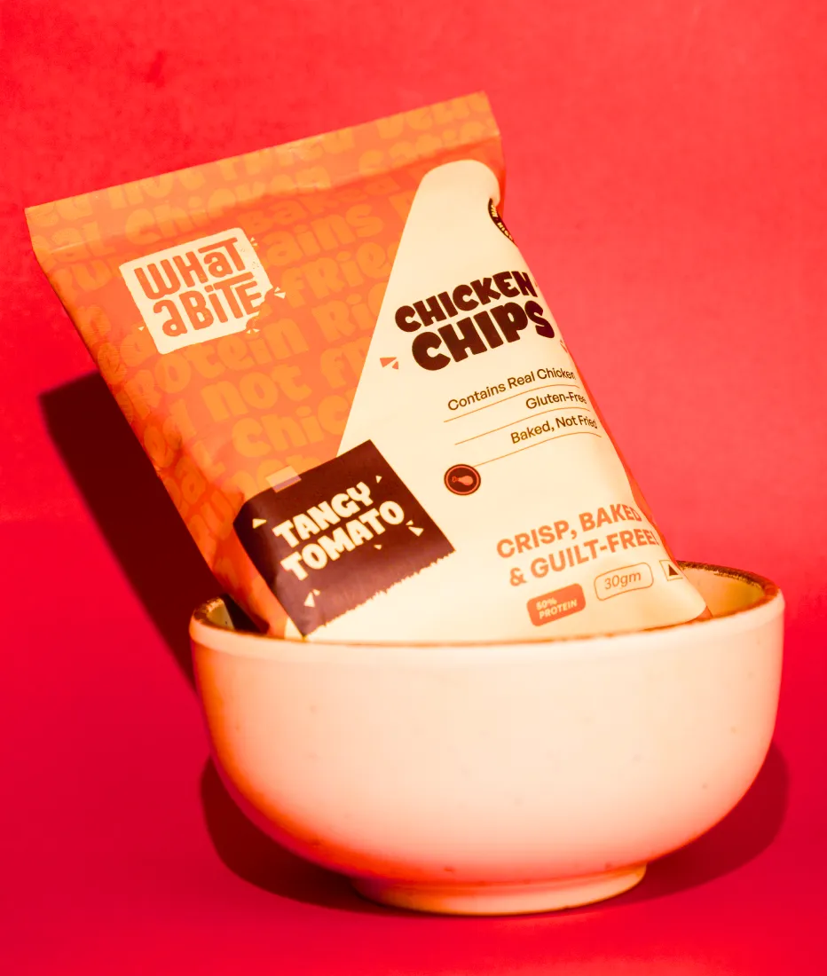
Let’s take a protein snack brand. If it targets gym-goers tracking their intake, packaging may prioritise protein content. If it targets office workers looking for a convenient afternoon snack, taste and occasion may deserve greater emphasis. The product may be similar, but the positioning changes what the design needs to communicate.
Desi Minimals, a minimalist apparel brand, illustrates this sequence. We developed its strategy, positioning and verbal identity before visual design. The line “Less noise. More you.” established a clear direction for the typography, visual restraint and packaging.
When brand identity is weak or undefined, every design decision becomes subjective. The founder likes blue, the marketing lead prefers green, the agency proposes black. There is no strategic filter, so there is no way to evaluate whether a decision is right. Teams argue about aesthetics because nobody defined the objective.
Brand identity is what prevents that argument. It gives every future decision a reference point including, and especially, the visual ones.
Visual identity is the visible expression of a brand. It turns the brand’s positioning and personality into design elements customers can recognise across packaging, websites, social media, retail and other touchpoints.
What visual identity includes:
A logo, a few colours and a typeface are individual assets. A visual identity defines how to use them, what happens when formats change and how the brand stays consistent as more products and communication channels are added.
Visual identity is the layer your customers actually encounter. They will never read your positioning statement or see your audience definition. But they will see your packaging on shelf, your website on their phone, your social media in their feed, and your shipping box at their door.
Every one of those moments is governed by the visual identity system and if the system is weak, the brand perception weakens with it.
A visual identity built without brand identity may look good but will not communicate anything specific. And in a crowded category, a brand that communicates nothing specific is a brand that gets forgotten.
The table may suggest that brand identity is just a bigger version of visual identity. It is not that simple.
Brand identity is a set of decisions, visual identity is the evidence of those decisions in a form people can see.
Crowded D2C categories often feature brands with similar visual identities but vastly different brand positioning.
Example: a clean-label nutrition aisle has white or pastel packs, geometric sans-serifs, and boxed ingredient call-outs. The Whole Truth’s front-of-pack ingredient list works because it reflects a deliberate positioning around transparency. The ingredient list is the claim. Competitors copying the layout without the underlying positioning look similar but offer no distinct reason to choose them.
The reverse also happens: a brand has clear positioning, but its packaging fails to communicate it. Founders often say, “People love the product once they try it, but they don’t pick it up.” Here, the brand identity is sound; the visual identity isn’t doing its job. This requires a different, usually smaller, intervention.
Let’s break down each metric to understand this further:
Brand identity answers: Who are we, and why should anyone care?
Visual identity answers: What do we look like, and how do people recognise us?
Brand identity is a strategic question, visual identity is an executional one. Confusing them can stall your branding projects, the team is designing before it has decided what it is designing for.
Brand identity is conceptual and verbal. It exists in language, decisions, and principles. It is developed through research, workshops, interviews, and strategic thinking.
Visual identity is tangible and sensory. It exists in colour, form, type, texture, and composition. It is developed through design exploration, iteration, and application testing.
Brand identity creates internal alignment, it ensures that everyone inside the business, from the founder to the newest hire, understands what the brand stands for and makes consistent decisions.
Visual identity creates external recognition, it ensures that customers can identify the brand instantly, distinguish it from competitors, and recall it later.
Brand identity applies to every business decision: hiring, product development, partnerships, pricing, customer service, and communication style.
Visual identity applies to every customer-facing touchpoint: packaging, website, social media, retail, advertising, and collateral.
Without brand identity, the business lacks direction. Positioning drifts, marketing messages contradict each other, different teams operate from different assumptions. Design decisions become subjective arguments because there is no strategic filter. The brand competes on price because it cannot compete on meaning.
Without visual identity, the brand becomes forgettable. Customers cannot recognise it across channels plus consistent application is impossible. Every new asset requires a fresh design decision. Recognition, which drives repeat purchase, never compounds.
Brand identity builds trust through consistency of behaviour. A brand that consistently delivers on its values, treats customers a certain way, and stands for something specific builds trust over time.
Visual identity builds trust through consistency of appearance. A brand that looks the same on shelf, online, and in hand signals competence and reliability. Inconsistency signals the opposite and in high-consideration categories, perceived inconsistency undermines confidence before a single word is read.
Brand identity determines the ceiling of perceived value. A brand positioned as premium can charge premium prices. A brand positioned as accessible cannot, without changing its positioning first.
Visual identity determines whether the ceiling is reached. Premium positioning supported by weak visual execution gets discounted. Accessible positioning supported by over-engineered visuals confuses the value proposition. The two must align.
Brand identity affects conversion indirectly, through the trust built by consistent positioning, clear differentiation, and a compelling reason to choose.
Visual identity affects conversion directly, through shelf impact, readability, hierarchy, and the split-second decision a customer makes when comparing two options side by side.
Brand identity is difficult to copy. It is rooted in the specific history, values, and audience of the business. Competitors can replicate a colour palette but they cannot replicate the meaning behind it.
Visual identity is easier to imitate. Competitors can match a logo style or a colour trend. But if the visual identity expresses a genuine strategic position, imitation looks hollow and customers notice.
Brand identity should be stable for years. A brand that changes its positioning every 18 months has no positioning at all. Shifts in brand identity are significant events, usually triggered by a fundamental change in business model, market, or ownership.
Visual identity can evolve more frequently without losing equity. Refreshes, new applications, seasonal campaigns, and extended palettes are all normal. The system flexes; the identity anchors.
Brand identity is judged by strategic clarity and commercial outcomes. Does the business make faster, more consistent decisions? Does it attract the right customers? Does it hold pricing power? Does the team align?
Visual identity is judged by recognition and consistency. Do customers recognise the brand instantly? Does the identity work across every touchpoint? Is the application consistent across teams and partners?
Brand identity is the compounding asset. It appreciates over time as consistency, association, and trust accumulate. A well-built brand identity becomes more valuable each year and eventually becomes the most defensible asset the business owns.
Visual identity is the expression engine. It does not appreciate on its own. But it is the mechanism through which brand equity becomes visible to customers, again and again, across every interaction. Without it, the strategic asset never reaches the market.

Talk to our team to find out where the gap really is
Book A Call
A product pack shows how brand identity and visual identity work together.
Every design choice must communicate the brand’s position while meeting practical requirements such as limited space, product information, regulatory text and different packaging formats.
Brand identity sets the direction. Visual identity turns that direction into design.
Positioning determines what gets attention
Brand positioning helps decide what shoppers should notice first. Consider two granola brands: one built around taste and indulgence, the other around high fibre and everyday nutrition.
The first may lead with flavour and appetising product imagery. The second may give its key nutritional benefit greater prominence, supported by cues that reassure shoppers about taste.
Both can use the same pack format, but their front-panel hierarchy should reflect different reasons to buy. Without clear positioning, design decisions often default to category conventions rather than a specific customer need.
Personality guides visual choices
A brand aiming to feel warm and approachable may need a different visual language from one positioned as clinical and precise. Colour, typography, imagery, layout and finishes should all support the intended personality.
Finishes such as foil, embossing and spot UV also affect production costs. Choosing them because they fit the brand’s positioning is more useful than adding them simply to make a pack look premium.
Visual cues support the message
Packaging cannot rely on written claims alone. Product imagery, colour and material choices help establish the intended impression, while all copy and claims must comply with the regulations of the markets where the product is sold.
For The Indus Valley, a cookware brand, the pack hierarchy prioritised the product, followed by the brand, features and technical details. This gave shoppers a clear order in which to understand the offer. The design hierarchy followed the information buyers needed most.
The system must work across the range
Brand identity also determines how a product range is organised. Are variants grouped by flavour, benefit, usage or occasion? Visual identity translates that structure into a repeatable system using colour, typography, patterns, icons or other cues.
A system that works on one large box must also remain clear on a small sachet, jar label or e-commerce thumbnail. Otherwise, recognition and differentiation can weaken as the range expands.
👉When strategy and design support each other, the pack communicates a clear reason to choose the product and gives customers consistent visual cues across the range. Neither layer can do that job as effectively on its own.
Most businesses approaching a branding project do not need both layers rebuilt. They need to identify which layer is actually failing. Here is a practical diagnostic.
Symptoms of a broken brand identity:
Symptoms of a broken visual identity:
☑️If brand identity is broken: You need strategy work first. Visual identity built on a weak foundation will not solve the problem, it will just produce better-looking confusion.
☑️If visual identity is broken: You may not need a full rebrand. A visual identity refresh, informed by existing strategy, is often sufficient and significantly less expensive.
☑️If both are broken: You need a full brand identity project. Rebuilding one layer without the other produces a system that will fail again.
Most scope problems start when a brief names a deliverable instead of explaining the business problem.
Asking for “a new logo and packaging” may lead to a visual identity proposal when the real issue is unclear positioning or an inconsistent product range.
👉Be clear about what your brand needs
If you need brand identity: Explain that you need to define or refine your positioning, target audience, differentiation, personality and messaging before design begins. Treat it as a strategy project that will guide the visual work.
If you need visual identity: Share your existing strategy documents and explain how the identity needs to be expressed across logos, colours, typography, packaging and other touchpoints. If your strategy exists only in the founder’s head, ask the agency to assess whether it needs to be documented first.
If you need both: State that upfront. The scope should cover strategy, visual identity development and guidelines, with applications such as packaging included where required. Allow enough time for the strategic decisions to inform the design rather than compressing the project by skipping discovery.
👉Prepare before the first conversation
Bring your current positioning, product range and planned launches for the next 12–18 months. Share photos of your packaging in retail settings or screenshots from e-commerce platforms, along with competitor examples.
Note fixed constraints such as existing pack formats, printers, regulatory requirements, launch dates and who will approve the work.
👉Questions to ask every agency
That last question helps distinguish strategic thinking from visual execution. Look for a clear explanation linking the client’s positioning to specific choices in colour, typography or information hierarchy.
👉Watch for scope gaps
A “brand identity” proposal that only lists a logo, colours and fonts may cover visual identity rather than strategy.
Also check for missing packaging applications, unclear revision rounds and no process for consolidating stakeholder feedback.
Your team must contribute timely decisions and agreed feedback. Before signing, ask: Which layer of our brand needs work, and what evidence supports that diagnosis?
The answer helps you compare proposals on scope, not just price.
At Confetti, we treat brand identity and visual identity as two halves of one system, not two separate services.
We work on branding, packaging and digital design for FMCG, D2C and retail brands, and our projects usually run in a set order:
Discovery comes first because packaging decisions depend on knowing the full range. For Forest Essentials, on a packaging project for an exclusive collection made for the Jaipur royal family, we built an SKU database and content inventory before any design began. We then researched Rajasthani heritage, developed eight packaging concepts, and narrowed them to three for client review.
Strategy shapes the visual system, including on digital work.
For Miduty, a women's wellness brand, we built user personas around specific pain points, including declining confidence and difficulty finding trustworthy products. The information architecture came next, then the visual identity: a black, blue, aqua and white palette with Poppins typography, chosen to communicate trust, calm and clarity.
We keep strategy and design in the same team, so the people who made the positioning decisions are still in the room when packaging trade-offs come up, such as which claim gets the front panel. That addresses the handover failure described earlier, where strategy gets reduced to adjectives between one agency and the next.
Not every brand needs the full sequence. If your positioning is clear and the problem is an inconsistent range, a visual identity and packaging system project is the right scope, and we'll say so. If the problem looks like product or pricing rather than identity, we'll say that too.
Not sure which layer your brand needs? Schedule a consultation, we will help you identify what is actually broken before you invest in fixing the wrong thing.
What is the difference between visual identity and brand identity?
Brand identity is the full definition of a brand: its positioning, values, personality, voice and the visual system that expresses them. Visual identity is the visible part of that system: logo, colour palette, typography, imagery and layout rules. Brand identity decides what the brand should mean; visual identity makes that meaning recognisable at a glance.
Is a logo the same as a visual identity?
No. A logo is one element inside a visual identity. The visual identity also covers colour, typography, imagery style, graphic devices, layout grids and usage rules. A strong logo with no supporting system leads to inconsistent packaging, social posts and website pages, because every designer fills the gaps differently.
Can I change my visual identity without changing my brand identity?
Yes. This is a visual refresh. It suits brands whose positioning still works but whose look feels dated, inconsistent or weak on shelf and screen. The risk is losing recognition built over years, so a refresh should keep the most distinctive assets (a colour, a shape, a typeface) and change only what is holding the brand back.
Which should a new brand create first: brand identity or visual identity?
Brand identity first, at least its core: who the product is for, what it promises and how it differs. That can be a two-page positioning document, not a long strategy deck. A visual identity designed without it usually has to be redone once the positioning becomes clear, which costs more than doing it in order.
Want strategic branding and packaging like this for your business?





.webp)
.webp)


.webp)
.webp)
.webp)
.webp)
.webp)







.svg)
.webp)